
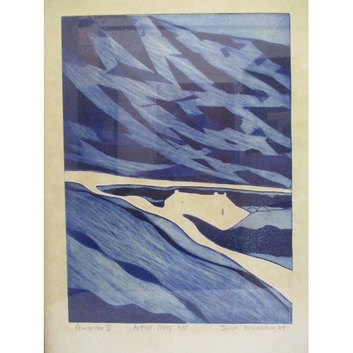
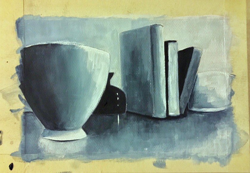
I’ve always liked John Brunsdon’s Pembroke II for the way he used a narrow range of tones, evoking, to me, an eerie atmosphere. When I show this to the children in my class, they mostly say they feel scared or nervous; it has a sense of foreboding. Some children feel nervous but hopeful when they think the house is a respite after being lost in the mountains. I decided to try to replicate a sinister, cold feel, just to be contrary as I always want to focus on the energy I feel when I’m painting, peace, calm…so I decided to play a bit. Same still life grouping but viewed from a different angle to generate a dominance of the objects.
I took on board the ‘language’ that Chevreul and Seurat, where sadness or other negative emotions could be interpreted through dark and cold colours with lines pointing down. With the latter, there are no obvious lines to point down but I found I was brushing in a downward direction, maybe subconsciously taking on this language.
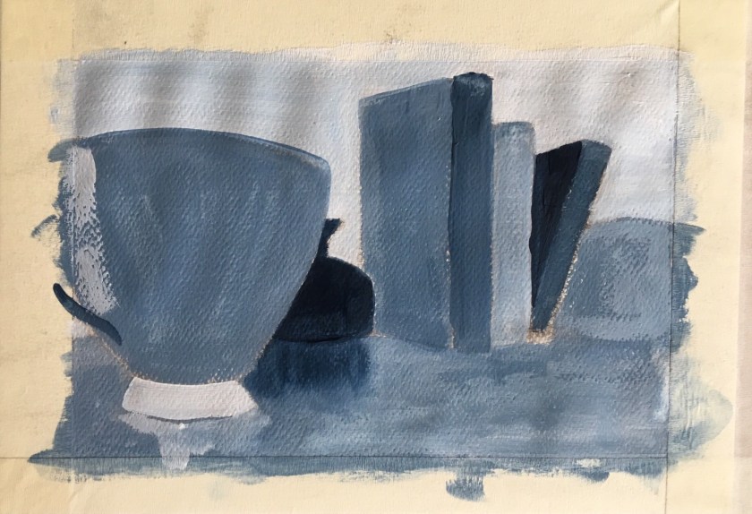

(I need to be aware of white balance affecting tone when taking photographs of my work. The first photograph is truest to colour).
