I was looking forward to this section for much of Parts 3 and 4! I think I was ready to be able to think out of the box and experiment in a more abstract manner. I wonder how students would approach this module if the contents of Part 5 was made to be Part 1 and they had to complete it first? My approach to painting would have been that I would have gained more inspiration and confidence doing the abstraction and material play first and then developed it into other standard study areas of painting. However, I do understand that the theory and basics need to be applied and practised. The introduction to Practise of Painting echoes my thoughts;
It can be hard to strike a balance between learning what we can from the great artists of the past and succumbing to the modern compulsion to always seek uniqueness and innovation.
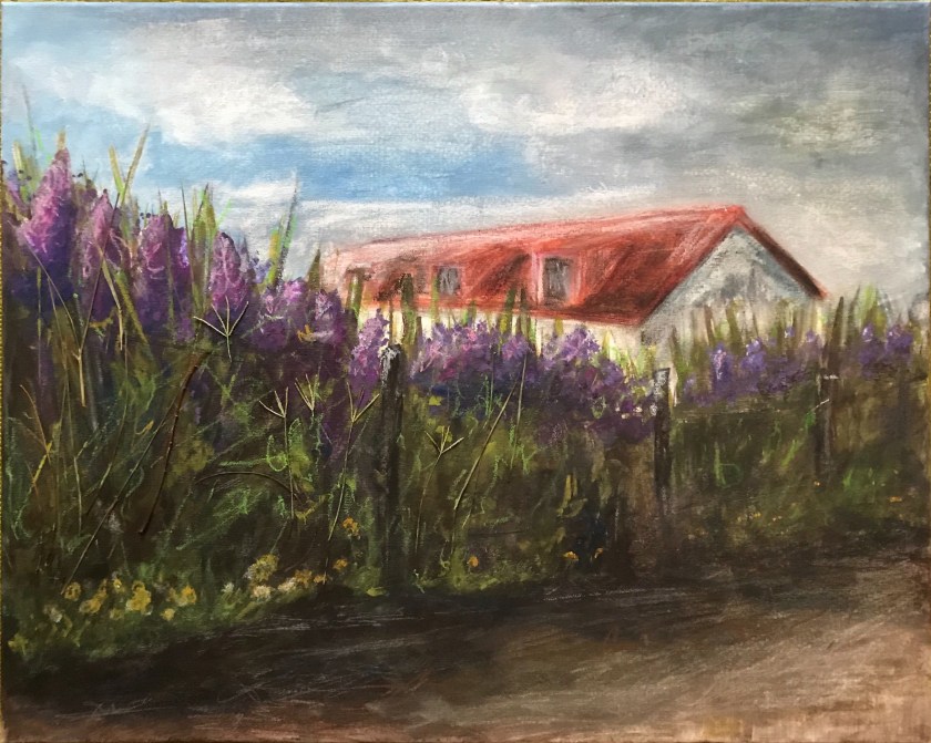
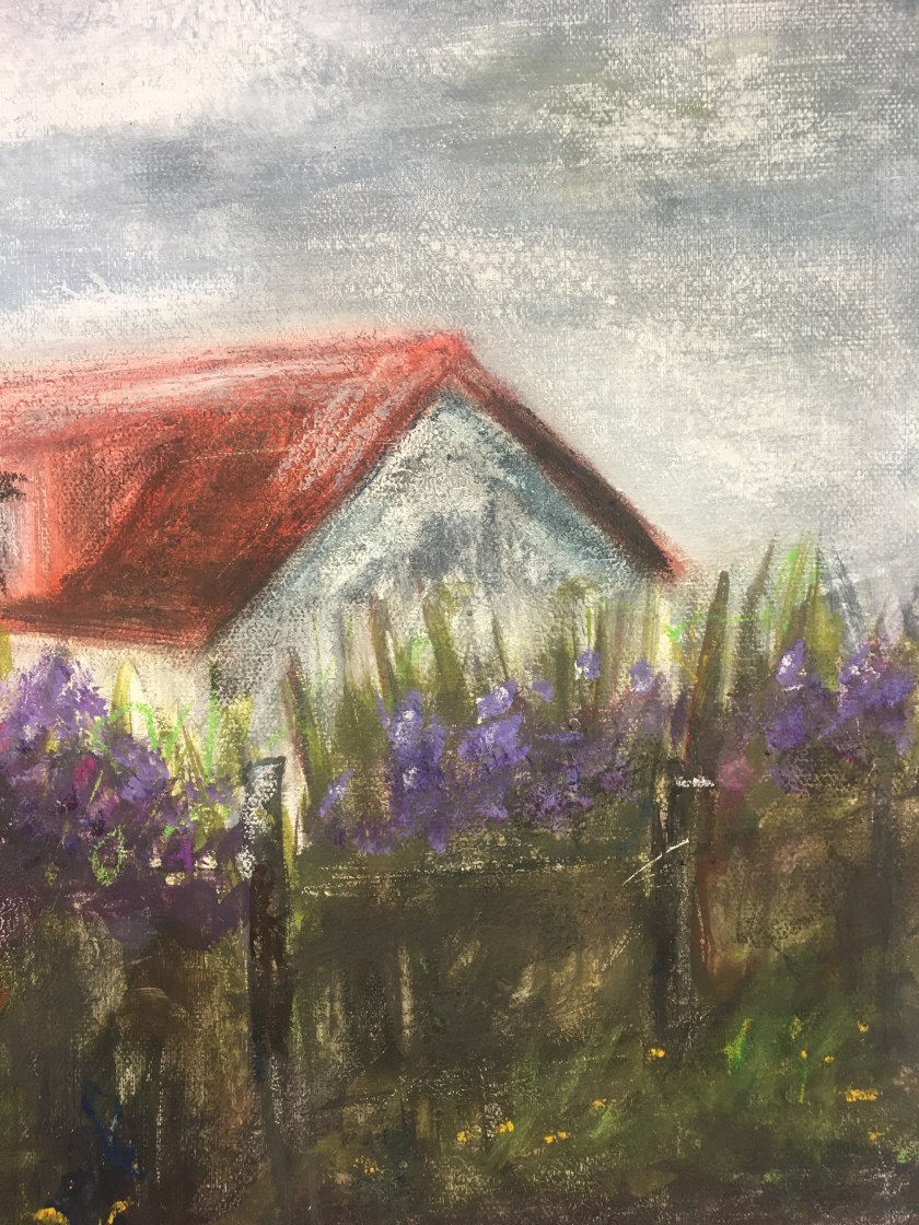
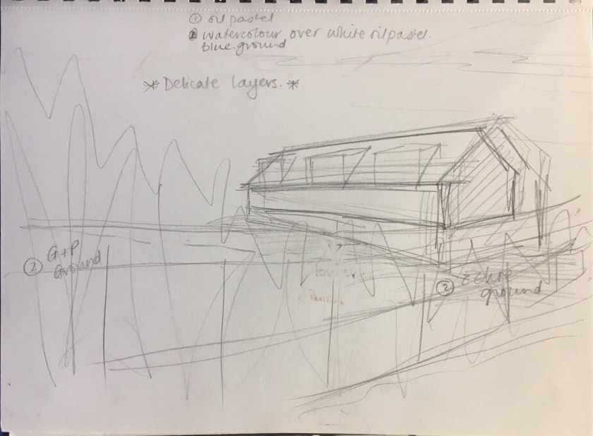
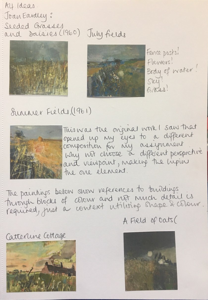
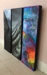
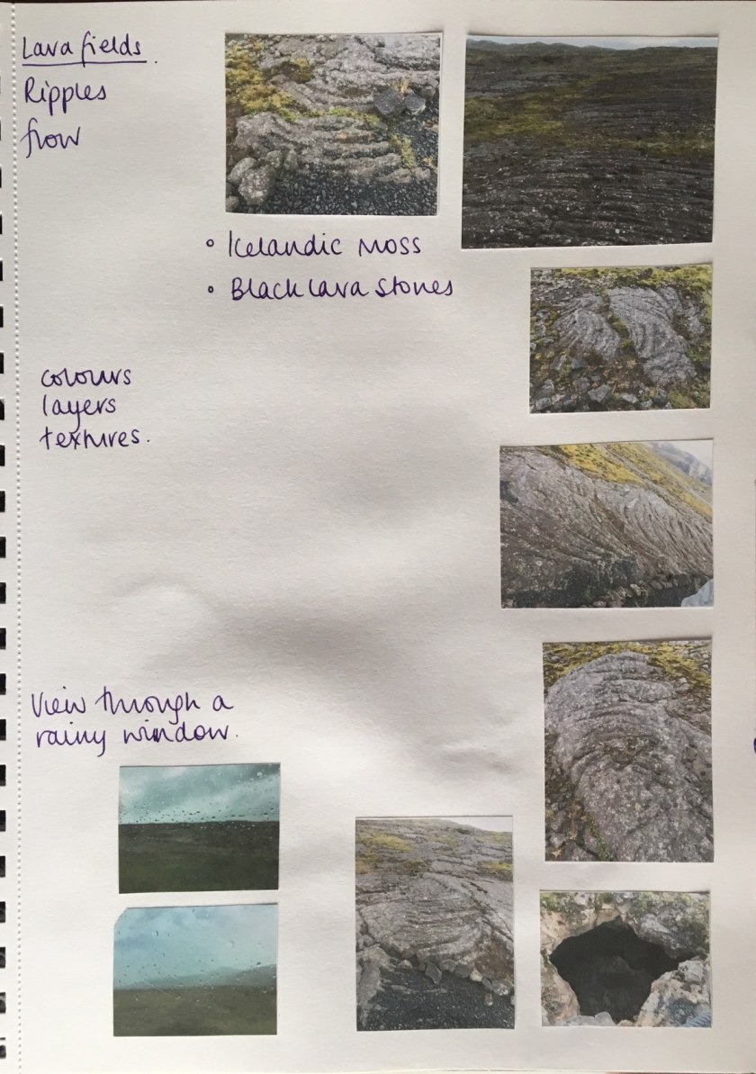
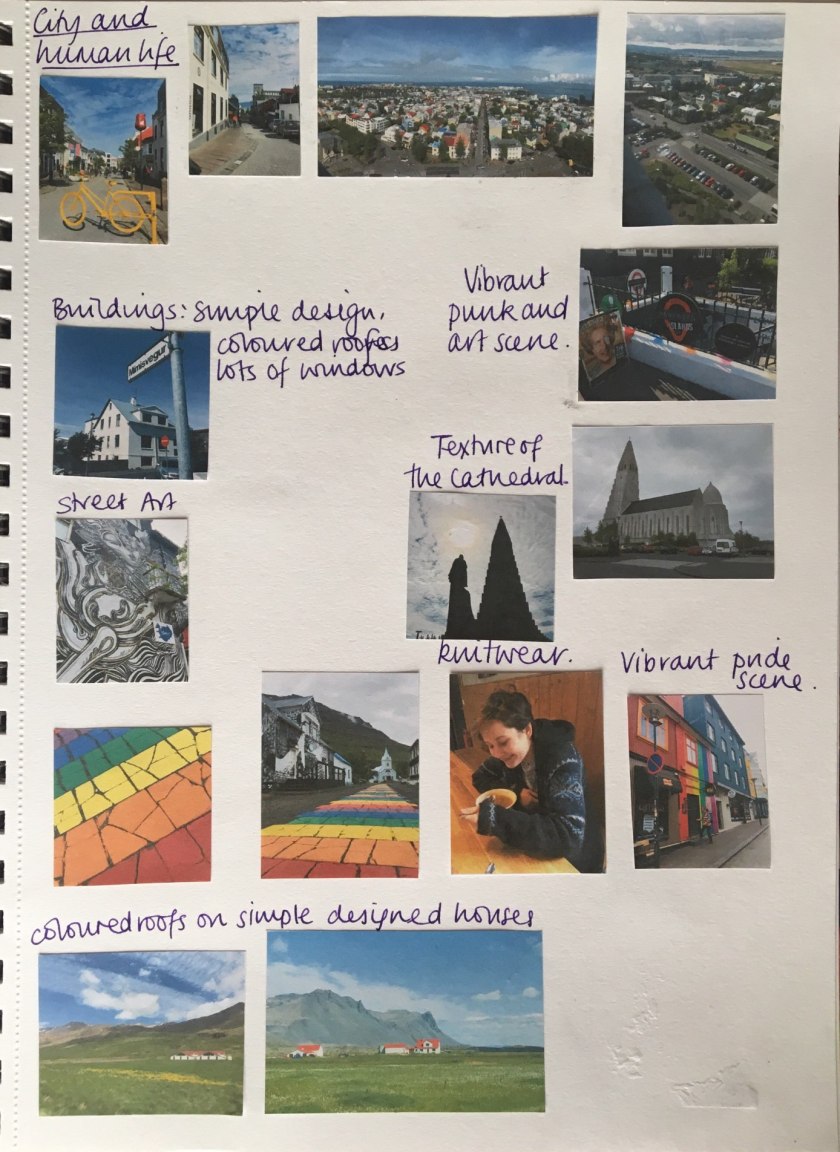
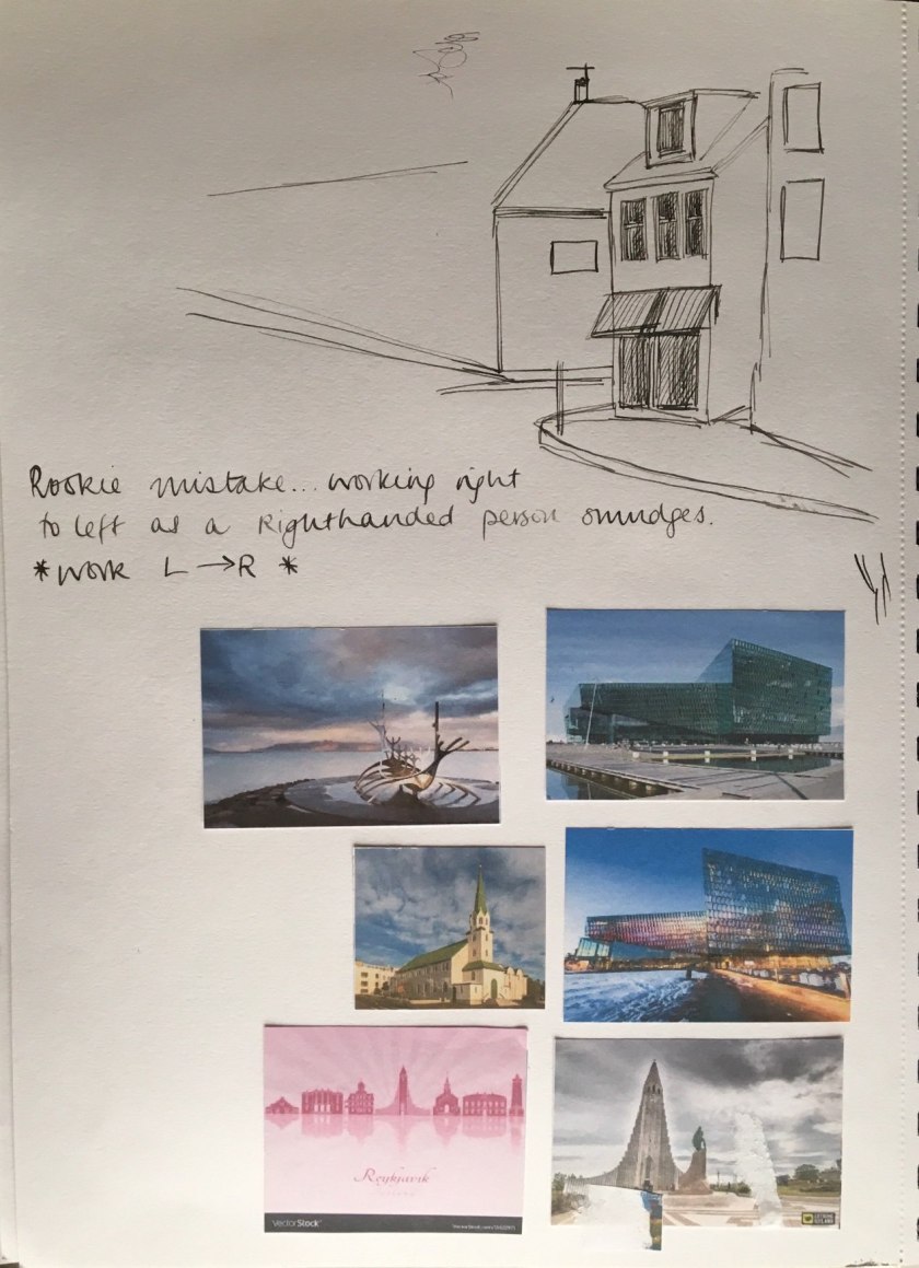
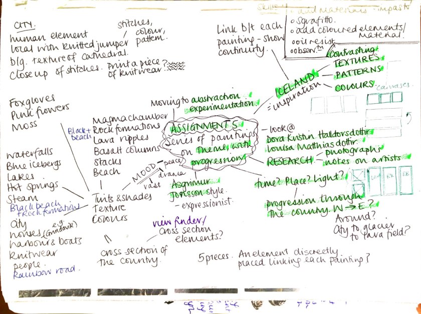
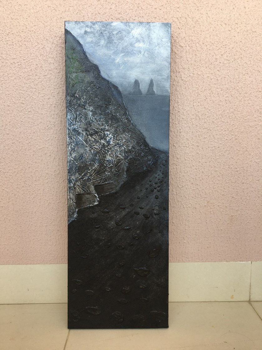
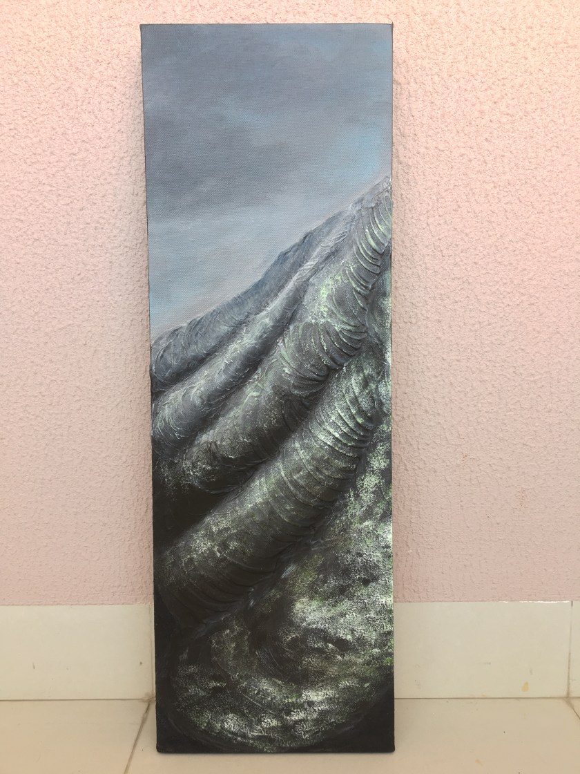
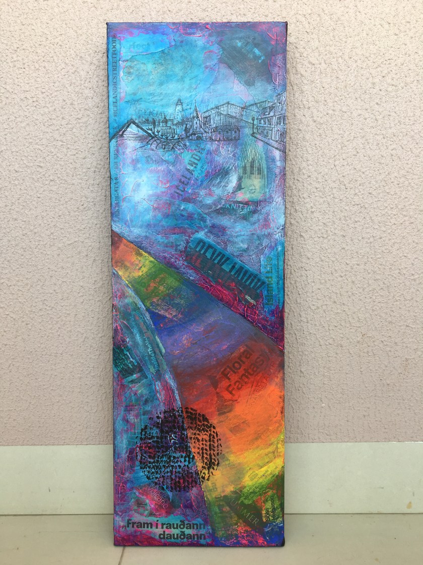
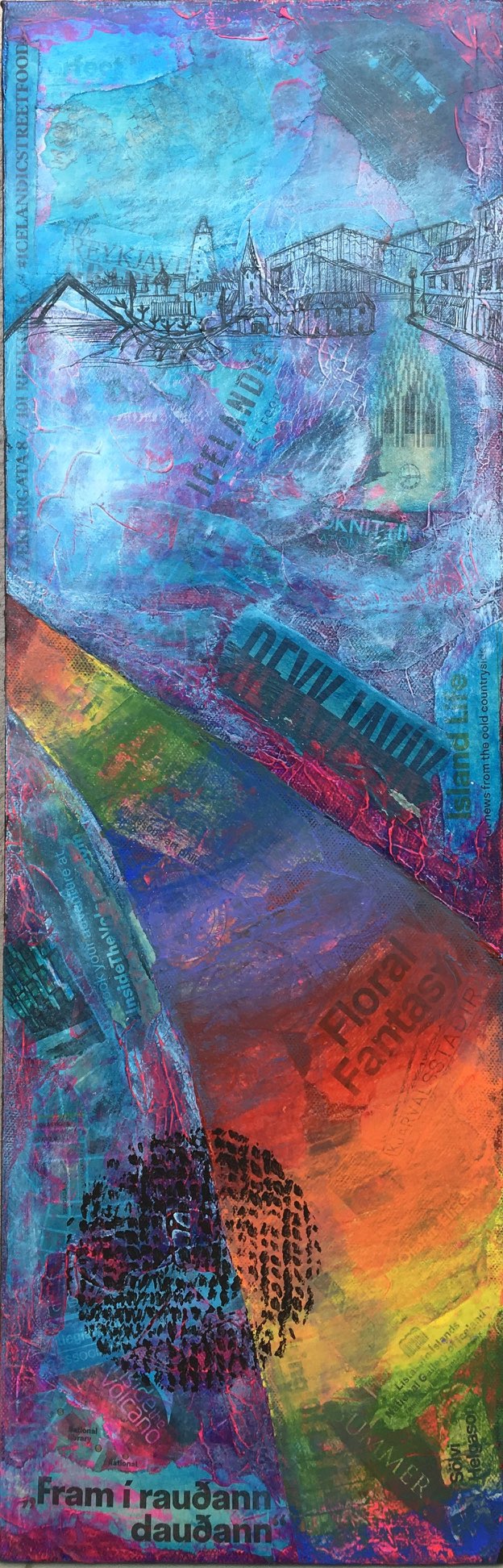
Part 5’s Assignment was always going to be based on my summer to Iceland. It was such a dynamic, varied country that offered plenty of inspiration for a series of paintings. This made me a little nervous to begin with as I did not particularly enjoy Part 4’s assignment development in landscape painting. It was the prospect of being able to abstract the features and feelings in some way that encouraged me to stick with my original ideas.
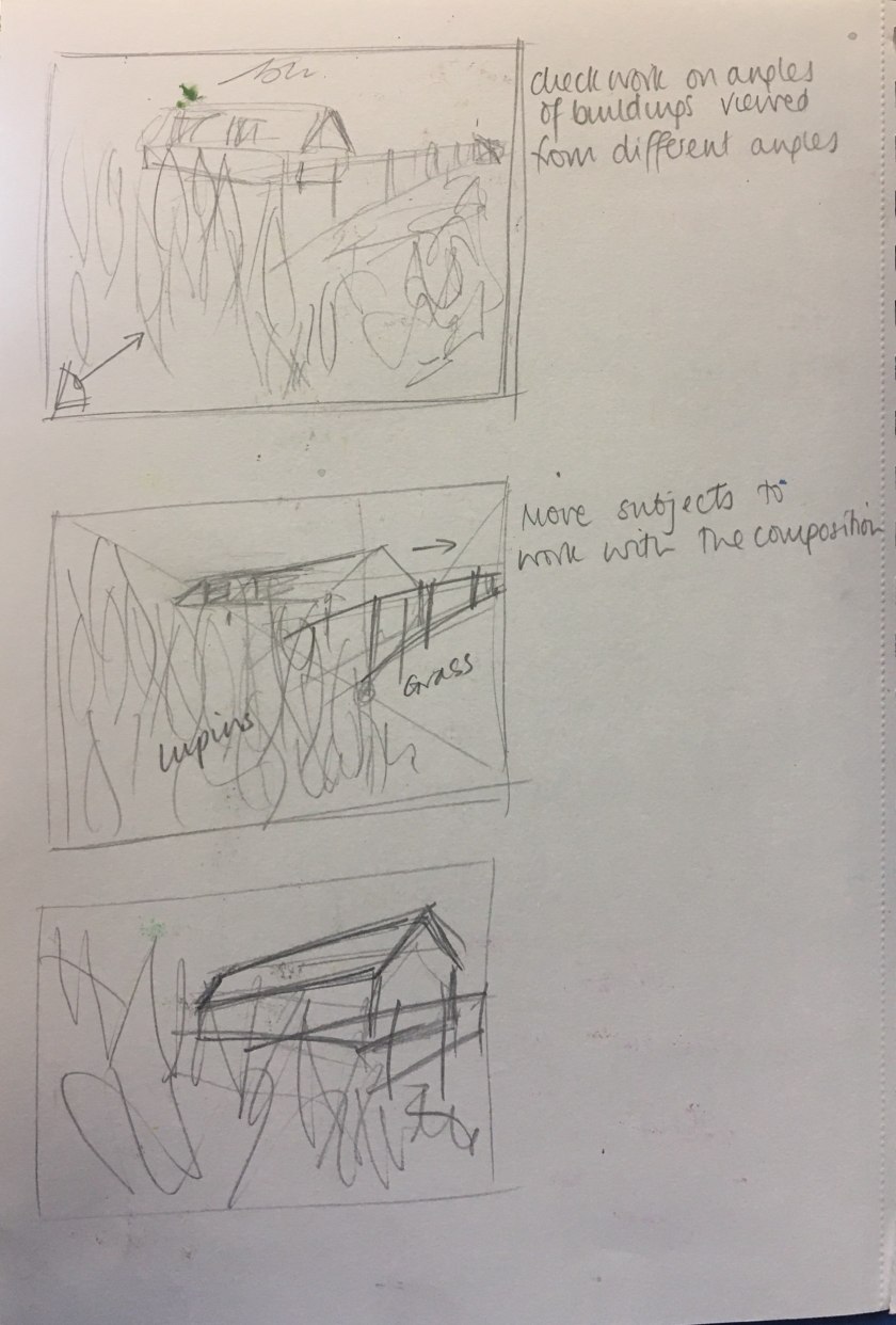
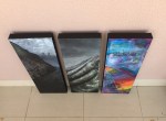
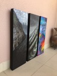
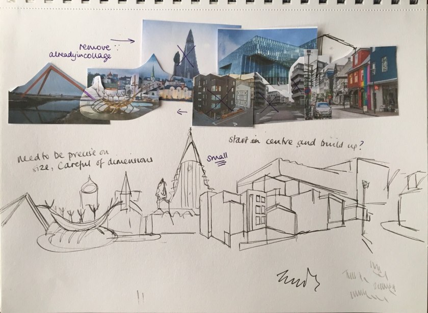
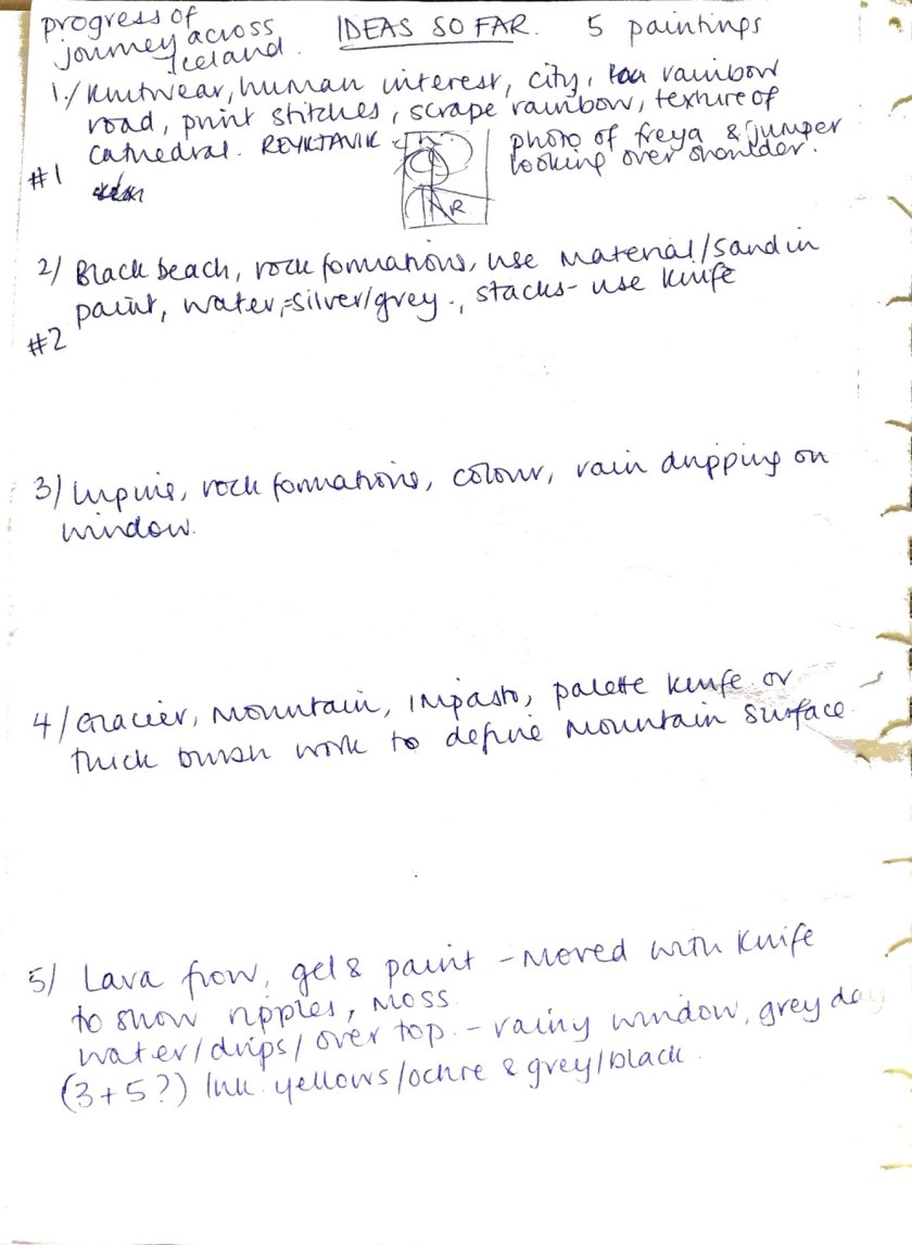
I knew I wanted to make 3-5 paintings that showed progression in an obvious linear connection. It was all rather fortuitous as I had three black deep canvases that matched my idea of linking the paintings in some way and so I developed the plans further based on these supports.
I initially thought I would work one painting at a time as they were each fundamentally different. But practically, allowing time for the media to dry and also using the energy and inspiration that Iceland gave me, I ended up happily working all three simultaneously, maintaining the same motivation for each.
At the start and through the early development, I had a plan to arrange the three paintings like this, as this was the chronological order that we visited the places that were inspirational;
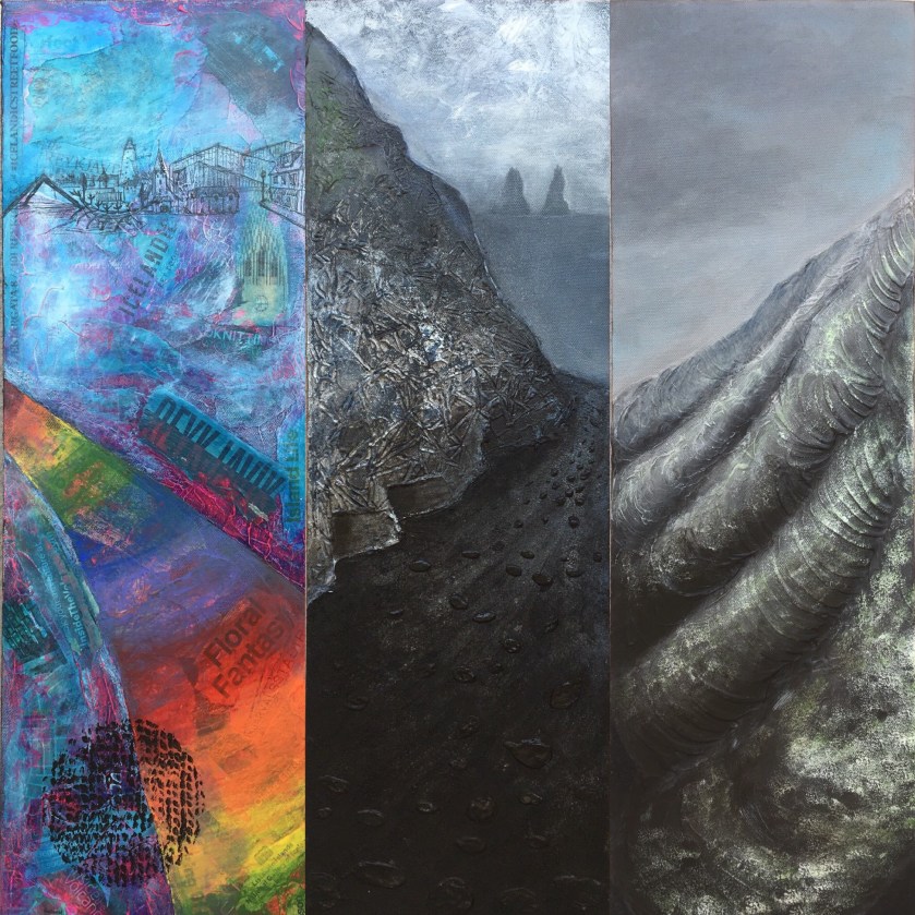
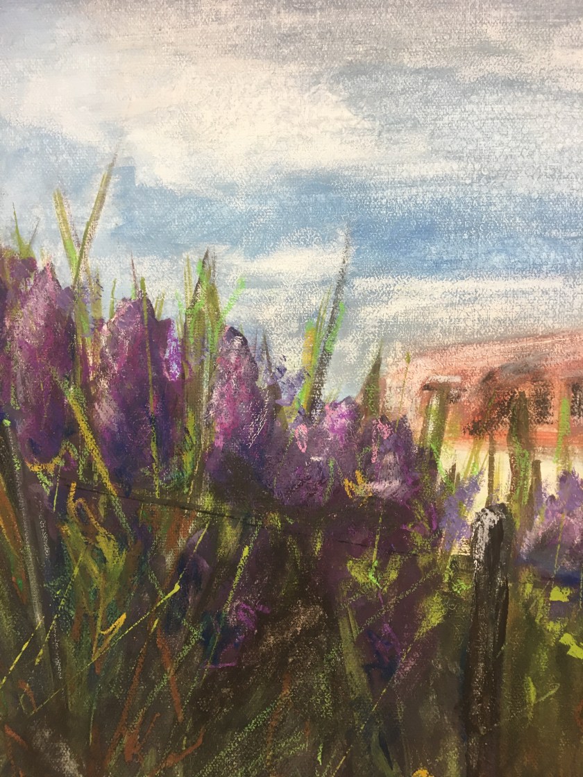
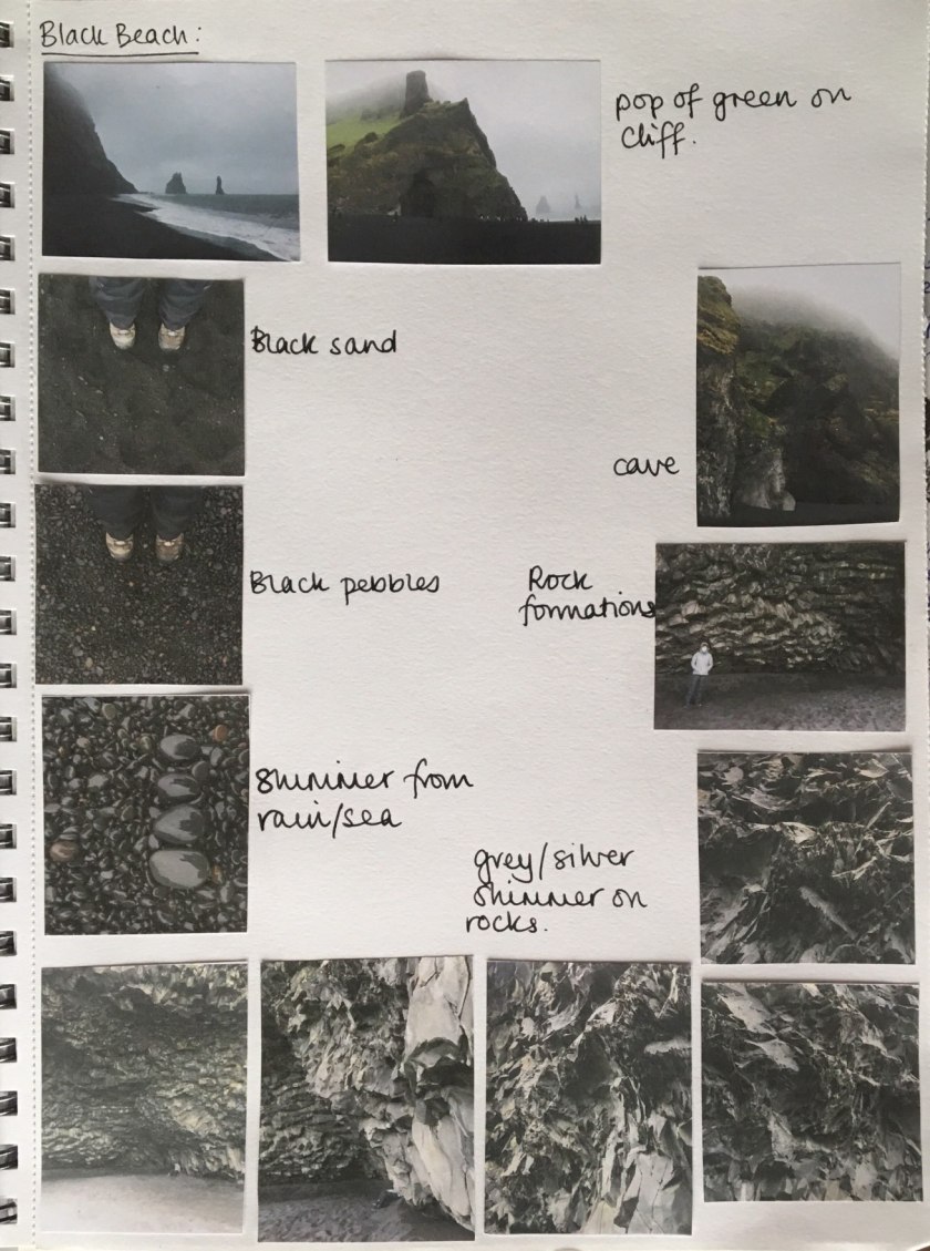
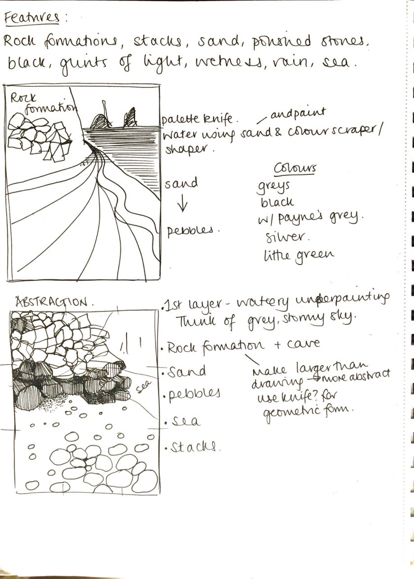
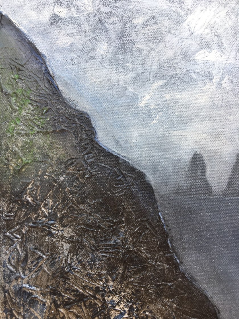
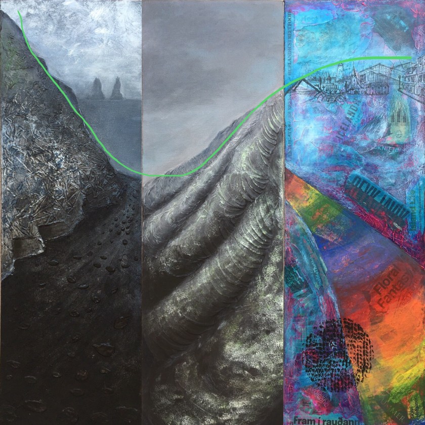
AS they developed I saw that the connecting line was not apparent and the black rock cut off on the left hand side jarred. Before I finished the colourful one based on Reykjavik, I moved only one and this allowed the continuation to remain.
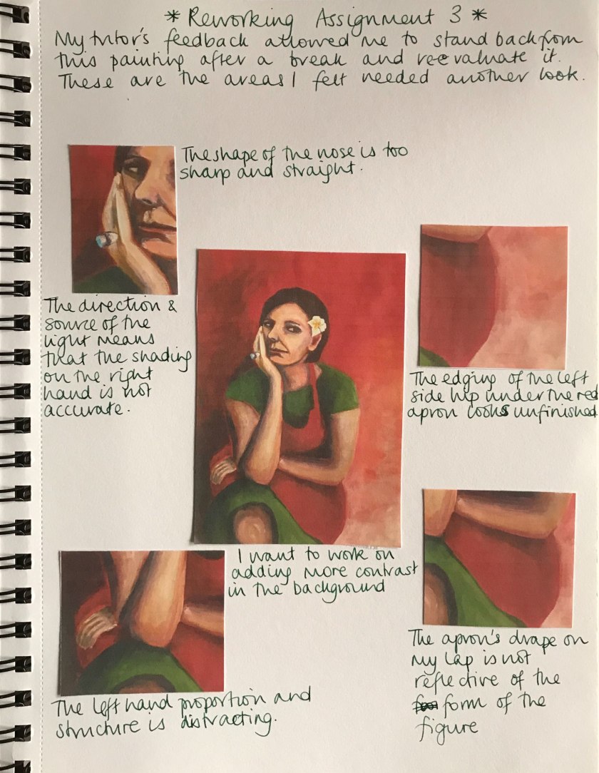
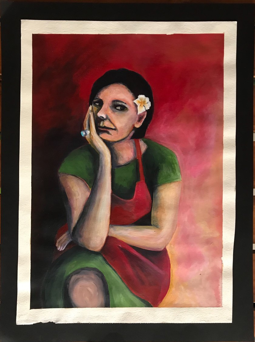
I am very pleased with the development of this series and the techniques that evolved throughout. I am glad I got to finish on a more creative note as far as my personal development is concerned. I feel circumstances rushed me in the last part and I was so disappointed. Having said that, I did reflect on the tasks to make sure I applied the techniques to the Black Beach painting in particular. Part 5 however, allowed me a freer approach in my work. Although time is of the essence for me at this stage, I have nonetheless been able to gain confidence again to experiment.
Demonstration of technical and Visual Skills. Materials, techniques, observational skills, visual awareness, design and compositional skills
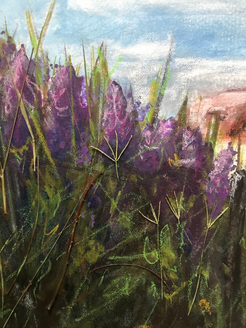
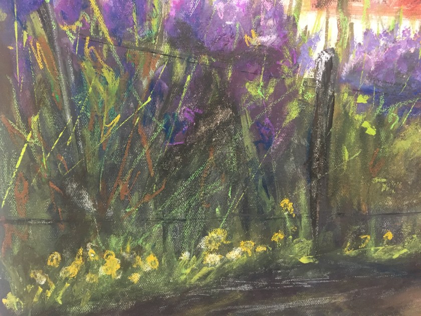
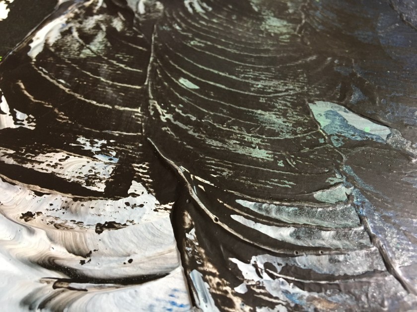
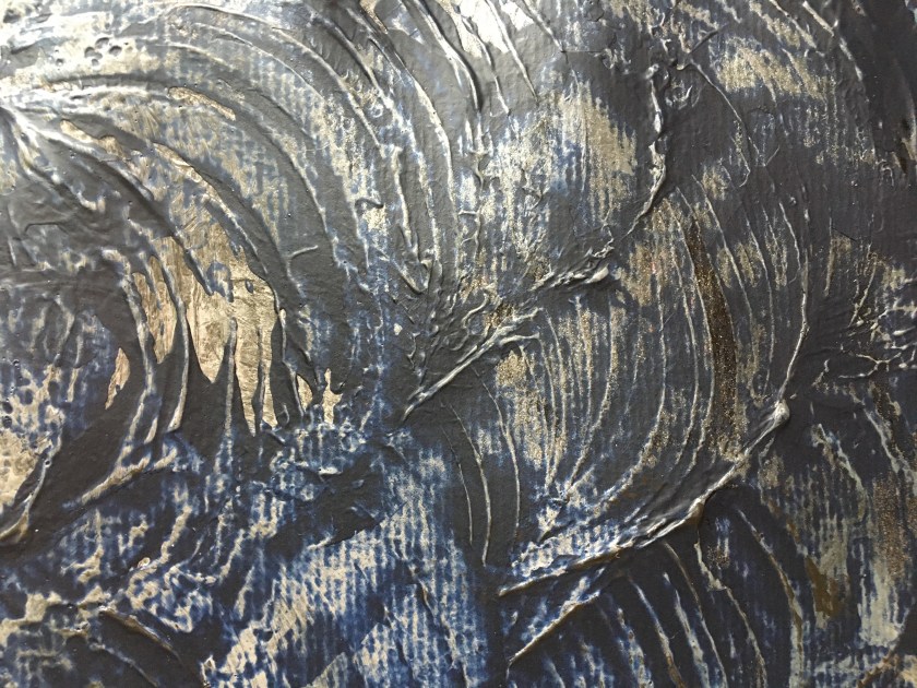
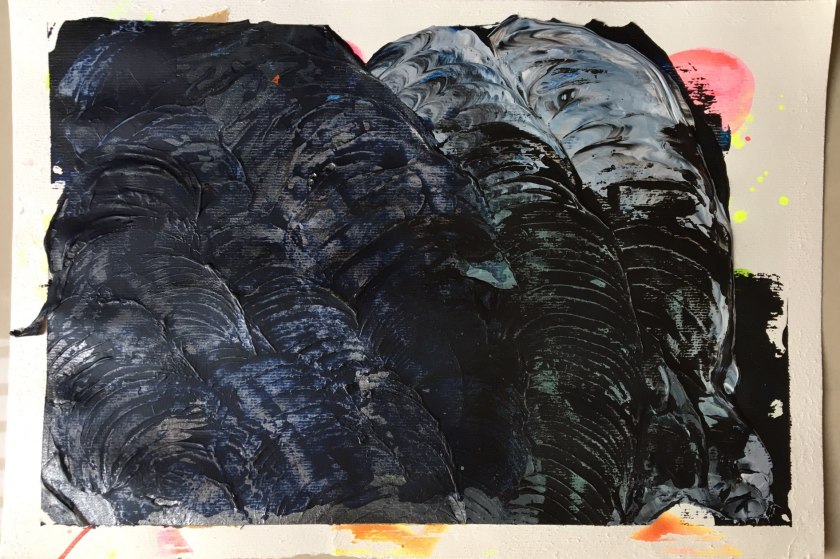
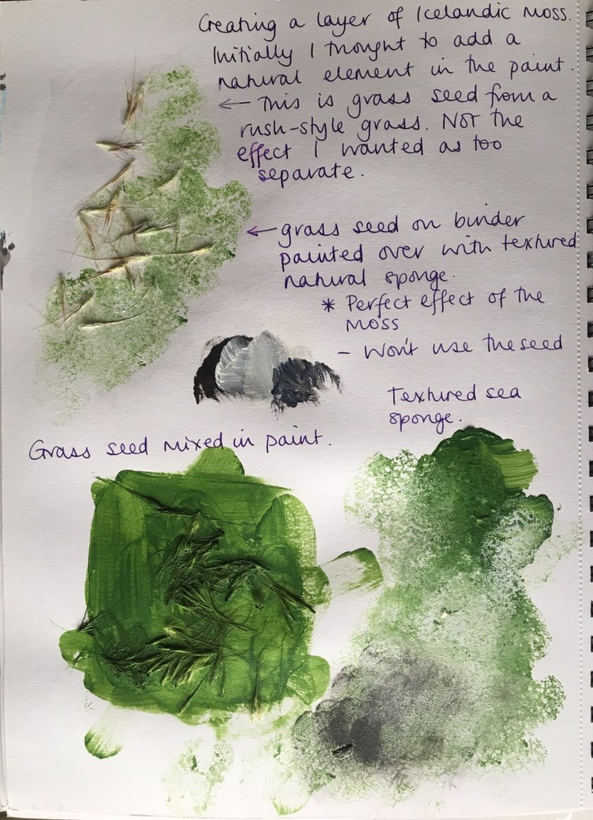
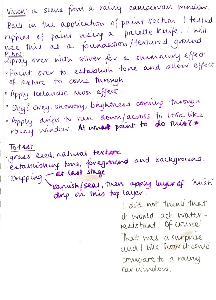
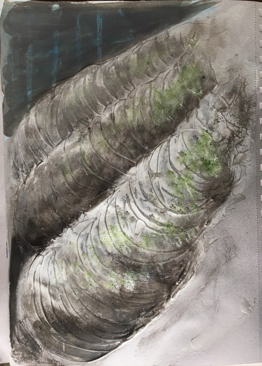
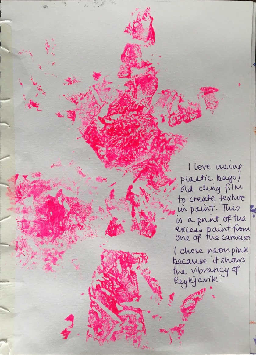
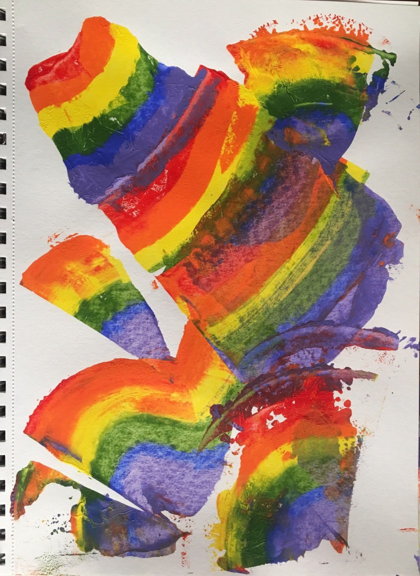
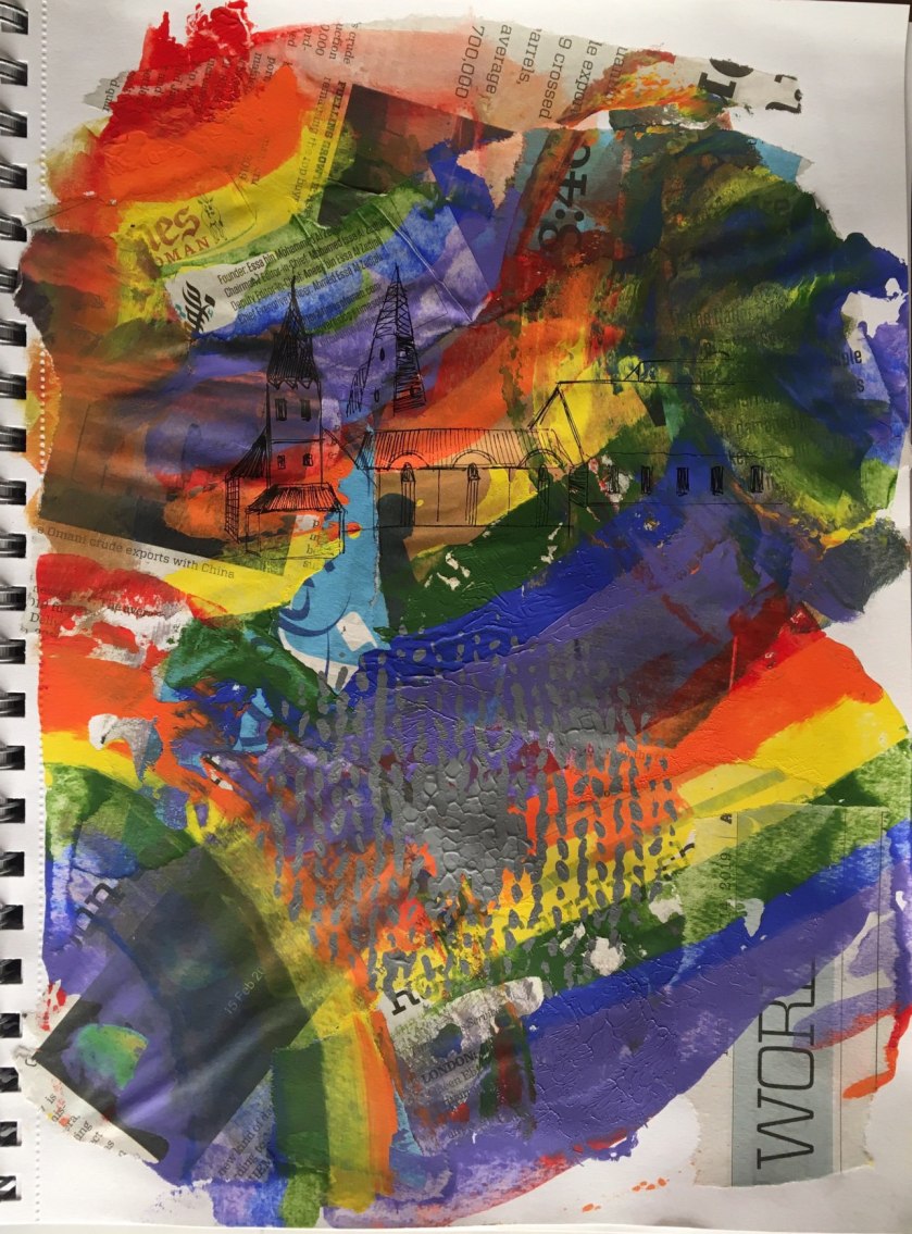
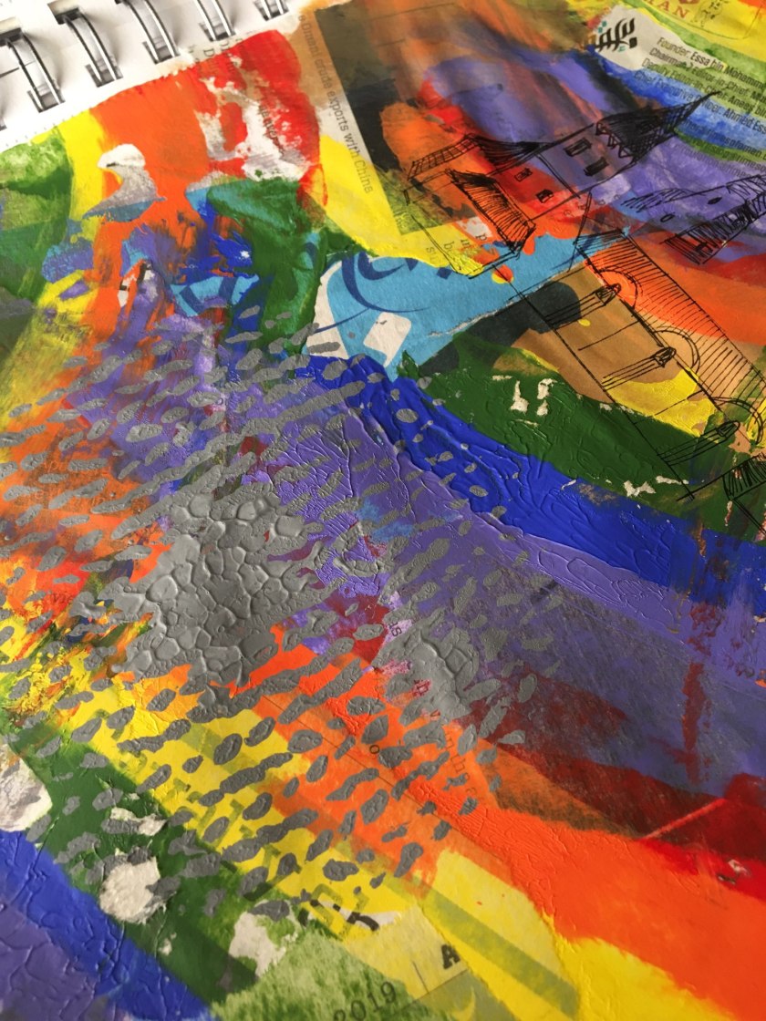
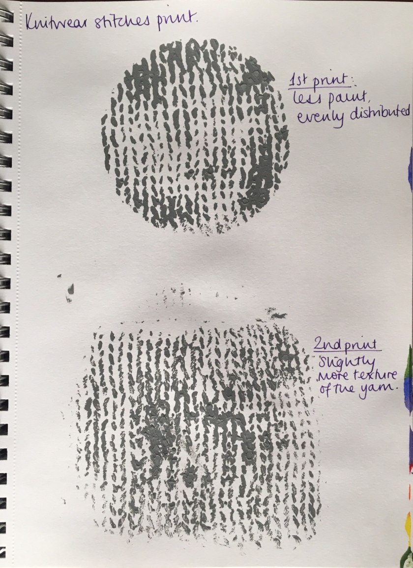
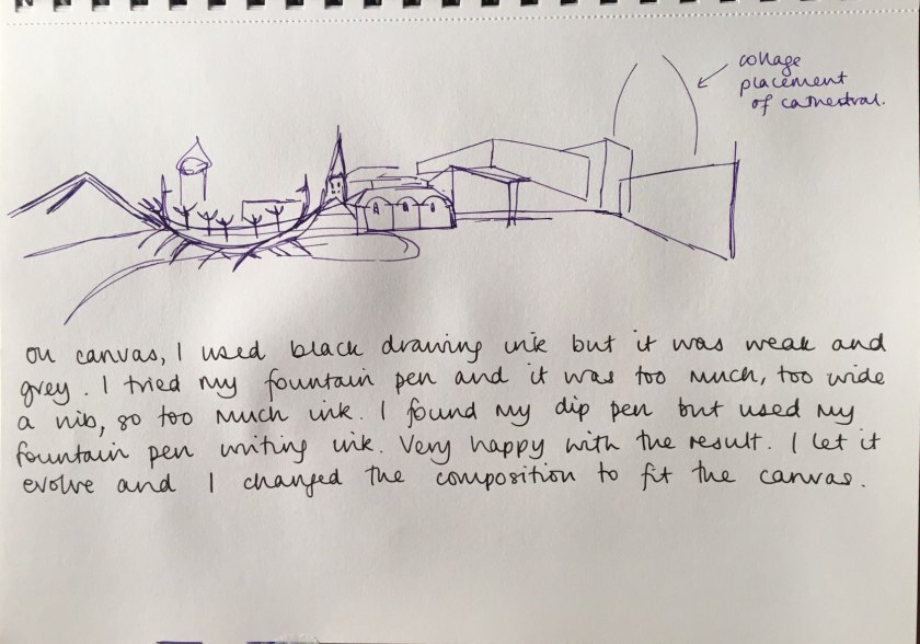
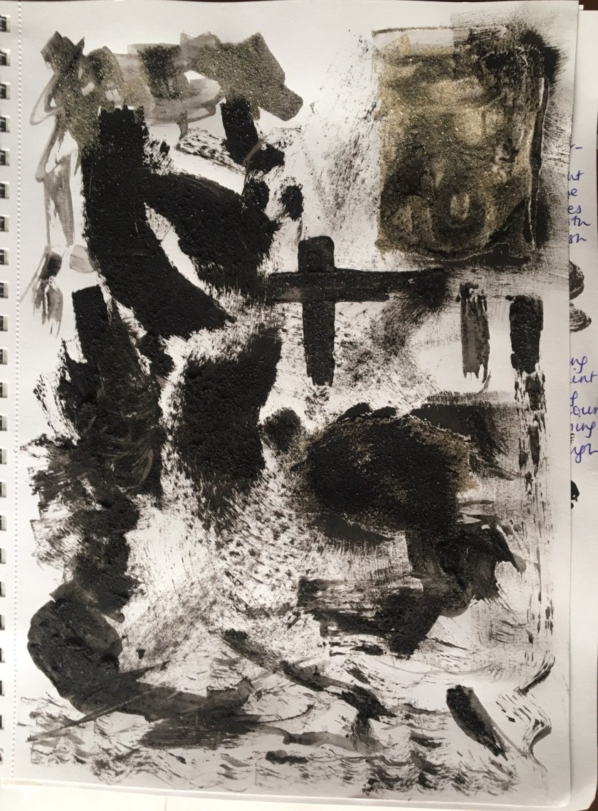
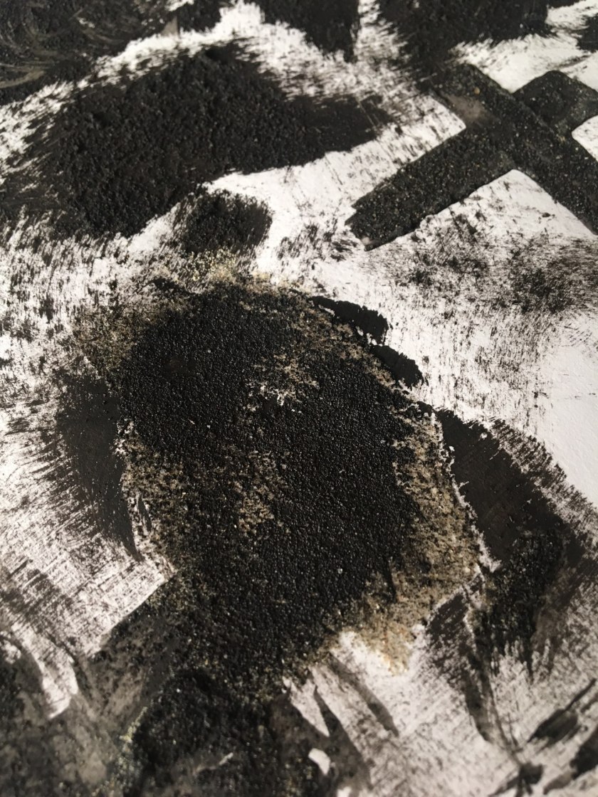
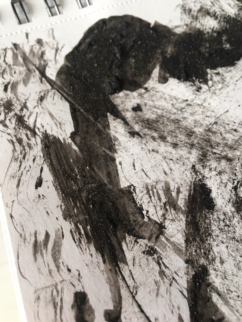
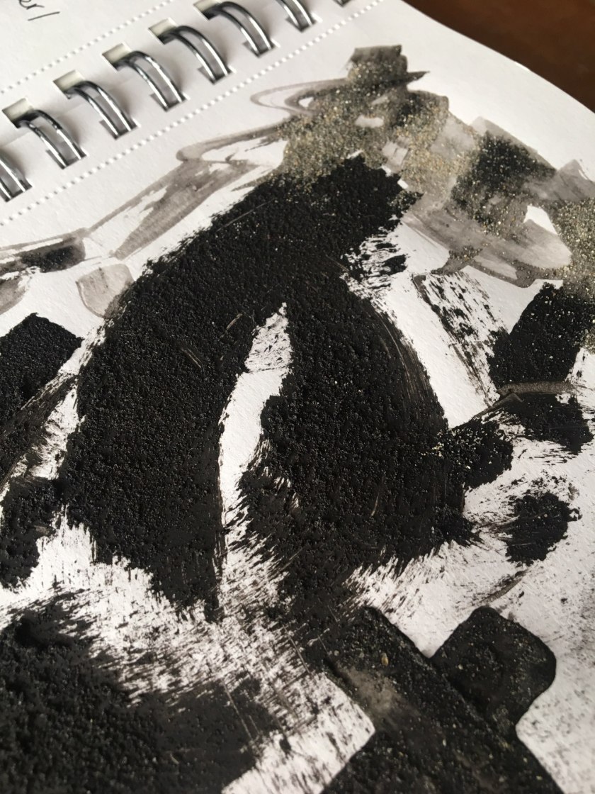
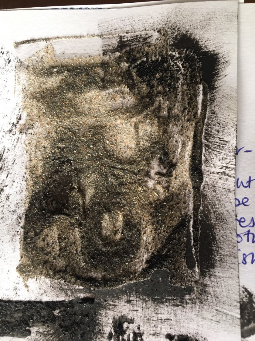
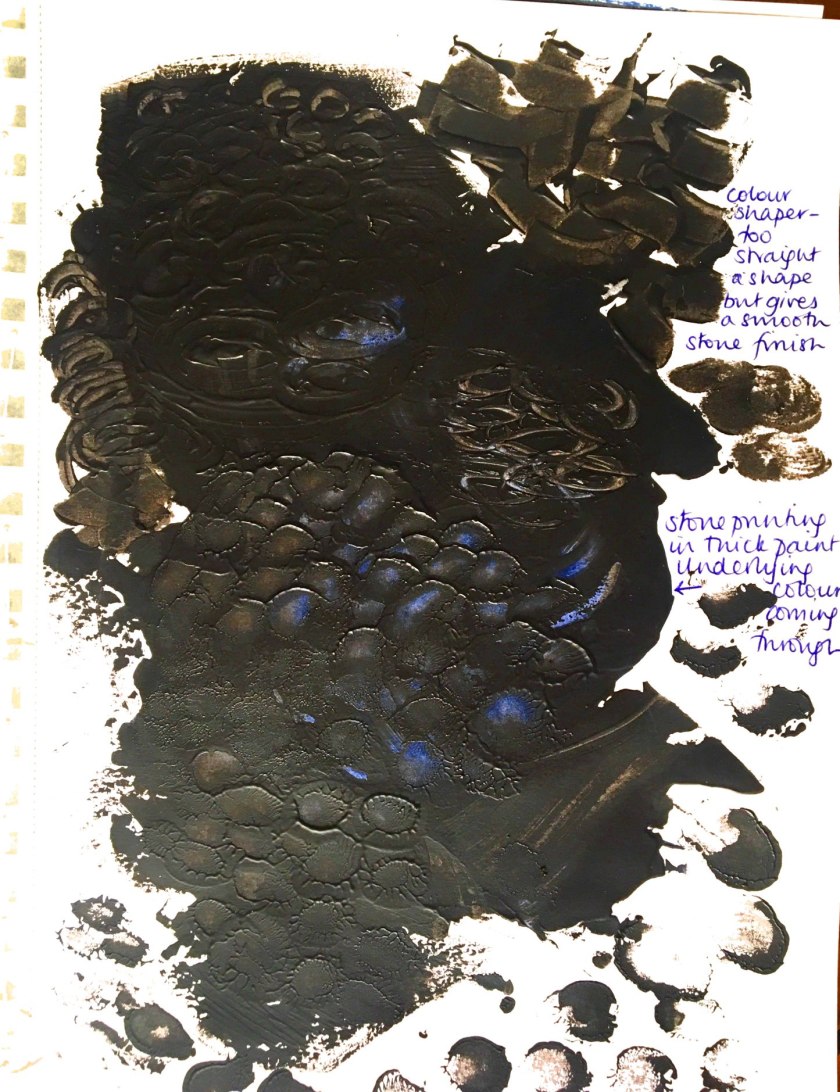
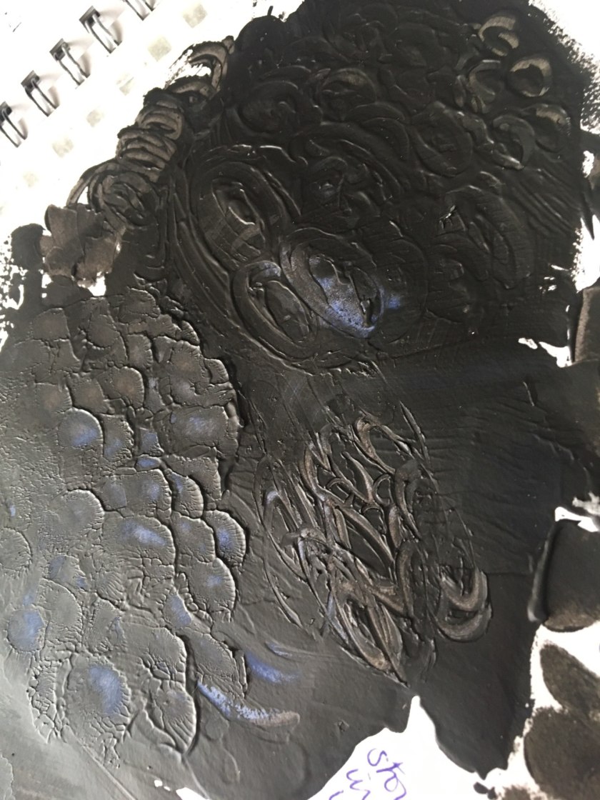
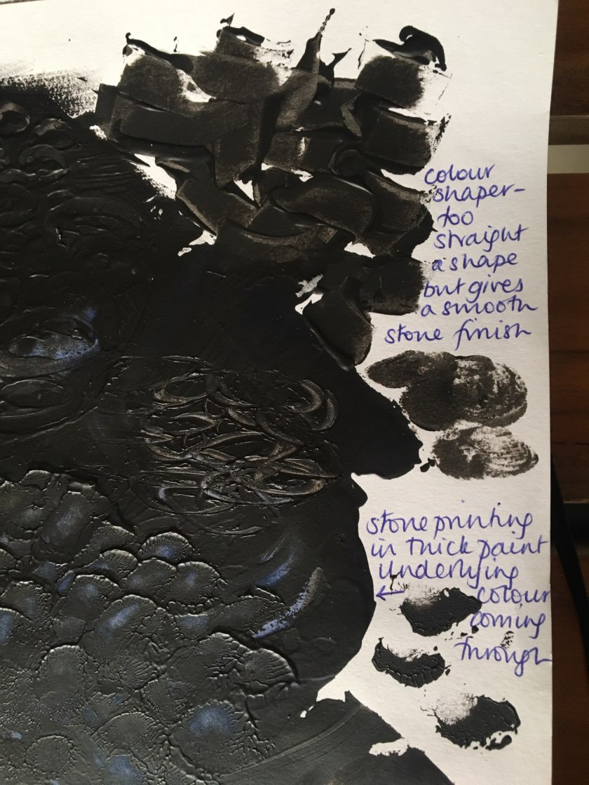
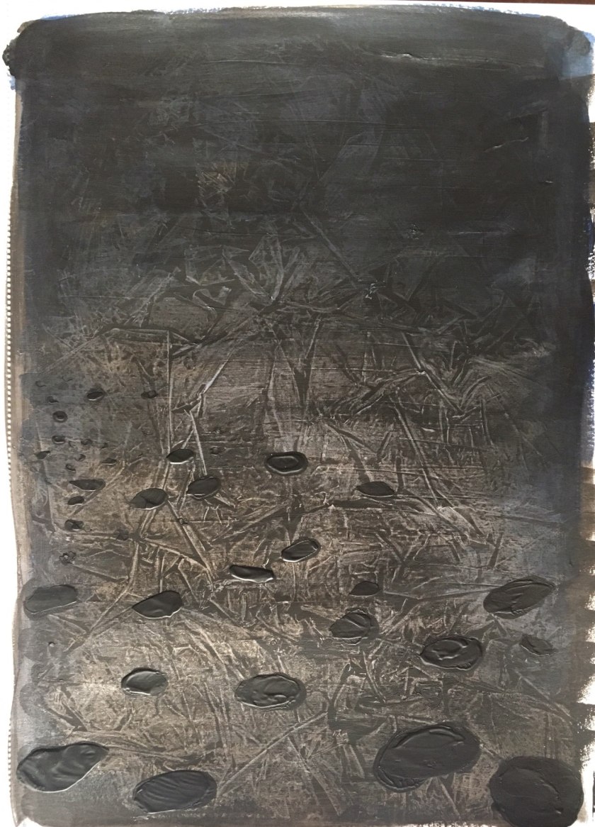
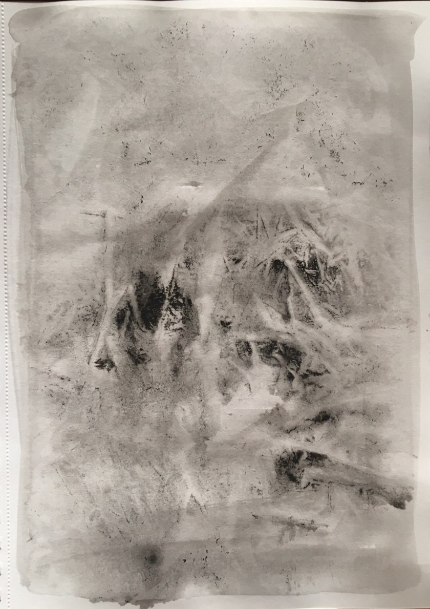
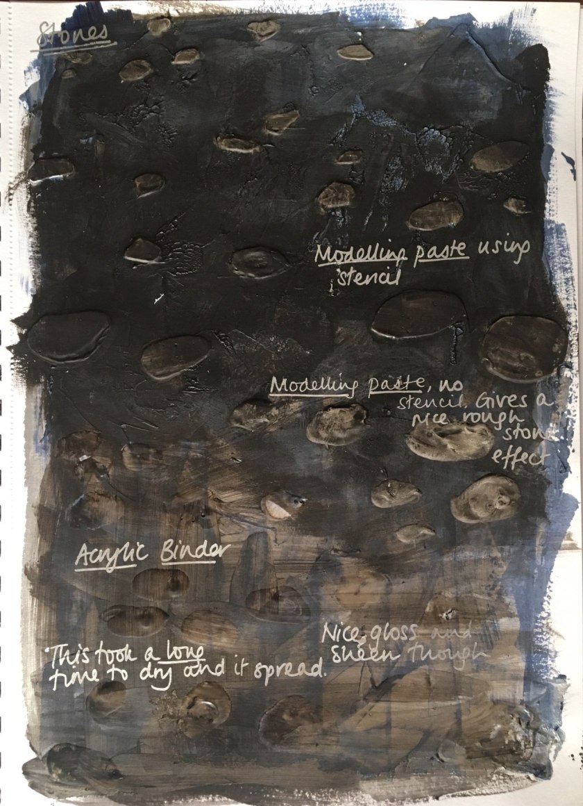
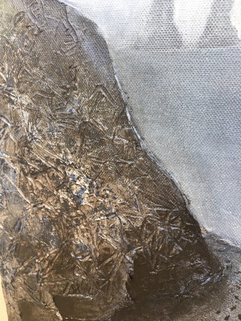
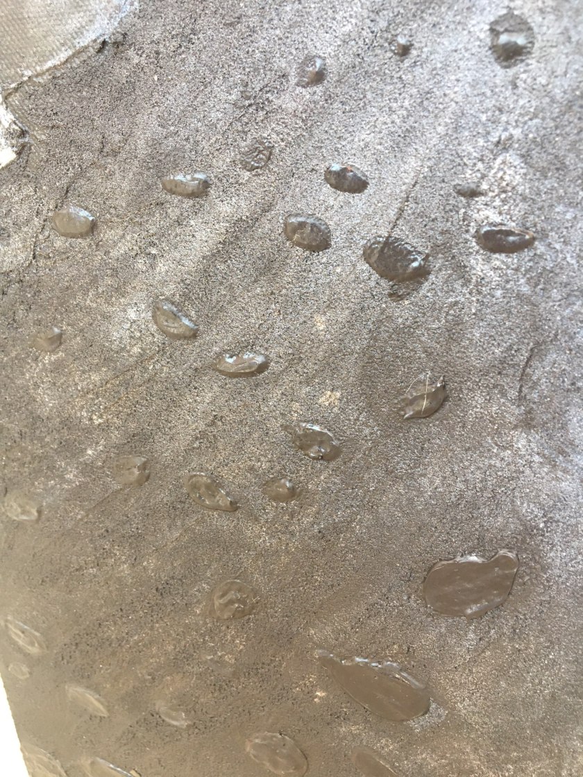
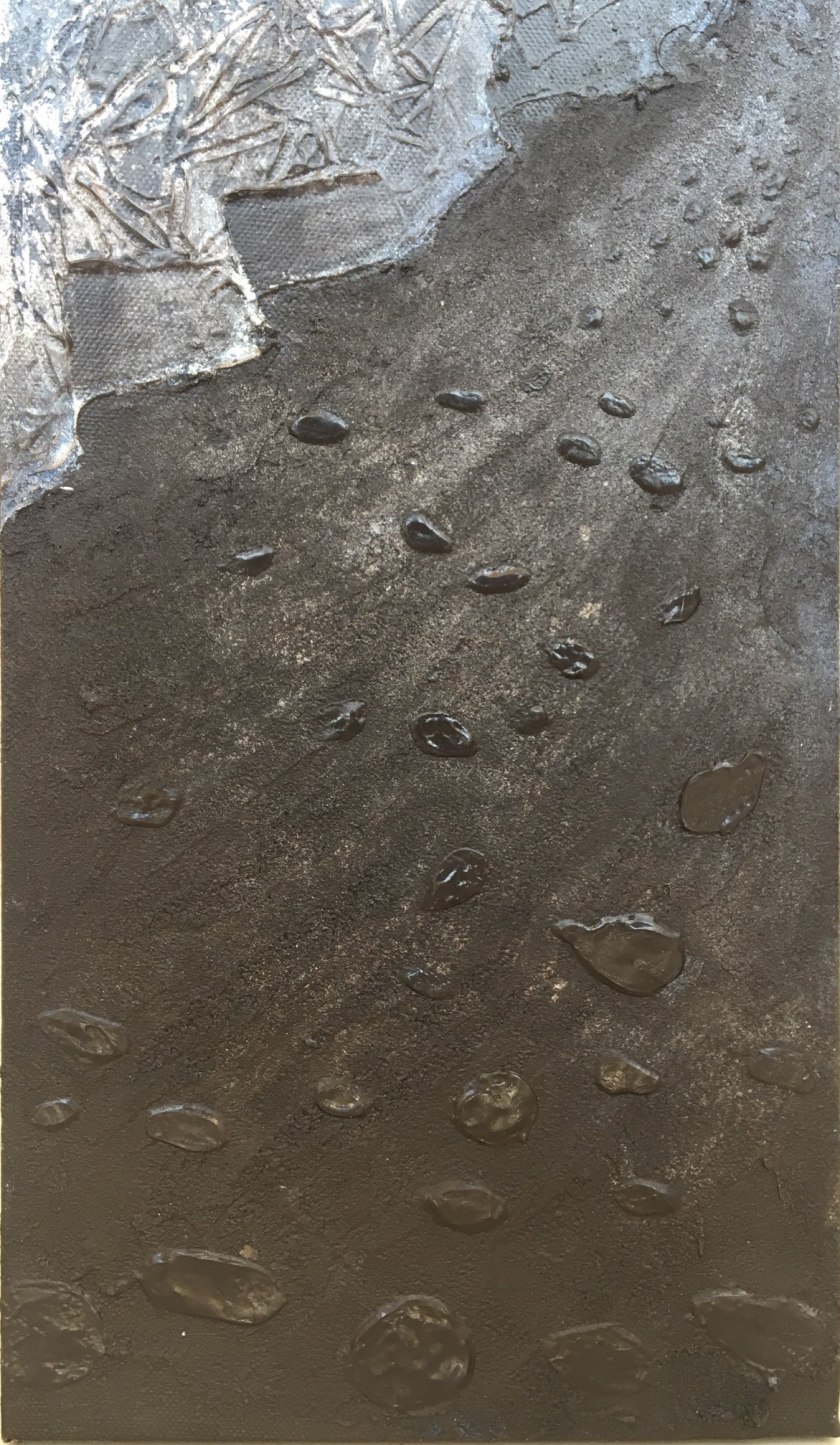
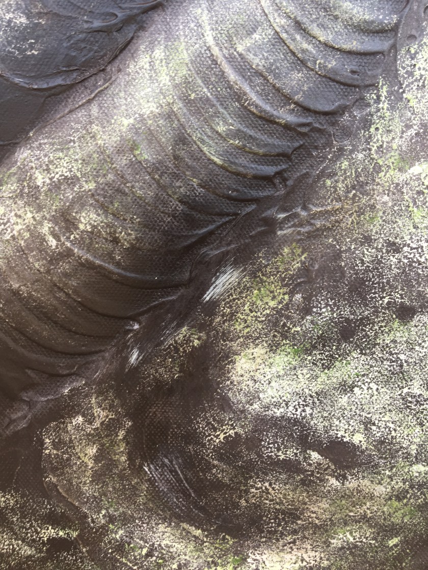
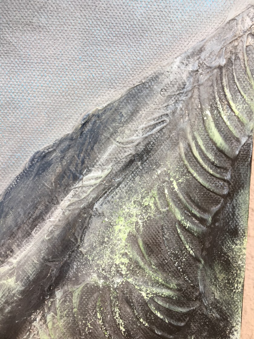
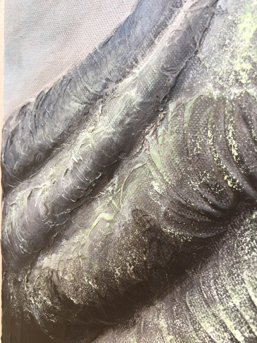
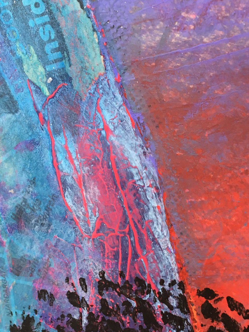
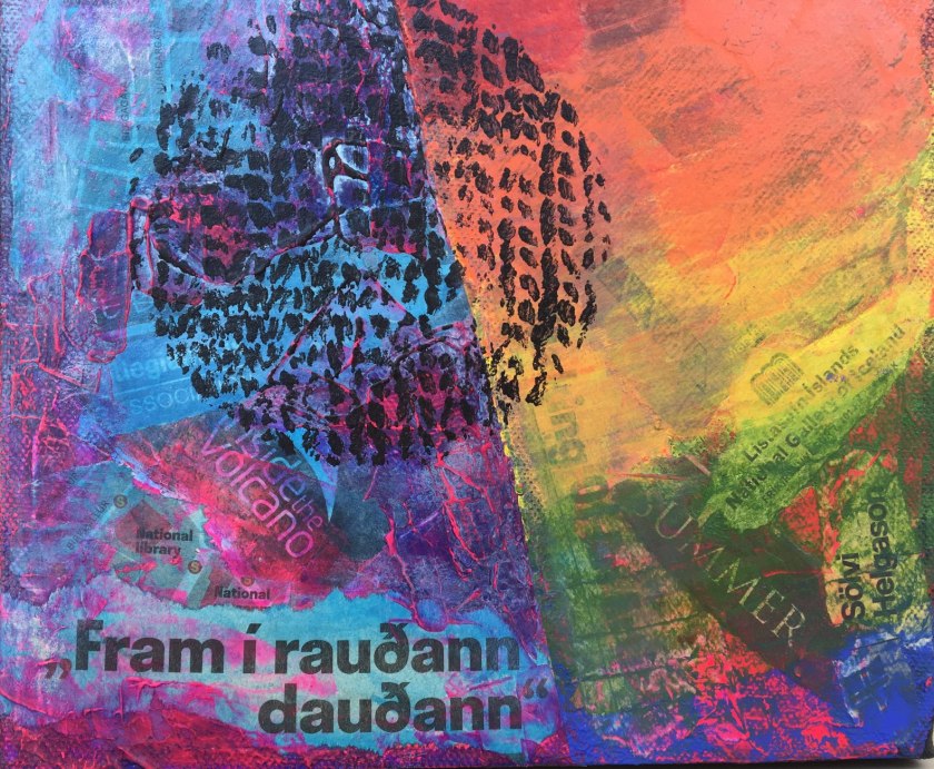
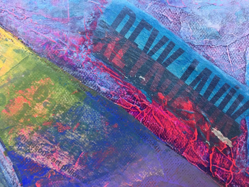
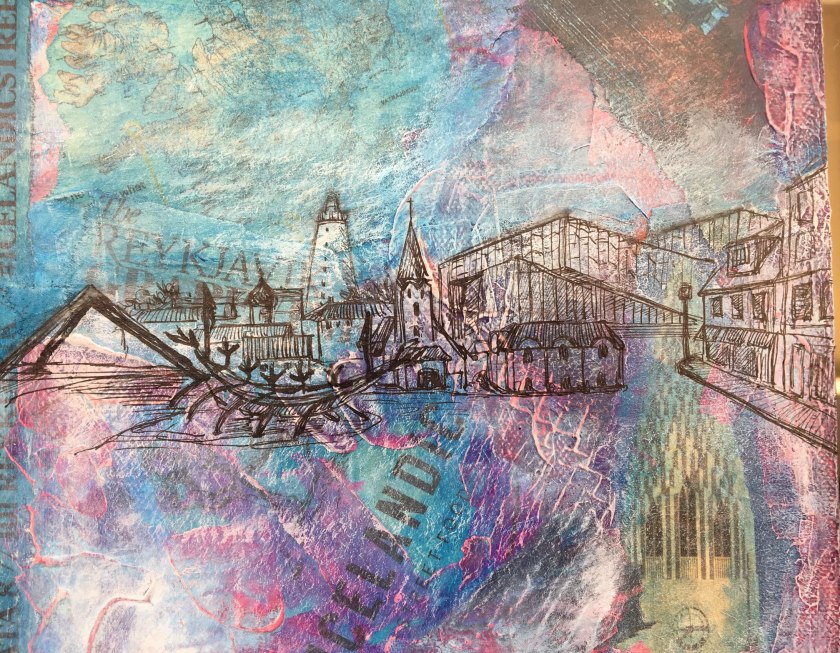
It could be said that I threw everything at this series in order to say I’ve used materials and techniques! I feel I have thought about, planned and ticked all these criteria in this assignment. Although not practised in depth, the exercises meant I could continue to develop something that interested me as the project evolved. As I knew what each picture would be based on, I worked on using the ideal material. Sand in modelling paste and black paint, modelling paste and a cut stencil to create black pebbles in relief, sgraffito, printing plastic film and a knitted piece, sculpting paint/modelling paste, newspaper ground, dry-brushing over the paint texture, drawing over. These all transpired as I went along, it was satisfying and I felt I was truly in the zone.
Quality of Outcome Content, application of knowledge, presentation of work in a coherent manner, with discernment.
The three paintings to me, show an application of knowledge and experimentation. It is a coherent presentation after a little amending and I like how the connecting line flows from the water’s edge through the lava field to the city.
Demonstration of Creativity Imagination, experimentation, invention, personal voice.
I really feel this part has allowed an increased demonstration of my creativity. It is a chance to put my personal voice through it. I envisioned this series and found the best ways to realise it, solving problems and queries along the way. More time would have allowed more experimentation but I have said that through the whole module.
Context Reflection, research (learning logs)
The sketchbook development this time around was a little haphazard as I bounced between practising different exercises at different times, so a lot of reinserting pages. The result though, is coherent according the course’s development and shows development of my learning.
Written reflection and research has proved minimal again. I do look at artists that have inspired me but I just get on with the experimentation rather than reflecting on them and their work. I’ll get as far as putting a picture in my log and moving on. Academic development needs to be set in place for any future studies.
Any future studies will not be crammed into 7 months though 🙂