PART 3 P2: Ex 2 Sketchbook Walk

Go for a walk.

Find a familiar view.
Use viewfinder and focus on a point of interest.
Make four sketches during the walk.
Draw rapidly.
Draw over any mistakes, restate what needs to be depicted.
Try to capture the idea of what is seen through drawing; think of sketching as taking notes.
Try to get in, everything no matter how roughly.
Fast drawing helps to concentrate and see more clearly, shutting out unnecessary ‘noise’.

Make written observations where appropriate:
* time, weather, direction of light and shadow
* main point of interest
* the division of space into foreground, middle ground and background 
* patterns and textures, repetition of large and small shapes, tonal values etc


PART 3 P2: Ex 1 Cloud formations and tone

Having been a meteorologist in a previous working life, I was looking forward to this exercise. I have always loved watching clouds form and seeing the shadows they cast on each other as well as on the ground. However, this is an exercise I feel I need to come back to as I have been too formal in the drawing of the cloud formation and my drawings seem flat. More practice and observation here, possibly on a close-up scale rather than within a landscape.


The following three sketches are further developing cloud study, but more of a detailed look at a particular cloud formation.


White ink on black paper

Chalk pastel on blue paper 

Eraser on black pastel in art book (no tooth)


PART 3 Landscape – Research Point

The landscape is a readily available subject for artists. It is fascinating how we experience one particular landscape at one particular time in our own particular way.
I am interested in the effect of time on the interpretation of a landscape. Artists often return to the same scene each season or even a few hours later. Even minutes can see a change in light, tone or subject.
CASPAR DAVID FRIEDRICH
The Wanderer above the sea of fog

FÉLIX VALLOTTON

La grand nuage 1918

La Mare, Honfleur 1909

Use tour Martello à Guernsey – such ‘Phare à 1907

La route d’Honfleur 1902


STEV’NN HALL

CRYSTAL LIU


PART 3 P1: Ex 3 Study of several trees

This was a fun few hours. I braved the heat and went to sit in the nearby wooded area to our compound. 42C heat, various ants nests and a couple of curious workers cut short the session but maybe this changed the way I worked…less formal perhaps?

I am in a quandary at this stage as to my drawing style. I feel I have a lack of definition in these pieces but am I trying for more detail, too much perhaps? I feel like I am missing the tonal areas. In adding the colour, am I aiming for atmosphere or quality of drawing.

Or am I over-thinking it all…?!

PART 3 P1: Ex2 individual Tree – Observational Study

Another exercise pushing me to be at one with my surroundings. I’m forever in the car…making time to really see what’s around me will never be time wasted. Although I know I really have to dedicate the time in the first place, this is proving the issue.

As a result, I am relying more on photographs as reference. Perspective and distortion are possible problems with this. But for reference to add detail after initial observation is a benefit.

PART 3 P1: Ex 1 Sketching Individual Trees

Trees
This section is a focussed study, thinking of not only the tree itself but its context alongside the background, other trees, buildings etc. Thinking of negative space, tone and perspective as well as textures, hard or soft structures, spaces, repetitions, grooves, bumps, joints etc. Liken it to my A-level studies, practising drawing the human body, light source, tone, texture.

  • Consider atmosphere, underlying structure, fluid approach, organic and flowing lines, individual components and characteristics.
  • Practise observational skills, drawing techniques, composition and selection.
I started by drawing the palm tree (from a photo – it is 45C outside) in its whole.  I found I was looking at the underlying structure in that certain basic shapes make up each differing part of the trunk, the top and the fronds. 
I then tuned into the tree and focused in on the texture of the bark and shapes it was made up of. It appeared to have a diagonal growth pattern. With the bark I seemed be picking up on the shadows created and those became my negative space to build up the main shapes.
I was aware of the underlying leaves behind the fronds and this added a new texture to the structure I was initially working on. I looked at light source, highlights and shadows in the leaves and stem.

Assignment 2 – tutor feedback

(My thoughts in green)

Overall Comments

Many thanks for sending me your second assignment.  Viewing photographs and writing a report online is of course limited as it is difficult to interpret the scale, texture , temperature ,tone and colour and not being in the presence of the drawing is a draw back. However I can see the intent and having read through your blog can see what your intentions were.

Living abroad has meant that online submission was the way to go on this assignment. However, this is not my preferred option for the reasons my tutor has given above. I am fascinated by the changes the camera makes in a document or photo, whether it is perspective or colour.

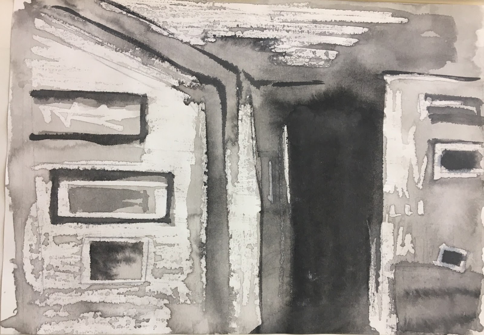
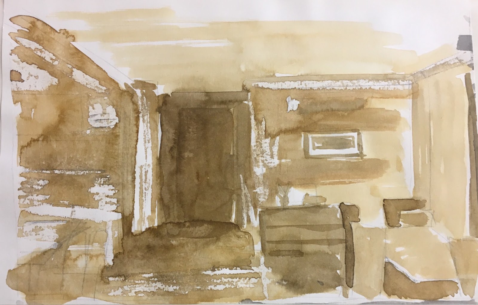
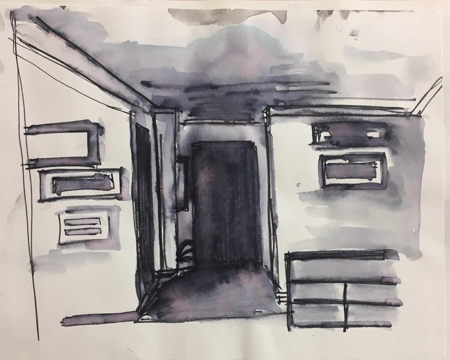
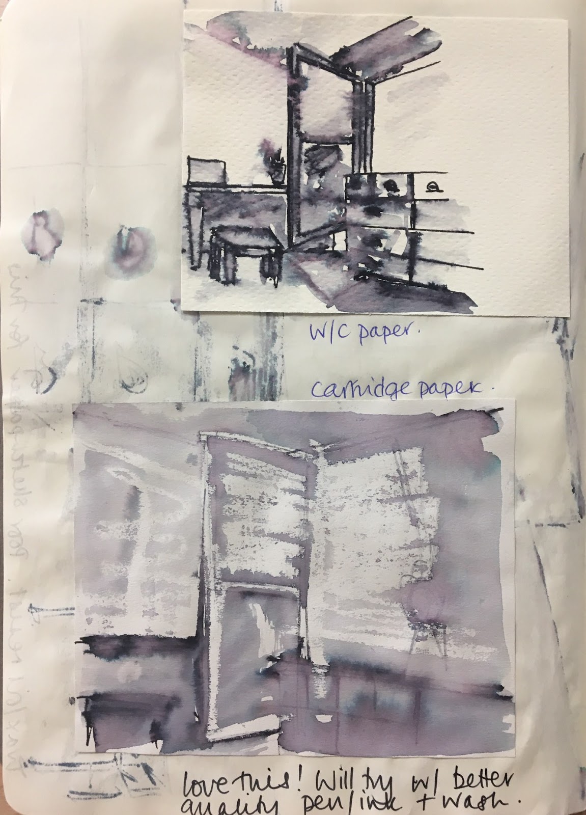
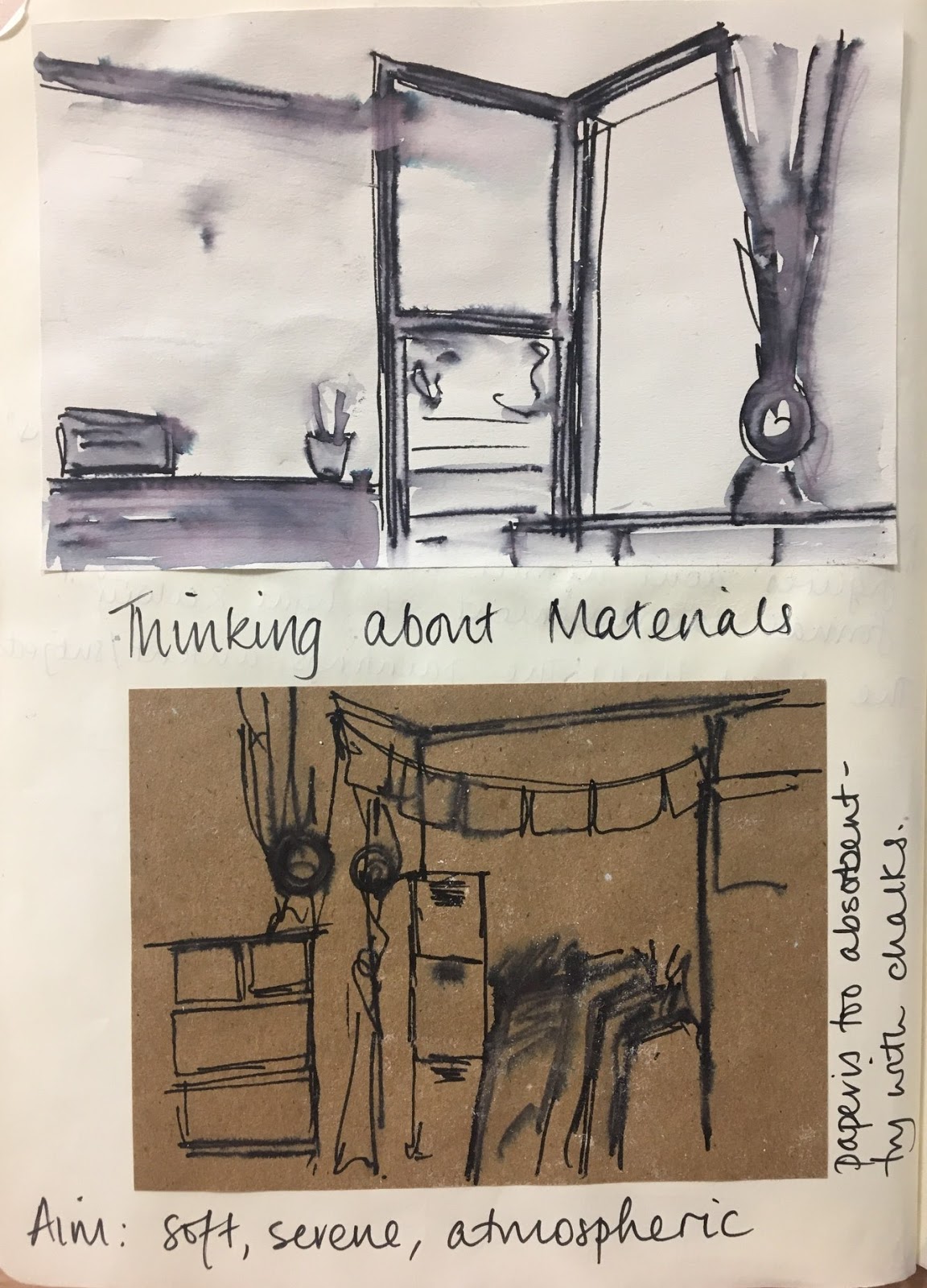
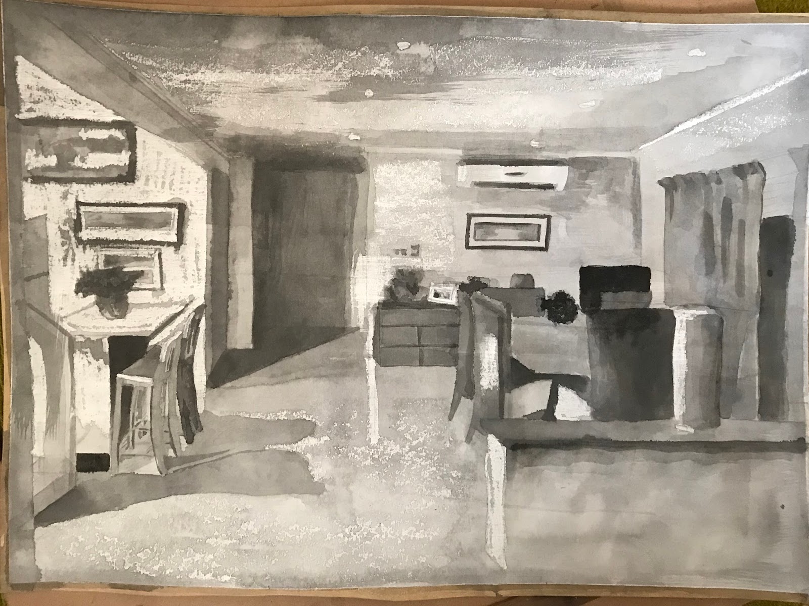
Material differences – this sequence of drawings attempts to create atmosphere through the use of light and tone and as a varied set of drawings fits well in the assignment. The combination of different water soluable materials and the resist effect of using, oil and watercolour and ink show a willingness to experiment.  It’s probably better to use a heavier weight paper if working wet in wet. For finished pieces, stretching the paper makes for a better support.

I am trying to perfect my paper stretching techniques as the outcome differs each time! I am more aware of paper weight now and will more often go for the heavier weight regardless of what I media I intend to use.

There are many artists who have  have painted interiors atmospherically that range from Vermeer  to Hammershoi to Vuillard and even Degas in this early painting
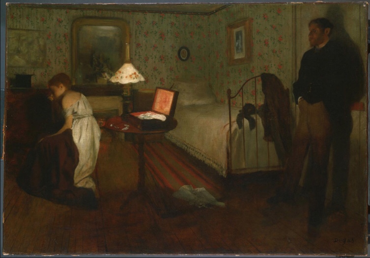
Degas

But it is Vuillard who obsessively worked indoors in the flat which he shared with his dressmaking mother and sister and where the patterns on the wall and the fabrics dissolve into one claustrophobic interior.

I find his composition and texture/pattern use fascinating in this image. it is indeed claustrophobic. Contrast the intense use of pattern with the dour clothing of the tutor and student on the left.
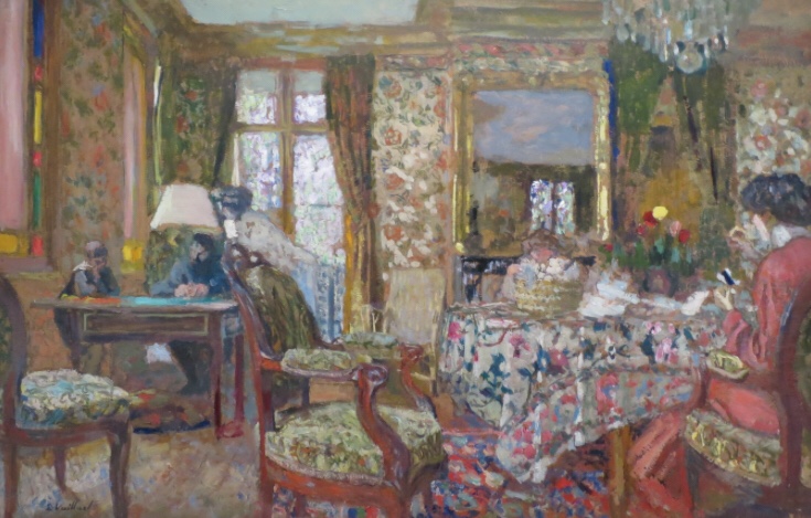
Vuillard

And here Sickert depicts ‘Ennuie ‘ in this well known painting –
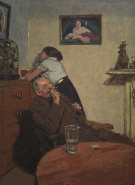
Sickert

And the Danish Artist Hammershoi is famous for his depictions of a lone figure  in a room seen from the back.

I am intrigued by this perspective and depth in Hammershoi’s work. 

Assignment 2 and 4 Assessment potential

(delete as appropriate)

I understand your aim is to go for the Painting/Fine Art/Drawing* Degree and that you plan to submit your work for assessment at the end of this course. From the work you have shown in this assignment, providing you commit yourself to the course, I believe you have the potential to pass at assessment.  In order to meet all the assessment criteria, there are certain areas you will need to focus on, which I will outline in my feedback.

Feedback on assignment

Demonstration of technical and Visual Skills, Quality of Outcome, Demonstration of Creativity

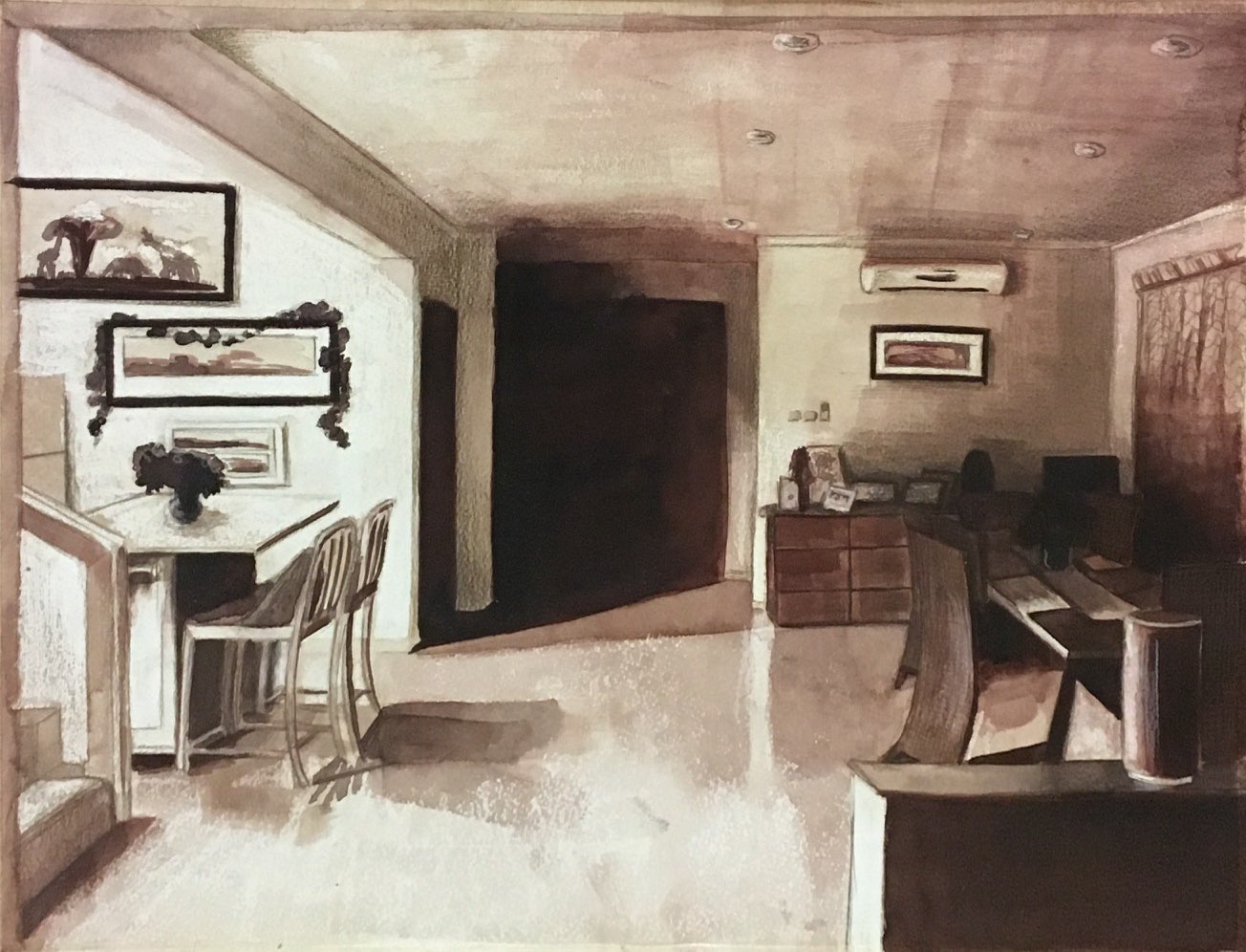
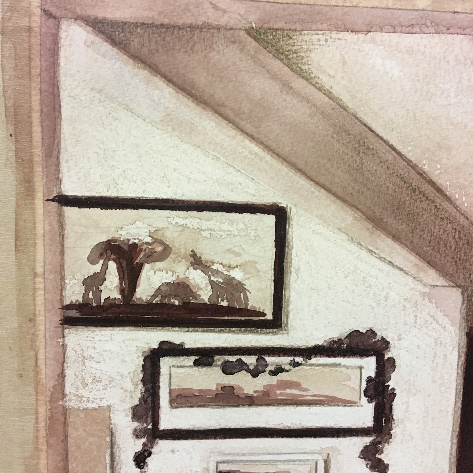
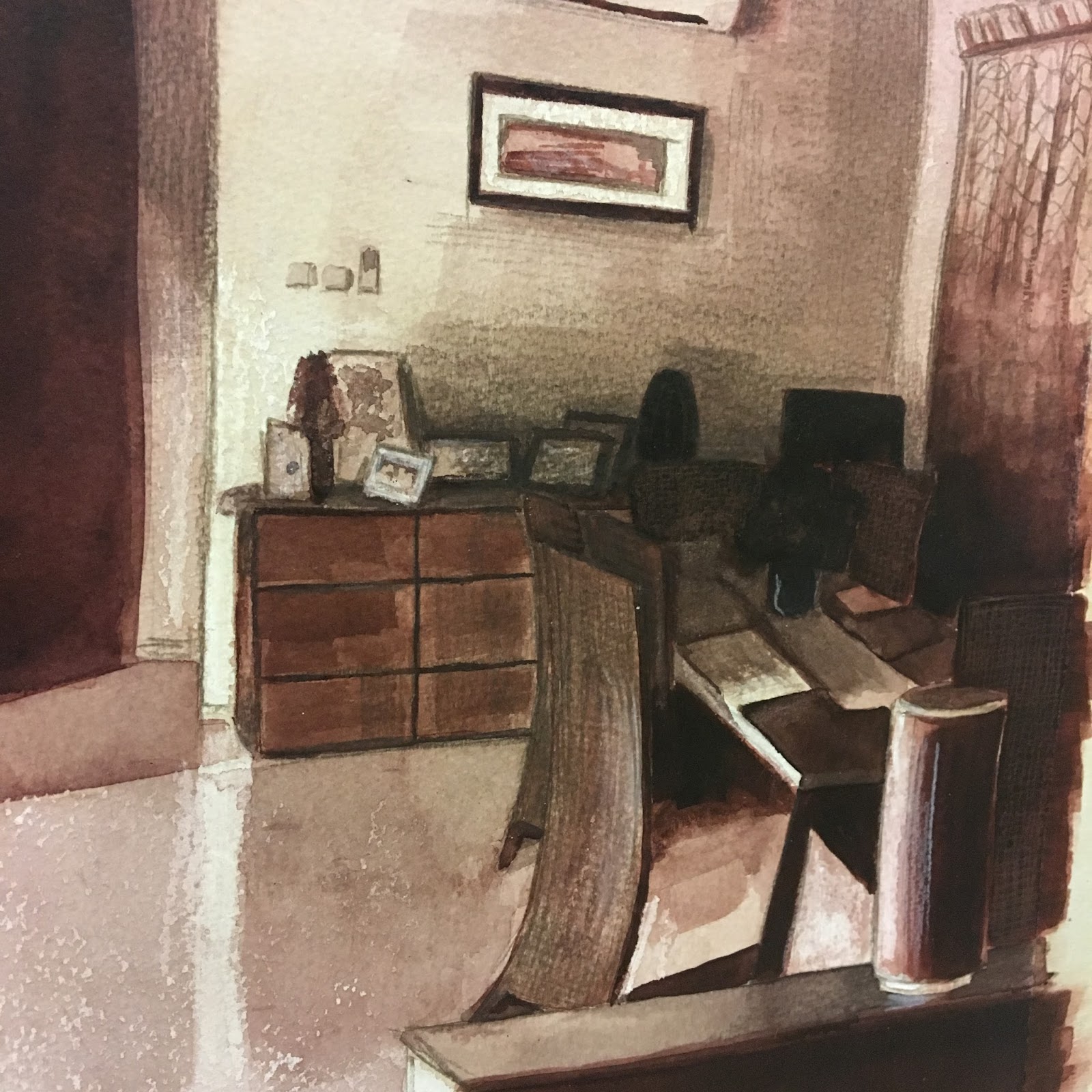
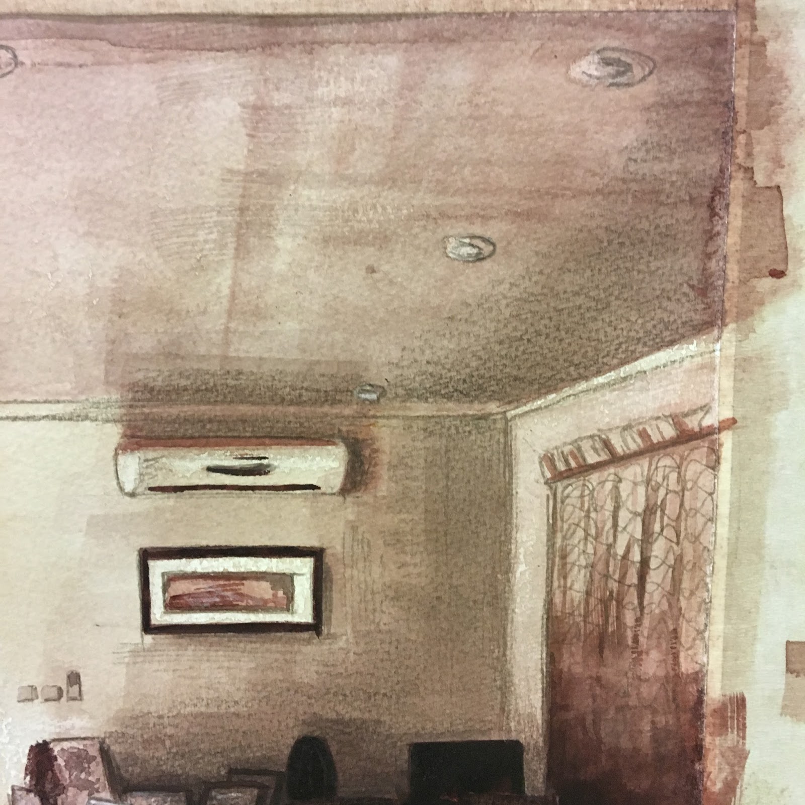
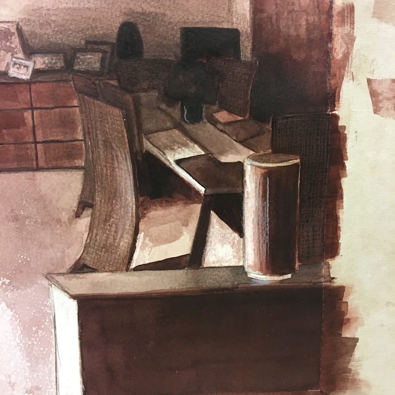
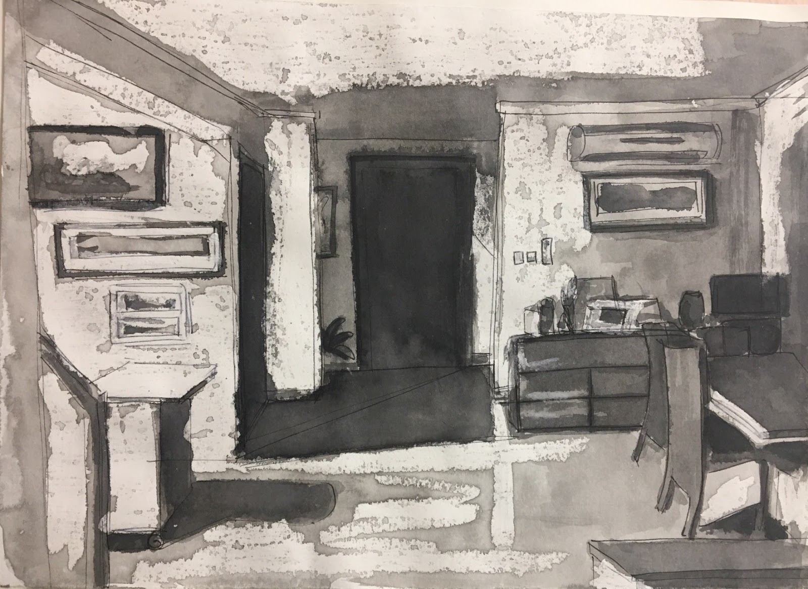
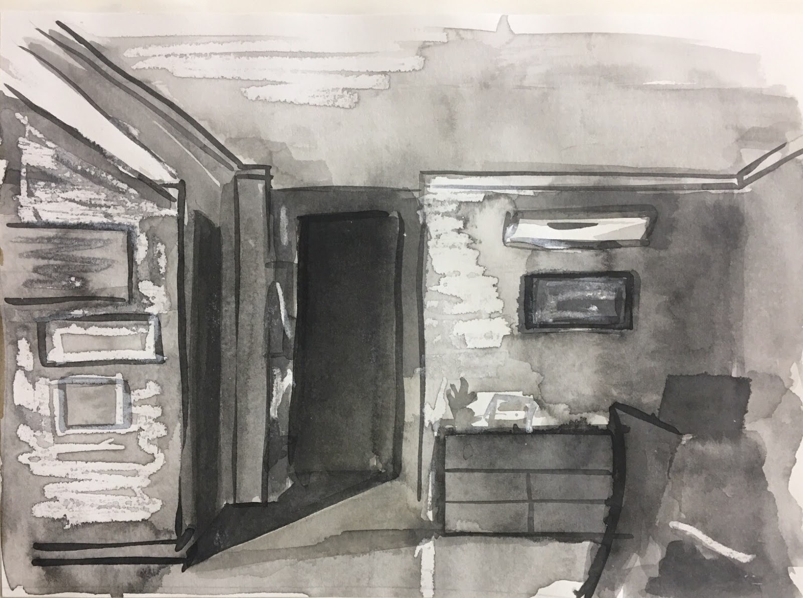
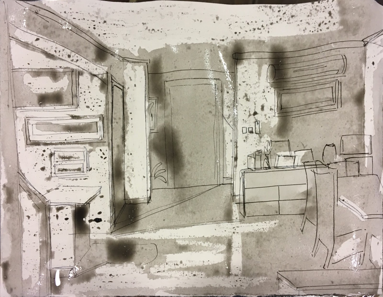
Lots of students do interior views of their houses and rooms but mostly in daylight and without the dramatic effects that selected lighting can bring.  They perhaps don’t use a photograph which I also thinks helps here to emphasis the shadows areas and composition.

The other photo showing  the lit stairwell  is a possibility which you might be able to return to latter.

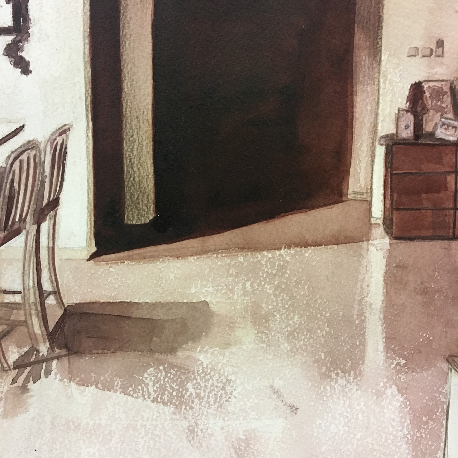
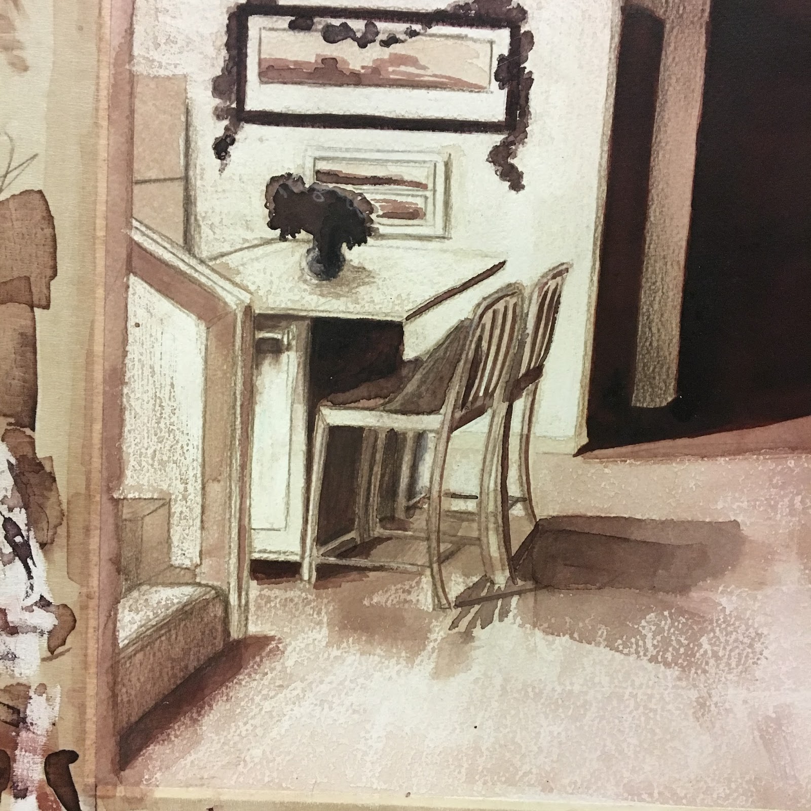
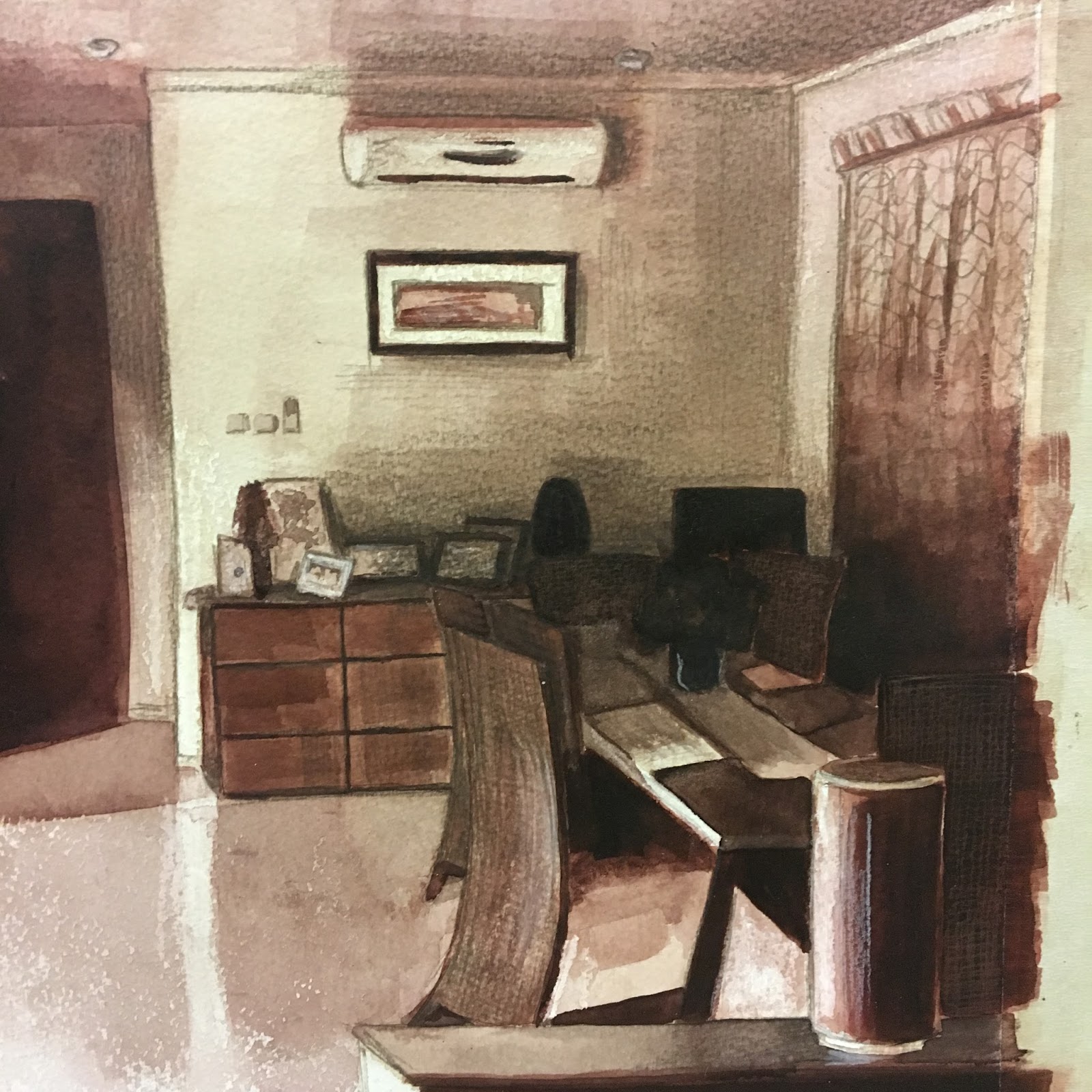
The area that you did decide on doesn’t look that promising when seen in the photograph. The large empty area of floor is worrying although it does lead toward the closed door, which  of course is atmospheric, but being strongly directional leaves the left and right sides to look after themselves. However through the medium of drawing and your decision making it gets transformed. I understand this in hindsight but I think I felt at the time that the space added to the sleepy atmosphere of a household late at night.

In the finished picture the door is darkened off making it even more mysterious and the lightest side with the table on the left attracts the eye at first and the diagonal shadows leads the eye across the picture so that the content can read in one directional line . The whole then moves from light to dark and the balance of the three parts of the picture is complete.

One thing to look at when using a photograph is that modern cameras such as those used on phones are designed to be wide angled which then create distortions in the perspective. This might account  for the exaggerated low ceiling height but you can ask yourself does this matter and does it not increase the  sense of isolation and atmosphere within the room? This comment has increased my awareness of perspective distortion when using the camera. It is something that has now caught my eye and I can no see it happening when I am taking photographs.

Sketchbooks

Demonstration of technical and Visual Skills, Demonstration of Creativity

The sketches use for the finished piece is appropriate and suitably experimental. If you are going for assessment then keep up the sketchbooks as they are required and remember to use a variety of materials in them.

Research

Context, reflective thinking, critical thinking, analysis

Research into interiors as a subject in art is a useful thing to do and will help you to increase and broaden your knowledge of  artists and art history. Make sure you go to as many exhibitions that you can and record you thoughts  in your learning log.

Learning Logs or Blogs/Critical essays

Context, reflective thinking, critical thinking, analysis

Well laid out and planned. I had not heard of this contemporary American painter Phillip Geiger and I can see why you like him. His interiors are bright, well lit  there is an element of story telling, the drawing is good  and he works in an attractive  painterly way.
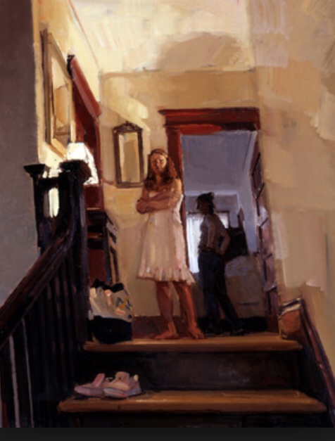
Geiger

Suggested reading/viewing

Context

Contemporary figurative or representational painting can be found in commercial galleries around the country and groups tend to show in the Mall Galleries in central London.

Tate Britain is currently showing an exhibition called All to Human –

http://www.tate.org.uk/whats-on/tate-britain/exhibition/all-too-human

Pointers for the next assignment

● Reflect on this feedback in your learning log.

● Include a more varied range art historical figures as well as contemporary artists.

Well done, I look forward to your next assignment.

Completed Assignment 2 & Reflection

  • This assignment is designed to pull together the fine observation and practice that you’ve done on this part of the course. 
  • You’re free to choose your own source material and media, provided that you take account of the factors listed below. You can either work on a still life, or interior scene – or a combination of these. 
In the work you produce now you must demonstrate a growing understanding of:
  • the use of colour in drawing
  • the most appropriate medium for the subject
  • composition and context
  • mark-making and contrasts of line and tone
  • accurate and expressive depiction of form, experimentation with idea, material and method.
  • Is this a creative composition? 
  • Is my subject interesting? 
  • Am I using the most appropriate medium, colour, method, etc.?
In my previous posts here and here I have shown my sketching and preparation for this assignment. I enjoy perspective and I liked the idea of combining a little still life of sorts with an interior scene. I am always on the lookout for interesting light shapes and tonal contrasts; I see how they could evoke a mood maybe in a photo and I would love to portray that in a drawing. 

Reflection

  • the use of colour in drawing
  • composition and context
After preparing mostly in black and white, I chose to complete my final assignment piece in warm sepia tones to create a welcoming warmth to the room. If I worked with too many colours it would suggest a more balanced, natural light across the room. It was the late evening, with the house in darkness apart from one landing light, shining down the stairs to the left of the picture.  ‘Leave a light on for me’ seemed an appropriate title as I noticed the shot when I came into my home late at night and everyone was in bed.

I think the shot struck me instantly as it was balanced in its composition without me having to tweak too much. It was in thirds from left to right – the bright light, bar area and stairs to the left, the darkness of the kitchen door to the centre and rear and the shadows of the dining table to the right.


  • the most appropriate medium for the subject
  • mark-making and contrasts of line and tone
An inviting, warm atmosphere required similar materials to recreate such a feeling. I started in black pen for all the sketches I did and, as much as I love pen line, it was too ‘matter of fact’. I had ink wash in mind from early on; I liked the way it ‘worked’ with oil pastel in its resist effect and it worked well to create that artificial lightness without risking it being muted by the ink wash. Maybe pencil to add definition and detail as the last stage. I thought chalks would be ideal for the soft, peaceful, ethereal effect but are not defined enough. I knew that mixed media approach would be ideal to show definition as well as effect. I finally settled on mixed black and Indian Red inks in various dilution helped to make a warm sepia picture, with subtle pencil detail. The pencil worked as an additional layer to show detail and contrast; it helped me to define the pattern in the sheer georgette curtain to the far right. A layer of pencil also gave a ‘veil’ to suggest tangible shadow.
  • accurate and expressive depiction of form, experimentation with idea, material and 
    method.

I was working to get a perfectly accurate picture as is my usual wont, but whilst I was completing this, an ongoing discussion was being had on the Drawing 1 forums regarding assignments, expectations and ability on the OCA drawing course.

There is some frustration that people come to a drawing course with little formal training and the OCA accepts them on a degree course/module. This might suggest that the OCA wants people who are willing to experiment, investigate and think outside the box rather than provide accurate depictions of still life. But then feedback given on the experimental and progressive assignments might be critical in the lack of technical skills. And it becomes a catch-22 situation; is this a technical course or an application of knowledge?

With that in mind, I seem to want to approach my work with a freer, more flowing sense, trying to think outside of the box, which is a contrast to how I have always worked in many aspects of my life. I am becoming more relaxed and I want to apply this to my art. A more expressive, investigative approach appeals to me. 
I have really enjoyed this assignment in that, as the title suggests, it is an intimate look at my space, my home. I am entirely happy with my assignment, I really like it. Technically, I could do better; some straight lines are a little off and I am bothered with this. It was a little hard with a brush and the fluidity of ink.

Staying on a technical level and process, I stepped back and realised I had created a workflow without realising it. I initially thought, and maybe hoped that I worked more spontaneously.  I focussed on what I wanted to achieve – an atmosphere and feeling of the place at that moment in time. This led me to practice with materials and find which suited the aim. 

PART 2 P3 Ex 3: Material differences

 My aim is to recreate the atmosphere created by the tonal contrasts of the sole light.


I bought oil pencils thinking they were more controllable oil pastels.
But no, not the effect I was expecting.


Options: 

* brown ink to create a sepia-like affect
* dusting of chalk over watercolour pencil
* water-soluble marker ink
* white oil pastel with ink wash
* monochrome coloured pencil to show tonal contrast

Tests so far

Work in progress. The paper isn’t ideal for this amount of wet work as I didn’t keep to taped down.
Second version to come.

Design a site like this with WordPress.com
Get started