Feedback for assignment 1 received:My comments are in purple, my tutor’s remain in black.
Overall Comments
Many thanks for sending me your first assignment. Your portfolio was sent down from Barnsley to me and it is best to send it directly to me using the sticky labels provided.
I need to get hold of up to date stickers then as my tutor was changed after I started the course.
I have read through your online blog and it gives me a good idea of how you are doing with the course, It is also a useful place to put sketches and exercises that don’t have to be sent as the final assignment.
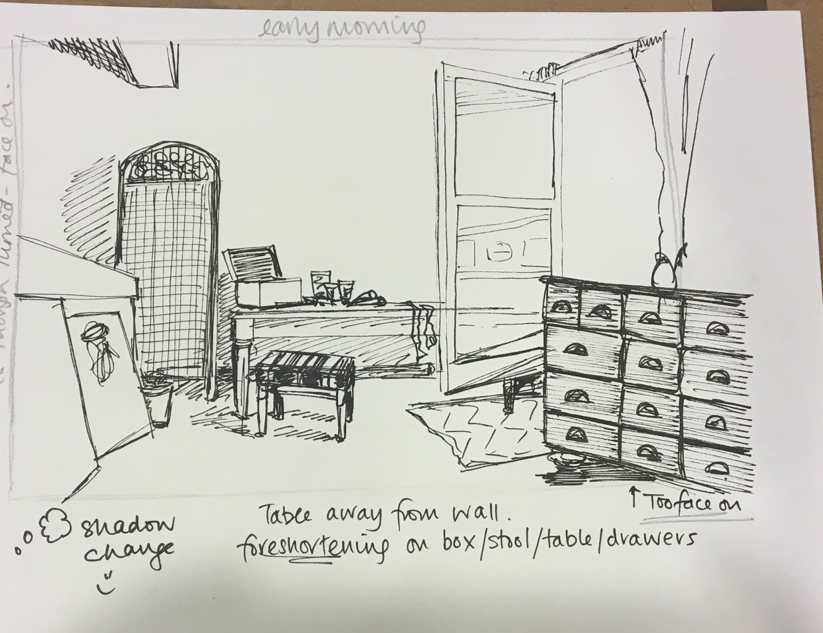
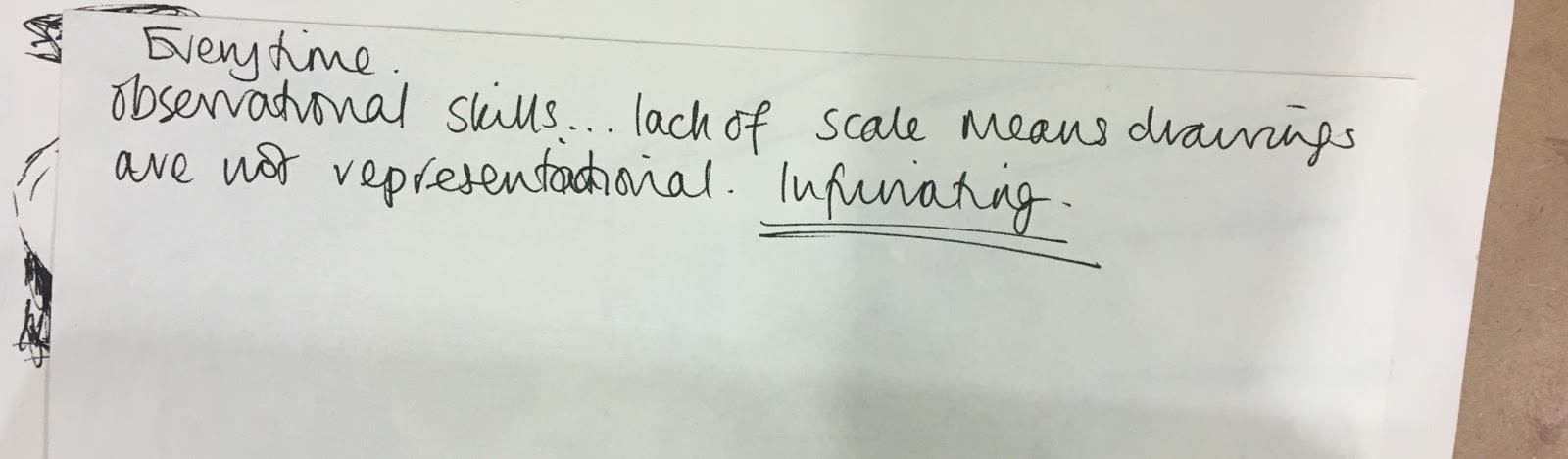
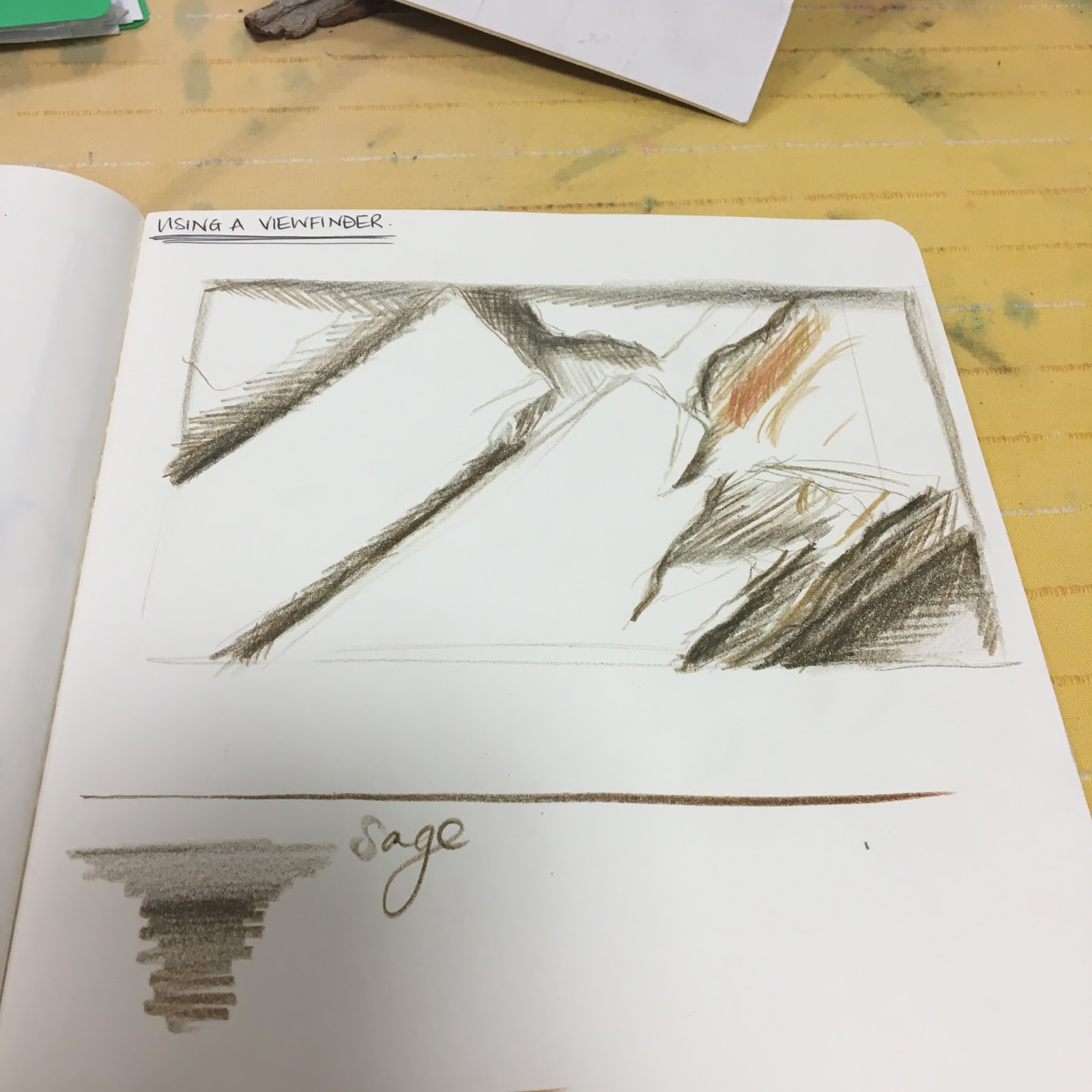
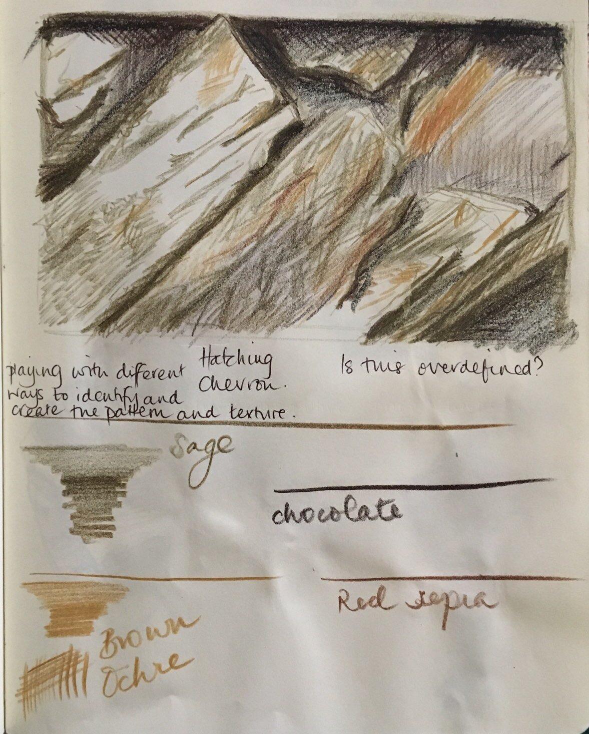
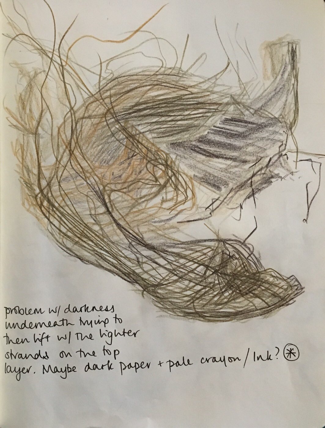
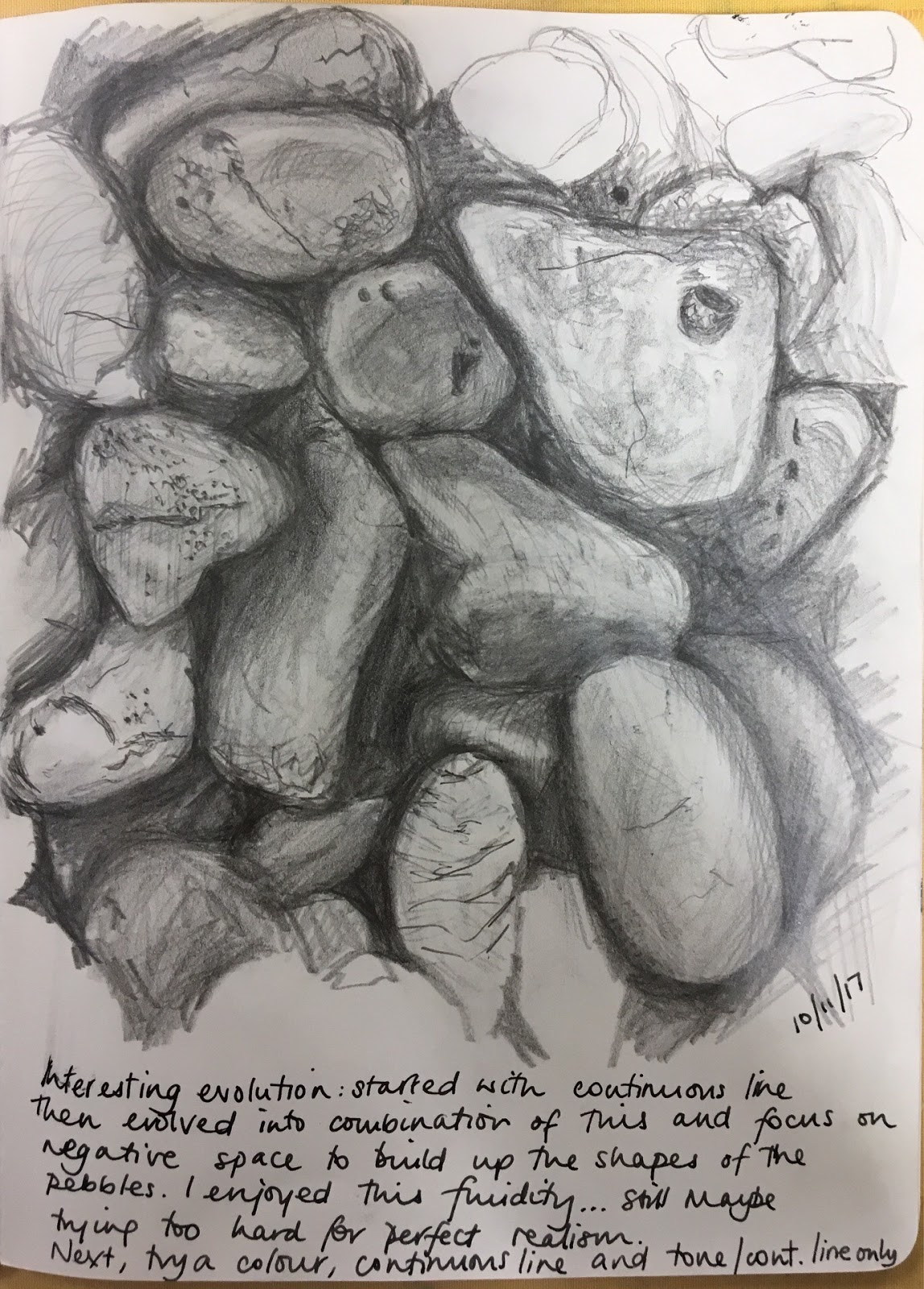
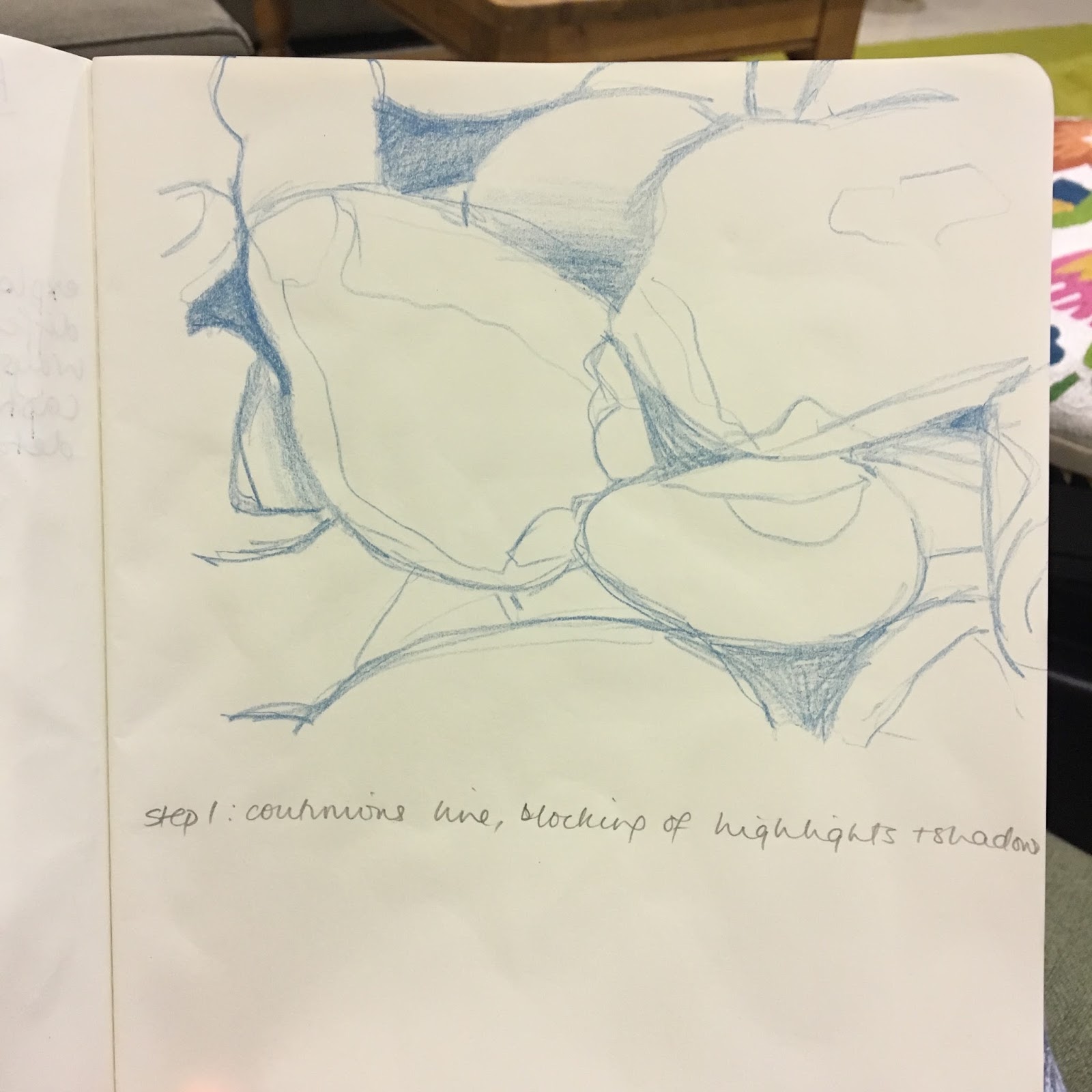
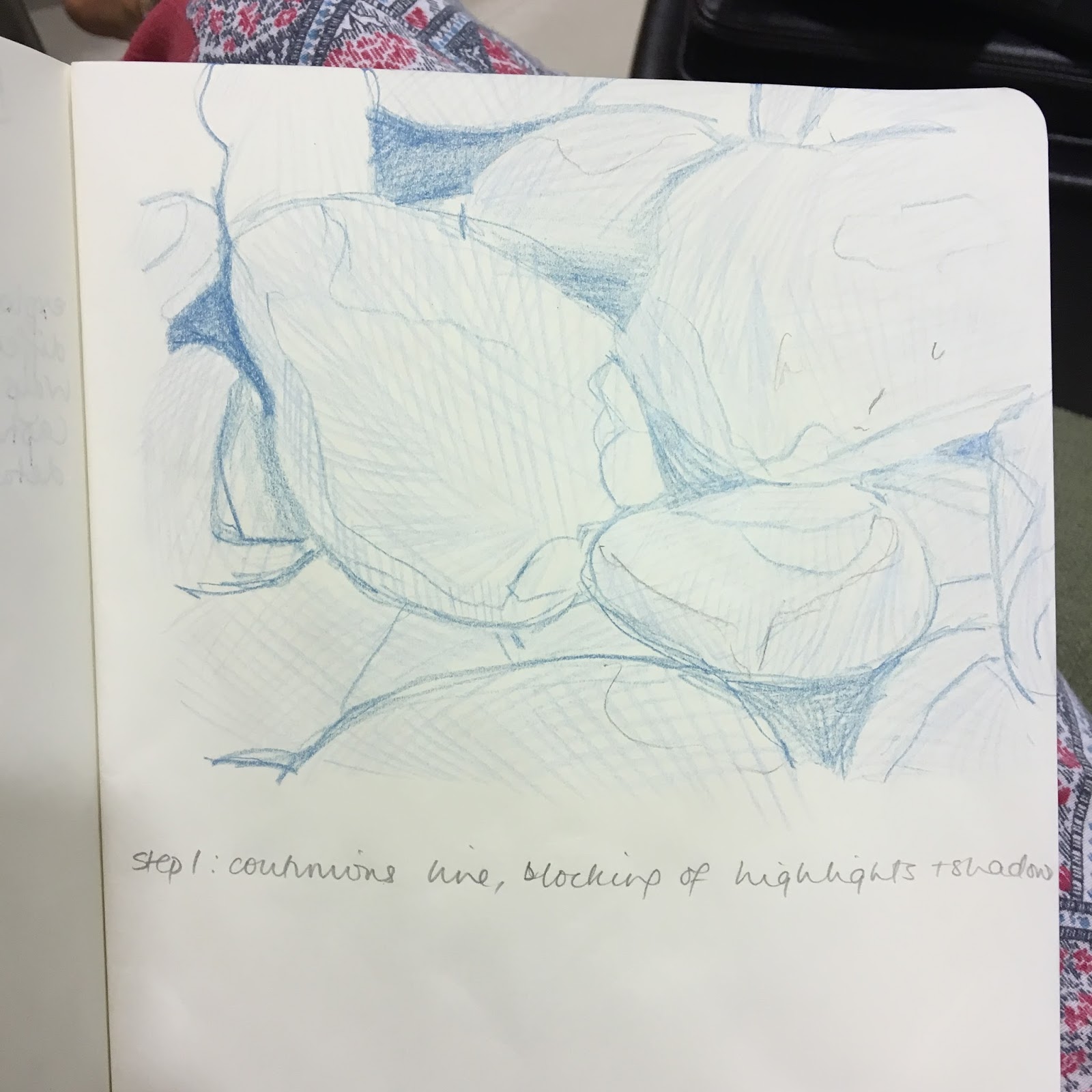
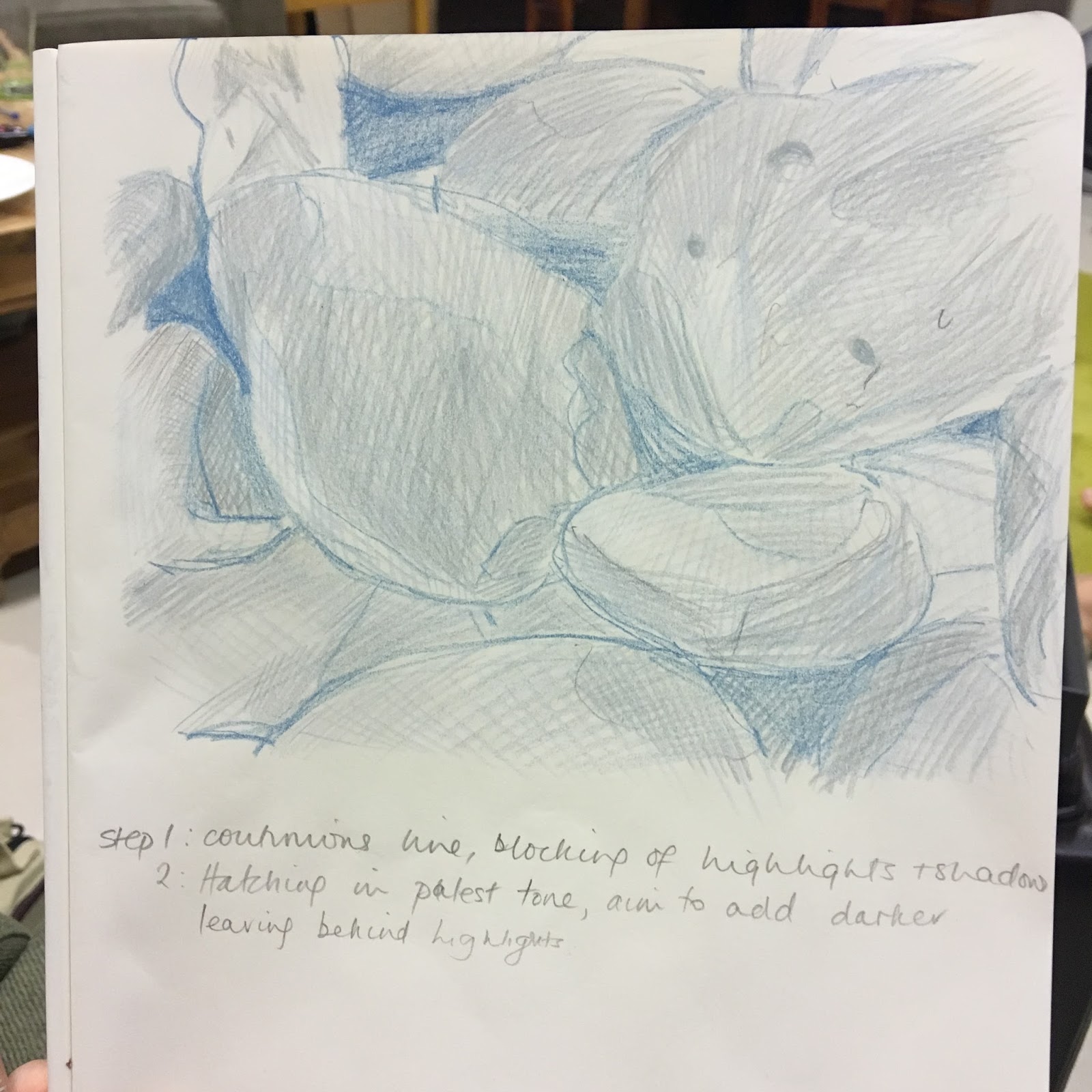
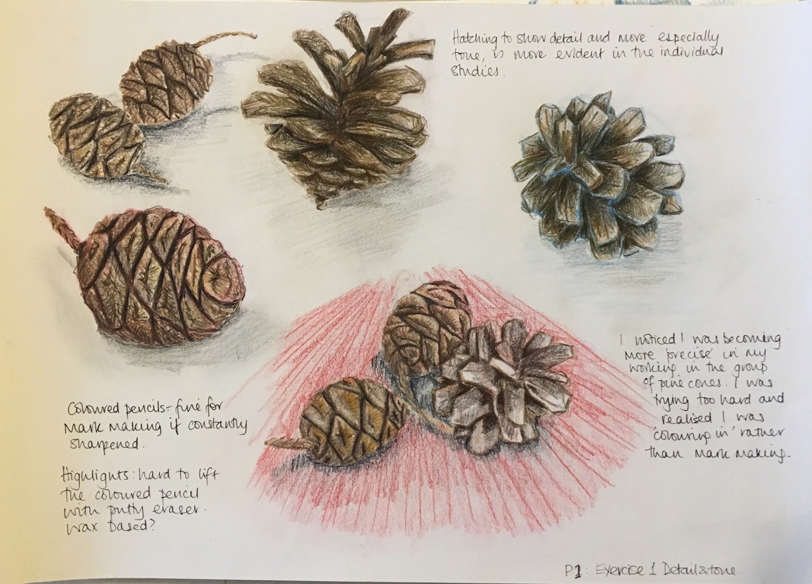
Mark making is traditionally the place to start and it is useful if you can take some of that experimental attitude into the more traditional means of working.
The charcoal drawings are a good place to start but please remember to fix them as they rub off easily against each other and on handling and start to fade.
Fixative can be bought in any art shop or else the cheaper method is to use Hair spray, which has the same effect. The non-perfumed version is preferred.
I have a love-hate relationship with fixative, hairspray and charcoal. It never seems to ‘fix’ with me!
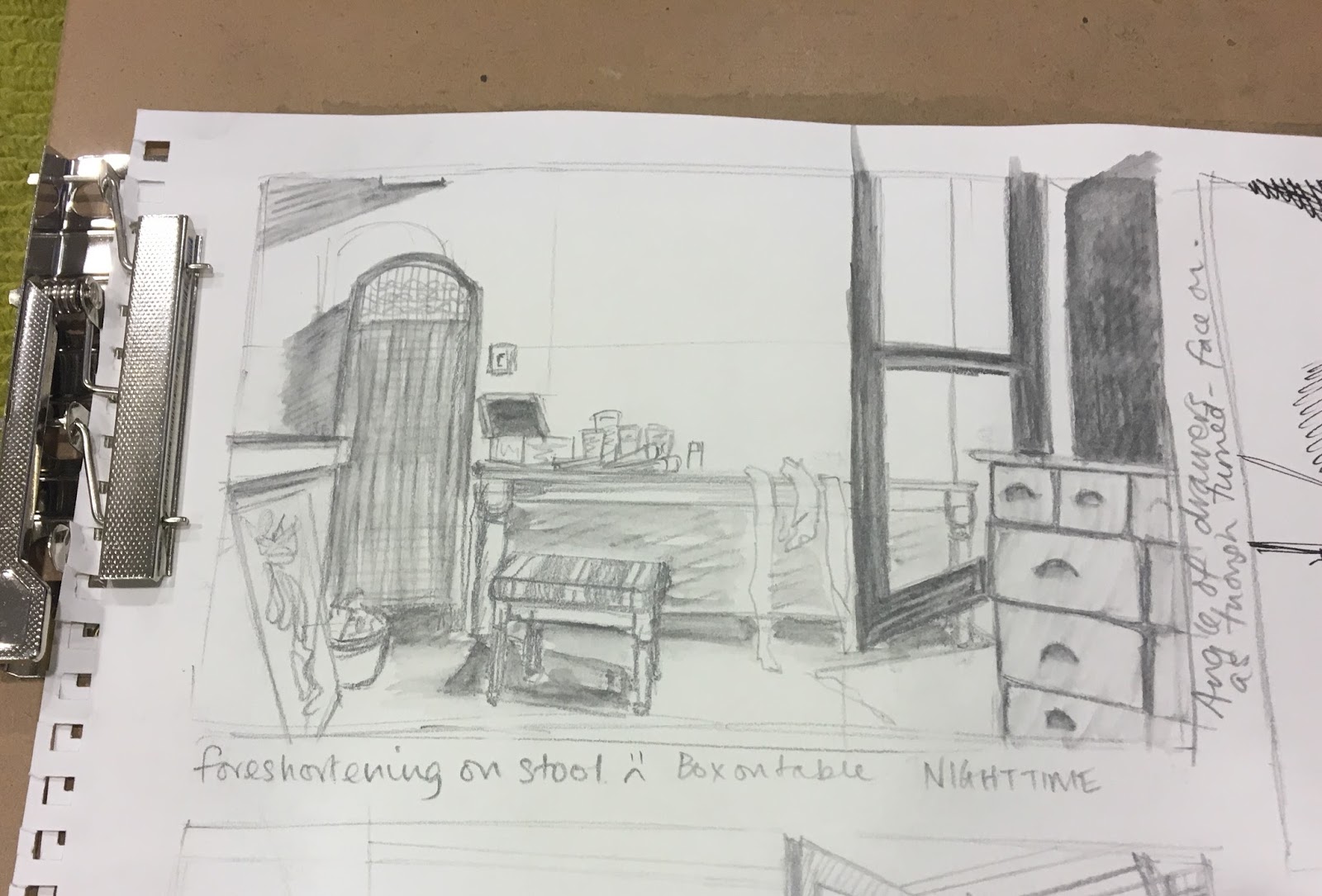
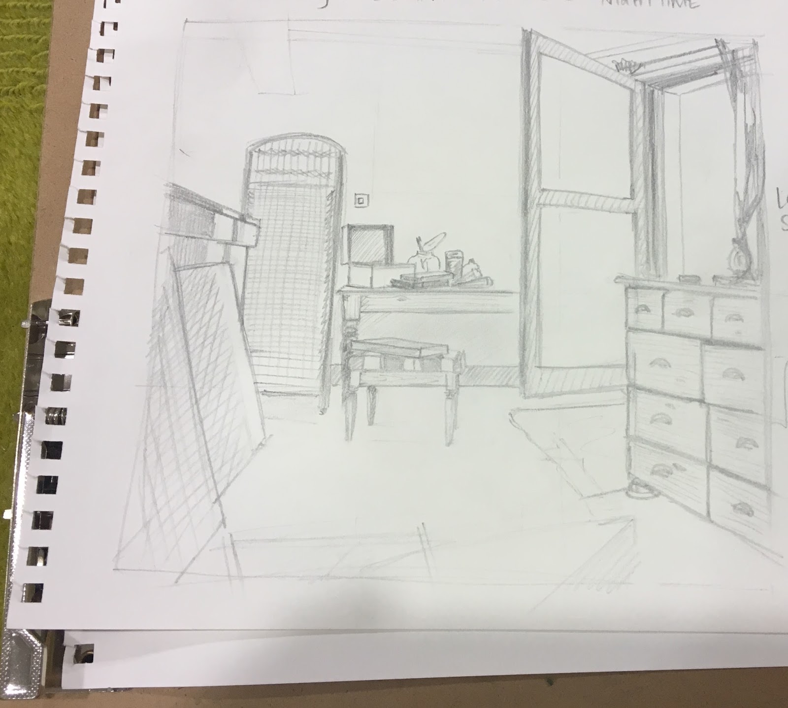
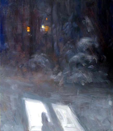
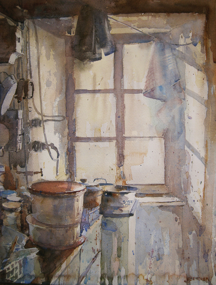
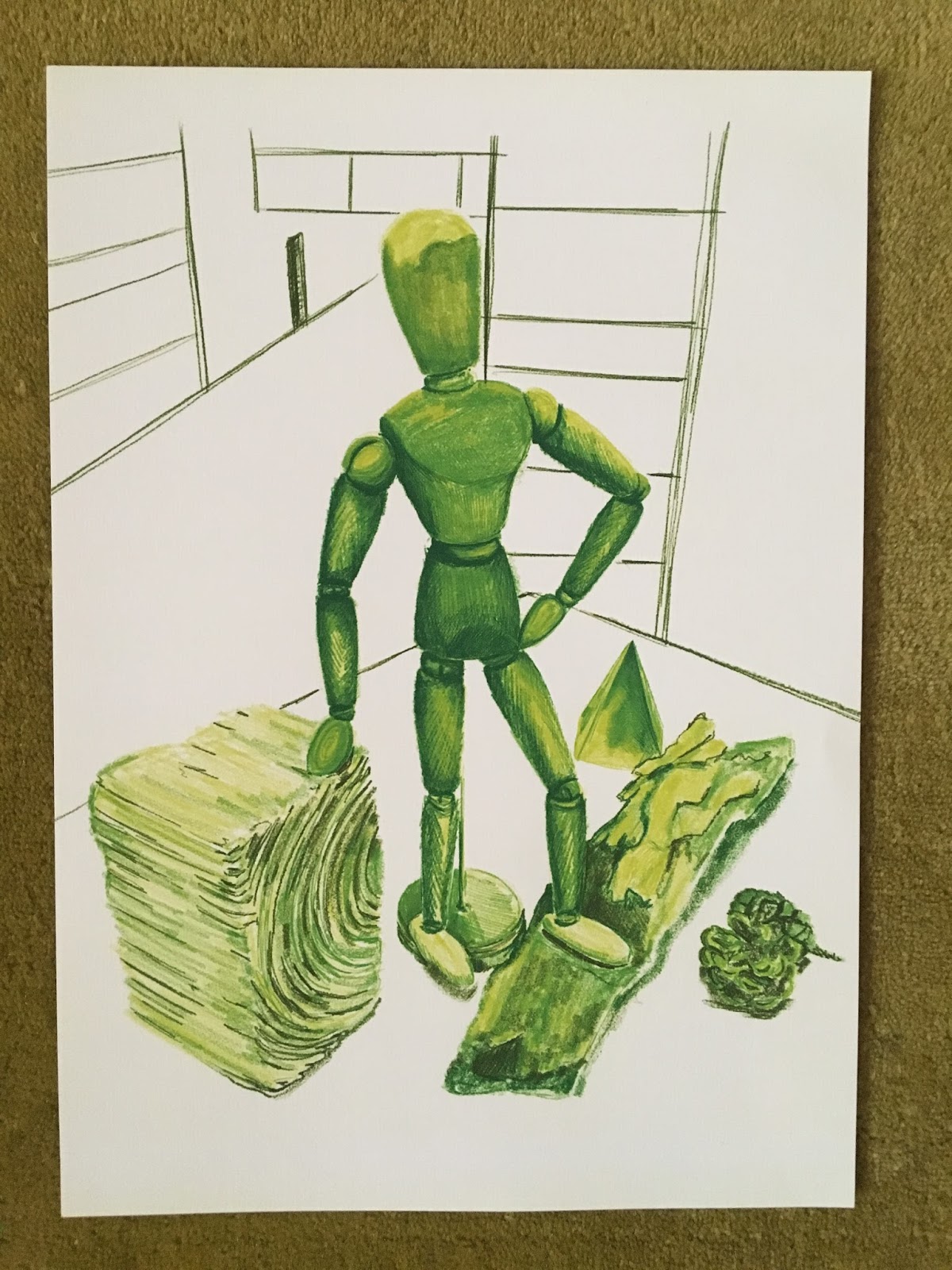
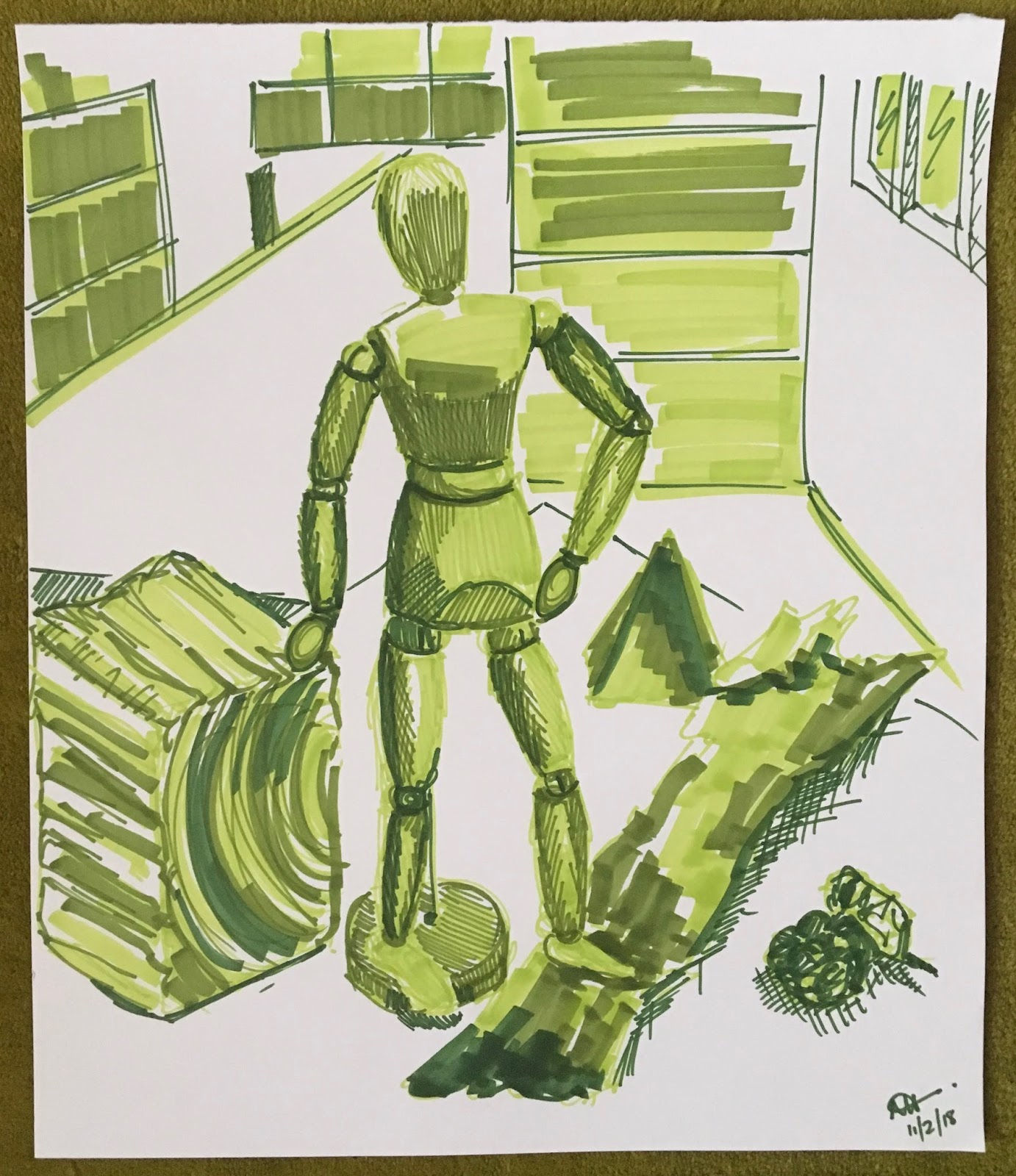
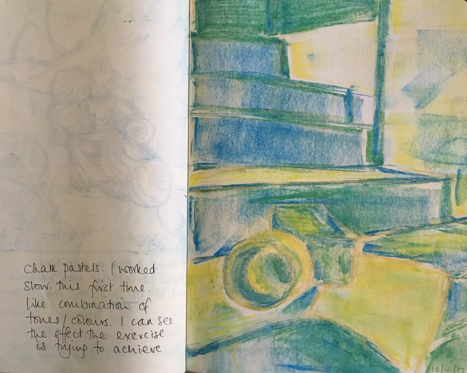
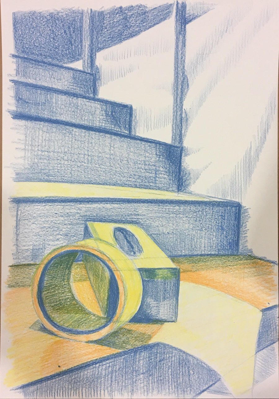
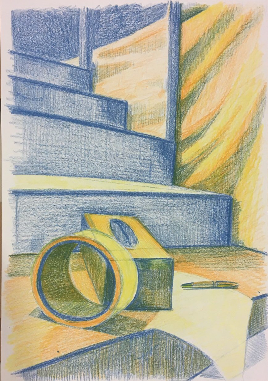
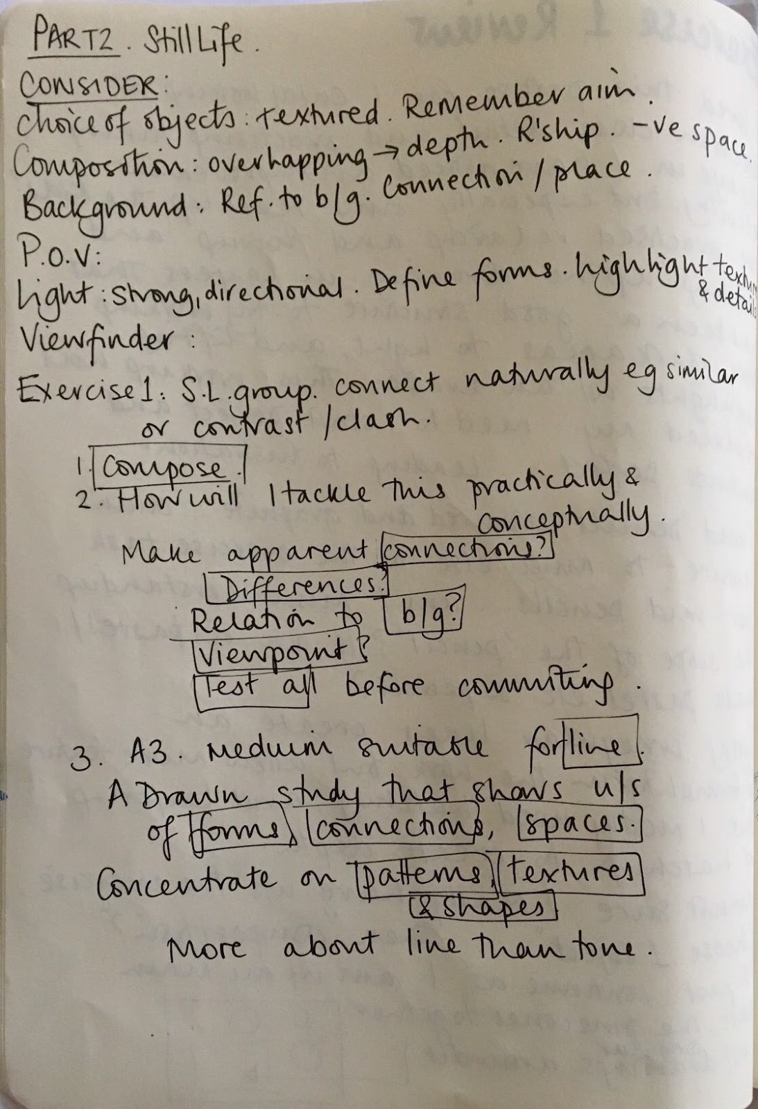
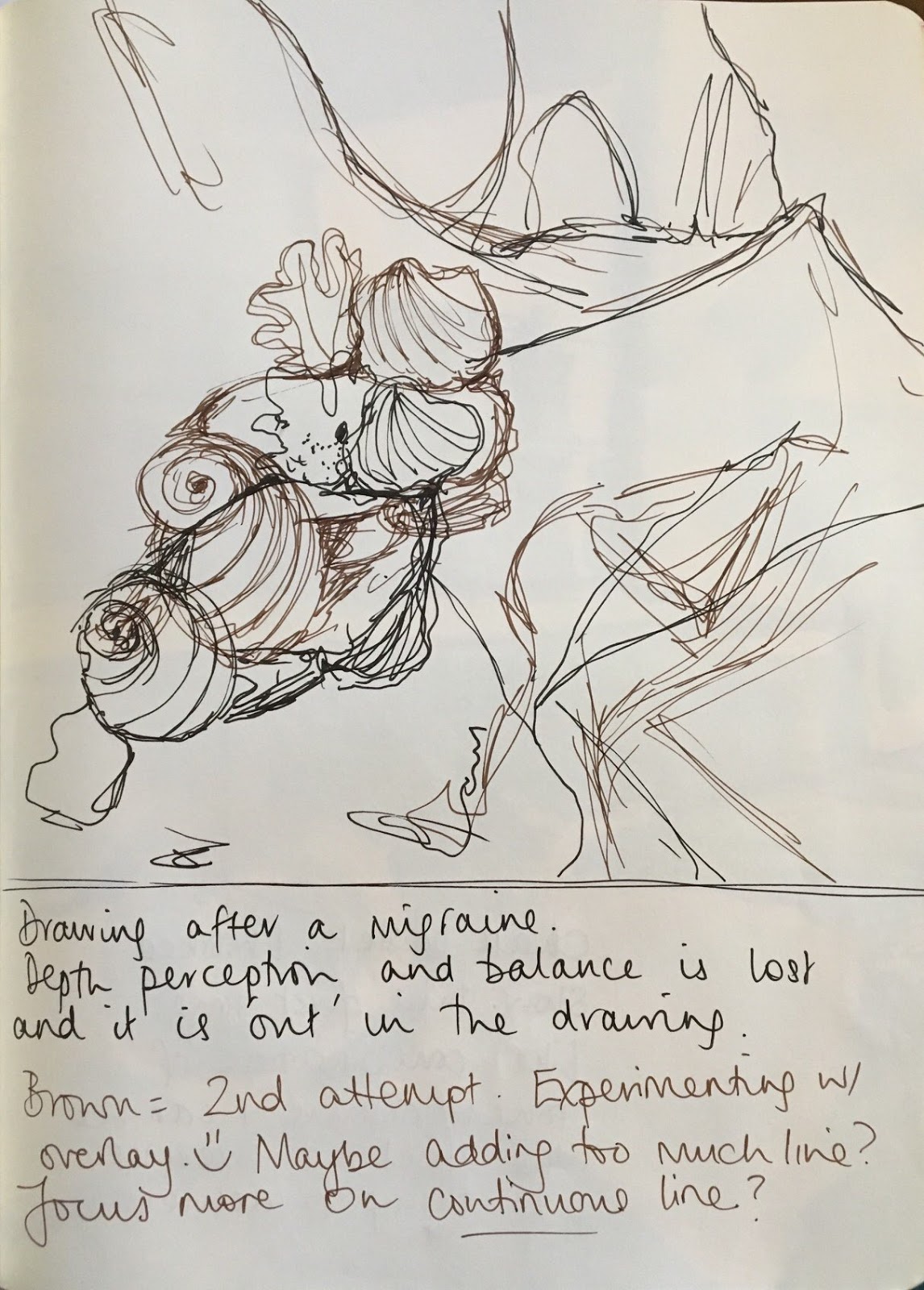
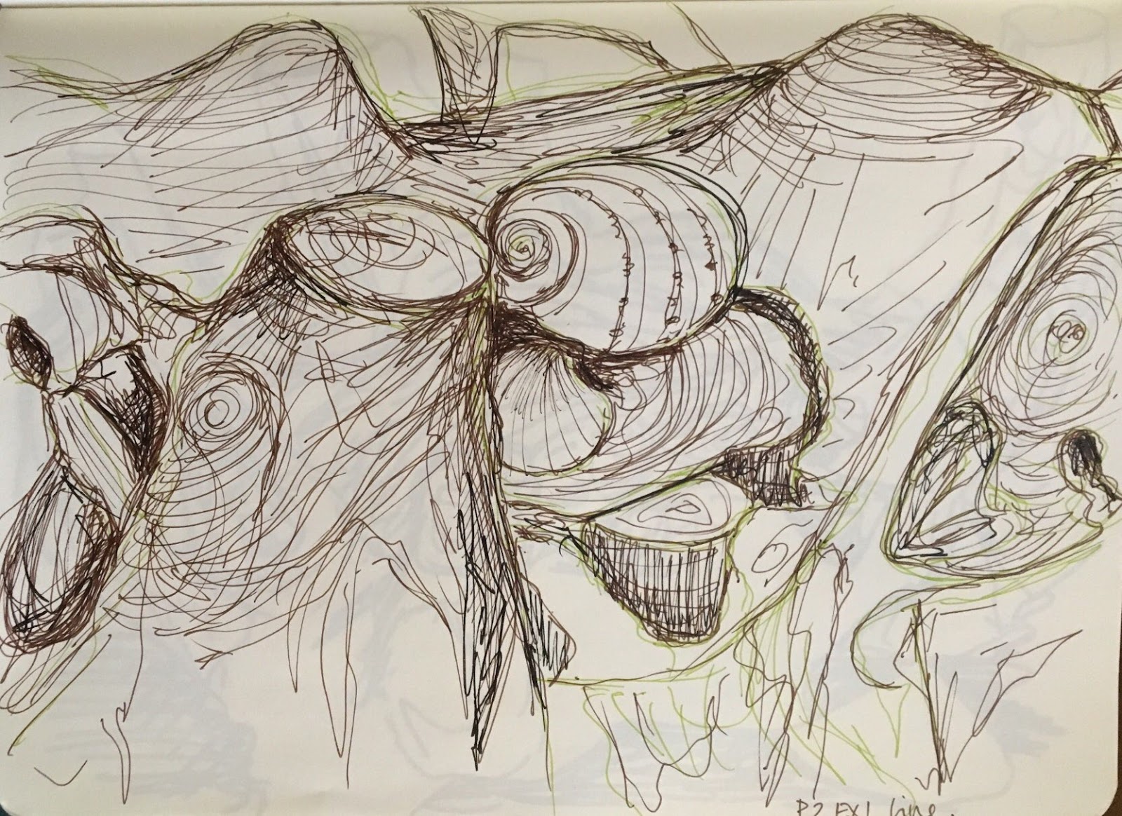
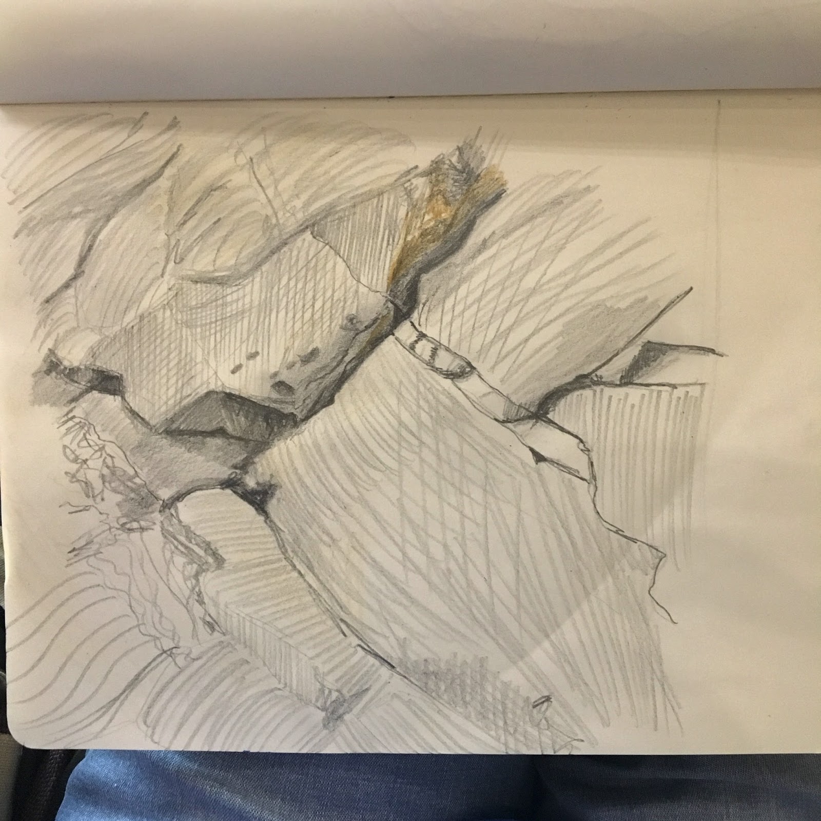
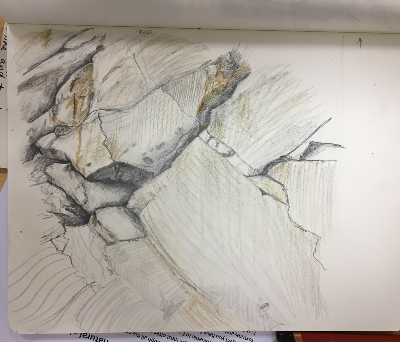
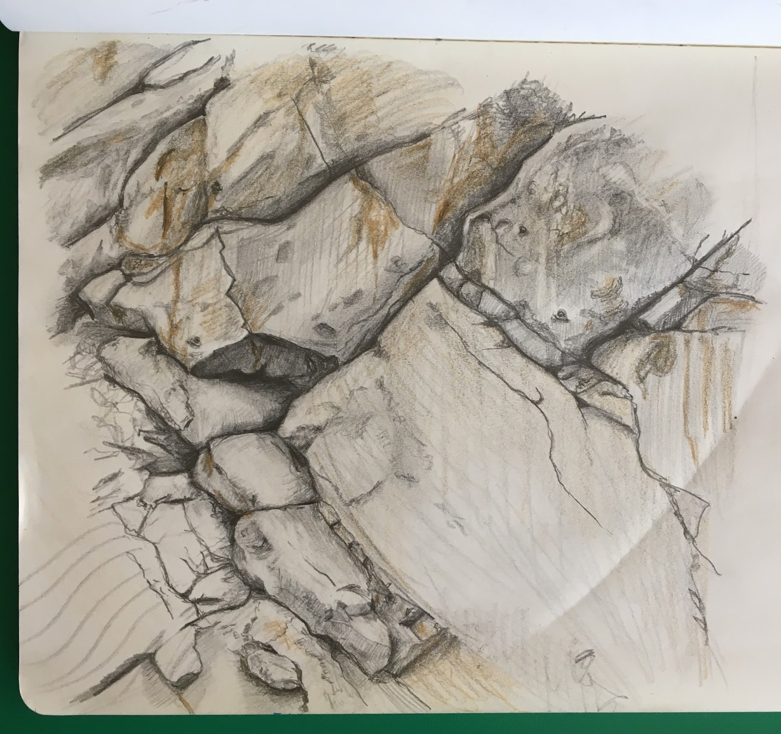
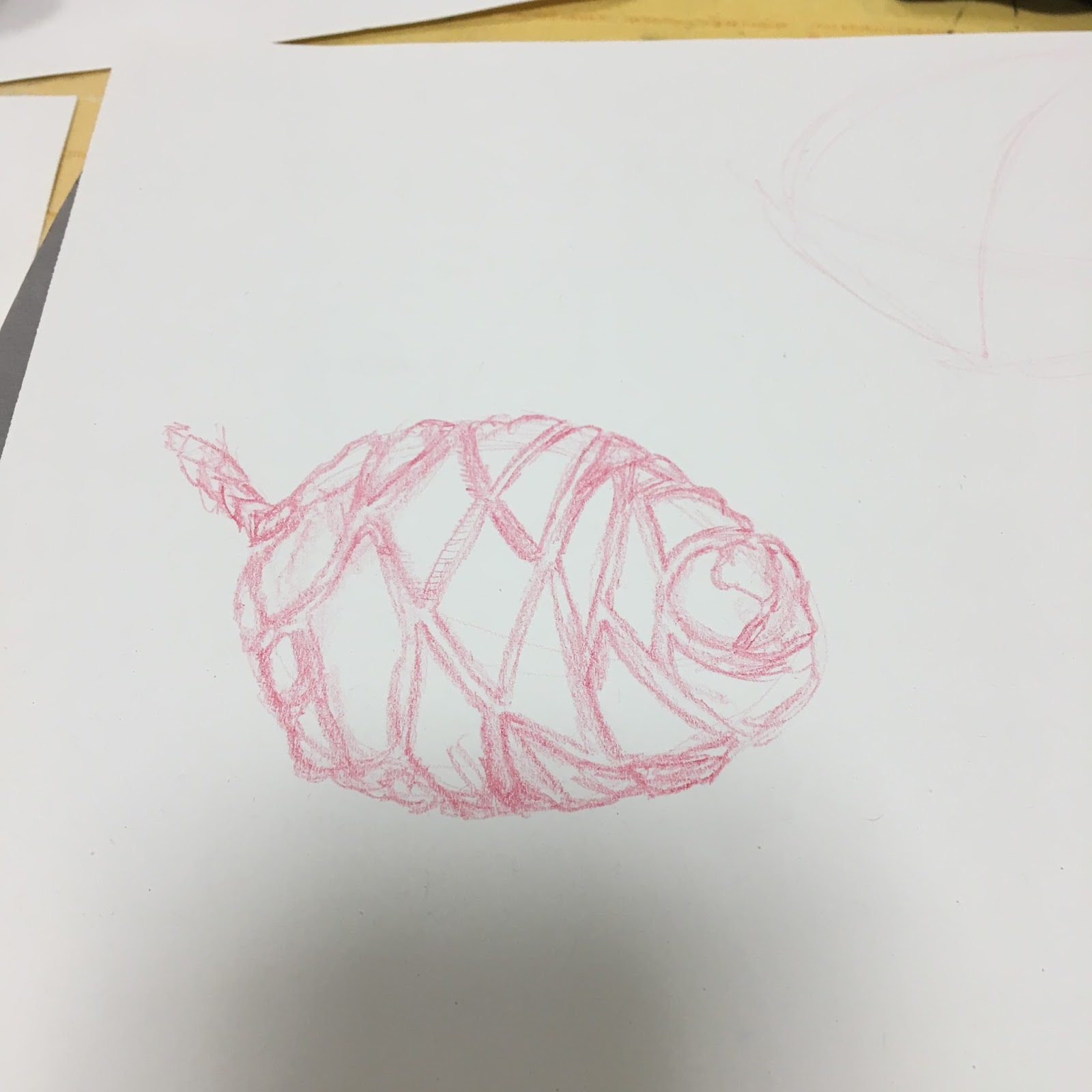
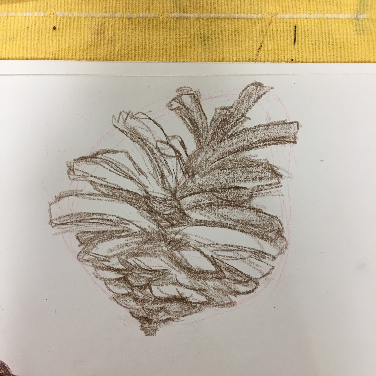
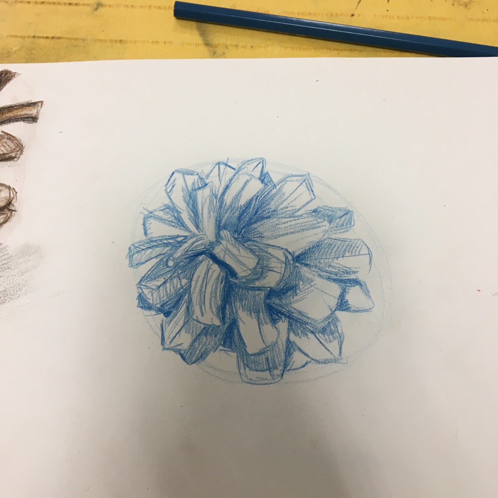
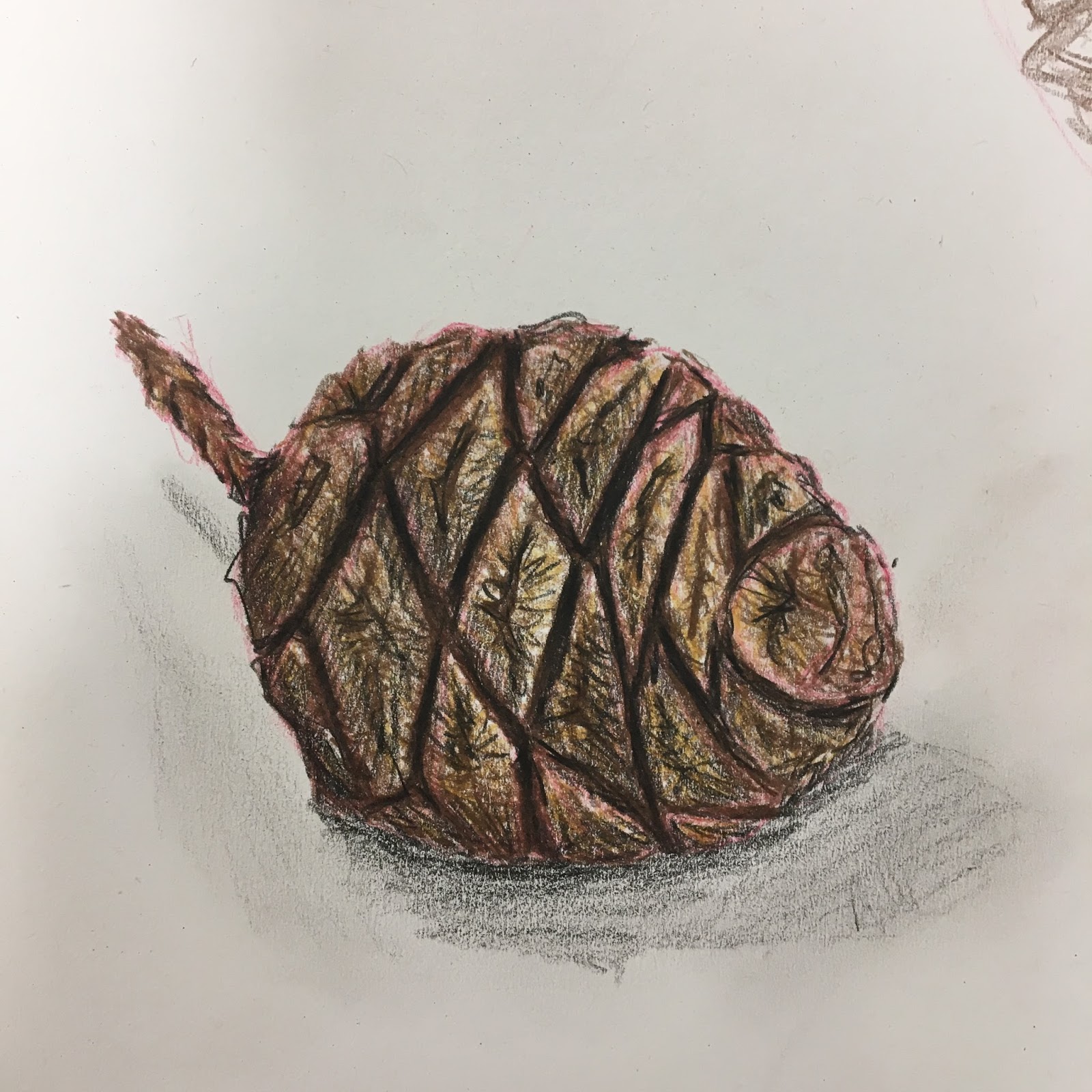
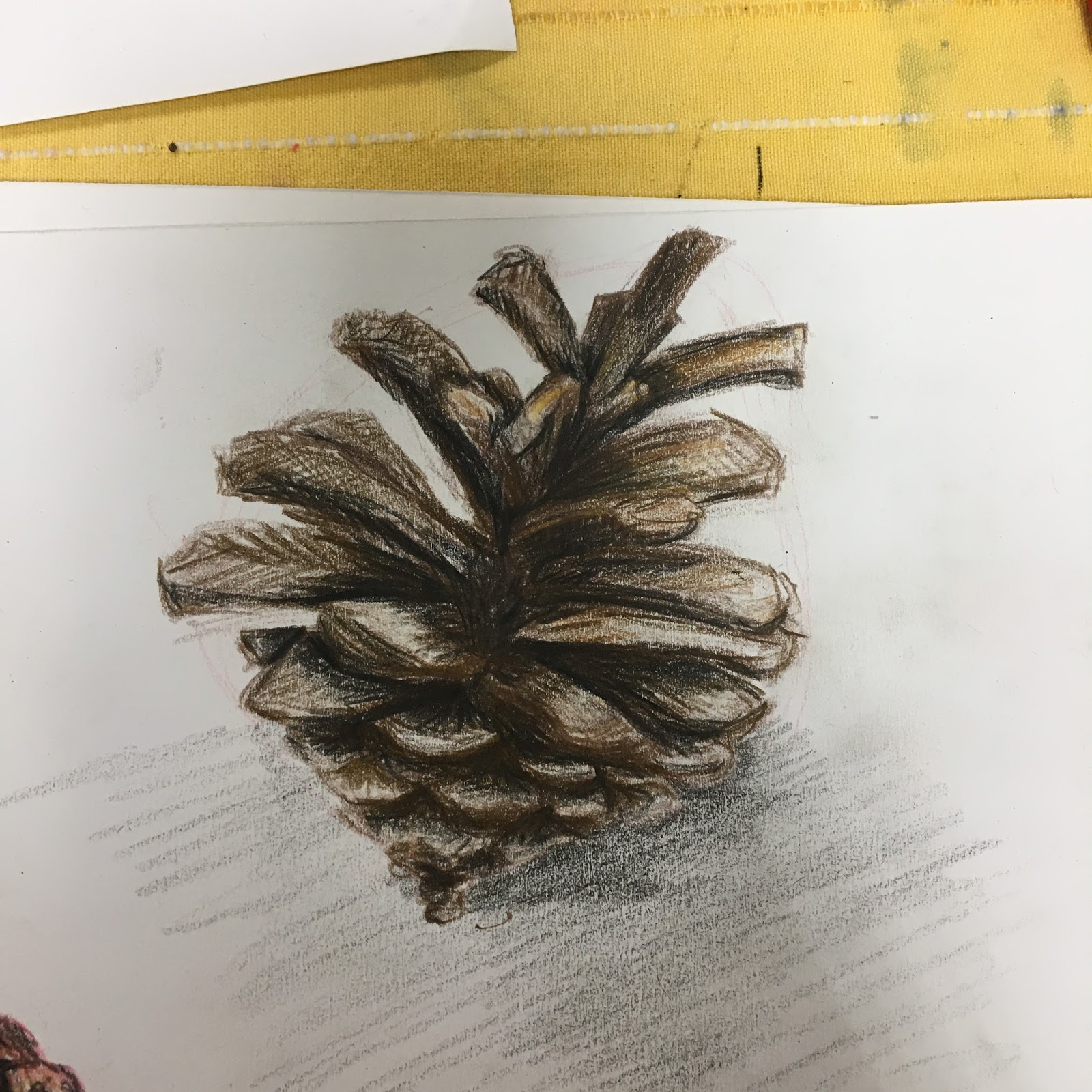
Project 2 exercise 2 where the use of the charcoal reveals the grain of the paper is very effective. The drawing of the two objects done large in close up is good as it shows the use of all the tones but it has a worn look and the drawing needs to be sprayed and reworked to bring it back to life. Similarly Project 2 exercice2 (iii) has a to grey overall look to it and needs to be reinforced with a dark tone a mid tone, light and highlight the latter of which you can get with a putty rubber. However I do like the composition the angle of which is direct and imaginative.
Insert photos for ref
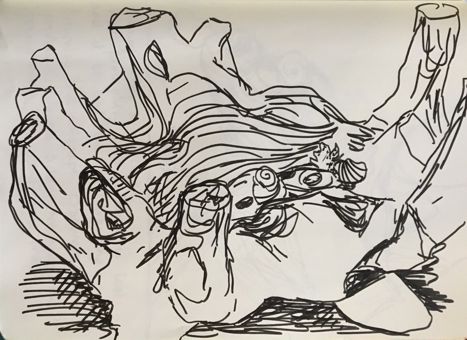
Again project 2 exercise 4 needs to be fixed. The drawing is good especially the cup but as an arrangement it is a bit lacking.
The white chalk on black paper is a nice idea but there is a lack of a mid tone probably because it was difficult to achieve and in this case you might find that if you try to fix it the drawing will disappear because of the way that the fixative reacts with the whited chalk. Try it and see.
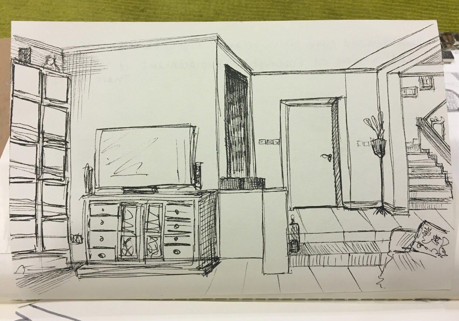
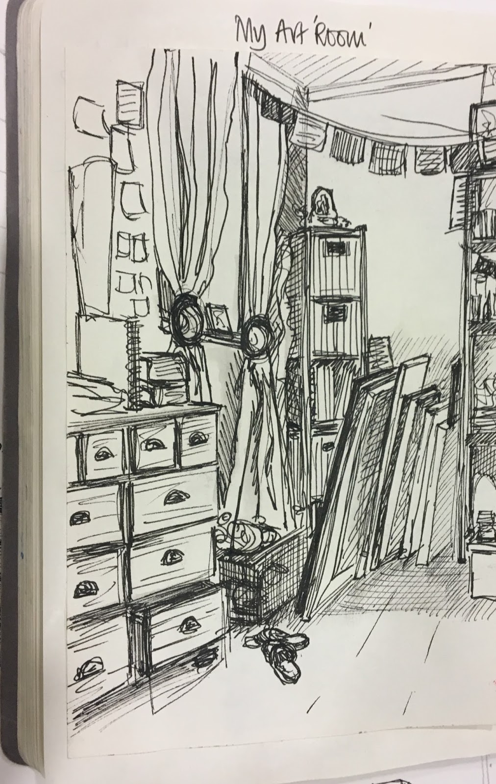
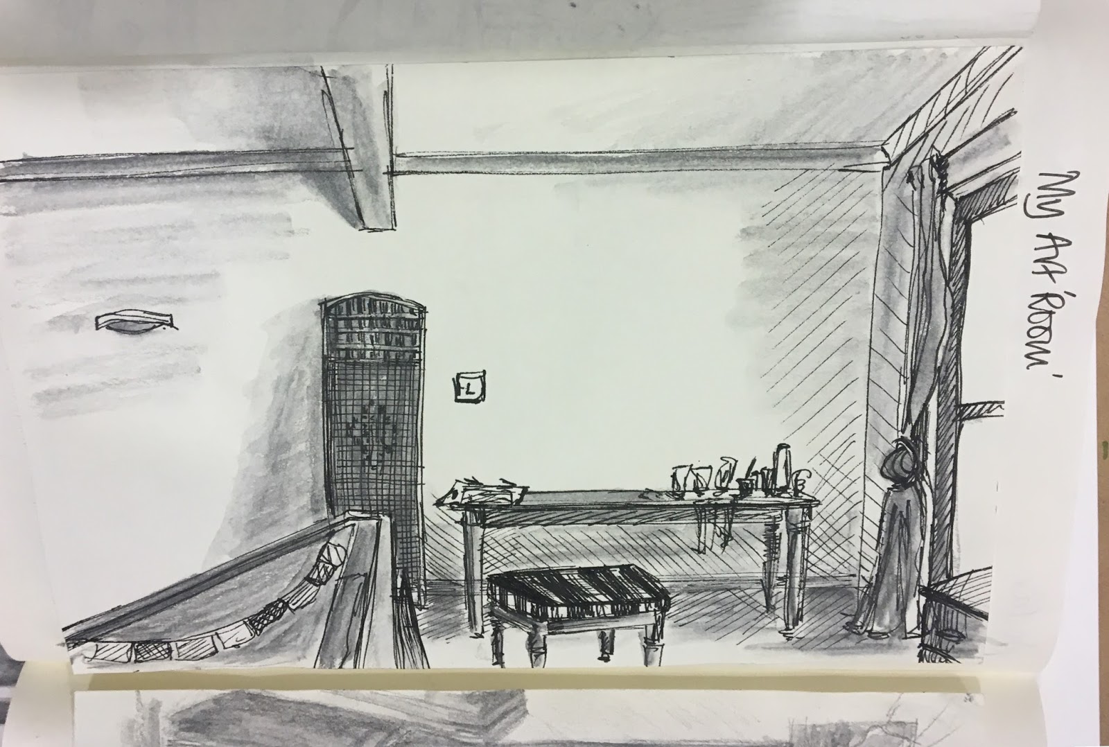
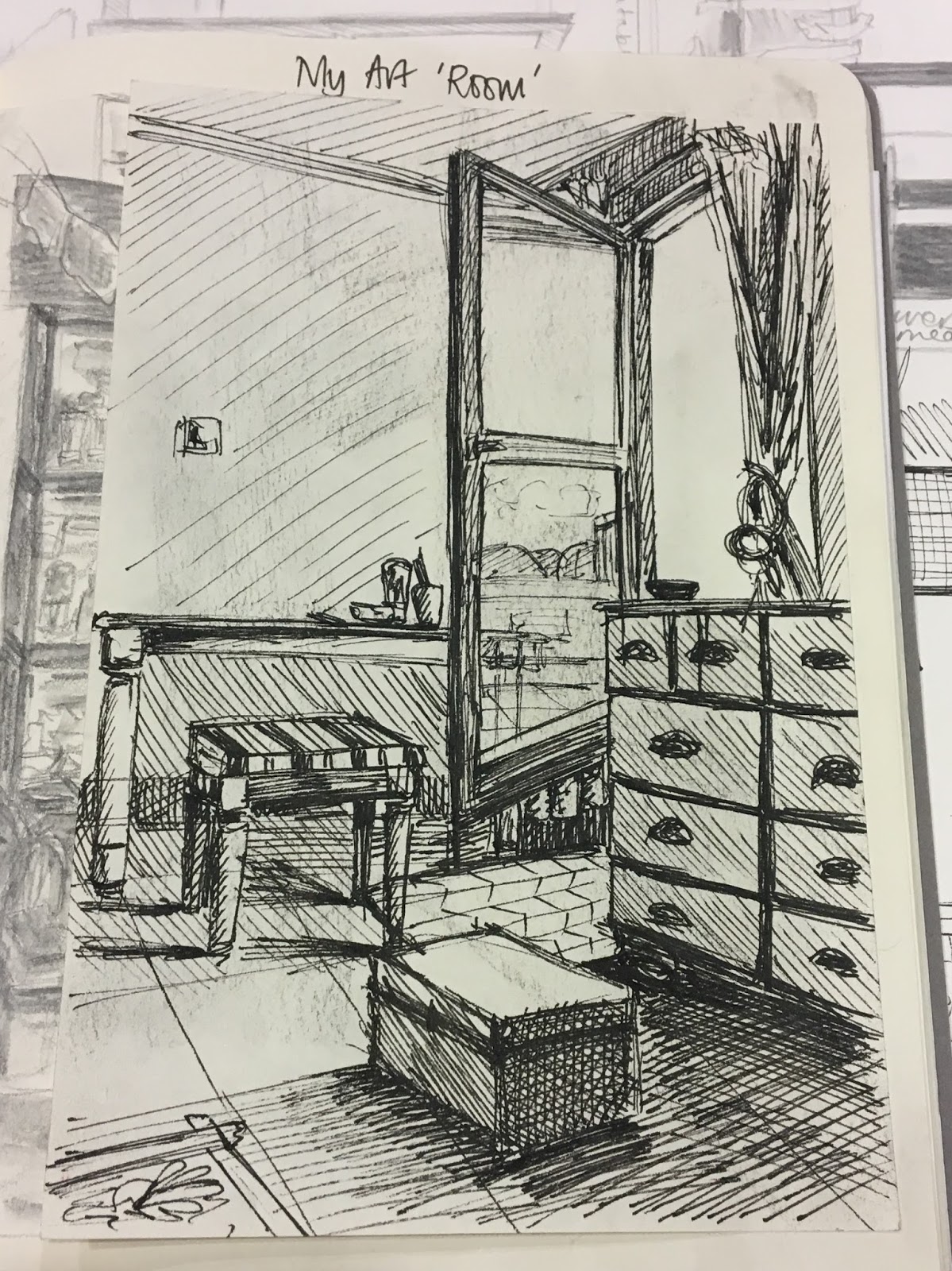
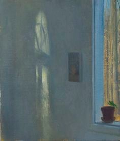
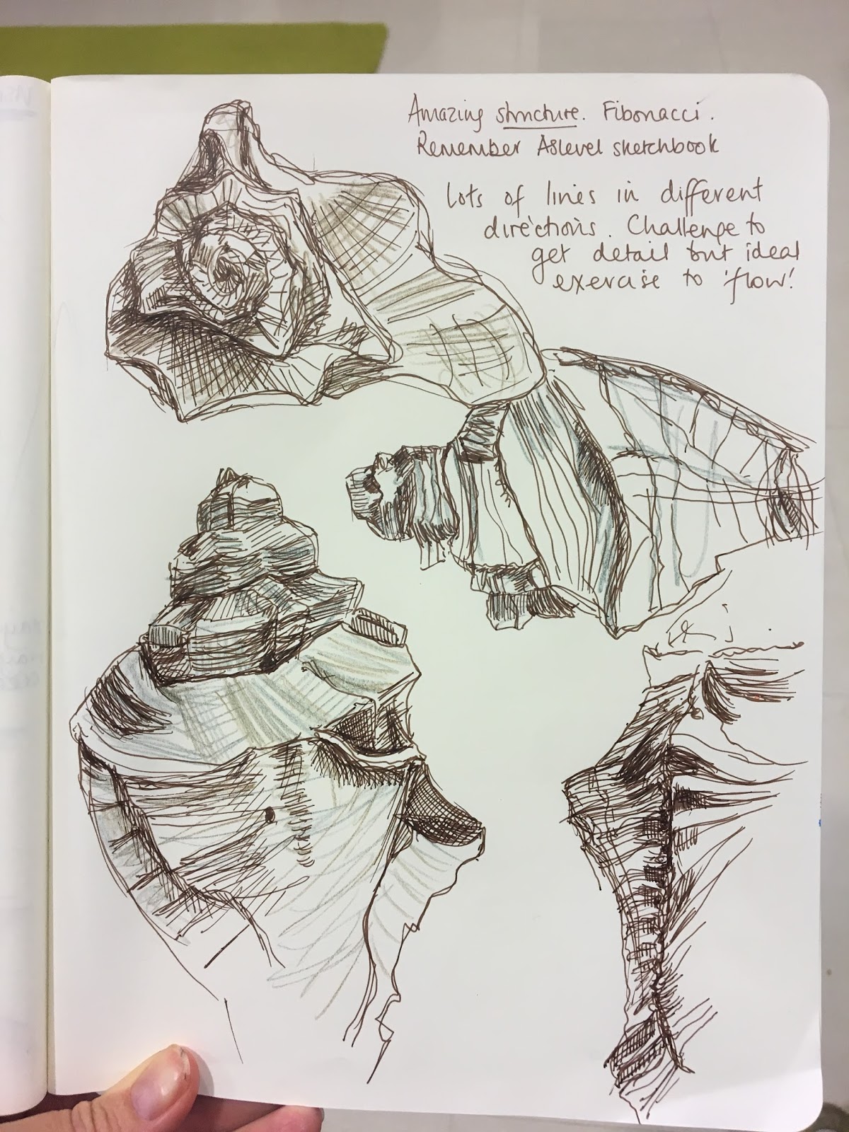
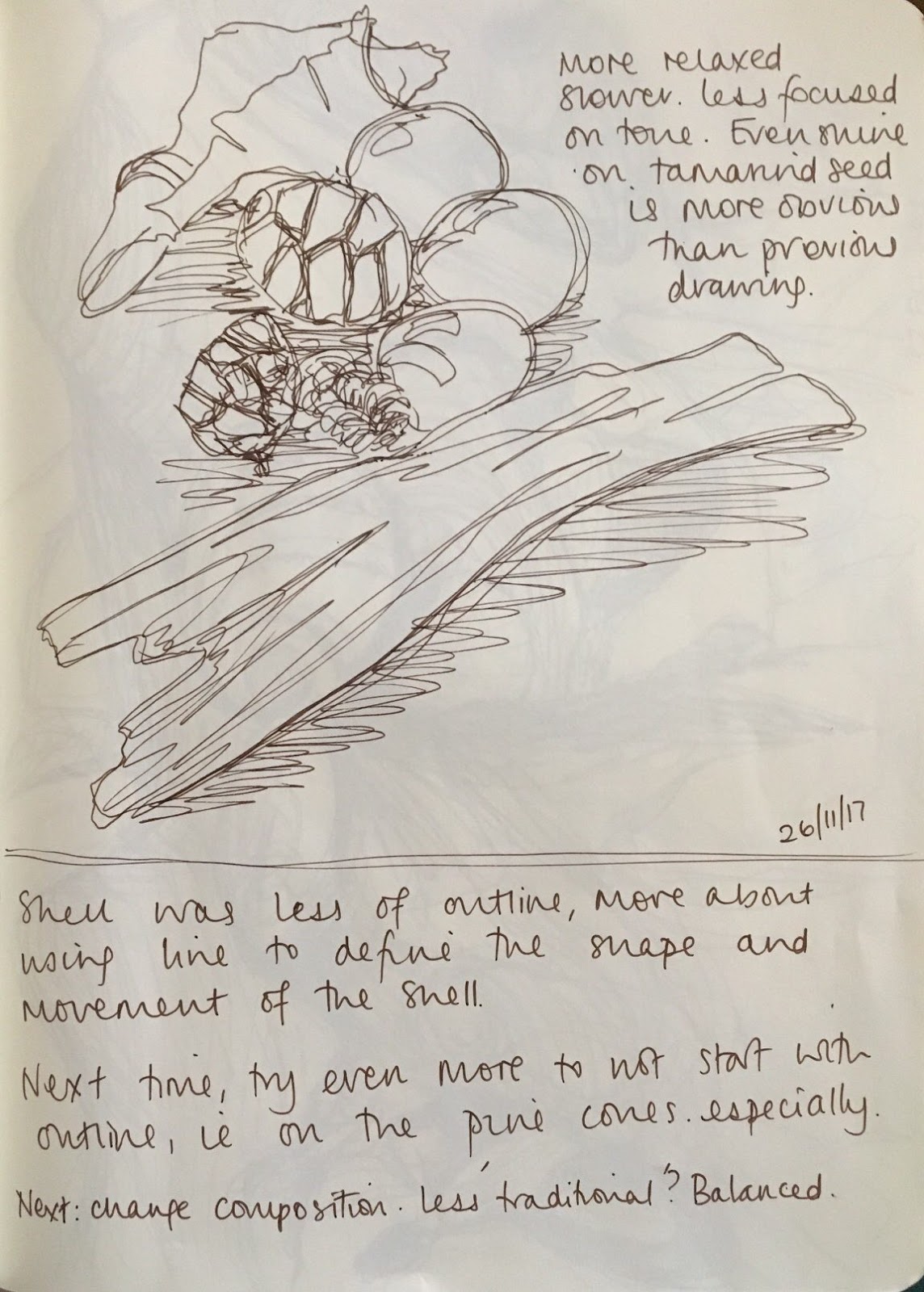
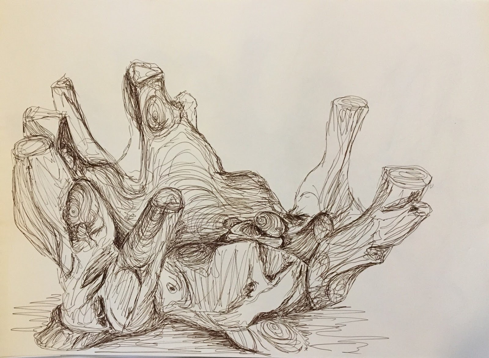
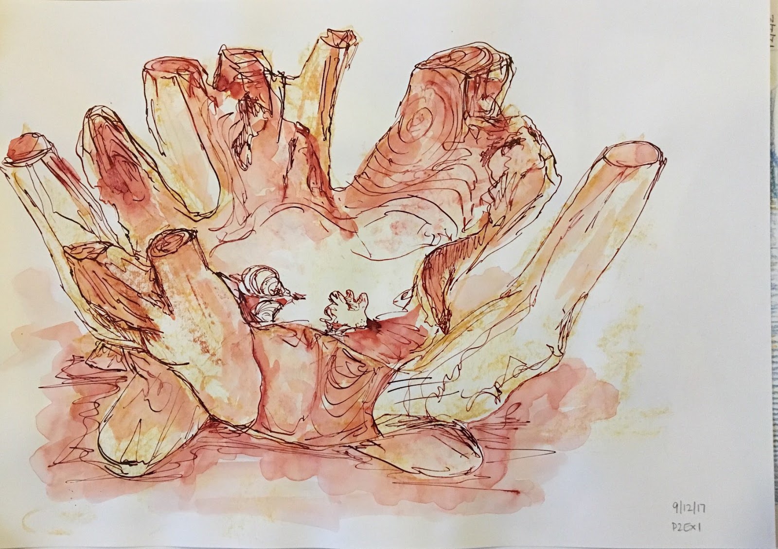
You seems to be most at home with the pen and I like your freedom of use with your ink drawing on the mauve coloured paper.
Assignment 1 Assessment potential
You may want to get credit for your hard work and achievements with the OCA by formally submitting your work for assessment at the end of the module. More and more people are taking the idea of lifelong learning seriously by submitting their work for assessment but it is entirely up to you. We are just as keen to support you whether you study for pleasure or to gain qualifications. Please consider whether you want to put your work forward for assessment and let me know your decision when you submit Assignment 2. I can then give you feedback on how well your work meets the assessment requirements.
Feedback on assignment
Demonstration of technical and Visual Skills, Quality of Outcome, Demonstration of Creativity
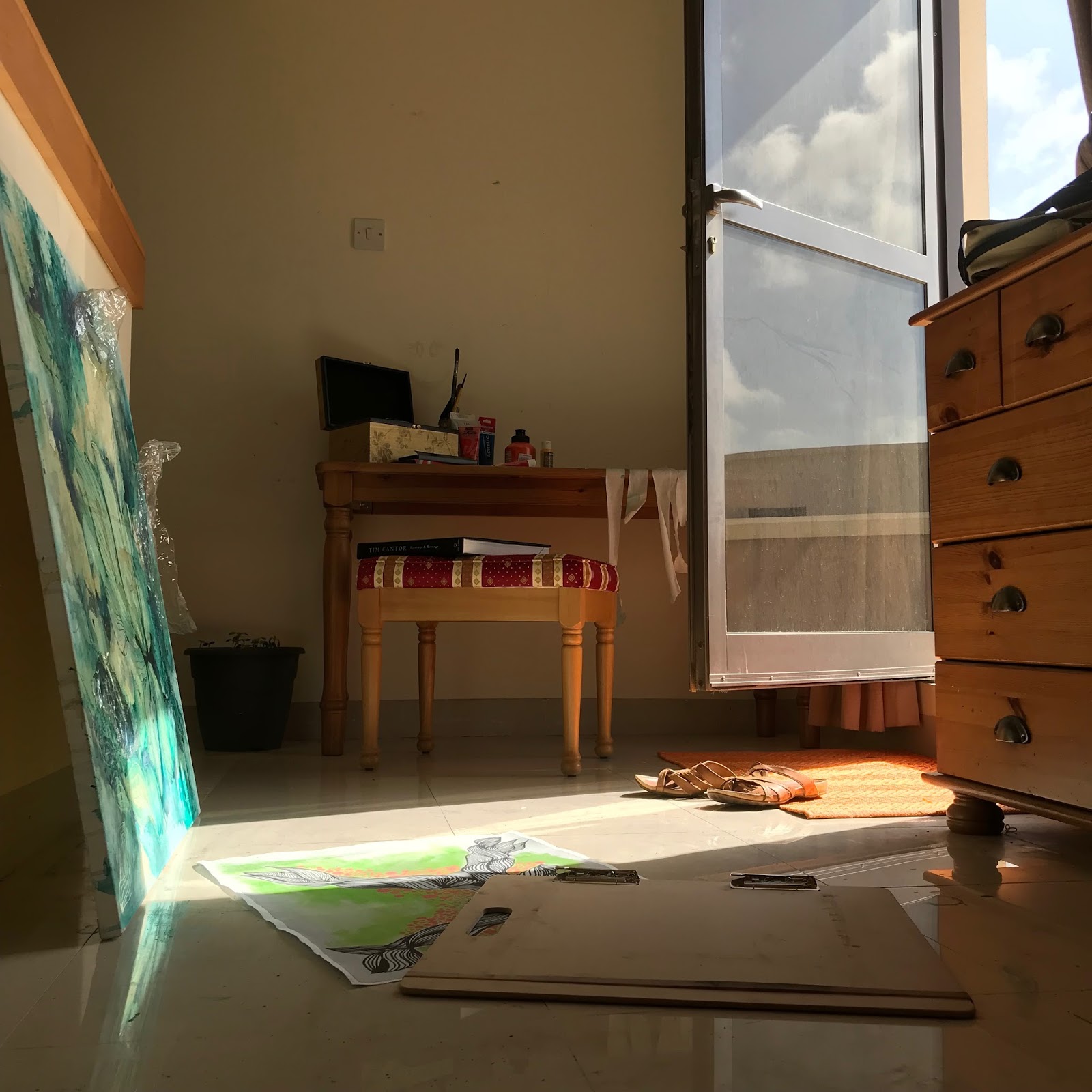
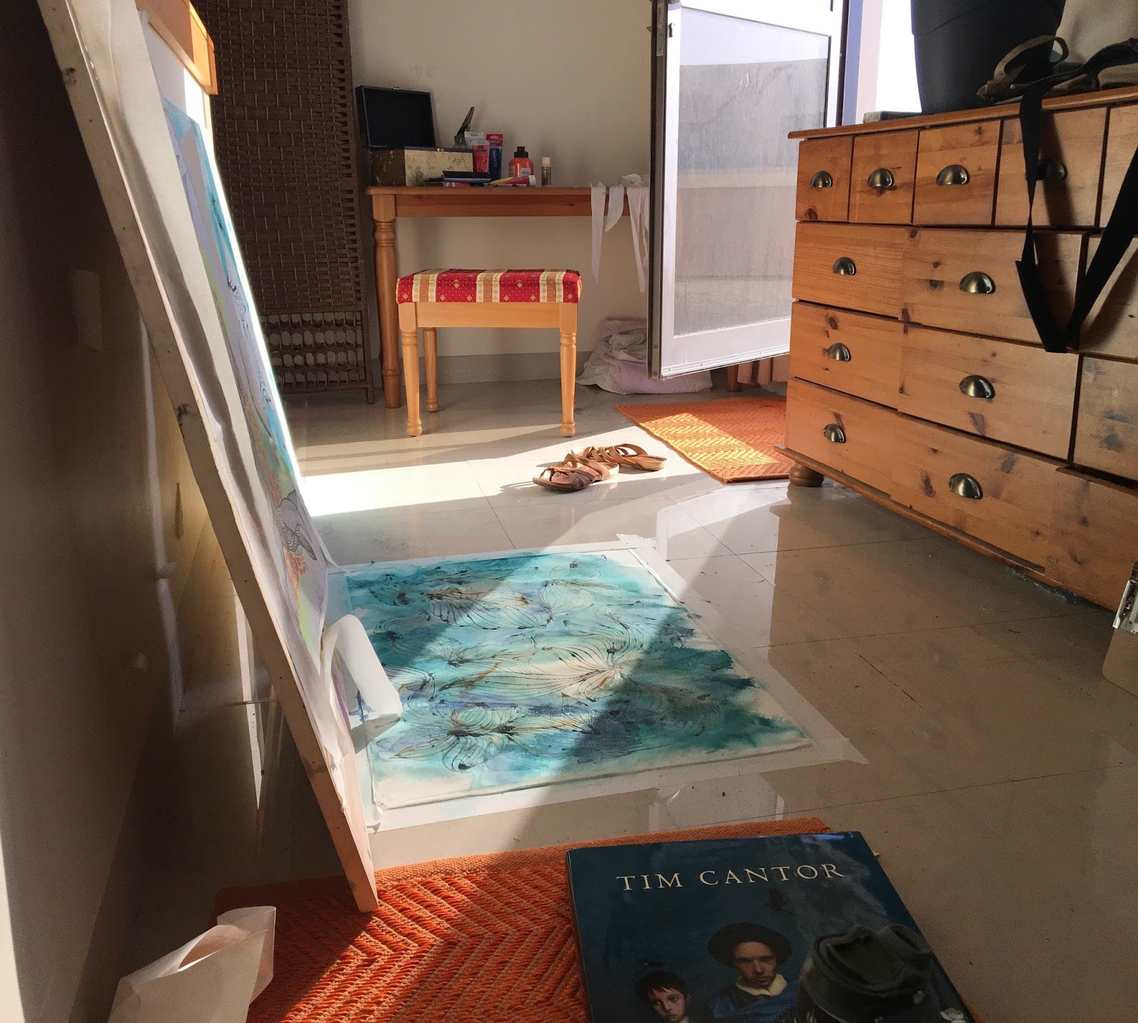
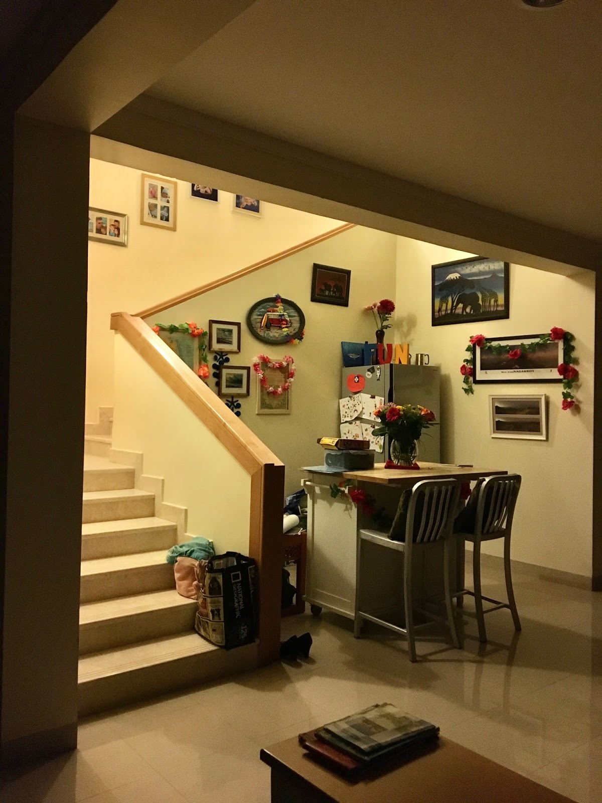
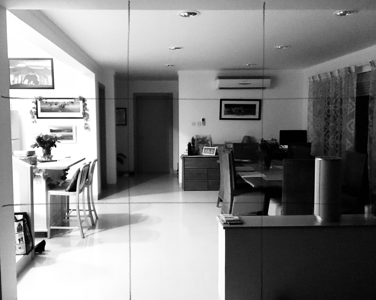
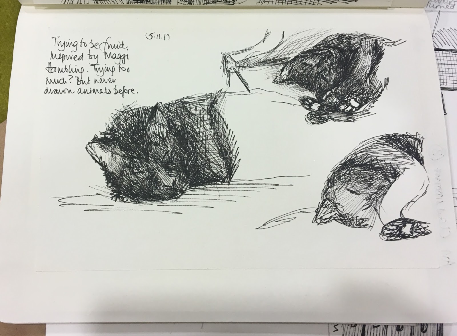
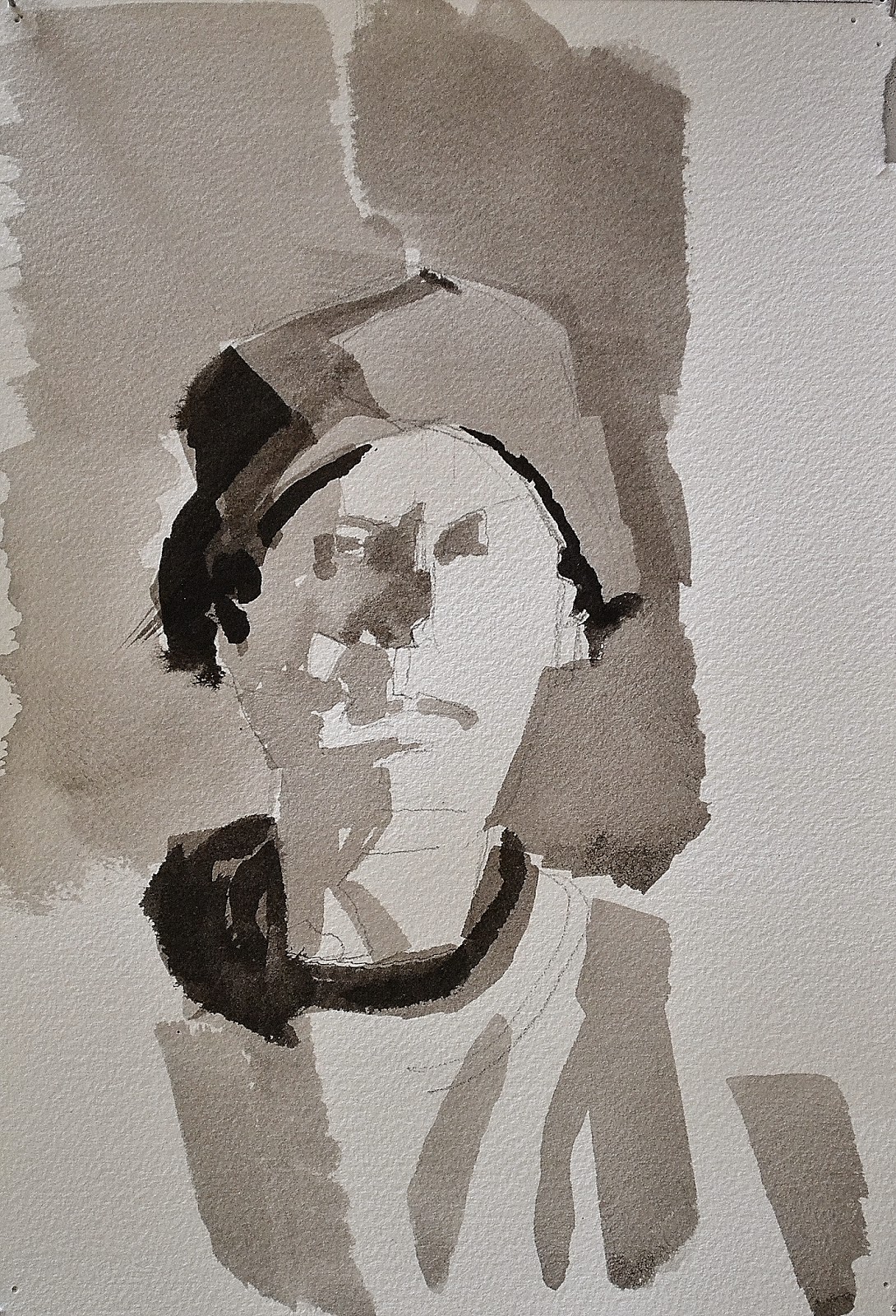
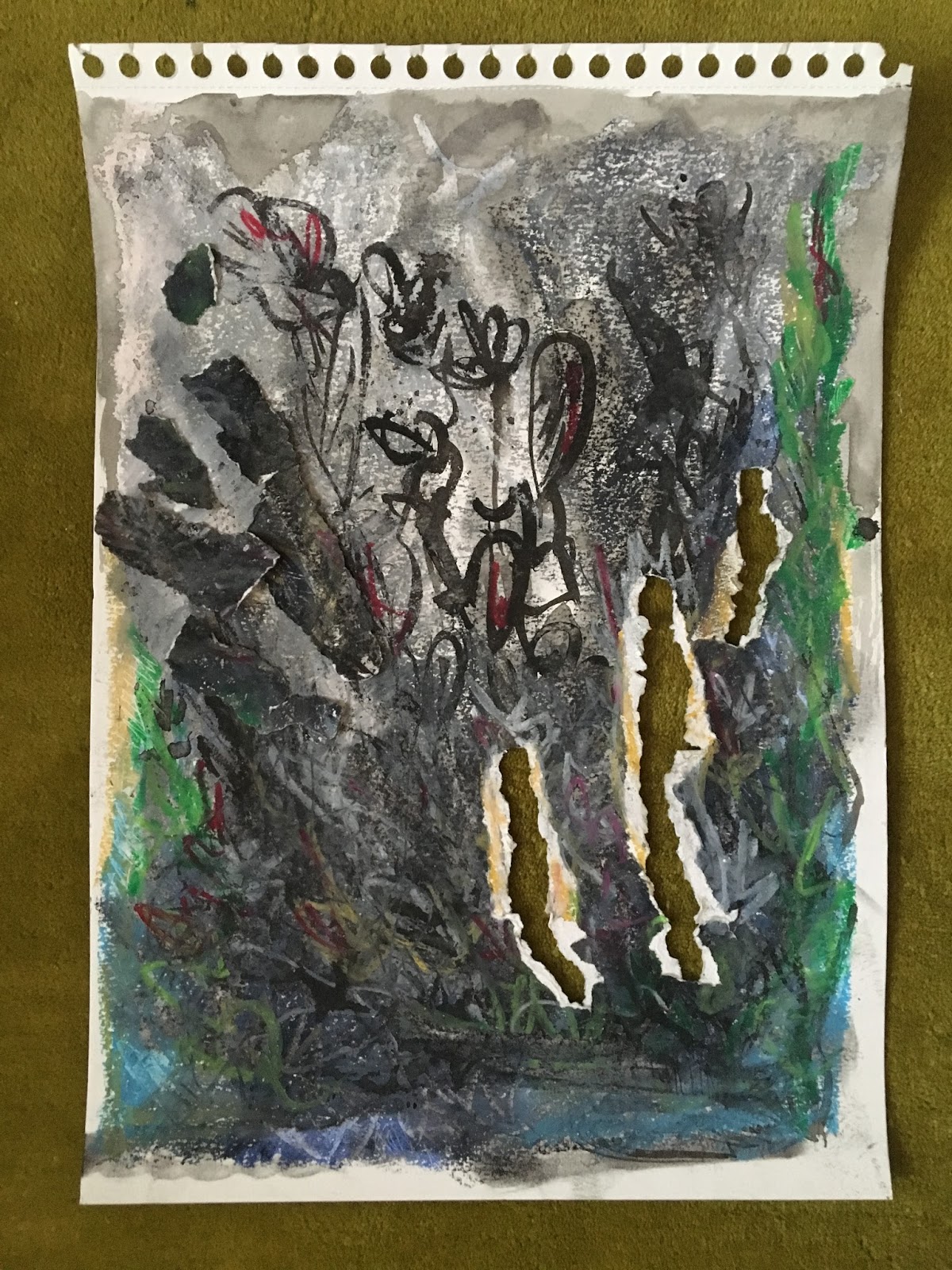
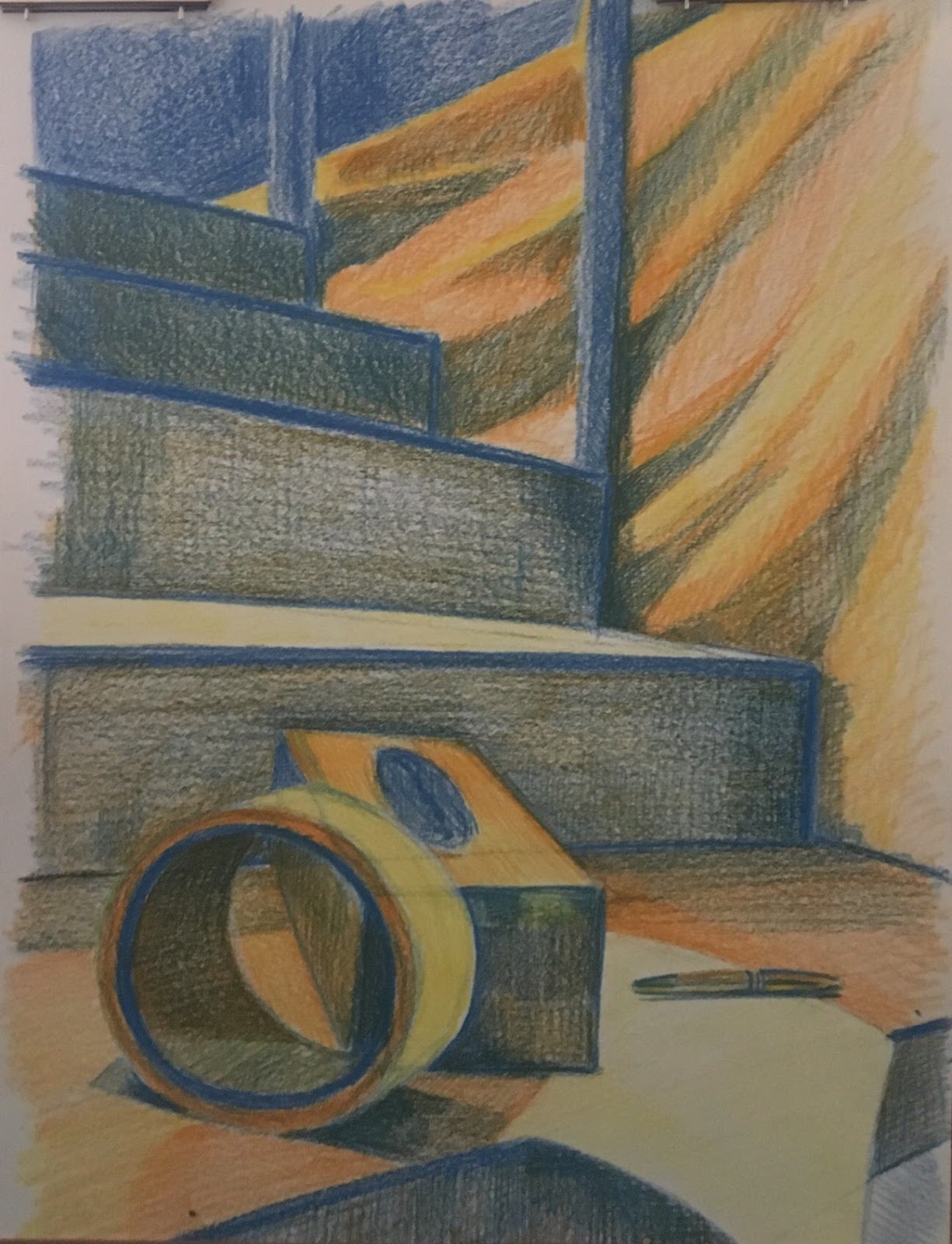
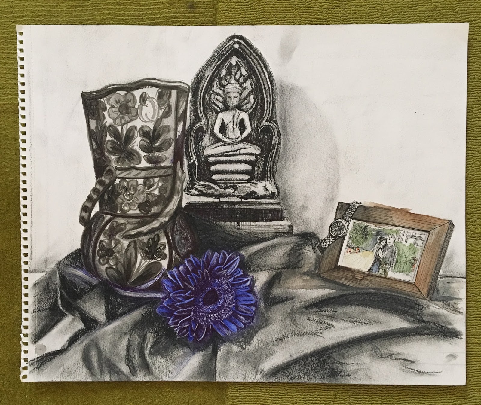
The objects in the final assignment have been chosen in order to exploit memories and associations. There is some exploratory work in the sketchbook showing compositional changes and ideas and it is a good idea to try out about four different arrangements before deciding on the final one. Then its good to experiment with different media to find the one you are most comfortable with. I like your use of ball point pen – a favourite among artists because you cant rub it out and it stops you from getting precious. It is also a surprisingly intense medium and I think your drawing of the Gerbera and the Vase stand out really well.
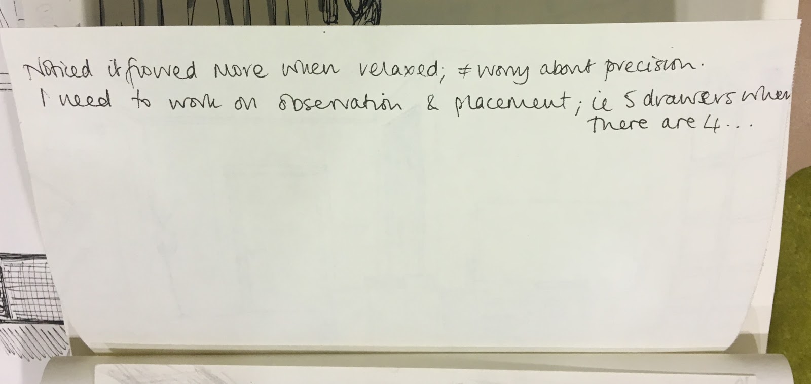
This is my new favourite medium and I think I enjoy it for that fact, I can’t get precious about my work. It is quite liberating.
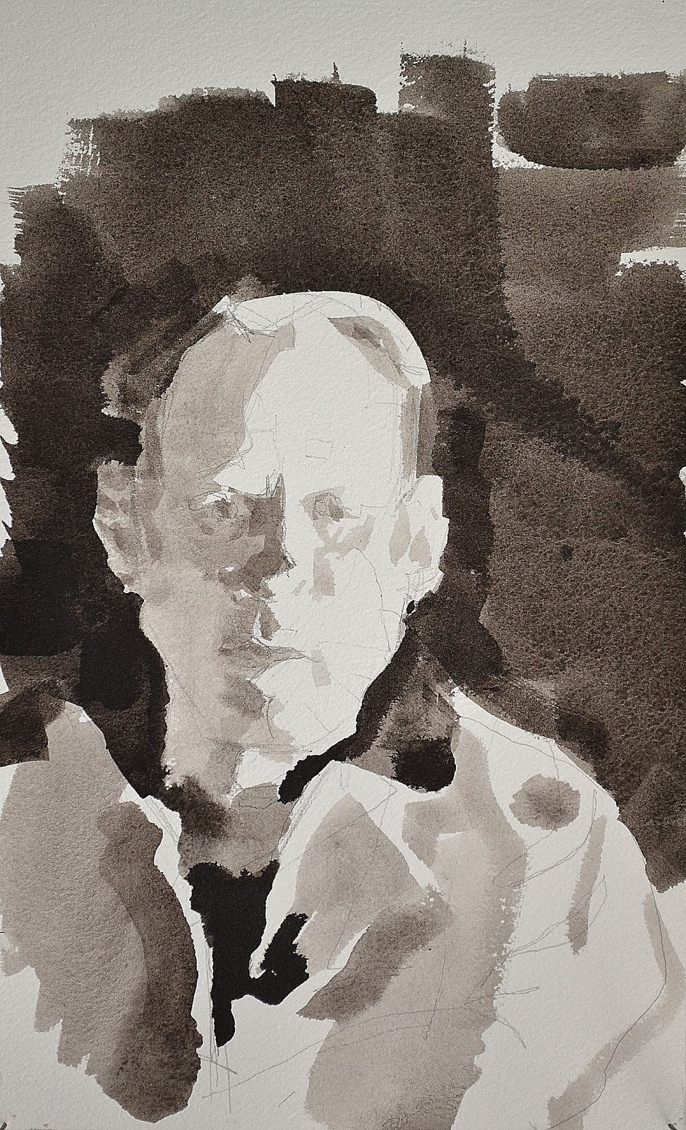
The use of mixed media is interesting, if you can bring it off ,especially mixing colour with black and white. I think I would have done the vase in colour as well as the cloth thereby leaving the Buddha in splendid isolation in the centre of the picture. The watch is particularly well drawn, not an easy thing to do.
This was a new thing for me, I wanted to see how pointillism works. It’s more than just placing dots to create light and shadow, it involves layering again and again to build up a depth. I am particularly pleased with the watch.
Sketchbooks
Demonstration of technical and Visual Skills, Demonstration of Creativity
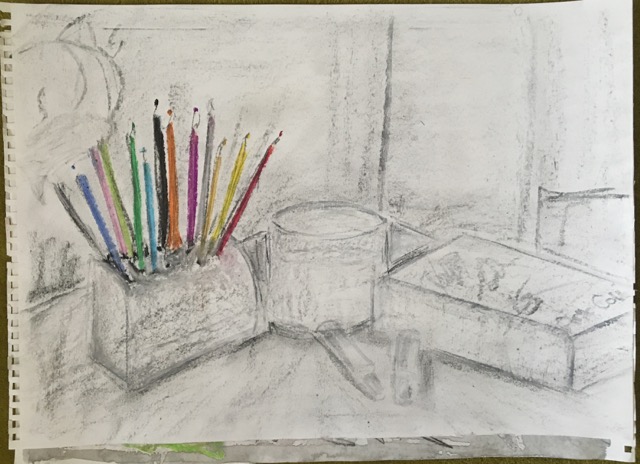
The sketchbook is filling up nicely with a variety of approaches. Discovering the use of ball point pen is a particularly good page and you use it with confidence drawing the ellipses and the shading to good effect.
Research
Context, reflective thinking, critical thinking, analysis
It is important part of the course to be able to write about and form opinions of other artists work and I see you have looked at the work of Odilon Redon. Another artists to include in your research is Seurat and especially with his conté drawings on rough paper which gives an impressionistic appearance,
I need to look more at artists as I did in my A-level course. This was useful.
Seurat
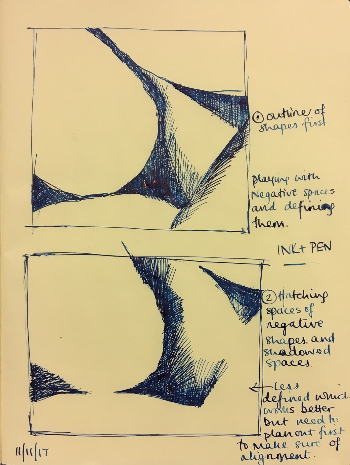
Another artists worth looking at is Morandi and his etchings which exploit cross hatching to achieve tone.
Morandi
Learning Logs or Blogs/Critical essays
Context, reflective thinking, critical thinking, analysis
The leaning log is developing well. There are headlines that are so grey that they are almost disappearing which you might like to alter.
To check.
I would try and get into the habit of writing more about the artists and the exhibitions you have seen.
Suggested reading/viewing
Context
Now you have moved nearer to London, the whole London art scene is open to you and there is a great number of exhibitions worth looking at. The Cezanne exhibition at the Portrait gallery is a must as is the Soutine portraits at the Courtauld institute which has some of the best impressionist and post impressionist in London.
Pointers for the next assignment
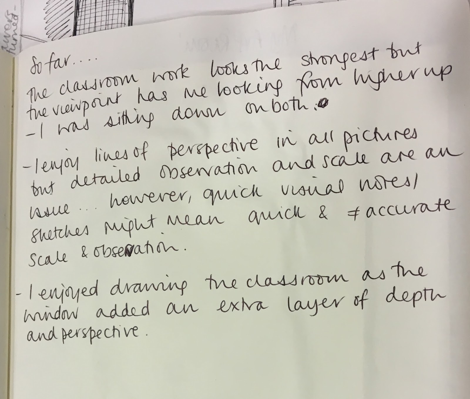
- Reflect on this feedback in your learning log.
Use Fixative.
Well done, I look forward to your next assignment.