A primary school teacher, currently in the Middle East. Teaching children has put me on a new path of not just teaching Art as a specialism, but also a new learning journey of my own. I am aiming for a BA in Painting but just enjoying the ride for now.
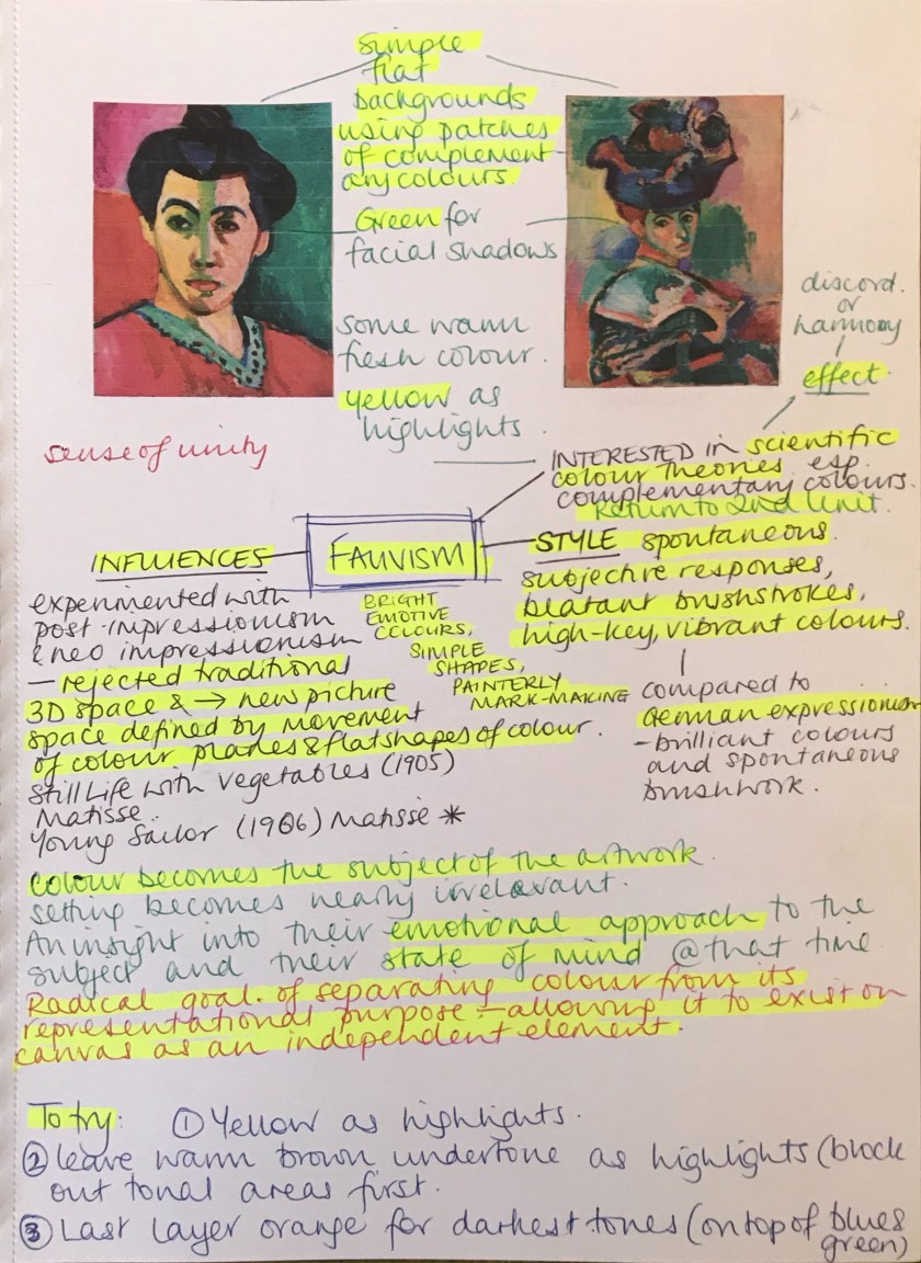
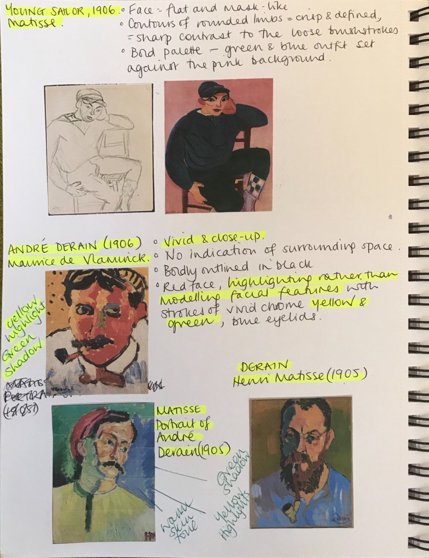
Through looking at portrait composition I was reminded of the Fauvist movement. I introduce this exaggerated, vibrant, spontaneous concept to my classes and I see them apply their colour wheel theory to their work. I love how something inherently theoretical can be seen by children’s eyes as free and expressive; no other conditioning is needed.
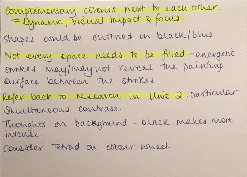
Link to Practise of Painting Unit 2 colour theory research.
With this in mind, I felt I needed to approach my style again in a new light and fresh eyes; the mind of a child. How liberating….
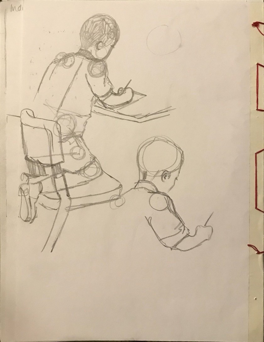
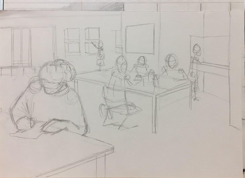
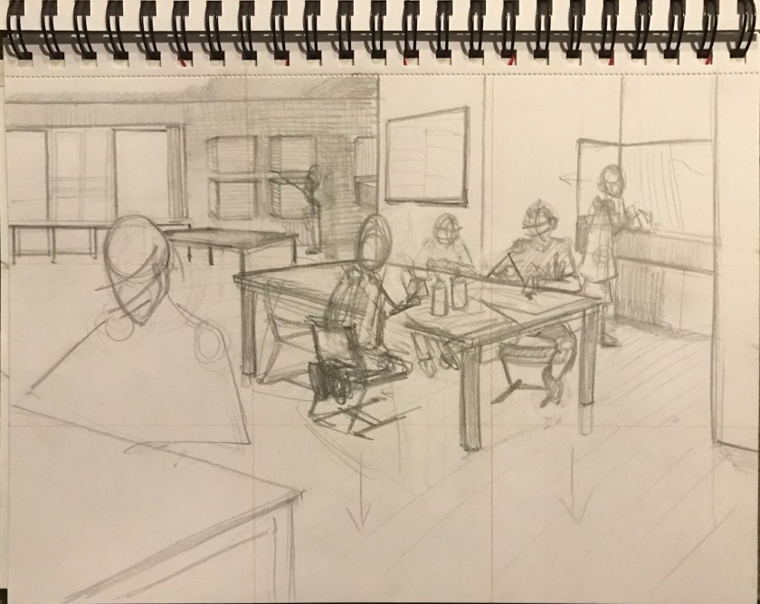
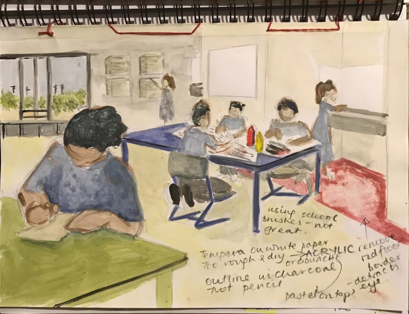
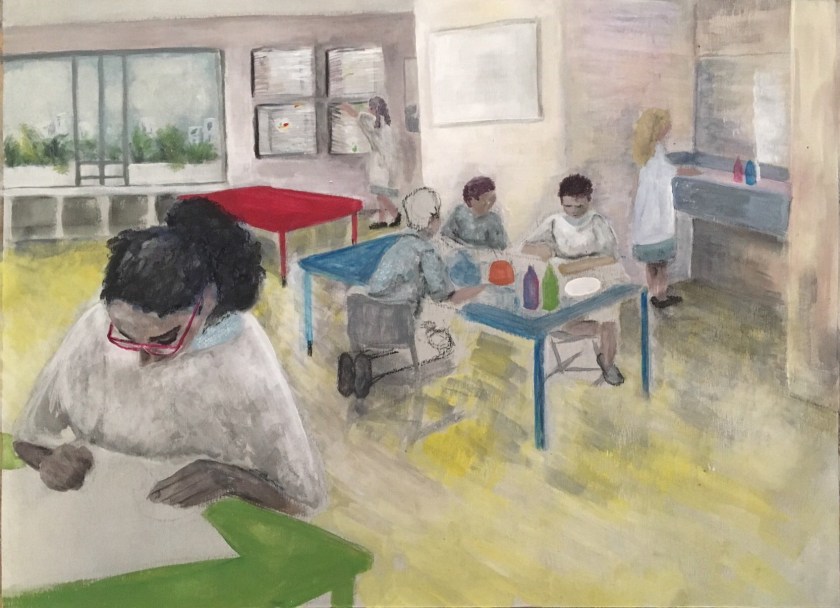
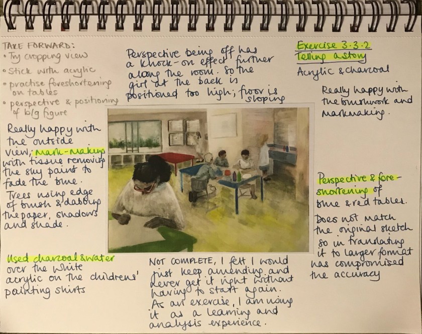
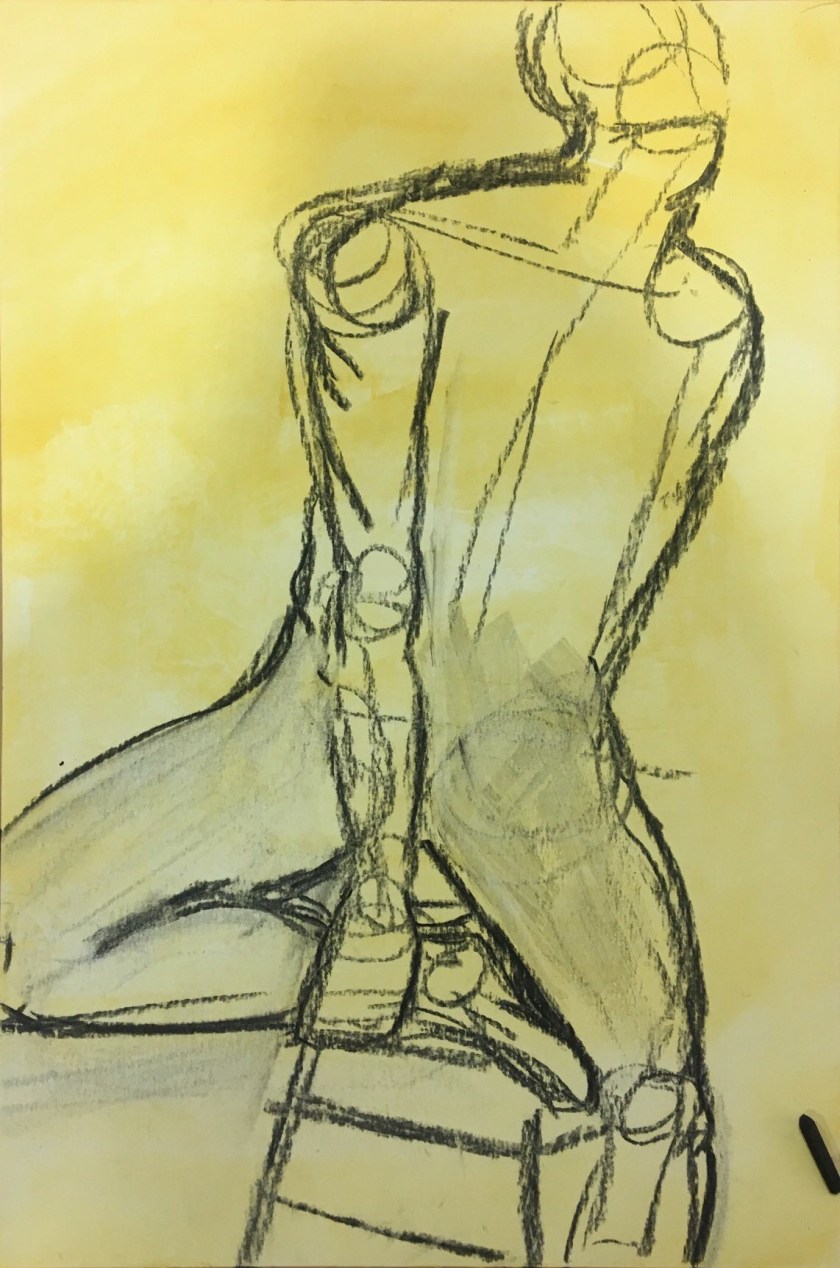
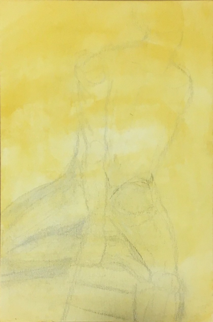
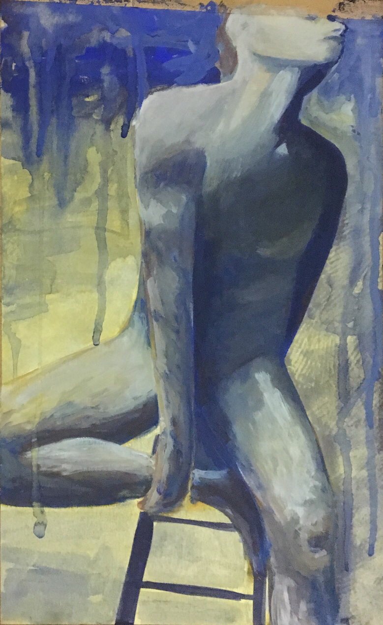
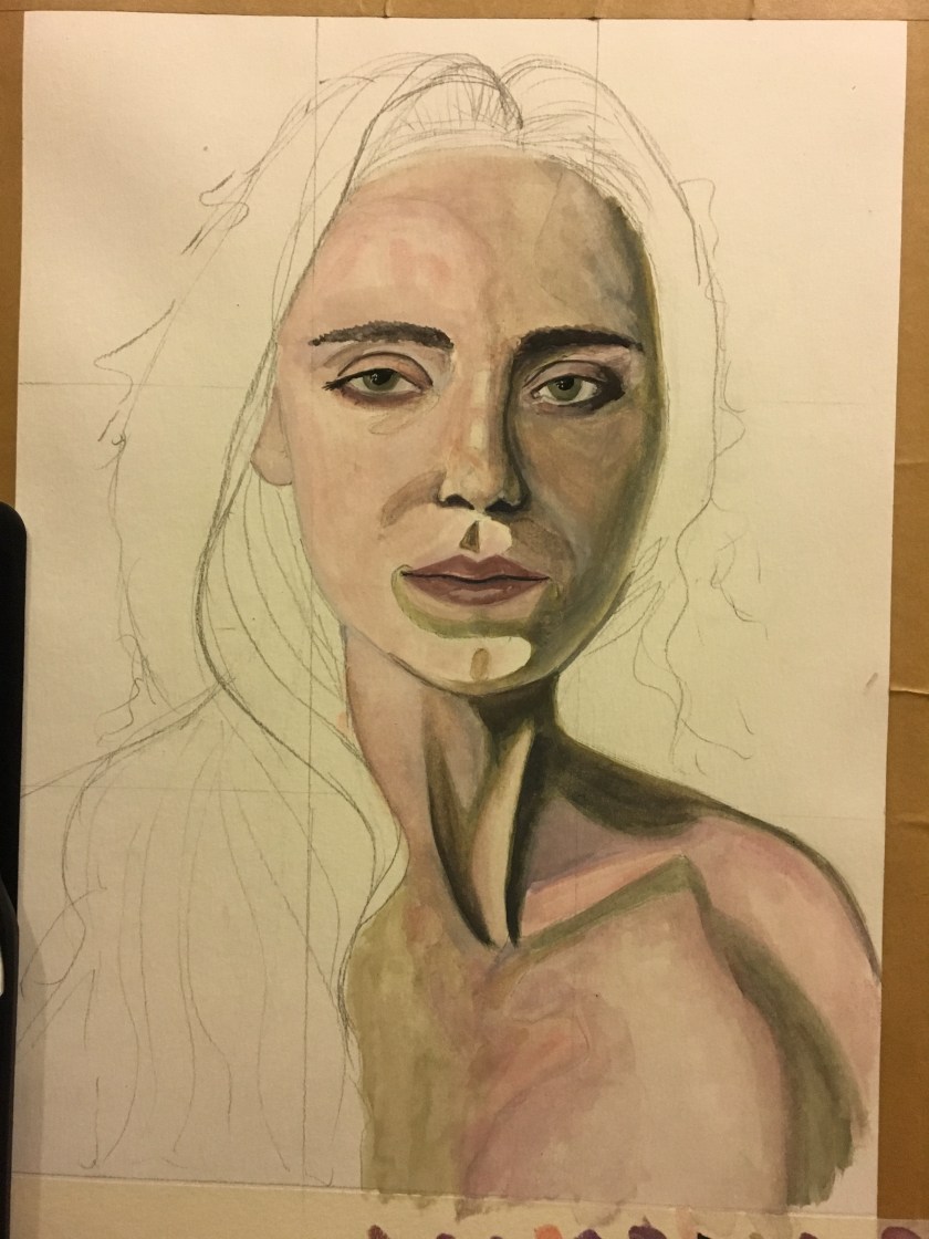
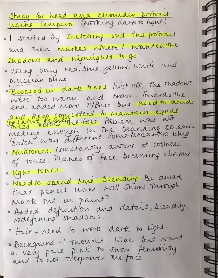
Between this tempera study above and the larger acrylic exercise below, the perspective had altered to become inaccurate. This will take some study and amending, but I will refer to the original study for positioning and line.
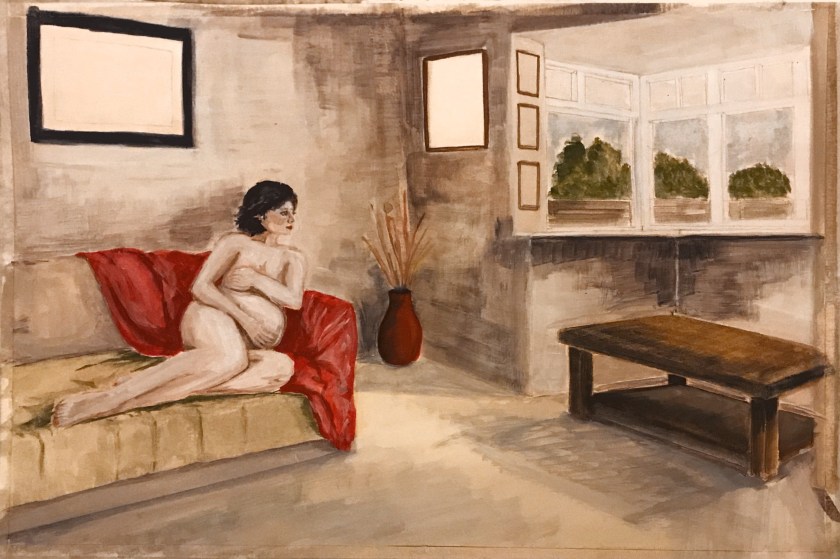
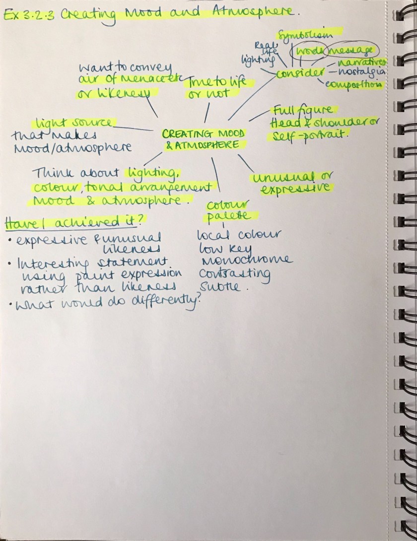
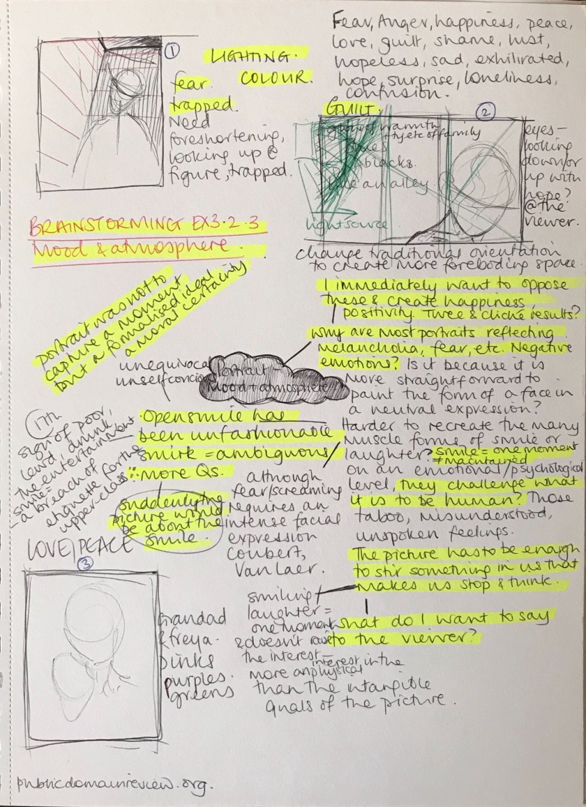
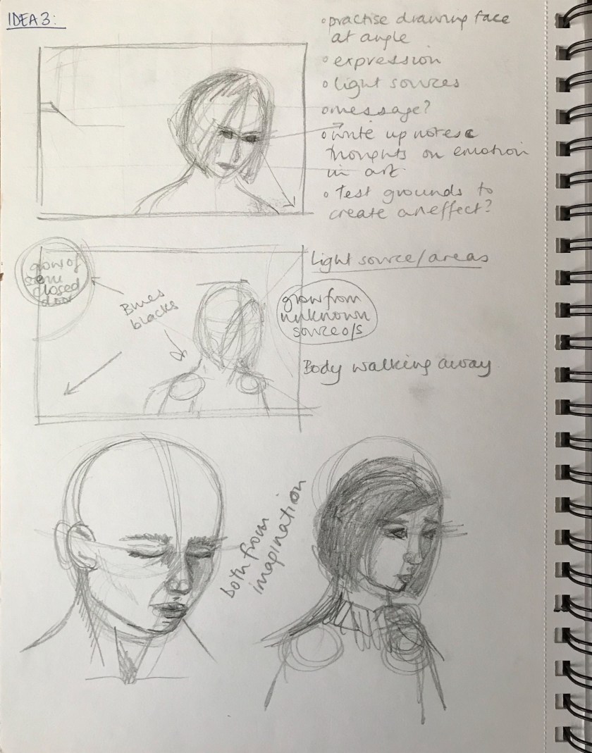
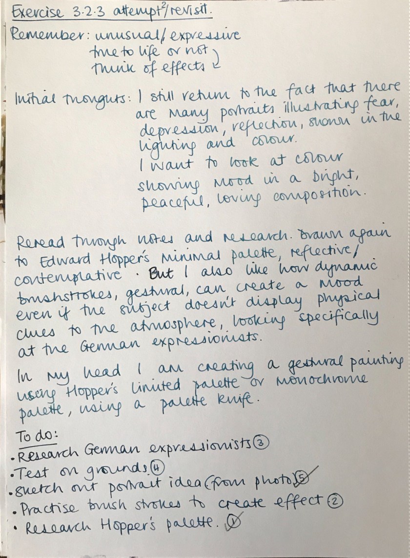
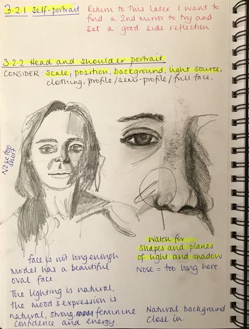
For this exercise you can choose to paint a full figure portrait, a head and shoulders portrait or a self-portrait. Your finished portrait should be unusual or expressive in some way. It can be true to life or not, depending on the effects you wish to achieve.
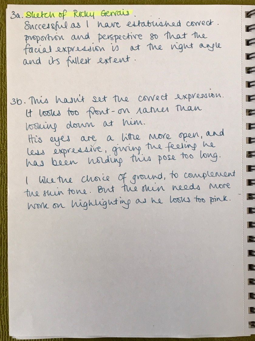
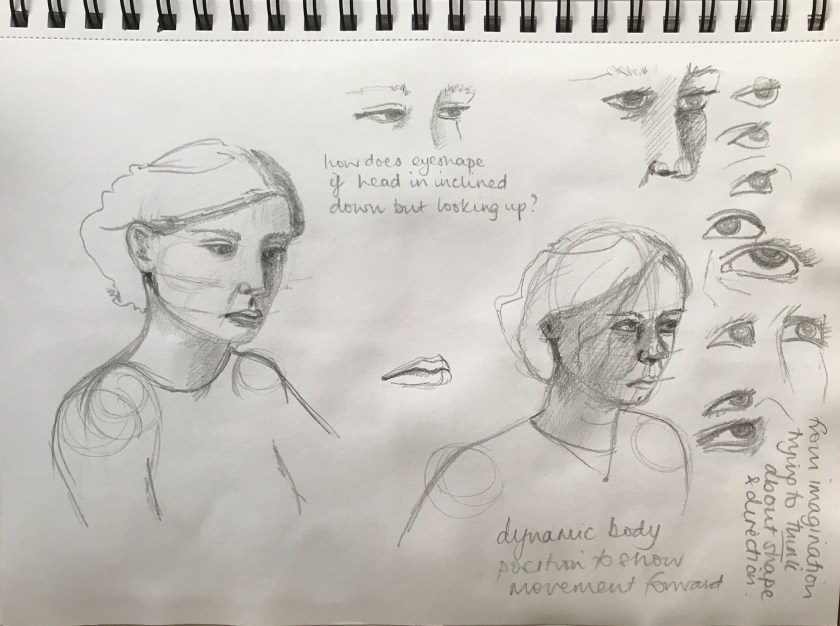
Decide what you’re trying to achieve at the outset and make some notes in your learning log.
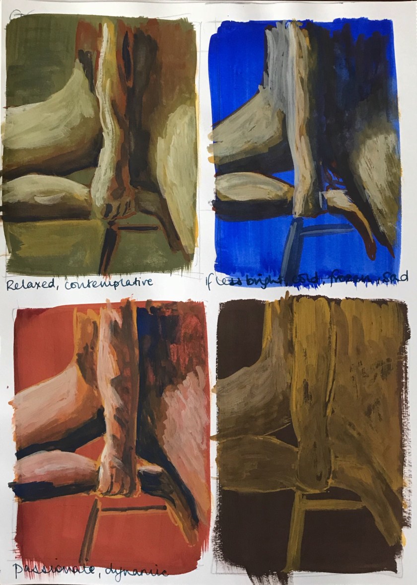
Next, decide on your light source as this will determine both the effect of solidity that you’re able to capture and convey mood and atmosphere.
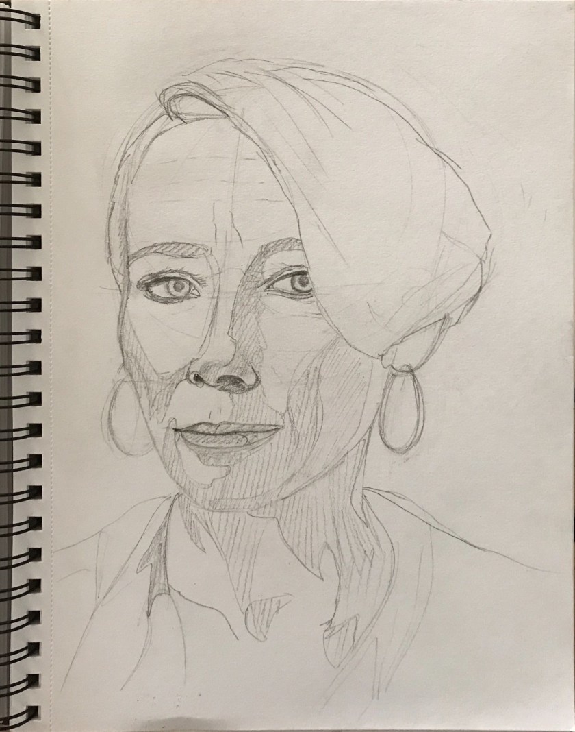
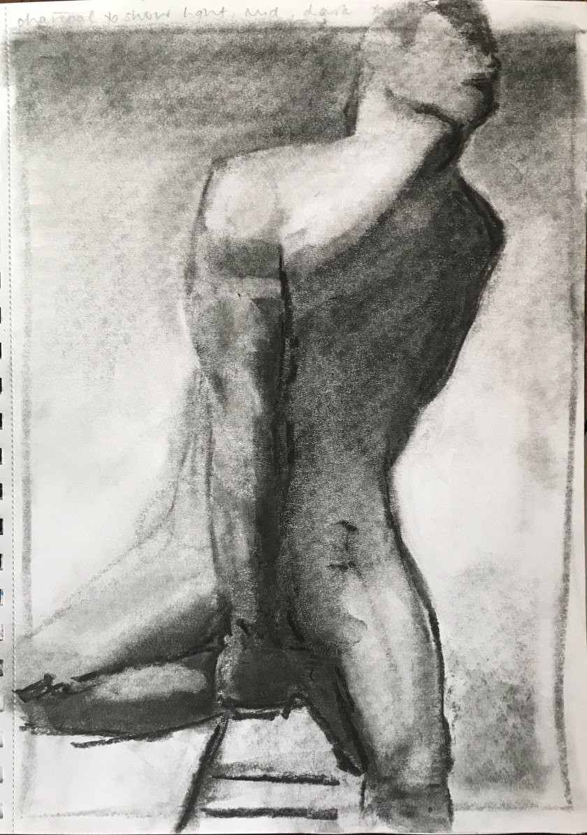
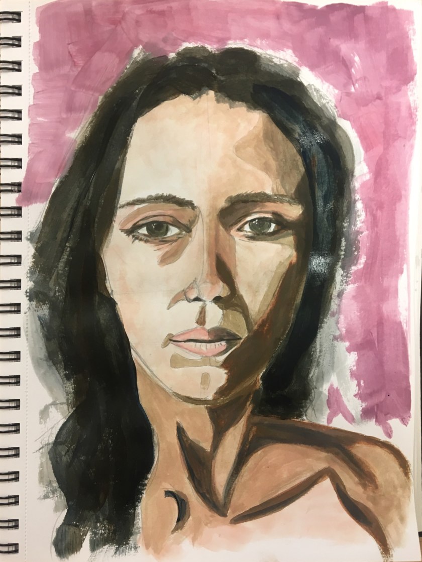
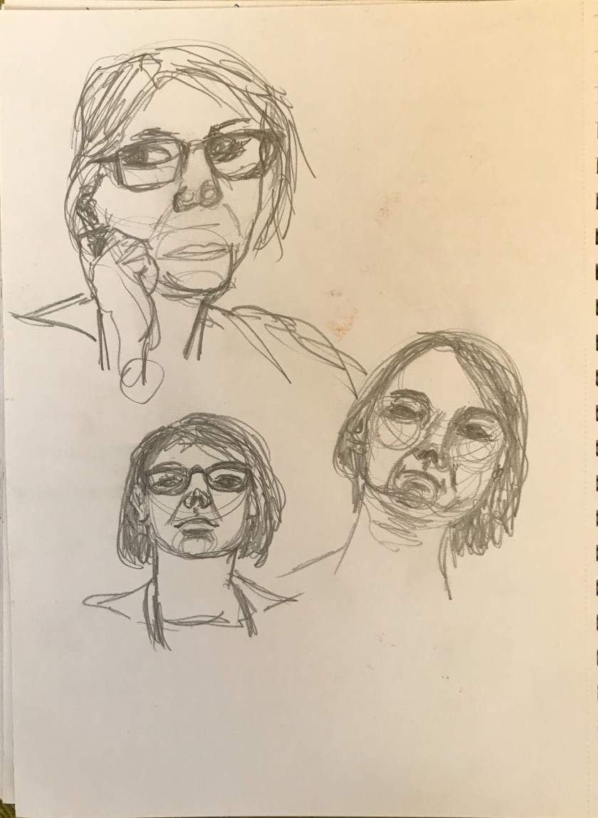
Sketchbook study portrait in gouache and then charcoal.It was easier to get the muscle definition and tone rather than paint
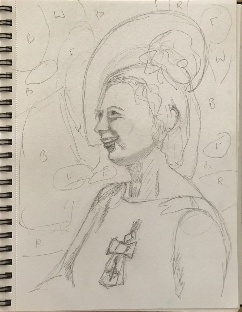
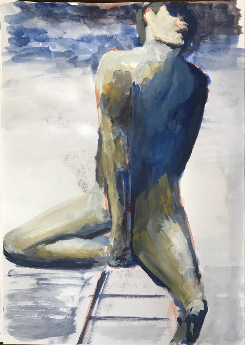
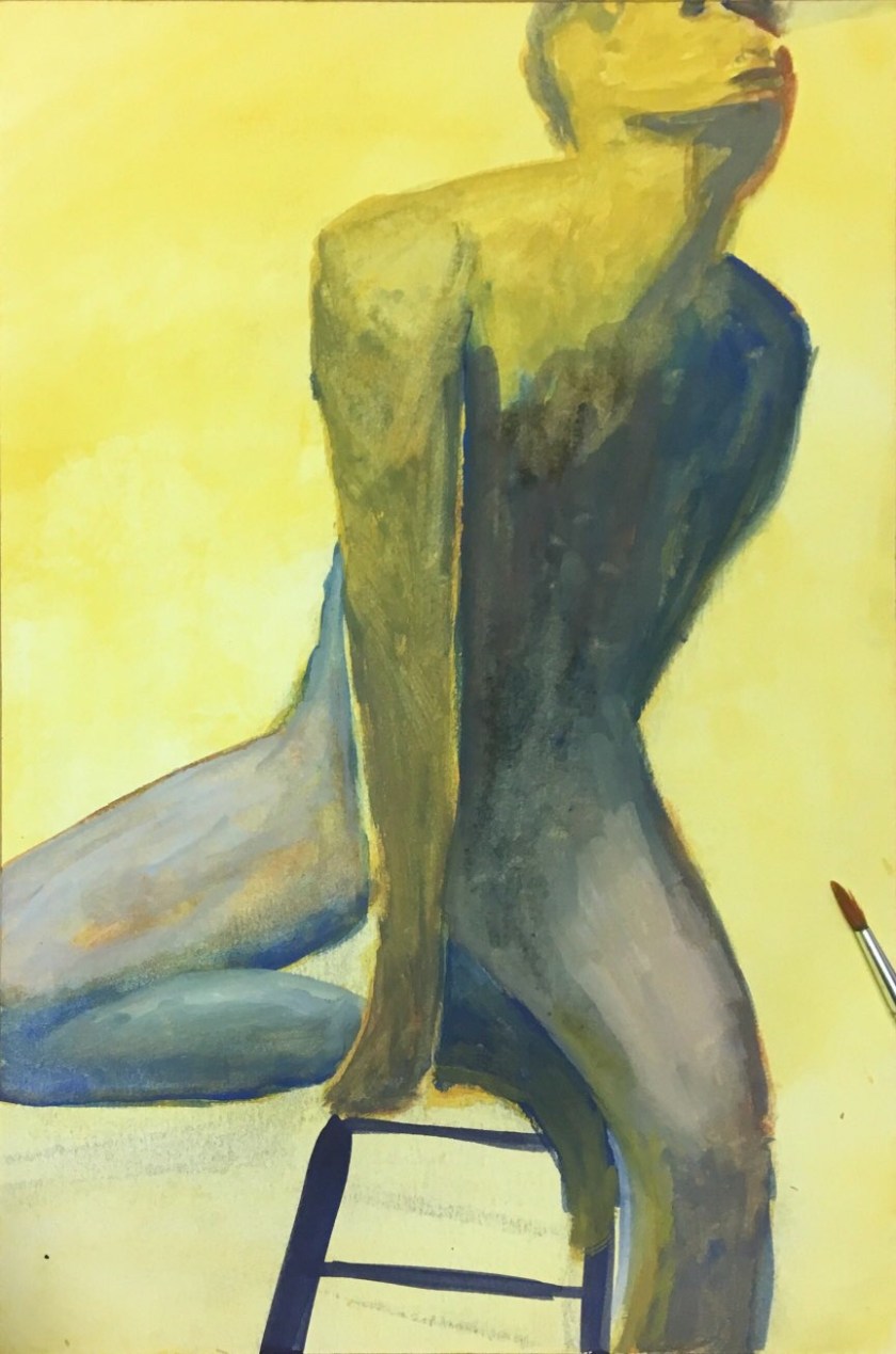
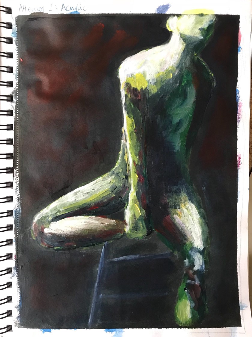
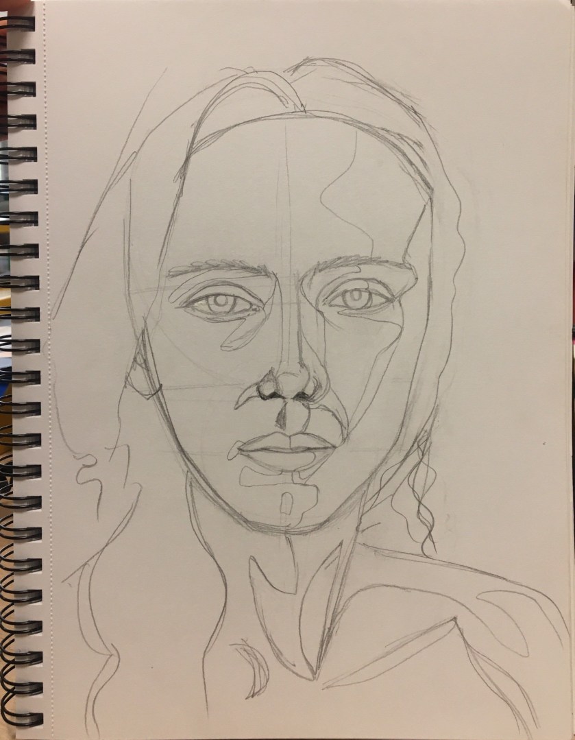
Attempt 2: Acrylic in sketchbook
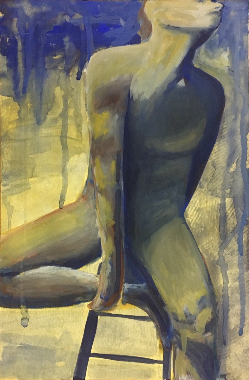
I really enjoyed the freedom of the mark making in the German Expressionist style. I understood how they sought to reflect inner feelings and emotional state through their colour choice and brushstrokes.
I want to know how to get that muscle definition I found using charcoal, without placing perfect brushstrokes.
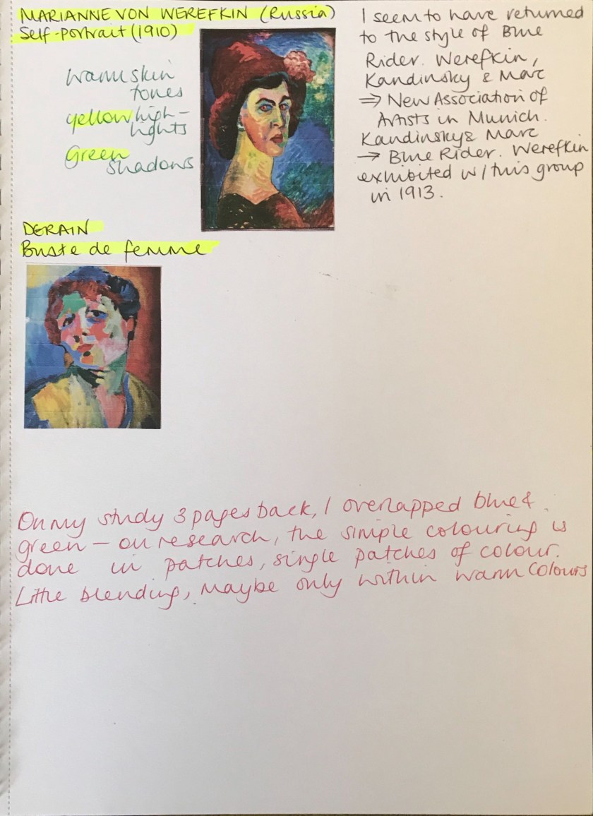
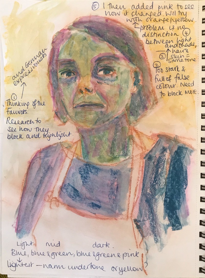
The more I look at the Fauvists and the German Expressionists, the more I am drawn to their use of brushstroke and colour combination to evoke a sometimes intense. jarring feel, reflecting the emotion and anxious reality of that time in history.
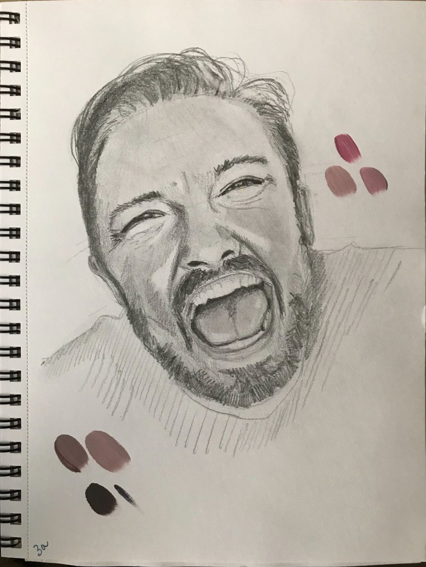
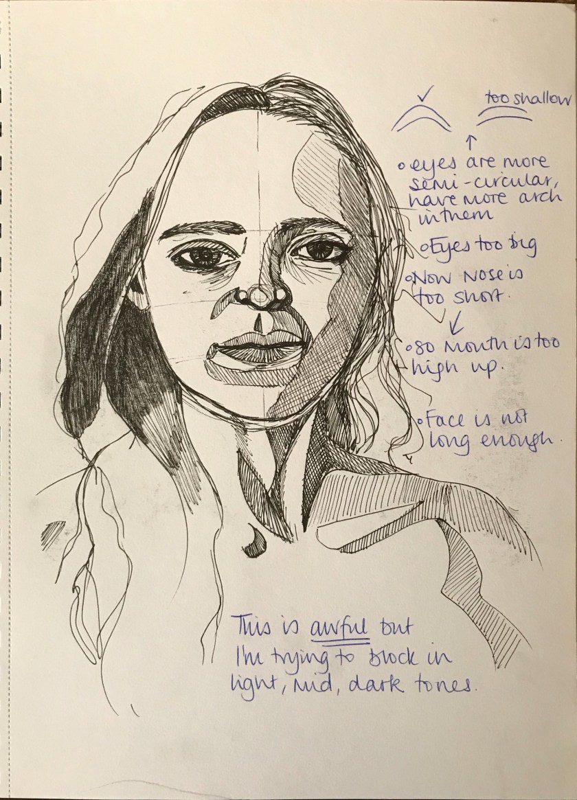
I thought I’d try out a study in my sketchbook expecting this to be the only attempt so that I could quickly move on (I have a tight schedule on this course). However, I knew I could do better and so figured it what I needed to improve and work on and then apply it to a larger attempt.
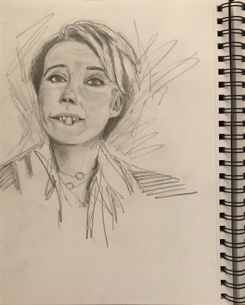
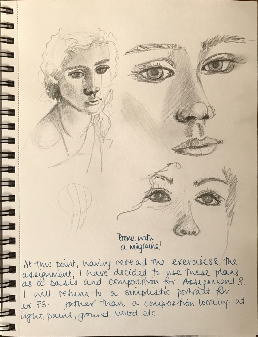
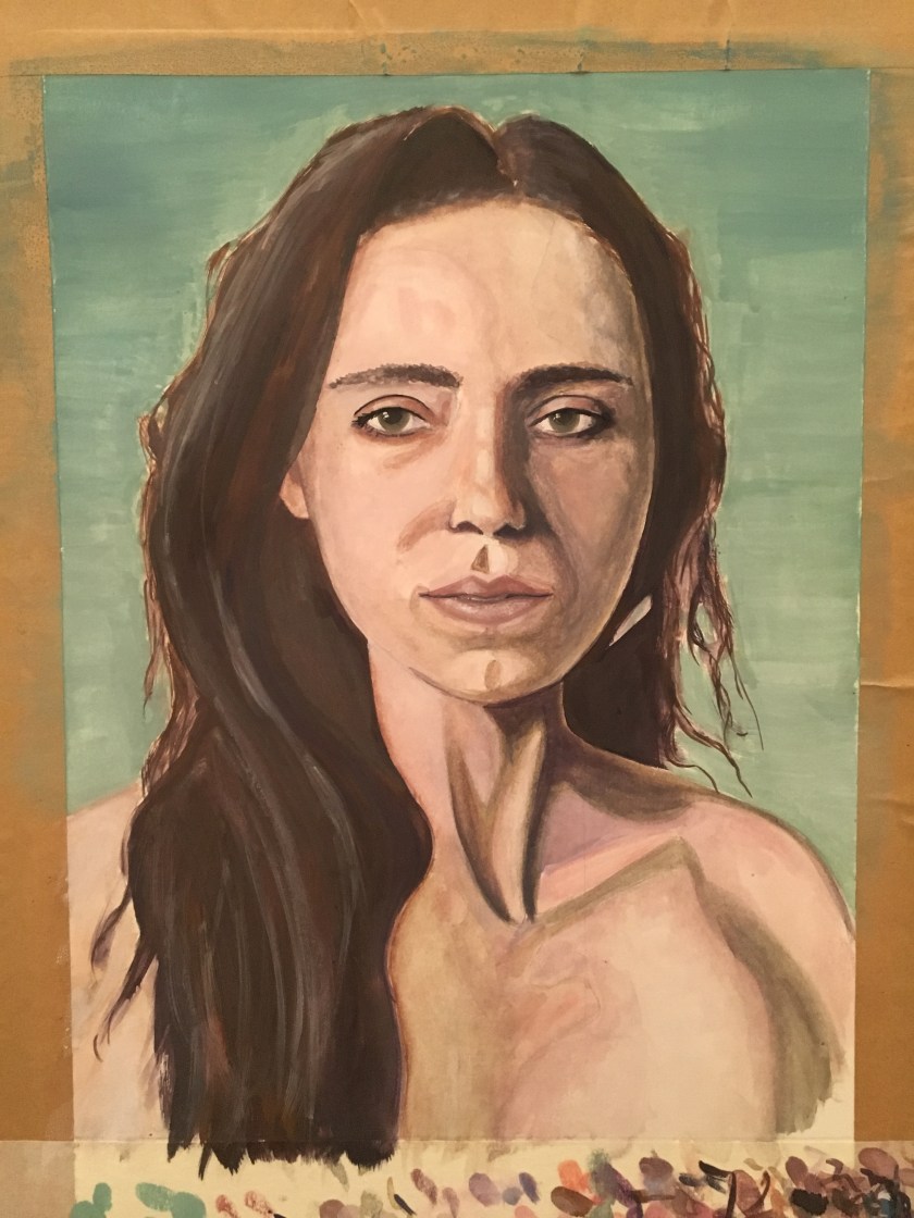
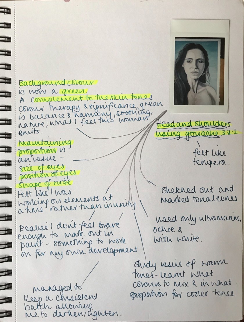
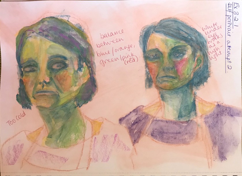
I need to work on proportion and sizing (eyes especially), making sure I vary the tones more and keeping the values consistent with an original skin tone.
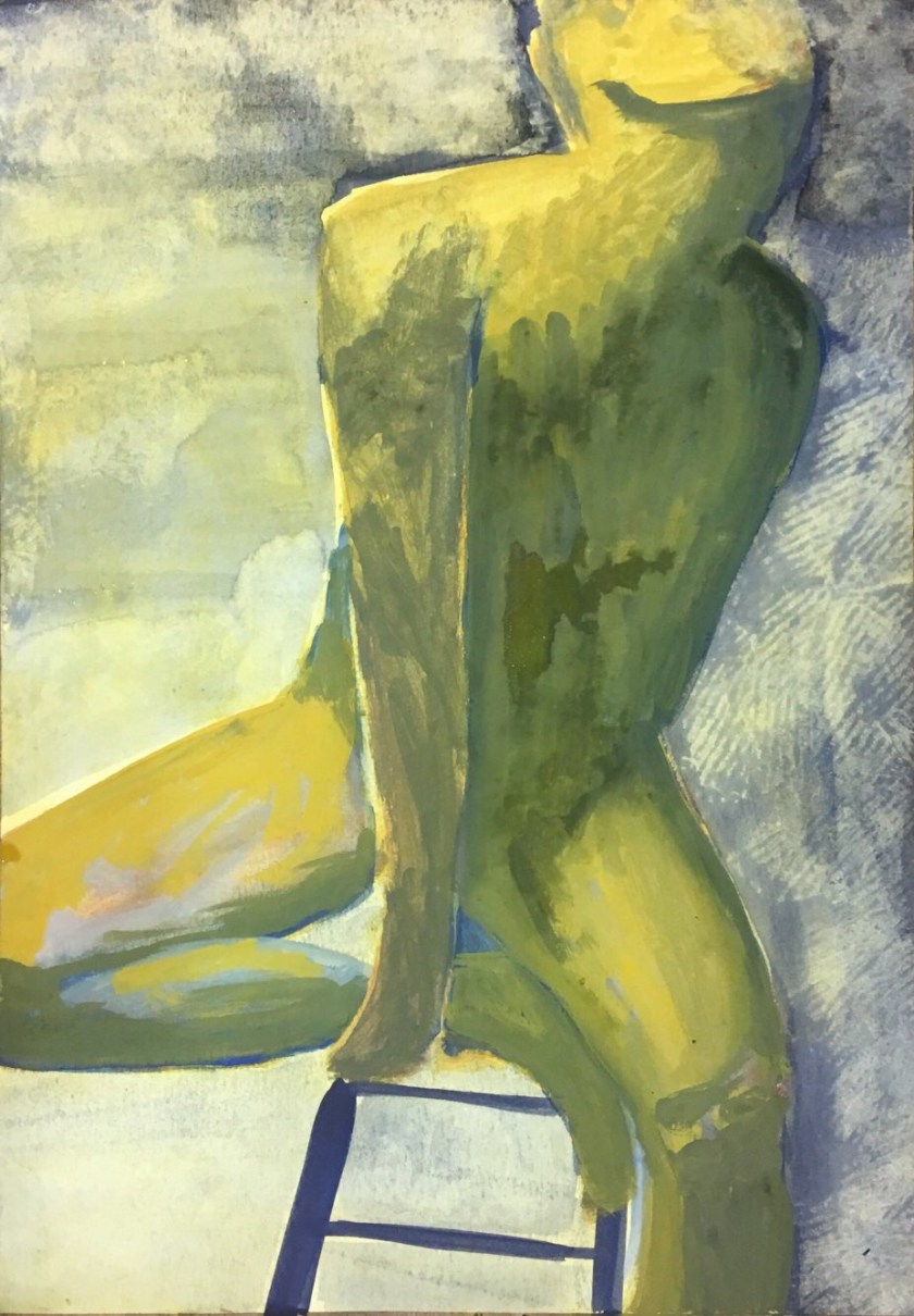
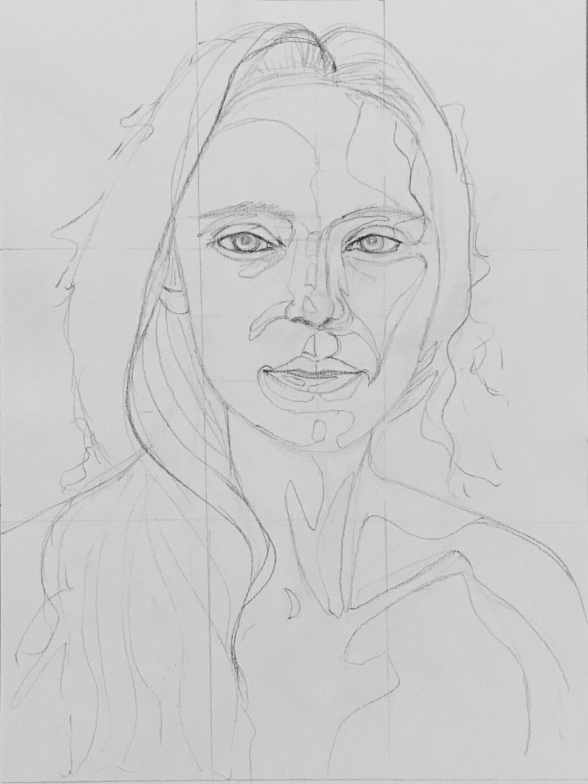
This marking out allowed me time to plan more areas for tonal variation. By this time I felt tuned into the subject and facial features. I noticed freckles and lines and additional shadows I hadn’t noticed before.
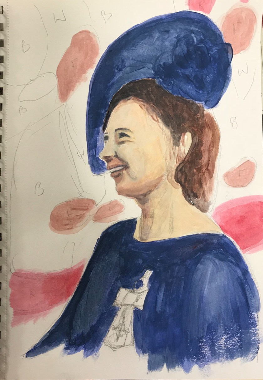
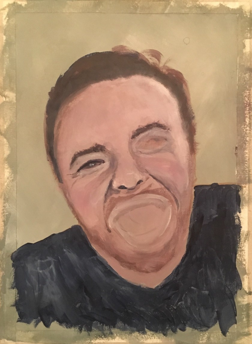
Between sketching out and filling in with paint, the eyes had changed shape. This was frustrating. However, I was really happy with the dark and mid tones at this stage. I found myself adding detail too soon as I was desperate to see it look real for me to be happy and continue. Next time I would block it all in and then build detail in.
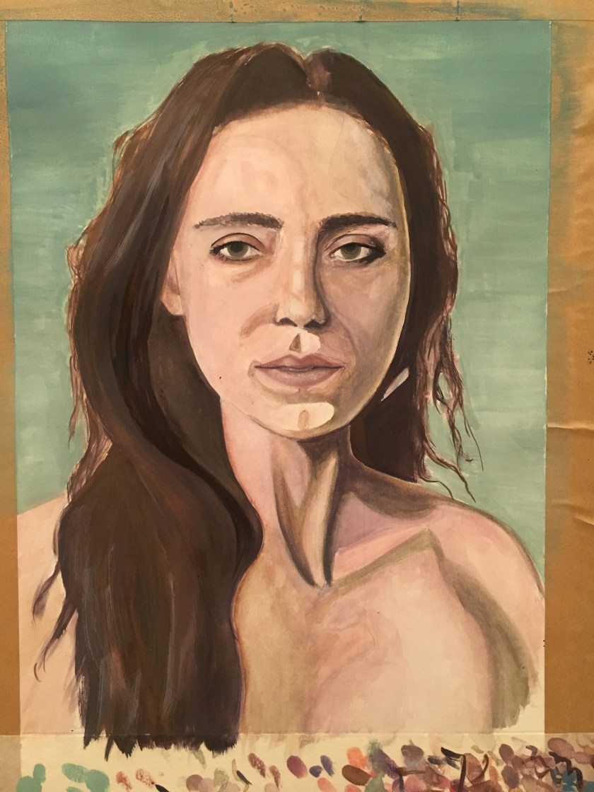
At this point I walked away and gave it chance, taking photographs so I could assess what I needed to amend – eye shape and detail, hair tones, definition and colours. I definitely need to work on hair. I chose a bluey green to complement the skin tone but also to represent the naturalness and peace of the woman.
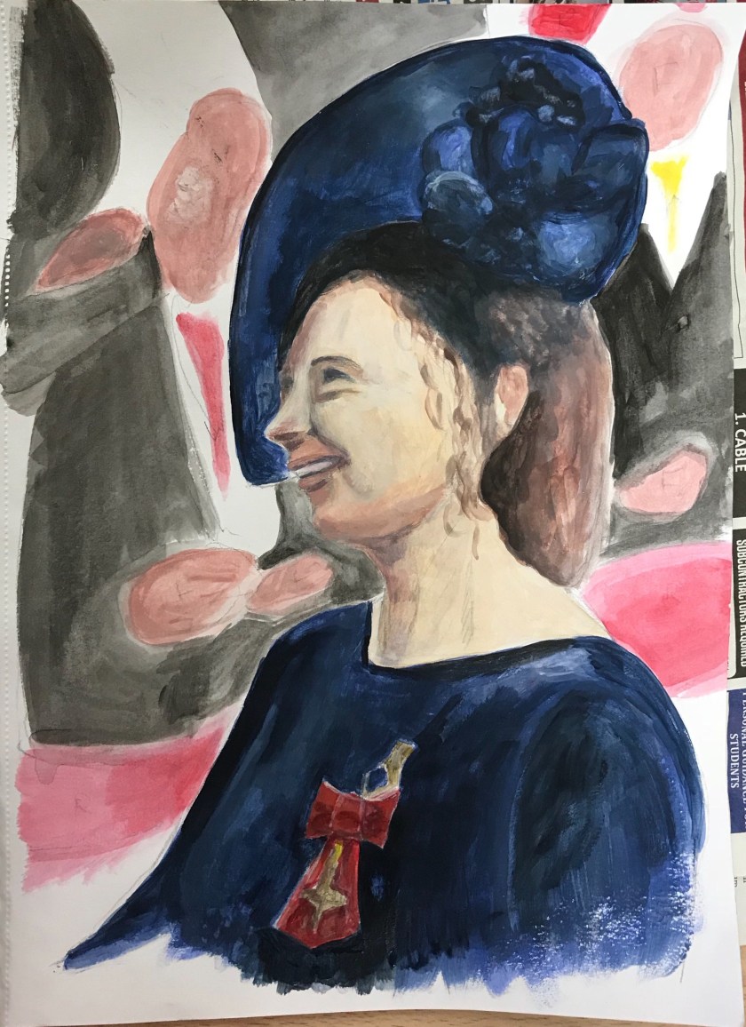
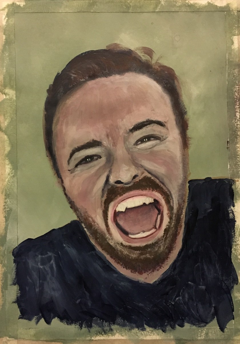
If I was to revisit this, I would work on the centre neck sinews. There is too much contrast and it is distracting. I would work to blend the defining lines a little more.
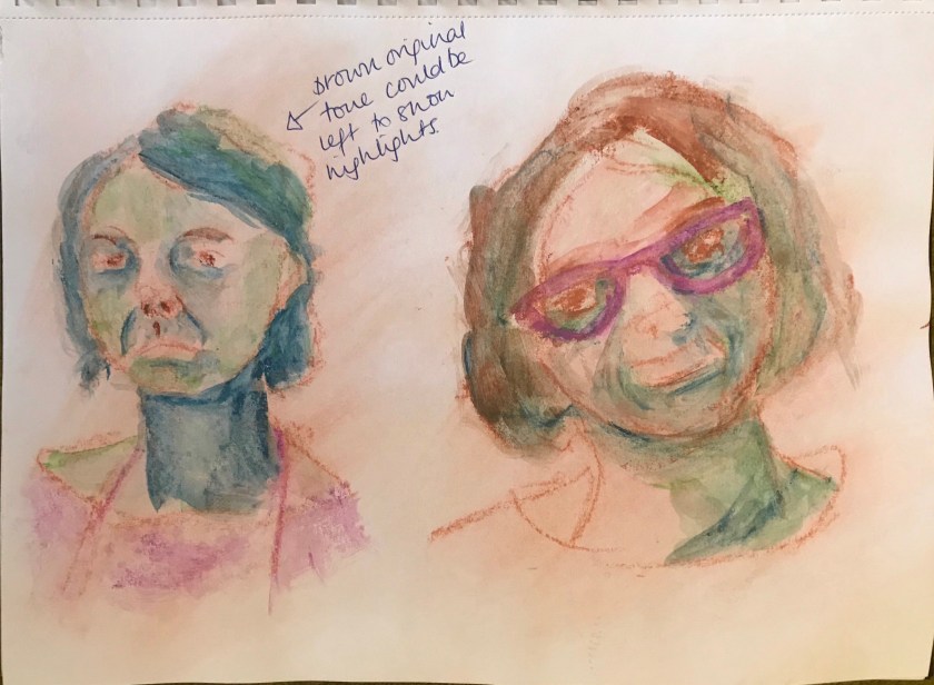
This first painted pastel study was purely experimental, and spontaneous. As I was working and choosing colour, I thought of the Fauvists and the German Expressionists. My link to research here.
In my next attempts for the exercise I will consider more what I am trying to convey, light source, different ways colours to highlight and shade according to my research and also composition and use of space.
This always happens but the one thing I was putting off actually became really enjoyable – even if it was the techniques and colour I was applying that made it so. Further practise will become preparation for my assignment 3