
Author: talymitchell
A primary school teacher, currently in the Middle East. Teaching children has put me on a new path of not just teaching Art as a specialism, but also a new learning journey of my own. I am aiming for a BA in Painting but just enjoying the ride for now.
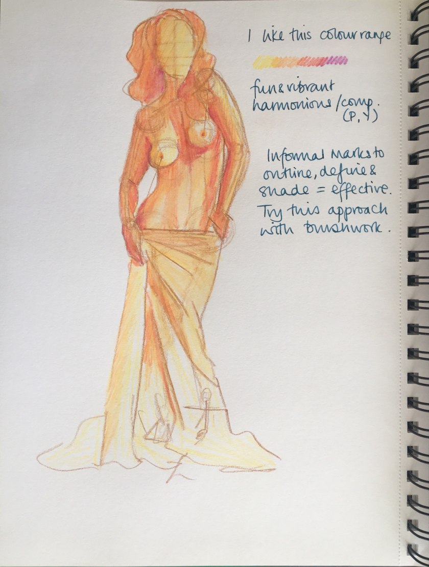
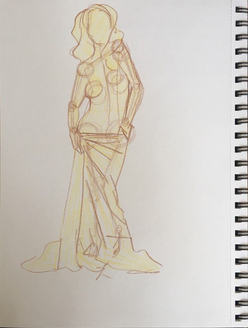
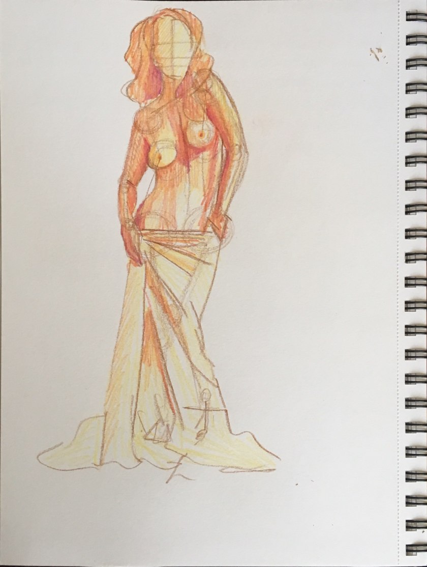
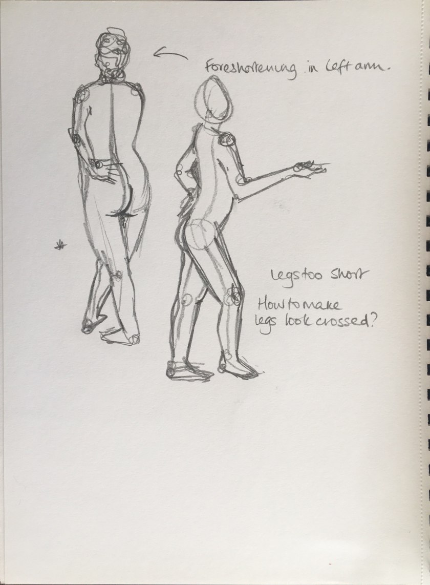
P3.1.2 – Linear Figure Study
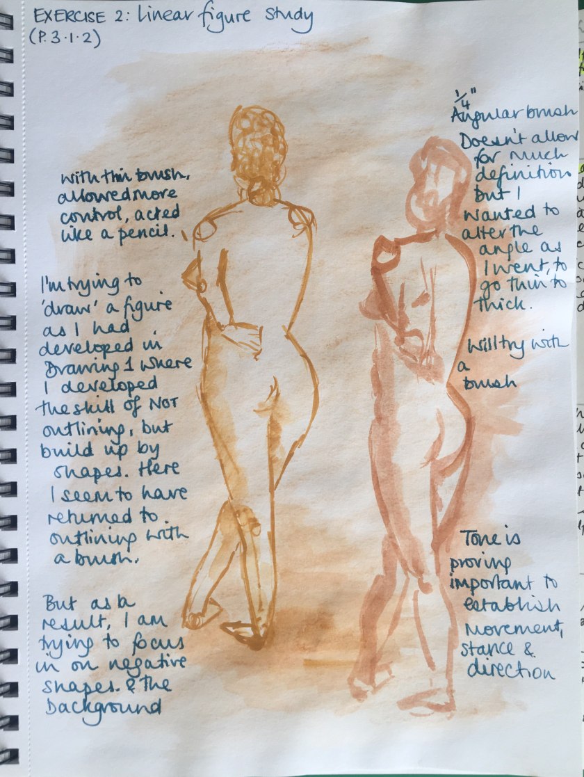
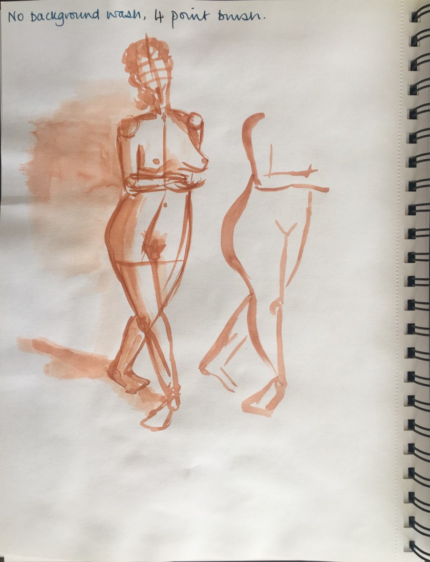 I like working with the line of action and watching how the figure and limbs move from this. The angle of the outline and possible foreshortening is necessary to show lean and poise; the feet highlight this.
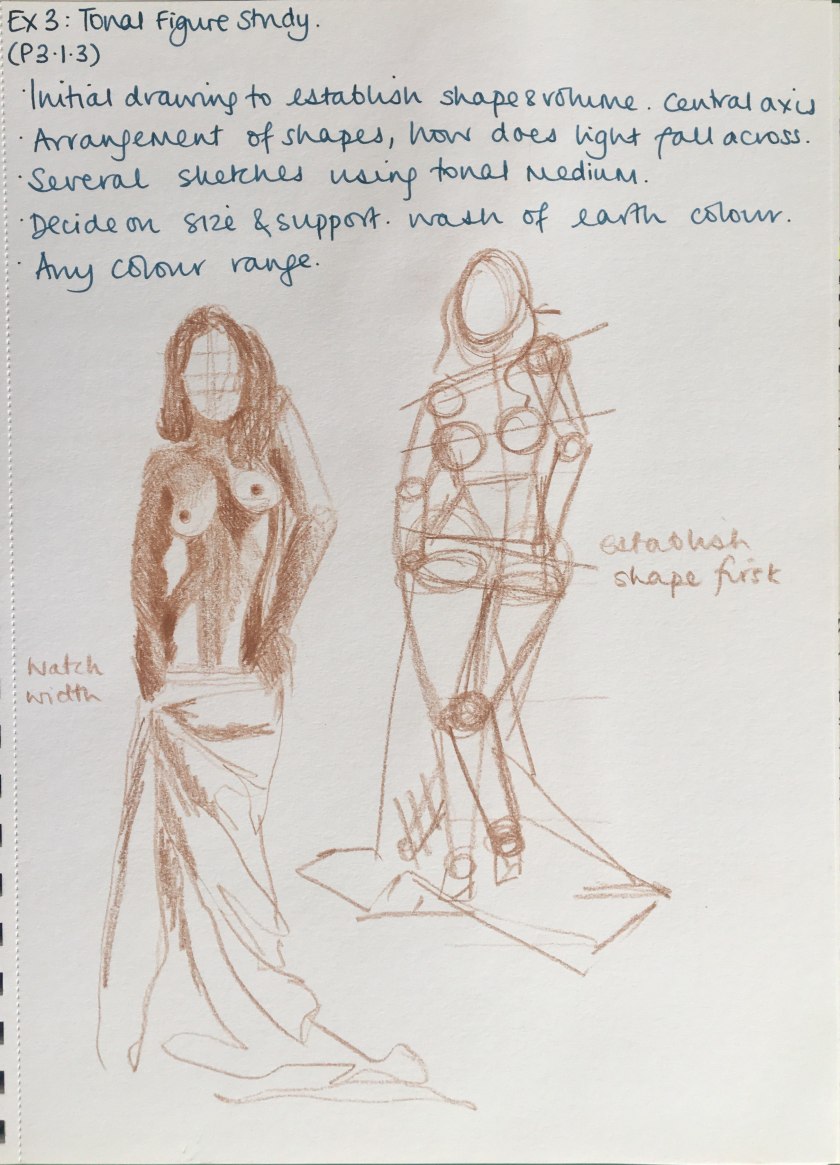
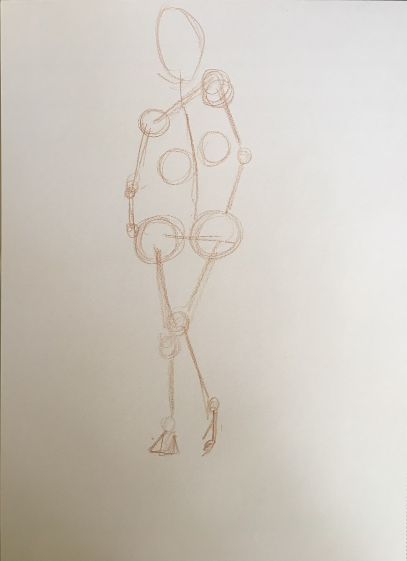
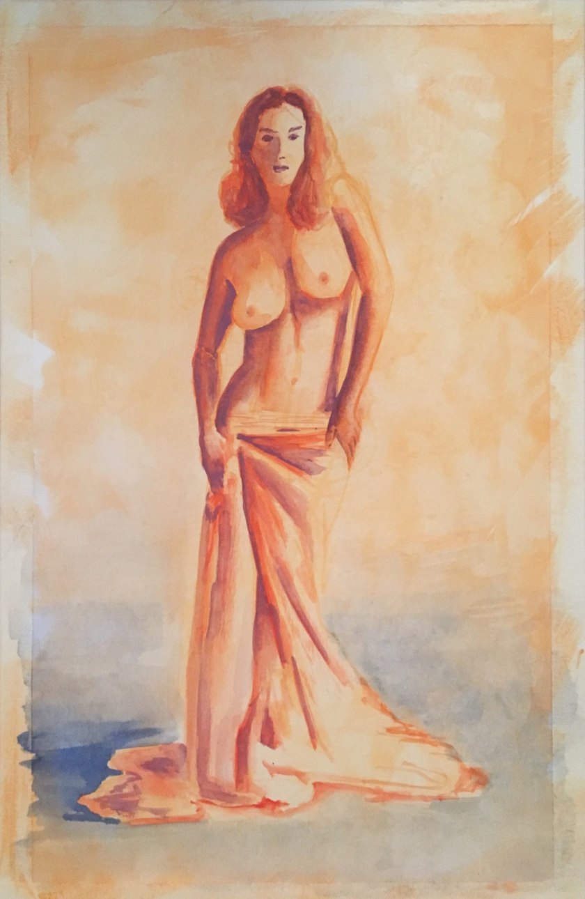
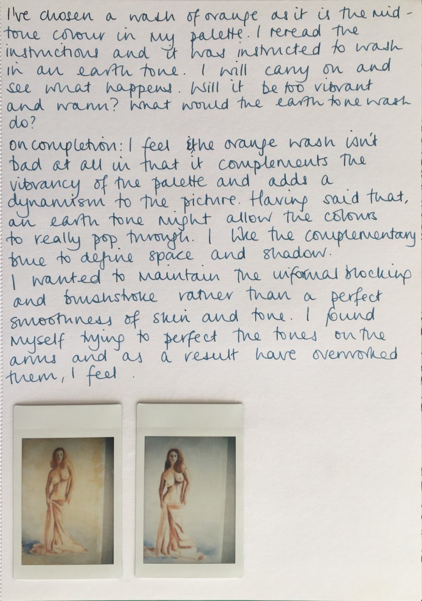
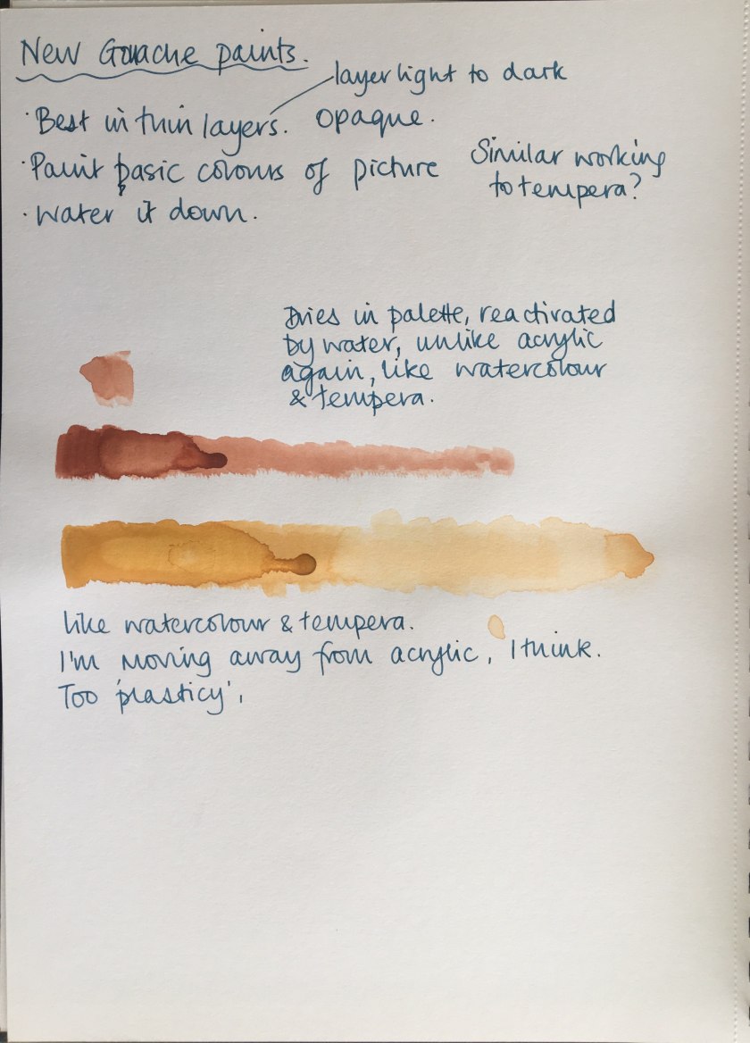
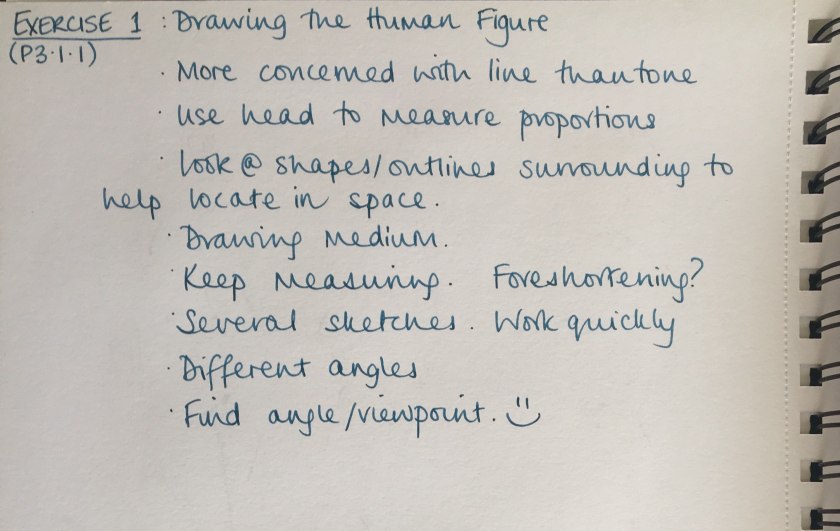
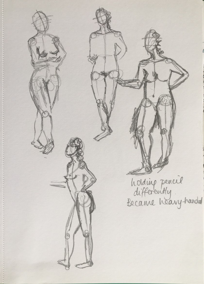
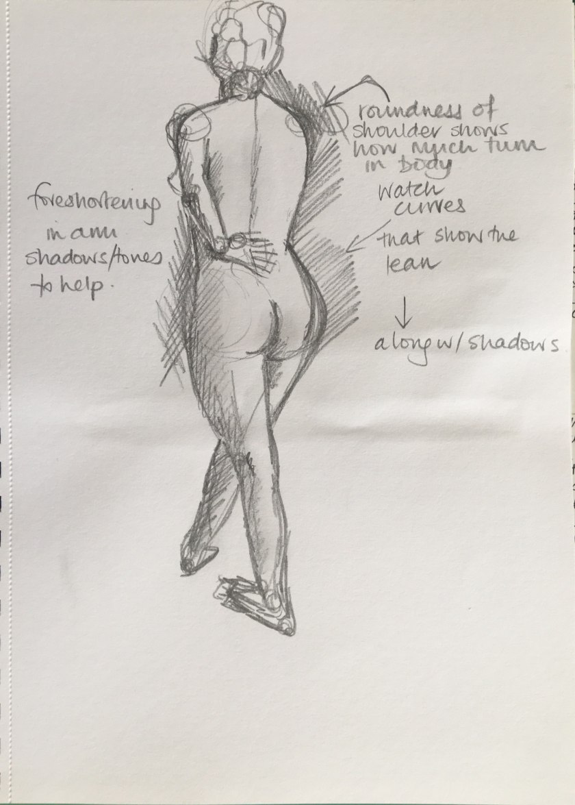
P3.1.1 – Drawing the Human Figure
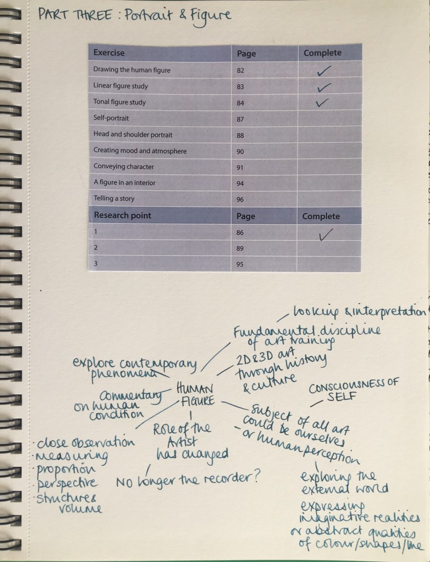
Part 3 Portrait and Figure
Assignment 2 and reflection
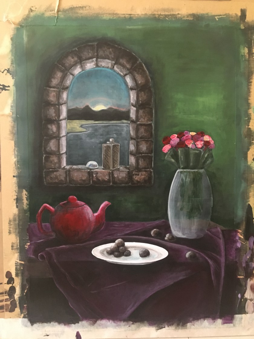
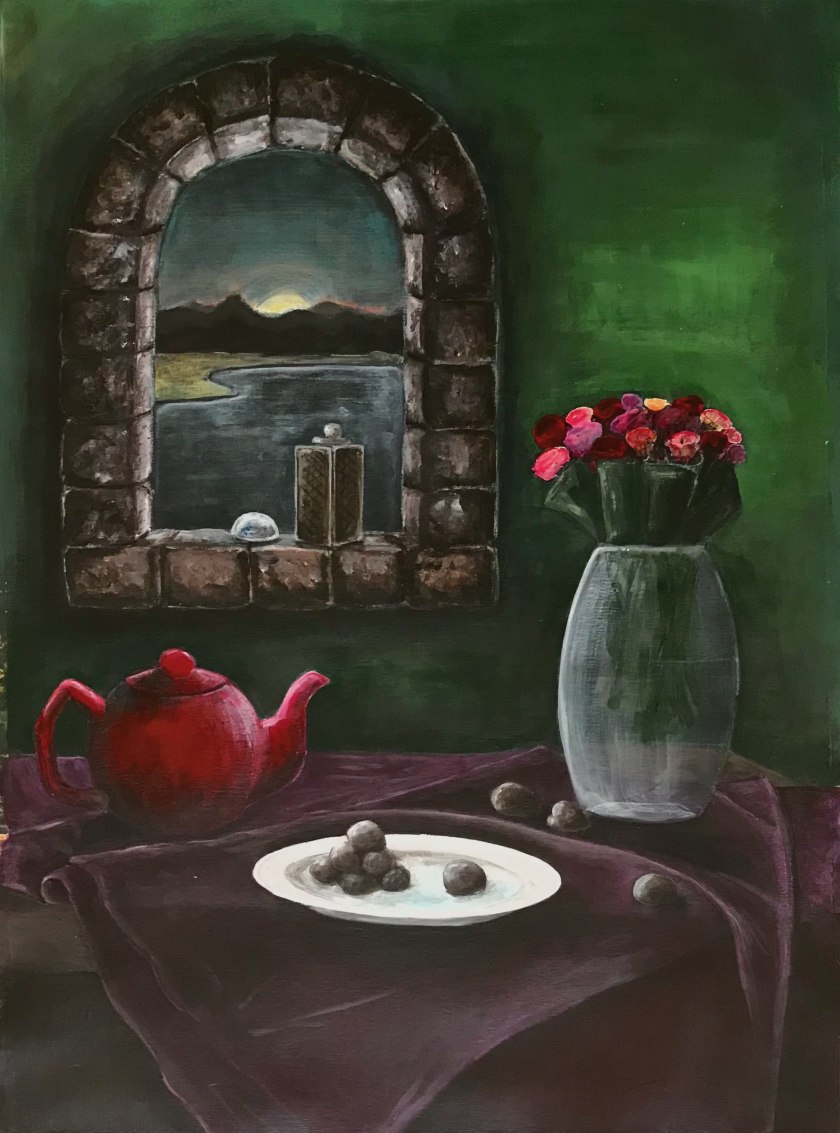
This still life was inspired by the incredible skills and arrangements of the Dutch Golden Age painters. I have been in awe of their richness and detail and am already a little concerned that the perfectionist in me will struggle with making this picture become realistic without looking cartoony.


I initially enjoyed working on the fabric but ended up spending all my time on it. I had to move away from it. I was struggling with the making the tones looked realistic and accurate. I realise that I have probably made work for myself in making the painting up by referencing and observing only parts at a time.


As I have progressed through this piece, I think what I would do differently. A more cropped version is a possibility.


In the feedback given to Assignment 1 I made noisy brushstrokes on the stool holding the flower pot. I remember thinking I liked the effect as it was a rough wooden trunk. Looking at it, it seems that it was a noisy effect across the whole picture. I thought this was a more relaxed, fluid approach that some artists have, with brushstrokes being visible. Maybe it was the texture of the paper making the noise. I think I have avoided that in Assignment 2 with smooth working and texture across the most part.
Looking back over the process of this painting, I see I have lost myself in each element and although I think I have flowed from one to the other in my composition, it feels disjointed to me. I could work on several aspects differently if I were to try this again. For a start, I would relax more. This took some time as I was constantly observing my still life elements in parts. Looking at the photograph of my painting I see that I need to add more shading on the flowers, leaves and the lantern and mountain shadow on the beach. I need to work on the glass vase as well. The perspective on the window stones is glaring at me. I think I could have made the window aperture bigger. With an infinite amount of time I could work on this continuously to amend and perfect. I will spend one more session amending and will call it a day.
I added a dark translucent wash over the blue sky as well as the beach.
Assignment 2 – preparation
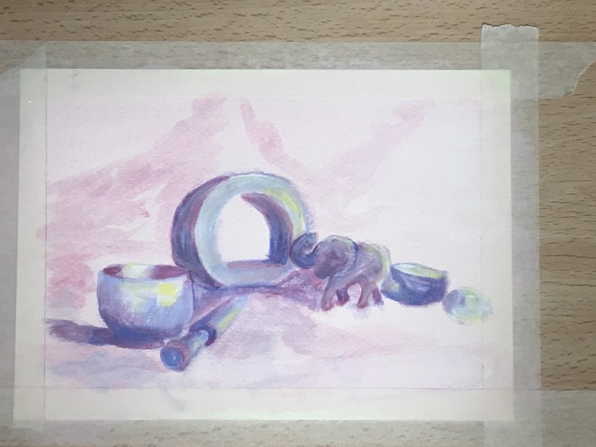
Idea 1 development


Idea 3 development


So at this stage I am happy with the composition, in that the eye should flow around from the window frame inwards and out to the mountains. I am however, struggling with the perspective of the window stones. This picture has evolved from a combination of imagination and reality and, although much of it will be referenced, some parts have had to develop from processing the view in my mind.

I sometimes experiment digitally to establish composition and colour plans. It seems to be a more time-efficient tool for planning.


Assignment 1 feedback
My comments in blue.
PART ONE What Paint Can Do
Overall Comments
PROJECT 1 Basic Paint Application
E1) Getting to know your brushes
You have made some interesting marks. This is a good opening to an exploration, however, you have not taken it any further.
E2) Applying paint without brushes
Again – you have made some interesting marks but have not taken the investigation very far, or considered the merits/difficulties of the different applicators.
E3) Painting with pastels
There is something rather rhythmical about this drawing. However, you have not explored, or analysed, or identified any learning that has taken place – so I am not sure you have gained anything from this exercise.
PROJECT 2 Transparent and Opaque
E1) Tonally graded wash E2) Overlaying washes E3) Opaque colour mixing
You have identified some of the challenges and some of the effects of the different ways of using layers to make transitional tones. However, I did not see much progress made in the exercise.
E4) Monochrome studies
Here you explored the idea a little further – looking at the difference using opaque paint and washes – well done.
All of these exercises are worth coming back to at different times to improve your control of the media you are using.
I acknowledge the above exercises in Projects 1 and 2 show minimal work and little progression. I think this is for a couple of reasons; 1) I am conscious of the tight time scale I have and 2) I am always playing and mark-making with the children in class so I know I have it in my head and ability. I understand that this does not reflect in my work and I have not shown work that reflects this ability. I think there is an element of restrictiveness in the exercises; I know that when it comes to it and I am experimenting under my own steam, I am able to show development.
PROJECT 3 Working on different coloured grounds
E1) Tonal study on white ground E2) Tonal study on a dark ground
You carried out a good comparison of painting the same subject on two different grounds – well done. Both show a fair competence in proportion and tonal relationships, but your paint application is a little brutal, and your colour choices quite stark. I was working on the exercise requirement of two low-key colours, earth shades and Payne’s Grey being suggested. Maybe I need to soften and harmonise my choices. You have managed to get a good solid sense of the book (or box?) but there is little evidence of close or considered observation. This is fine as you are at the beginning of this course – however, I would suggest you learn how to pay more attention to tonal relationships, colour relationships, and hard/soft edge relationships – this will help you gain more sophistication with your work.
Also – you have made no commentary on this exercise. Acknowledged. I think I am getting better at that, both written in my sketchbook and linked on my blog. The reflection that you make after each exercise is as important as the exercise itself. This is where you clarify the learning that is taking place, the challenges that you have come across, what it is that you are enjoying the most, what you are finding difficult. For instance here specifically – what was the difference between painting on a dark or a light ground? You have an idea in your head, but having to articulate these ideas in coherent sentences will force you to consider these things much more specifically, and this will help you know what it is you need to do next.
Feedback on assignment
You made quite few preliminary sketches and a little exploration in colour. This is good but I feel you could have gained more from the work. Your idea of quite a stark, cropped
composition is fine, but you didn’t consider even slightly different compositional choices – for instance, the horizontal line is a dominant aspect of the piece, would it make a difference if it were slightly lower or higher? the size of the plant? how much space in front of the sofa?
The three purple shapes – what would it be if they were slightly different hues? There are
many many more choices, each with their own effect on the final piece.
Everybody works slightly differently – some people like to have all their decisions worked out before they start the final piece, other people want to make the decisions as they proceed through the piece. You need to experience different ways of working in order to find which is your preferred manner of working. However, you need to make yourself aware of what you are doing and why you are doing it. If you want to make preliminary drawings, ask yourself – ‘what am I wanting to find out?’ This will help you become more focused with what you do.
Having the magenta ground was a good decision I feel. And working from rough, generalised shapes to more specific, developed shapes allowed you to adjust the colours as you wished.
The final piece has quite a modern feel to it, with objects clearly defined in their own space. Your colour combinations – browns, greens, and purples with the white and black are a good choice. However, the exact hues you have chosen fall a little flat in relation to each other and they have become a little dull. This take experience and practice to find the exact colours that ‘sing’ together – the slightest change in hue, intensity or value can make all the difference.
You have worked hard to simplify the composition and the description of each of the objects and this works well. To push this modern feel further however you also need to think about your paint application – for instance the stool holding the plant pot has a lot of ‘noisy’ marks for no real reason. You also need to be constantly aware of the relationships of effects – for instance the zebra throw on the sofa could be very effective but it doesn’t read well because there is no modelling at it’s edge to soften the effect of the strong black/white contrast.
You managed to ‘fix’ the horizontal line – good for you. However did you consider the effect of having the plant touch the line, rather than being well under it or over it? Just touching has the effect of bringing the plant and the line into the same space and so flattens the depiction of actual space between them. Some artists use the effect purposefully – are you? and if so for what reason?
I think this piece has quite a lot of potential but things need to be pushed further in order to deliver it.
Sketchbooks
Please put up a new heading on you blog called ‘sketchbook work’ and upload images from your sketchbook so I can see how you are developing here. Done – already linked as ‘Coursework’ but renamed.
This first course is about organising yourself to capture as much of your learning as possible and to provide yourself with spaces designed specifically by you, for you to be as creative as possible. Your sketchbooks are an important part of this aspect.
• You need a place to keep all the drawings you make for the various exercises with each of the assignments. I make sketchbooks out of the larger pieces of paper.
• You need a place to collect all the experimentation you carry out with different media – this may require written notes alongside to remind you of what you were trying to achieve or what you learnt. I have an initial workbook as well.
• You need a place where you can jot down quick visual responses to things you see
around you, as you are on the go – this would probably be a very small sketchbook that
fits easily in a pocket or bag. Initial workbook
• You need a place to collect anything that you come across that you find visually
compelling – often you see something but don’t have the time to do anything with it right
at that moment – you need place where you can collect these things to look at later when
you do have time.
• You need a ‘you-friendly’ space where you can let all these different inputs come together – a place that is just for you, where you can doodle, study, experiment, try out an idea, see what happens, mingle and mix things – whatever it is – a place where you can be creative without needing to get to a successful outcome. This is a very important space – it’s a place where your intuition, your inclination, and your will, can meet – a place that allows you to discover who you are as an artist (this is not always the same as who you are as a person).
How you organise your sketchbooks to make sure you cover all these aspects is up to you.
Each person is different in the way they work. It is important that you organise it in a way that suits you best and is the most useful for your own personal needs. You may not get it right straight away – don’t be afraid to change how you set up. What is important is that it works best for you.
Research
Your research seems to be very distant from your own personal responses to the work you are looking at – almost as if you are simply copying and pasting somebody else’s summary of the work. Engaging with the work yourself is a very important part of the research element of this course. It is here that you will gain an understanding of how artworks operate and what your particular taste is. It is also a chance for you to explore solutions other artists have found for the various challenges of painting. When you look at artwork of others analyse:
The technical content – how line, tone, marks, colour, composition, etc. have been used to
convey convincing forms.
The emotional content – how technique and imagery have been combined to deliver an
emotional content. The meaning and conceptual content – is there something beyond the technical and emotional content that is being delivered? If so what is it and how is the artist managing to convey it?
The impact it is having on you – positive or negative, what are your immediate responses to the work you are looking at?
It is also a chance for you to contemplate where it is you might want your work to fit in. What kind of work attracts you the most? has the strongest impact on you? what kind of styles do you enjoy the most? what is the content that holds your attention the most?
Learning Logs or Blogs/Critical essays
The purpose of reflection is to capture your learning. Every exercise involves learning – by defining it you will ensure you retain it.
Part of this journey into making artwork is to discover who you are as an artist, how you like to work, and how to get the best out of yourself. Take the time, when you reflect in your log, to notice the way you approach challenges and overcome difficulties, what you find exciting and easy, what you find difficult or boring. You are your biggest resource and it is worth spending the time getting to know how you operate best/worst.
Suggested reading/viewing
Have a look at the work of:
Soheila Sokhanvari, a contemporary artist born in Iran, based in the UK.
Njideka Akunyili Crosby – a Nigerian artist (b 1983), living and working in New York,
Pointers for the next assignment
• Reflect on my written feedback in your learning log
• The next unit asks you to explore colour and colour theory. Think about your own taste in colour as well – what colour do you go for in clothes? in decor? what colours attract you in artworks?
• Make each exercise useful to your development and part of your exploration into what
interests you.
Well done Natalaie, I look forward to your next assignment.
PoP 2.4.1 – Quick sketches around the house
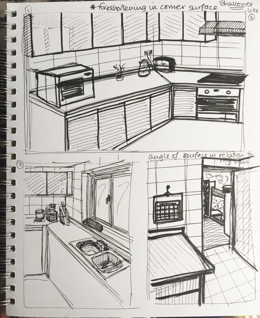
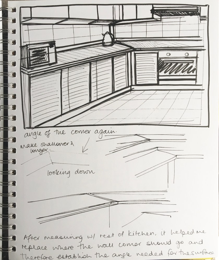
I finally got my eye in towards the end and with practise, I realised that measuring and triangulating helped me establish a much more accurate placement and angle. Rather than just draw the object, I found I was really watching how lines related to each other.
PoP Research 5 – Linear perspectives
Rather than reinvent the wheel I will place links to previous research I have looked at and completed in Drawing 1 along with additional research more relevant to Painting if necessary. This will be considered more in depth in Part 4.
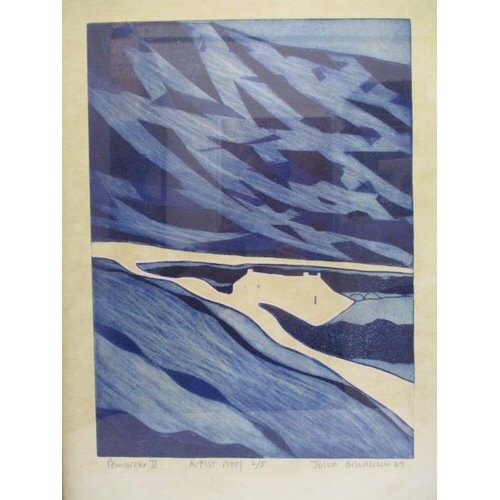
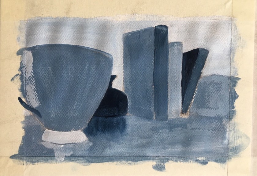
PoP 2.3.5 – Still life with colour to evoke mood
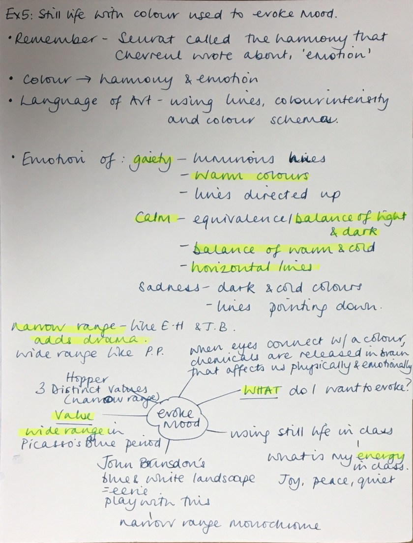
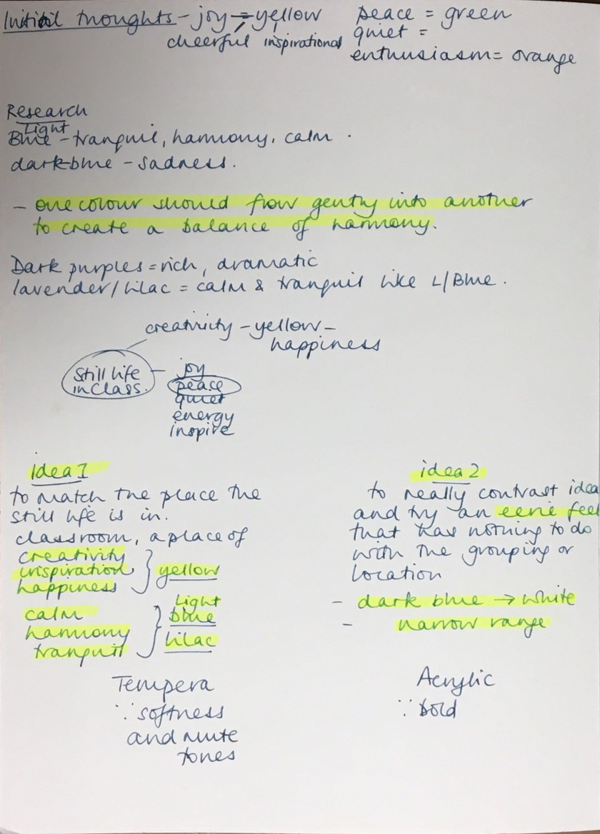
I’ve always liked John Brunsdon’s Pembroke II for the way he used a narrow range of tones, evoking, to me, an eerie atmosphere. When I show this to the children in my class, they mostly say they feel scared or nervous; it has a sense of foreboding. Some children feel nervous but hopeful when they think the house is a respite after being lost in the mountains. I decided to try to replicate a sinister, cold feel, just to be contrary as I always want to focus on the energy I feel when I’m painting, peace, calm…so I decided to play a bit. Same still life grouping but viewed from a different angle to generate a dominance of the objects.
I took on board the ‘language’ that Chevreul and Seurat, where sadness or other negative emotions could be interpreted through dark and cold colours with lines pointing down. With the latter, there are no obvious lines to point down but I found I was brushing in a downward direction, maybe subconsciously taking on this language.
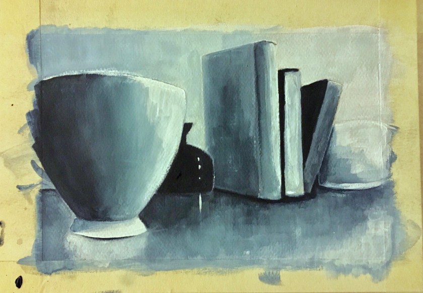

(I need to be aware of white balance affecting tone when taking photographs of my work. The first photograph is truest to colour).
