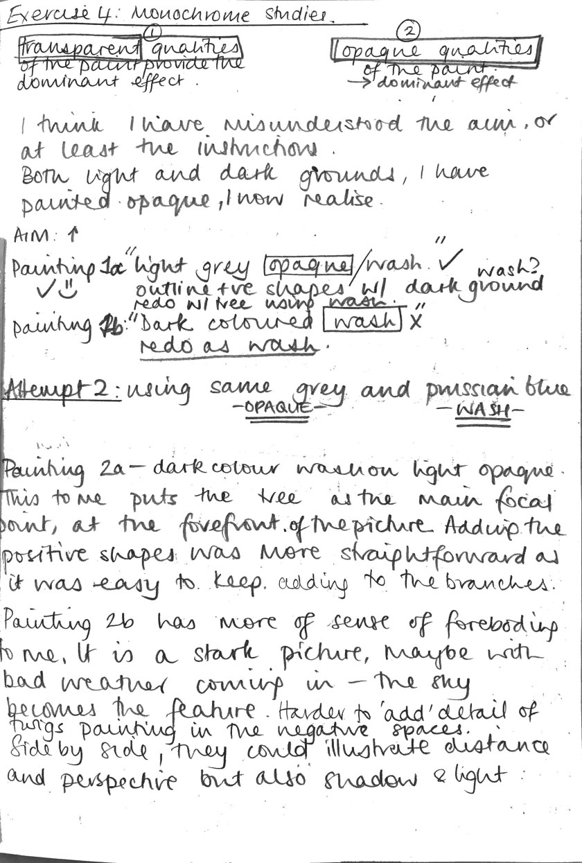
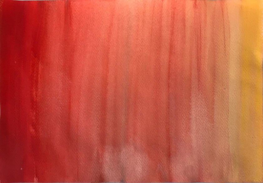
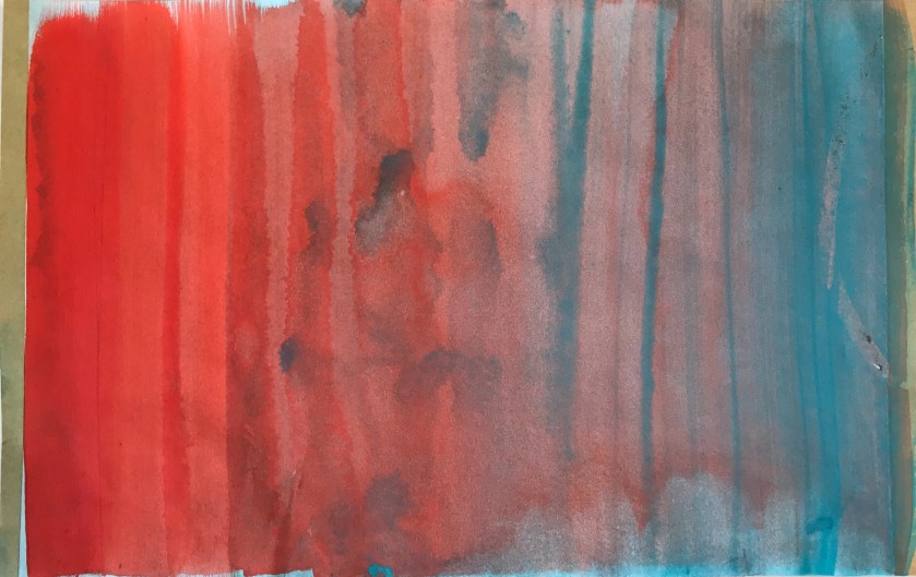
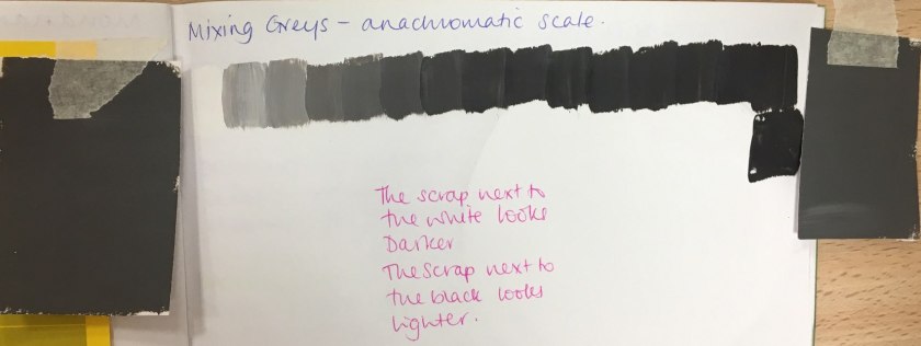
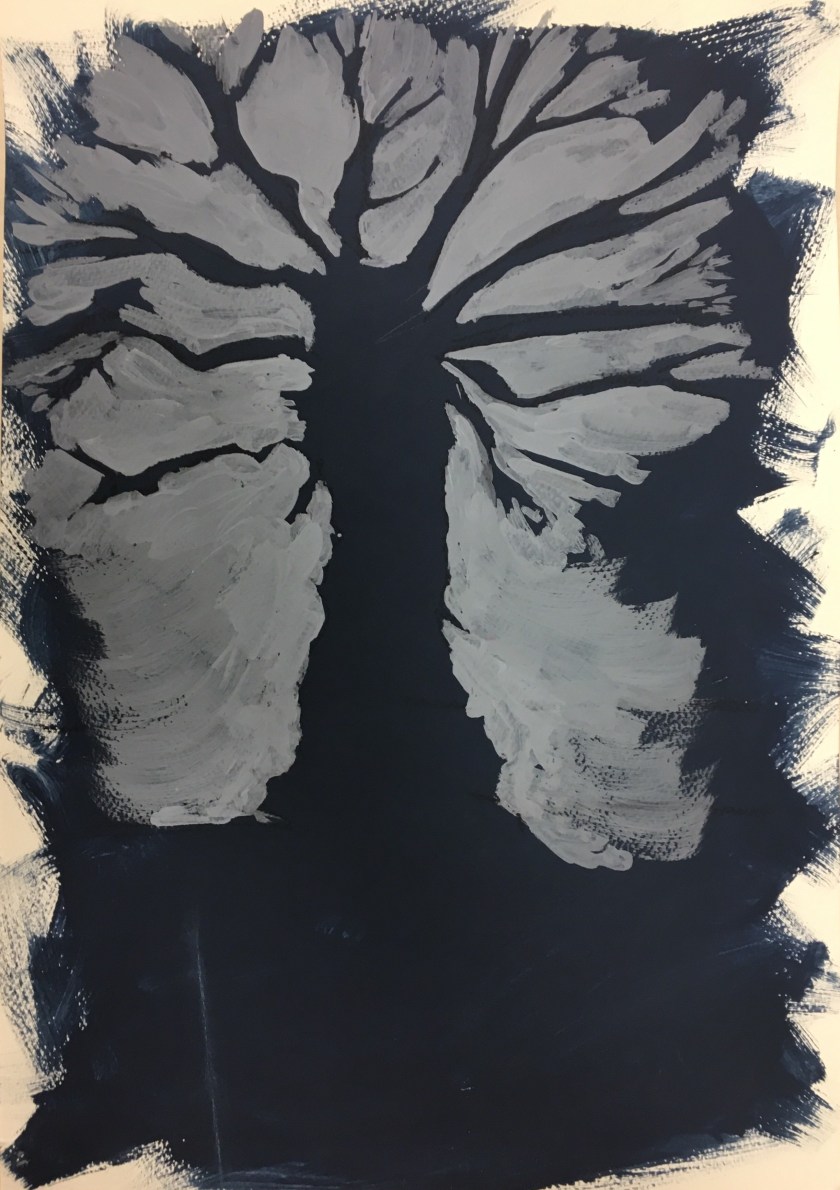
 This was one of those optical illusion activities! The greys were from the same sheet yet were perceived differently when juxtaposed with white and black.
Against the white, the grey was darker and against the black, it was perceived to be lighter.

This was one of those optical illusion activities! The greys were from the same sheet yet were perceived differently when juxtaposed with white and black.
Against the white, the grey was darker and against the black, it was perceived to be lighter.
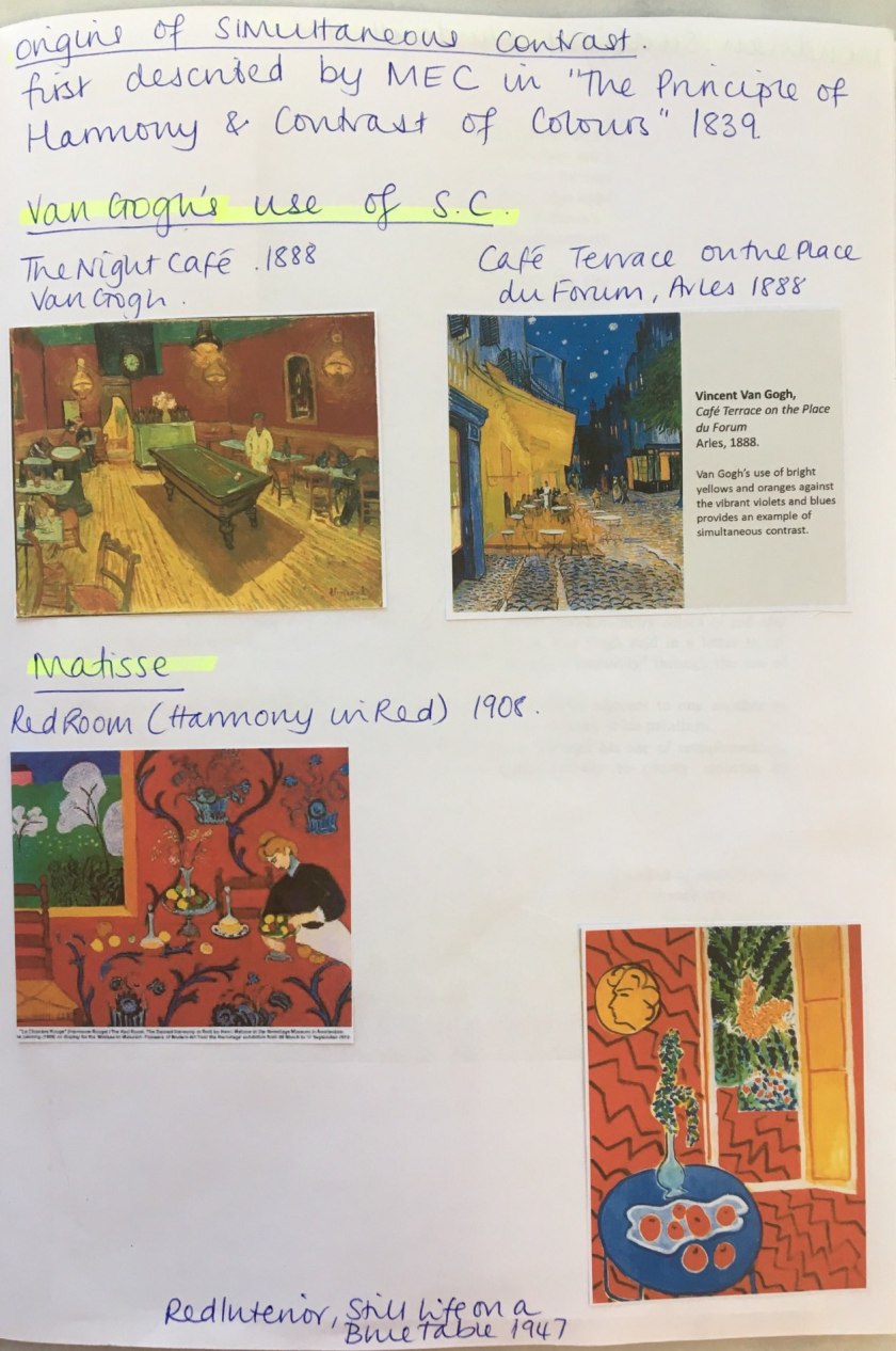
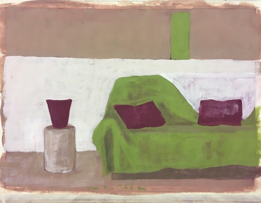
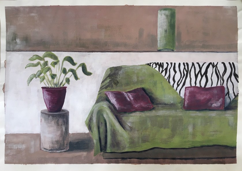
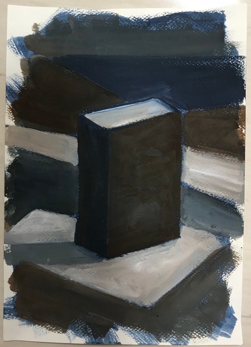
This assignment was developed here and I’ve decided to work on a complementary ground colour of violet.
I will say at this stage that I have a love-hate relationship with paper stretching….
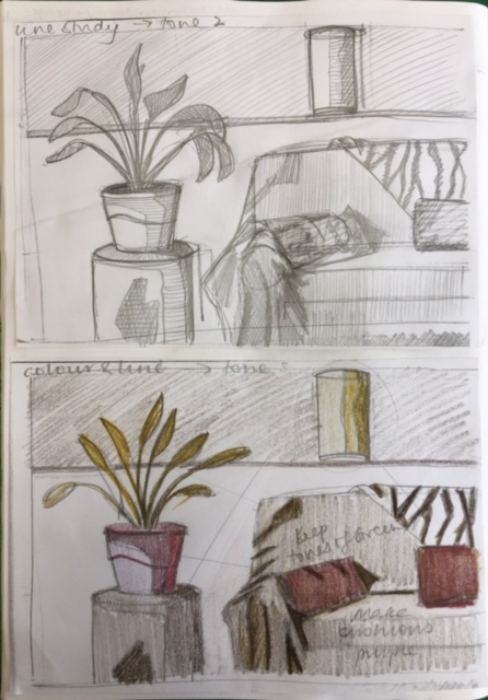
Blocking in the midtones and highlights. Not sure of my process at the moment, I don’t feel I have a ‘checklist’ and seem to be blocking in by feel rather than a theoretical process as such.
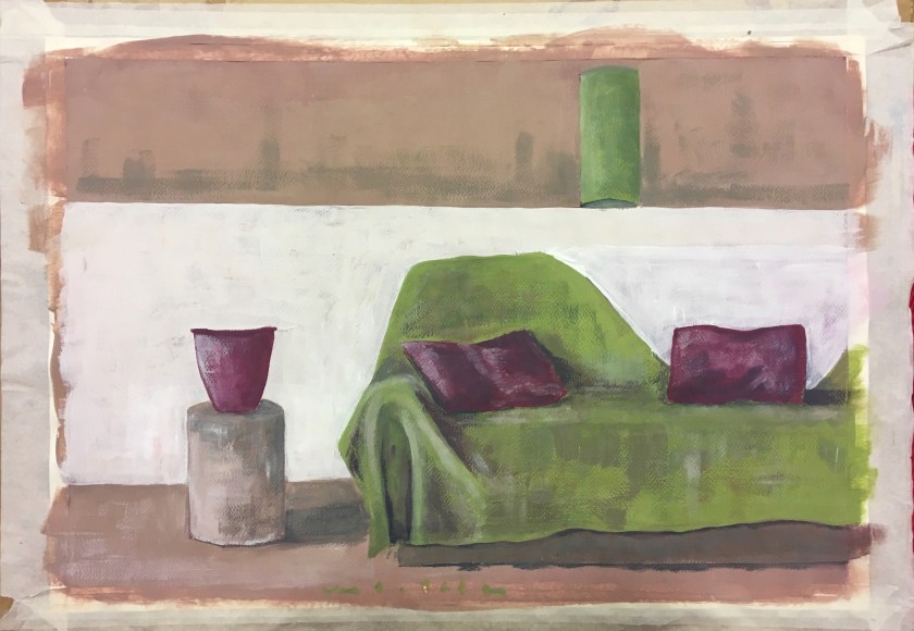
Ugh. So happy with this and then I see that appalling horizontal line at the last minute. Why?? Looking back, this was present early on. Something to watch.
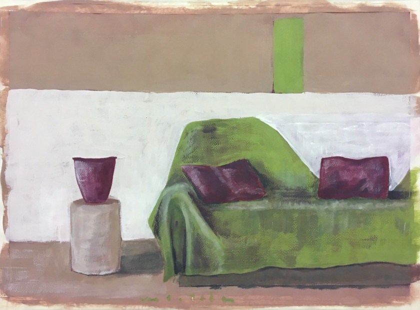
Corrected, but worried I will overwork it so will leave it at this point.


https://www.luxdeco.com/styleguide/top-10-modern-interior-designers/
 https://artdecision.eu/david-hockneys-double-portraits/
http://kvadratinterwoven.com/david-hockneys-furniture
David Hockney, Portrait of Sir David Webster, 1971, acrylic on canvas © David Hockney. Photo: Richard Schmidt

https://www.tate.org.uk/art/artists/david-hockney-1293

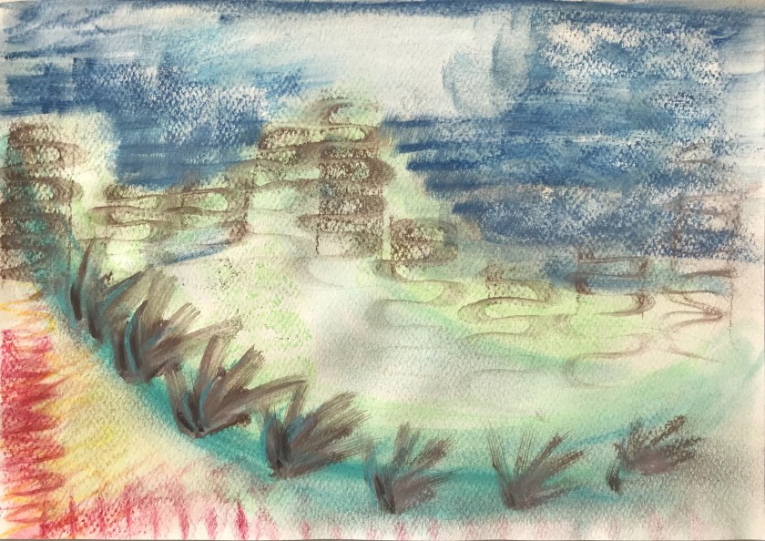
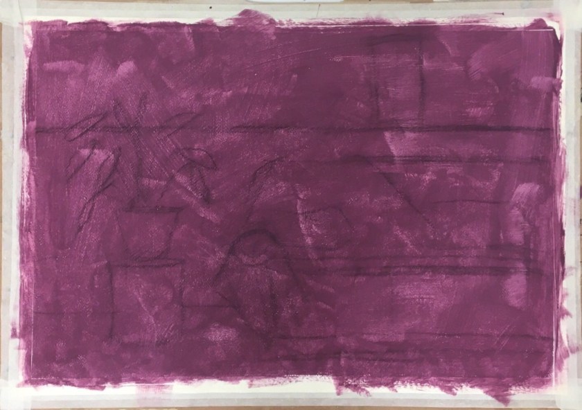
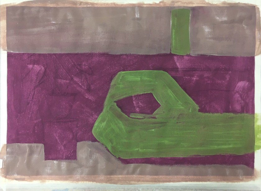
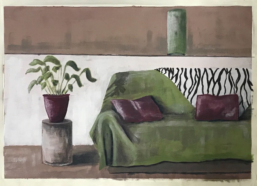
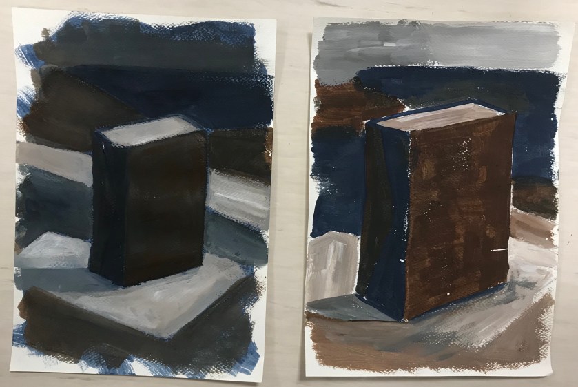
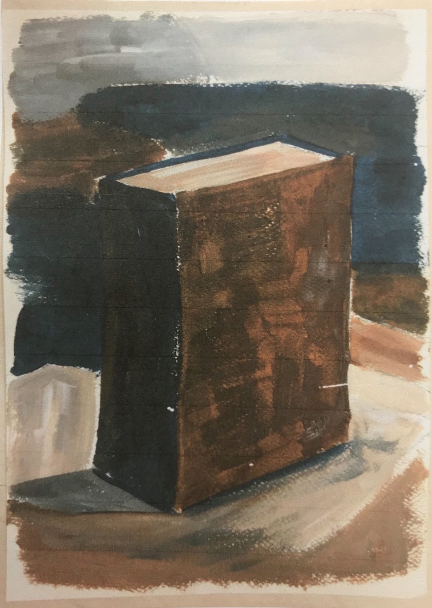
I enjoy the tonal effect of different colour grounds and I wanted to work with this more rather than paint on white.
I wanted to try white, then the complementary colour to the main colour in the picture (a magenta to the main green). And thirdly, I would try the mix of the green and its opposite, a complementary grey/brown.
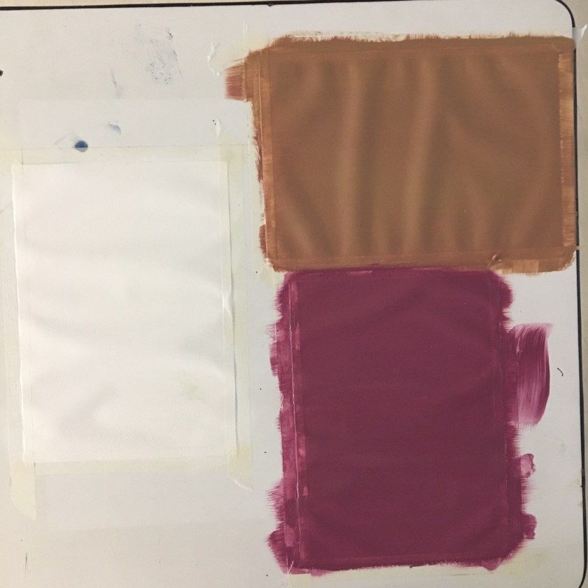
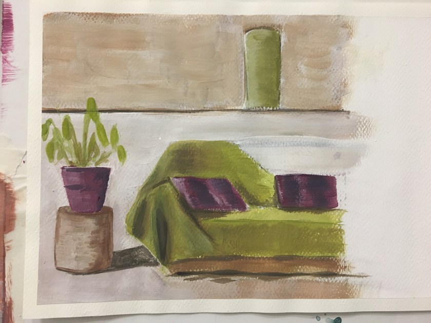
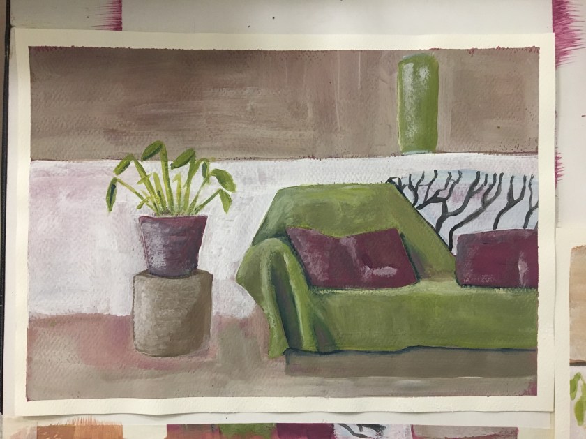
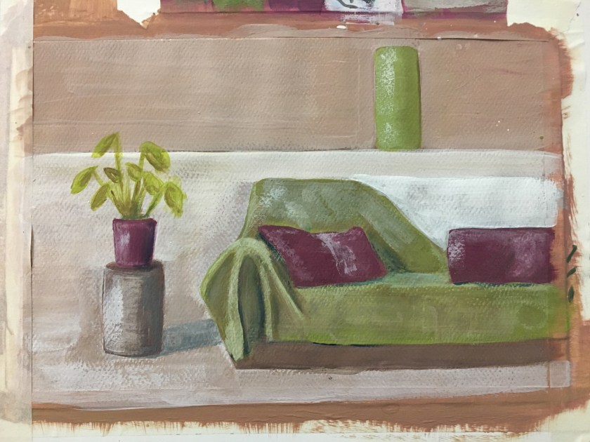
I’ve decided on the magenta ground as it added a crispness and warmth but also allowed a clarity for the highlights.
Chiaroscuro’s Place in the Contemporary World of Art and Artists
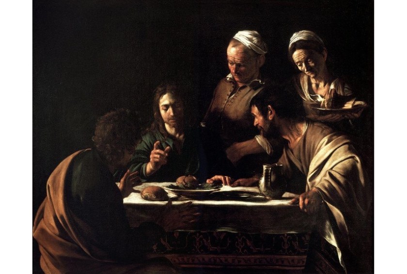
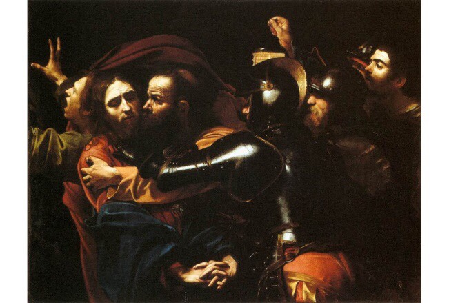
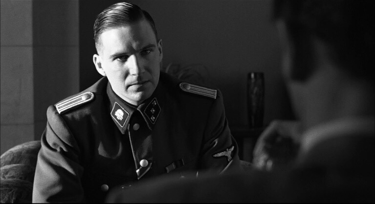
Today, the term chiaroscuro is frequently applied to a wide array of dramatic lighting effects and it is used as a technical word linked to many mediums and kinds of art[3]. It is related to literally any form of expression that possesses something dark and moody with strong slashes of shadow[4] that emphasize the dramatic effect. Interestingly, the traditional power of the chiaroscuro pictures and the tense action within their frames had a massive influence on cinematography as the genres such as Film Noir heavily based their visuals on it. Many filmmakers have stated that this technique shaped the final looks of their movies – for example, Martin Scorsese actually referenced Caravaggio as one of his biggest inspirations behind many of his films.
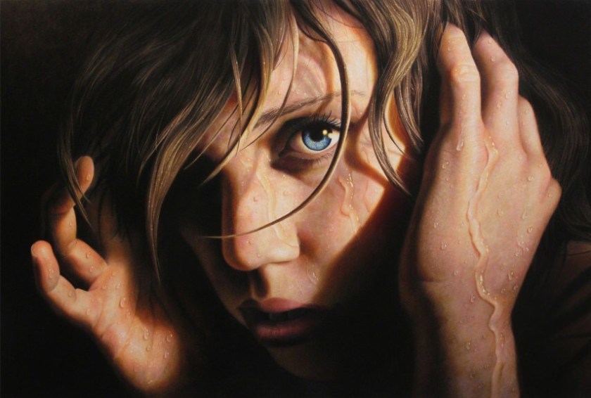
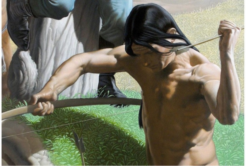
Staying true to Caravaggio’s original roots of realistic depictions, Jesse Lane is an American painter who combines the concepts of Hyperrealism and chiaroscuro. His paintings aim to channel the emotional impact and capture intimate moments wrapped into a single instant presented to the audience. Lane’s pieces are rather open-ended, as the artist himself explained on many occasions, and his goal is to make the viewers create the narrative on their own. When observed from a technical standpoint, it’s hard to find a more talented painter than Jesse Lane both in regards to Hyperrealism and chiaroscuro.
With his specialty being found in the fusion of popular imagery and traditional painting techniques, it’s no wonder that Nicola Verlato‘s amazing painterly world enjoys such a high level of respect within the art community. This Italian artist is primarily known for his highly refined allegorical surrealism that features spectacular light effects, twisting nude figures and dense compositions, all underlined by a commanding application of chiaroscuro. Wonderful and bizarre, his compositions are a true delight to analyze.
Chiaroscuro in Contemporary Photography
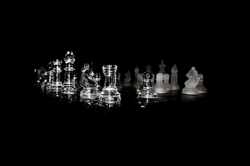
When used as a photography technique, the chiaroscuro style is often referred to as clair obscur or extreme low key. Just as the case is with movies, it’s rather interesting to investigate how this shading method traditionally associated with painting has evolved in order to become a viable option for modern artists. As far as the realm of photography is concerned, chiaroscuro kept its strong and bold contrasts between light and dark areas. Of course, the dramatical effects such photos are able to channel is often the reason why photographers opt to use this method of picture-making.[5] The chiaroscuro style of photography is often well-suited for portraits[6], still life compositions and boudoir. The pioneering attempts to translate this technique into the vocabulary of camera images can be traced to the early developments of black and white imagery – for instance, Alfred Stieglitz was one of the oldest practitioners to successfully use a form of chiaroscuro in his work.
Tim Cantor
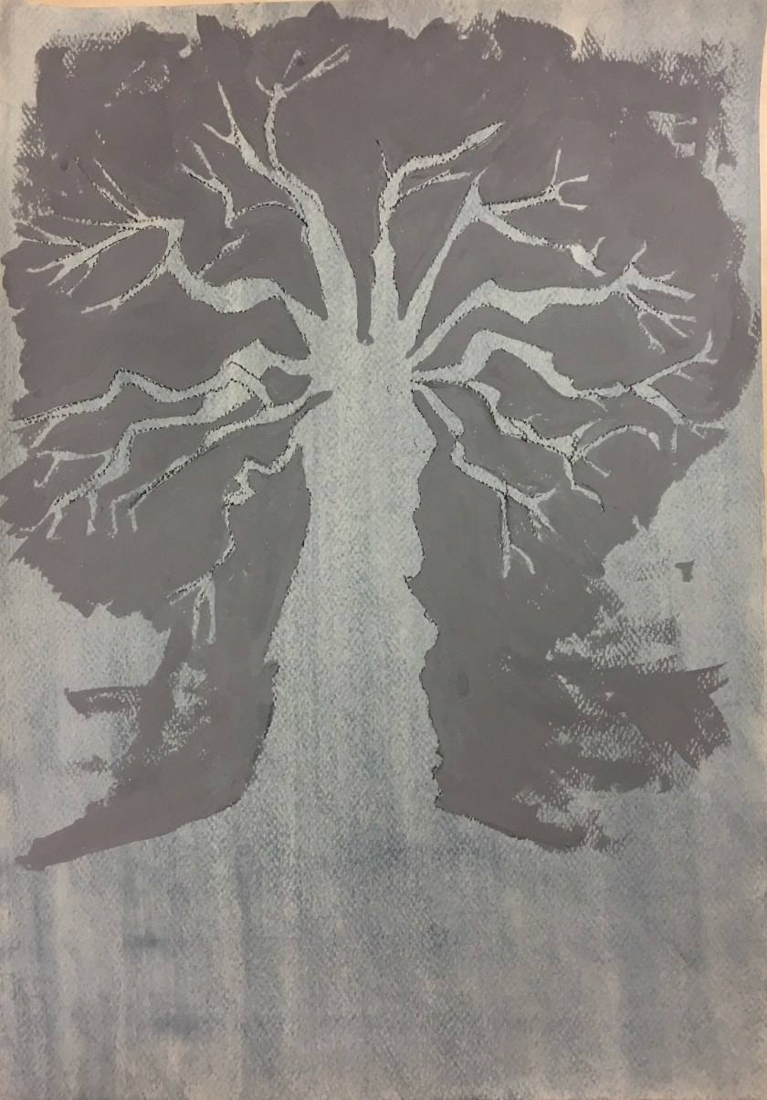
Painting 1a
Painting 1b
Painting 2a
Painting 2b