
This page outlines each piece for my Drawing 1 assessment submission, along with the relevant link for the work for reference.
My blog currently contains links to both my Drawing and Practise of Painting courses. I feel they are clear enough to be easily distinguished from each other.
The links are found to the top right. There are links to all posts relevant to Assignments, Research and Notes and Sketchbook Work. These are in green writing below the dark grey heading of ‘BA PAINTING – MODULES’, under the heading of OCA Drawing 1. Otherwise, follow the respective links given above or in the relevant individual post links given below.
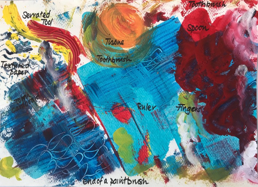
1. Part 2 Project 2 Exercise 3 – Experiments with Mixed Media x 2.
Oil pastel, watercolour, ink, stitching.
Cross referenced to sketchbook and support work 1/62.
Sepia ink and wash, oil pastel, pencil
Cross referenced to sketchbook and support work 1/6
3. Assignment 3 – Expanse, first attempt.
Sepia ink and wash, pencil
Cross referenced to sketchbook and support work 2/6
4. Assignment 3 – Expanse, second attempt.
Pencil
Cross referenced to sketchbook and support work 2/6
5. Part 3 Project 2 Exercise 1 – Cloud Formations and Tone.
White Ink on black paper
Cross referenced to sketchbook and support work 2/6
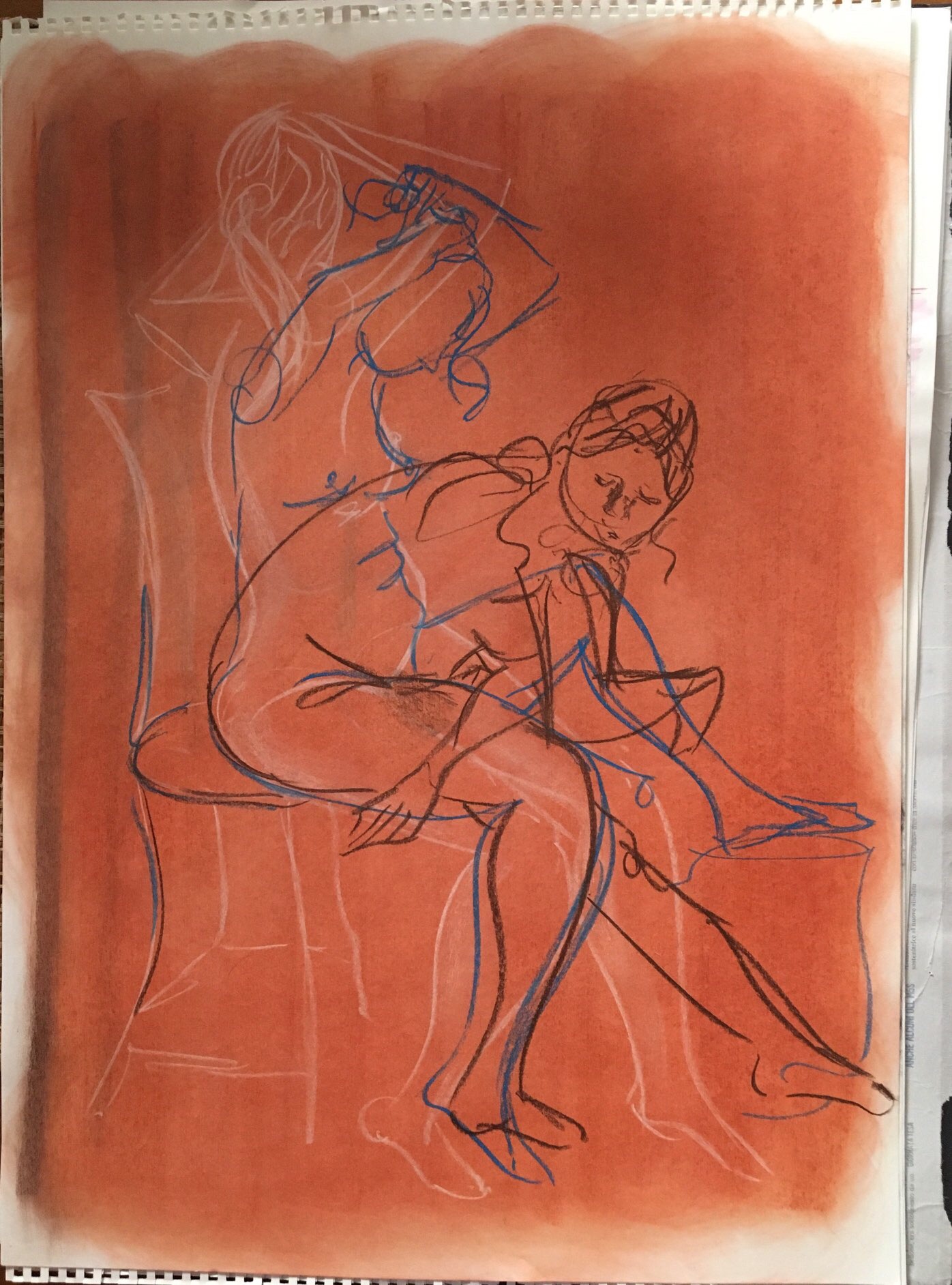
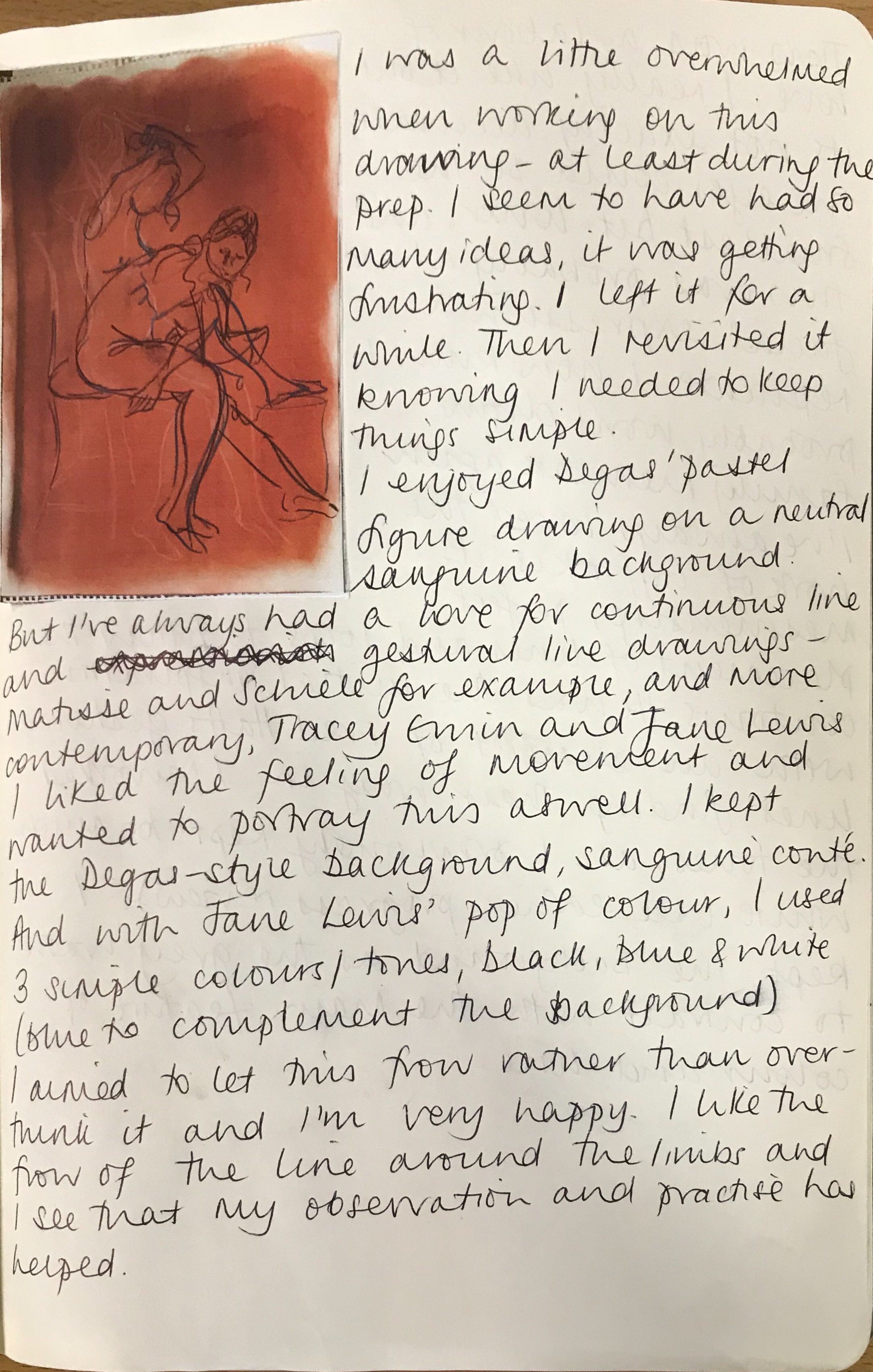
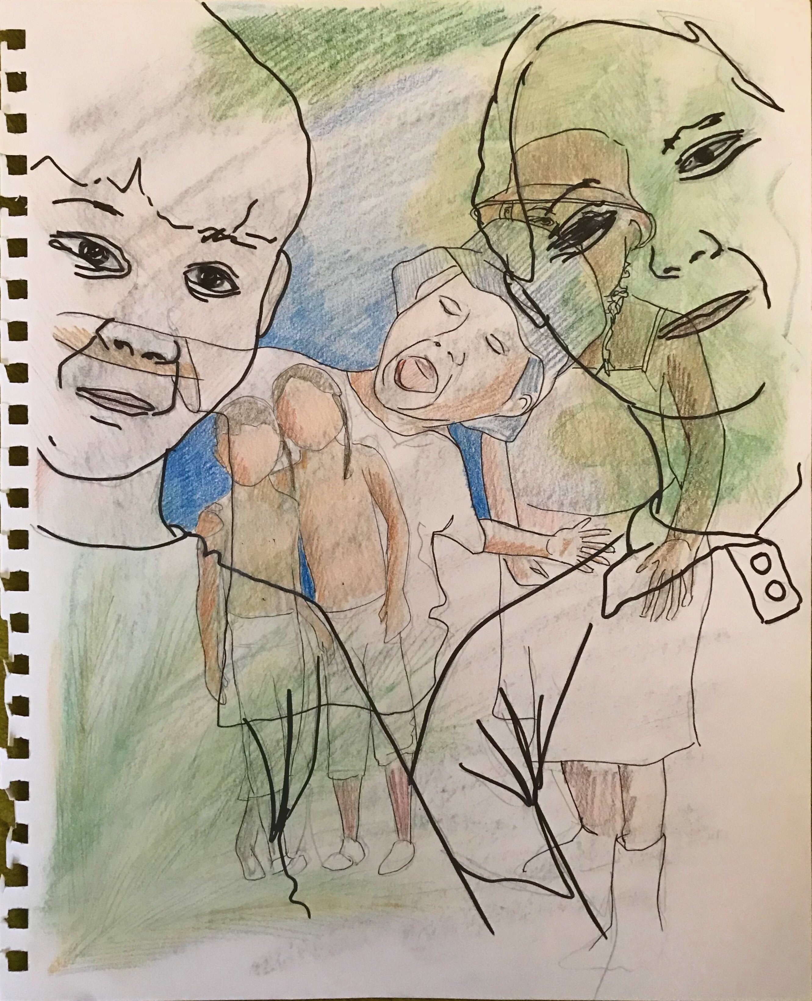
6. Part 4 Project 4 Exercise 2 – Figure Drawings.
Third figure study on page; charcoal
Cross referenced to sketchbook and support work 3/6 and 5/6
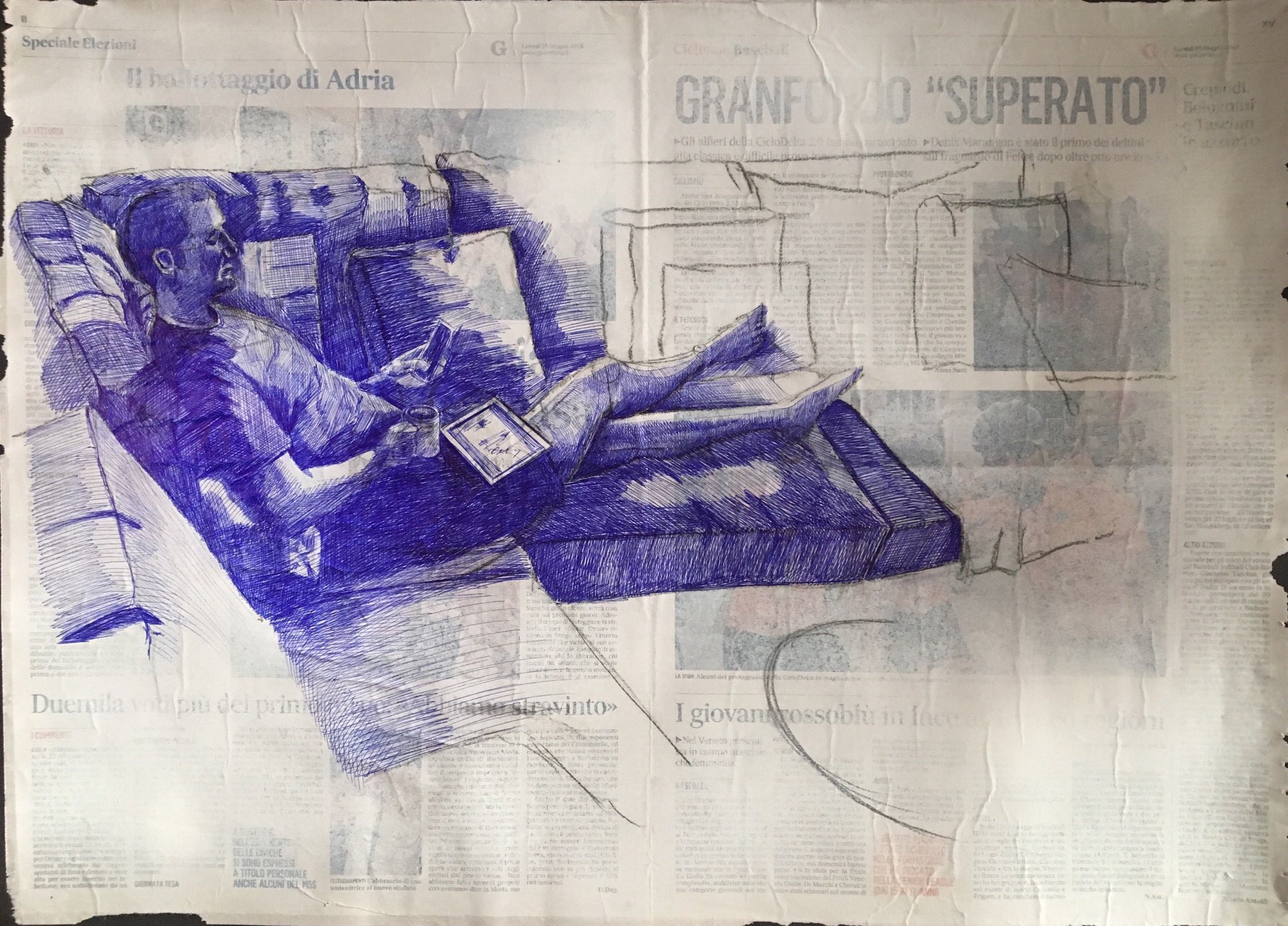
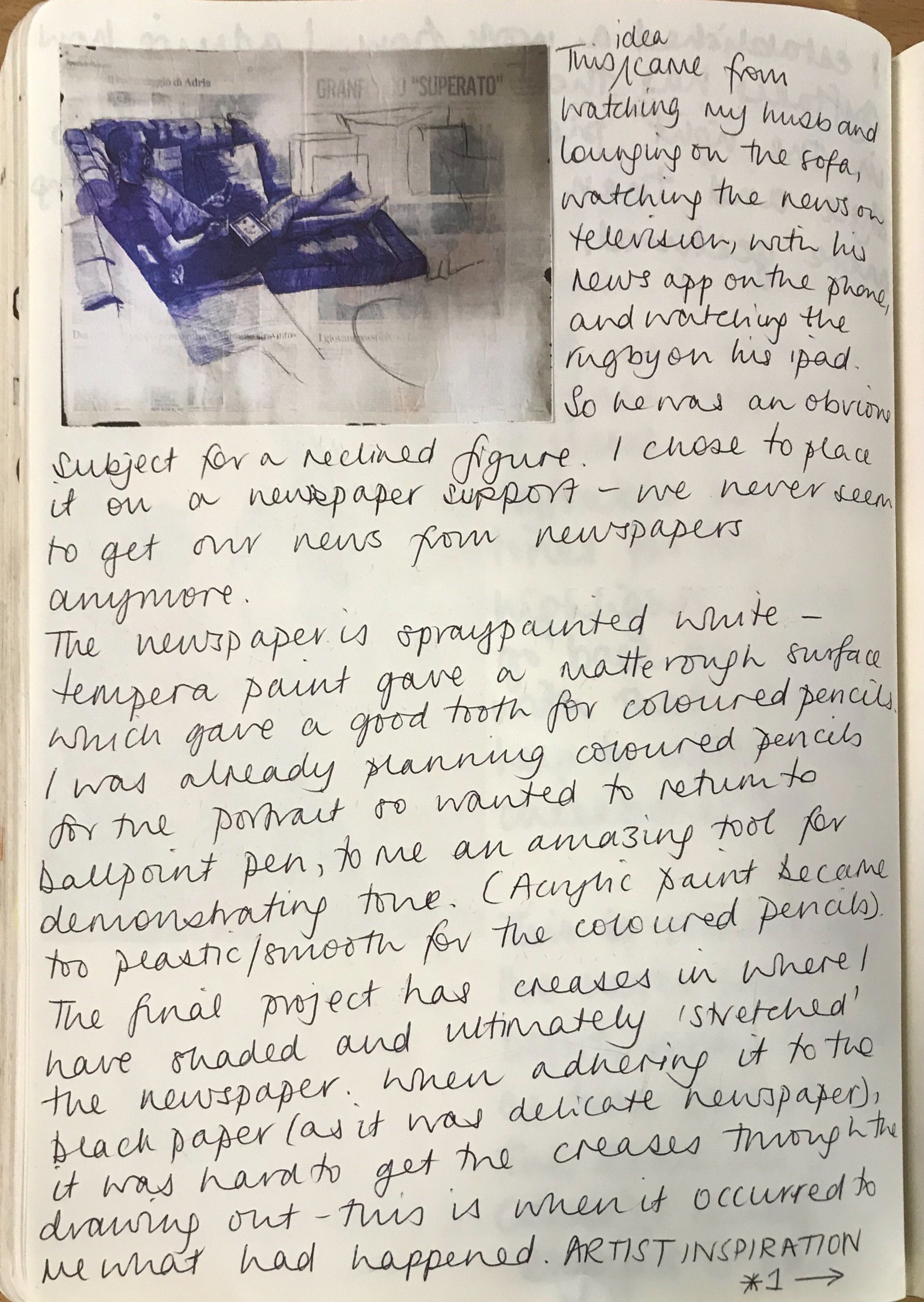
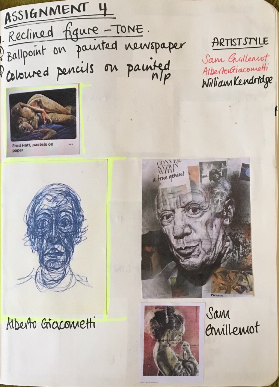
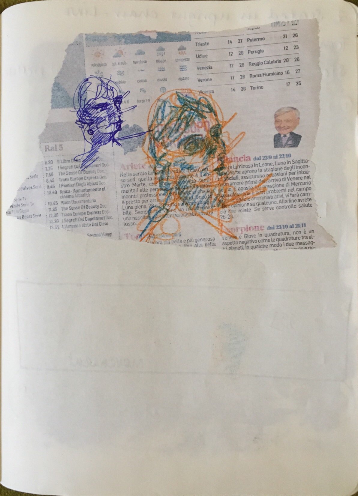
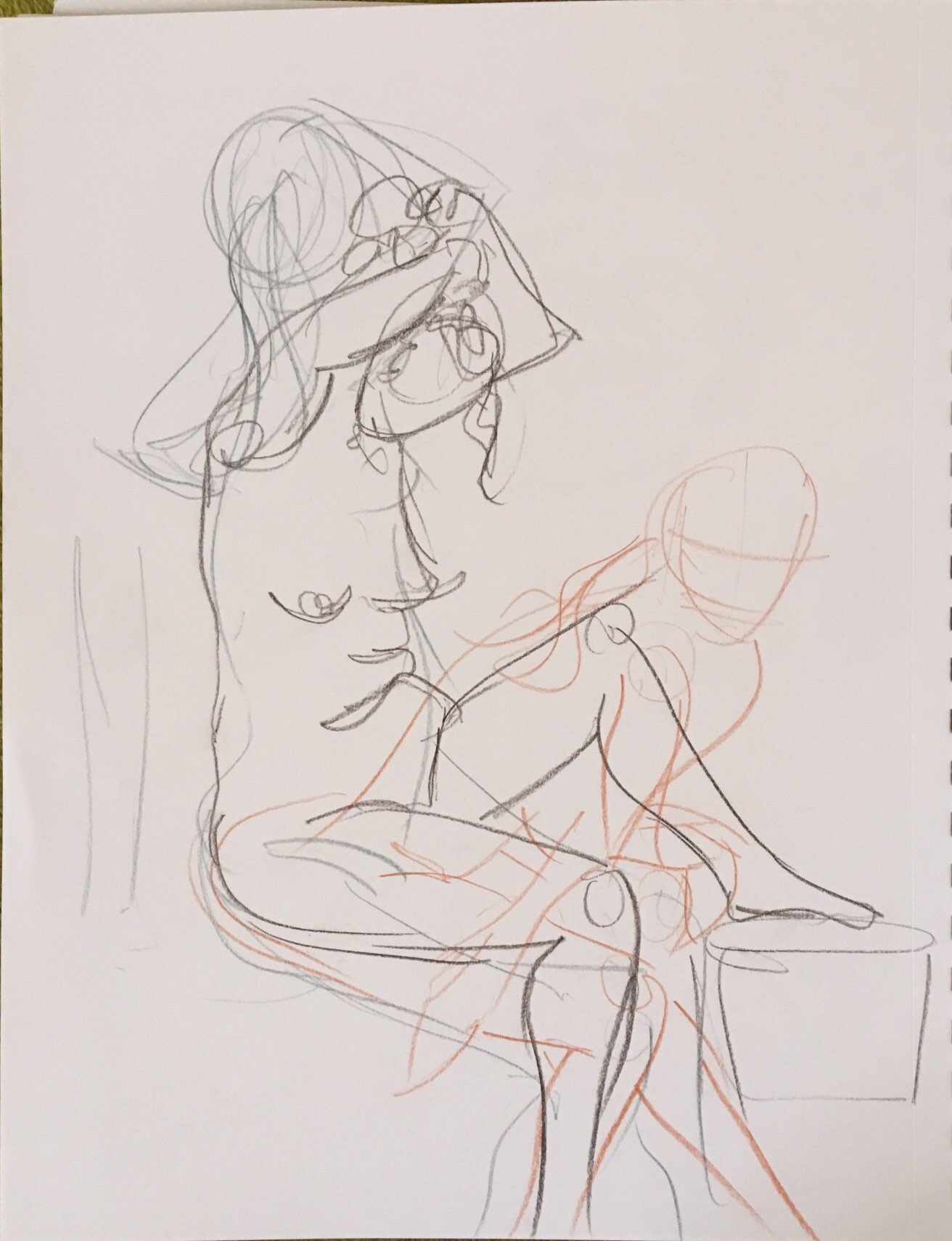
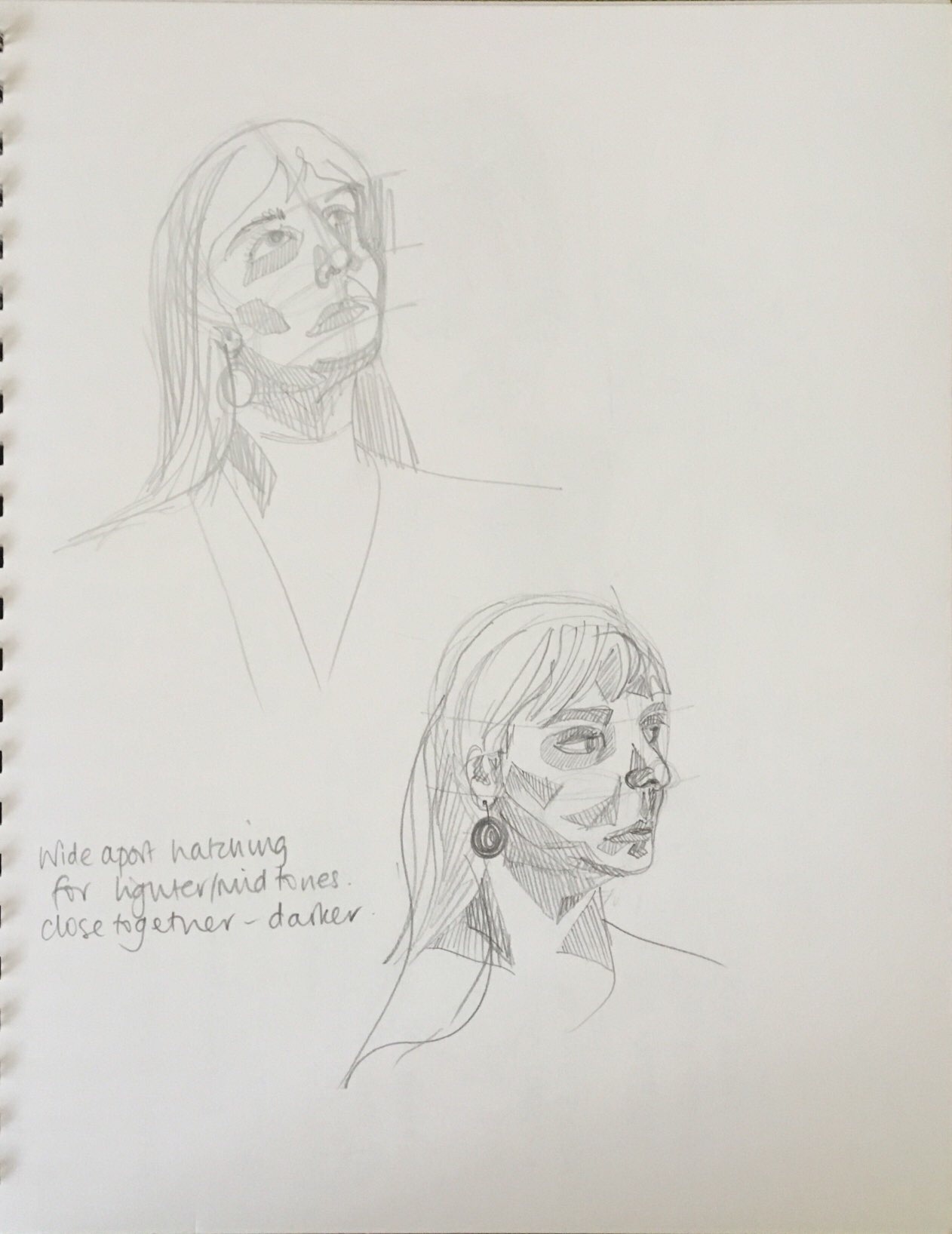
7. Assignment 4 (i) – The Figure and the Head
First figure study on page; ballpoint pen on prepared newspaper
Cross referenced to sketchbook and support work 3/6 and 5/6
8. Assignment 4 (i) – The Figure and the Head
Second figure study on page; chalk pastel
Cross referenced to sketchbook and support work 3/6 and 5/6
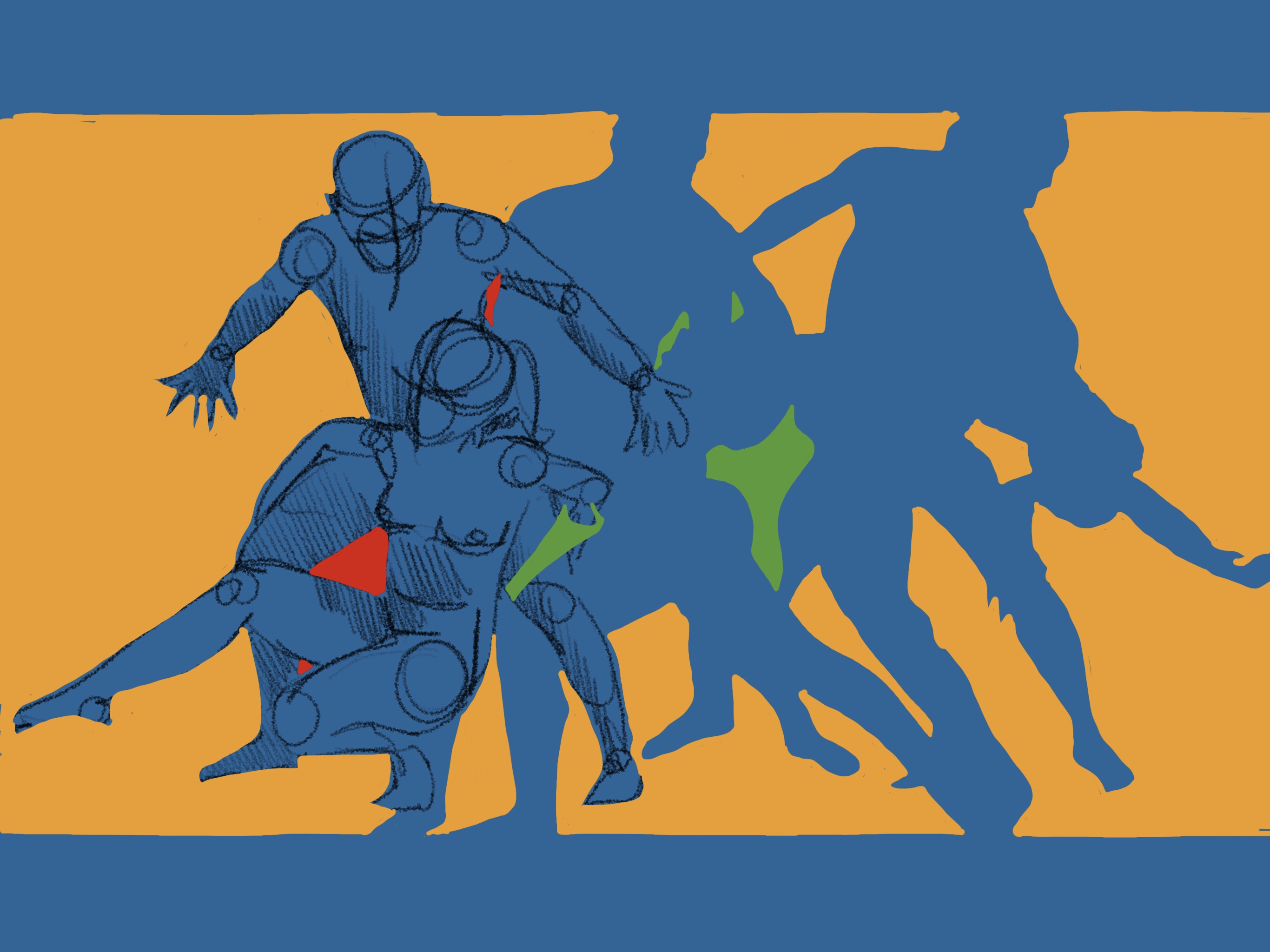
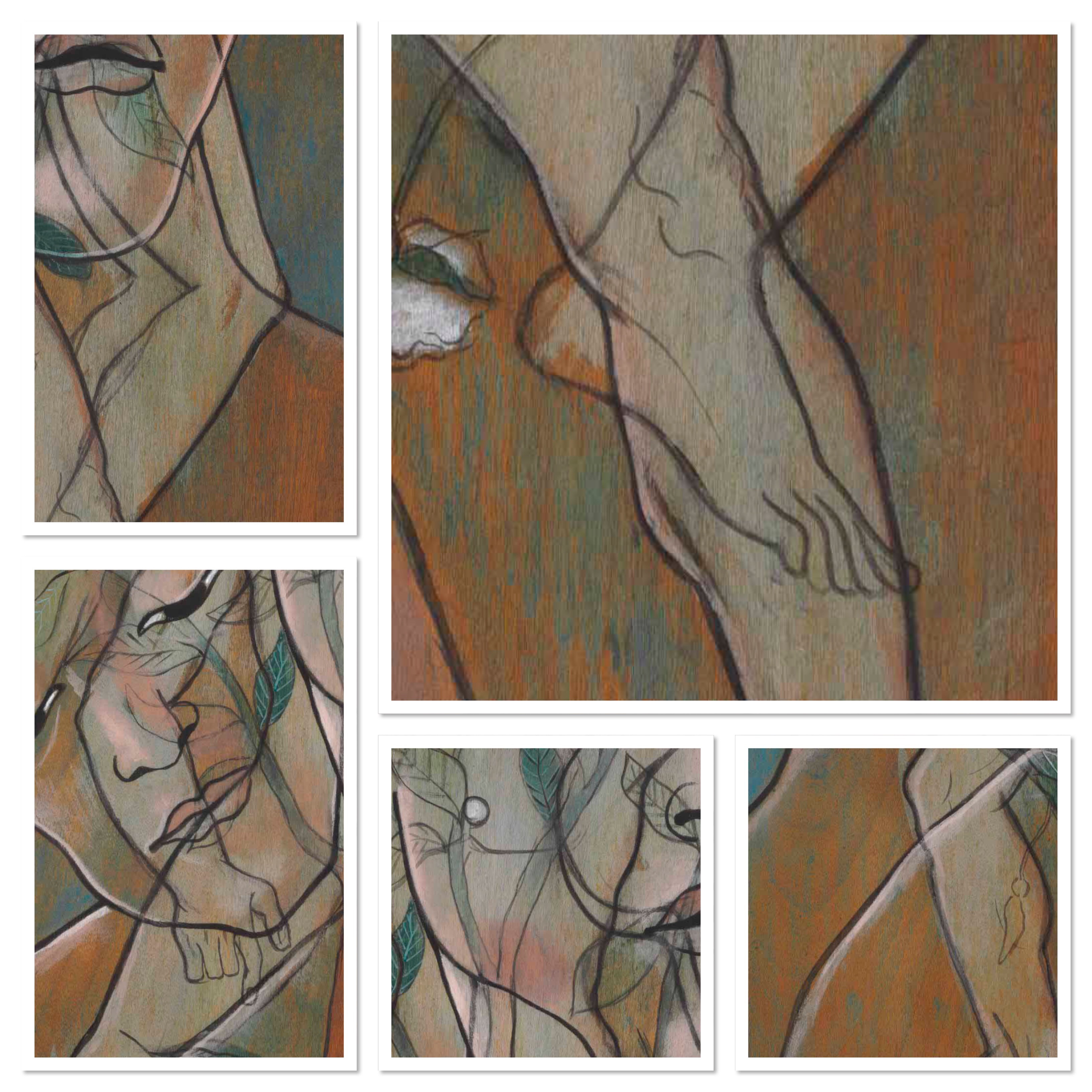
9. Assignment 5 – Independent Project
Pencil, charcoal, coloured pencil and chalk pastel on brown paper
Cross referenced to sketchbook and support work 4/6 and 6/6
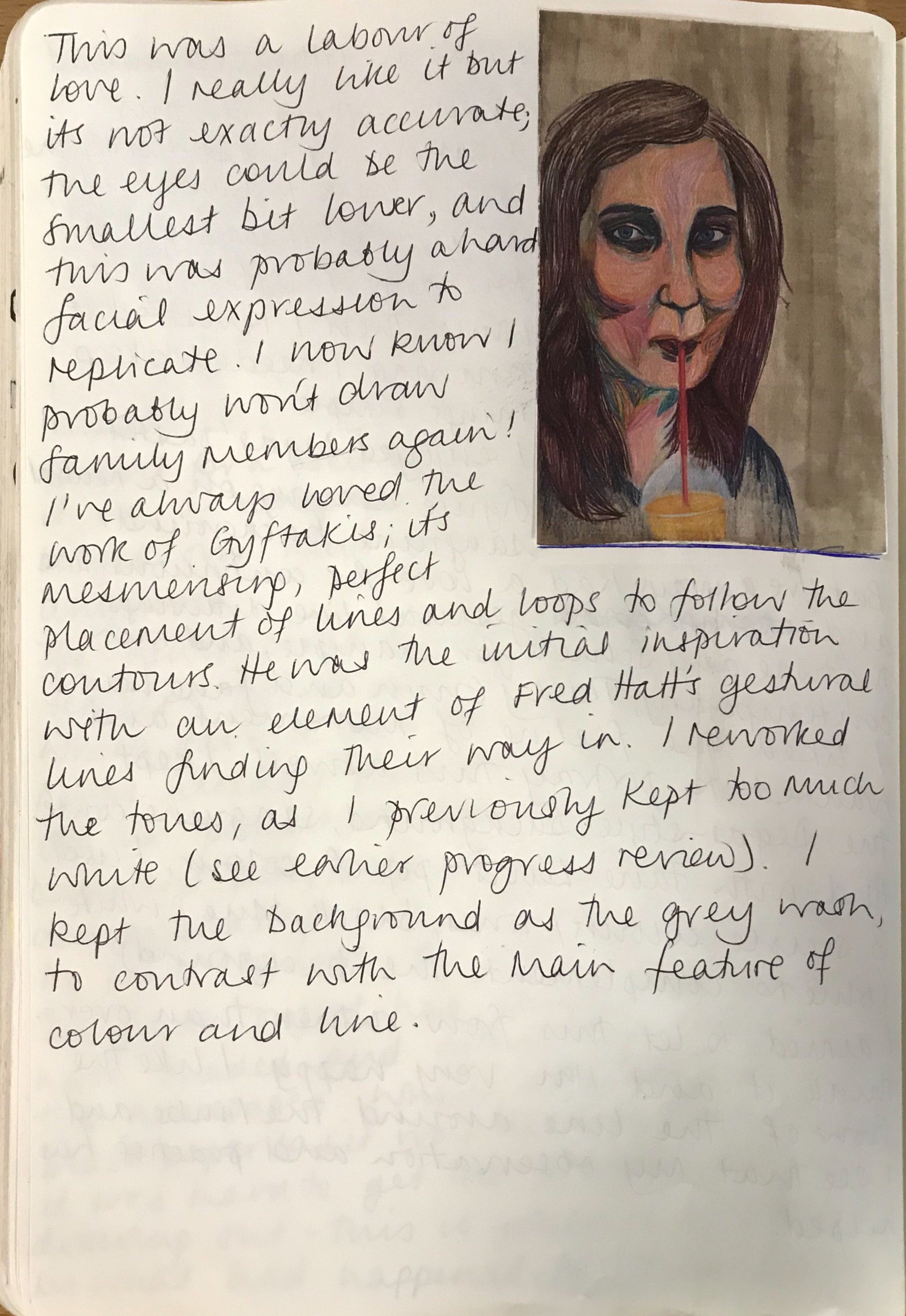
I had this assignment in my mind for several weeks before I actually started the unit. Yet it feels that in a short space of time, this process has been intense; I have bounded so many ideas and concepts around it have been overwhelming at times.
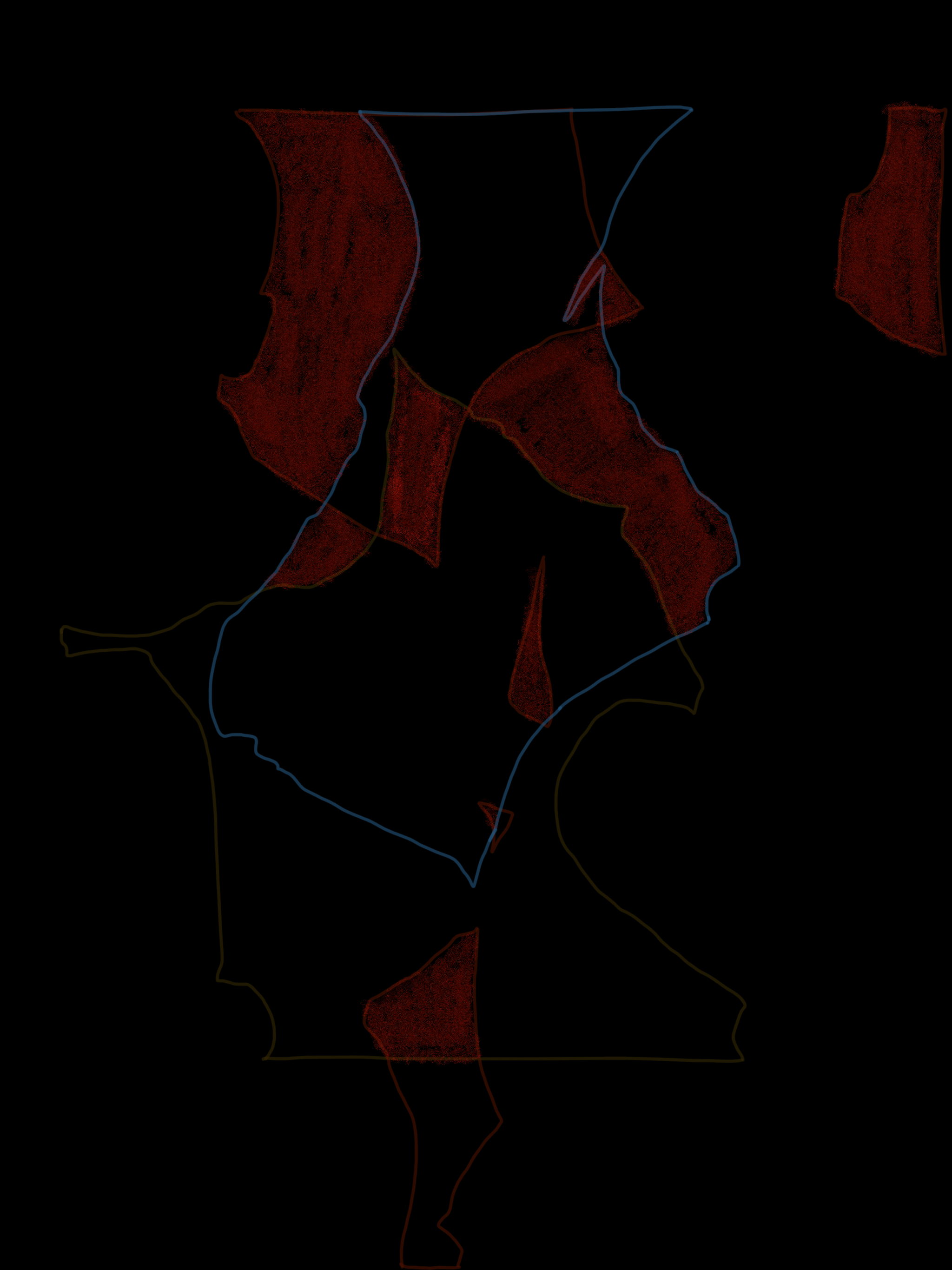
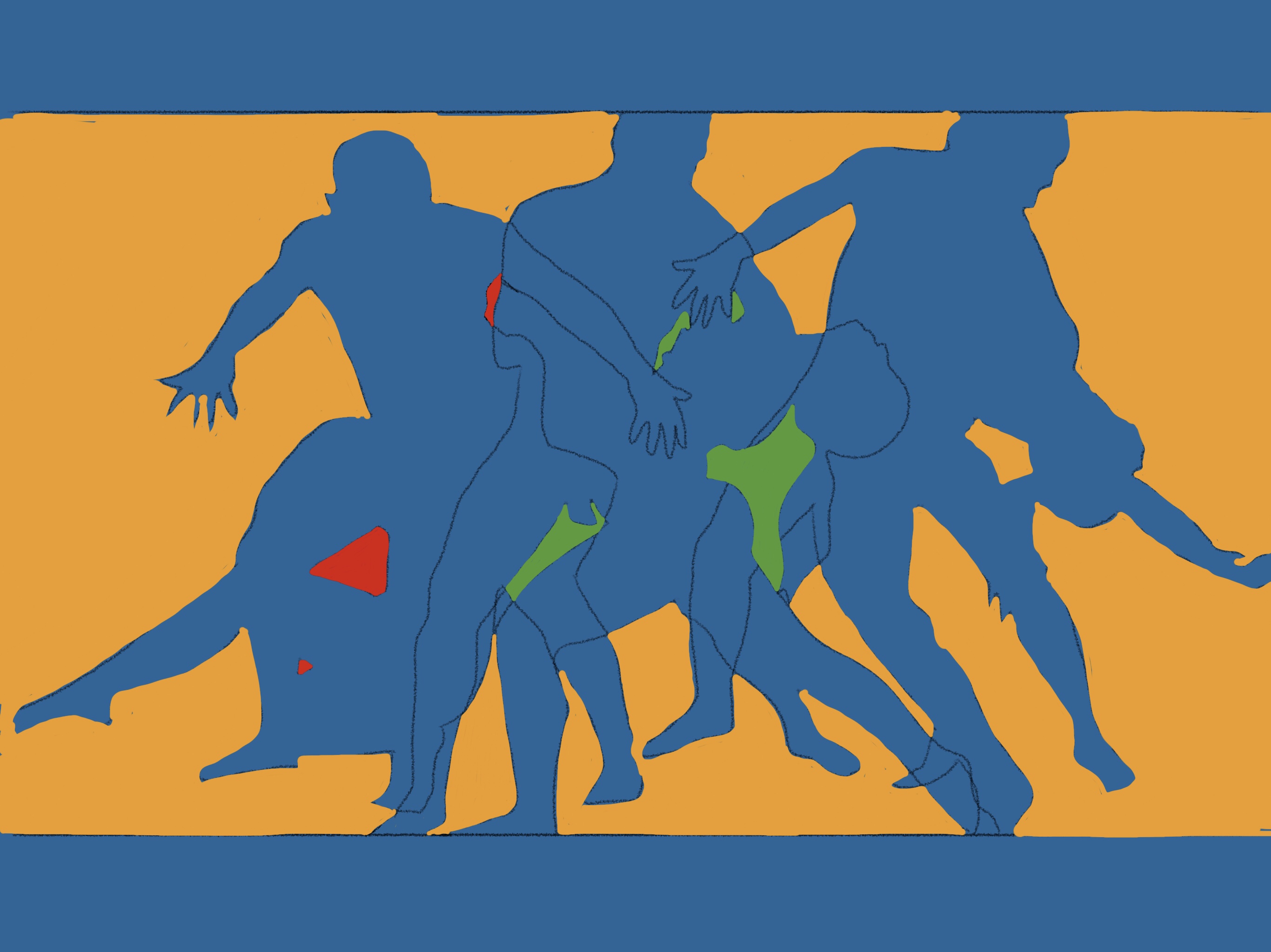
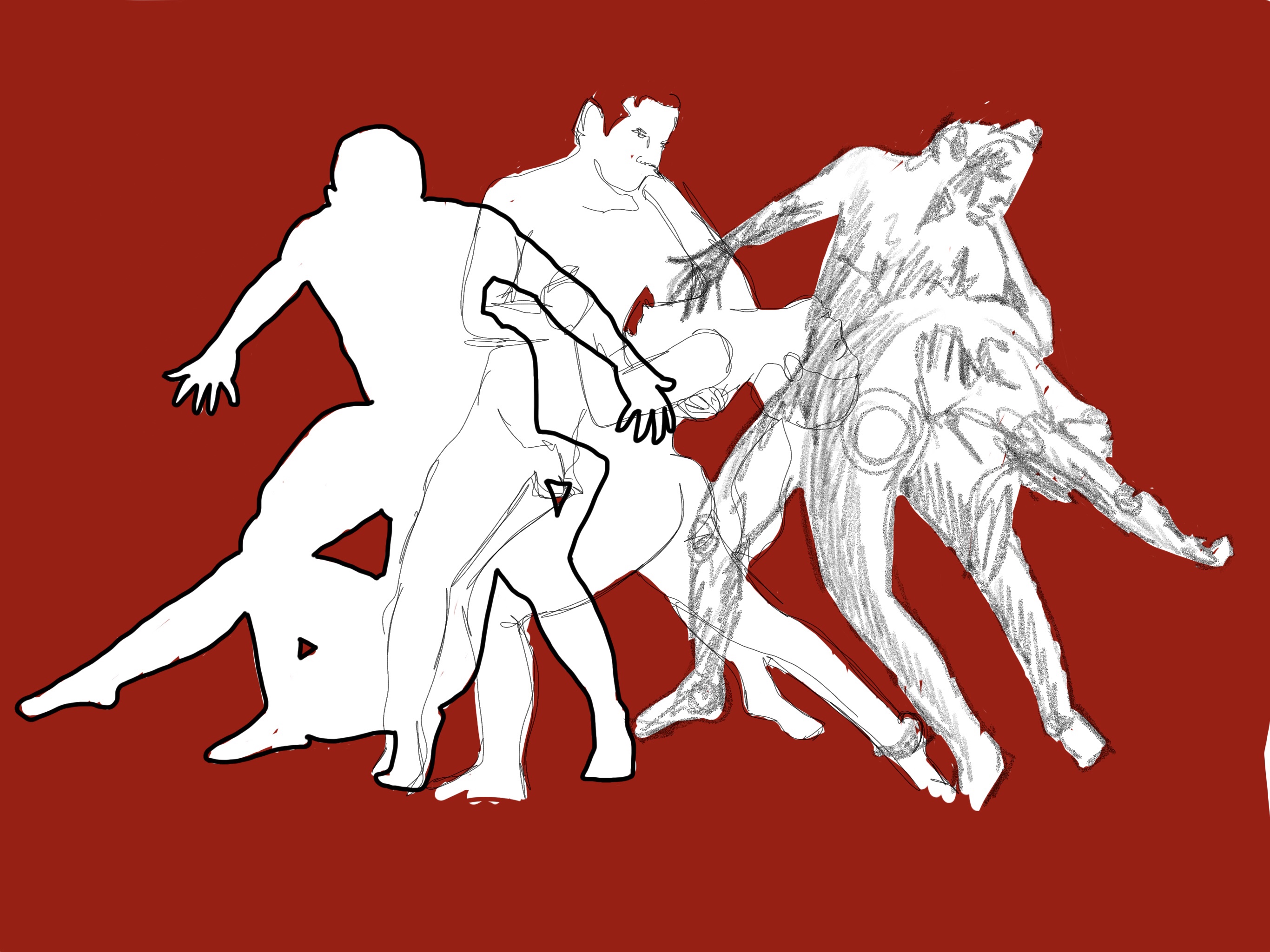
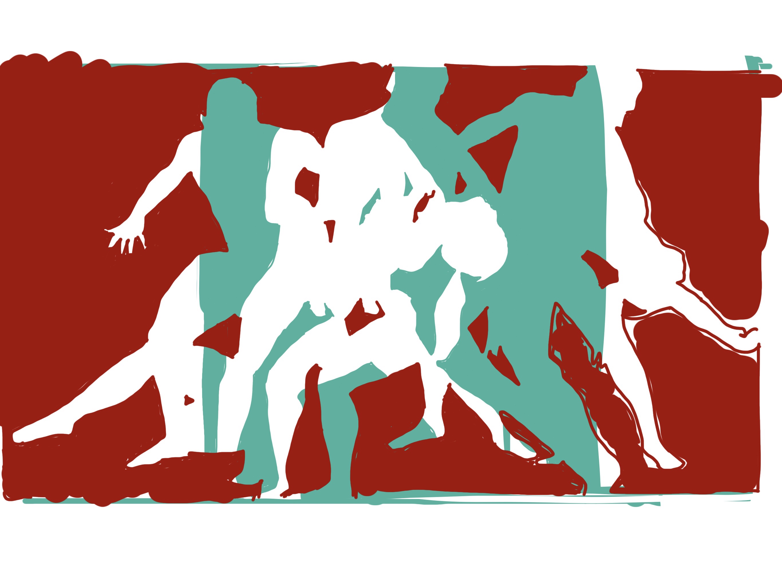
Early on I knew that I was interested in form shape and line, and figures. I found I was looking at the negative space created between objects or people, making an abstraction of new positive spaces and shapes.
This thought process coincided with my reading Arthur J. Miller’s book, Einstein, Picasso: Space, Time, and the Beauty That Causes Havoc (2001). Miller looked at two of the greatest minds of the twentieth century and how they simultaneously had their most important moments of creativity and in relatively similar circumstances. This book reintroduced me to Pablo Picasso’s Demoiselles D’Avignon. I saw so much more to this painting than before, how it was influenced by Picasso’s connection with the mathematician Henri Poincare and a resultant fascination in the fourth dimension – time and its geometrical representation.Thus followed an enjoyment of looking at and playing with negative space and shapes. It felt right, the timing of the book was serendipitous as negative space created by connected beings had been my initial seed of thought.
I digitally played with these thoughts; my ipad allowed me overlap images and see the negative spaces created. I played with line, negative spaces and colour.
Miller highlighted the fundamental link between Picasso and Einstein, talking about time travel; “Gyroscopes are required for the time machine to remain motionless a complex mechanical ether while the rider observes time passes by…much like an observer of one of Picasso’s paintings standing in one place while watching many different representations of an object unfold in time.” (Miller, 2001, p.104-5). Poincare suggested that different perspectives could be illustrated on a canvas; Picasso understood this as perspectives being shown in spatial simultaneity. And this led him to create Demoiselles.
Early on, I had so many ideas and materials, artists and inspiration that my sketchbook was very active to the point it was feeling disjointed and forced. I came to a point where I needed to return to simpler ideas. I was trying to be too precise and perfect, recreating the image in my head rather than going with the evolution of the work.
I experimented with the spaces in Demoiselles and also Matisse’s The Dance. At this point I started to focus on colour theory as I noticed the colours in The Dance were split complementary. This led me to Paul Klee.
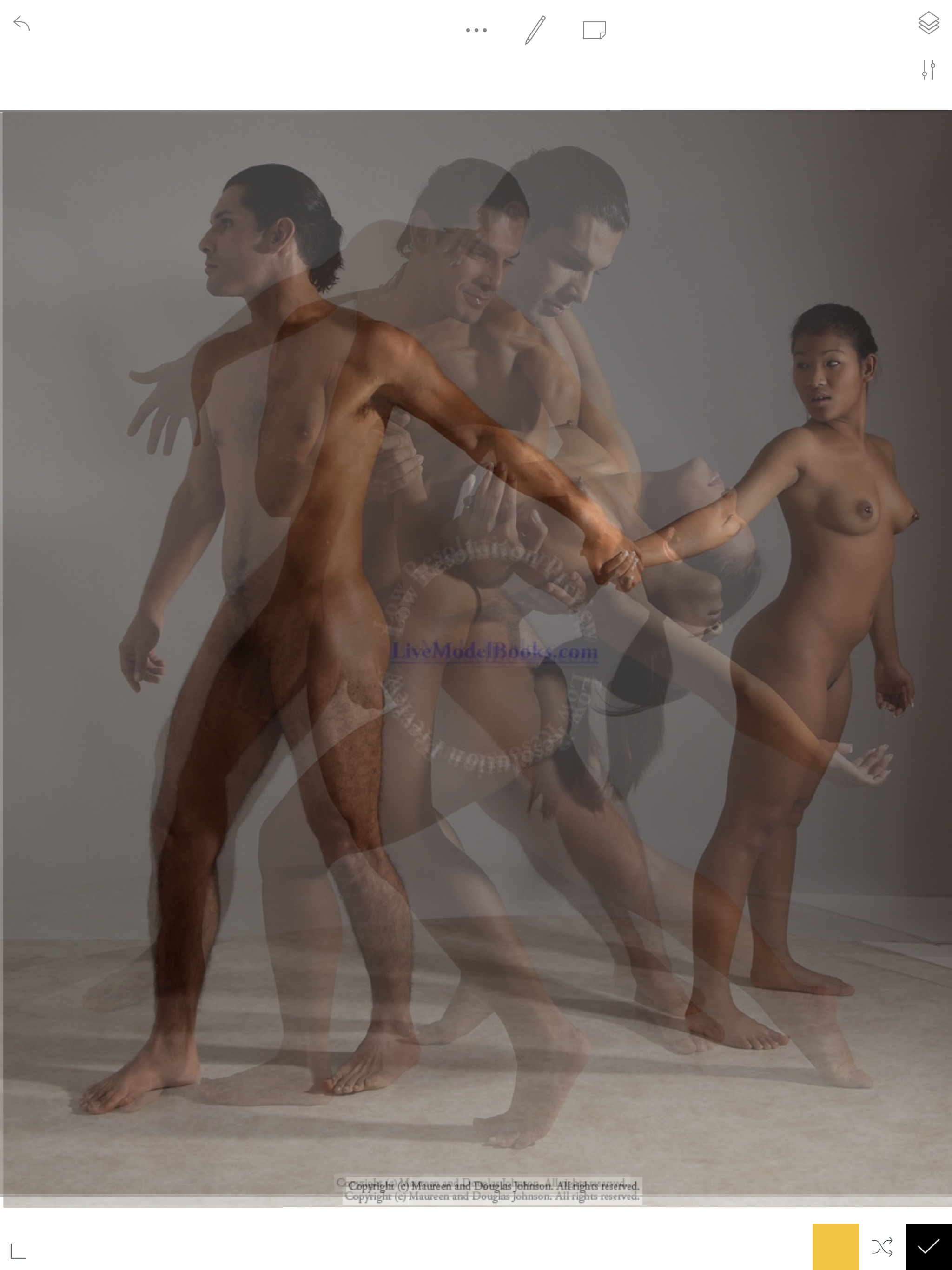
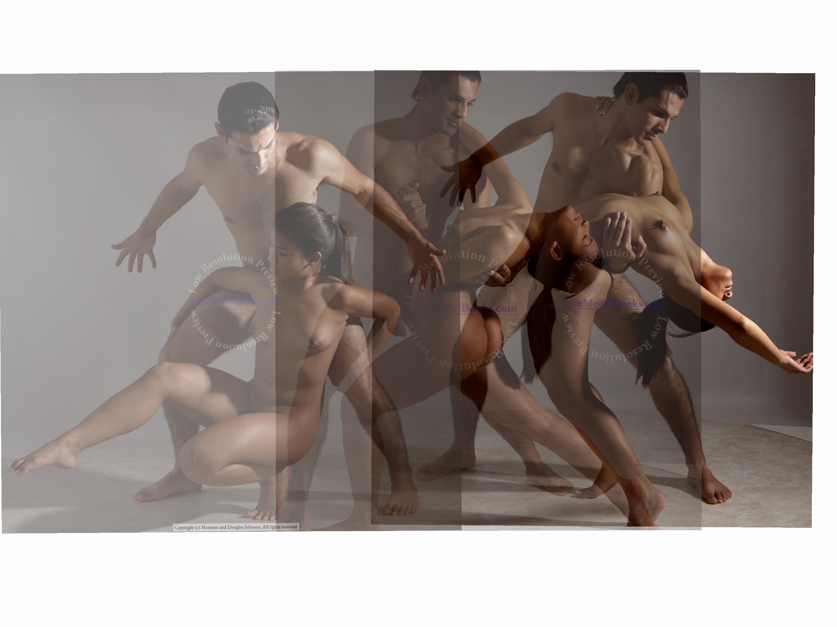
At this point I was constantly thinking about this assignment so I ended up dreaming of an image! It was a layered pencil drawing, showing moments changing over time.
I thought that to keep with the layers and the idea of movement, I had to collage. But this became too ‘chunky’ and although effective in some respects, was not showing my drawing skills as it should do in Assignment 5.
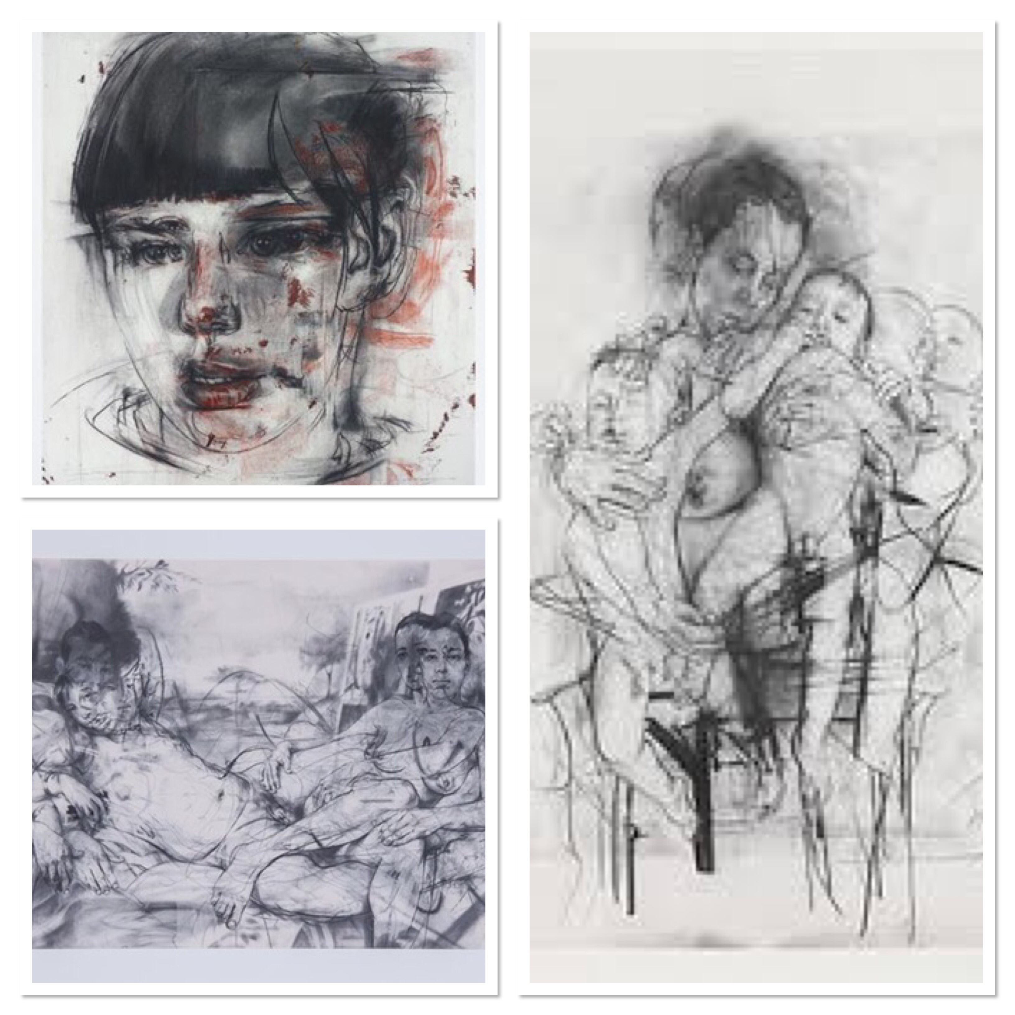
After another break and brainstorm, I reflected on the charcoal life drawings I had made on a drawing course a few years ago. I thought this could be a pathway, particularly with Jenny Saville’s fluid charcoal drawings in mind. I returned to my course self-assessment at this stage to hopefully regain direction.
During this time that I broke from this, a cup of tea with a friend gave me a new direction. Human connection and moments frozen in time had me thinking of the placement and movement of the tea cups and biscuit plate.
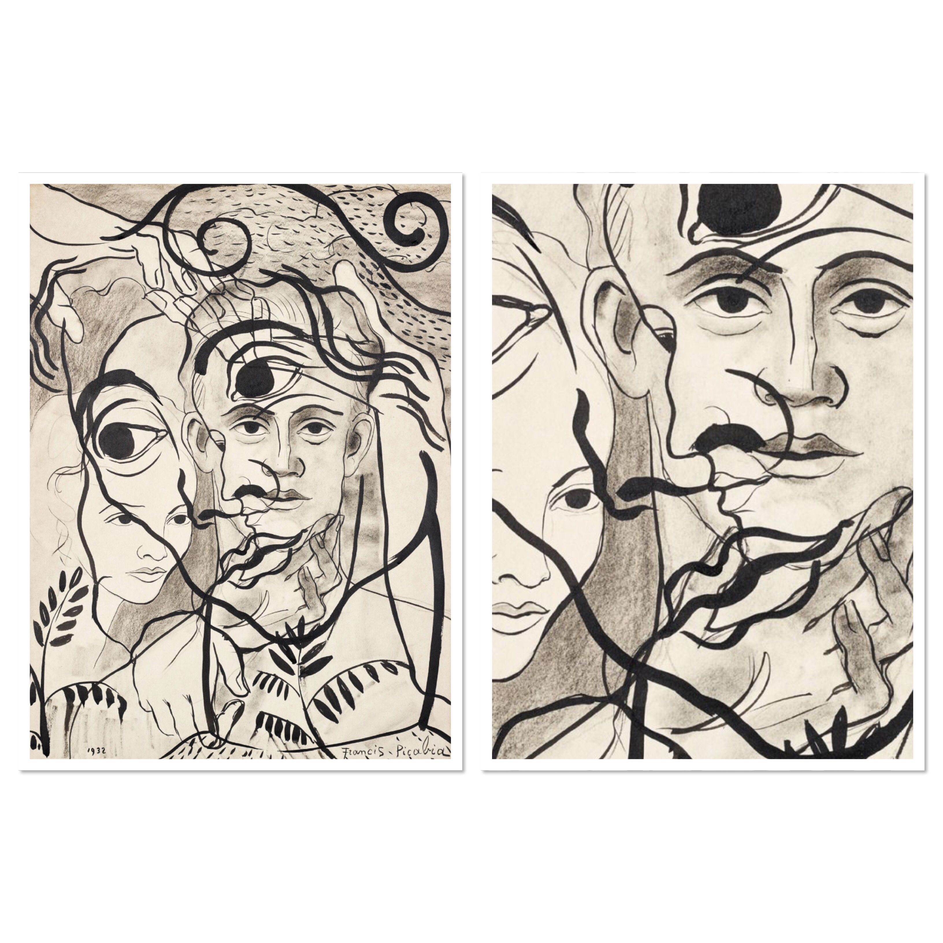
At this time I also came across Francis Picabia. His layered work reminded me of my earlier digital layered line play. I finally had a clearer vision of my ideas, with Saville’s inspiration satisfying my need for movement.
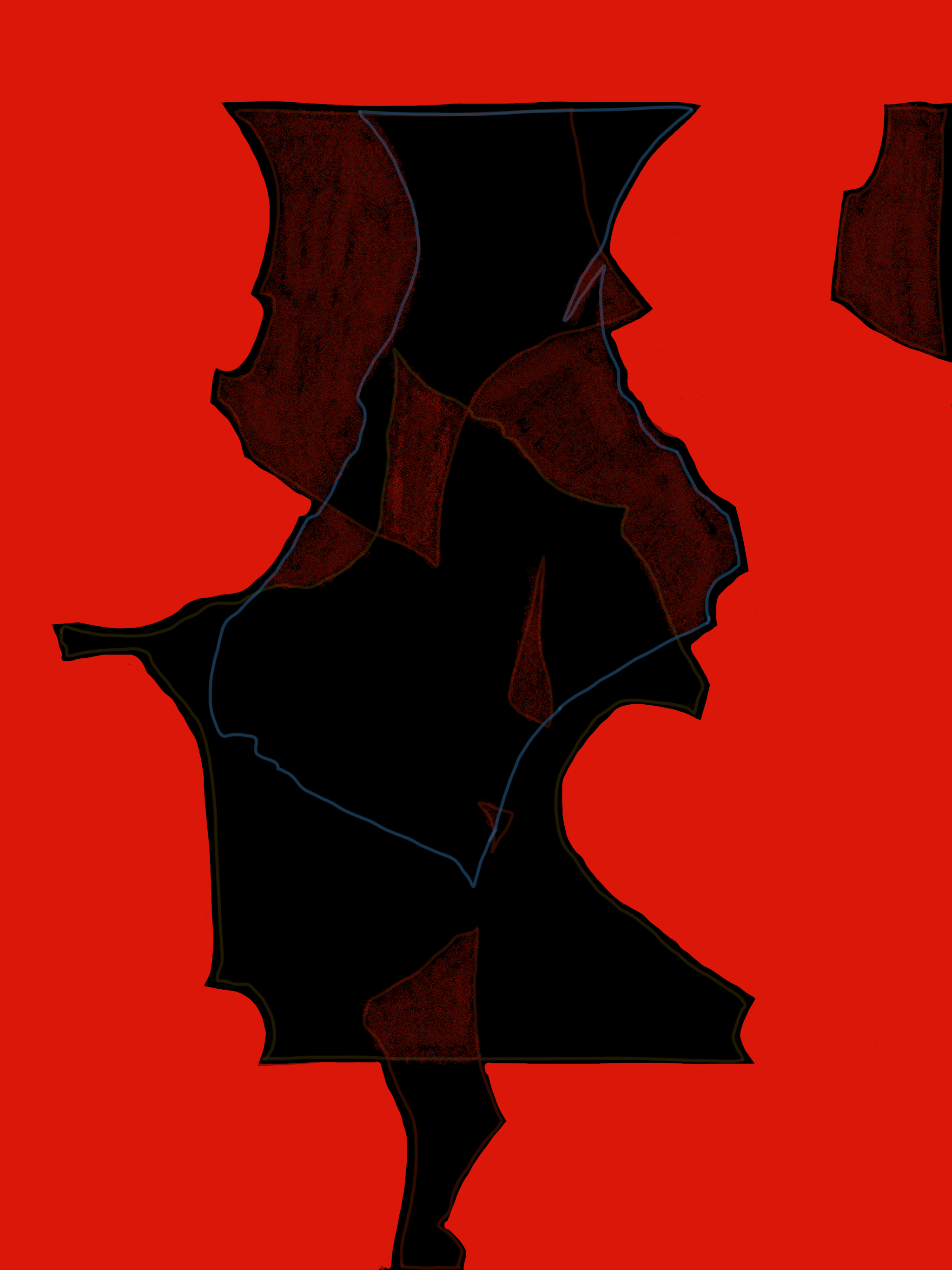
From this point on the piece evolved rather than followed a rigid plan. I layered a drawing with muted tones to illustrate precious moments caught in time but also its brevity. In turn new shapes were created between these moments.
The piece is made using pencil, charcoal, coloured pencil and chalk pastels. The coloured pencils were wax based so I learned that it becomes harder to draw over the top of the waxiness. In hindsight, I would add the colour last once the layers were drawn in but this defeated the object of creating the pictures as layers; one complete moment in time.

Human connection, moments in time and negative shapes and spaces meant I found lots of photographs of family – summing up the human connection and moments captured in time that I seem to constantly drawn to in this project.
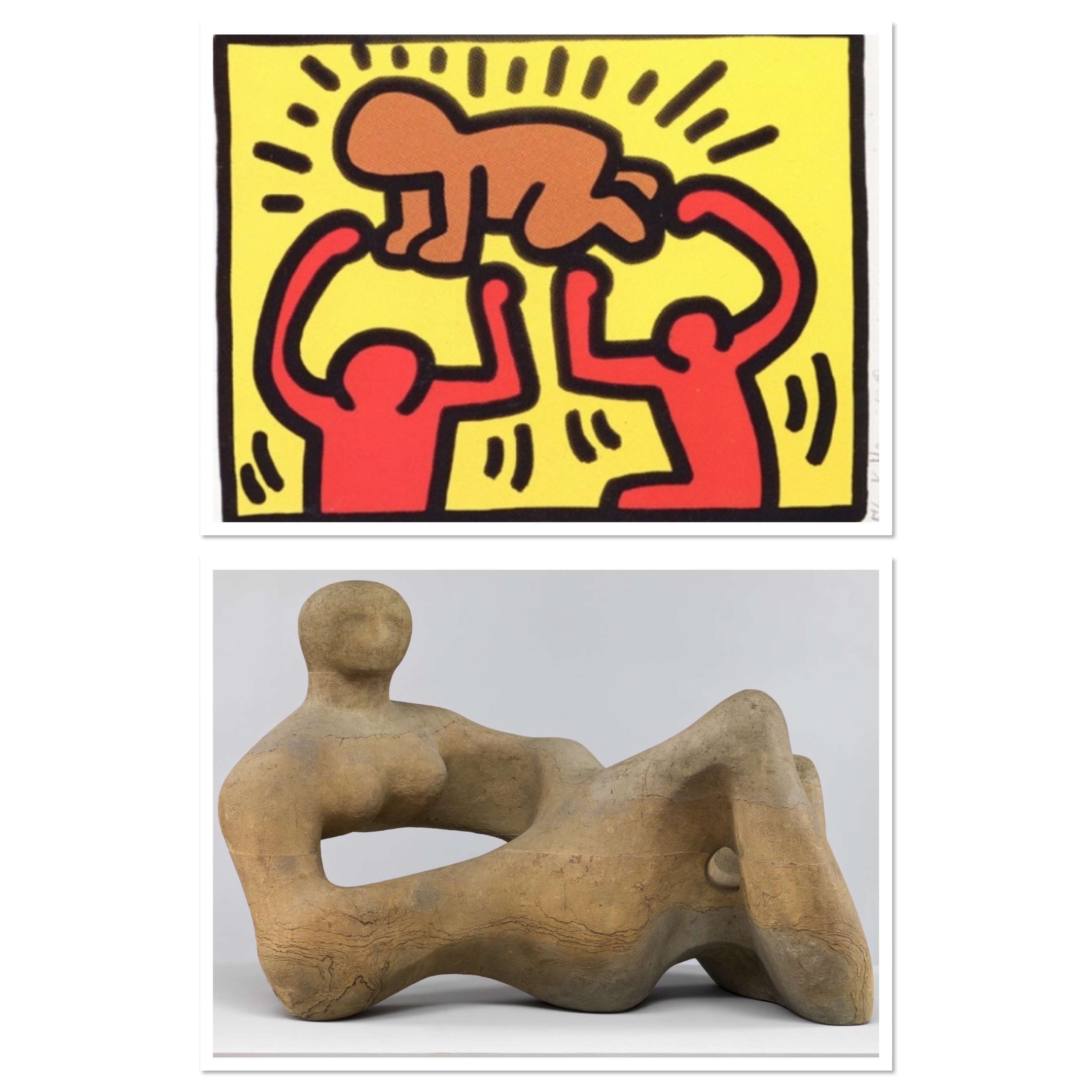
I looked at various artists who worked with space and shape. Keith Haring’s simplistic, playful shapes and forms and Henry Moore’s use of spaces in sculpture.
Playing with the images on my iPad looked me to play with line and shape but also placement. This led to abstraction and new shapes made by the negative spaces. Colour became a focus at this point too.


This was the point that I discovered Francis Picabia and reminded myself of Jenny Saville.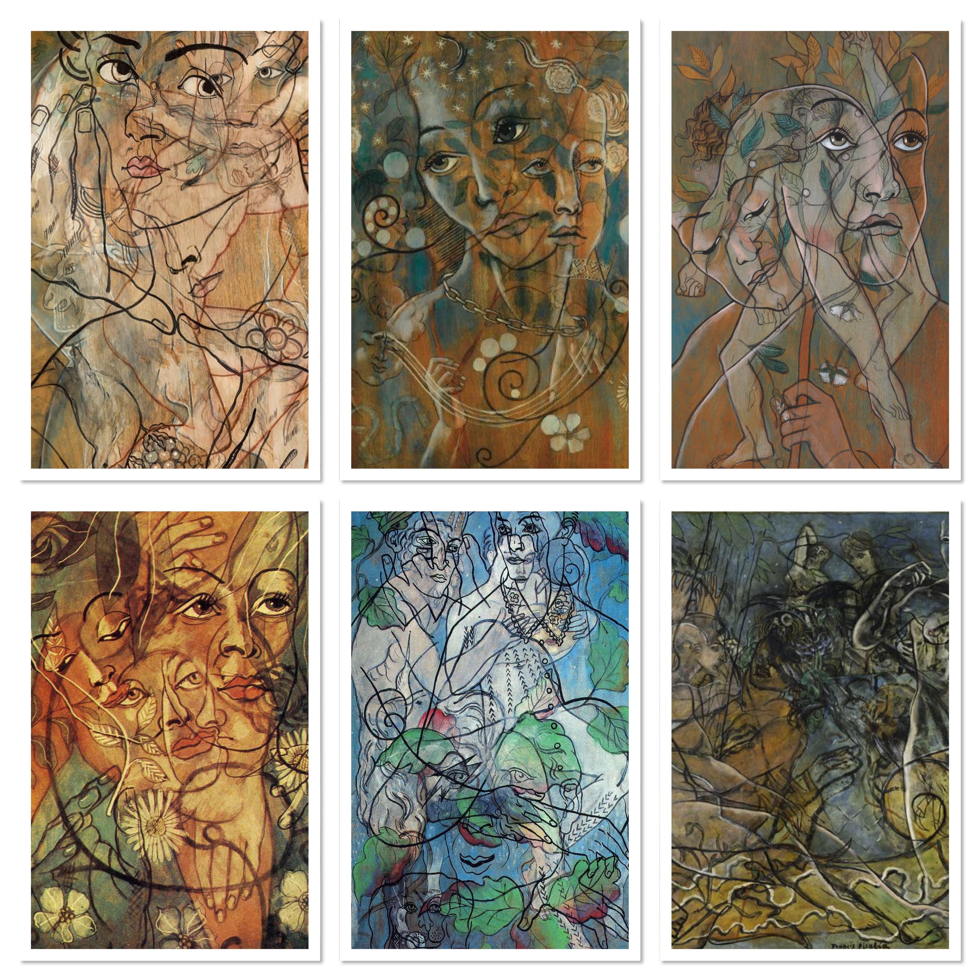
It’s worth pointing out that at this stage the assignment piece was evolving in its own right. I felt that the physical prep work is not enough but I had so much in my mind, it was coming out in the final piece.
What have I learnt
In the beginning for Part 1, I wanted to experiment with digital drawing in the hope that it was a variation of medium to submit. But I became aware that submission of ‘physical’ drawings on paper gave my tutor more insight into my techniques, pressure, clear mark making etc and therefore my developing skills. Looking back I did acknowledge that nothing beats handling a piece of charcoal, a granite pencil or pen and ink.
Early on, I knew that I would be battling my need to create realistic pictures. The still life activity helped me relax a little. Negative space and how objects link was in my mind, even at this stage. I liked the description of the space that objects leave behind.
Conté appeared to be my favourite medium of choice at this point, along with blue ballpoint and the the rough drawings that charcoal produces. I would like to experiment more with the soft side of the charcoal, maybe adding fluid lines, like my figure in assignment 4, maybe with Odile Redon in mind.
In the negative space exercise, the digital attempts are what I visualised in my part 5 preparation, making shapes out of the spaces left behind. The concept of negative space continued to run through in Part 2. I never realised how much I was aware of it and used it.
I need to try about four different arrangements of composition before deciding on a final one.
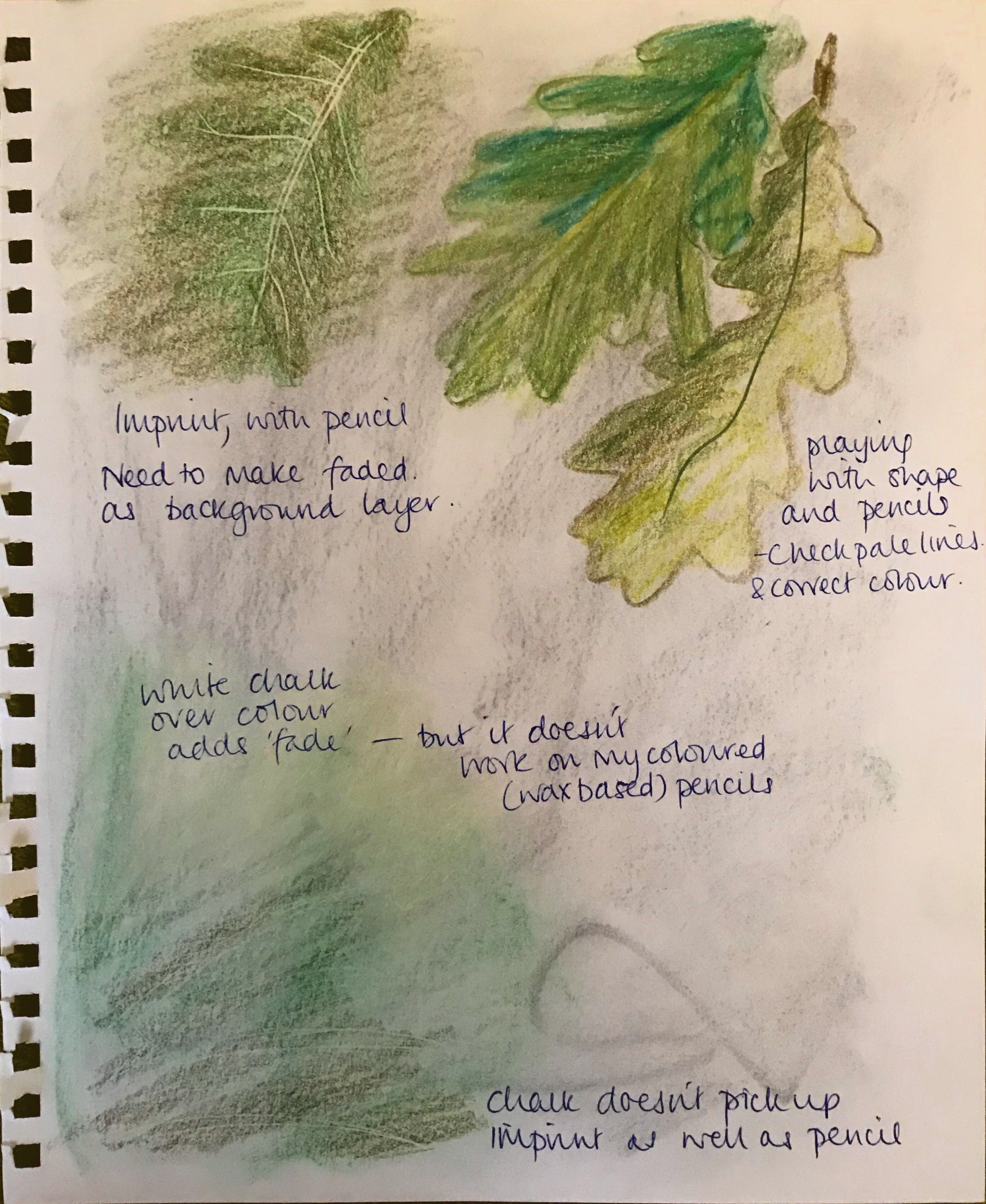
I became more relaxed with mark-making, when the exercises were less restrictive. I like my mixed media and the oil pastel resist that I produced in a state of freedom! I enjoyed using monochrome pen and ink in the assignment in Part 2, I should consider more use of colour. With this though, I could probably look to use heavier paper and practise stretching it before working wet on wet.
Observing detail in trees was an enjoyable task. I enjoyed honing in and losing myself in it. Again, using the blue ballpoint enabled me to bring it out. In contrast, I also was very pleased with the results of the loose, conté drawing. Pen and watercolour helped me create definition and tone in a several landscapes and this was considered a strong point. I risked overworking the lines and hatching. I questioned my drawing style at this stage. I felt possibly a lack of definition but then am I trying for more detail too much? I am possibly missing tonal areas, am I aiming for atmosphere or quality of the drawing? I especially enjoy line work, creating tones in landscapes and water.
In part 4 I showed some good drawing in places, but obviously not consistent. Fabric and drapery is not my strong point but I don’t think I gave it the time it needed. I need to work on my measuring and triangulation with body proportions appearing not entirely accurate, even using a ruler/straight edge.
I should make more analytical reviews on my blog.
Assignment reworking:
Assignment 1 – not to be submitted but charcoal should be reworked, more tonal definition and fixative.
Assignment 3(ii) – rework pencil markings, using different grades.
Assignment 4 (i) – tape to board and put over blue wash on background.
(My comments in green)
Overall Comments
Many thanks for sending me your 4th assignment.
Looking through your online blog I appreciate that you have not sent everything for comment but the first thing that attracts my attention are your drawings illustrating Line Play.
This post, Line Play, was a post of my own art that I was working on in between exercises. So, nothing to do with my course.
There is no comment attached to these so I am at a loss to know where they came from and what is their inspiration. The obsessive use of line combined with watercolour in the greeny/blue flower picture is quite evocative as is the pylon type drawing with the discs, which I presumed are collaged on. This is the problem with looking at work digitally – I cant see how it is made – but I am impressed with the freshness and the contemporary feel to this drawing. I noticed a similar feel to a print by OCA tutor Doug Burton that is useful to point out.
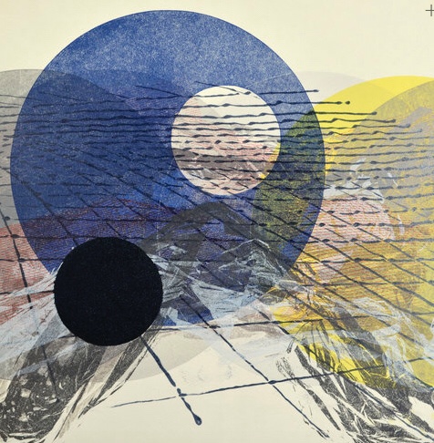
Doug Burton
I think I mention before your ability with the pen as opposed to the pencil and I see this also in your drawing of drapery which is less linear and more an exercise in tonal arrangements. Youtube demonstrations are very useful and a quick look on youtube throws up this demonstration which although a bit long winded shows the folds being realised in pen through hatching and if you looked you would find others.
https://www.youtube.com/watch?v=g5Mdbo-yu4U
****
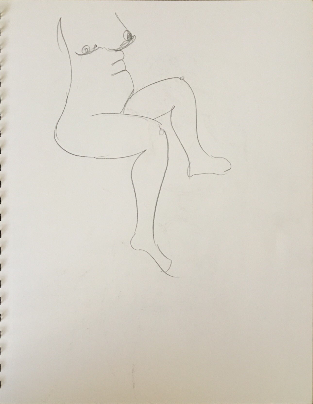
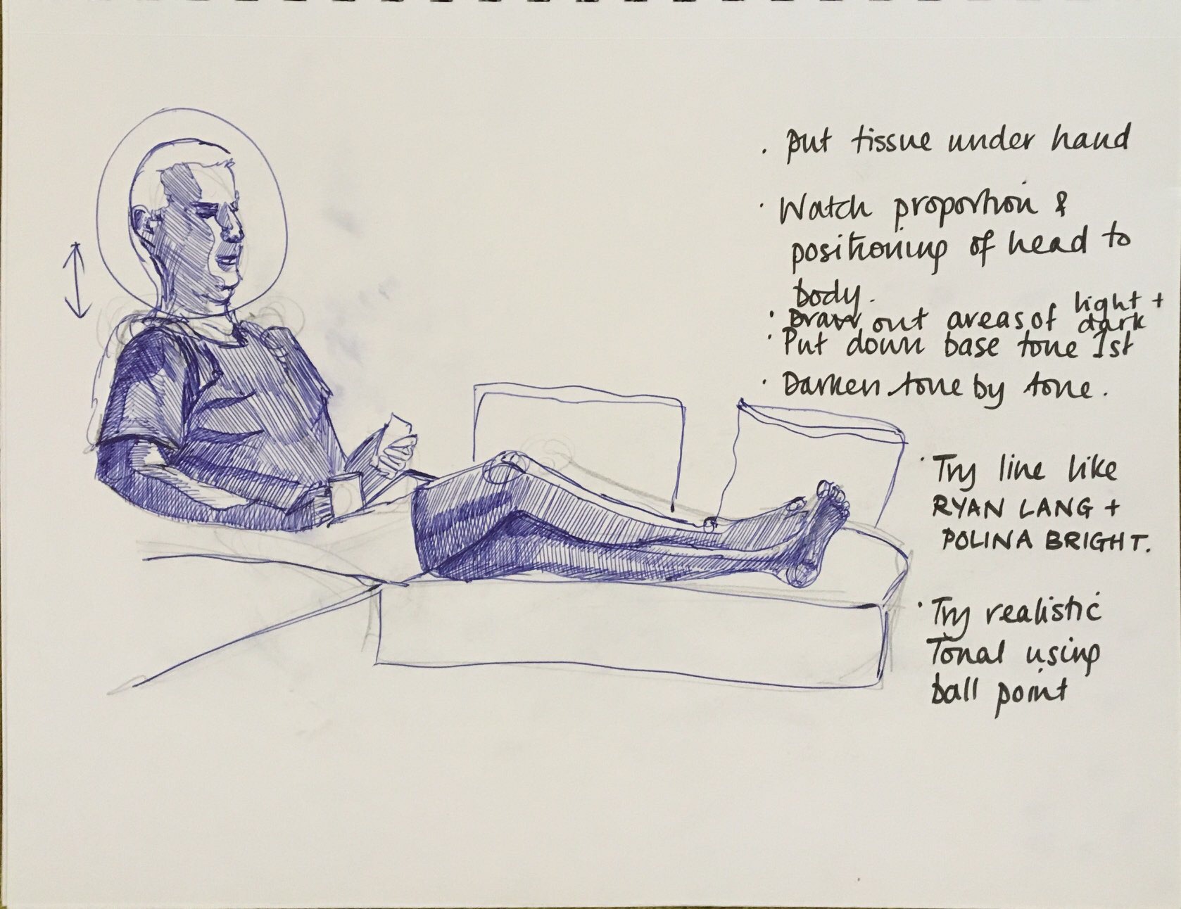
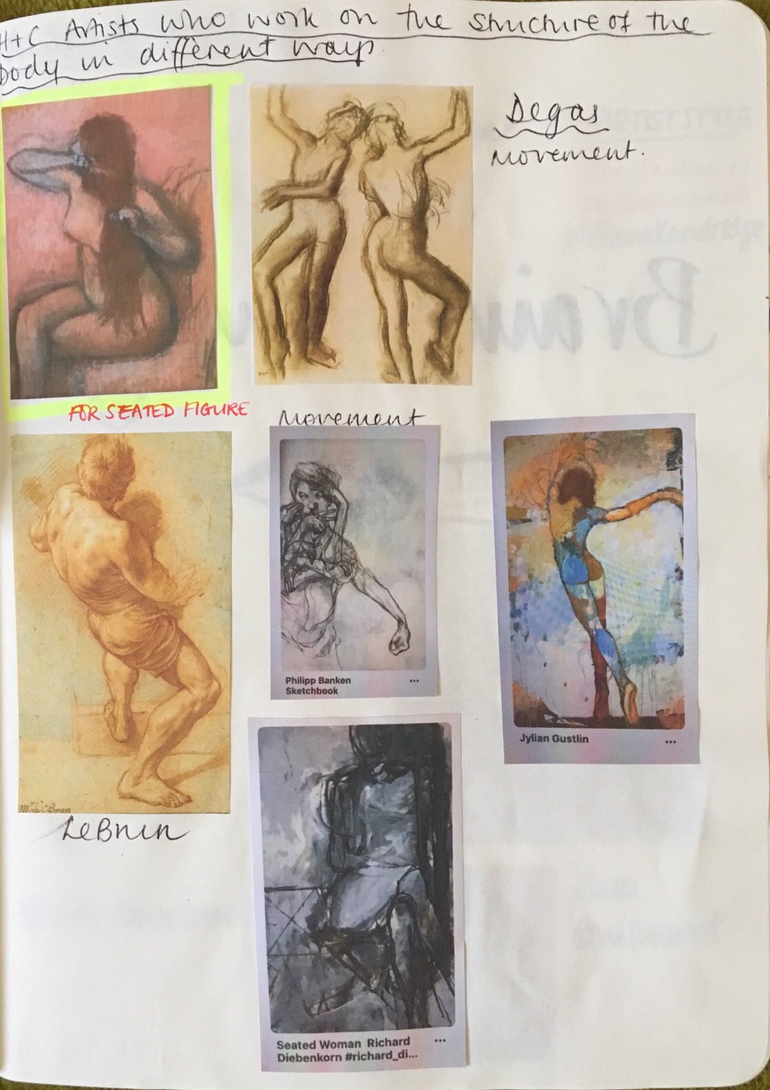
Moving on to the life drawings,the quick studies show a variety of approaches and mediums and as quick sketches they have a vitality that can produce in places some passages of accomplished drawing. The problem is to combine all the best bits into a longer more realized drawing. The charcoal drawing sent is quite impressive the stance is arresting and indicates movement the fact that the head and feet are too small and the arm too long and the stance awkwardly proportioned is neither here or there. It’s the intention that matters. El Greco with his elongated figures is a case in point. **(research El Greco). But I do think its important to get the proportions right and various strategies can be used as I am sure you know. Measuring out the figure is important, getting the angles and proportions right and of course realising that your figure will inevitably move means being willing to alter what you have done to follow the body. And of course leave out doing the head until a later opportunity presents itself.
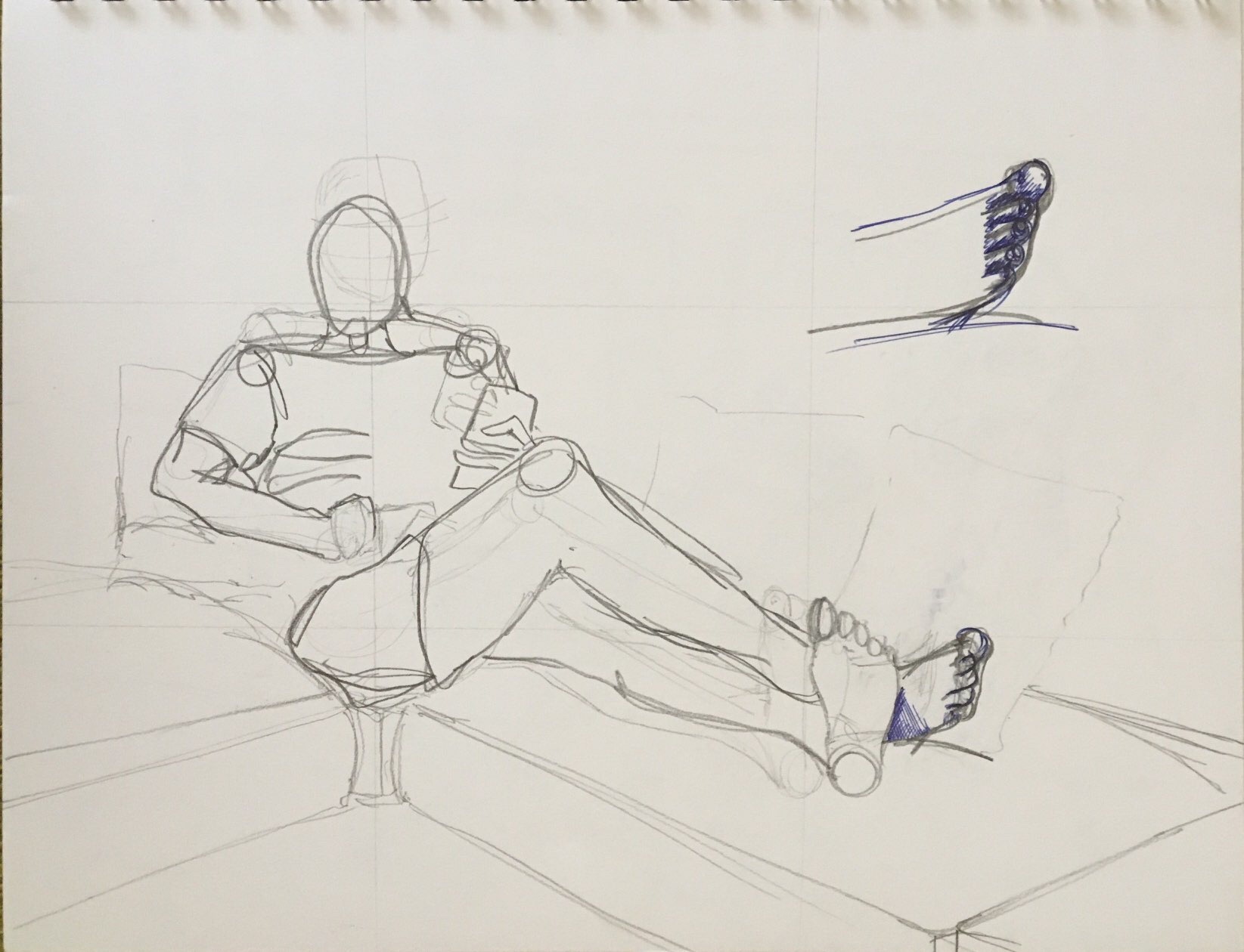
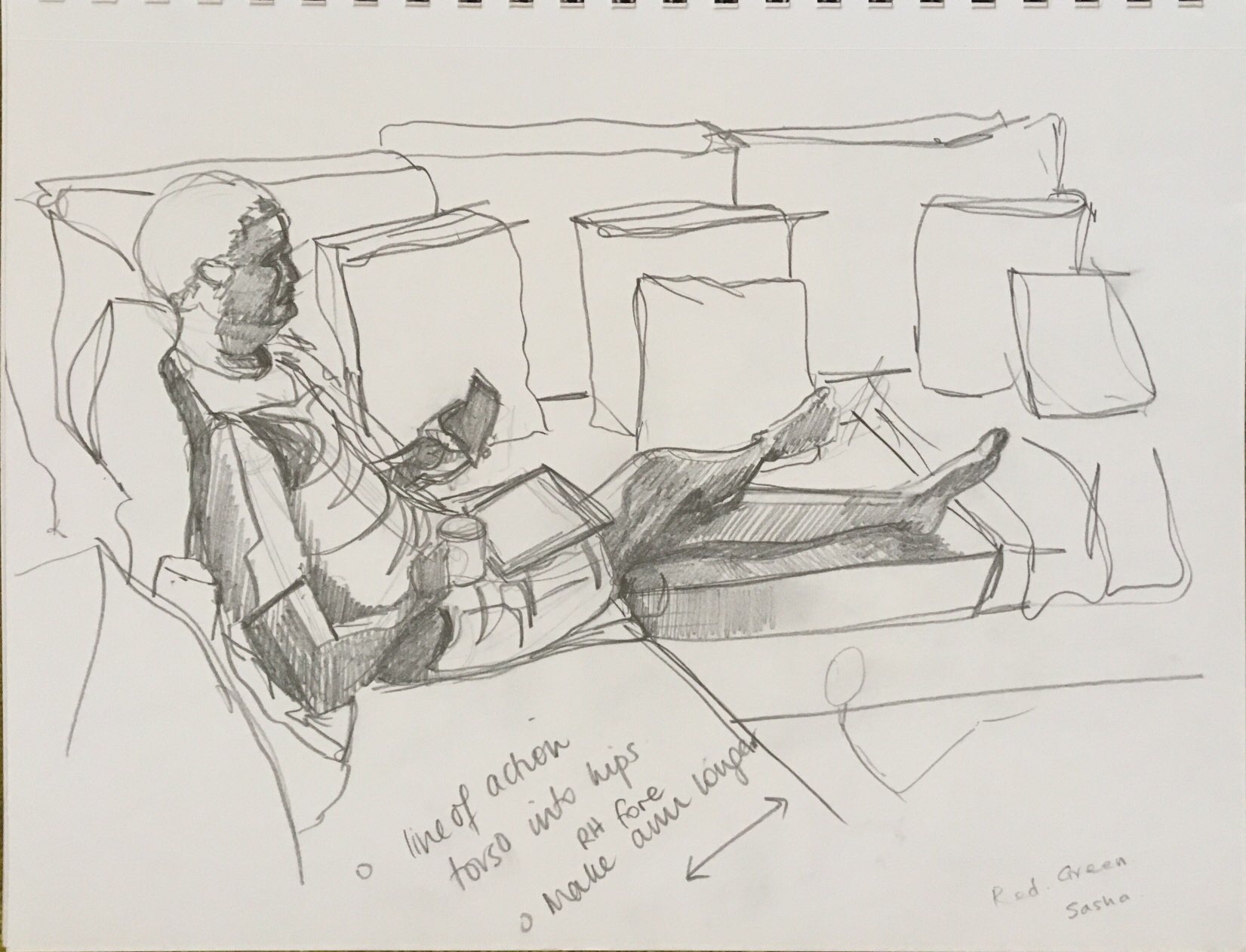
The seated figure drawing in black pen in the sketchbook is well done especially the hatching in the T Shirt . I think the leg is too long but I appreciate this is a quick drawing and I see this has been corrected on the next page but the other leg to compensate seems to have got bigger. (I was aware of this from the outset and I tried too hard to correct, overcompensating essentially and losing my ‘eye’). No matter but when it comes to doing the finished drawing then measuring techniques should come into play and triangulation using a straight edge or a ruler is important.
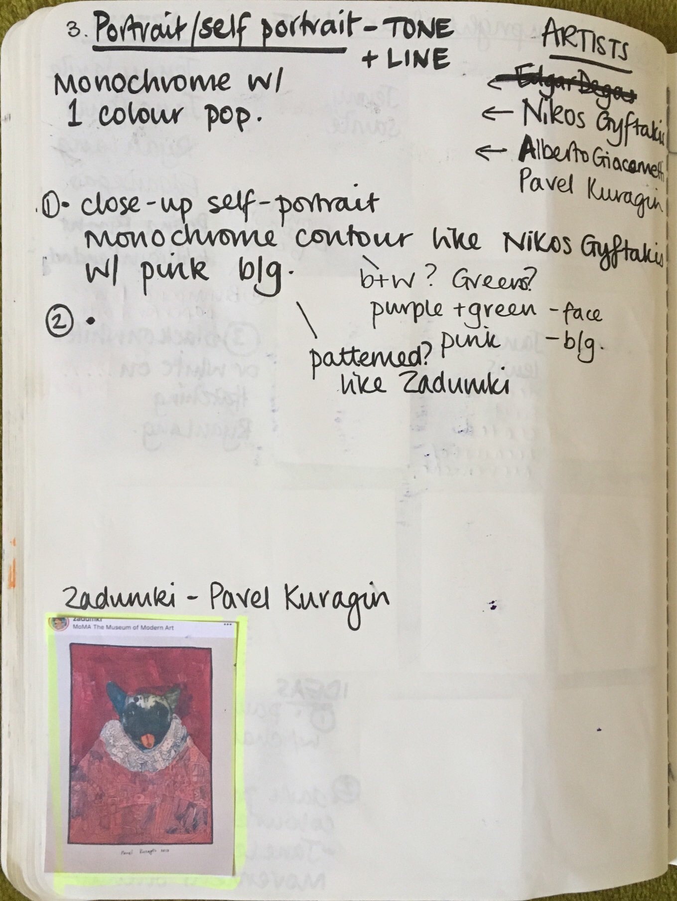
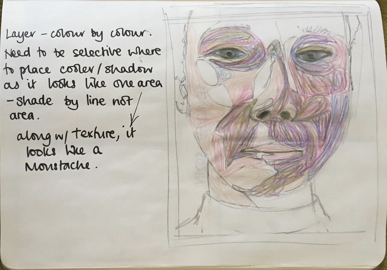
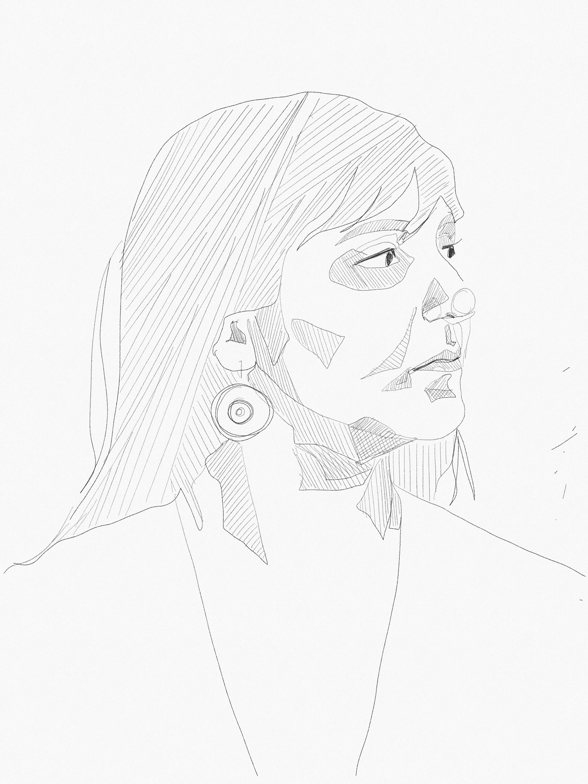
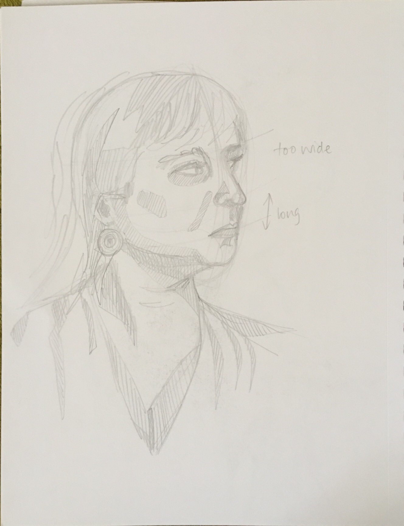
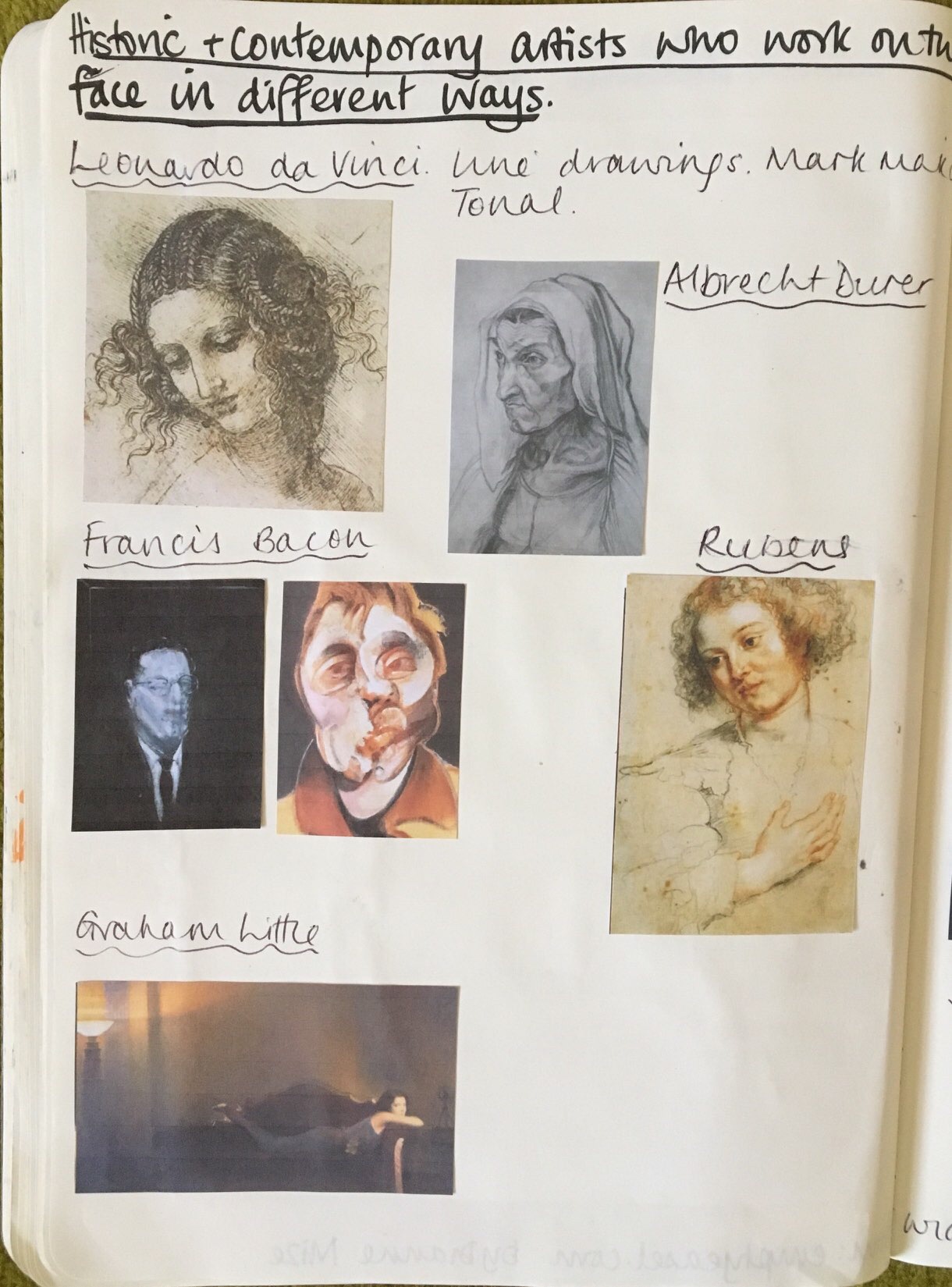
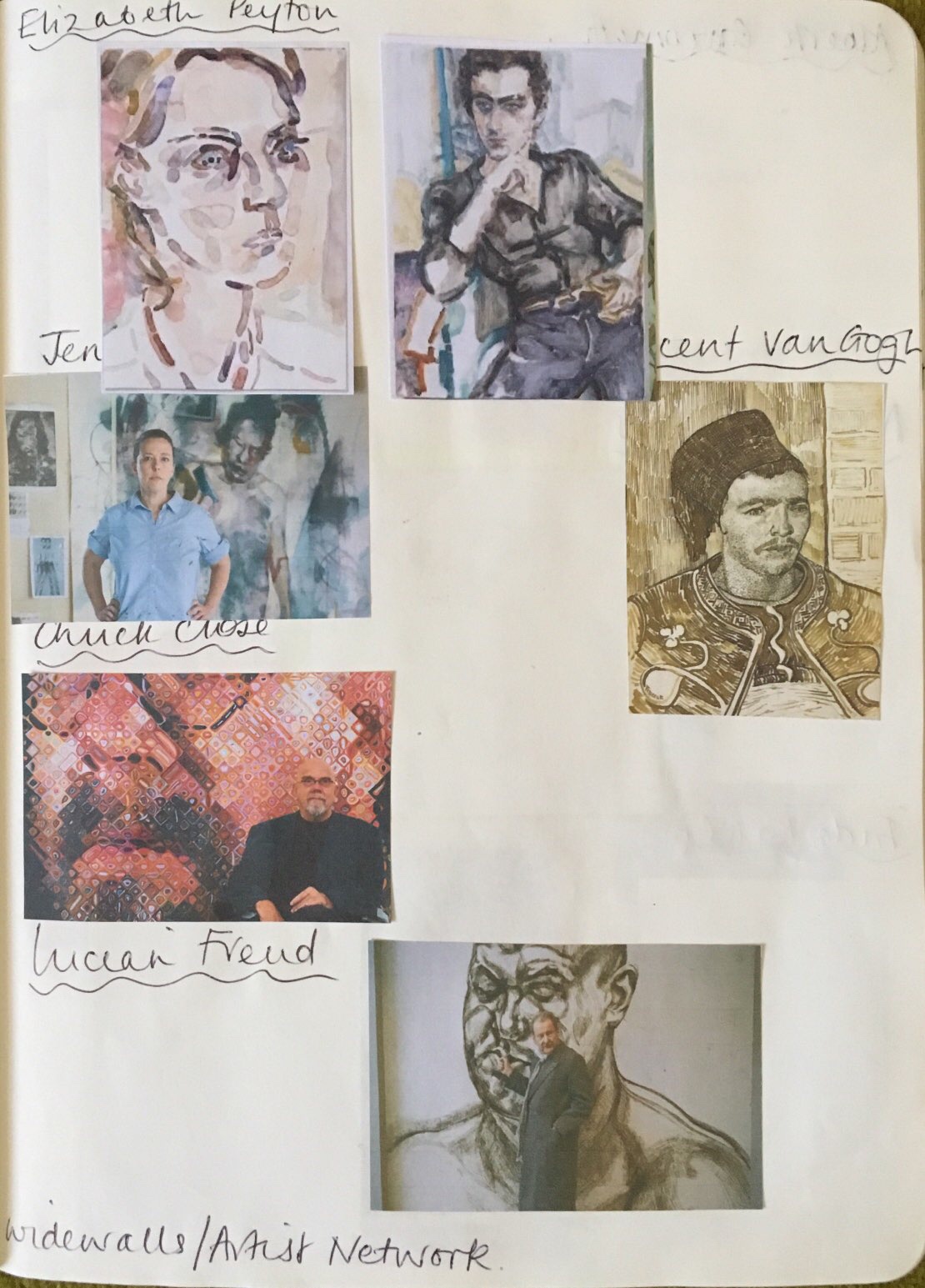
Portraits are next on the menu and can present their own challenge . Looking at the work of great portraitists from Rembrandt to Lucian Freud and many others will help and I think that copying an example is the best of all. It may looked down upon in todays educational climate but it is a tried and tested method in the past and one still worth using. I acknowledged this in my own reflection.
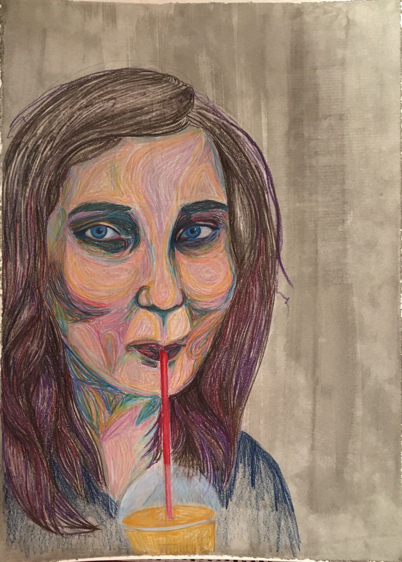
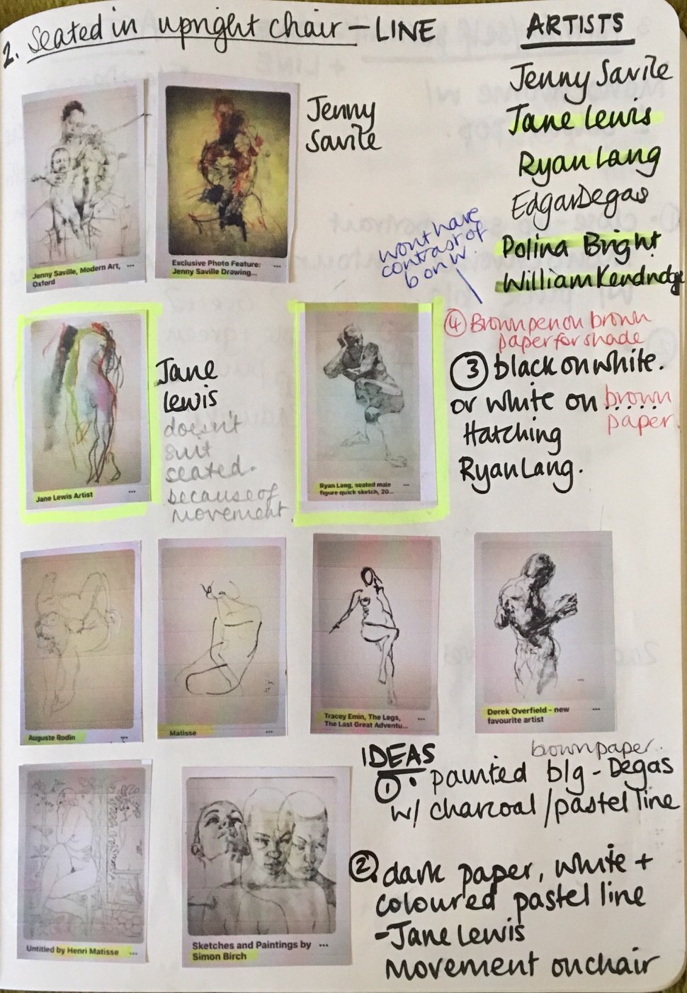
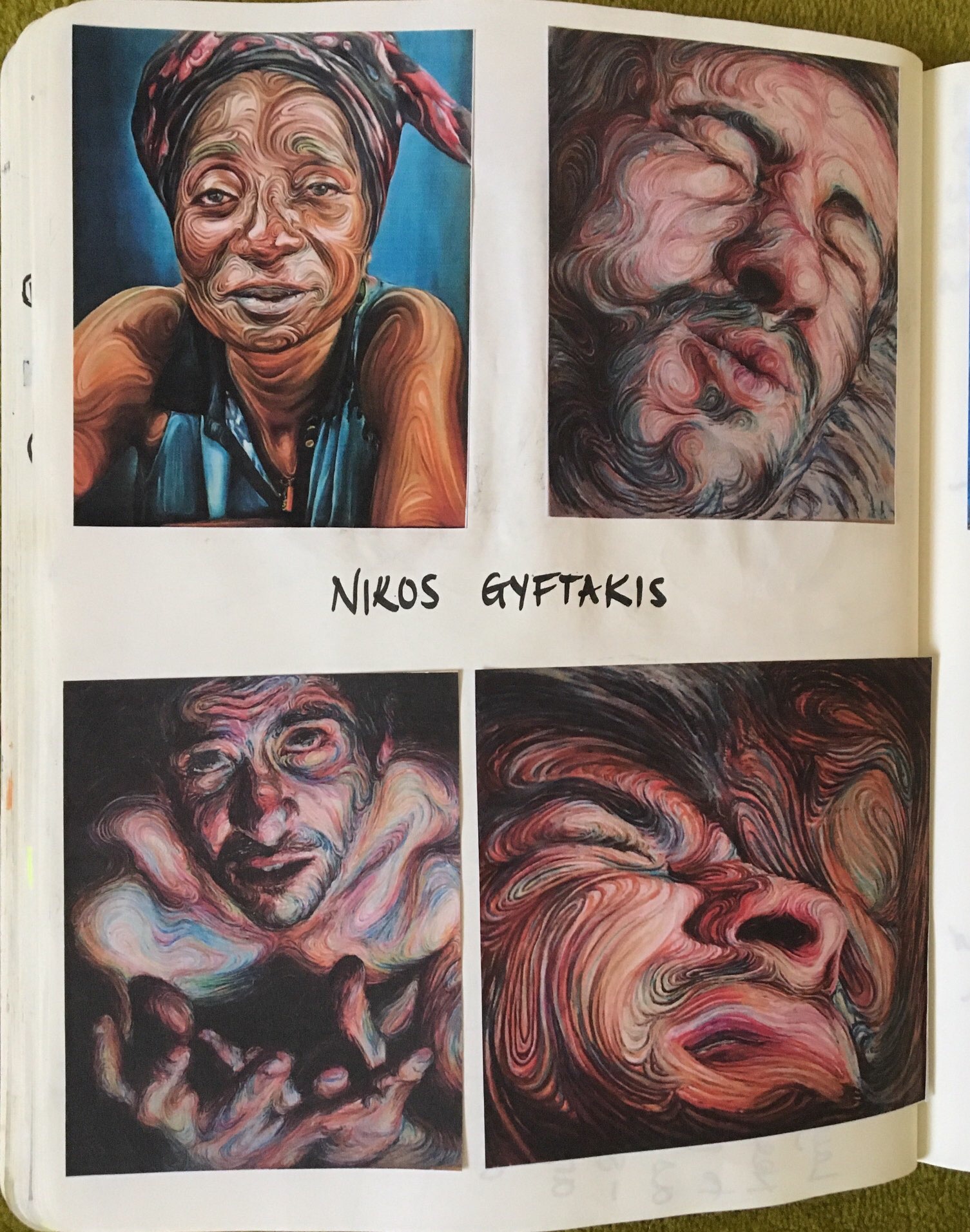
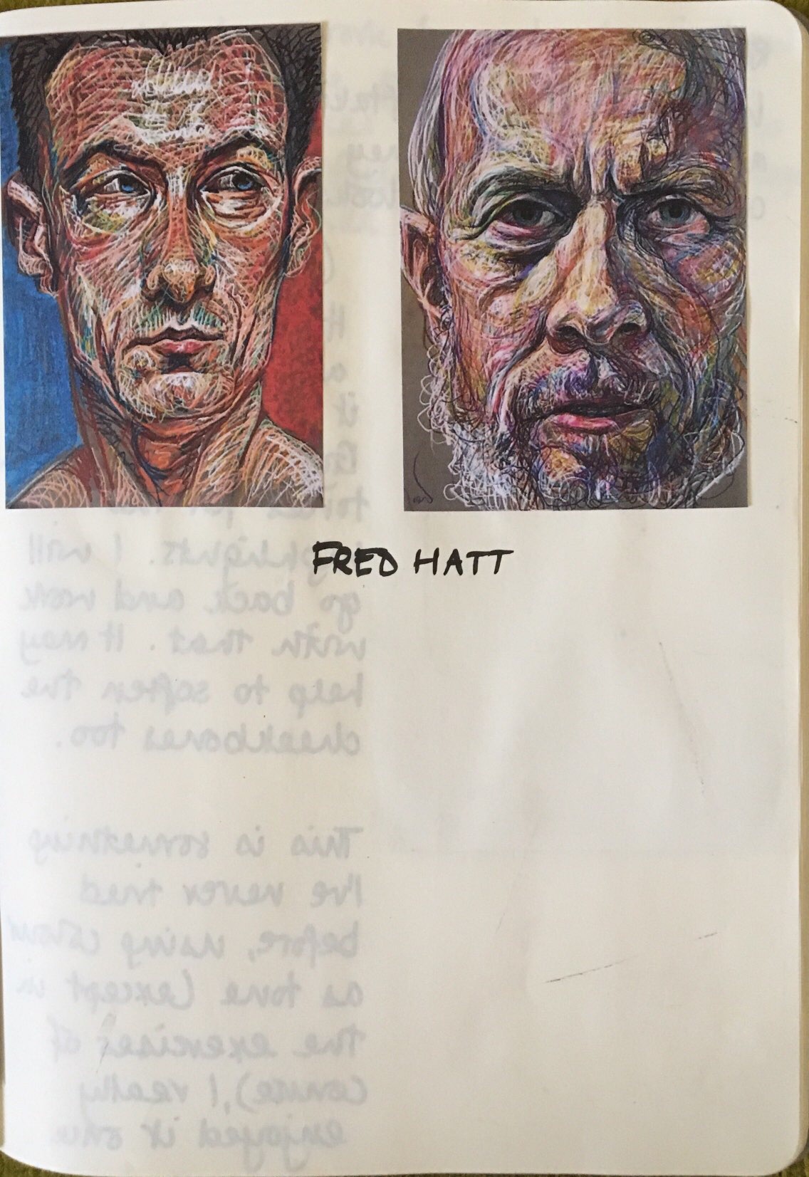
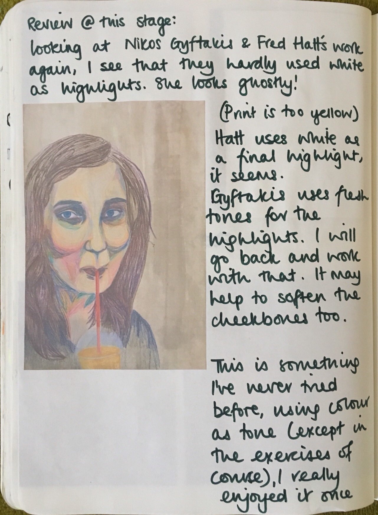
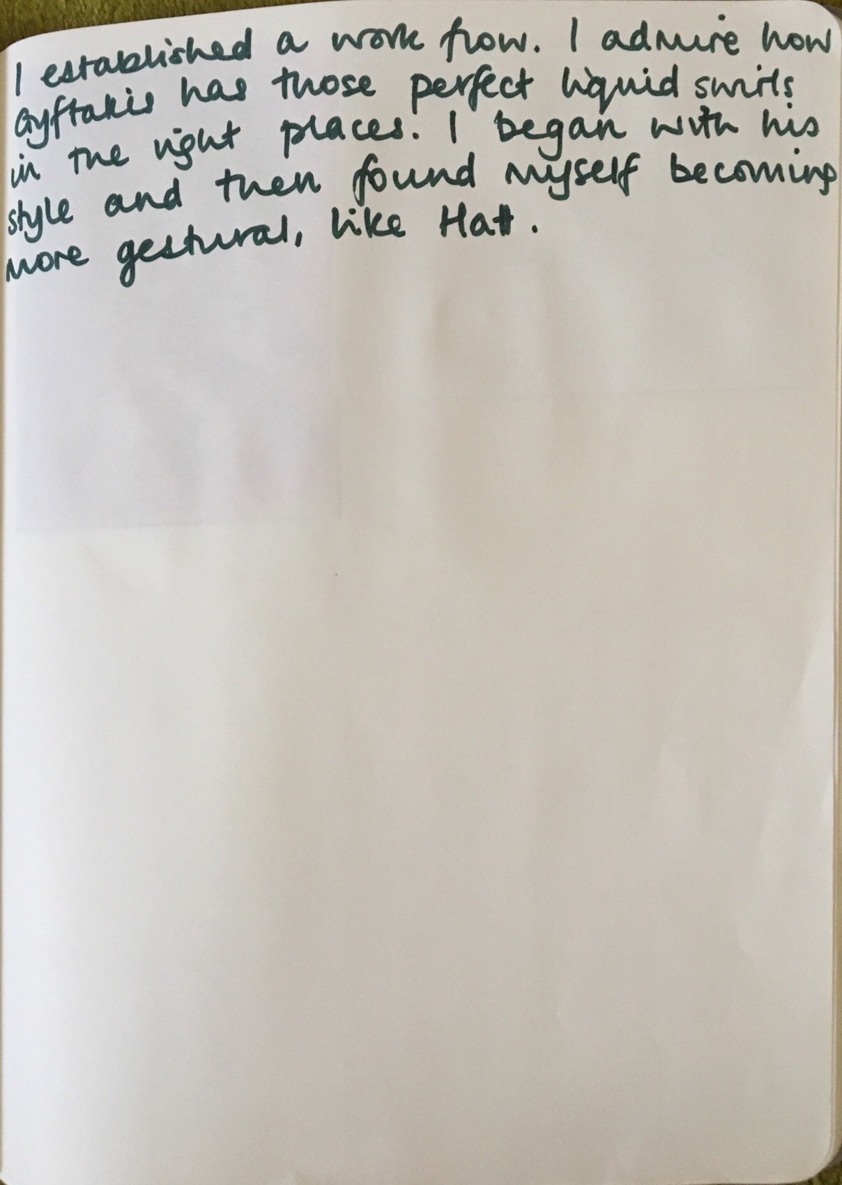
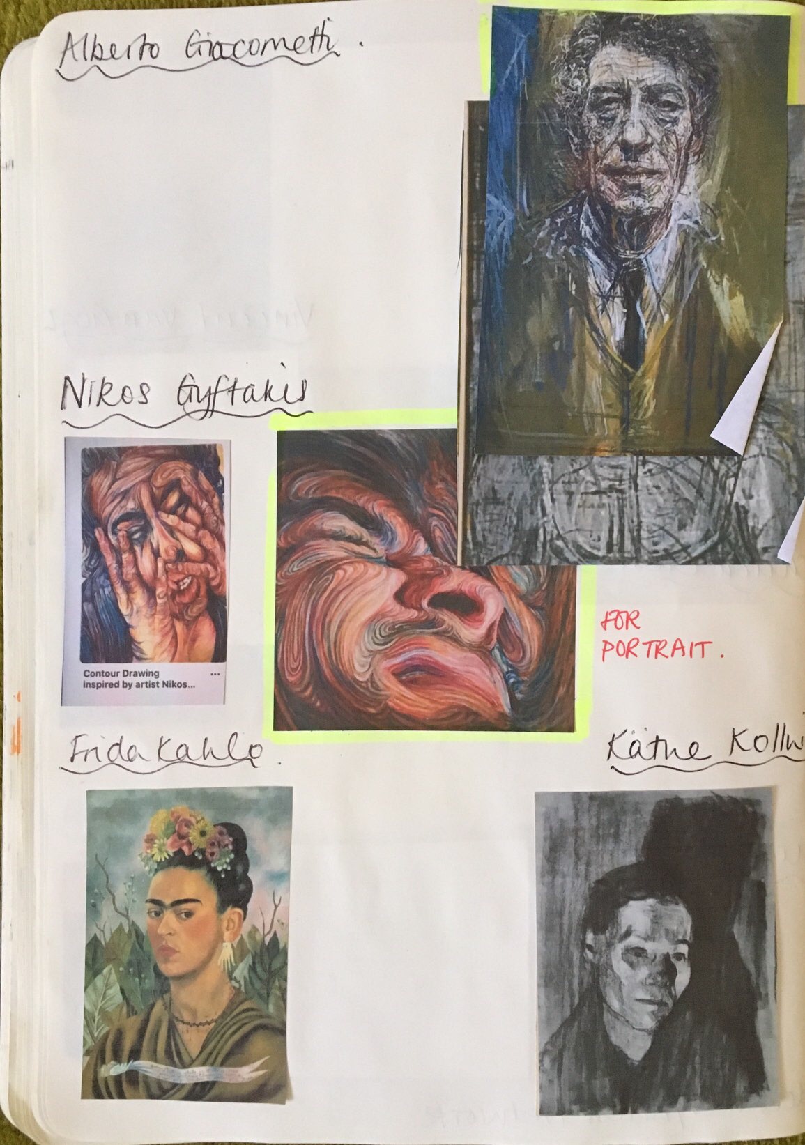
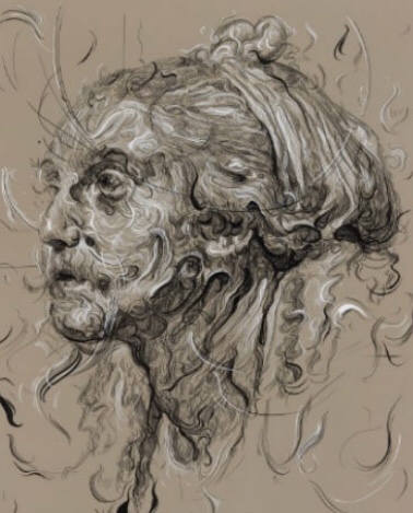
The model you seem to have chosen is the contour drawing method of Nikos Griftakis. There is however a hierarchy in the world of art and it is better to look at the work of established and well regarded artists such as Jenny Saville, Lucian Freud or even Glen Brown if you want to emphasis contours in an interesting way.
I have a real problem with art hierarchy. And am beginning to feel like I shouldn’t be having this problem and I should be understanding. Art is so subjective. I think I just need to have it explained to me why I should study Jenny Saville, whose work I do love, and not Nikos Graftakis or Fred Hatt, whose work I am fascinated by. I appreciate time to be established is a big factor but how else are other artists expected to compete and raise themselves in the art world? But then I’m just a teacher studying art in my 40s…
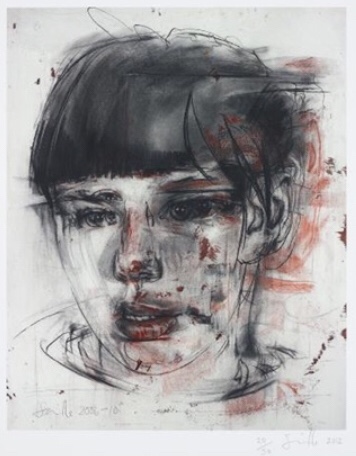
Jenny Saville
Glen Brown
Your own drawing interestingly uses contour lines that don’t emphasis the roundness of the forms but I’m not sure if you intended that effect.
I acknowledged I struggled to replicate the true form in this style. I’d like to try and copy Brown’s work, a name I have not seen before. A very interesting example, a contemporary approach with a Renaissance feel.
Feedback on assignment
Demonstration of technical and Visual Skills, Quality of Outcome, Demonstration of Creativity
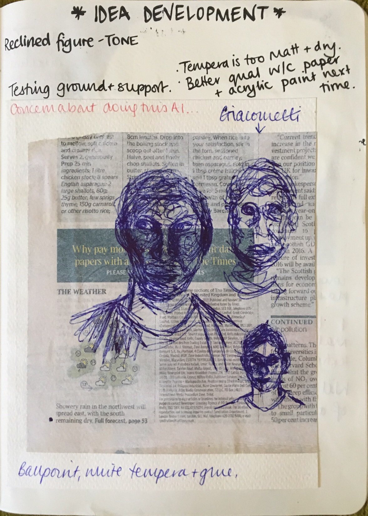
For your assignment you have chosen to be experimental and work on newsprint which is not the best paper to use but giving it a light coat of white paint helps you to work on the drawing. As a background it seems too blanched out and perhaps it should be more integrated into the overall image. In retrospect and in hindsight it might have been better to prepare the background first sticking it down on a more solid surface and then varying the transparency of the white let some area come forward and others go back before starting the drawing.
I did attach it to a board. I could have varied the depth of spray paint.
On the drawing itself, the positioning of the body where you are looking down at an angle allows for a perspectival opening up in the picture. There is very effective use of a blue ballpoint with intense hatching which enlivens the surface , the drawing is accurate and in proportion and the lighting is very effective . So it is down to integrating the background in some way.
The options are
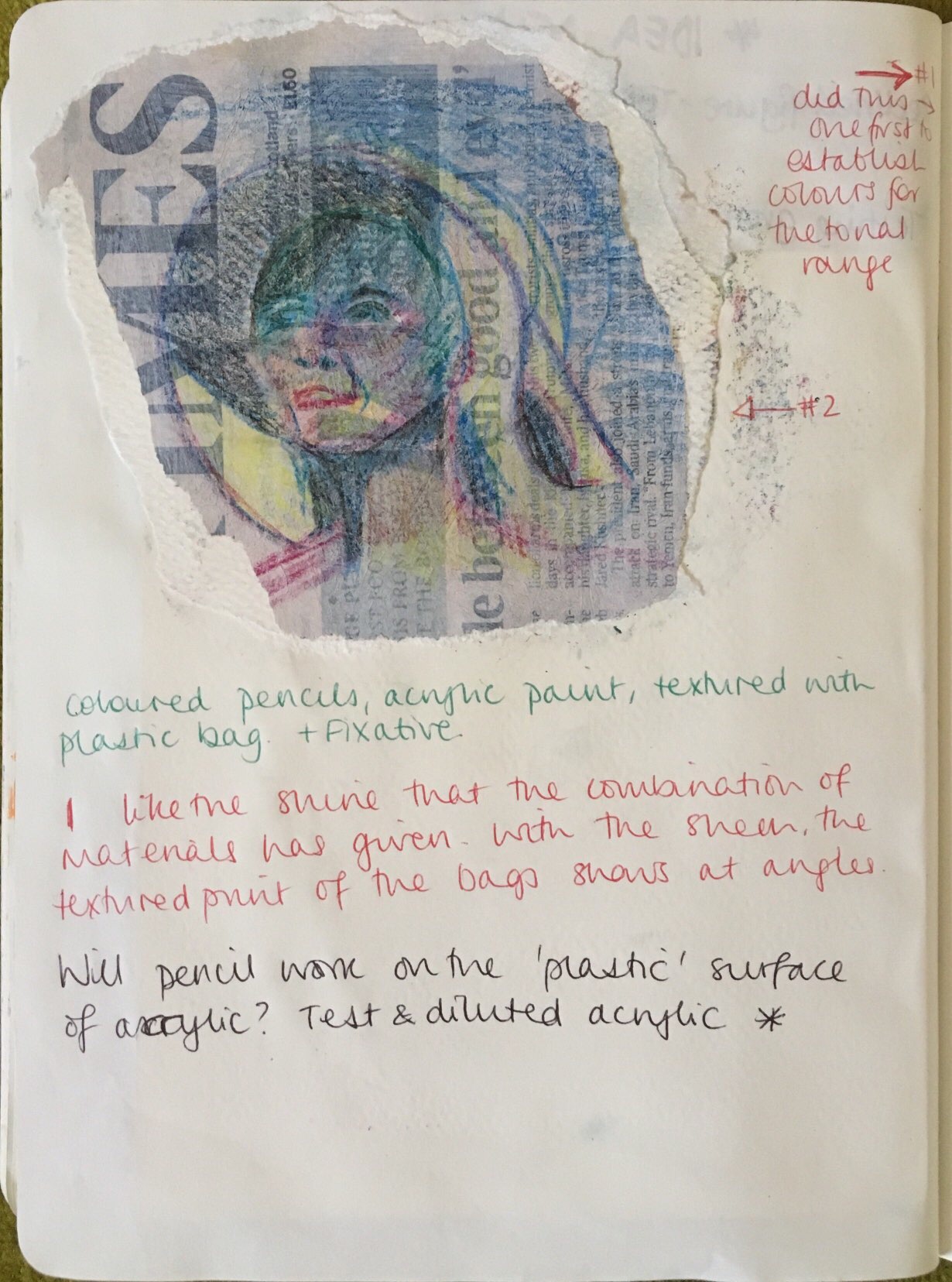
1. Looking at the Lisa Brice paintings, paint a glaze of blue over some areas of the background. This sounds appealing as I like her work very much.
2. Recollage the background around the picture to integrate the background imagery more.
3. Cut out the drawing and re collage it on another background.
3. Leave it as it is as a work in progress.
Sketchbooks
Demonstration of technical and Visual Skills, Demonstration of Creativity
The Sketchbooks are being used well with lots of drawing and the opportunity for insights.
Research
Context, reflective thinking, critical thinking, analysis
Research is also effective with context being given to the work. You are looking at other artists work and learning from them.
Learning Logs or Blogs/Critical essays
Context, reflective thinking, critical thinking, analysis
The blog is well written and if possible should contain more analytic reviews of artwork seen and researched.
Suggested reading/viewing
Context
For drawing of course the Scheile and Klimpt exhibition stands out at the Royal Academy while the next big exhibition at Tate Modern is the Bonnard and although primarily a painter and colourist if you can get to see it it will be worthwhile .
Bonnard
Pointers for the next assignment
● Reflect on this feedback in your learning log.
Strive for more accuracy in drawing.
Demonstration of technical and visual skills – materials, techniques, observational skills, visual awareness, design and composition skills
As the course continues to develop I am becoming more aware that I need to use a wider range of materials. Like assignment 3, with more time a viable I think I have been developing the variety and instinct for materials. I know I am curious enough to experiment and try new combinations but such experimentation takes more time that I could give in this course along with my work-life. In a full time educational situation I know I would have the means to successfully follow such ideas through.
My visual awareness and compositional skills continue to progress and feel second nature. I am always looking at objects, people and connections to see how I could interpret and represent them; there is always room for learning!
Quality of outcome – content, application of knowledge, presentation of work in a coherent manner, discernment, conceptualisation of thoughts, communication of ideas
I am enjoying presenting my sketchbook as a working piece. Showing all thoughts and processes allows a concept to form, with which I can develop. I teach my school children to use their ‘Art’ (as opposed to ‘sketch’) books as a working book, to show me how they are thinking and developing.
Demonstration of creativity – imagination, experimentation, invention, development of a personal voice
I think this assessment criteria will become more evident through assignment 5 as the exercises so far have been quite prescriptive on the surface. Interpretation is key, I am seeing, and this has enabled me to relax, simplify and play again. I always remember that I was experimental through my A-level as it was less structured and I was not working through developmental exercises.
Context reflection – research, critical thinking
This is another criteria that could always benefit from more time being spent on it. I think in reflection, I need to make a study schedule so that I allow an amount of time of research and reflection. In further levels this will become a priority.
I also need to allow myself to turn to artists for inspiration, even to replicate and use their techniques to inform my work. I was always a little reticent to do this but I am well aware of its advantages. Again, more time spent on this would be a benefit and a work flow and schedule would help this happen. Research – replicate – apply – reflect.