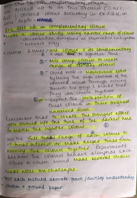
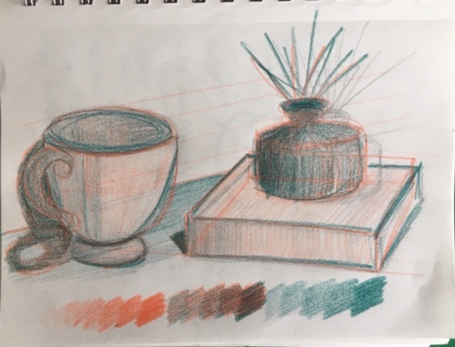
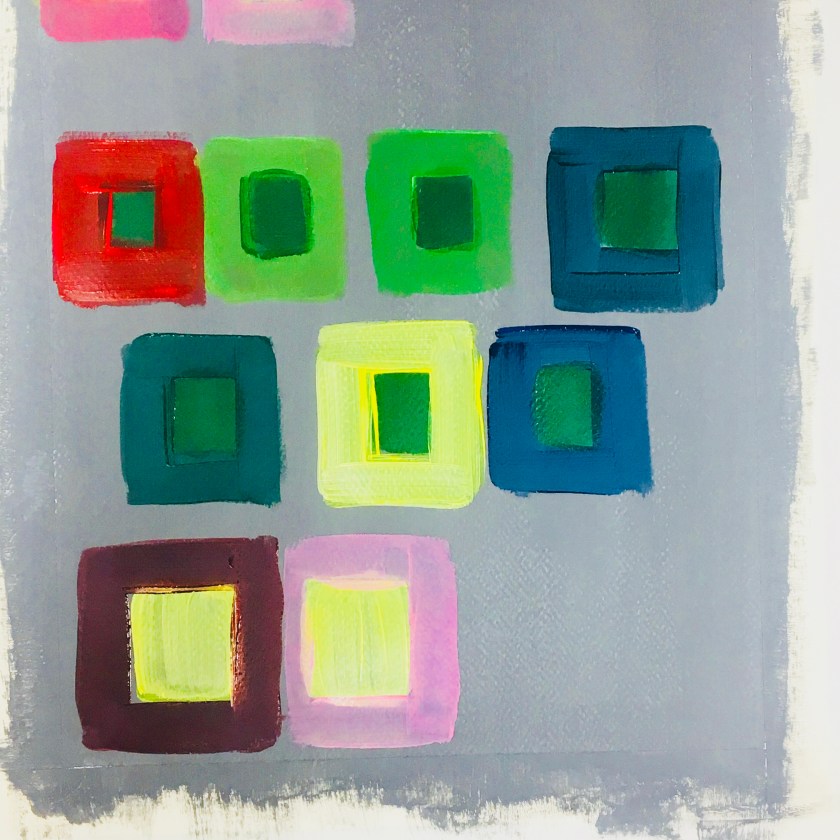
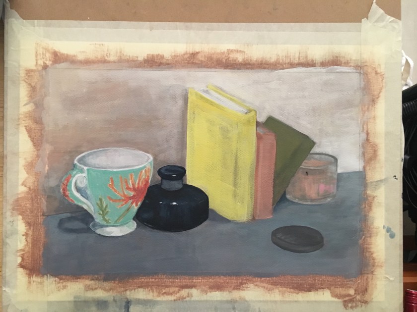
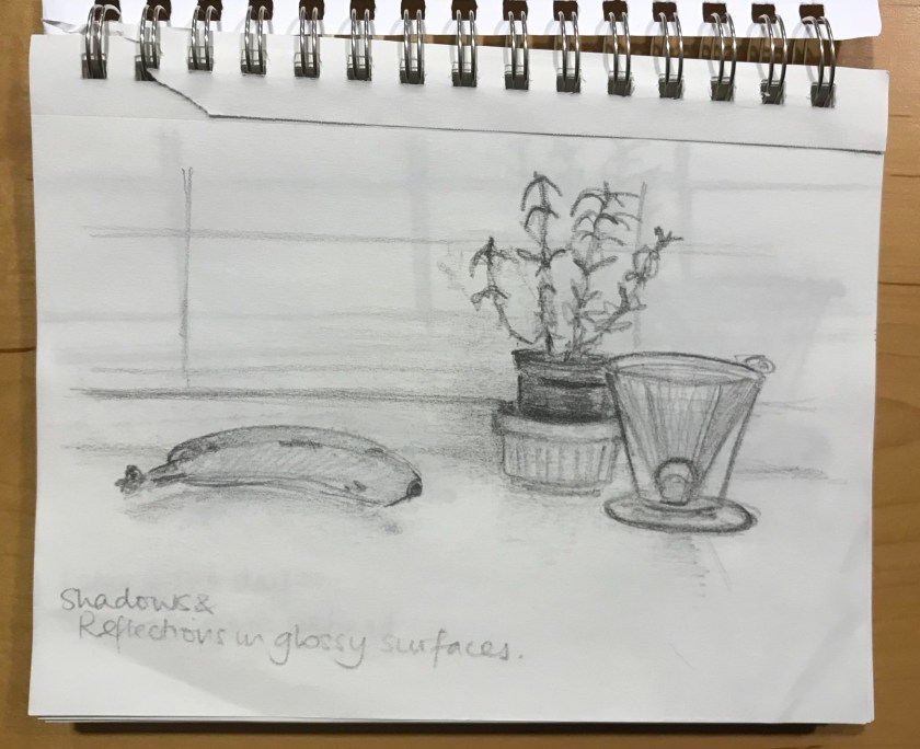
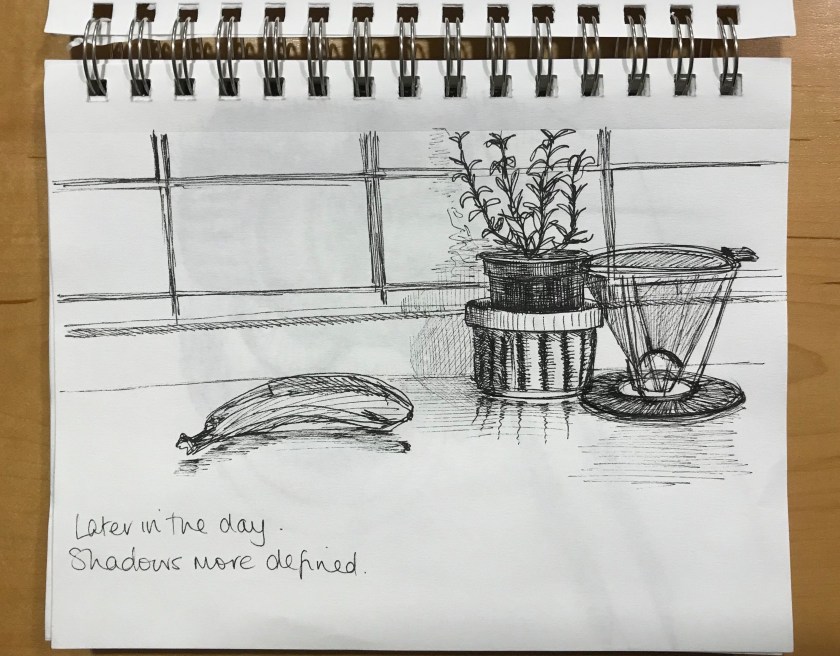
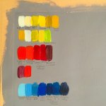
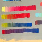
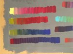
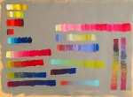
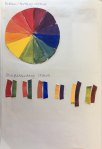
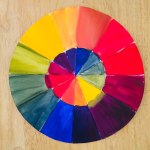
These were my initial colours to play with but I anticipated difficulty in creating a consistent starting colour every time.I decided to work with Brilliant Blue and Vermillion out of the tube for consistencyI initially found this concept hard to imagine so I tried it out in coloured pencils. This did help me especially where to combine the hues if to create shadow, where to lift tones for lighter values. It didn’t really help me think where to use which hue and its appropriate tone. At this stage RO was for lighter tones and BG was for darker tones in the objects.Black and white helped me establish the levels.Perspective linesBuilding up and lowering the values. I was starting to see how this works, especially in the darker shadowy areas.The blue became functional only in the creating of shadows where it was combined with vermillion.The dark glass bottle was tricky but I feel it needed the blue to dominant as an object rather than combine to make a shadow tone.
If I continued working on this exercise:
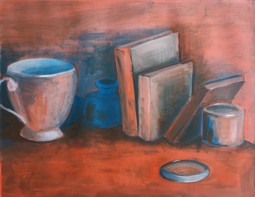
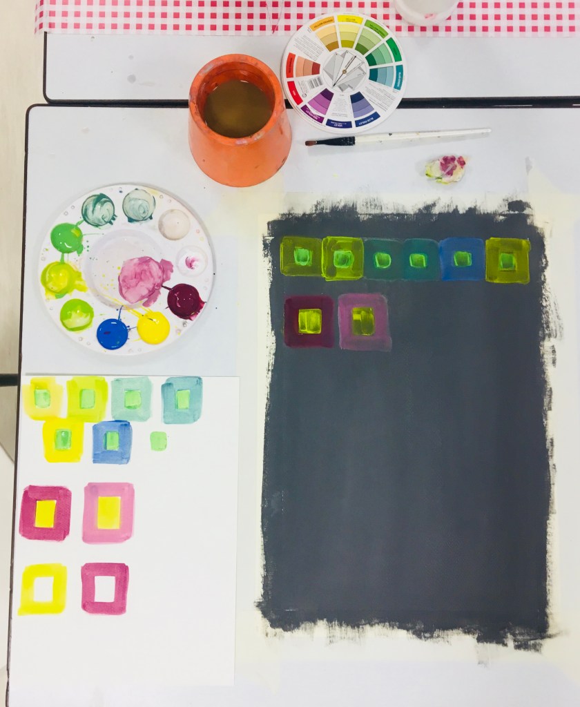
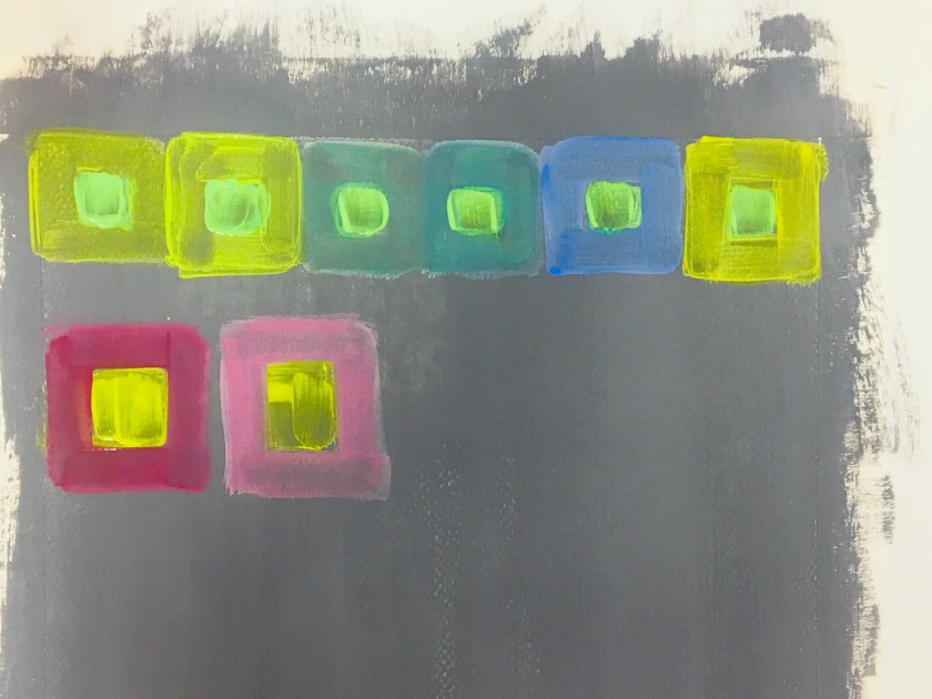
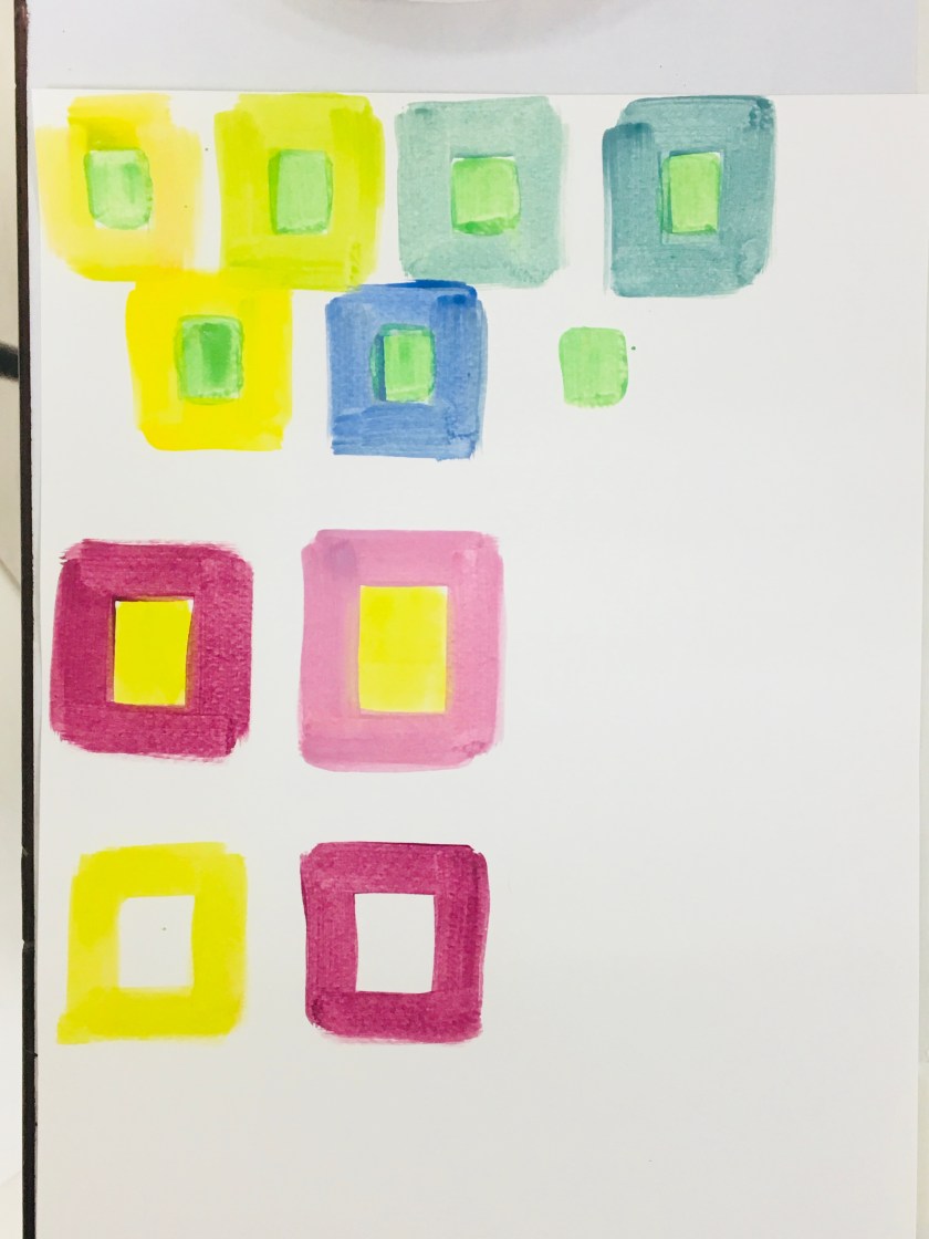
The surface was too vibrant and needed work to reduce its chroma. It is too high-key against the rest of the picture.
Create shadows around the jar lid
Experiment with creating the dark blue bottle in shadow. How would I combine colours to do this?
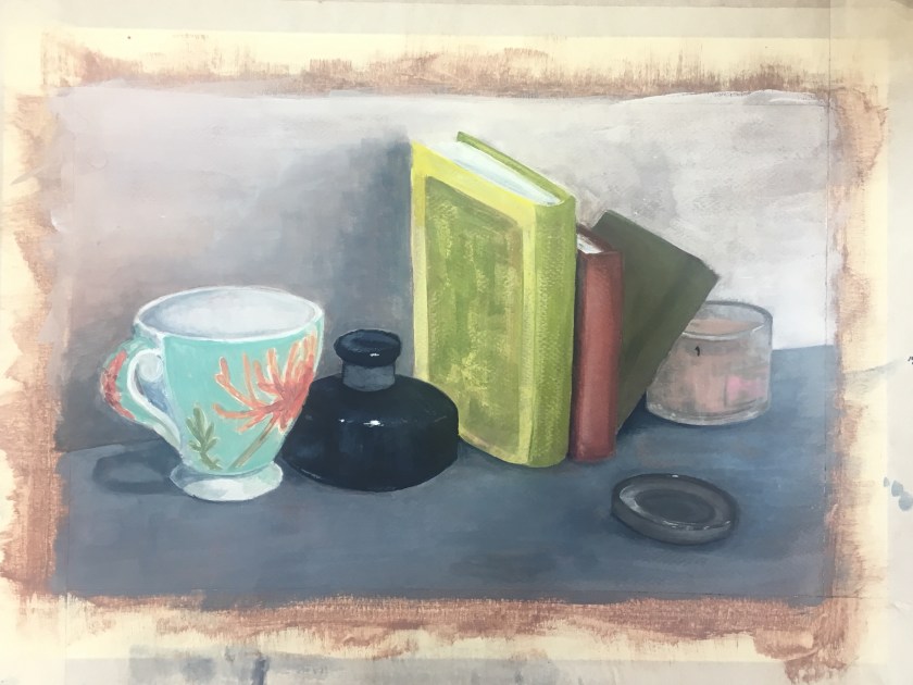
Keep the fluidity of my work pace. I was loose and relaxed and this allowed brushstrokes to remain and add atmosphere.
After 1517 religious movement abandoned Roman Christianity, Protestant reformation. Crucial moment for the development of genre painting
Expensive decorations and public displays abandoned and frescoes rejected
Patrons now belonged to the middle class, would embellish their homes with small-scale ‘feel-good’ paintings that they could relate to
Historians believe that the climate in the northern countries played an important role in this switch to nasal paintings as the air was too humid for the preservation of fresco painting
“Dutch Realism’ was middle on the hierarchy in between still life and history painting. Seen as less powerful than history paintings and portraits of rich and influential patrons
Dutch realists combined people, nature, architecture and still objects as part of a simple narrative
Pieter Bruegel the Elder (1525-1569) – portrayal of landscapes and peasant life is lively and unsentimental depictions of everyday life; observational skills, a grounded approach and the moral/social commentary
William Buytewech (1591-1624)
Frans Hals (1582-1666)
Adriaen Brouwer (1605-1638)
Genre painting in the Golden Age is diverse in style and content as the achievement in techniques, optical effects and mood evocation
1630s – school of fine painters established by Gerrit Dou.
Night scenes, hearth glow, candlelight
Gerard ter Borch the Younger (1617-1681)
Pieter de Hooch (1629-1684)
Johannes Vermeer (1632-1675)
Jan Steen (1626-1679)
Judith Jans Leyster (1609-1660)
First phase of Dutch landscape painting – tonal phasesoft outlines, atmospheric effect, focus on the sky
1650s – classical phasekept atmospheric quality but featured contrasting light and colour and a compositional anchor like a tree, tower, ship
Ruisdael
Interiors became popular
Jan Vermeer – uniquely captured lighting in interior spaces
Genre developed from the realism and detailed background activity of Early Netherlandish painting. The style reflected the increasing prosperity of Dutch society and settings became more comfortable, opulent and carefully depicted as the century progressed
Adriaen Brouwer – Flemish master of tavern scenes
Before Brouwer, peasants were depicted outside; he shows them in a plain and dim interior
Art in the 20th Century
A few historical realisms developed – American and Socialist for example. Their painters portrayed American city life in an non-idealised manner
Painting during and after Modern Art Era
Well-known shift from figuration to abstraction
Modernism – instead of imitating scenes from everyday life, artists started to produce shapes and figures of their own imagination. They no longer felt a need to represent reality
After the Modern era ended figuration will never really be abandoned but it never went back to its pre-modern state. Is its role in society the same? Does it illustrate the new working class and their lives in the same light?
Recent Genre Painting
Slight reversion back to figuratove painting in Europe during the 1930s and 1940s
However, considered regressive and politically charged due to al ink with the Nazi movement
Pop-Art – new kind of appreciation for the mundane
David Hockney’s work is similar to the initial principle behind genre painting
Their subject matter stressed a fascination with the ordinary and the common
Wayne Thiebaud’s still life paintings
Genre Painting in Contemporary Art
Many contemporary painters apply themselves to figuration and many of these artists deal with scenes from everyday life. But we’re not sure if these scenes are real, invented or imagined
Relationship between Genre Painting and Photography
Factual nature of photography
Always been positioned between art and documentation and not considered art until recently
Ordinary people and life as it is have turned out to be just as interesting as fantasy
Julie Blackmon – “…images are both fictional and auto-biographical, and reflect not only our lives today and as children growing up in a large family, but also move beyond the documentary to explore the fantastic elements if our everyday lives, both imagined and real.”
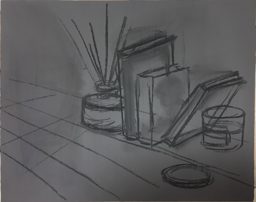
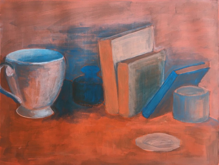
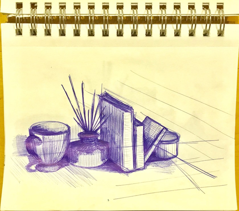
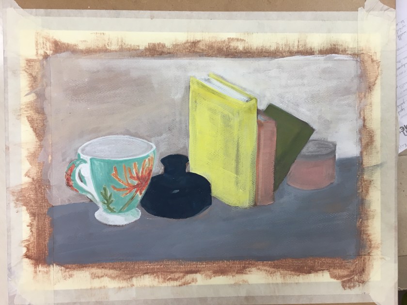
Need to change the left line of the yellow book to a more inclined angle
Need to work on the shape of the grey lid
It was at this stage that I think I have misunderstood the exercise aim.
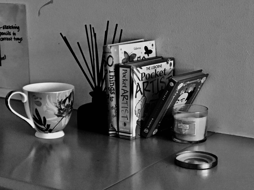
I have used more than 4 objects (but could count books as 1 ;-))
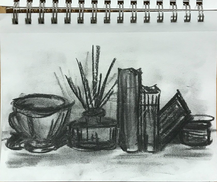
I need to have made a study of tonal variation in my sketches
However,
I have worked in broad areas of colour and then worked on it analytically
I know I have observed colours and have done well in replicating as best I can
Now I have reanalysed the exercise I think I will finish it rather than repeat it; I have worked on it in the way it requires, maybe more tonal study early on would have been helpful.
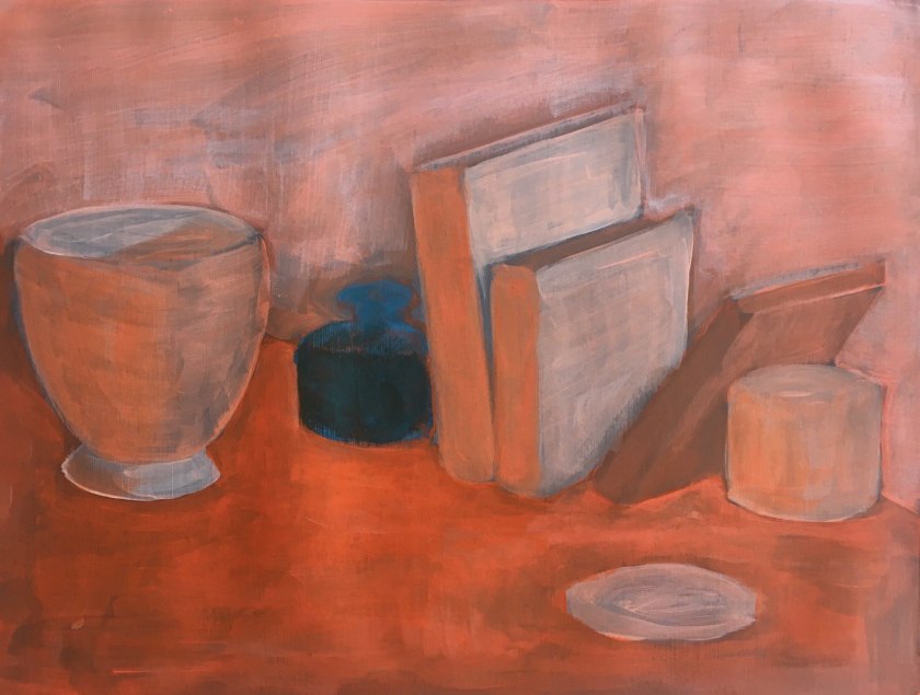
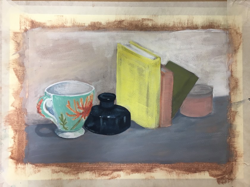
Really happy with the way this is going. But I really need to move on as this is only an exercise.
I am definitely watching the development of tone
I would work on the lines of perspective more if this was an assignment
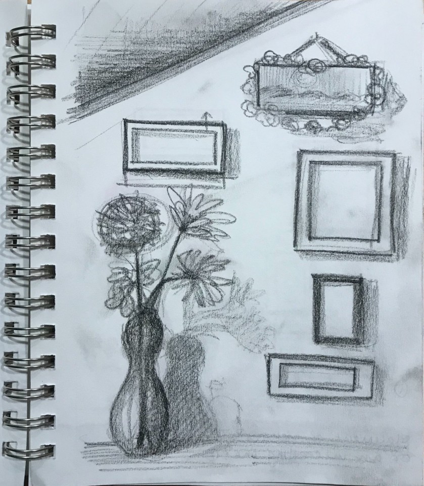
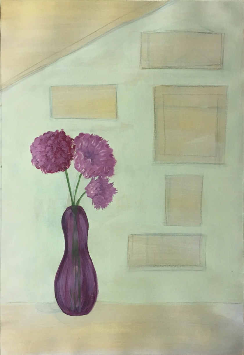
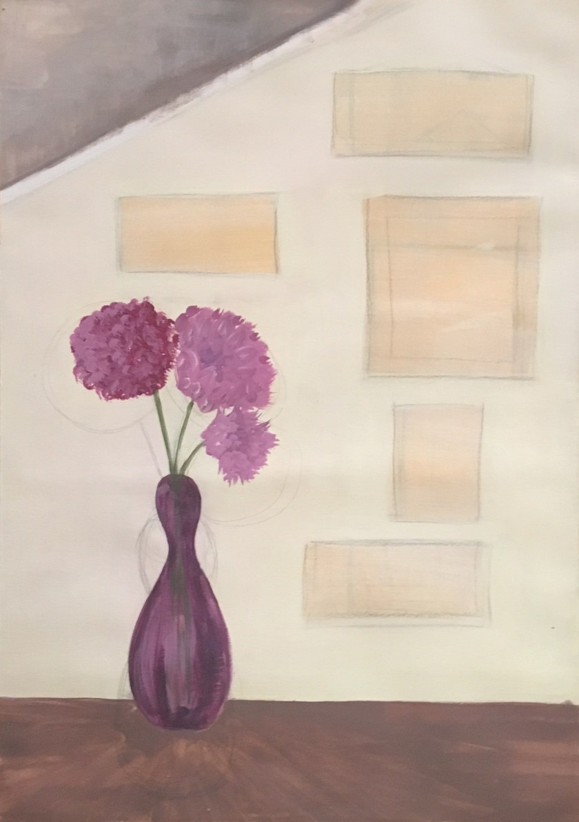
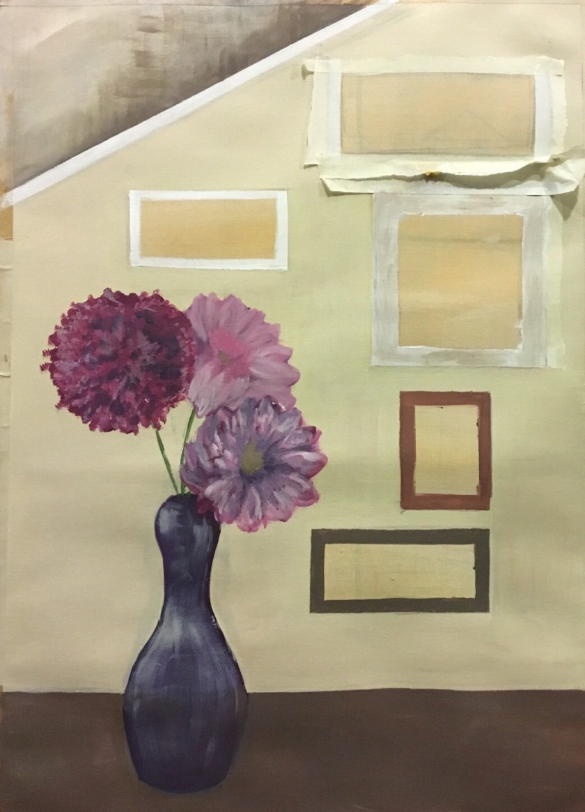
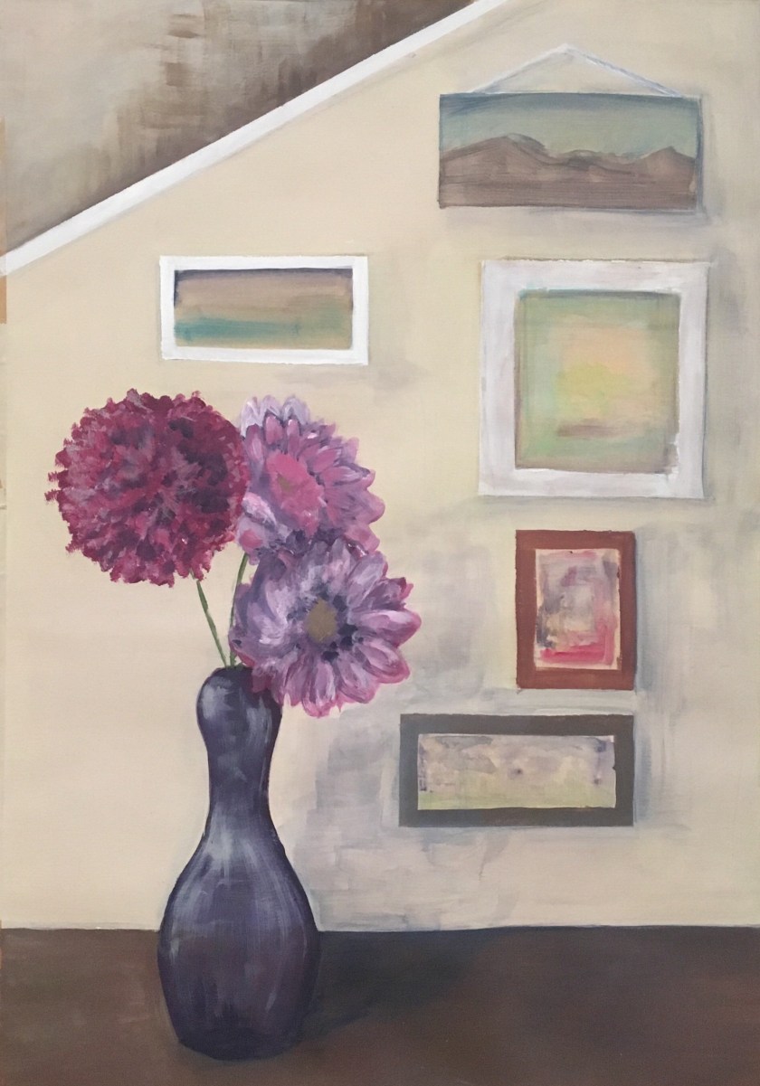
It was at this point that I felt the composition was flat in regards to depth. The vase was against the wall. It’s placement was nothing more than lack of creativity. It occurred to me to try and created the depth that could exist in a different placement of the vase and also to create more interest in the pictures composition.
I worked on pencilling in the new composition with the vase being moved forward. I’m glad I did this as I would have thought the flowers would change perspective and position but they merely changed size with little significant change with their placement ‘on’ the wall.
I realised I was spending too much time on this considering this was an exercise only. It’s something I may develop in the assignment.
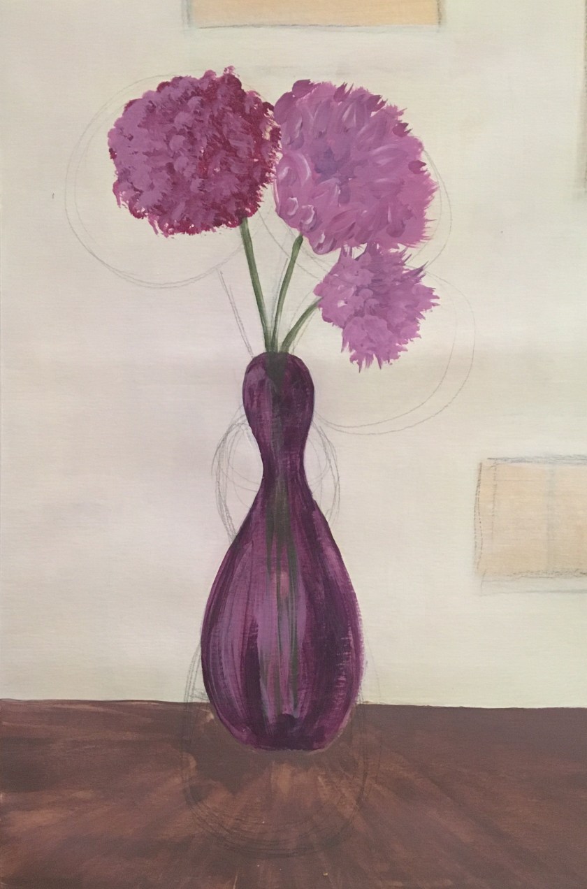
I enjoyed the fluidity of this, the relaxed approach without having to rely on sketching out the composition. I would like to have spent more time painting out the outline and composition but maybe this is not what it needed as it would be too precise and restrictive.
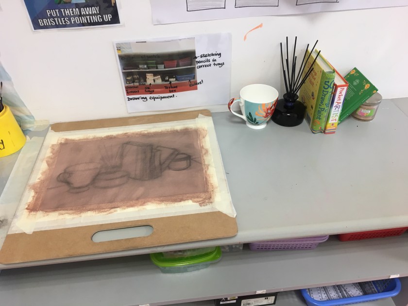
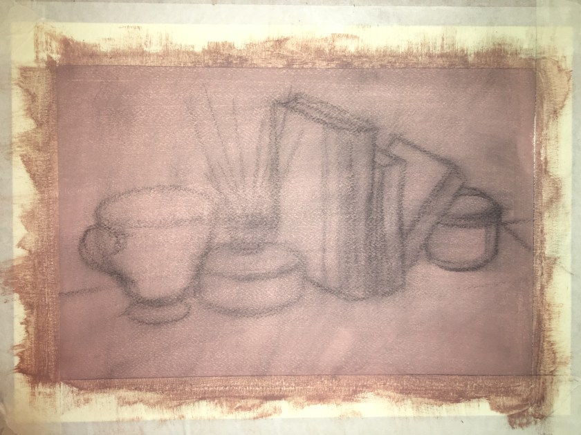
Project 2 is all about developing observational and technical skills by focusing in the still life genre. The exercises create a framework within which the choice of subject, colours and paint is free to me.
Drawing is essential to painting; it enables graphic and interpretative skills to be developed by using observational drawing to develop into painting.
The following research has helped me to tune into possible composition and symbolism but also the technical grace that is possible and is so distinctive of this 17th century Dutch still life artists.
Background
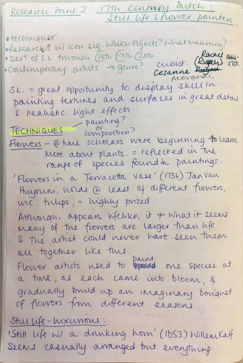
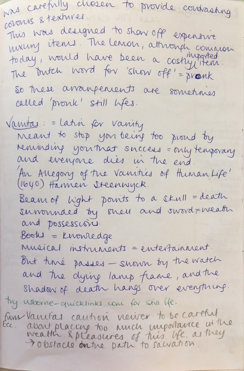
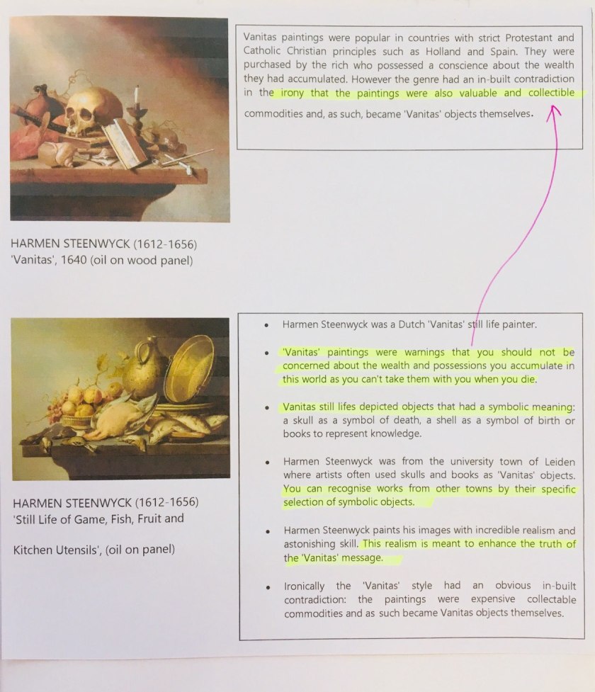
The Dutch Golden Age coincided with stability and wealth in the newly independent Dutch republic. Still life arose through a shift away from classical and religious subject matter to genres more suitable for the homes of the newly wealthy. This was the shift to Calvinism. These pieces were not just technical exercises – they were also of an underlying significance, maybe to the role or status of the person commissioning the work. ICONOGRAPHY. VANITAS paintings.
They pushed painting to new boundaries in their rendering of light on and through glass in exploring colour, texture and tonal arrangements.
They also created a hierarchy of genres – that some painting types were more prestigious than others:
History painting
Portrait
Scenes of everyday life
Landscape, seascape etc
Still life. It was less important because they only seemed to copy how things looked BUT there is often more to them than meets the eye.
Research Point 2 – Consider the techniques of the 17th century Dutch still life and flower painters. Research a painting with iconic significance. What has been the development of still life through the following centuries including contemporary artists?
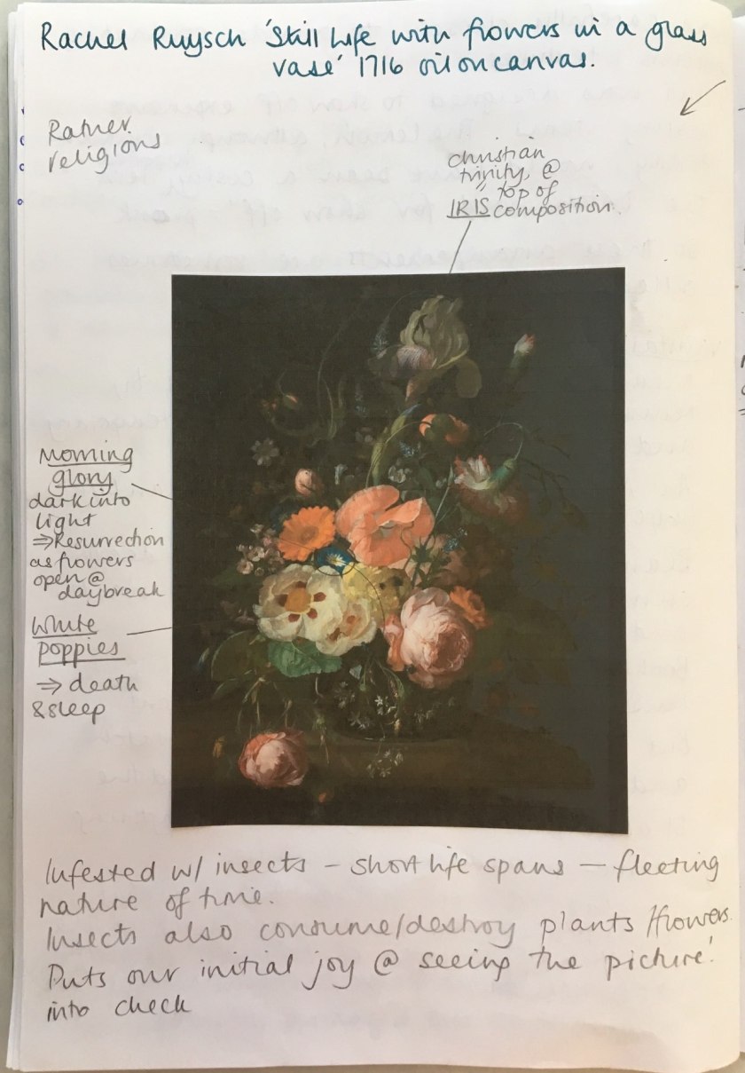
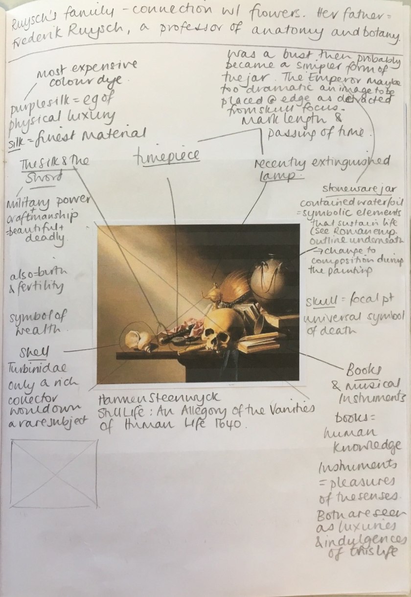
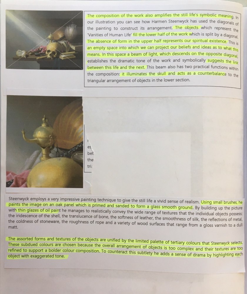
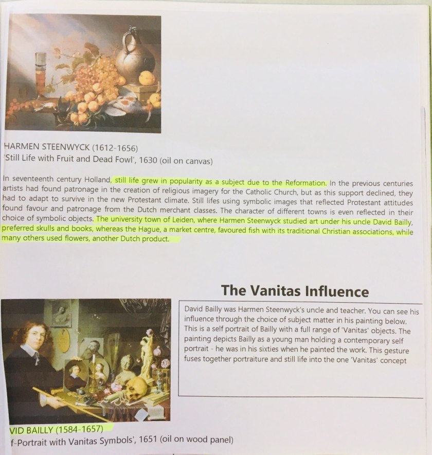
Analysis of Rachel Ruysch’s ‘Still Life with flowers in a glass vase’ (1716). Oil on canvas.Analysis of Harmen Steenwyck’s ‘Still Life: An Allegoru of the Vanities of Human Life’ (1640)