Assignment 1 and Reflection

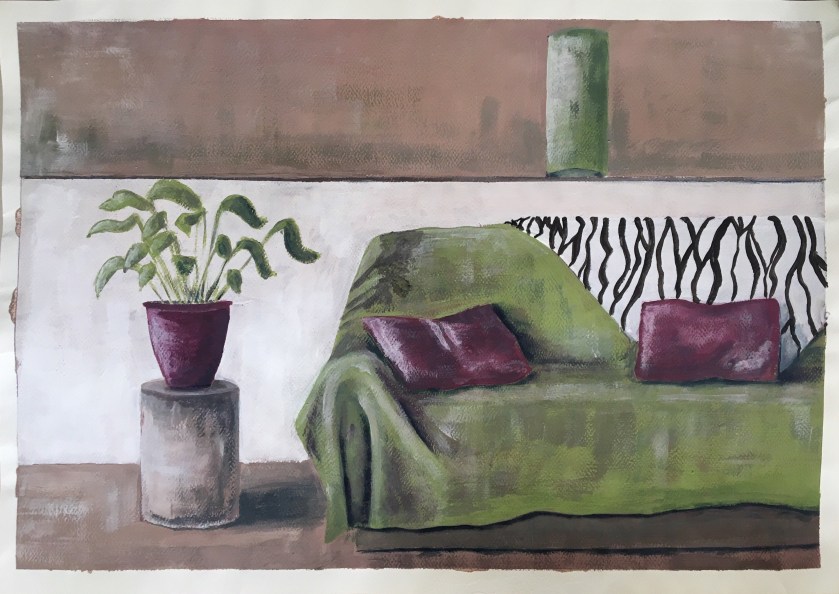
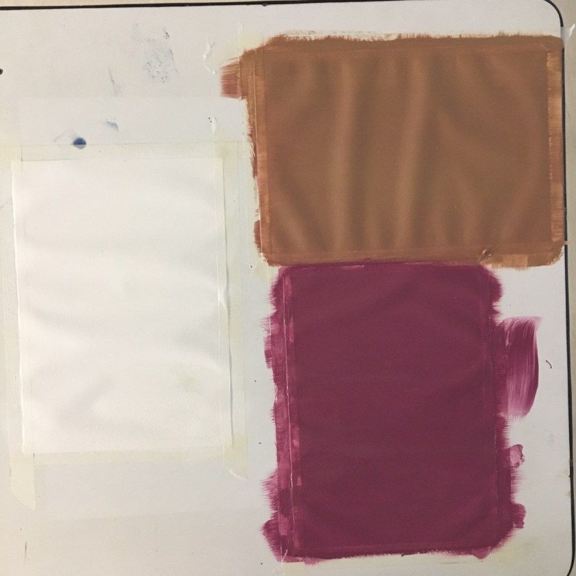
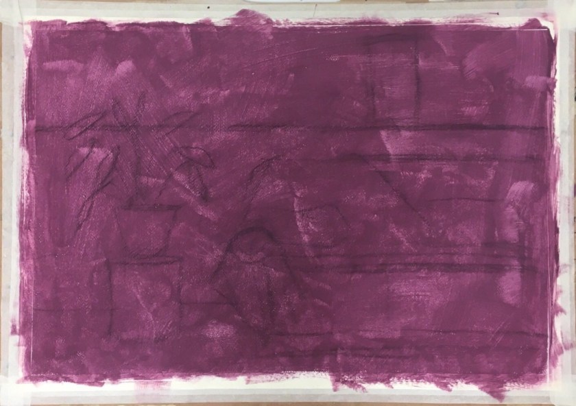
This assignment was developed here and I’ve decided to work on a complementary ground colour of violet.

I will say at this stage that I have a love-hate relationship with paper stretching….

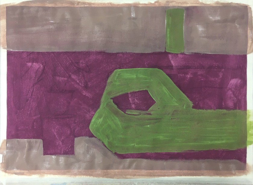
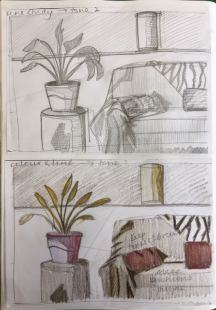
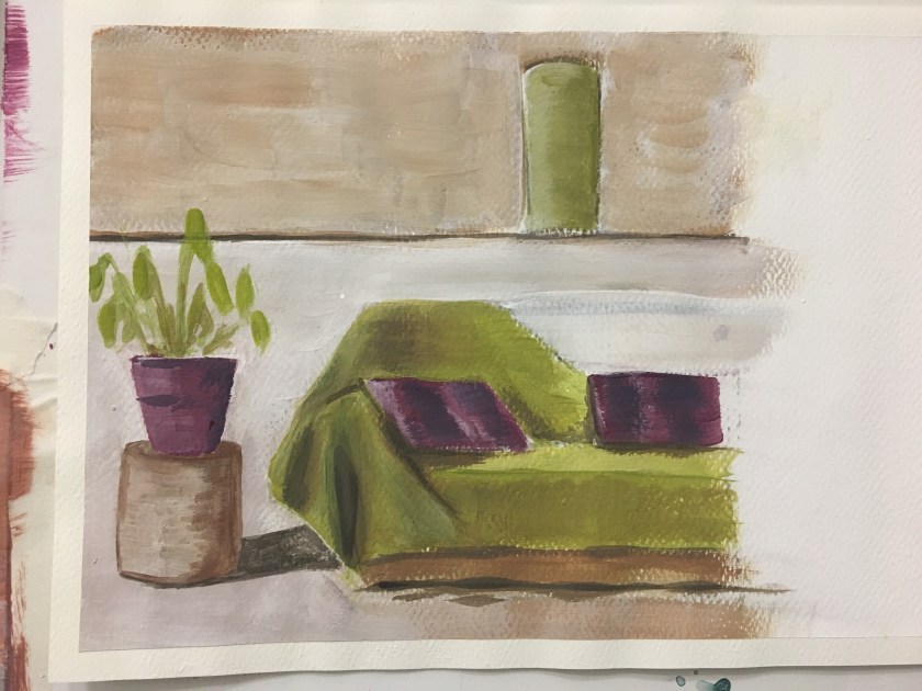
Blocking in the midtones and highlights. Not sure of my process at the moment, I don’t feel I have a ‘checklist’ and seem to be blocking in by feel rather than a theoretical process as such.

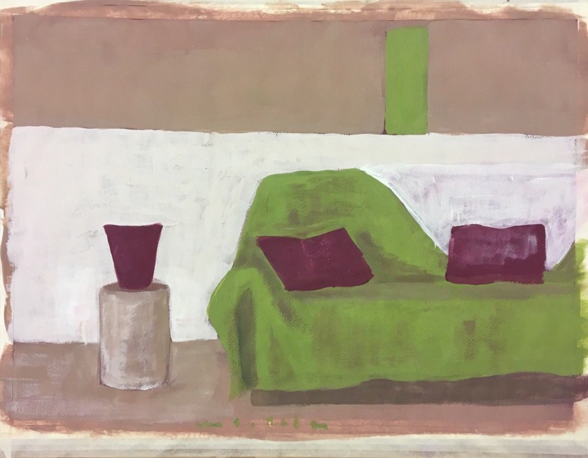
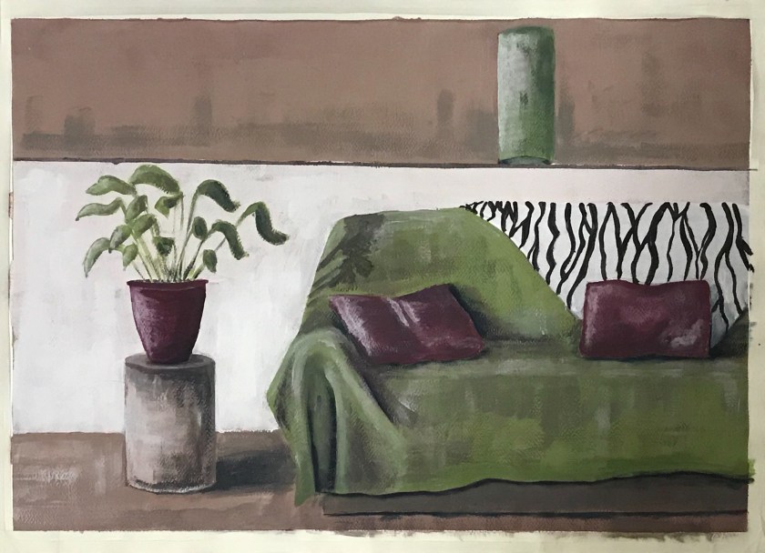
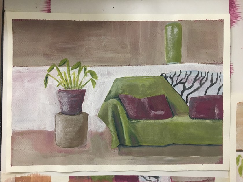
Ugh. So happy with this and then I see that appalling horizontal line at the last minute. Why?? Looking back, this was present early on. Something to watch.

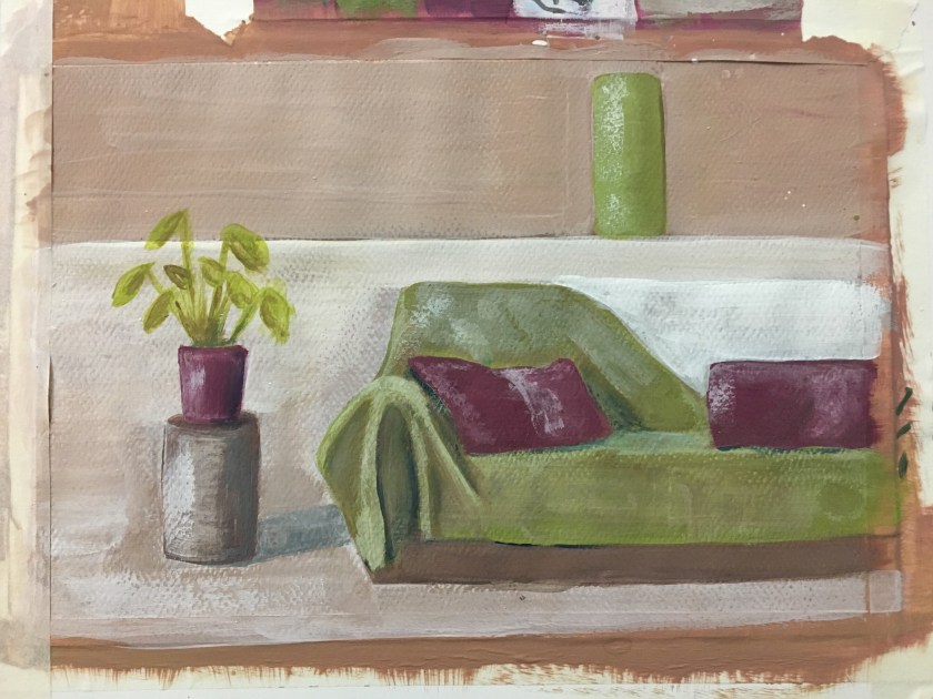
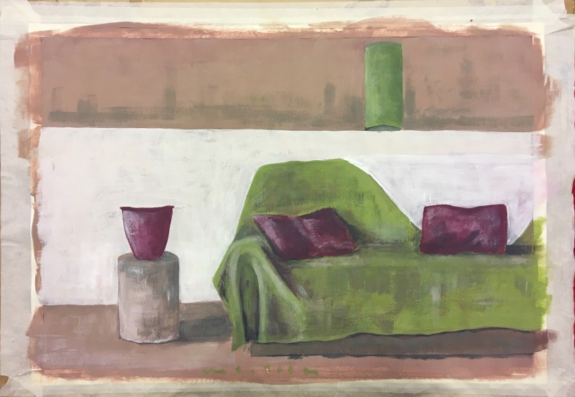
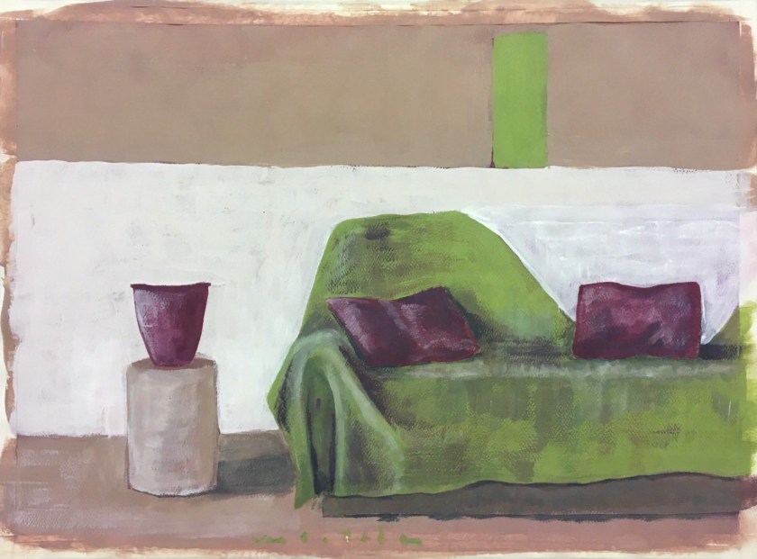
Corrected, but worried I will overwork it so will leave it at this point.

PoP Assignment 1 – Preparation

2019-02-20 11-26 page 3

2019-02-20 11-26 page 4

2019-02-20 11-26 page 7

2019-02-20 11-26 page 8

2019-02-20 11-26 page 6


Image result for contemporary interior paintings

https://www.luxdeco.com/styleguide/top-10-modern-interior-designers/

https://artdecision.eu/david-hockneys-double-portraits/


http://kvadratinterwoven.com/david-hockneys-furniture

David Hockney, Portrait of Sir David Webster, 1971, acrylic on canvas © David Hockney. Photo: Richard Schmidt


Image result for contemporary interior artists hockney

https://www.tate.org.uk/art/artists/david-hockney-1293


2019-02-20 11-26 page 22019-02-20 11-26 page 1

I enjoy the tonal effect of different colour grounds and I wanted to work with this more rather than paint on white.

I wanted to try white, then the complementary colour to the main colour in the picture (a magenta to the main green). And thirdly, I would try the mix of the green and its opposite, a complementary grey/brown.

I’ve decided on the magenta ground as it added a crispness and warmth but also allowed a clarity for the highlights.

Design a site like this with WordPress.com
Get started