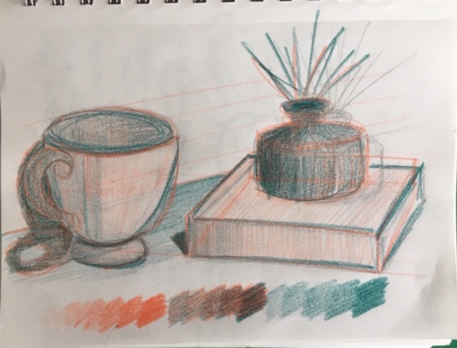
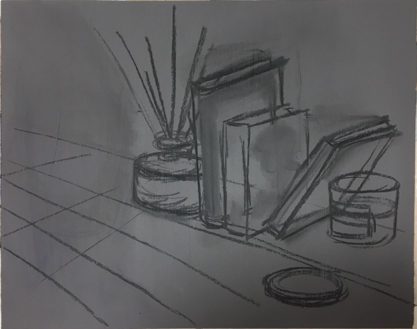
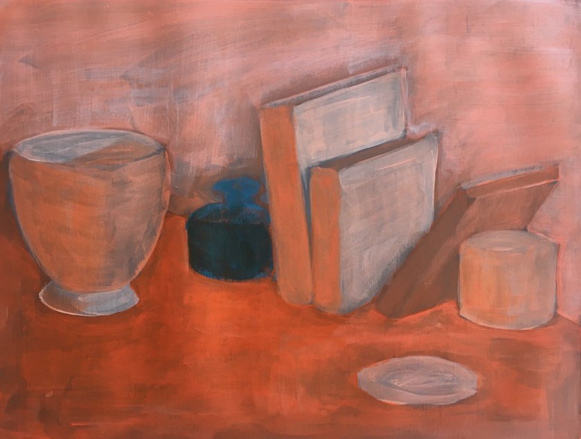
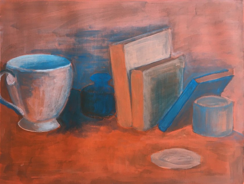
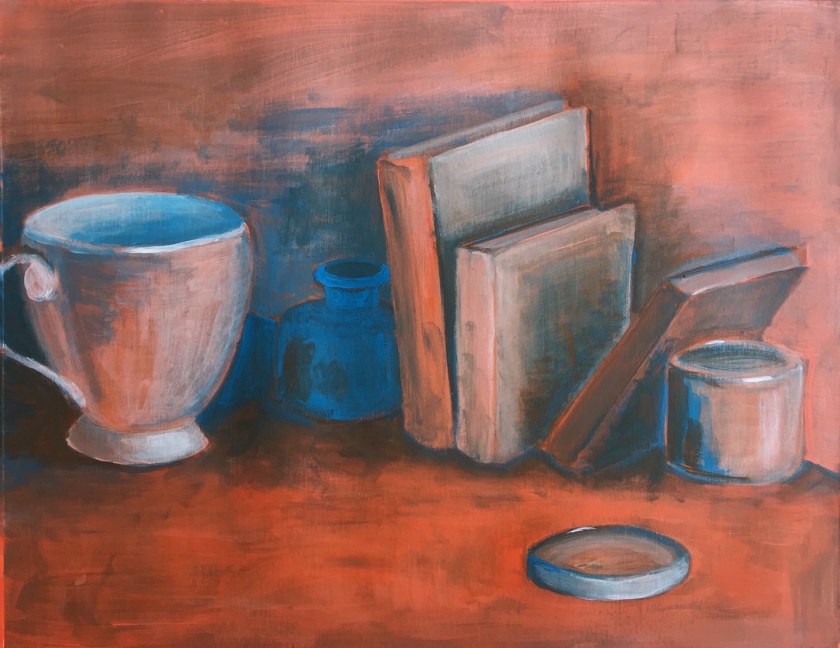
These were my initial colours to play with but I anticipated difficulty in creating a consistent starting colour every time.I decided to work with Brilliant Blue and Vermillion out of the tube for consistencyI initially found this concept hard to imagine so I tried it out in coloured pencils. This did help me especially where to combine the hues if to create shadow, where to lift tones for lighter values. It didn’t really help me think where to use which hue and its appropriate tone. At this stage RO was for lighter tones and BG was for darker tones in the objects.Black and white helped me establish the levels.Perspective linesBuilding up and lowering the values. I was starting to see how this works, especially in the darker shadowy areas.The blue became functional only in the creating of shadows where it was combined with vermillion.The dark glass bottle was tricky but I feel it needed the blue to dominant as an object rather than combine to make a shadow tone.
If I continued working on this exercise:
The surface was too vibrant and needed work to reduce its chroma. It is too high-key against the rest of the picture.
Create shadows around the jar lid
Experiment with creating the dark blue bottle in shadow. How would I combine colours to do this?
Keep the fluidity of my work pace. I was loose and relaxed and this allowed brushstrokes to remain and add atmosphere.