- This assignment is designed to pull together the fine observation and practice that you’ve done on this part of the course.
- You’re free to choose your own source material and media, provided that you take account of the factors listed below. You can either work on a still life, or interior scene – or a combination of these.
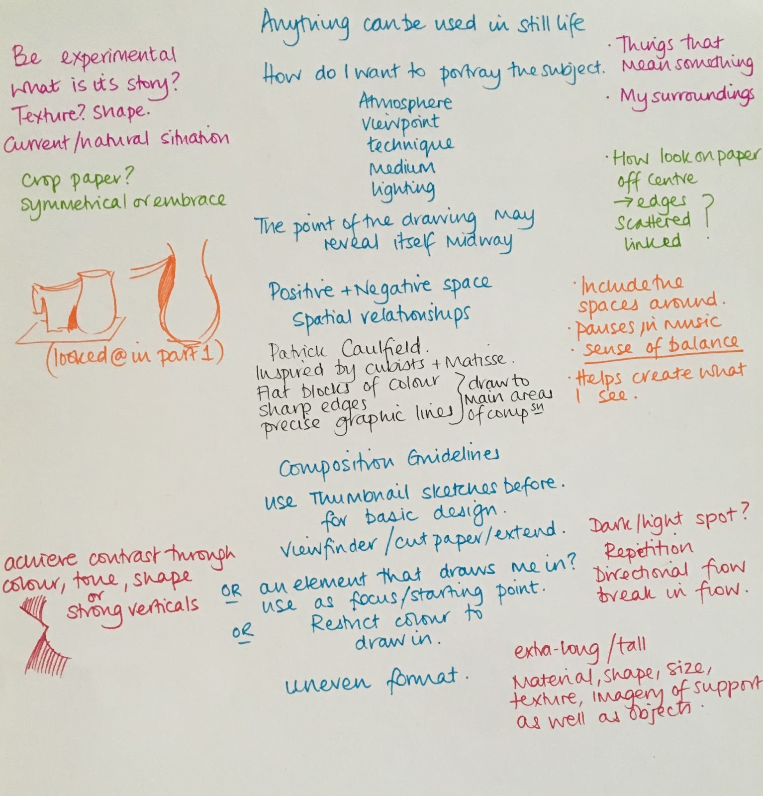
In the work you produce now you must demonstrate a growing understanding of:
-
the use of colour in drawing
-
the most appropriate medium for the subject
-
composition and context
-
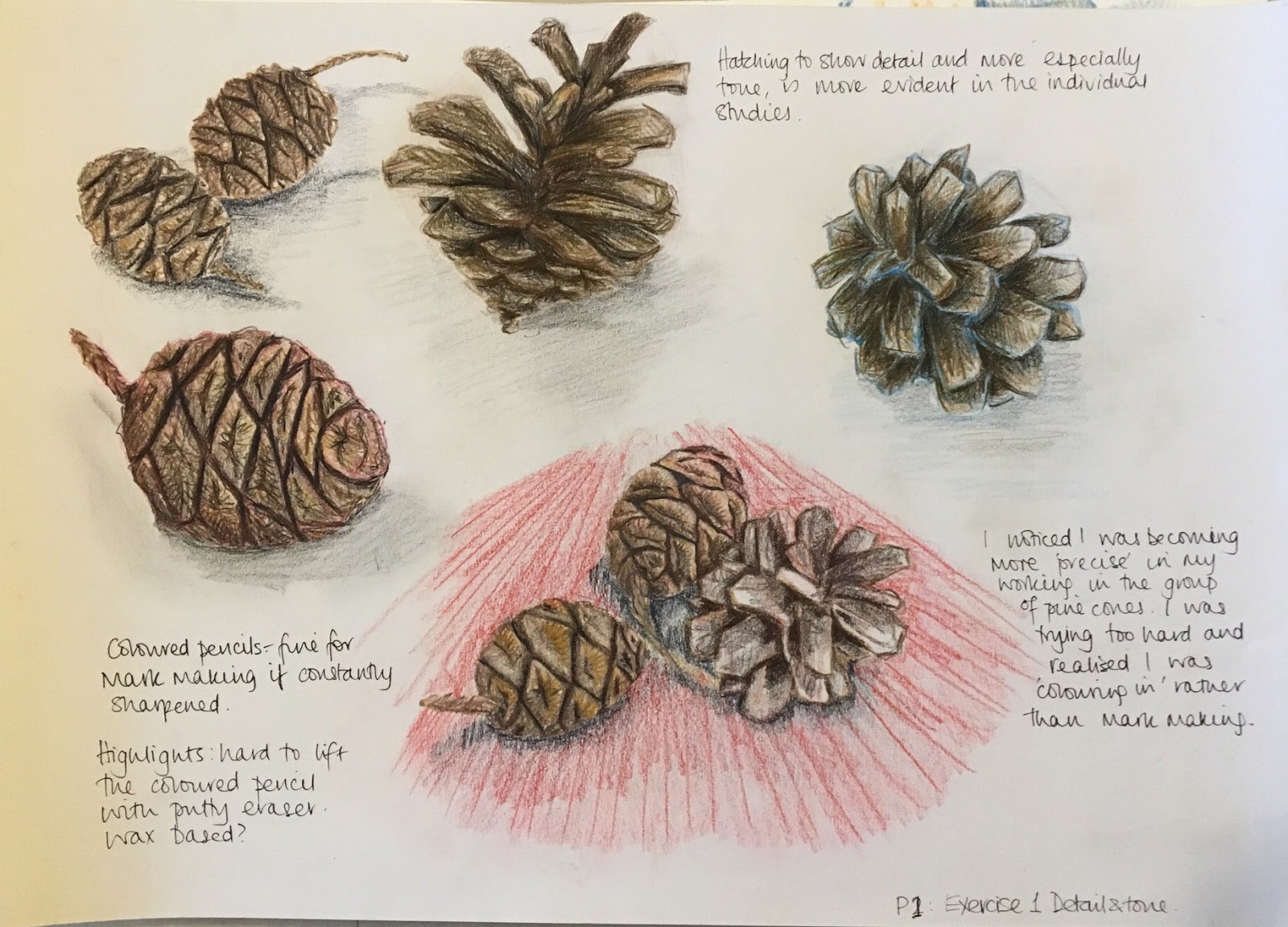
mark-making and contrasts of line and tone
-
accurate and expressive depiction of form, experimentation with idea, material and method.
- Is this a creative composition?
- Is my subject interesting?
- Am I using the most appropriate medium, colour, method, etc.?
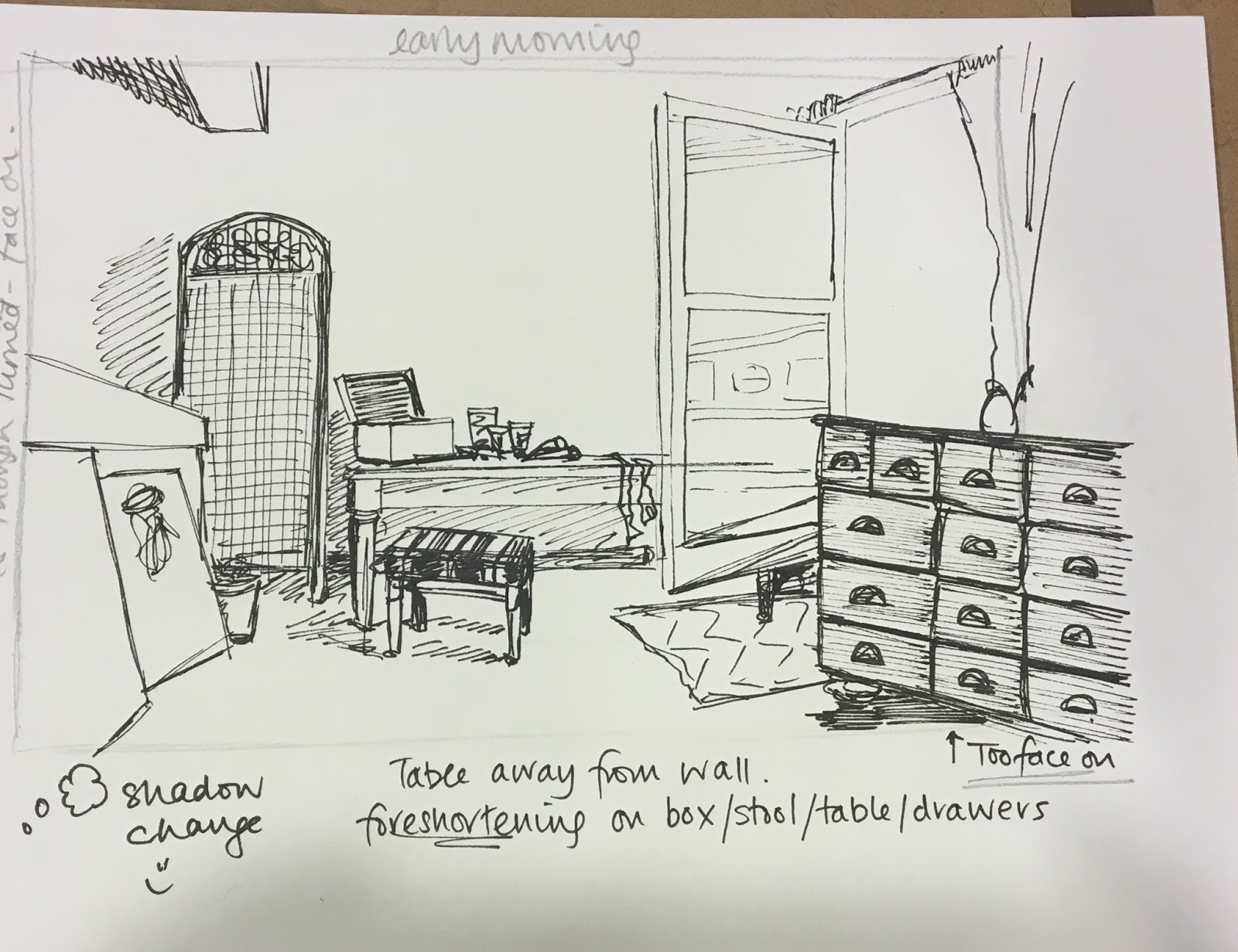
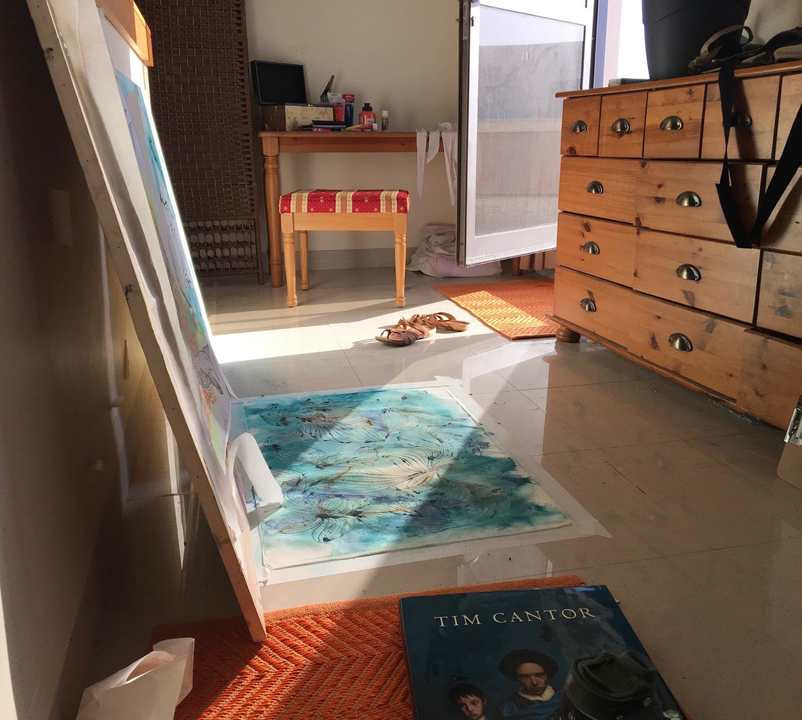
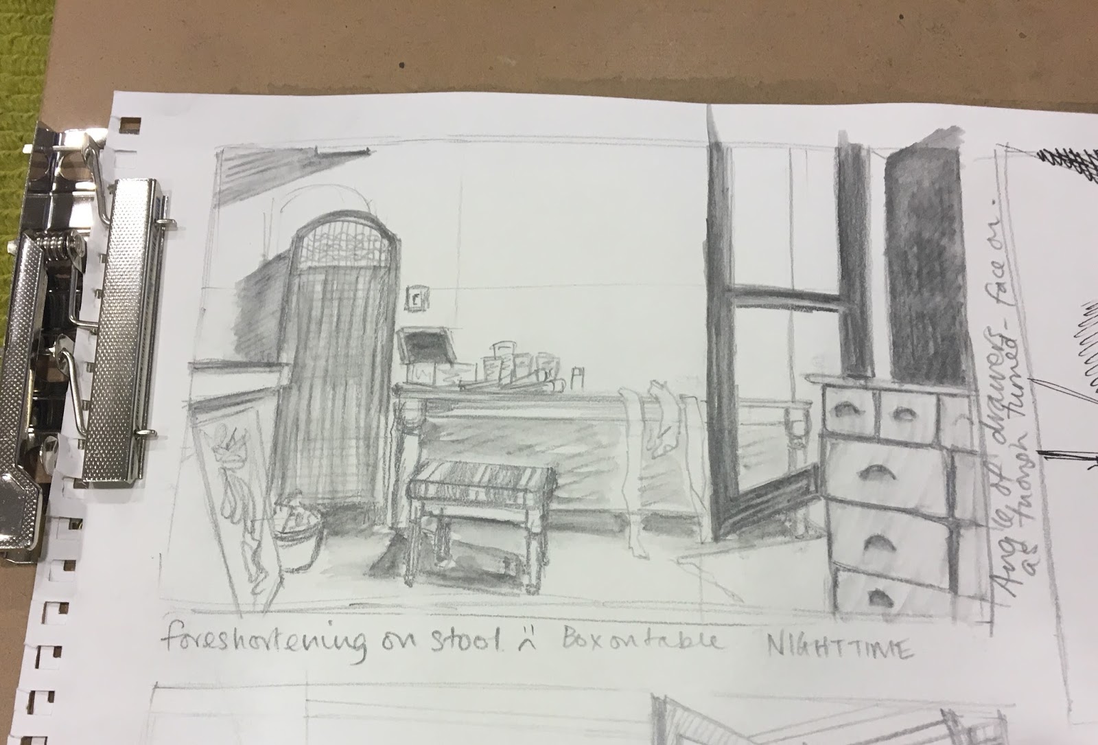
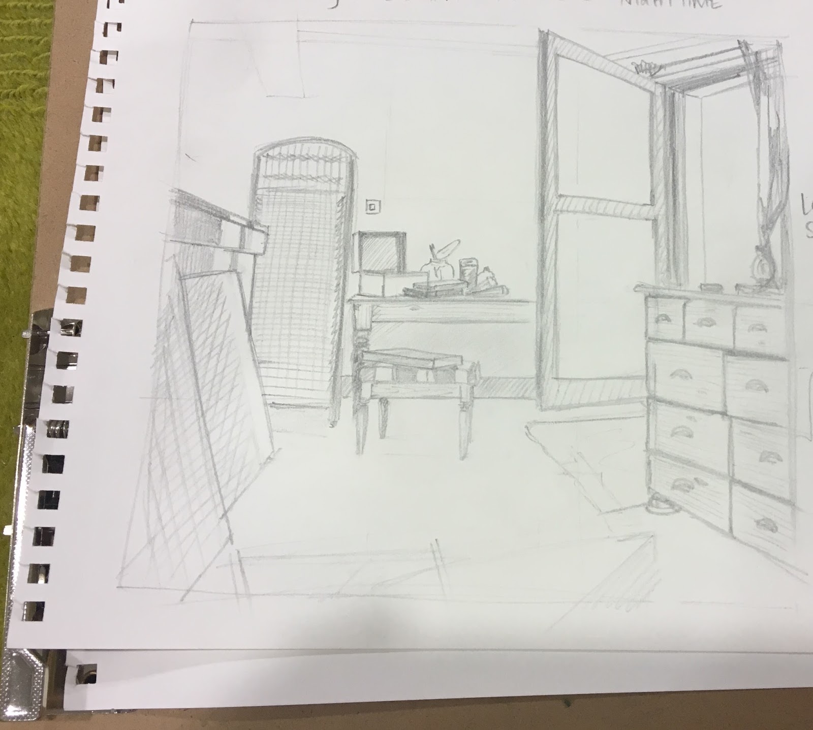
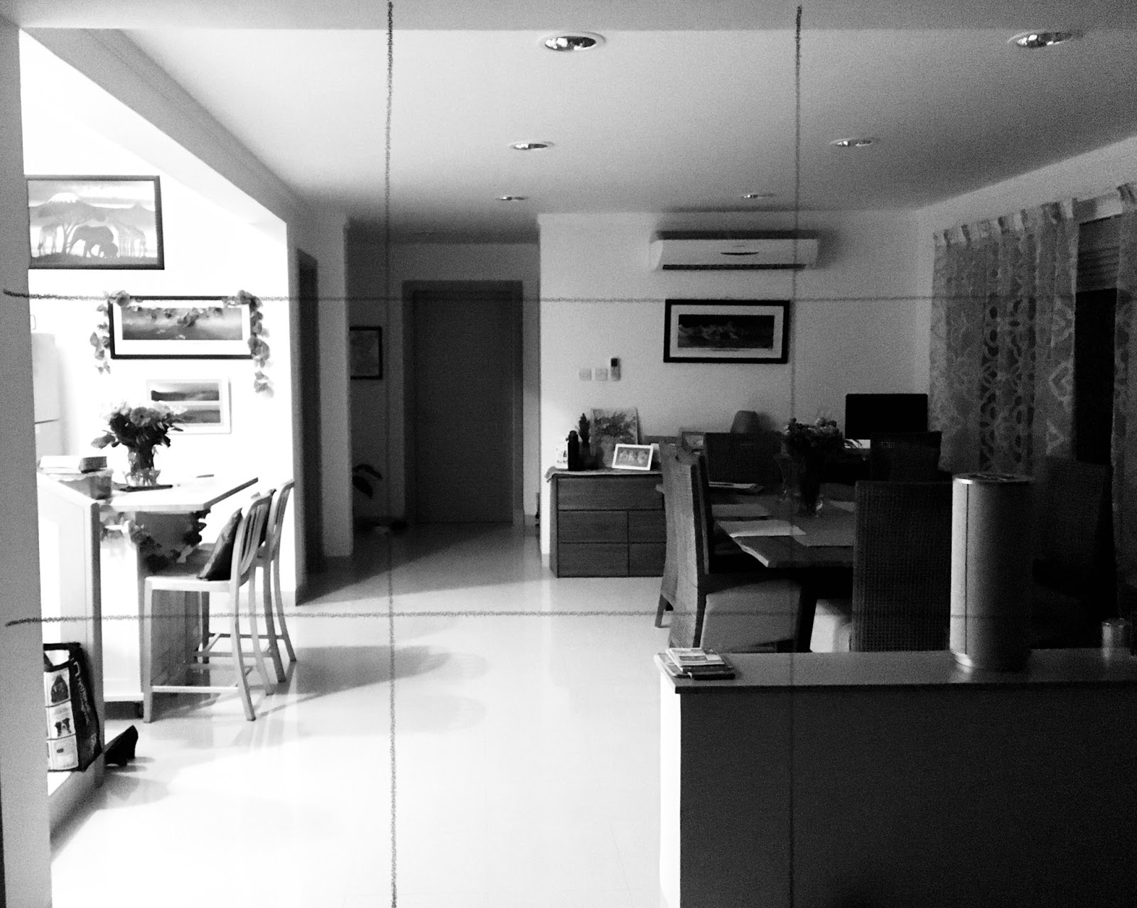
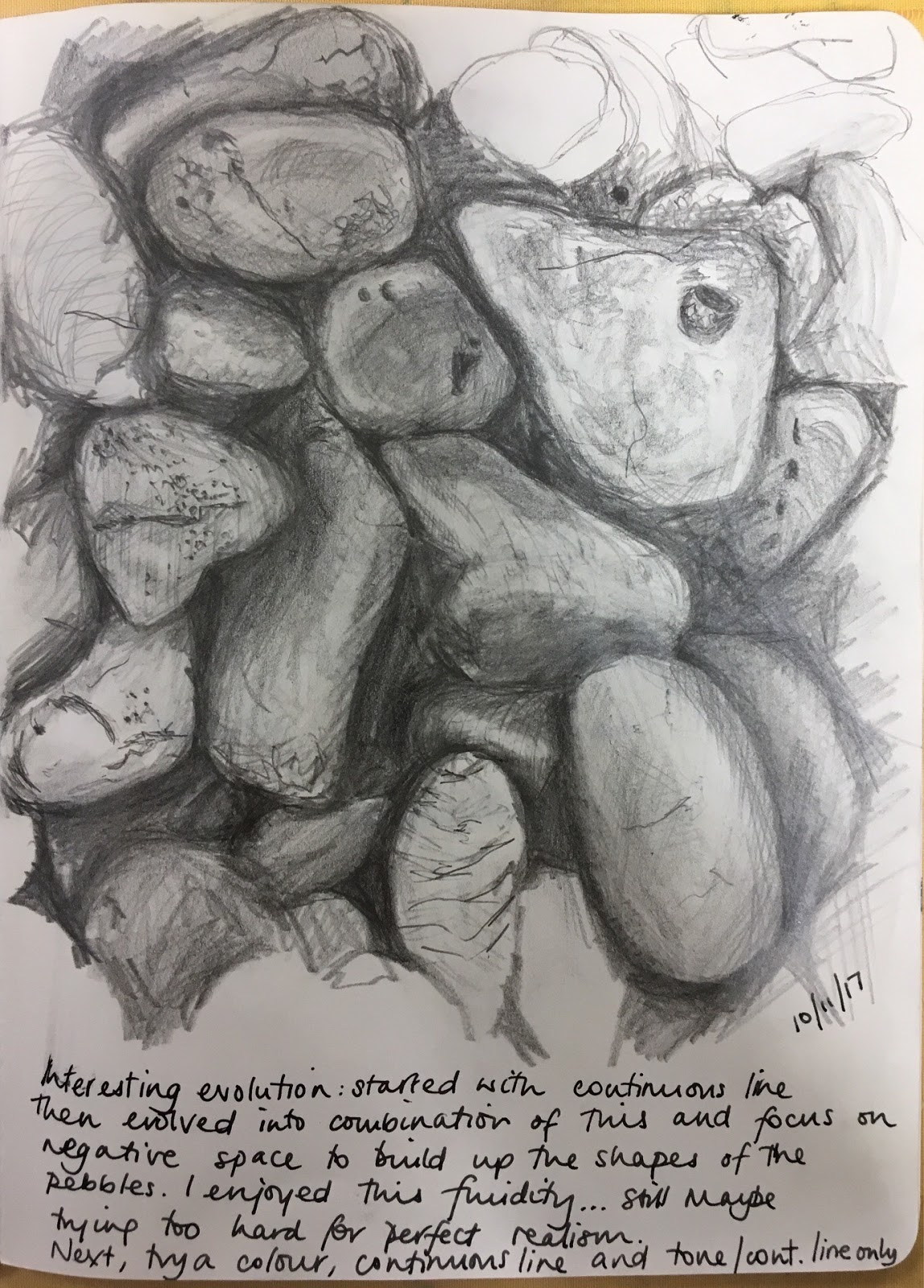
In my previous posts here and here I have shown my sketching and preparation for this assignment. I enjoy perspective and I liked the idea of combining a little still life of sorts with an interior scene. I am always on the lookout for interesting light shapes and tonal contrasts; I see how they could evoke a mood maybe in a photo and I would love to portray that in a drawing.
Reflection
- the use of colour in drawing
- composition and context
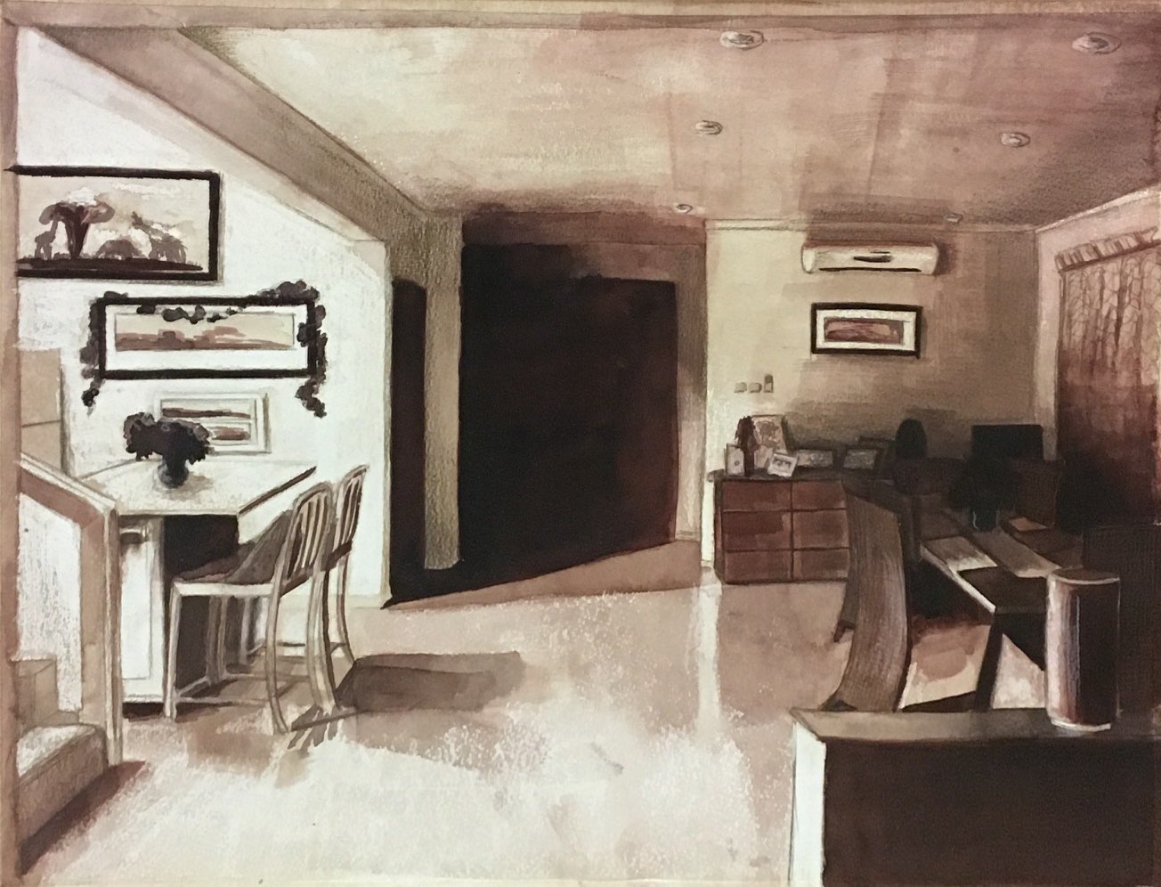
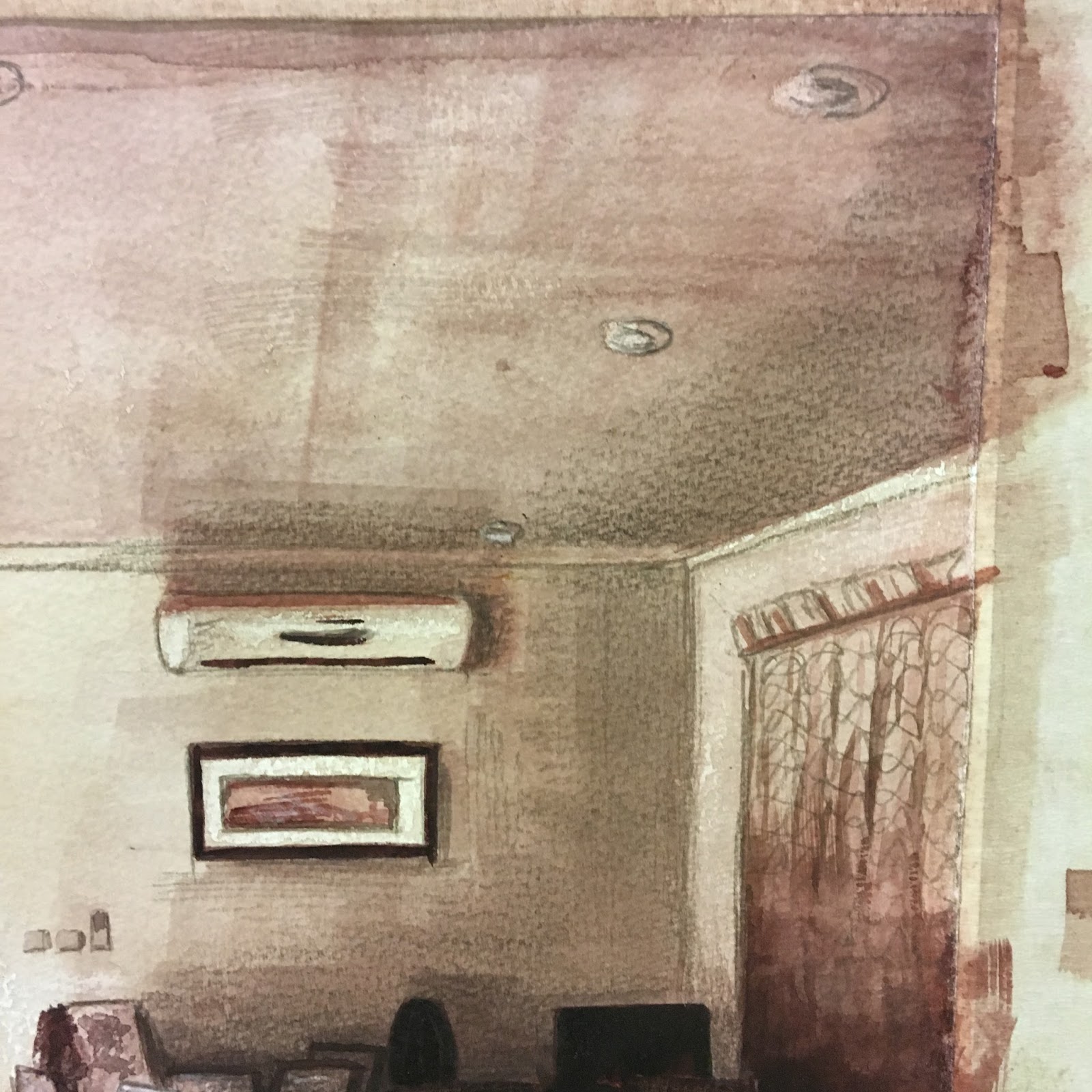
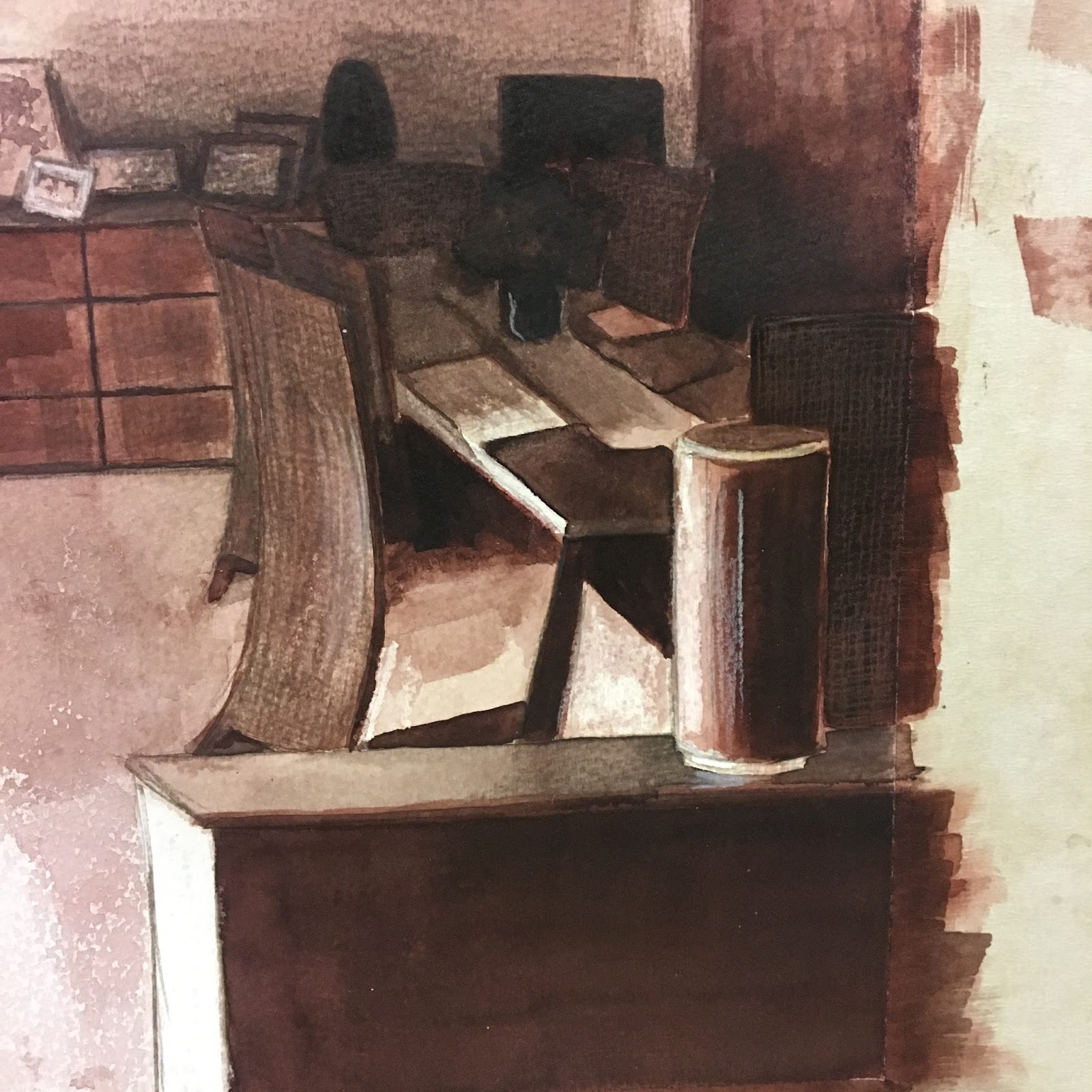
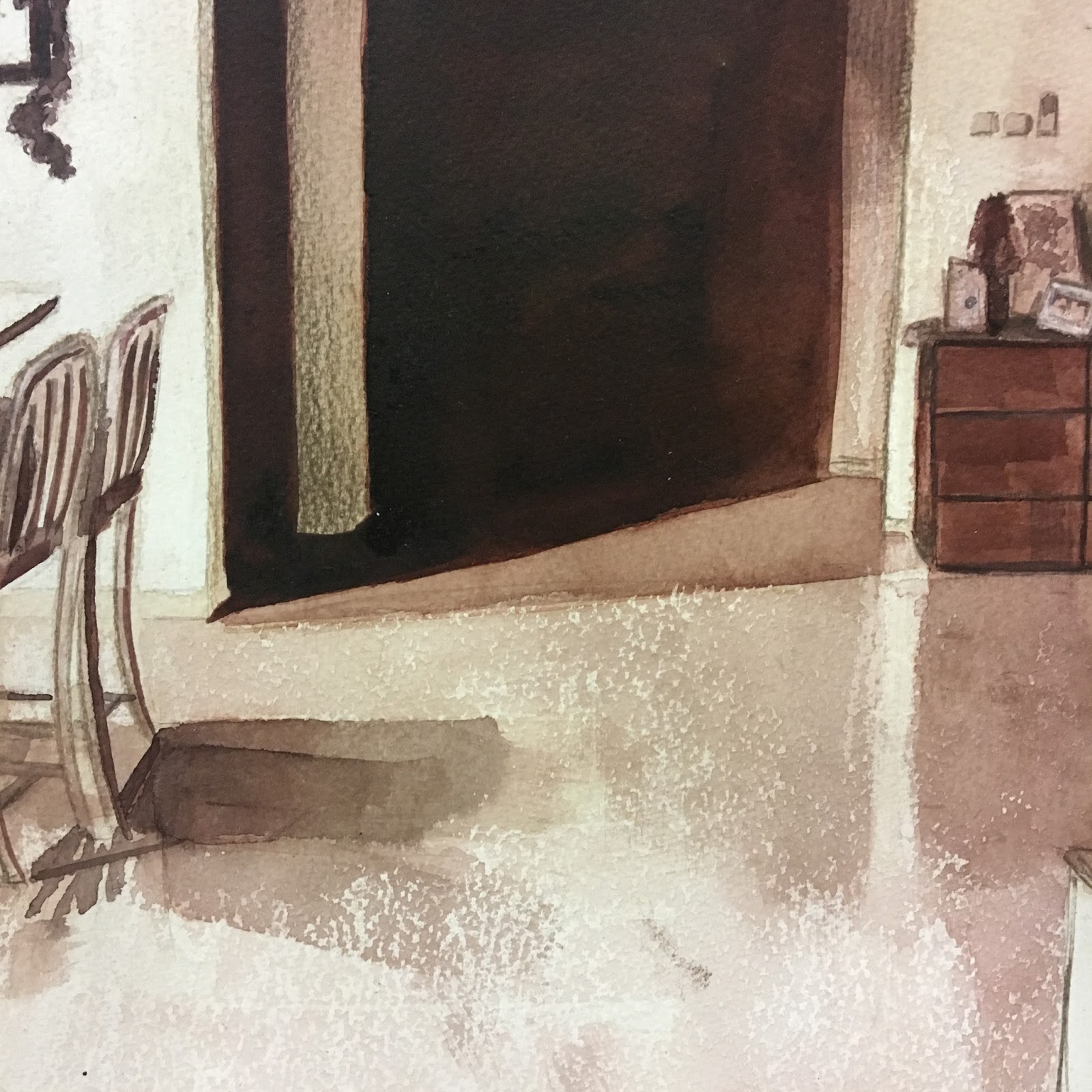
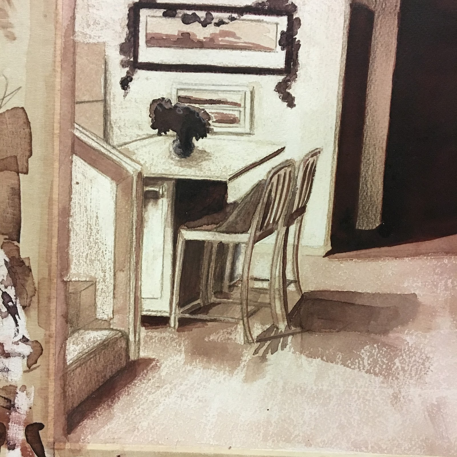
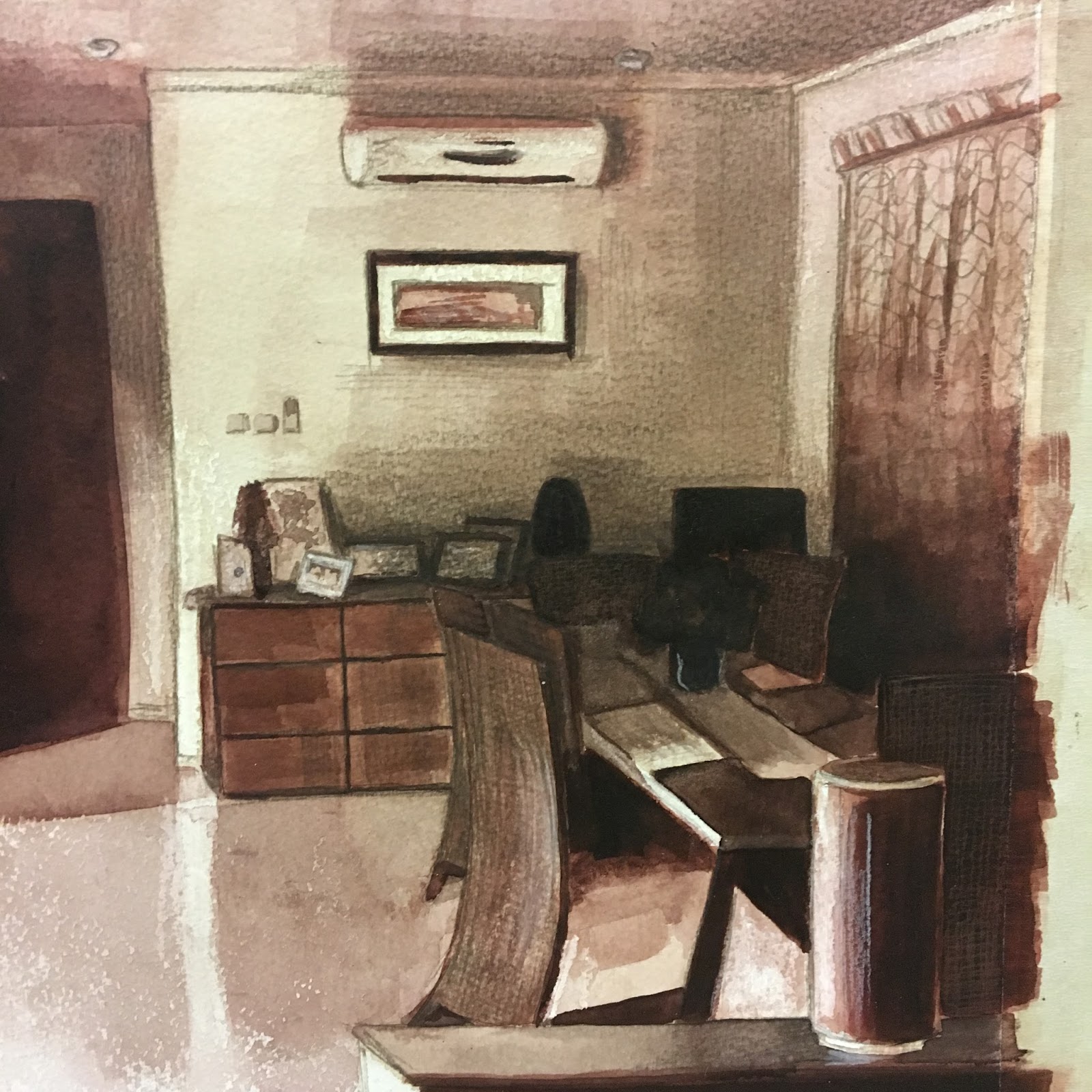
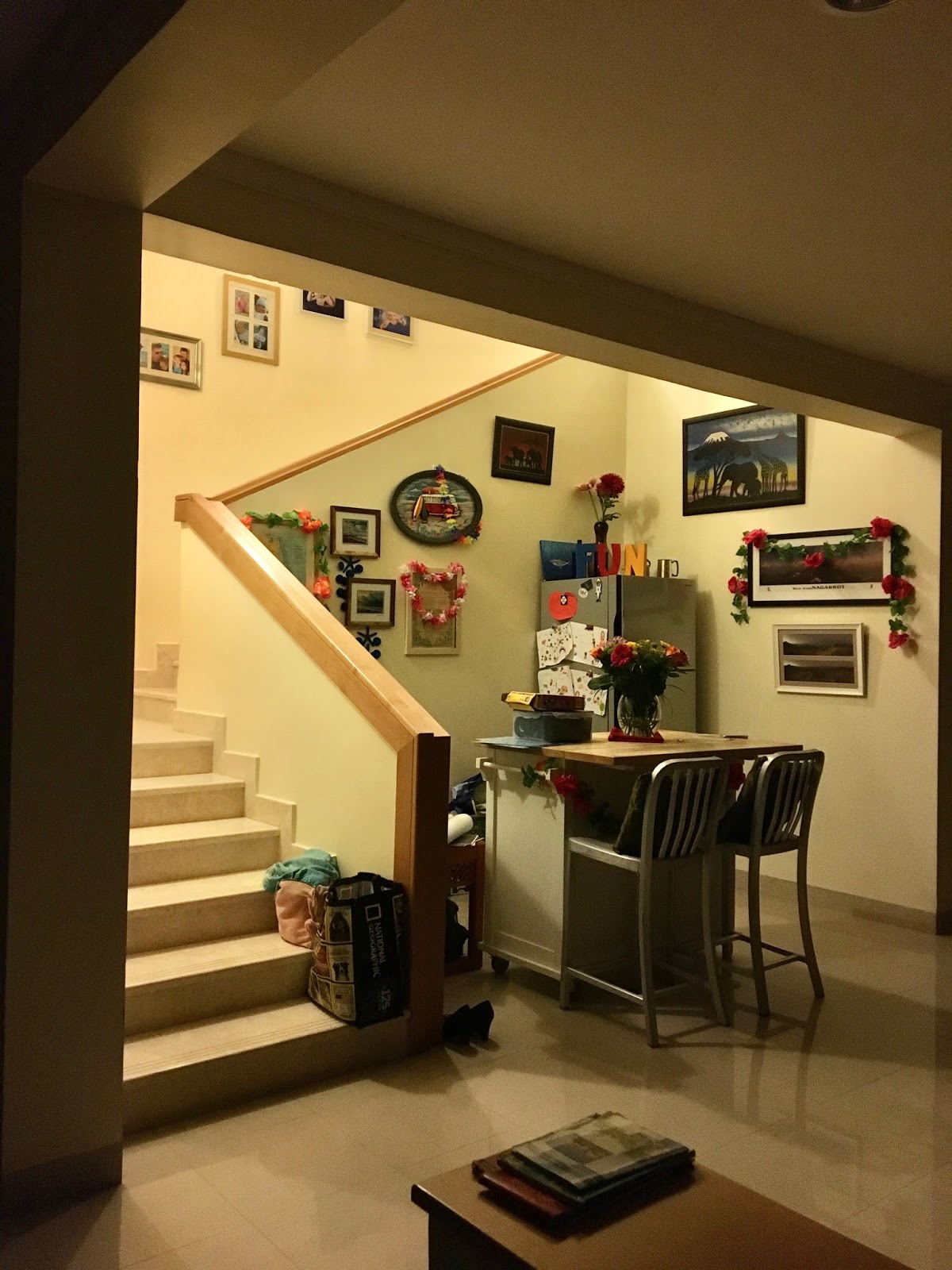
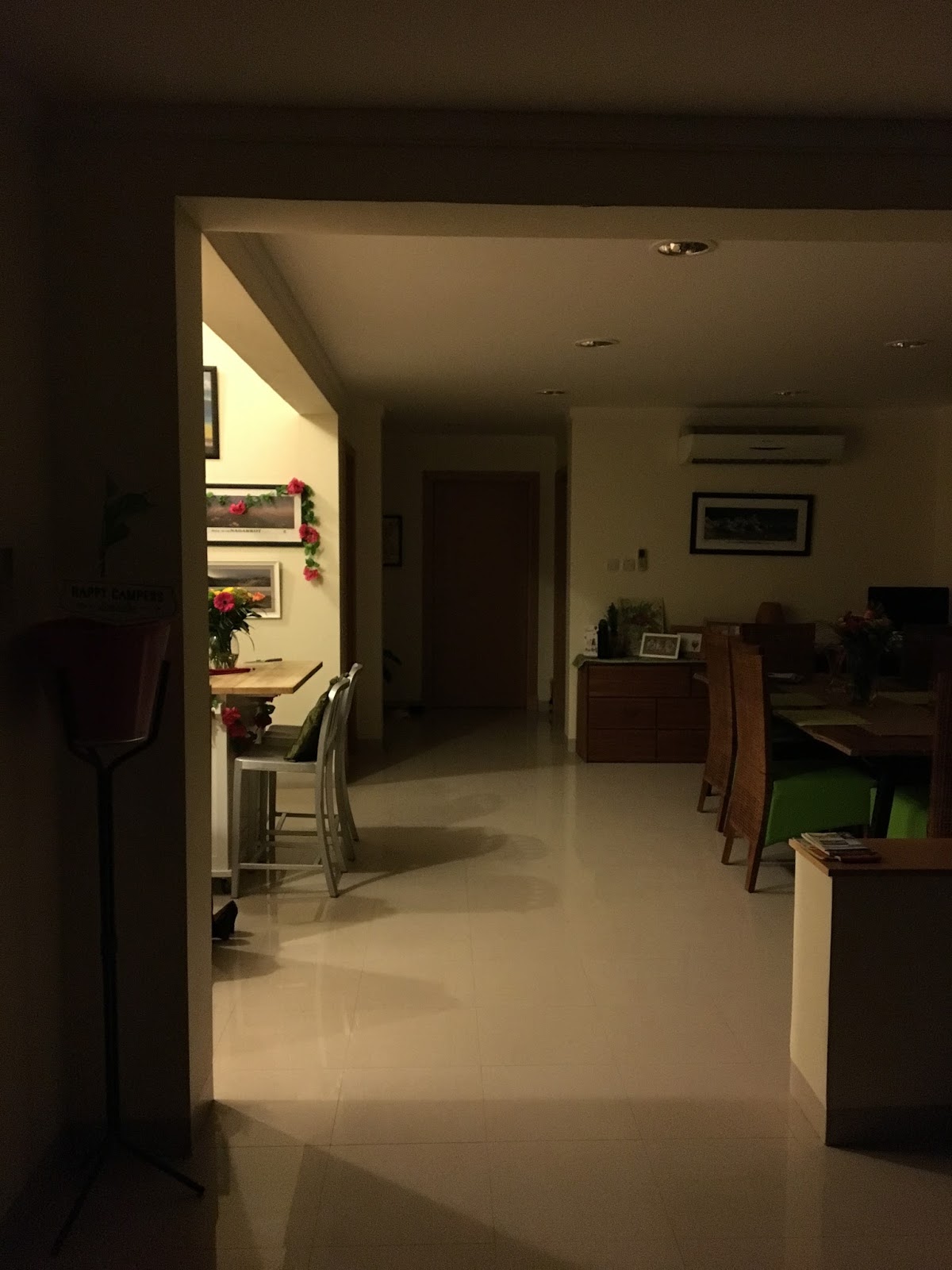
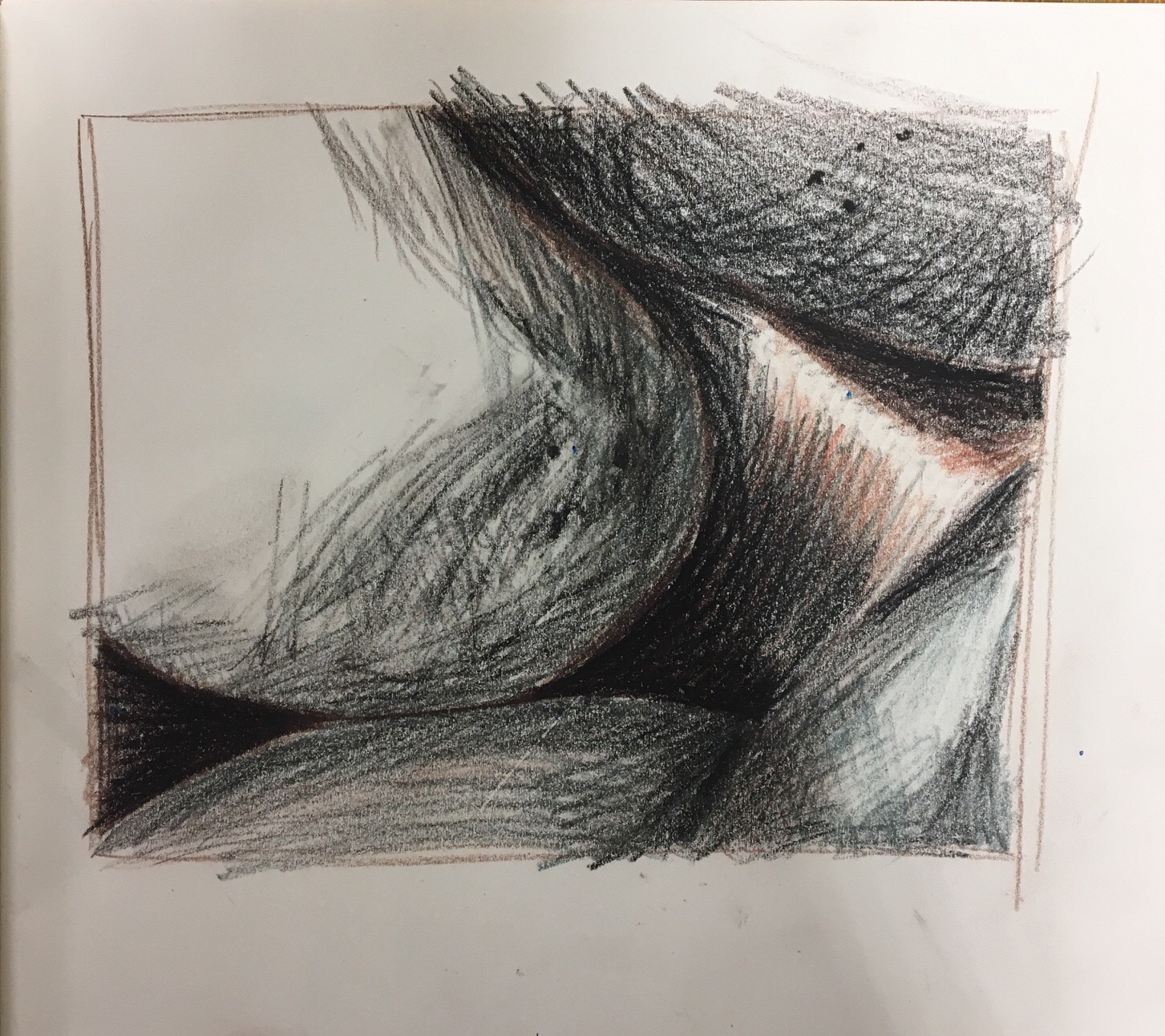
After preparing mostly in black and white, I chose to complete my final assignment piece in warm sepia tones to create a welcoming warmth to the room. If I worked with too many colours it would suggest a more balanced, natural light across the room. It was the late evening, with the house in darkness apart from one landing light, shining down the stairs to the left of the picture. ‘Leave a light on for me’ seemed an appropriate title as I noticed the shot when I came into my home late at night and everyone was in bed.
I think the shot struck me instantly as it was balanced in its composition without me having to tweak too much. It was in thirds from left to right – the bright light, bar area and stairs to the left, the darkness of the kitchen door to the centre and rear and the shadows of the dining table to the right.


- the most appropriate medium for the subject
- mark-making and contrasts of line and tone
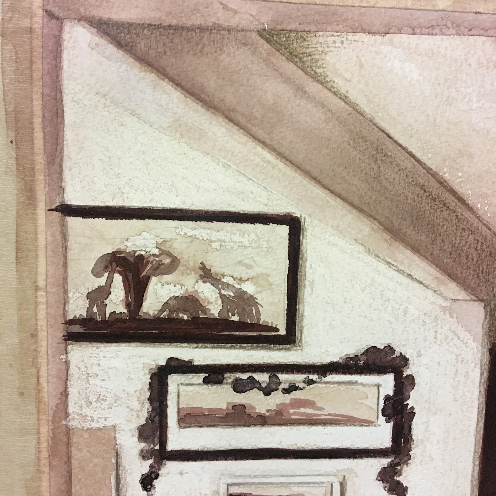
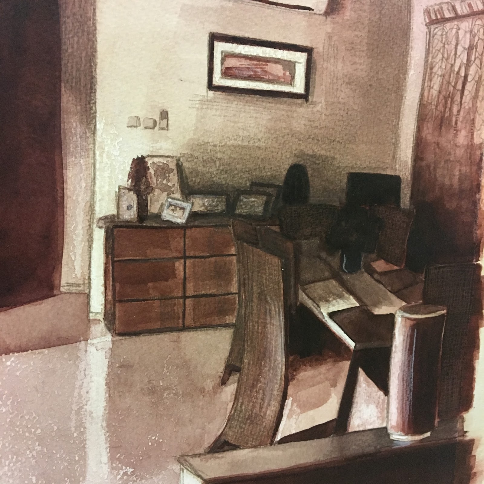
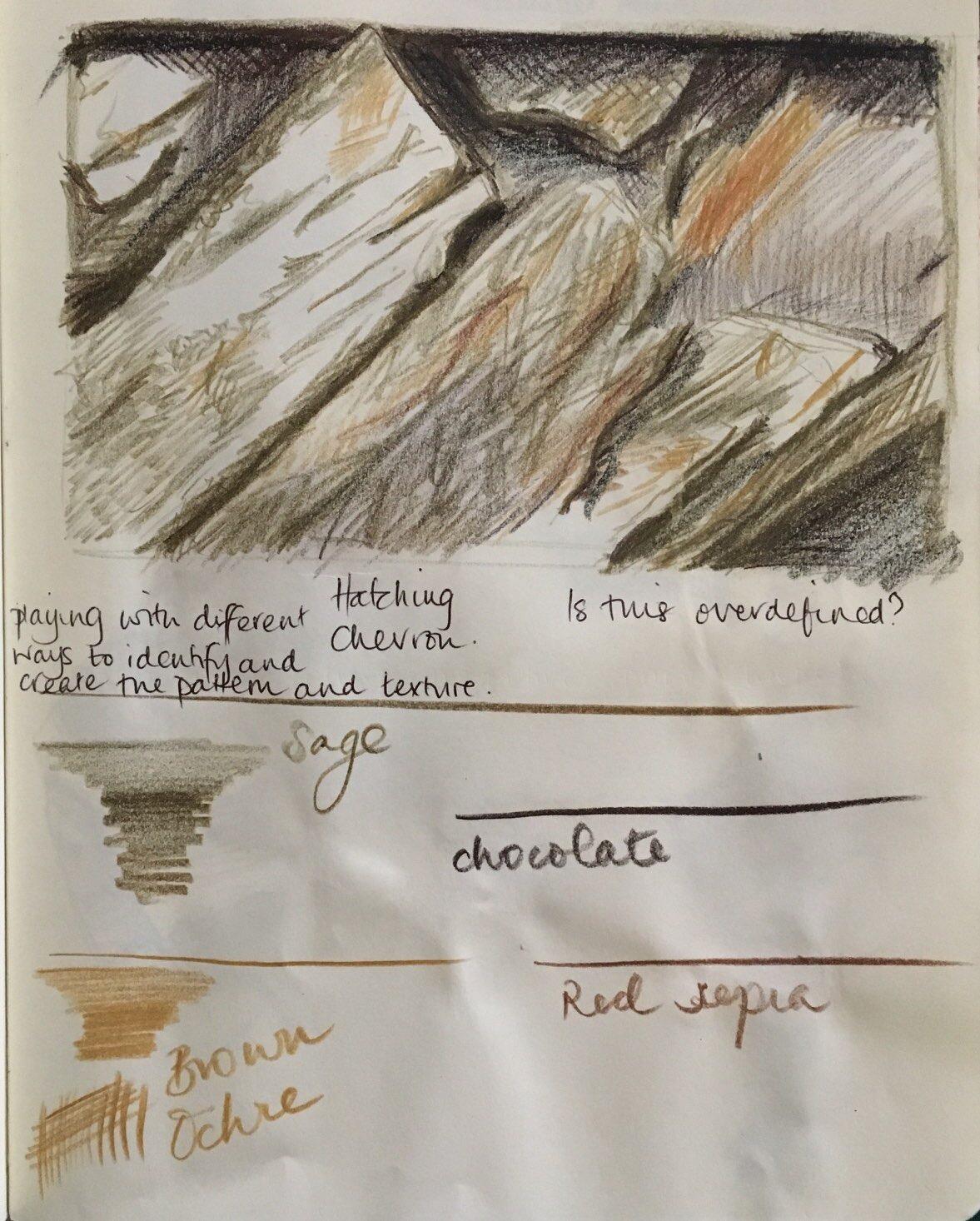
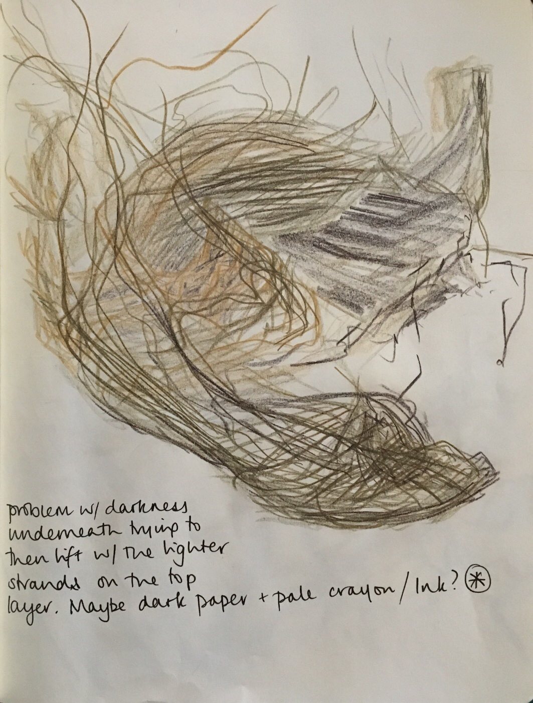
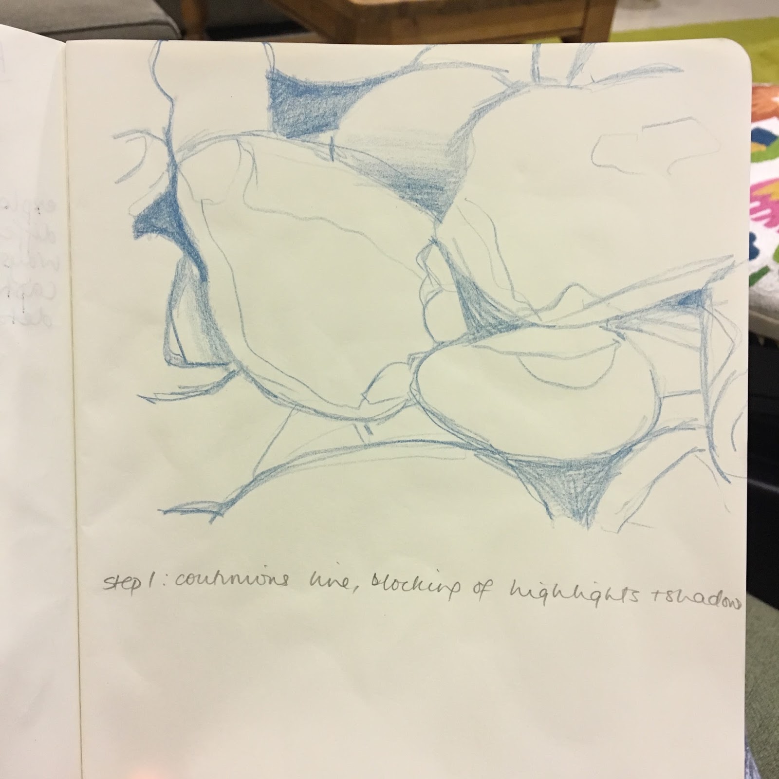
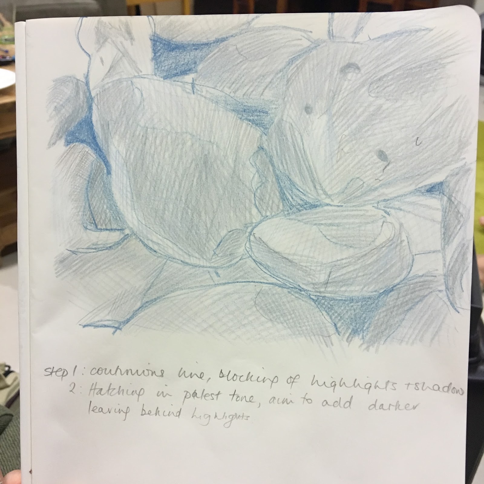
An inviting, warm atmosphere required similar materials to recreate such a feeling. I started in black pen for all the sketches I did and, as much as I love pen line, it was too ‘matter of fact’. I had ink wash in mind from early on; I liked the way it ‘worked’ with oil pastel in its resist effect and it worked well to create that artificial lightness without risking it being muted by the ink wash. Maybe pencil to add definition and detail as the last stage. I thought chalks would be ideal for the soft, peaceful, ethereal effect but are not defined enough. I knew that mixed media approach would be ideal to show definition as well as effect. I finally settled on mixed black and Indian Red inks in various dilution helped to make a warm sepia picture, with subtle pencil detail. The pencil worked as an additional layer to show detail and contrast; it helped me to define the pattern in the sheer georgette curtain to the far right. A layer of pencil also gave a ‘veil’ to suggest tangible shadow.
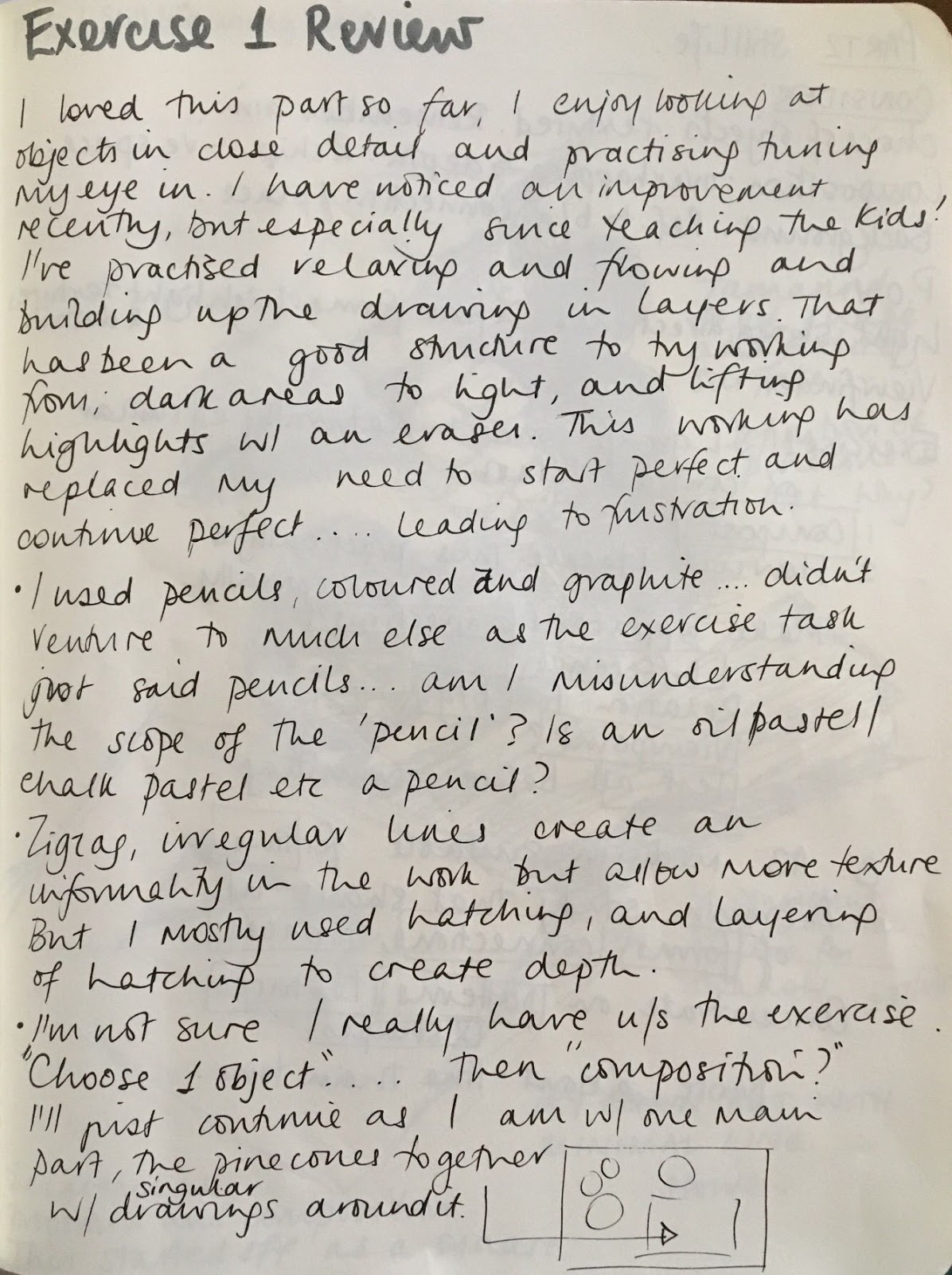
I was working to get a perfectly accurate picture as is my usual wont, but whilst I was completing this, an ongoing discussion was being had on the Drawing 1 forums regarding assignments, expectations and ability on the OCA drawing course.
There is some frustration that people come to a drawing course with little formal training and the OCA accepts them on a degree course/module. This might suggest that the OCA wants people who are willing to experiment, investigate and think outside the box rather than provide accurate depictions of still life. But then feedback given on the experimental and progressive assignments might be critical in the lack of technical skills. And it becomes a catch-22 situation; is this a technical course or an application of knowledge?
With that in mind, I seem to want to approach my work with a freer, more flowing sense, trying to think outside of the box, which is a contrast to how I have always worked in many aspects of my life. I am becoming more relaxed and I want to apply this to my art. A more expressive, investigative approach appeals to me.
I have really enjoyed this assignment in that, as the title suggests, it is an intimate look at my space, my home. I am entirely happy with my assignment, I really like it. Technically, I could do better; some straight lines are a little off and I am bothered with this. It was a little hard with a brush and the fluidity of ink.
Staying on a technical level and process, I stepped back and realised I had created a workflow without realising it. I initially thought, and maybe hoped that I worked more spontaneously. I focussed on what I wanted to achieve – an atmosphere and feeling of the place at that moment in time. This led me to practice with materials and find which suited the aim.