P3.2.3 – Creating mood and atmosphere

For this exercise you can choose to paint a full figure portrait, a head and shoulders portrait or a self-portrait. Your finished portrait should be unusual or expressive in some way.  It can be true to life or not, depending on the effects you wish to achieve.

Decide what you’re trying to achieve at the outset and make some notes in your learning log.

Next, decide on your light source as this will determine both the effect of solidity that you’re able to capture and convey mood and atmosphere.

Sketchbook study portrait in gouache and then charcoal.
It was easier to get the muscle definition and tone rather than paint

Attempt 2: Acrylic in sketchbook

2019-05-13 14-41

I really enjoyed the freedom of the mark making in the German Expressionist style. I understood how they sought to reflect inner feelings and emotional state through their colour choice and brushstrokes.

I want to know how to get that muscle definition I found using charcoal, without placing perfect brushstrokes.

Assignment 3 and Reflection


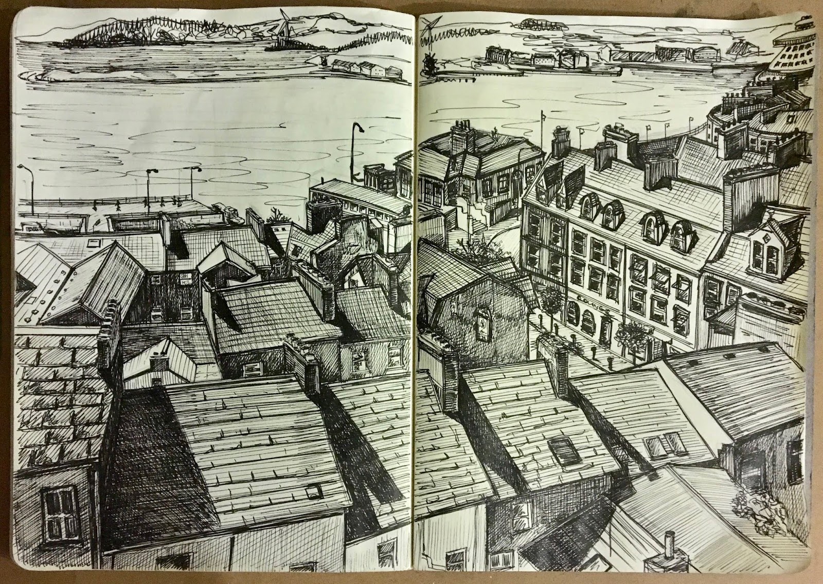
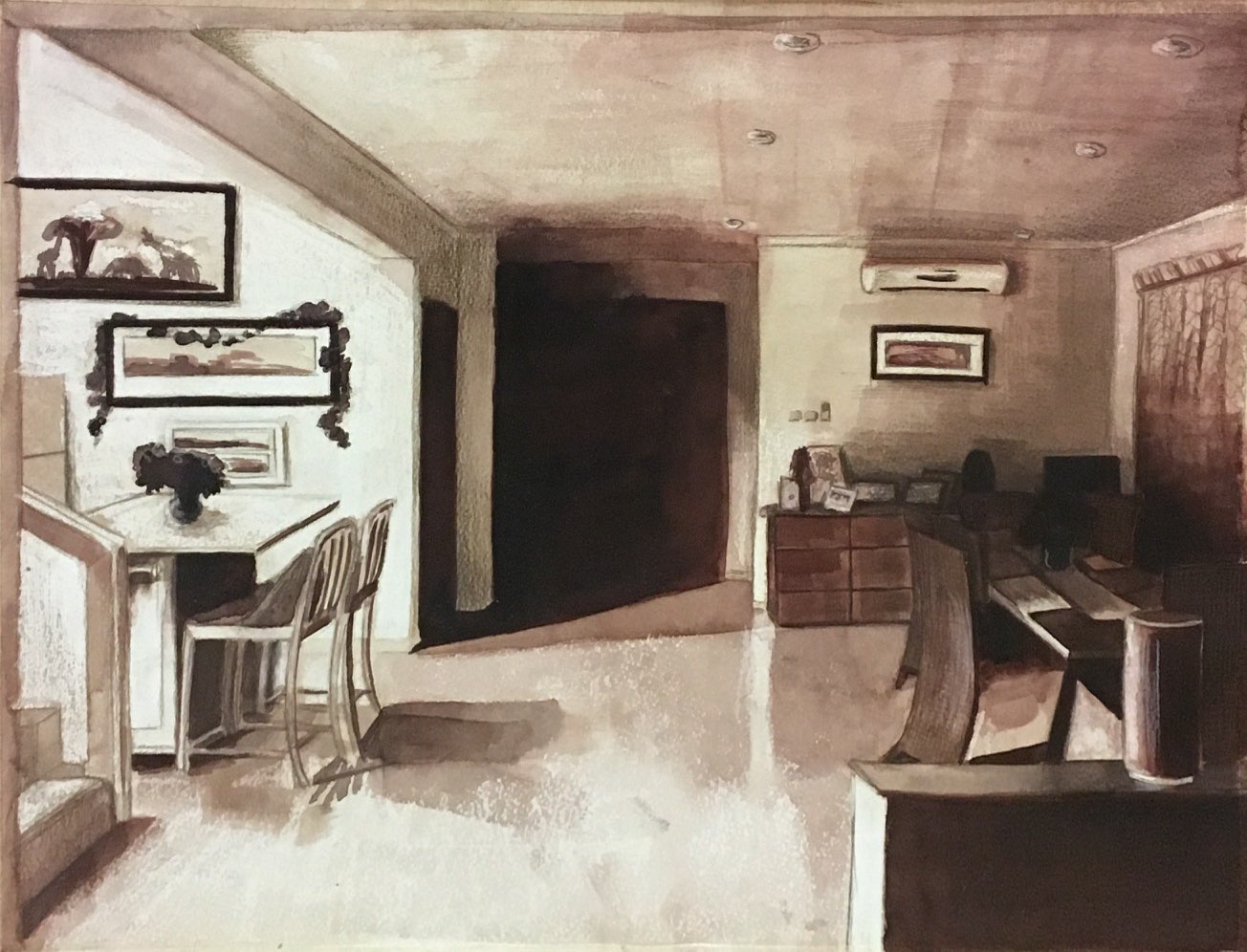
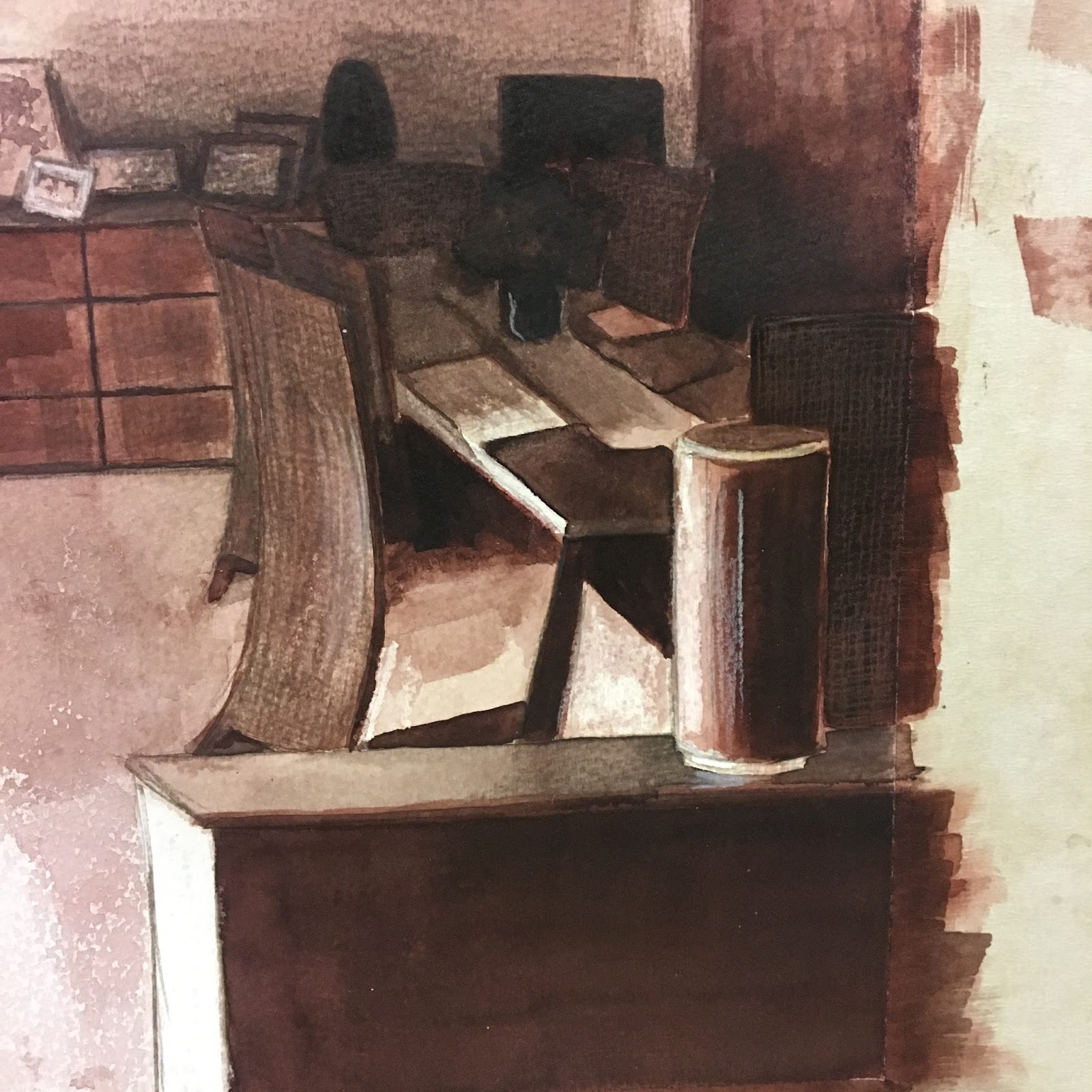
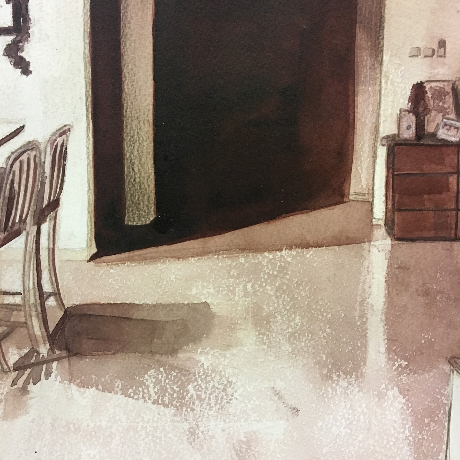
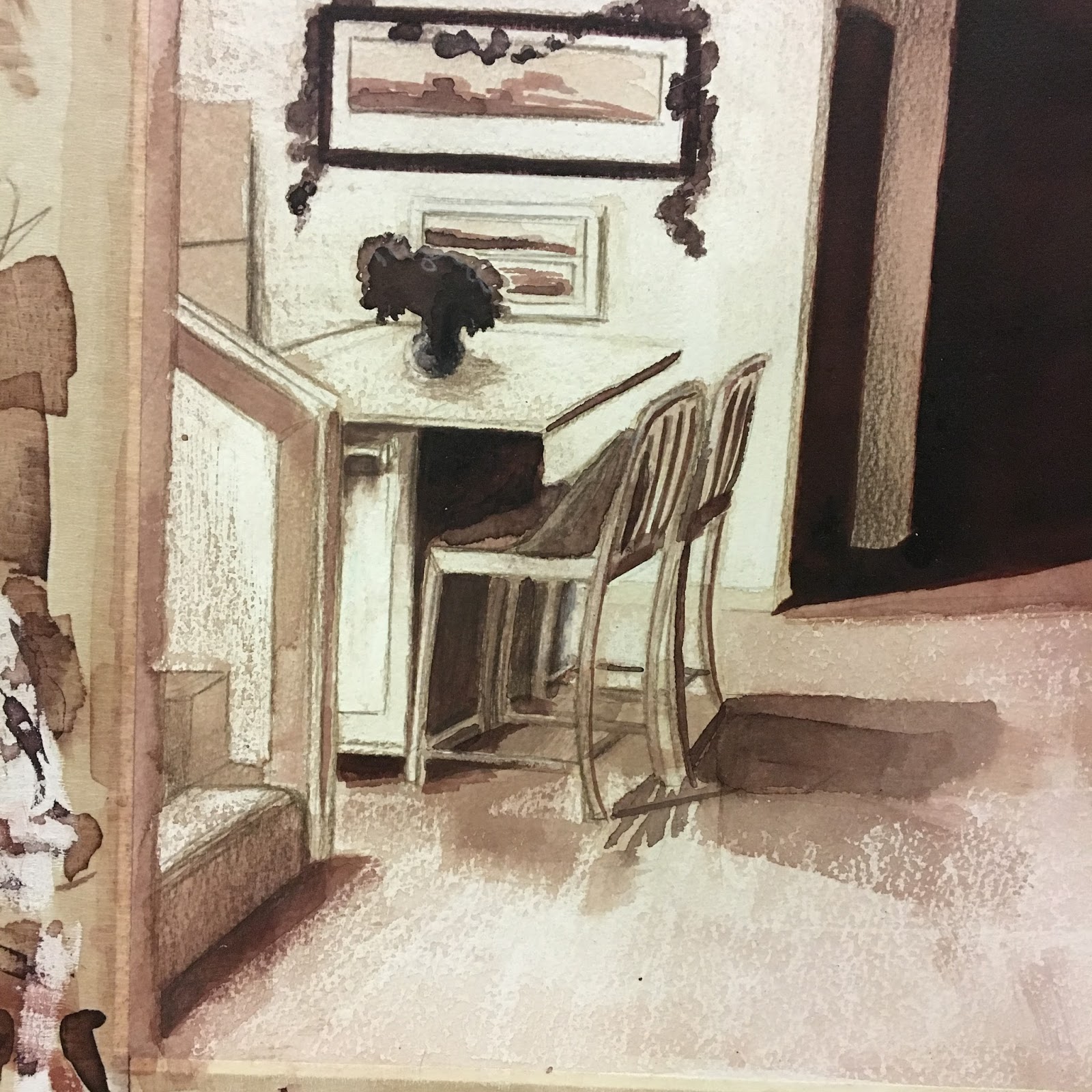
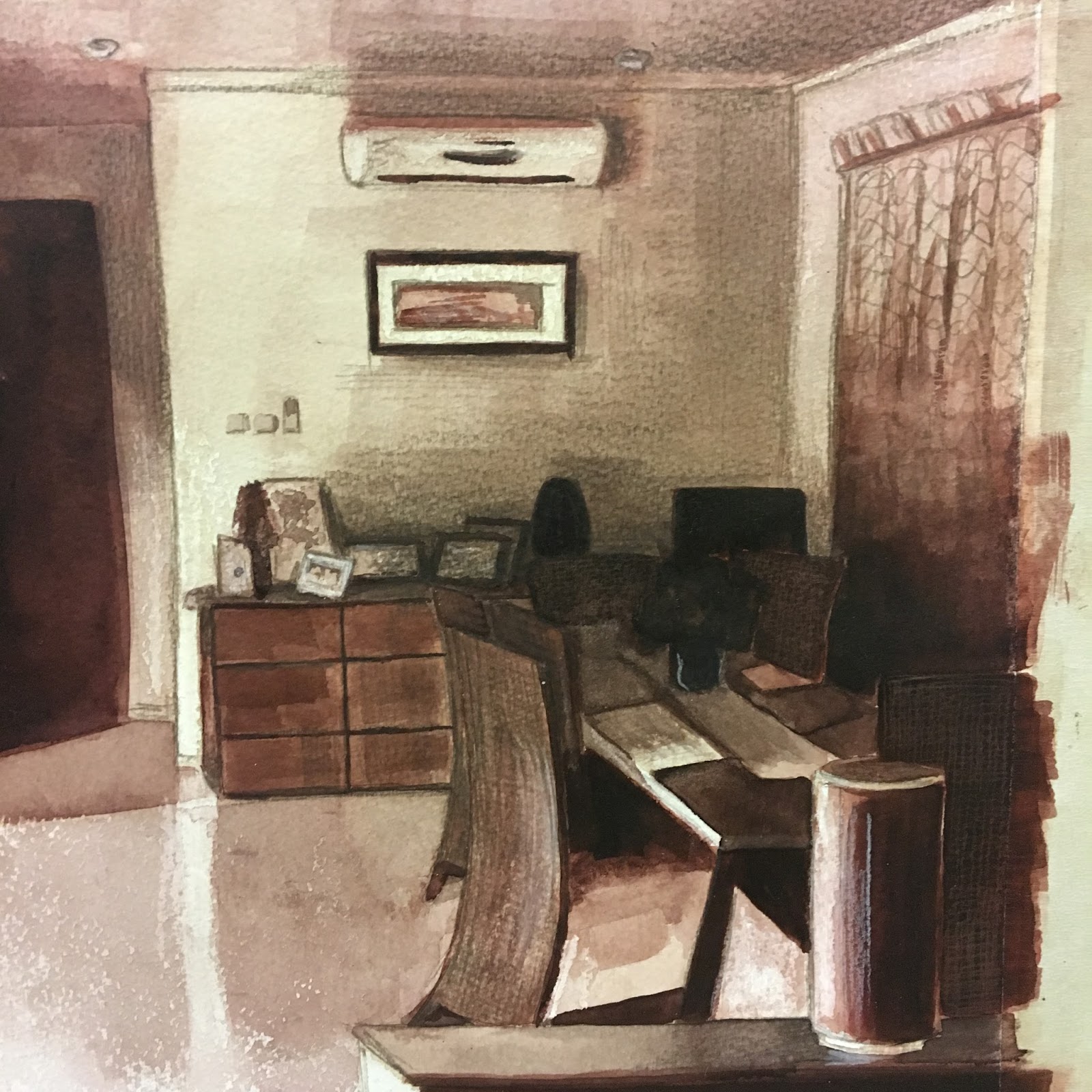
Draw an outdoor scene of your choice. Try to find a view that includes some natural objects – trees, shrubs, pot plants, fields, garden plants. Also try to find a view that will allow you to demonstrate your understanding of aerial or linear perspective – in other words a view that has some demonstrable depth to it. Look for a view that offers an opportunity to draw straight- lined objects as well as items drawn from nature: buildings, walls, fences, gates and so on. This may seem like a lot to look for, but most views from windows and doors will offer you a bit of all of these things.

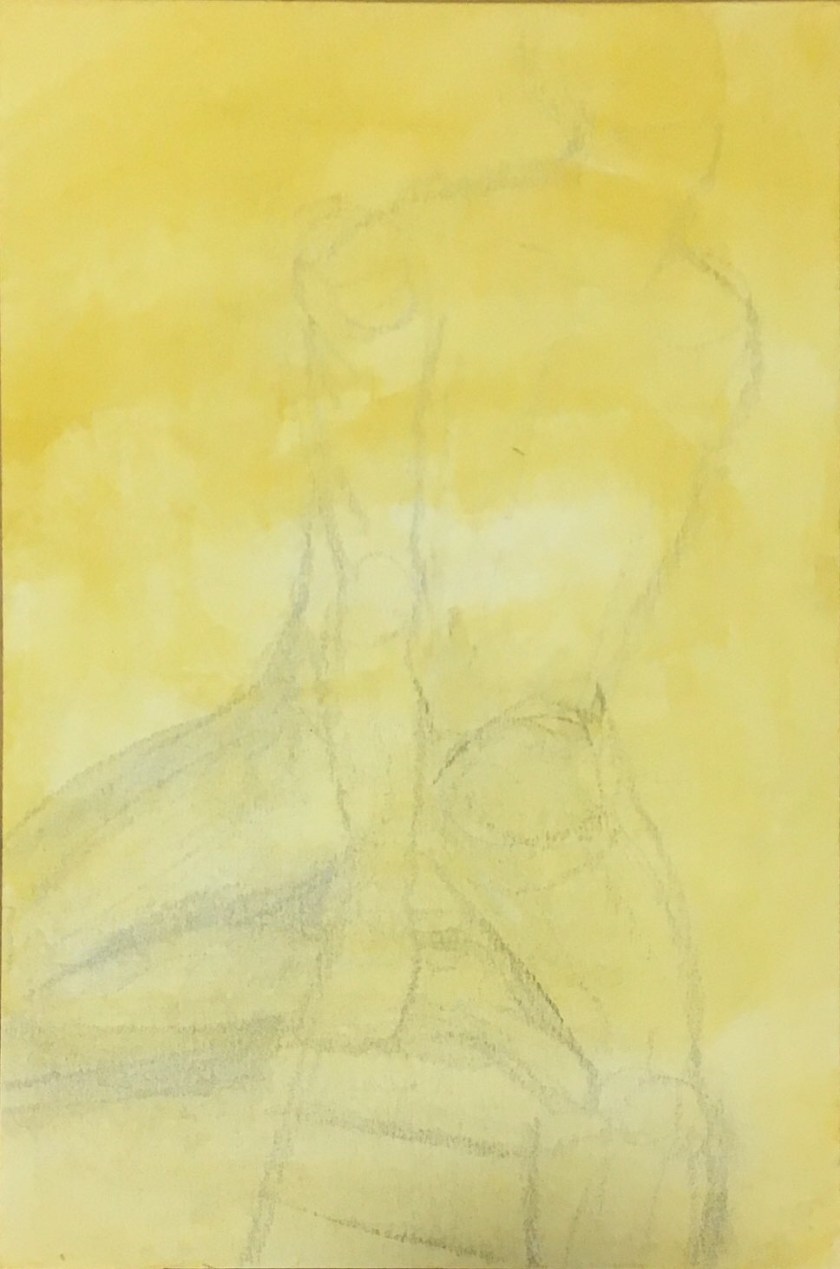
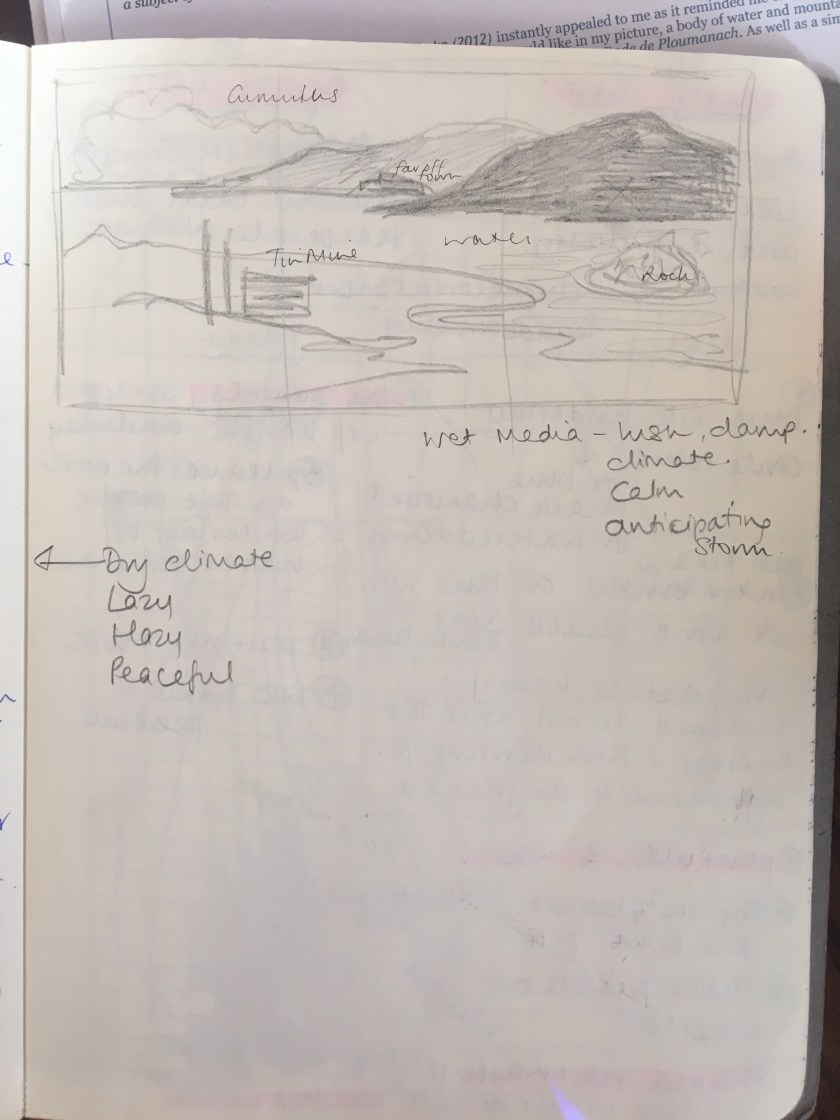
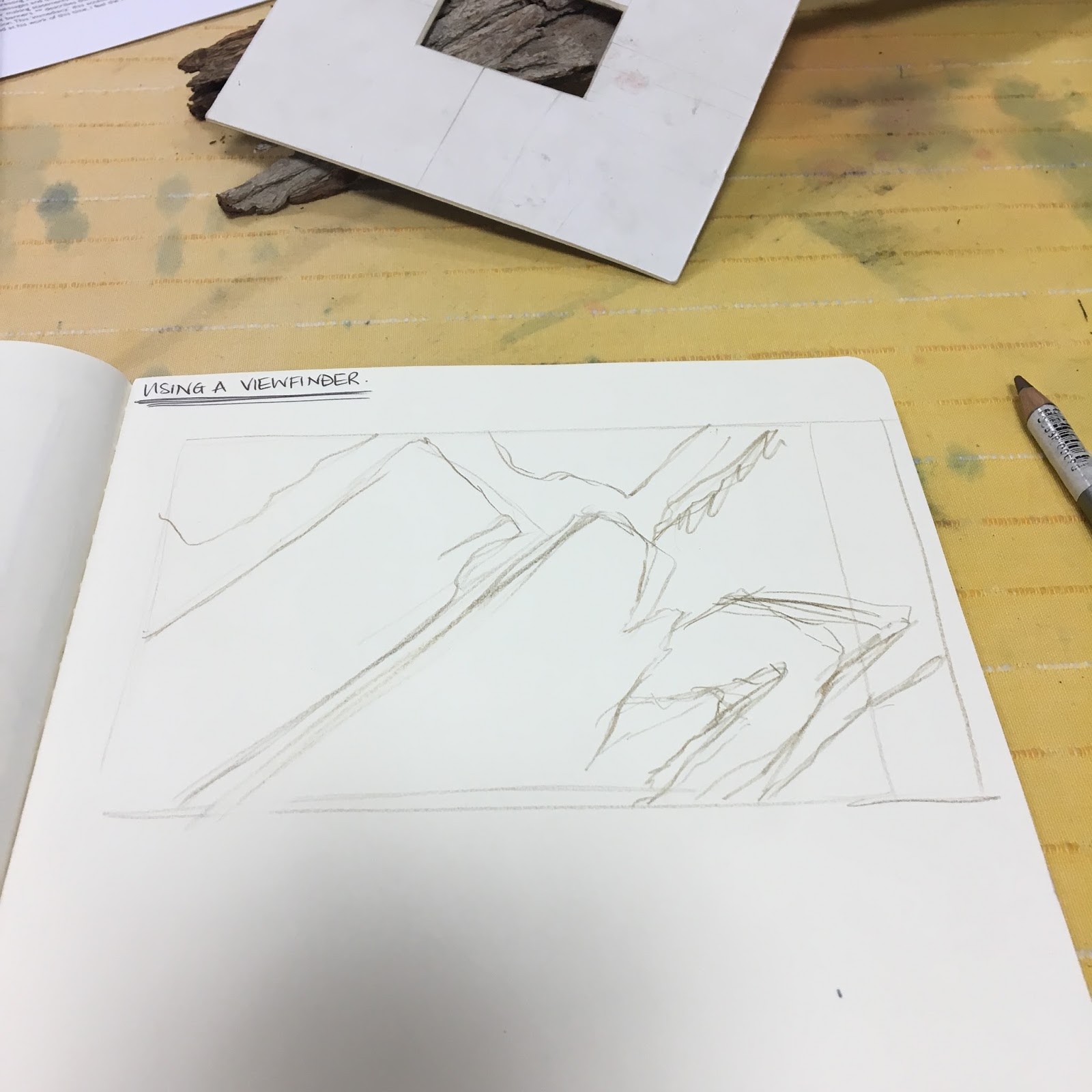
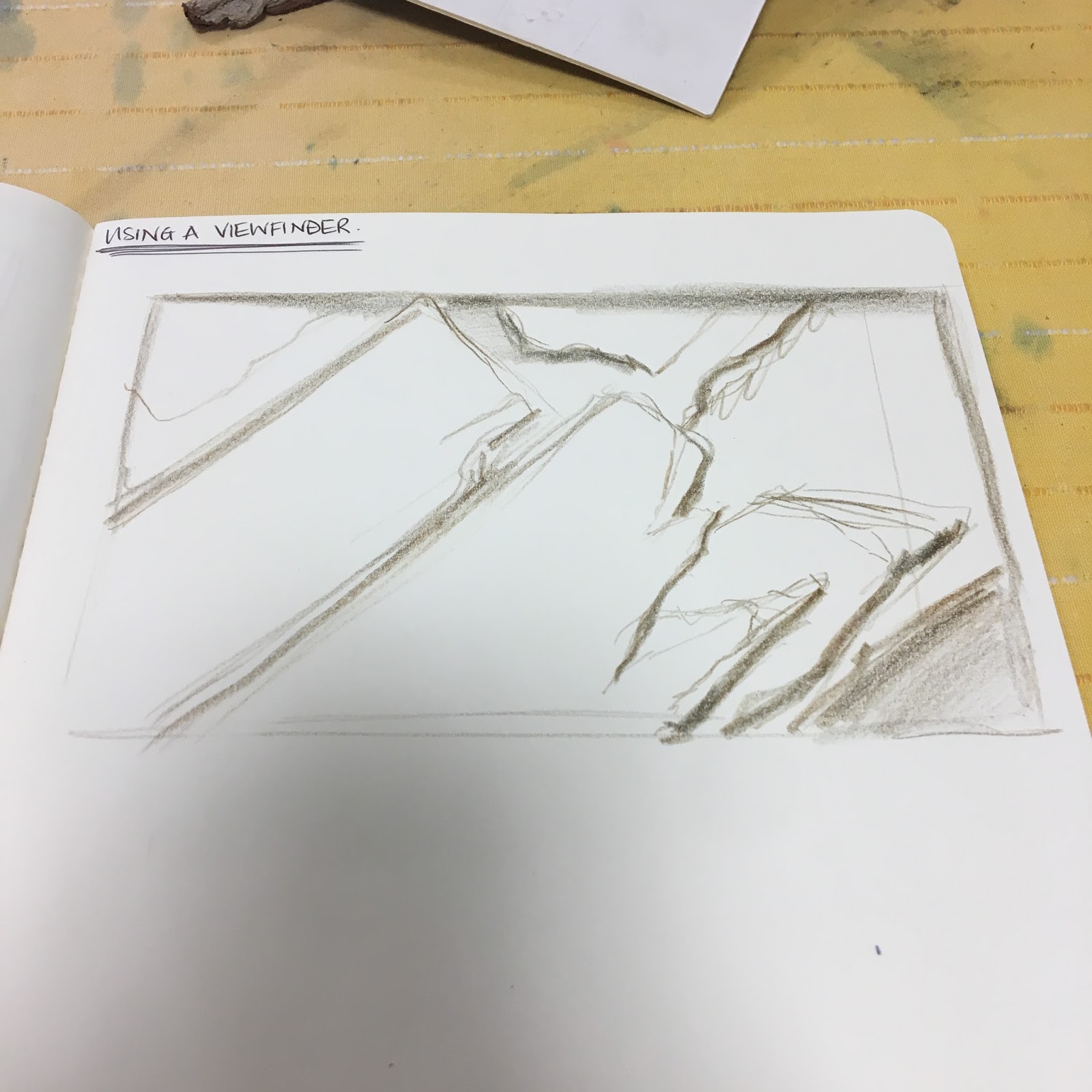
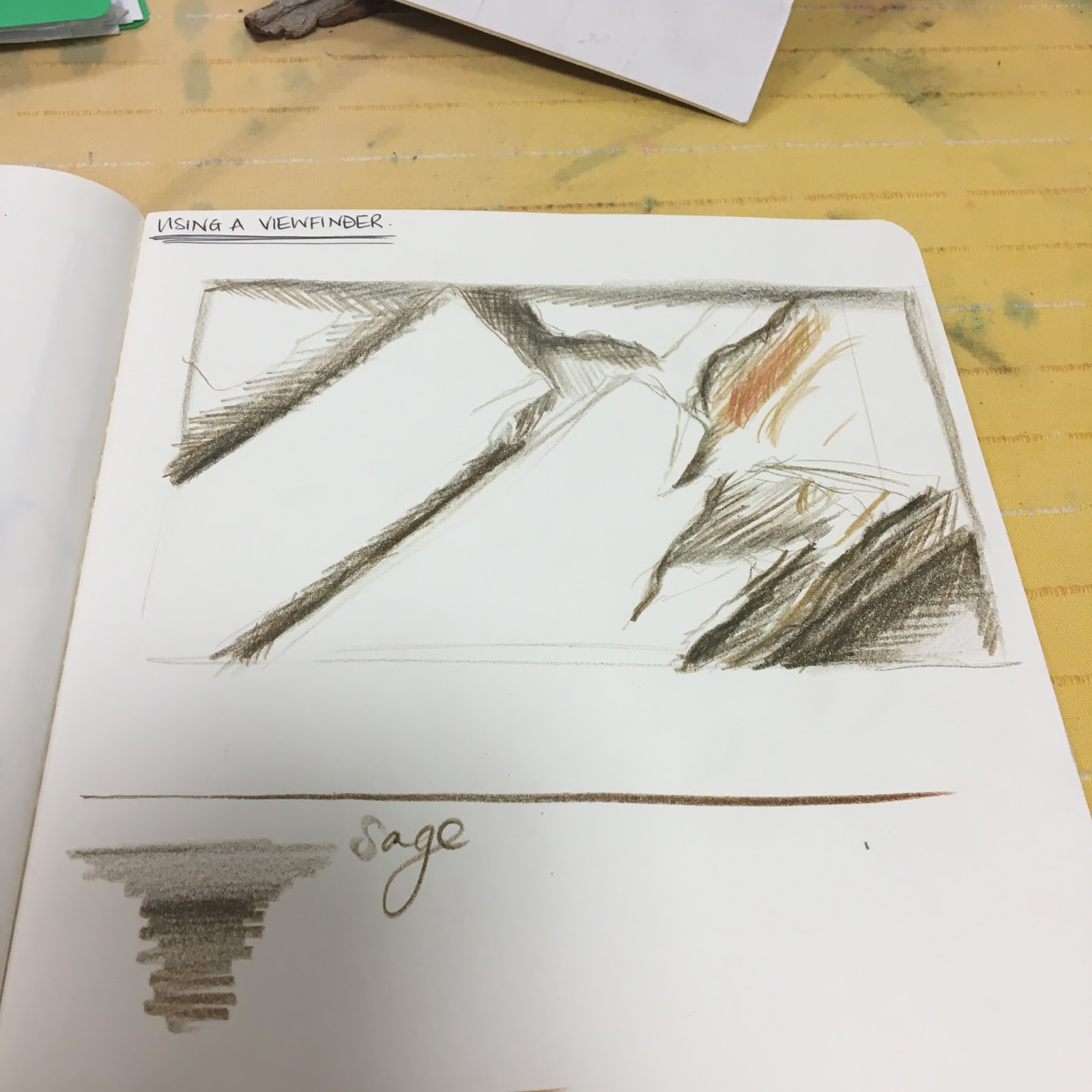
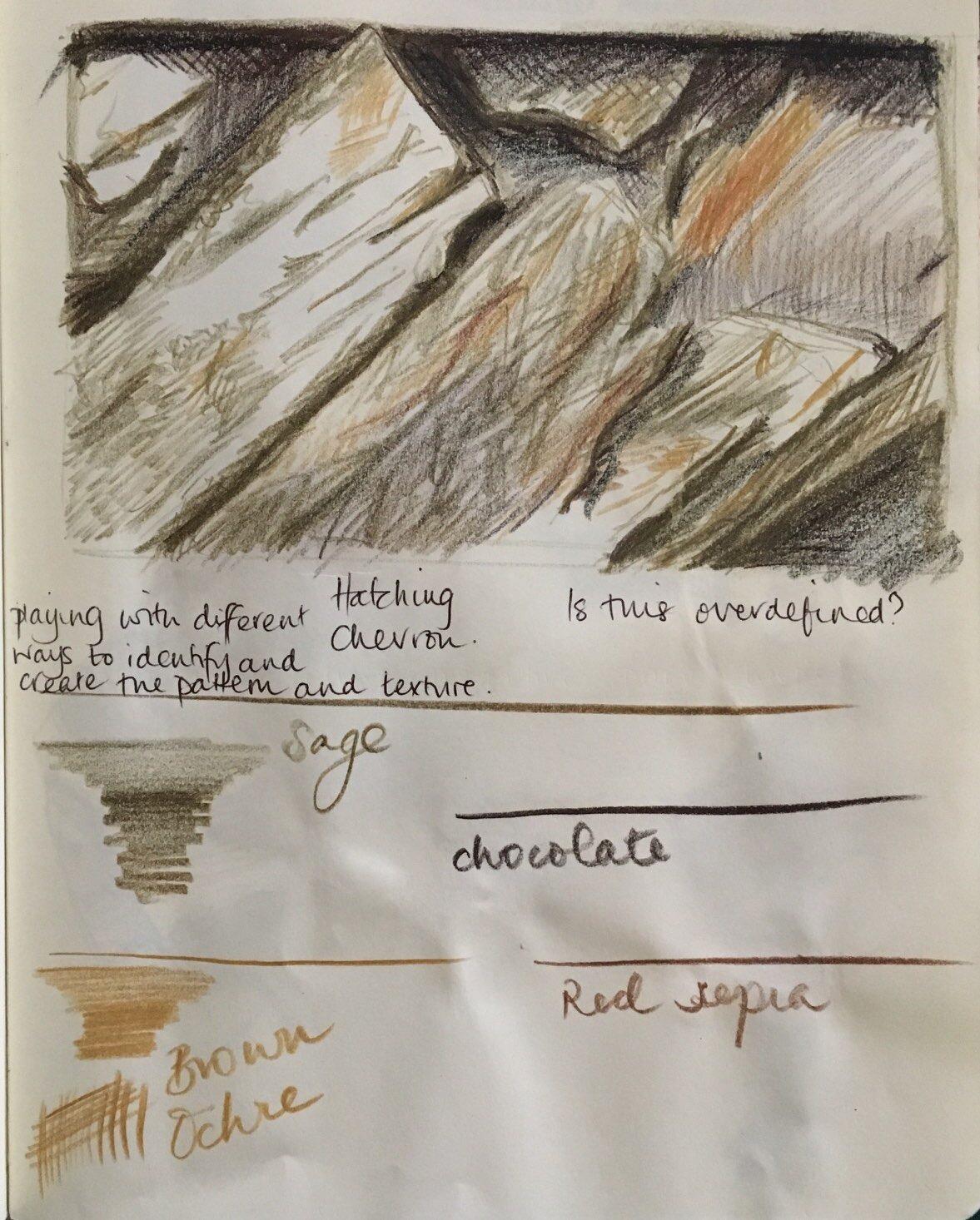
Do some preliminary drawings in your sketchbook to experiment with the composition.Try different versions, eliminating and moving objects if necessary to create a pleasing composition. Make some sketches to practise getting the perspective of the scene right. How are you going to create depth? Are you going to use receding lines (linear perspective) or use graduated tone (aerial perspective) and the receding size of objects, people and buildings?

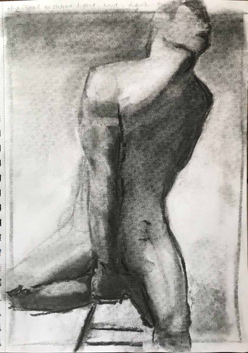
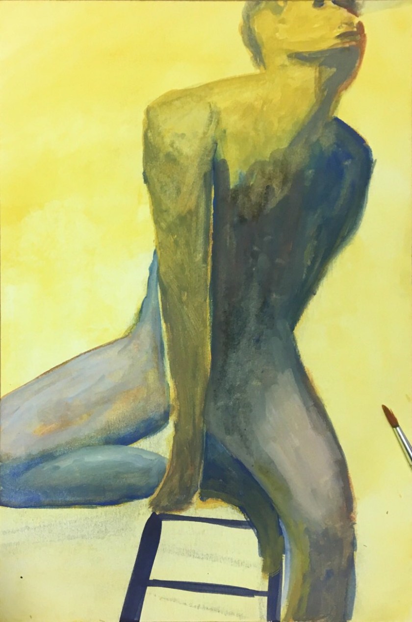
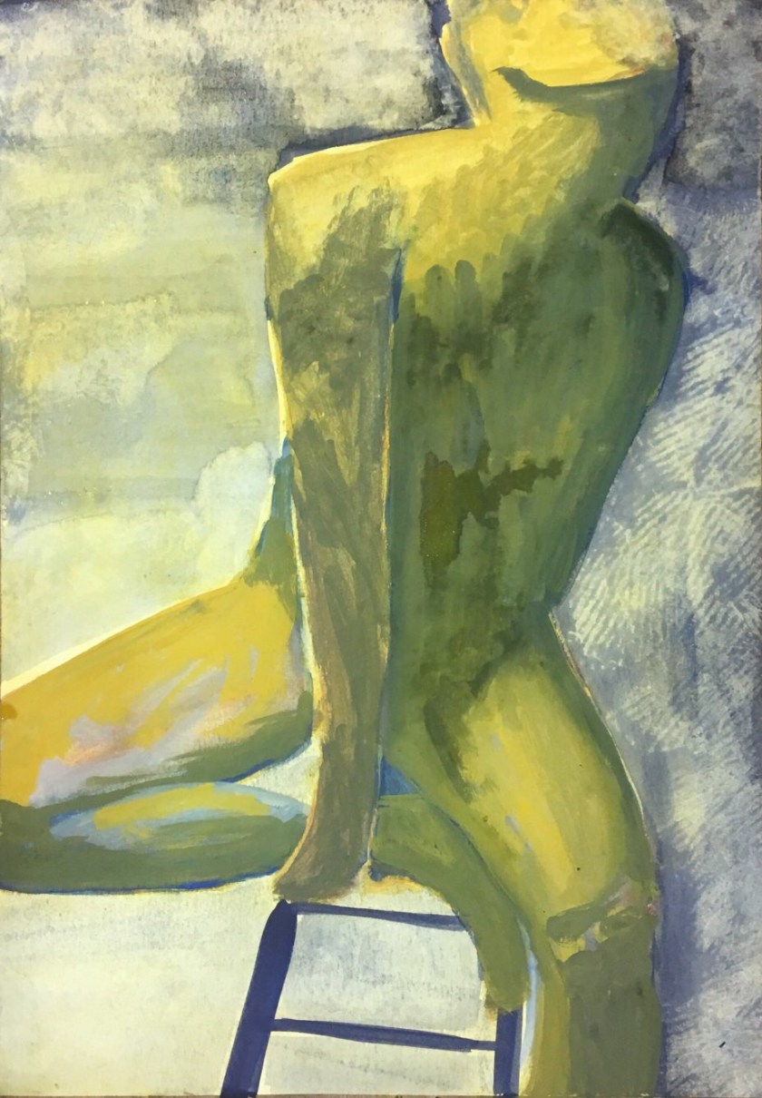
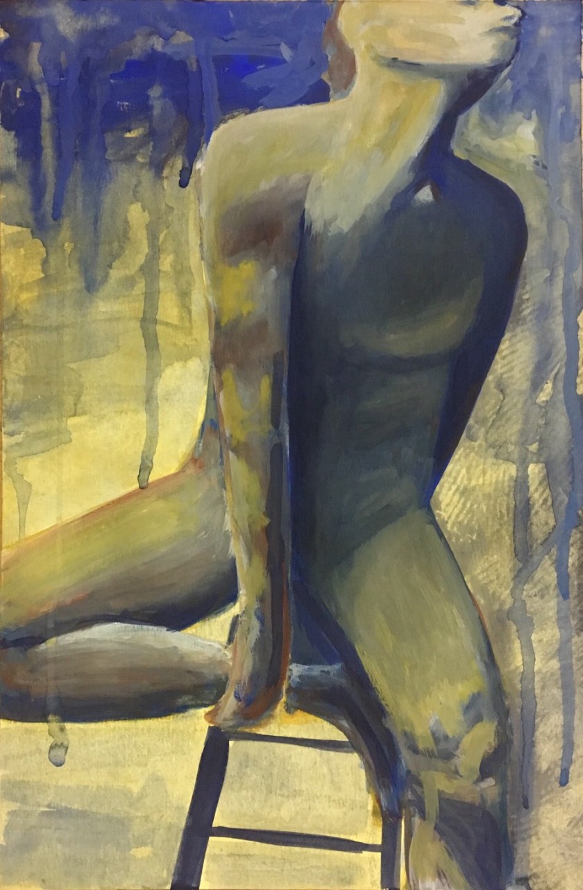
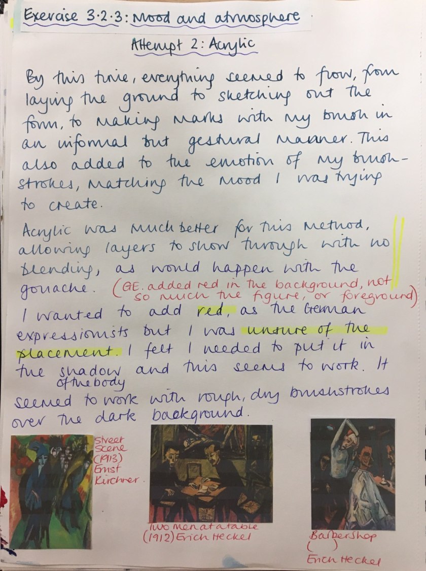
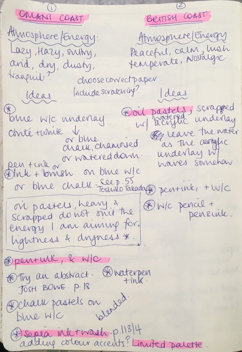
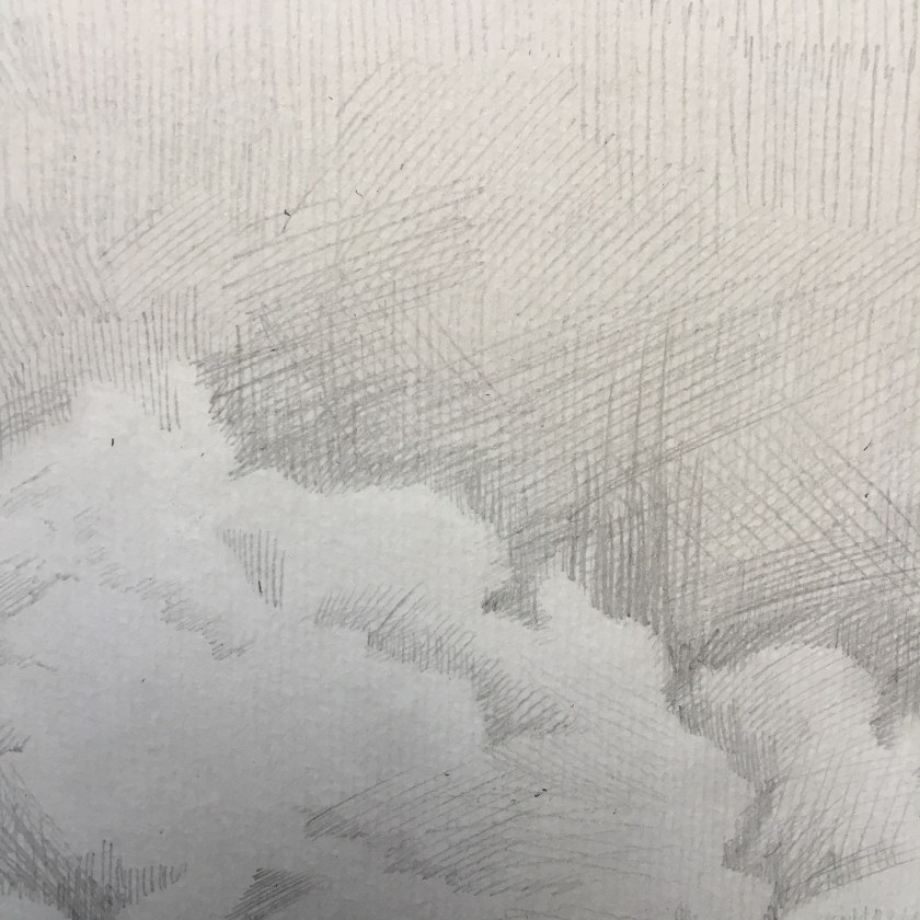
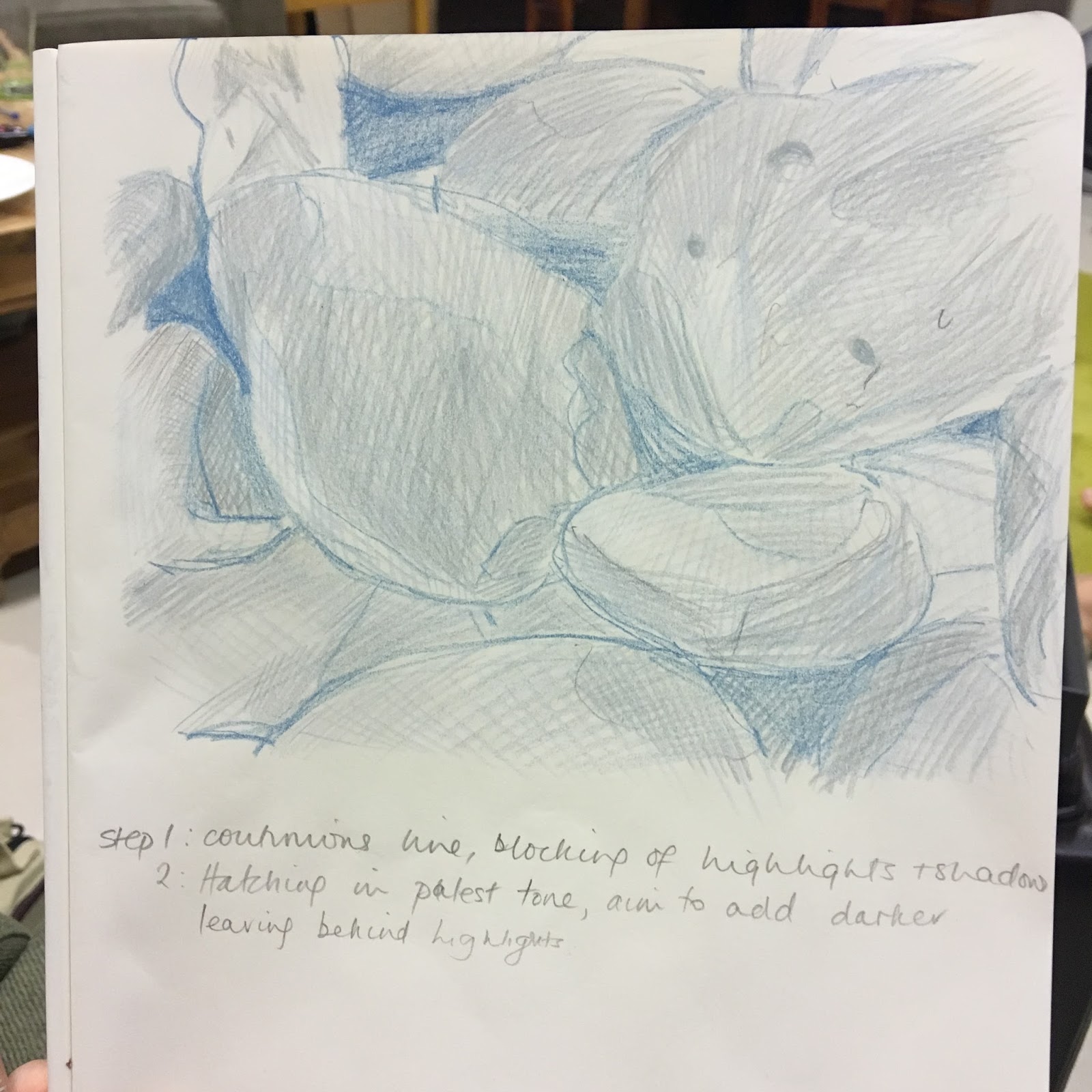
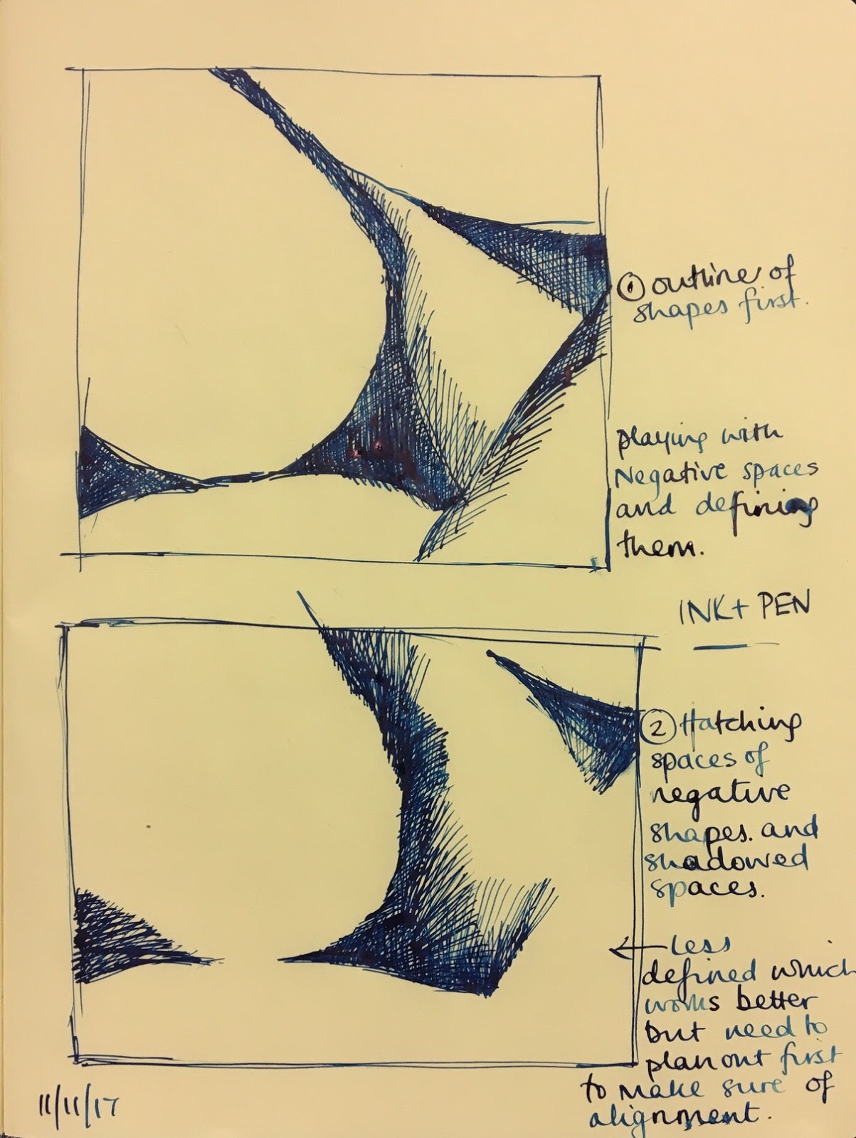
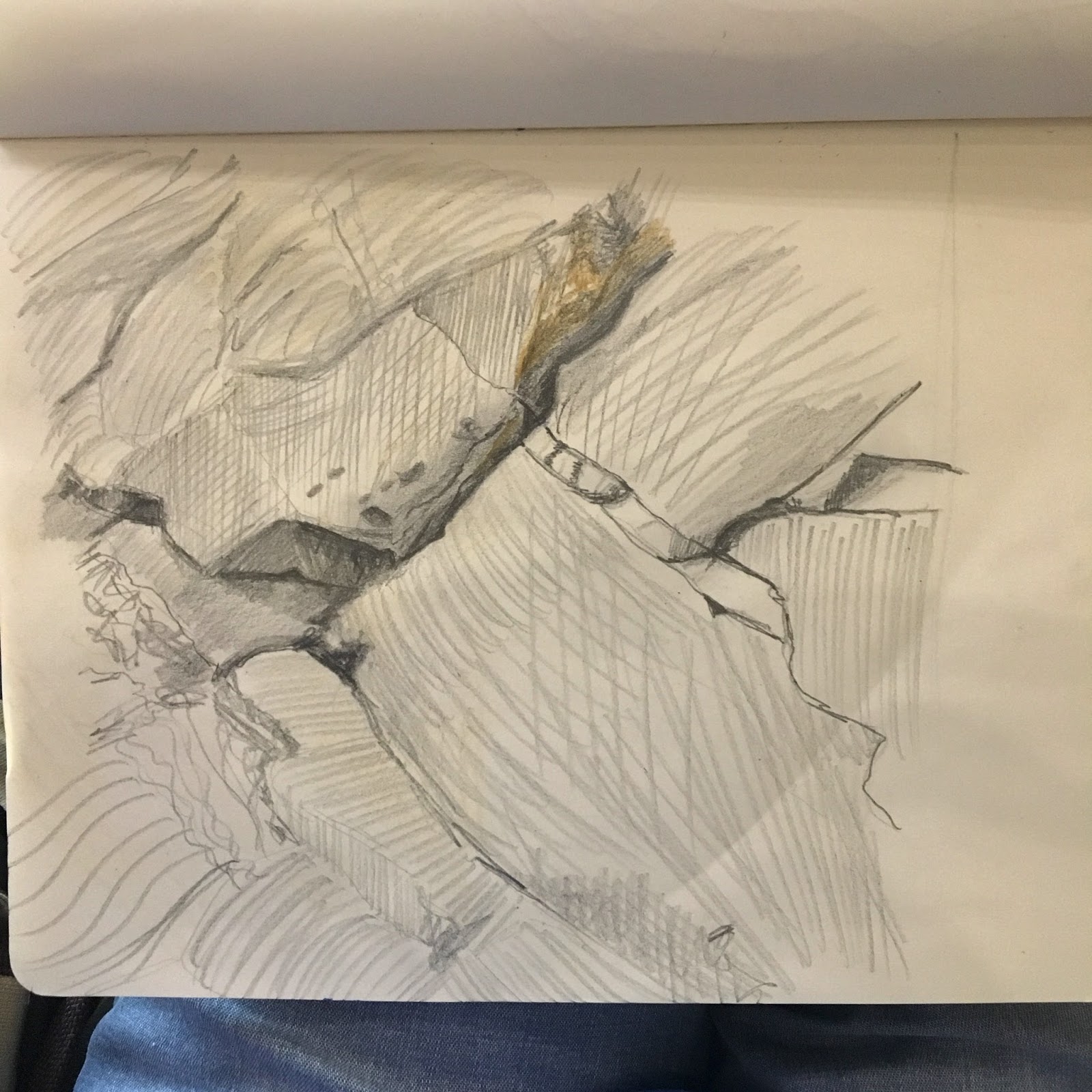
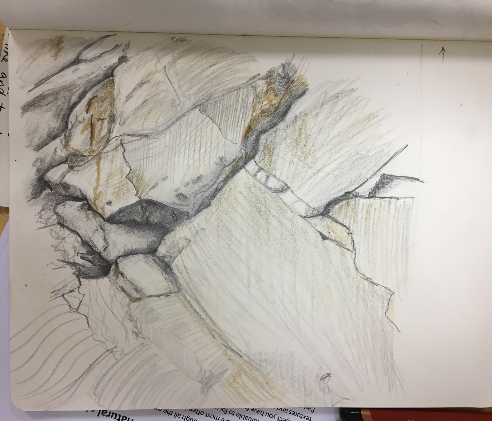
Next do some broad sketches in charcoal or diluted ink and brush and trial other media before you select which to use. Think about the atmosphere and energy of the place and whether you’ll be able to give a sense of this through your chosen material and approach to mark- making.

With an A2 or A1 sheet of paper pinned or taped on a board or on a pad, get settled comfortably and keep your preliminary sketches around you for reference. Think about your successes in previous exercises and look very carefully at the scene in front of you. You should spend anything up to two hours on this final drawing, not including all the preliminary work you’ve already done.

Demonstration of technical and visual skills – materials, techniques, observational skills, visual awareness, design and composition skills

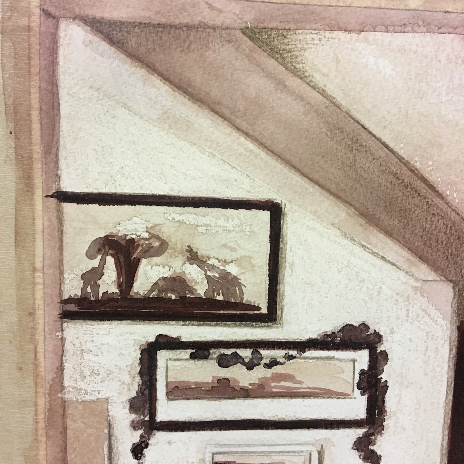
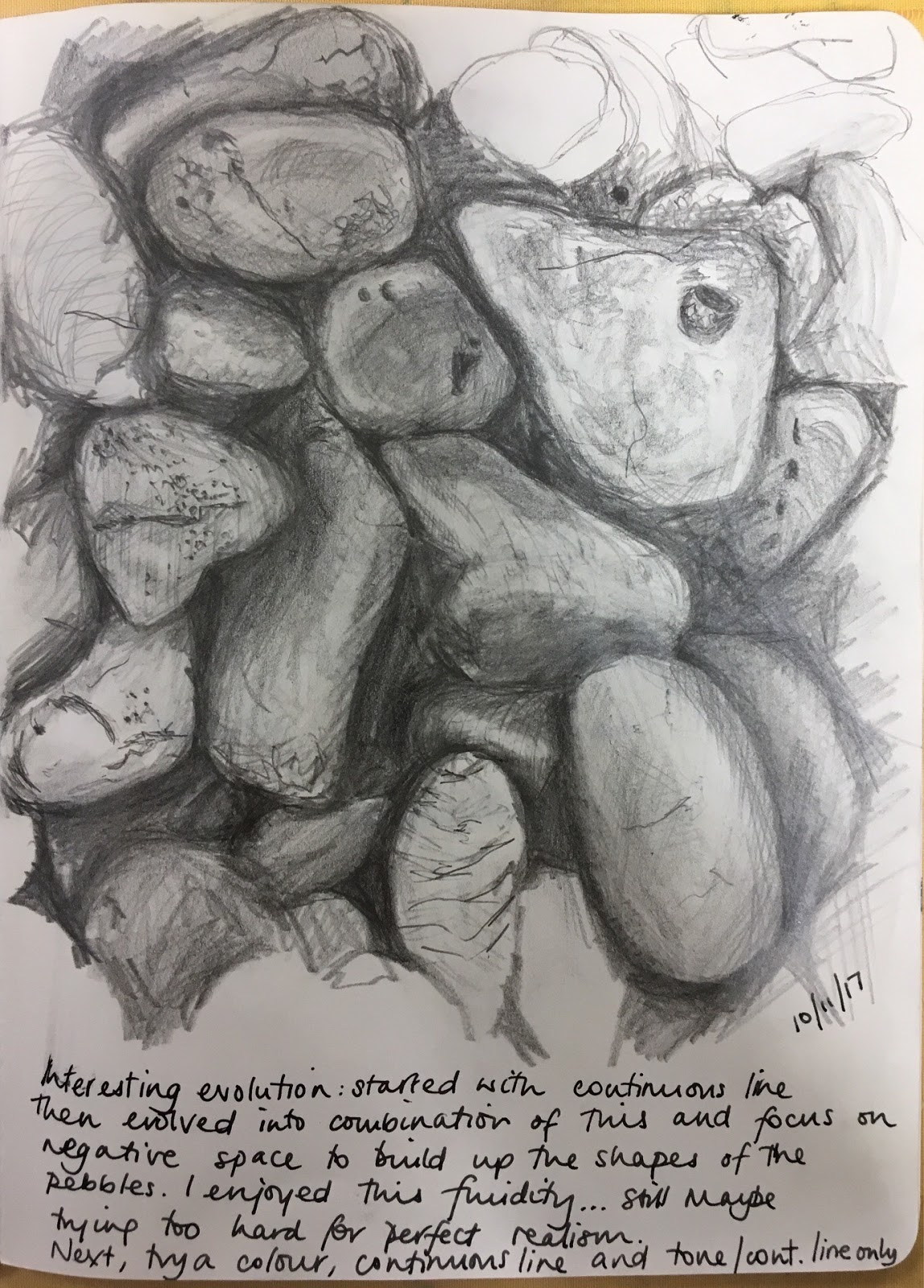
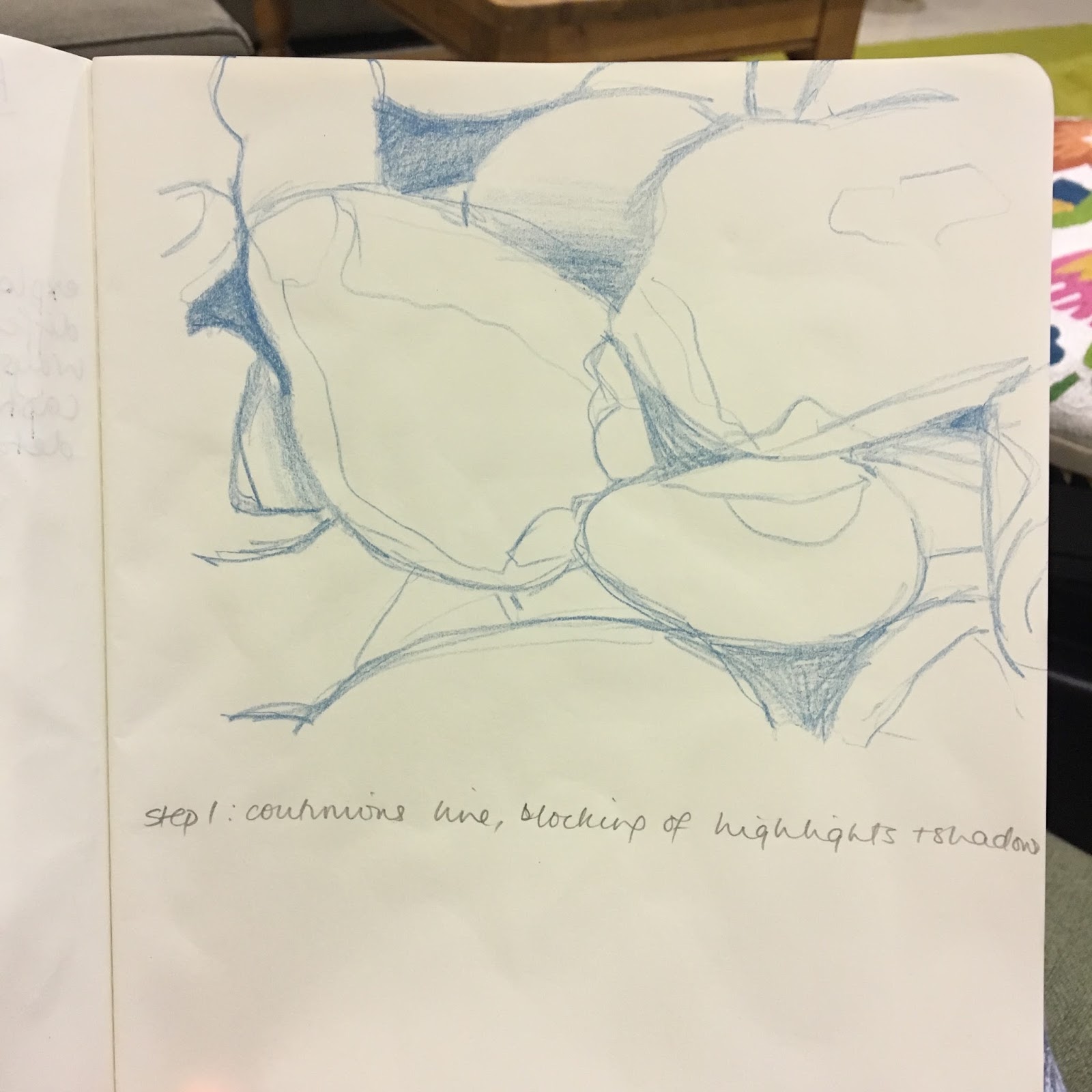
I continue to notice an increased confidence in my composition skills; I feel I have more of an eye for balance and this is happening earlier on rather than it taking over the exercise. My observational skills are also developing further – I am becoming more tuned in and thinking about how I could intepret what I see and what materials may work best. I don’t feel I have experimented with materials to the fullest as I would have made myself fall behind more than I already was. I feel my mark-making and final work is too formal, and so the techniques need to be simplified. As I become more relaxed I think that my techniques will broaden.

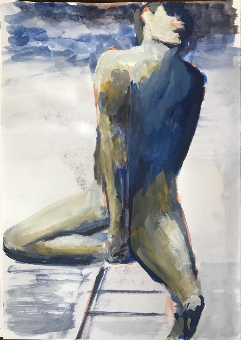
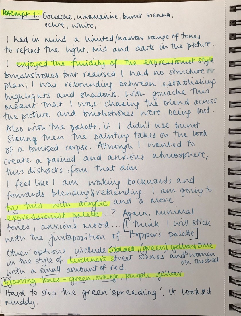
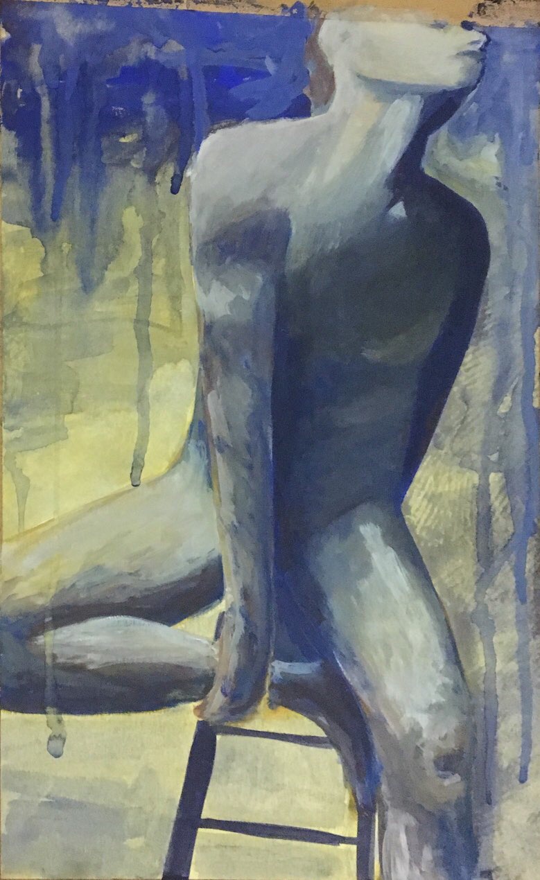
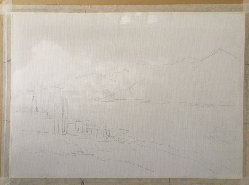
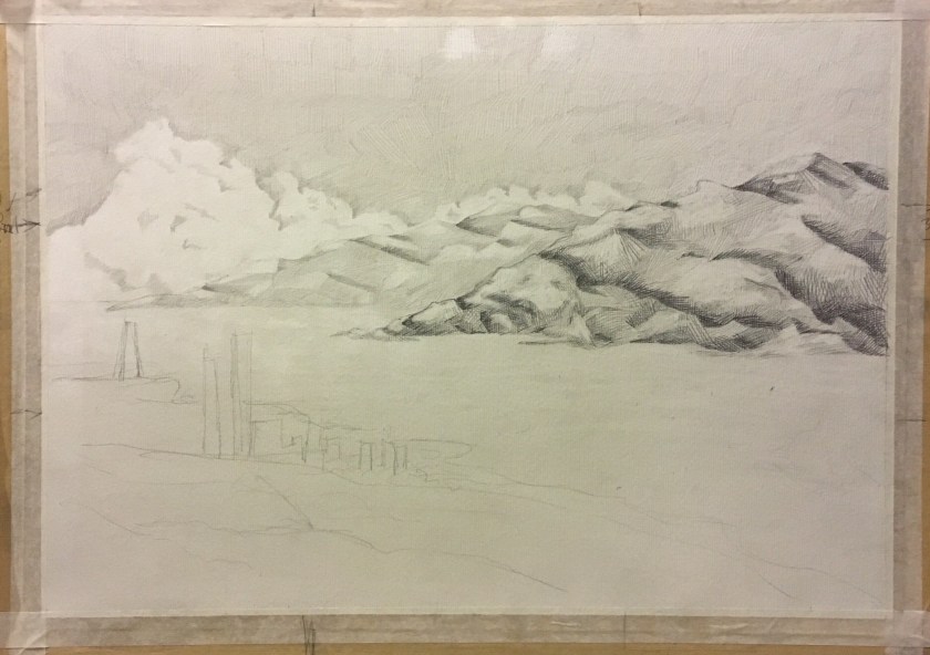
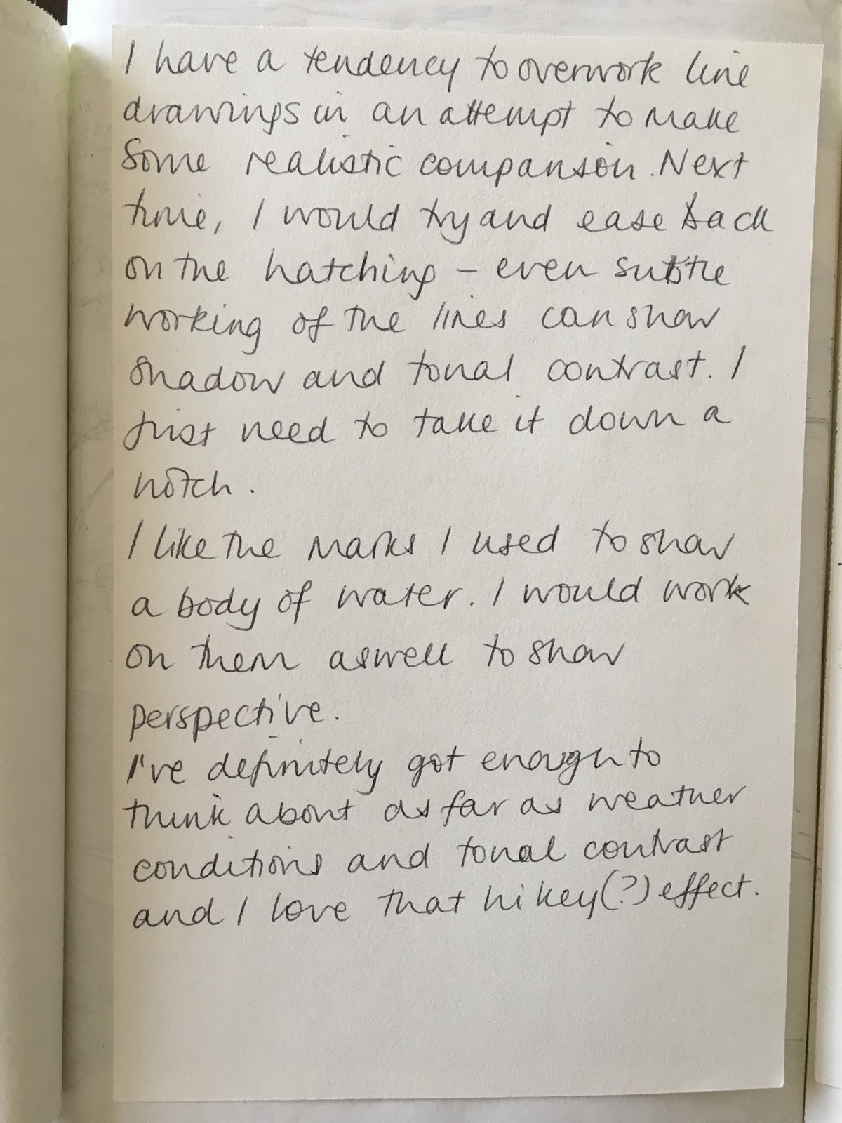
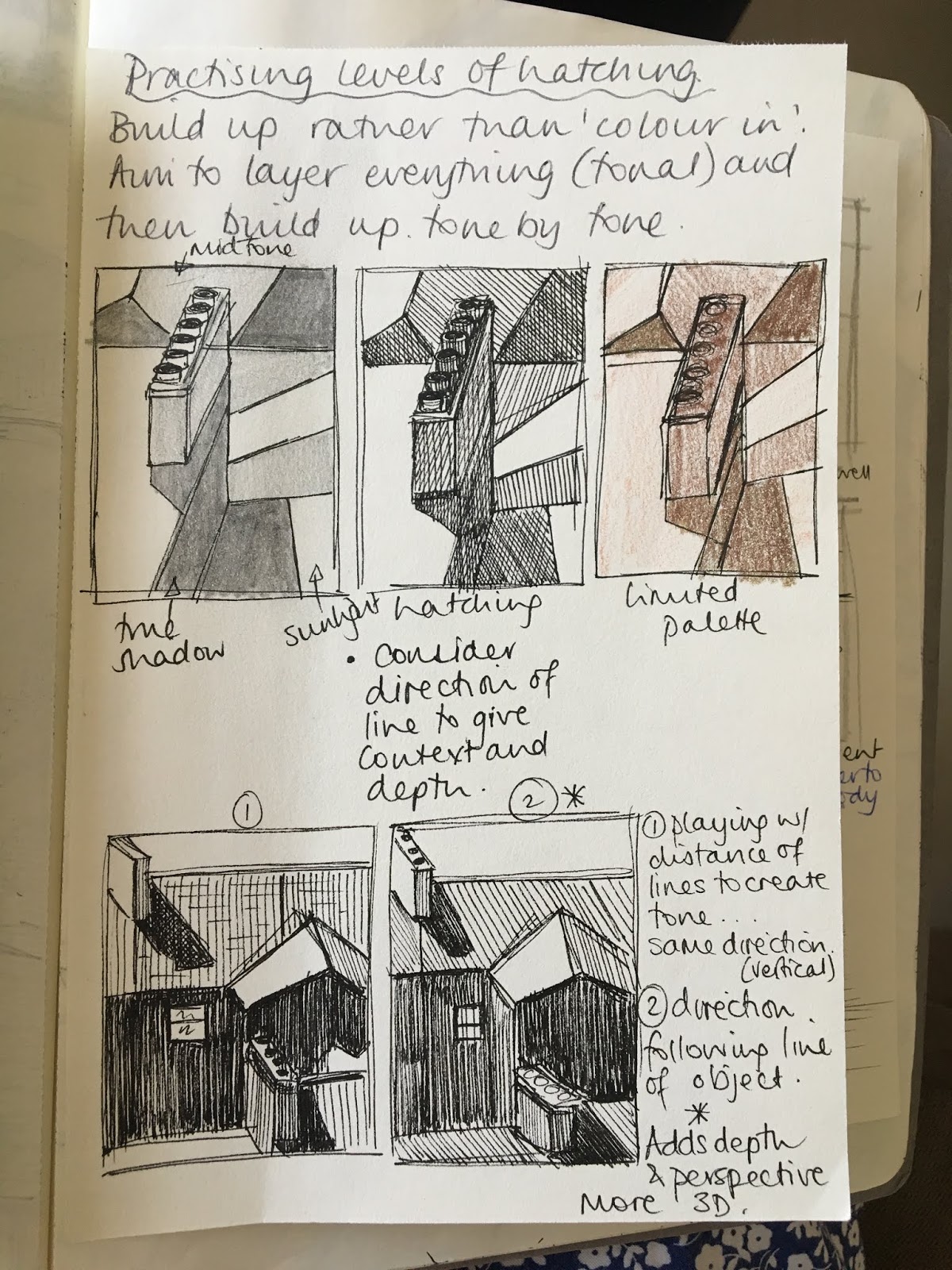
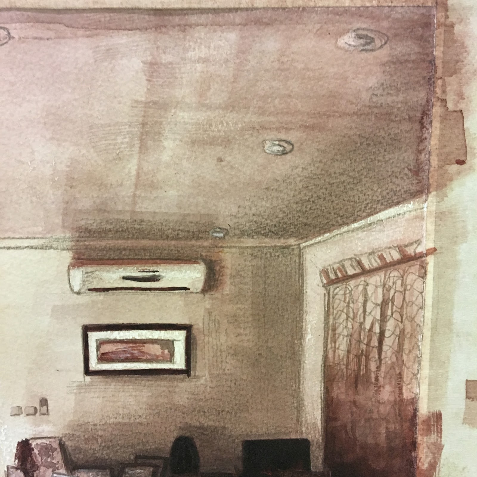
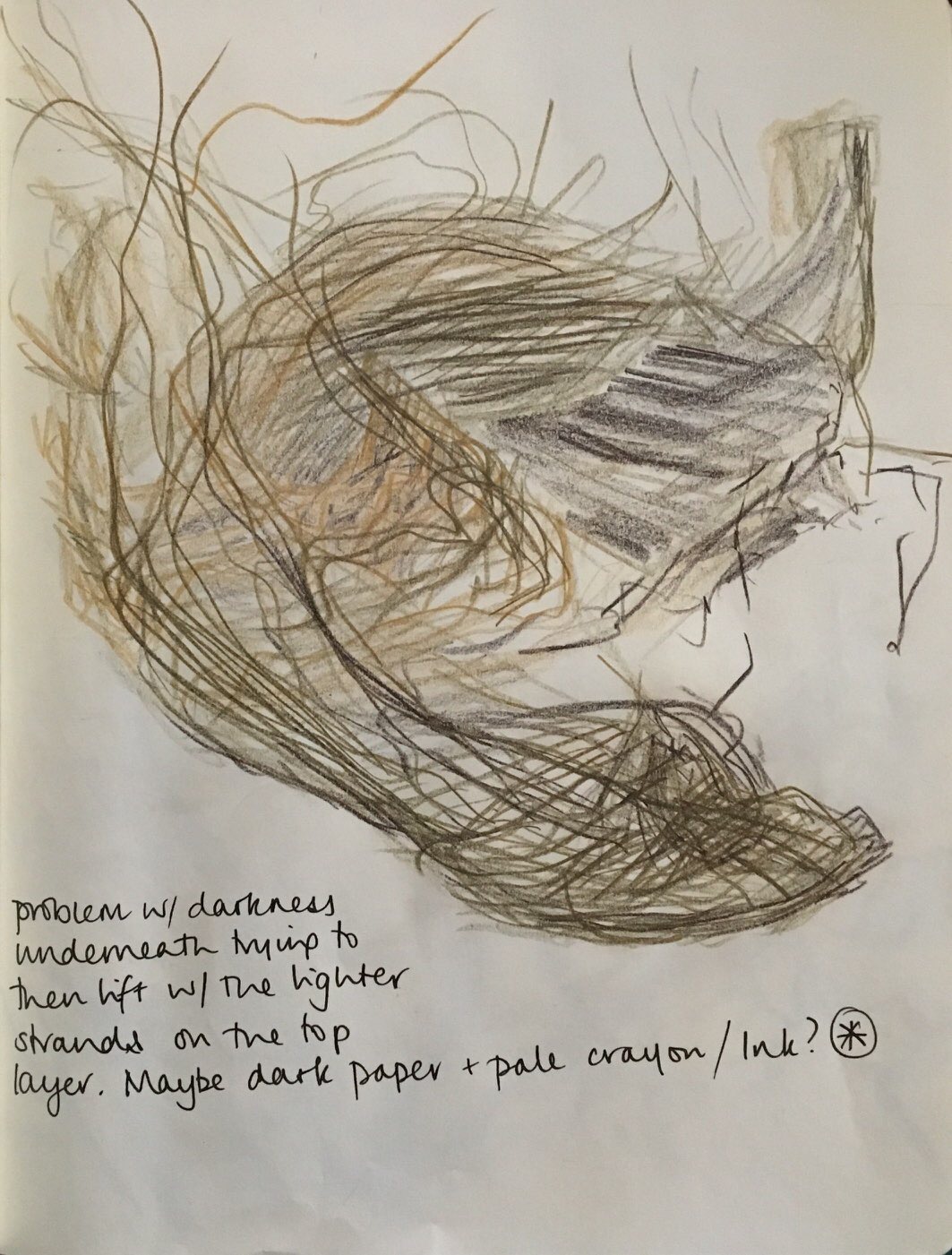
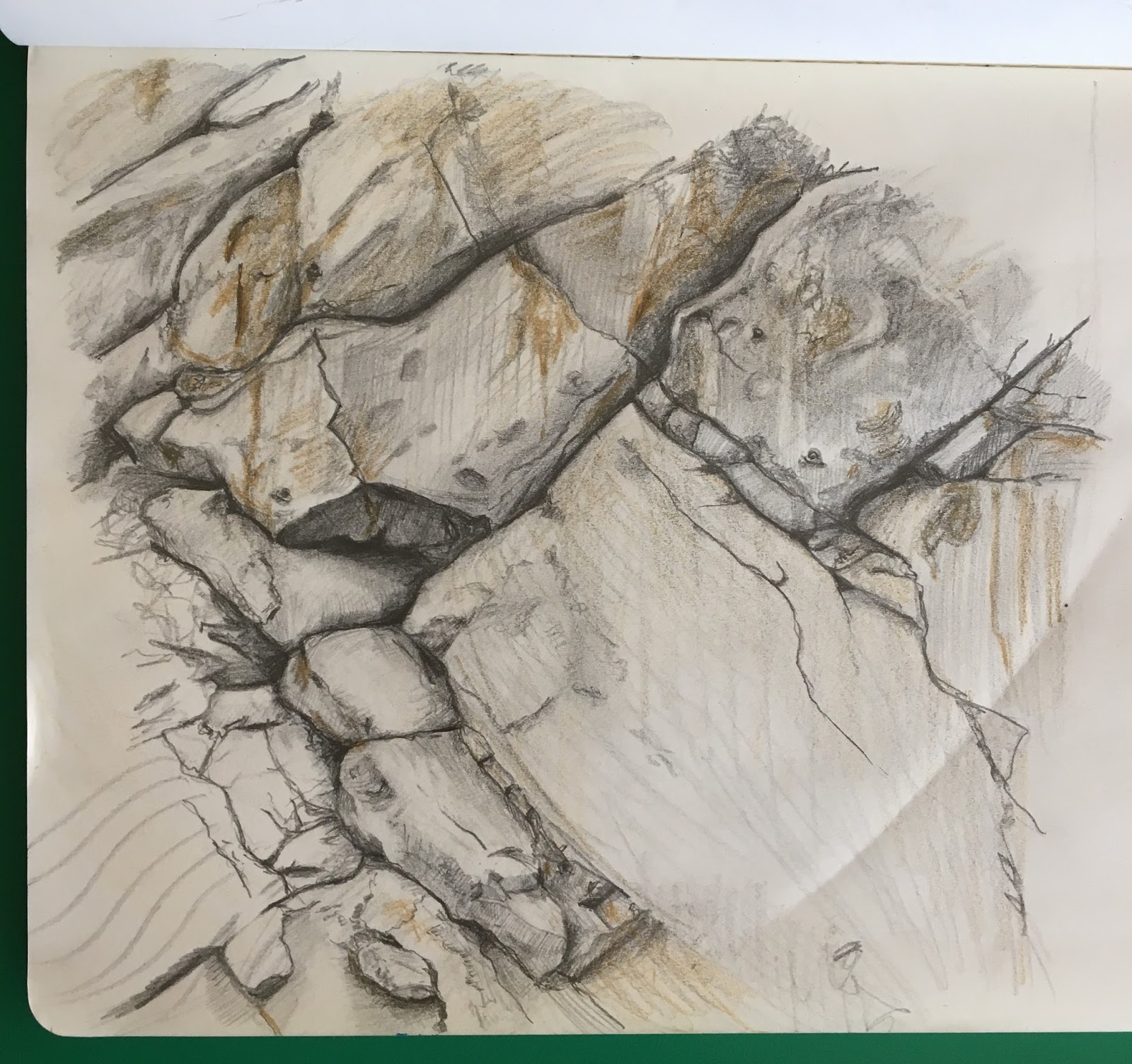
In attempt 1, I think I have lost the technicality with trying to represent the distance haziness of the buildings. In hindsight, I would not have started with a pen and ink outline as I ended up trying to cover this up with white and grey pastel. I would like to be less formal in this.

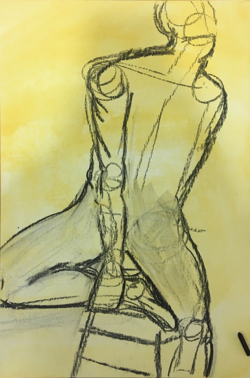
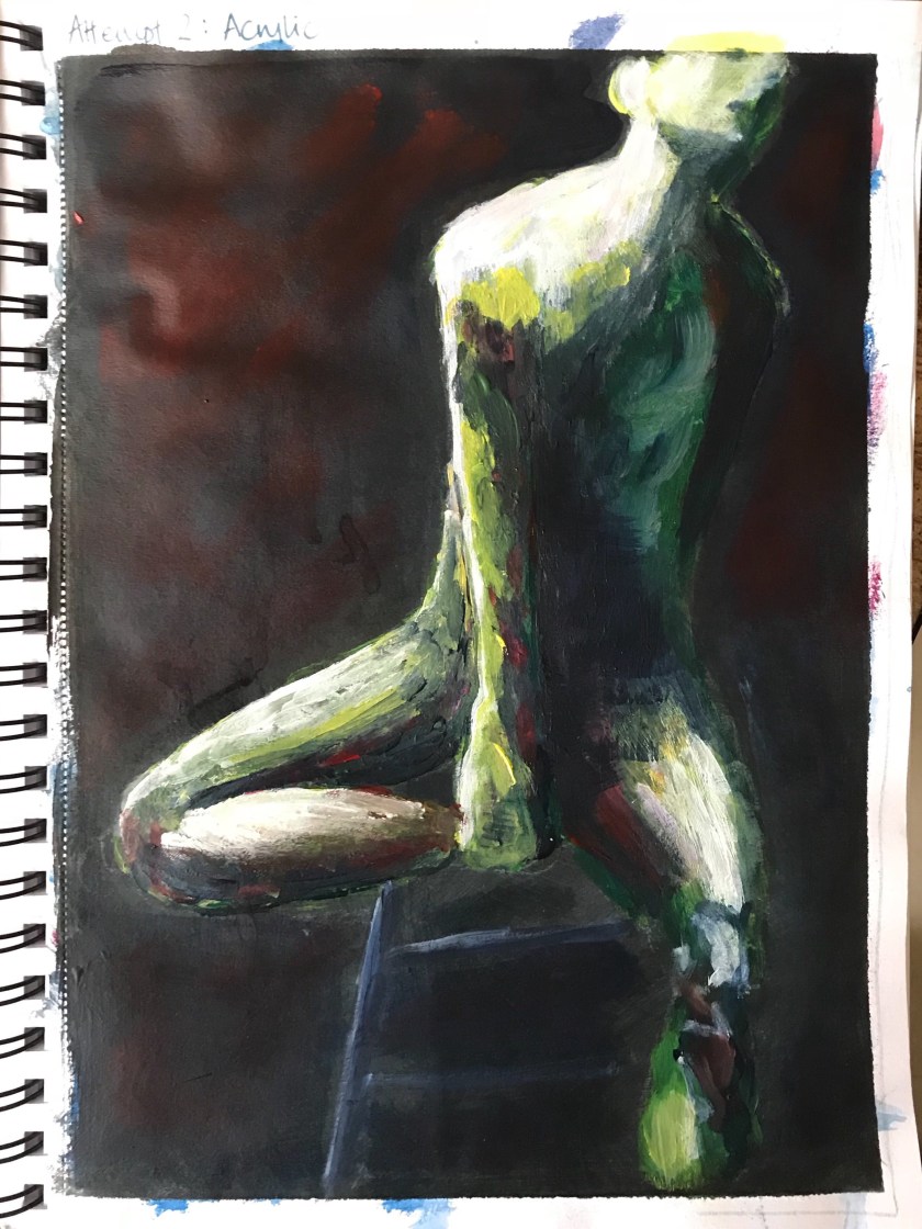
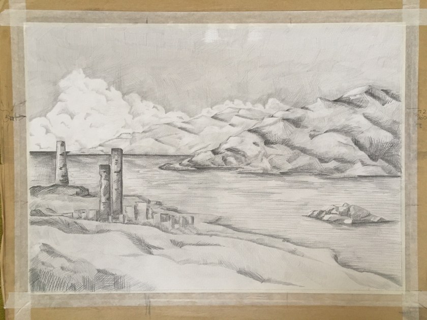
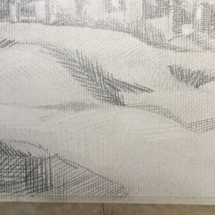
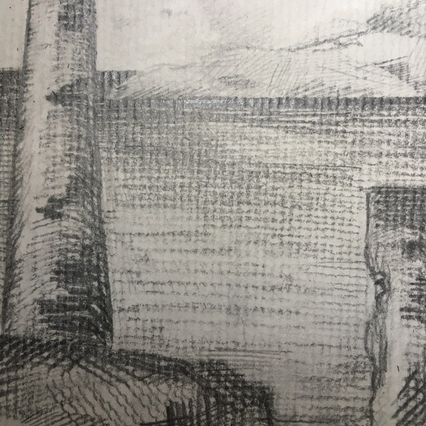
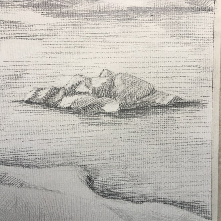
In attempt 2, more attention could have been paid to the size of marks in relation to the perspective, i.e. smaller further away. The marks on the first distant hill are the same as the marks in the foreground. I noticed this after as something was not quite right – the first hill seemed closer than I wanted it to be. I also need to think how the shadows of the towers should fall across the undulating ground.

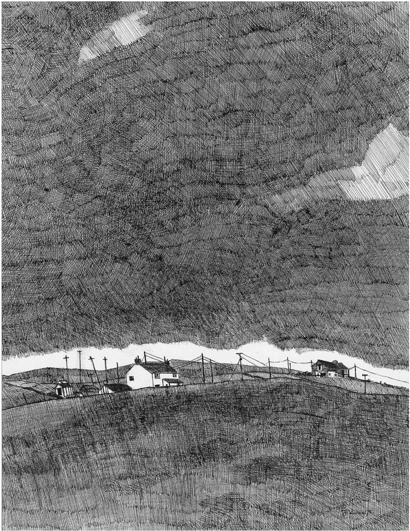
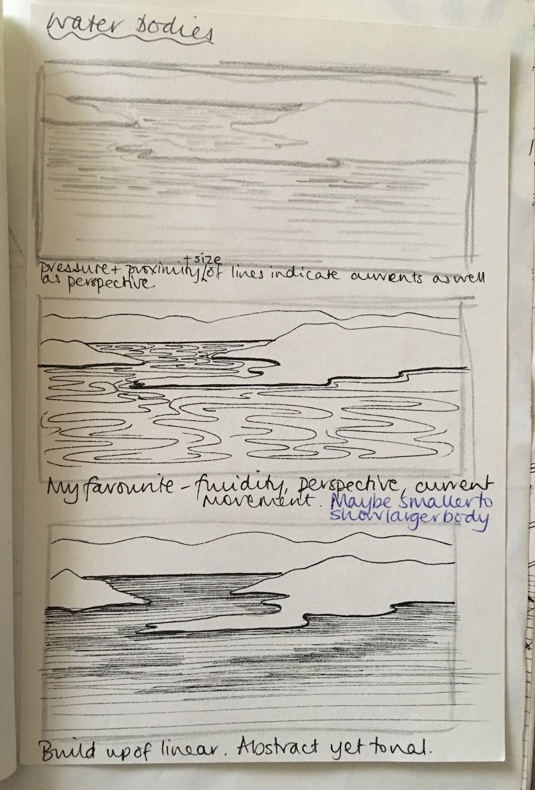
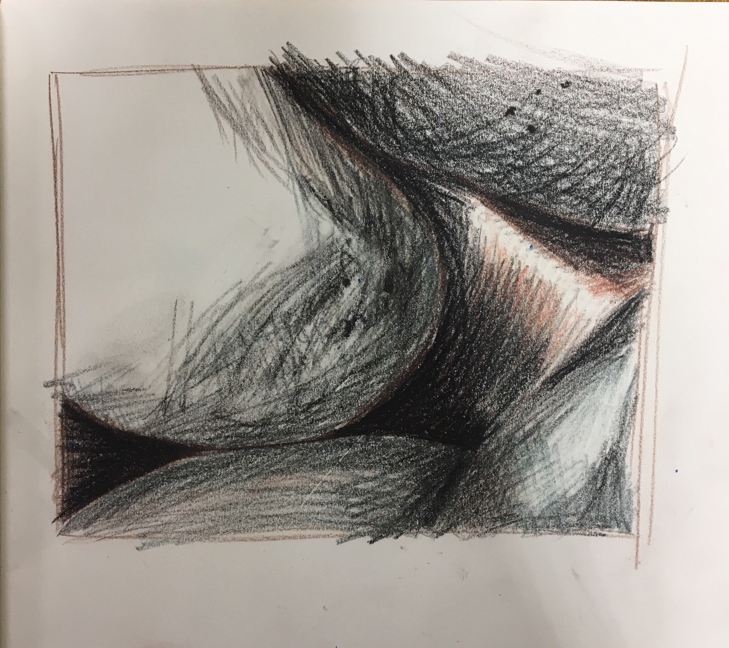
I liked how I used the electric eraser in the same way as a pencil, making the same linear marks to create highlights. I also like the texture of the water colour paper. Definitely will try this in pen and ink in the style of John Virtue.

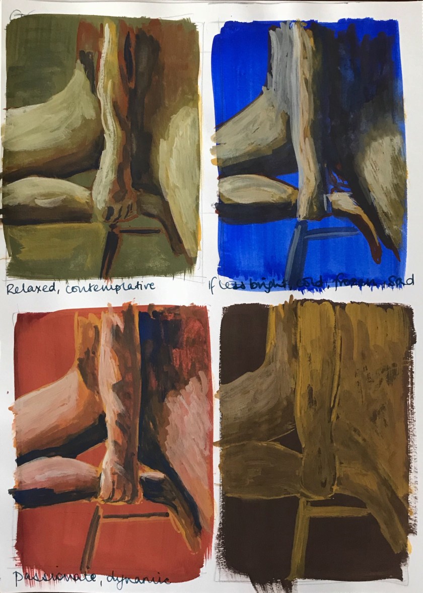
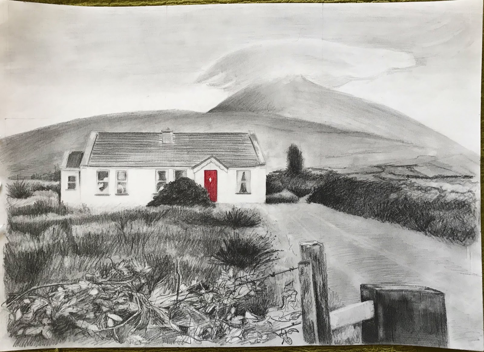
The atmosphere and energy of each setting was high up on my list when I was developing each piece. Particularly in attempt 2, the energy was running alongside my ideas and drawing the whole time. It consisted of elements of landscape from my holidays in Ireland and Cornwall, both spiritually energetic places anyway.

Quality of outcome – content, application of knowledge, presentation of work in a coherent manner, discernment, conceptualisation of thoughts, communication of ideas

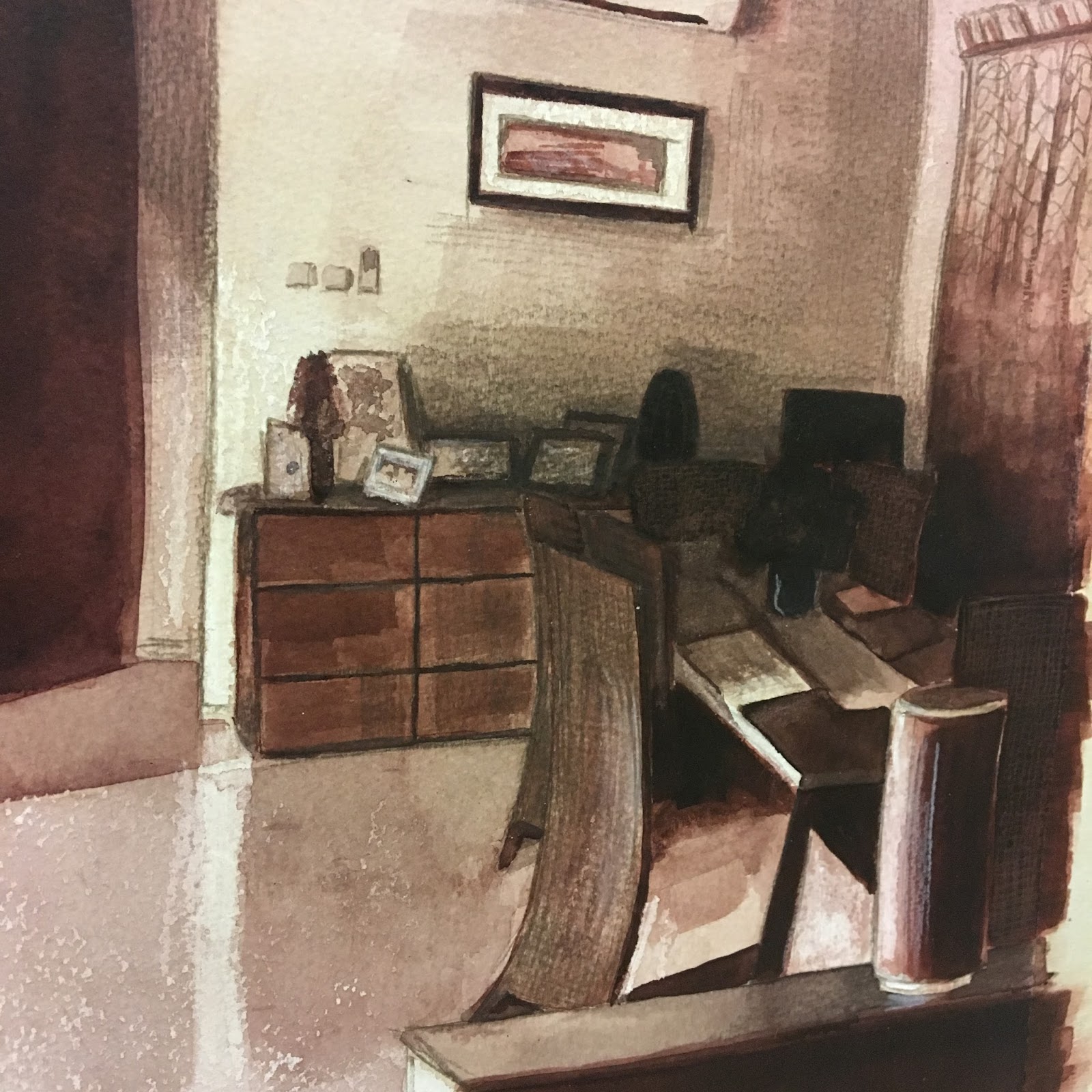
Both attempt 1 and 2 are still formal pieces, 2 less so. I risked overworking the first one in particular by trying to make it look realistic; I have tried to include everything so that there is no risk of the viewer losing any context or perspective; despite there being no chance of this, I still got hung up on this. It took longer than 2 hours and I was still seeing things to change. Realising this and asking myself the question should I simplify my choices more, led me to attempt the assignment a second time. I was not satisfied and needed to create something  more fluid, especially after my Virtue research. For me, it became more of a case of simplifying the techniques rather than the content.

I am more satisfied with attempt 2, I relaxed more and this helped as I had more of a direction by following Virtue’s drawing style. This piece has less preliminary work carried out, I just wanted to get the idea out on paper. Although this did still take longer than 2 hours…

This is one I will work on again for assessment; I can already see what I need to do. I just hope I remember to not over-formalise it.

Demonstration of creativity – imagination, experimentation, invention, development of a personal voice

I think I am becoming more practised at the work for the assignments – I am getting my head in the game three assignments in!

There is no doubt I am tuning into my imagination, but on the other hand I often feel I get carried away with some many ideas and processes running through my mind. With that in mind, the chaos may be in my head but I think I communicate well enough to plan and narrow down my thoughts. I am becoming braver with experimentation of materials but I don’t think I’m experimenting to the fullest potential.

I am inspired by so many artists, works of art, and colours and objects around me and at this point I have an amazing exhibition of my work in my mind! To get these ideas out with the investigation and experimentation needed, would require me becoming a full-time artist and I find that thought frustrating as ideas go untapped.

Context reflection – research, critical thinking

As far as critical thinking is concerned I need to learn how to compare, contrast and analyse pieces of work. I teach my primary school children the questions to ask about a piece of work and maybe I should bring my thinking back to basics as well.

I could be doing more research. Compared to A-level, I have got out of the habit of creating artist study pages in my sketchbook, where I would copy an artist’s technique and picture and then apply this to a piece of my own work. I need to do this more often.

I am always critically thinking, just not communicating it, it seems. I am not communicating ideas in depth on blog, as I write notes down as I go. It is all in my book and I end up uploading the photos of the pages rather than doubling my work load. I guess as long as you can read my writing that is acceptable?

Assignment 3 – second attempt

676d68f2-8586-4ea3-994b-4271c000acf0-776-0000002beb830da7_file-12018-10-22 15-23 page 5

Words I would associate with this landscape would include peace, tranquil, lush, temperate; a calm energy. Originally I wanted to follow the lush and temperate feel by using thick, ‘full’ medium of oil pastels, texture could be scrapped into the oil pastel with a wash over the top.

I had three ideas forming – oil pastels, textured, and wash; watercolour pencils and pen and ink; pen and ink and watercolour. I considered the oil pastels as they offered an unpredictability and a full thickness to match the lush feel of a temperate landscape. However, in the end I chose not to go this route after I lost myself in John Virtue’s tonal pencil drawings from the 1970s.

I know that one of the points in the assignment outline was to create preliminary drawings for this assignment. I worked on basic composition but wanted to get this piece out in its simplicity, with John Virtue in mind the whole time. Hence I knew I would work with pencil only. I might have added ink if there were any distinct, man-made lines, like the telegraph poles in Green Haworth from South. I did not want to risk overworking this piece and I am a lot happier this time round. Not satisfied entirely, I’d like to continue practicing building and layering the Virtue-style marks to create depth as well as tone but for now, I need to step away and move on.

My inspiration:

https://www.christies.com/lotfinder/Lot/john-virtue-b-1947-green-haworth-5484636-details.aspx

Below are photos from the process, plus the earlier composition ideas I had. I started with a black ink wash, with the cloud area tissued away. Ink does not seem to react to this as well as black watercolour may have done as I was looking for more of the delicate cloud edges to appear from the tissue. Nice enough though.

I’d like try this again with pen, ink and wash.

P3 P3: Ex 2 Foreground, middle ground and background

It has taken me to select photos and sketches to work on this exercise, for me to let go of my previous composition for now. It was a more made-up impromptu landscape, which hasn’t allowed for in-depth study yet.

Whilst studying this section, I did watch the BBC’s This Green and Pleasant Land: The Story of Landscape  Painting. It was certainly offered some much needed motivation and inspiration.

I am not entirely happy with the lenticular cloud, but I decided to stop working it. I’m also not so happy with the shape of the tree on the right. New version:


Reflection


Completed Assignment 2 & Reflection

  • This assignment is designed to pull together the fine observation and practice that you’ve done on this part of the course. 
  • You’re free to choose your own source material and media, provided that you take account of the factors listed below. You can either work on a still life, or interior scene – or a combination of these. 
In the work you produce now you must demonstrate a growing understanding of:
  • the use of colour in drawing
  • the most appropriate medium for the subject
  • composition and context
  • mark-making and contrasts of line and tone
  • accurate and expressive depiction of form, experimentation with idea, material and method.
  • Is this a creative composition? 
  • Is my subject interesting? 
  • Am I using the most appropriate medium, colour, method, etc.?
In my previous posts here and here I have shown my sketching and preparation for this assignment. I enjoy perspective and I liked the idea of combining a little still life of sorts with an interior scene. I am always on the lookout for interesting light shapes and tonal contrasts; I see how they could evoke a mood maybe in a photo and I would love to portray that in a drawing. 

Reflection

  • the use of colour in drawing
  • composition and context
After preparing mostly in black and white, I chose to complete my final assignment piece in warm sepia tones to create a welcoming warmth to the room. If I worked with too many colours it would suggest a more balanced, natural light across the room. It was the late evening, with the house in darkness apart from one landing light, shining down the stairs to the left of the picture.  ‘Leave a light on for me’ seemed an appropriate title as I noticed the shot when I came into my home late at night and everyone was in bed.

I think the shot struck me instantly as it was balanced in its composition without me having to tweak too much. It was in thirds from left to right – the bright light, bar area and stairs to the left, the darkness of the kitchen door to the centre and rear and the shadows of the dining table to the right.


  • the most appropriate medium for the subject
  • mark-making and contrasts of line and tone
An inviting, warm atmosphere required similar materials to recreate such a feeling. I started in black pen for all the sketches I did and, as much as I love pen line, it was too ‘matter of fact’. I had ink wash in mind from early on; I liked the way it ‘worked’ with oil pastel in its resist effect and it worked well to create that artificial lightness without risking it being muted by the ink wash. Maybe pencil to add definition and detail as the last stage. I thought chalks would be ideal for the soft, peaceful, ethereal effect but are not defined enough. I knew that mixed media approach would be ideal to show definition as well as effect. I finally settled on mixed black and Indian Red inks in various dilution helped to make a warm sepia picture, with subtle pencil detail. The pencil worked as an additional layer to show detail and contrast; it helped me to define the pattern in the sheer georgette curtain to the far right. A layer of pencil also gave a ‘veil’ to suggest tangible shadow.
  • accurate and expressive depiction of form, experimentation with idea, material and 
    method.

I was working to get a perfectly accurate picture as is my usual wont, but whilst I was completing this, an ongoing discussion was being had on the Drawing 1 forums regarding assignments, expectations and ability on the OCA drawing course.

There is some frustration that people come to a drawing course with little formal training and the OCA accepts them on a degree course/module. This might suggest that the OCA wants people who are willing to experiment, investigate and think outside the box rather than provide accurate depictions of still life. But then feedback given on the experimental and progressive assignments might be critical in the lack of technical skills. And it becomes a catch-22 situation; is this a technical course or an application of knowledge?

With that in mind, I seem to want to approach my work with a freer, more flowing sense, trying to think outside of the box, which is a contrast to how I have always worked in many aspects of my life. I am becoming more relaxed and I want to apply this to my art. A more expressive, investigative approach appeals to me. 
I have really enjoyed this assignment in that, as the title suggests, it is an intimate look at my space, my home. I am entirely happy with my assignment, I really like it. Technically, I could do better; some straight lines are a little off and I am bothered with this. It was a little hard with a brush and the fluidity of ink.

Staying on a technical level and process, I stepped back and realised I had created a workflow without realising it. I initially thought, and maybe hoped that I worked more spontaneously.  I focussed on what I wanted to achieve – an atmosphere and feeling of the place at that moment in time. This led me to practice with materials and find which suited the aim. 

PART 2 P1 Ex 1: Detail and Tone

The fact that this part of the project is of natural objects has inspired me. Despite not really being naturally drawn to realistic drawing, I have enjoyed this as I can see improvements in my observation skills over time. And I just love looking at pattern and formations in nature.

In the past, I would build up the picture but it would be very flat at the end. I now realise that I was not being brave enough and creating additional layers. I feel that my drawing has been transformed through this layers of tone.

PART 1 P1: Exercise 1 – Experimenting with expressive lines and marks

Experimenting with expressive lines and marks


I haven’t had chance to get the right size paper for the activity yet. But I thought this would be a good opportunity to try out my new Pencil for Paper 53. My first foray into digital drawing.

What follows are all digital drawings using only Paper 53 and its pencil. It is NOT a review of the technology, although I have already realised a massive difference in the techniques used to produce a similar effect. Nothing beats a graphite pencil/ink and nib…in my opinion.

It is a given that the process of art in all forms should, in its purest form, be a means of expression for the artist. Inner feelings, emotions, contemplation, memory,  therapeutic…the act of making art can be a release regardless of the emotion. 

Drawing is an expression in a simple, accessible form. The emotion at the time of mark-making, could be expressed in some manner to reflect them. Yet, a mark made in joy by one person will appear different to another. This is what I love about the pure expressionism of art; it is truly individual. We may share the same opinion but our narrative is our own. Non-objective objects were created, lines, marks, and abstract shapes. Certain emotions were transformed into such marks.

These are the digital results.


CONFUSION/FRUSTRATION
Design a site like this with WordPress.com
Get started