
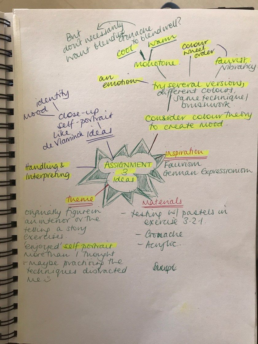
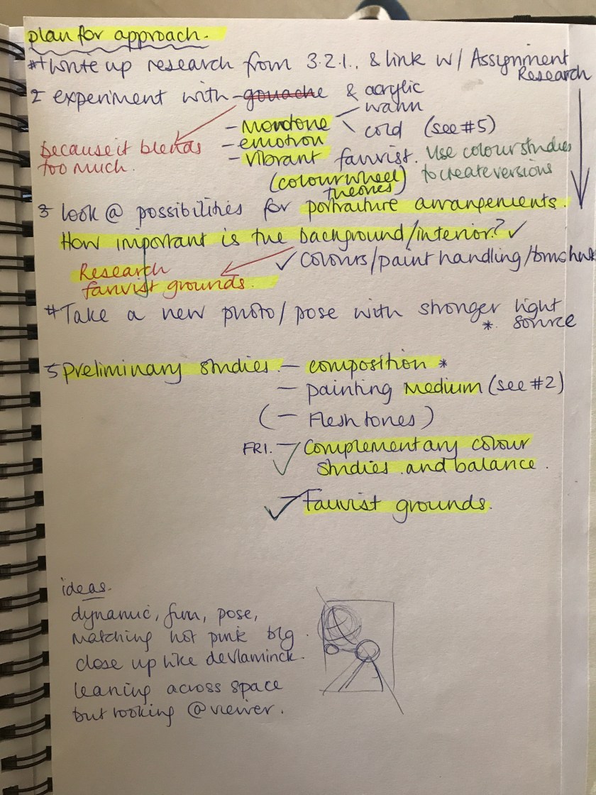
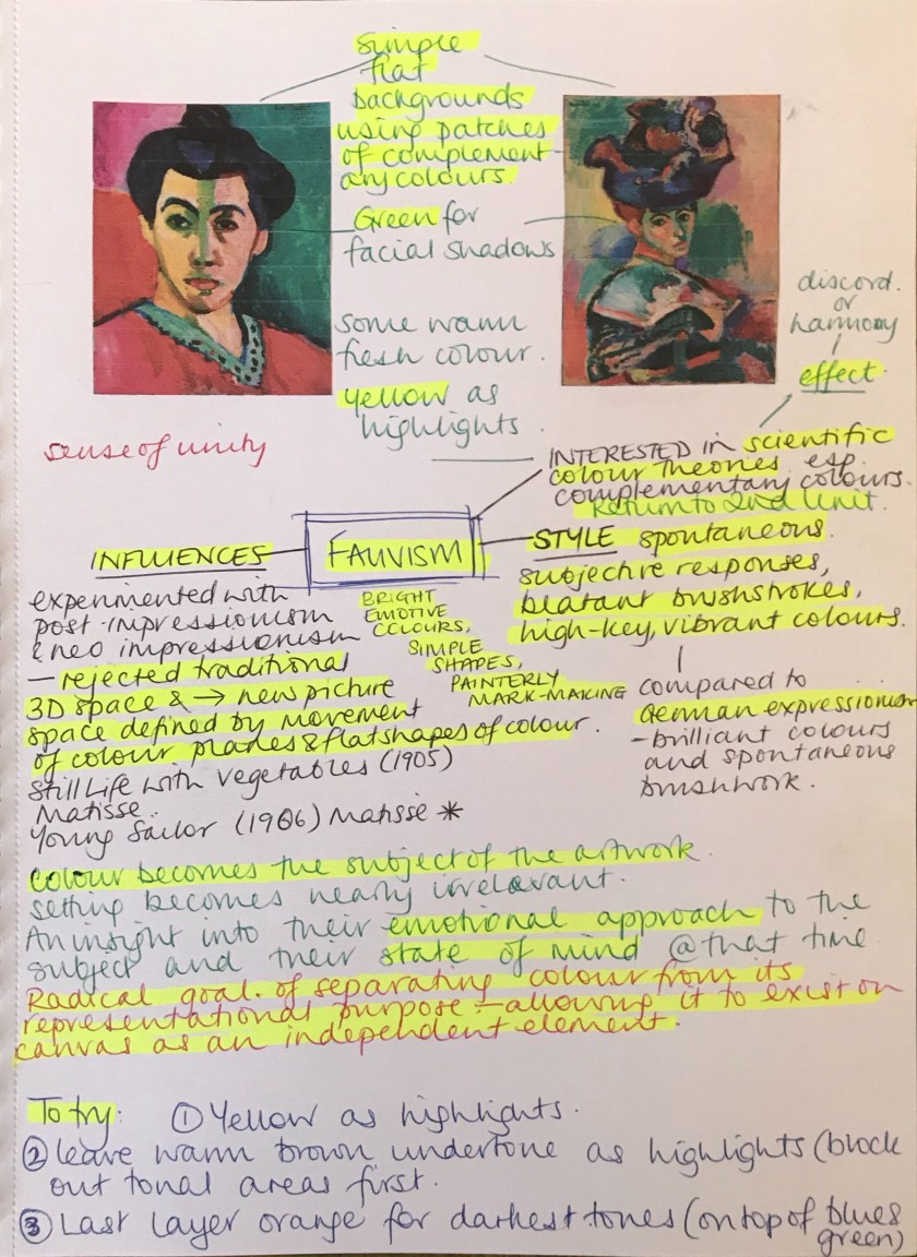
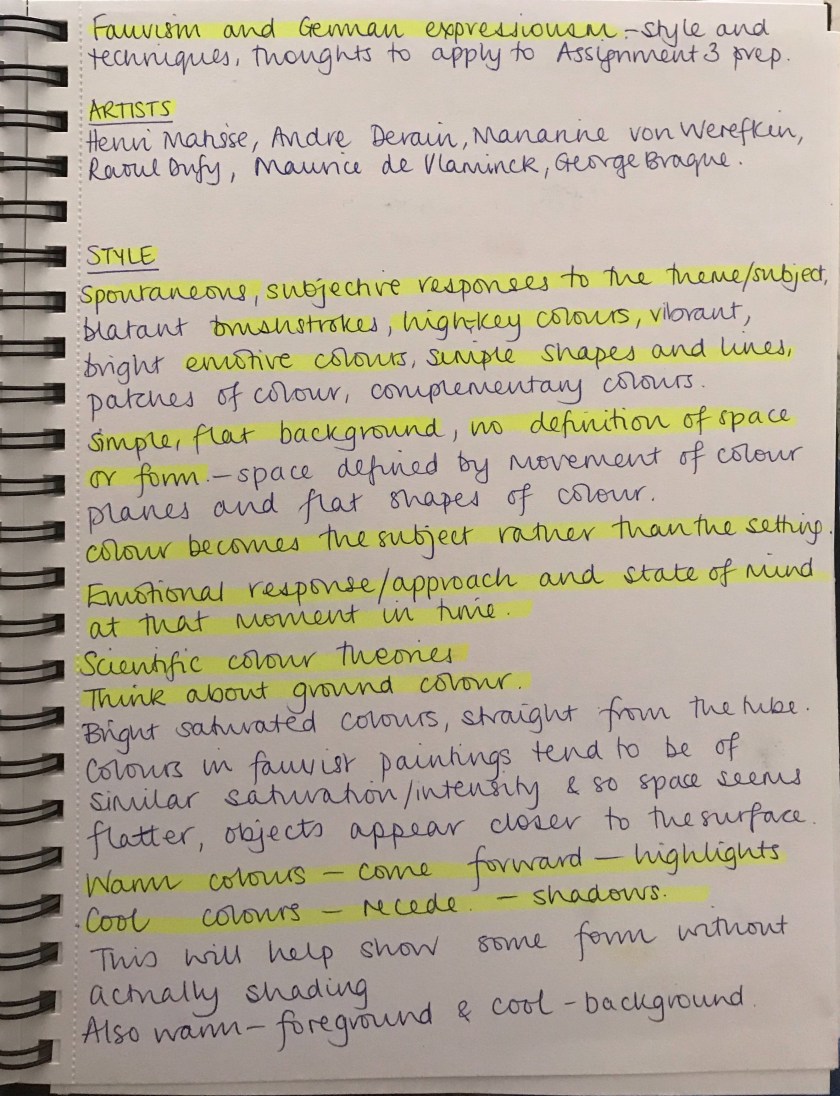
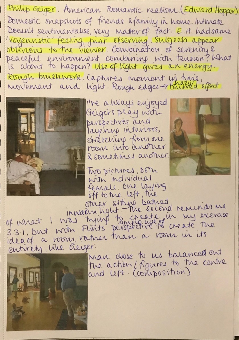
I continued with research and has a further look at the Fauvists movement, to help inform my next practise.
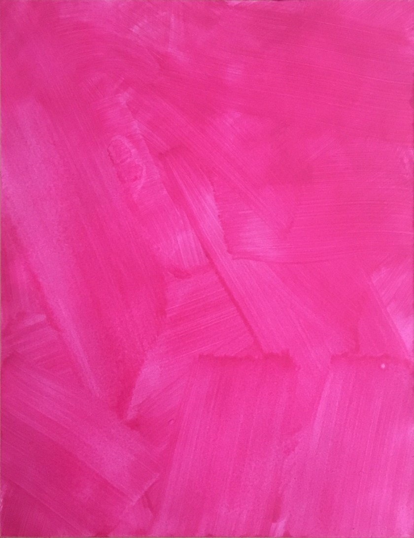
At this point I continued research on colour, values, grounds and balance here.
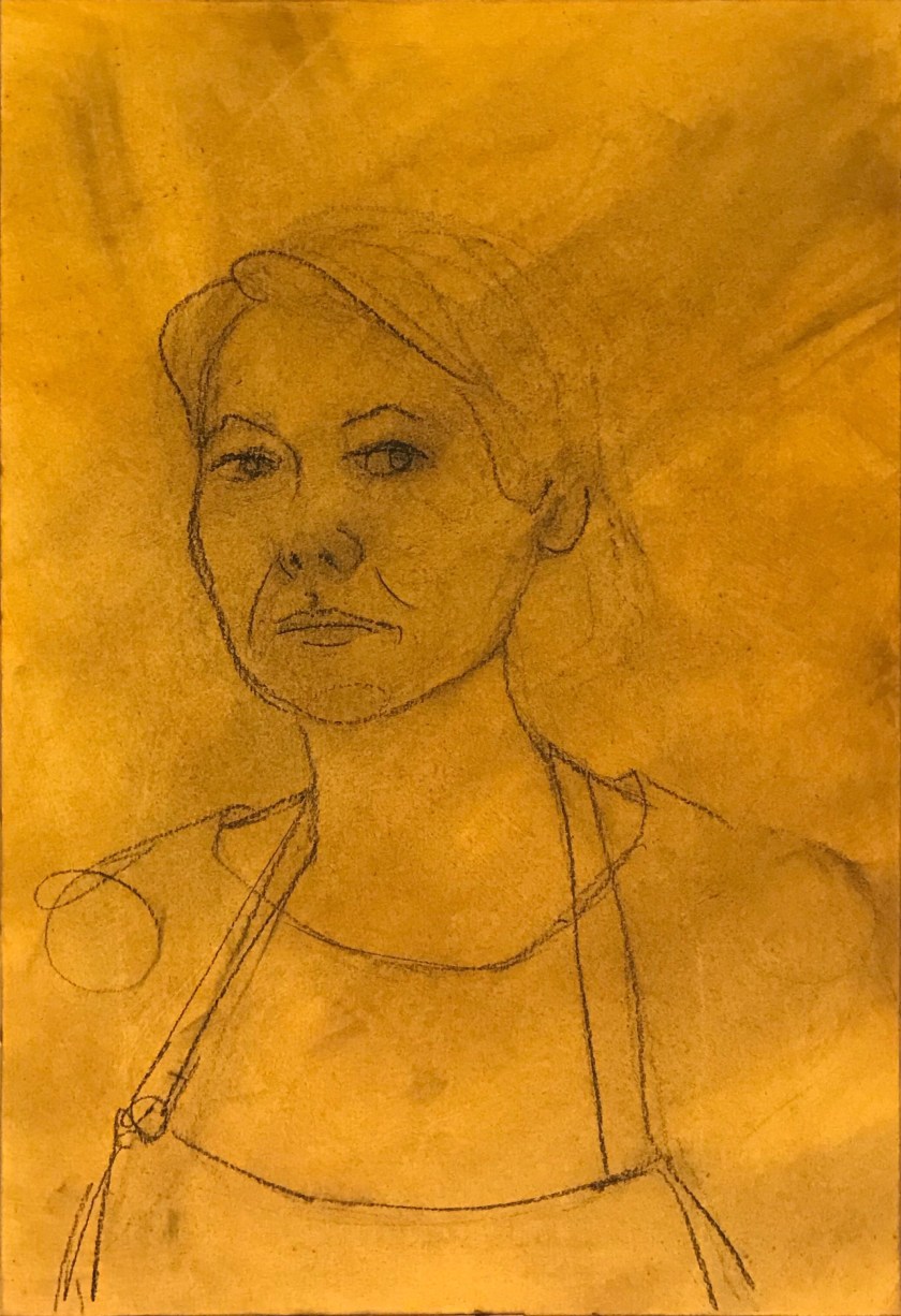
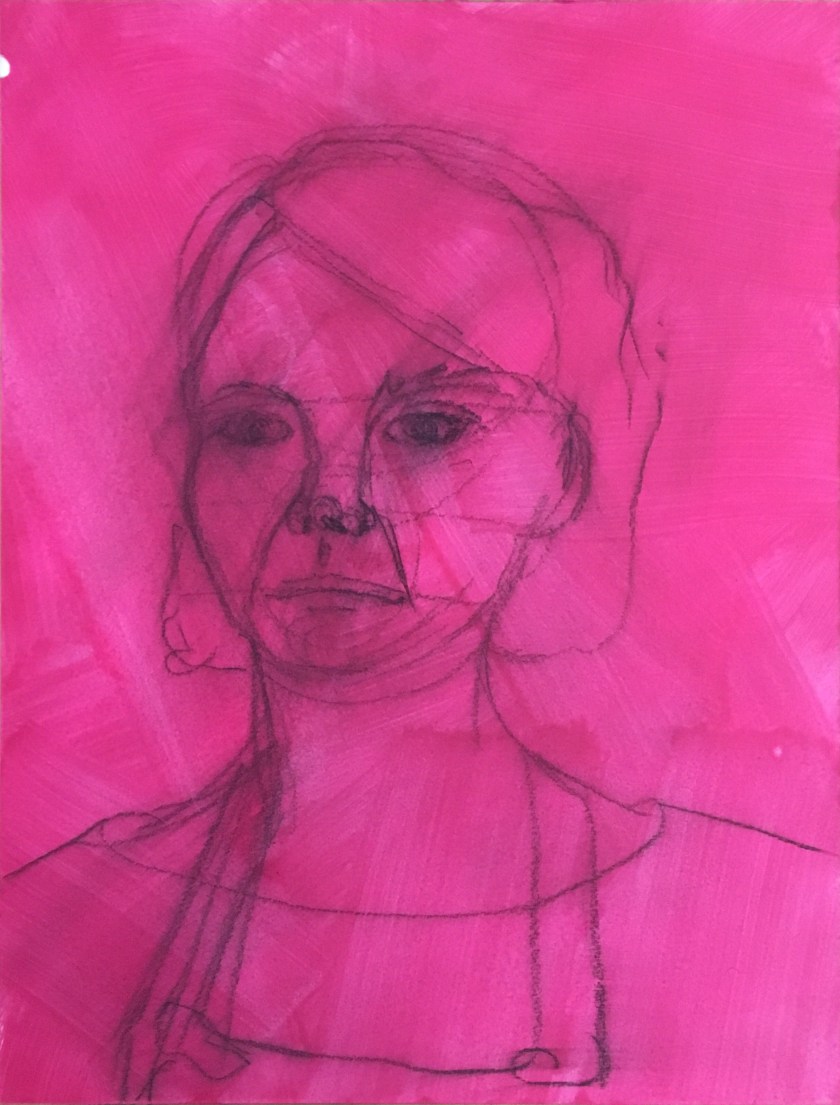
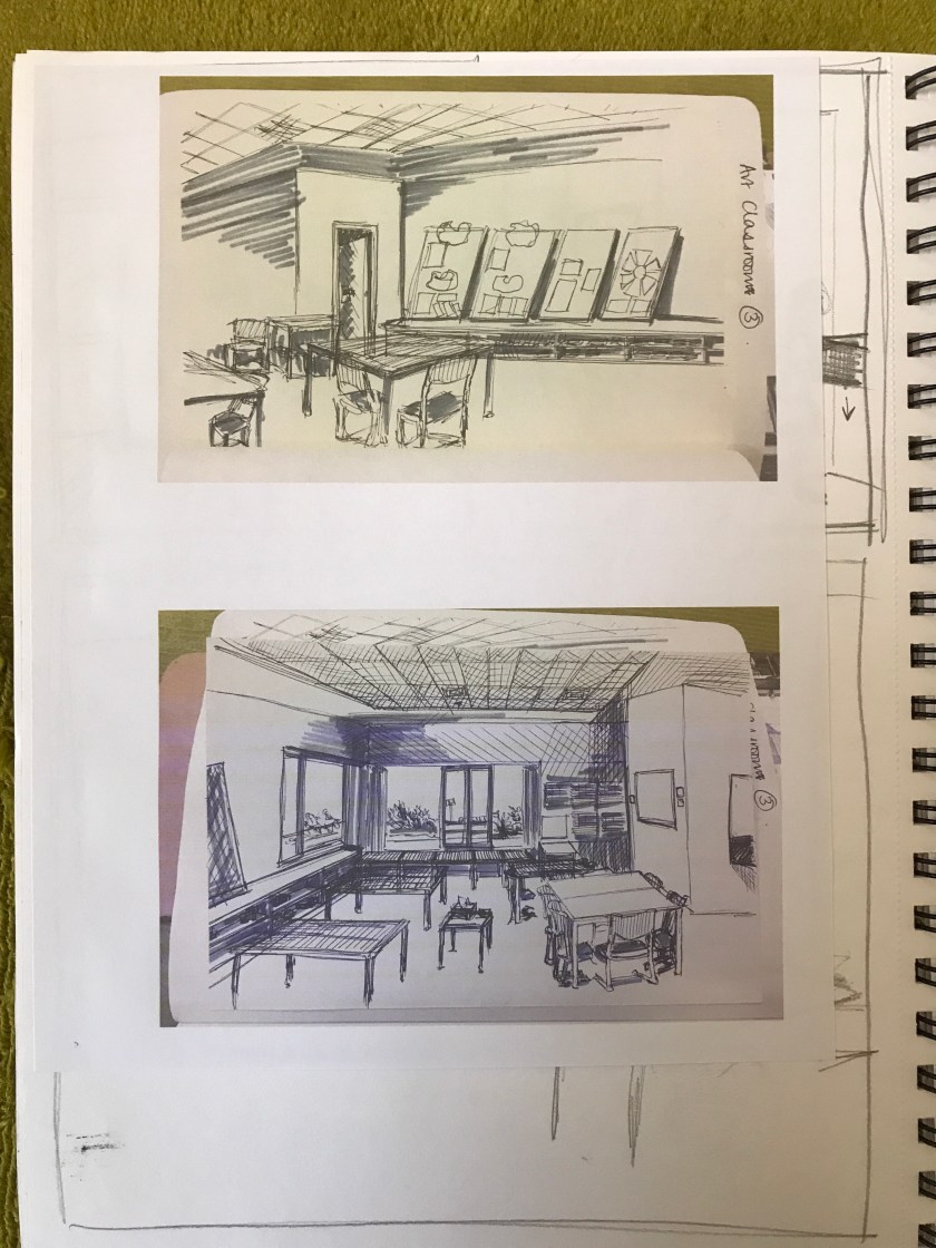
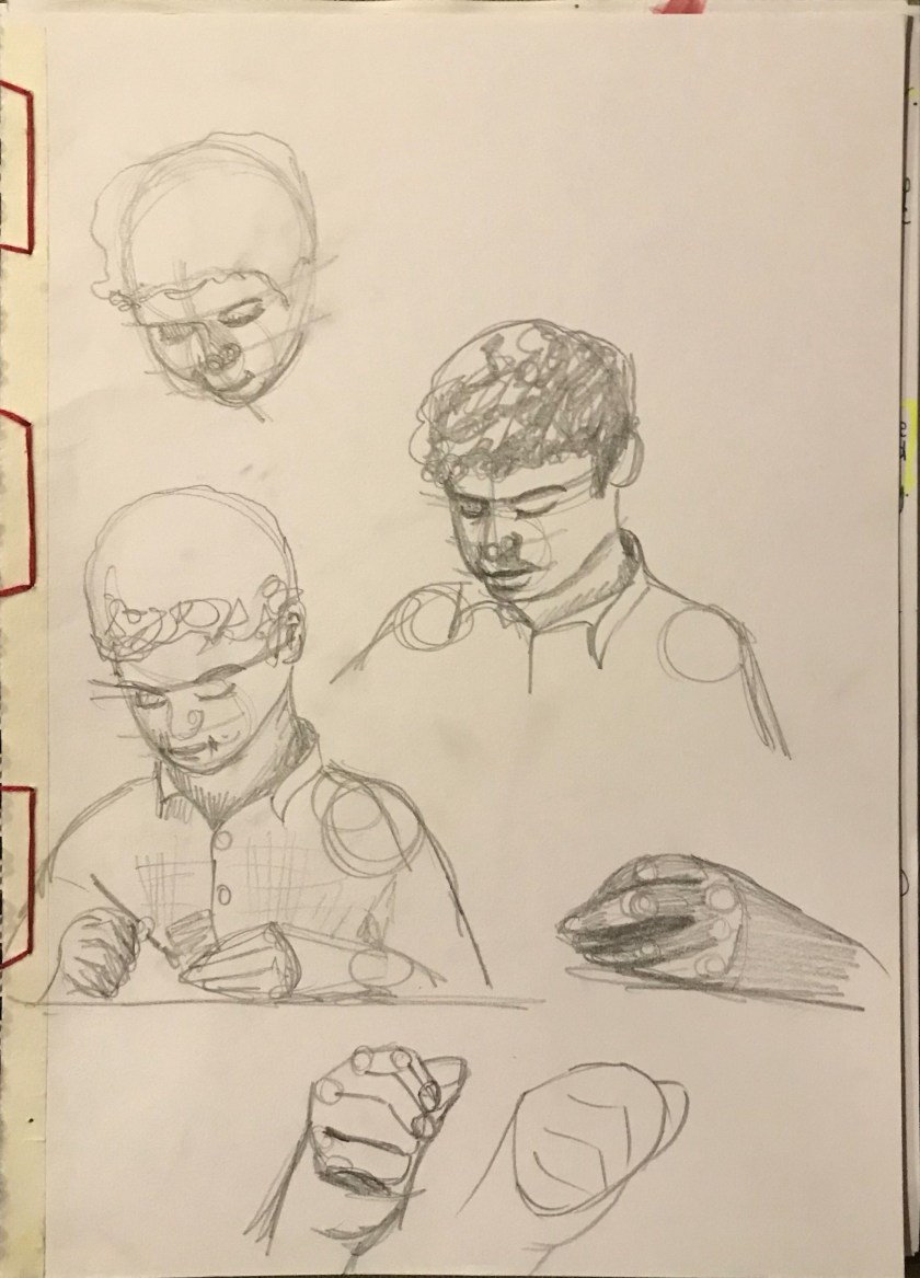
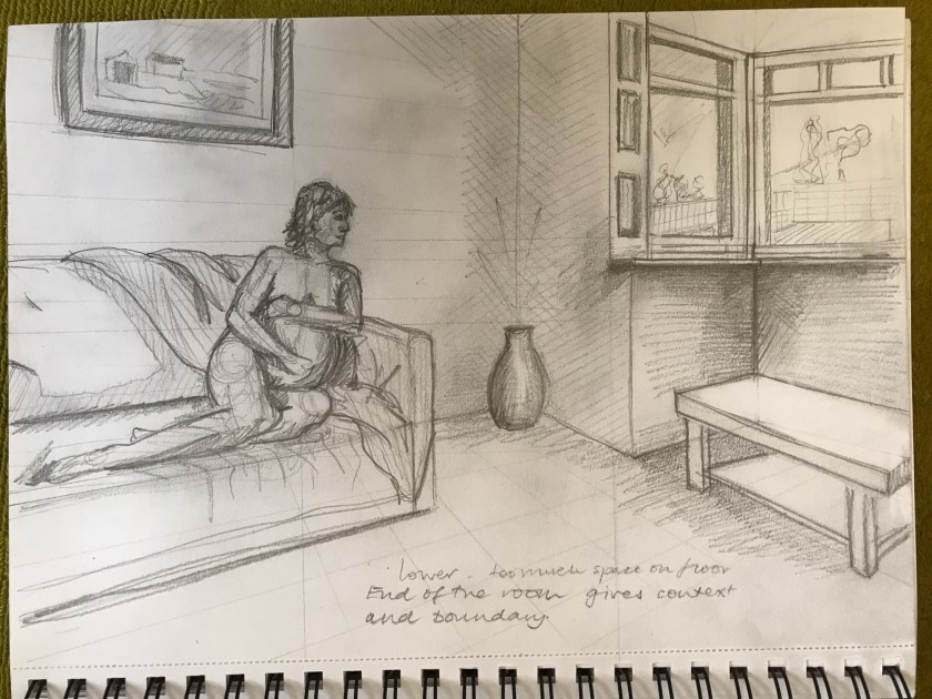
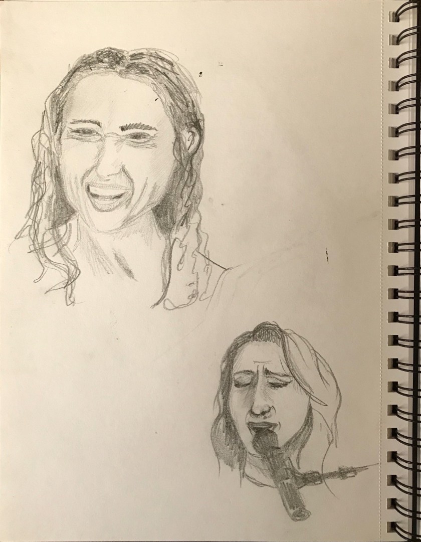
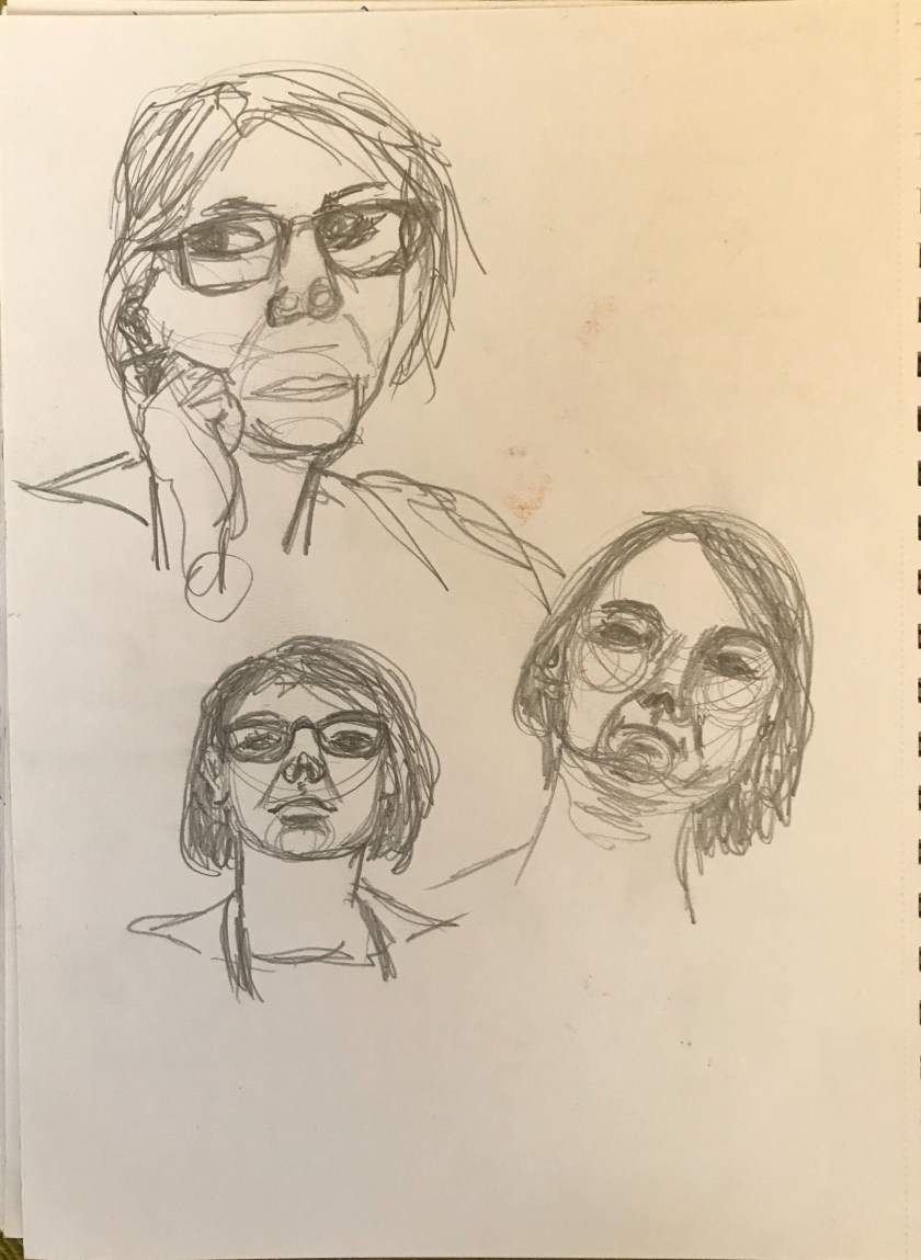
Very simple charcoal outline seems to be more effective than too much detail at this early planning stage.
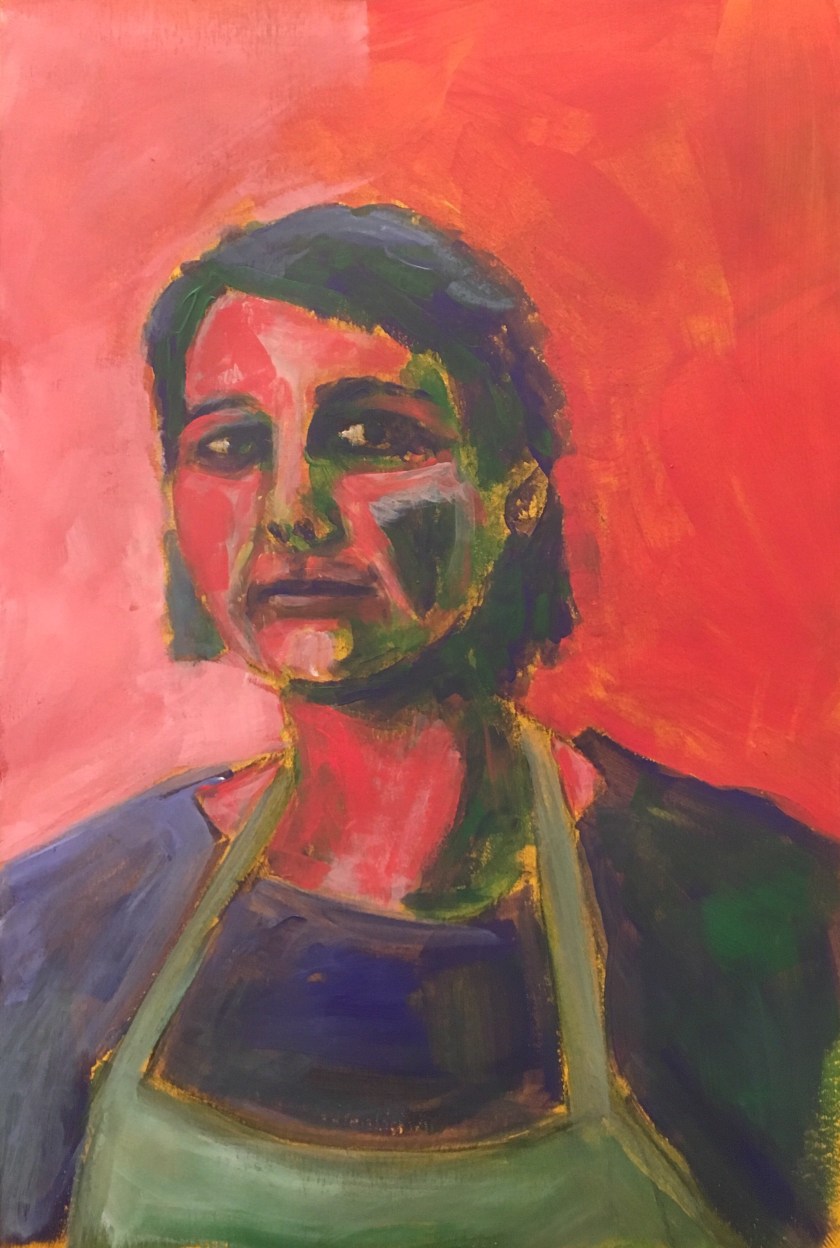
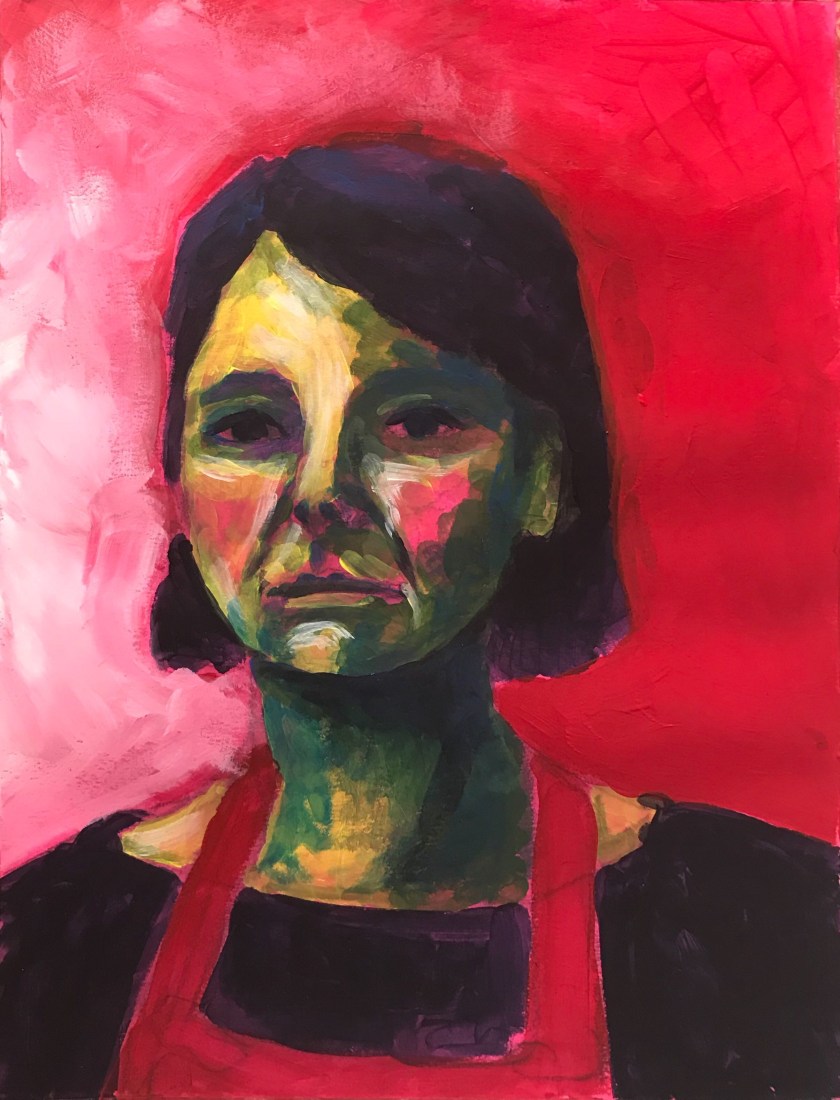
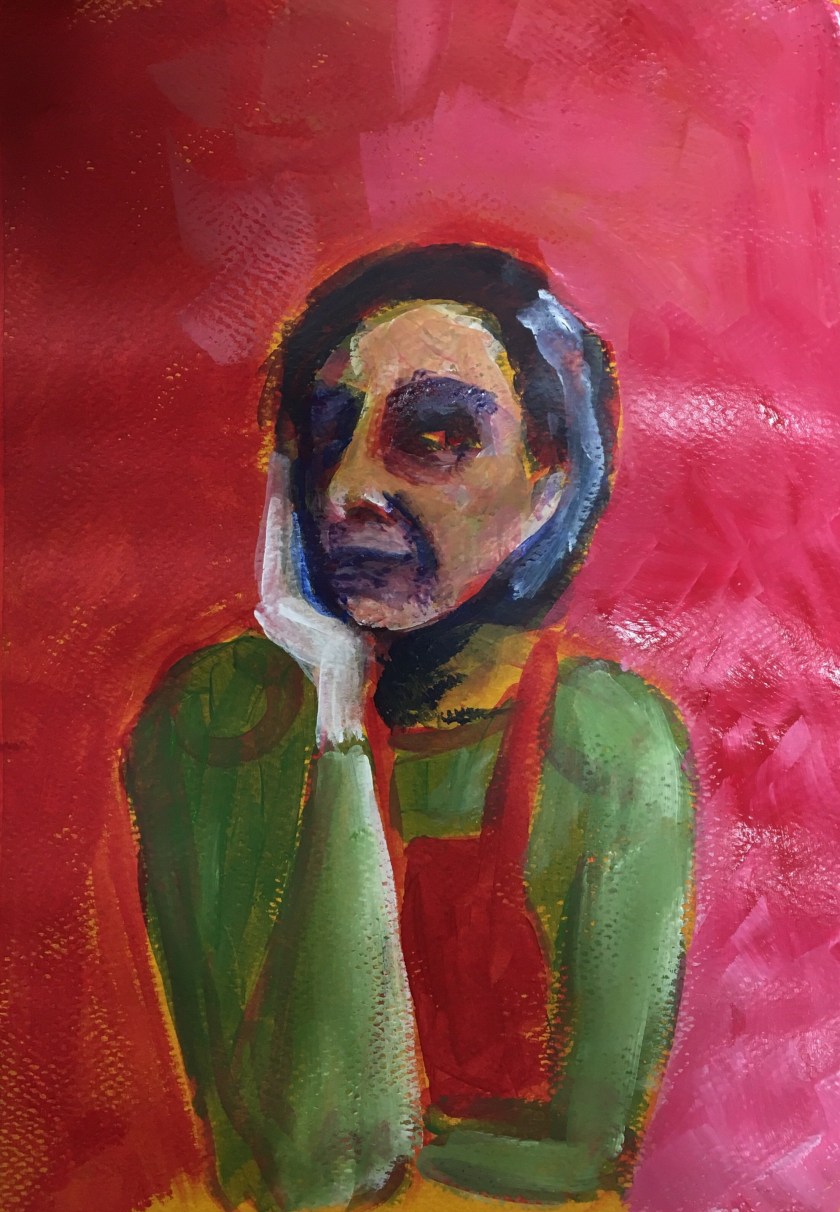
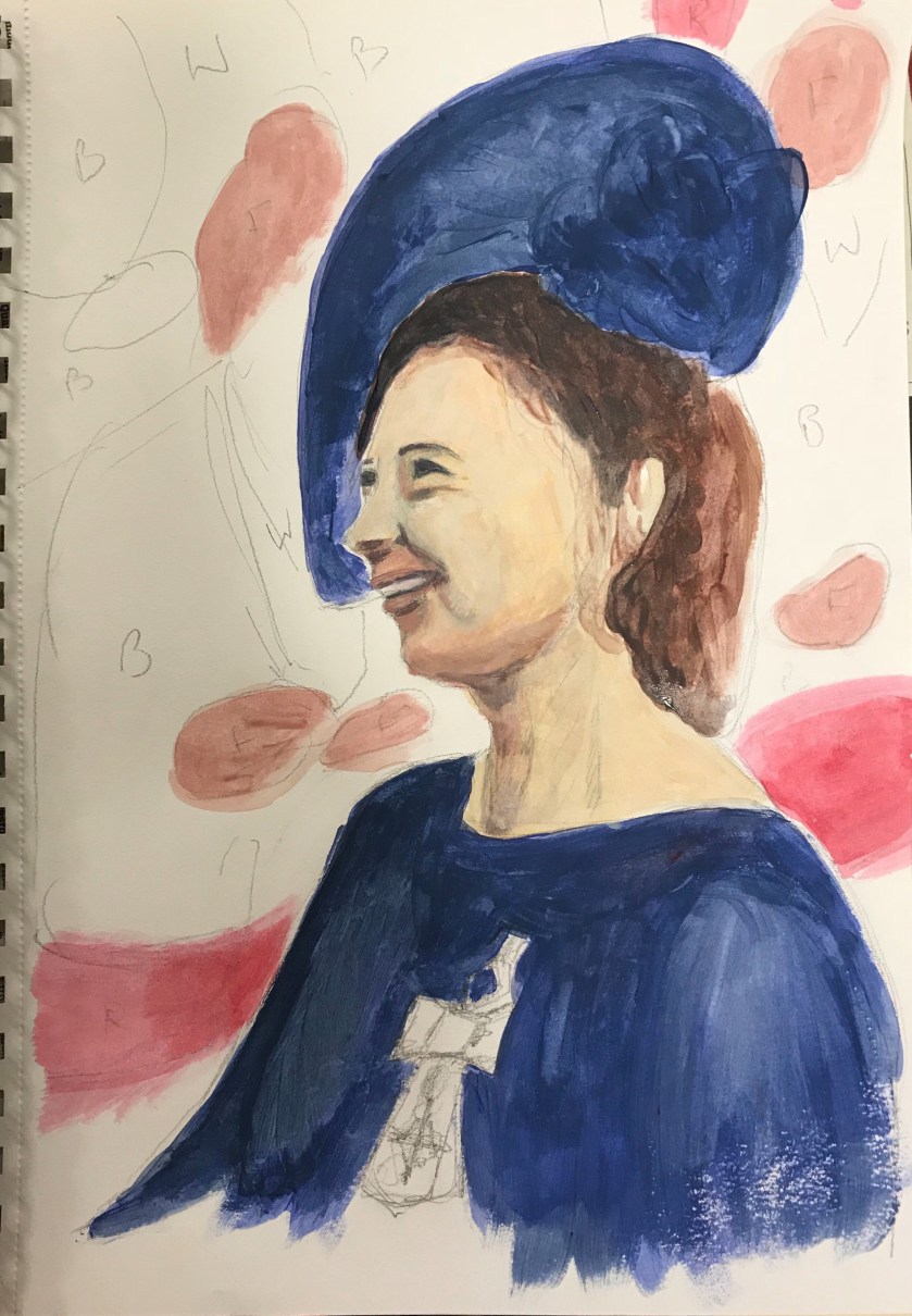
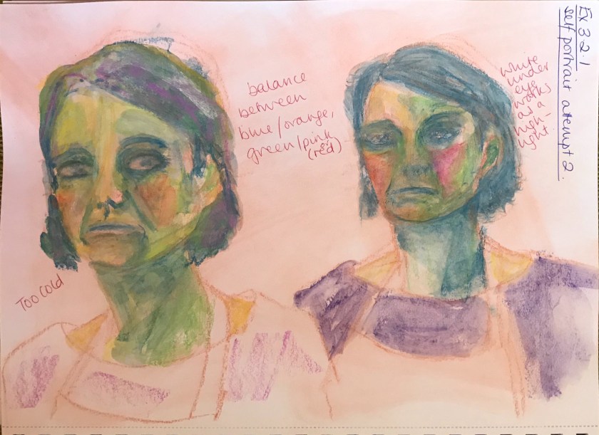
Very red-orange even with highlighted left background. However, I like it as this one complements the green of the face and apron
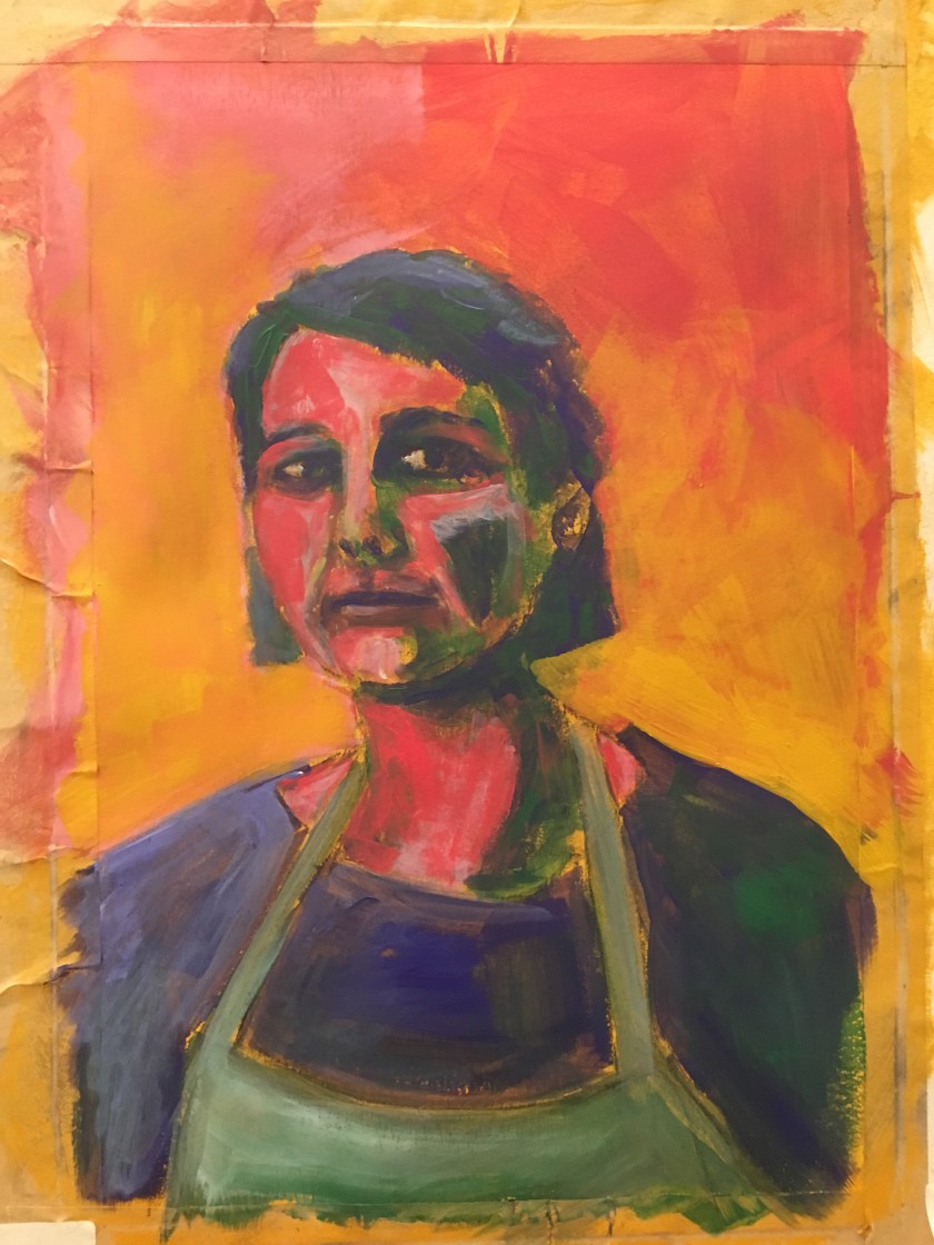
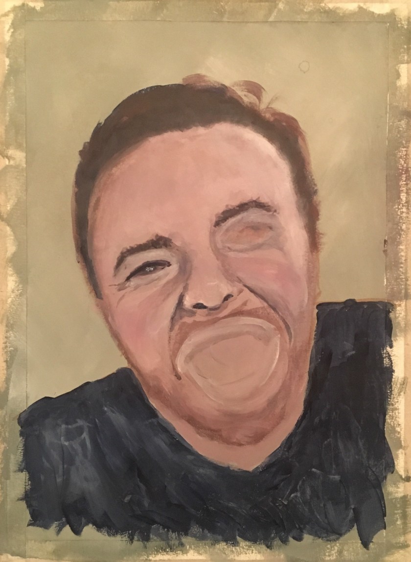
I decided to bring the majority of the background back to yellow ochre to complement the blue-purple of the dress and hair. Another option is to highlight the face with yellow ochre as well.
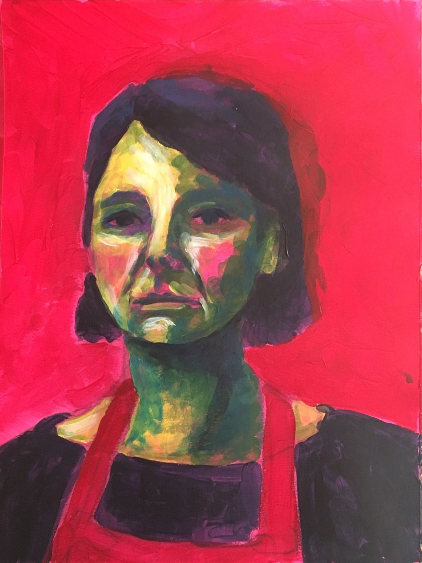
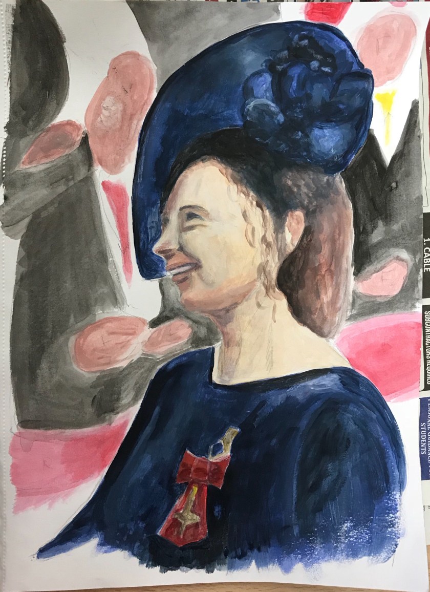
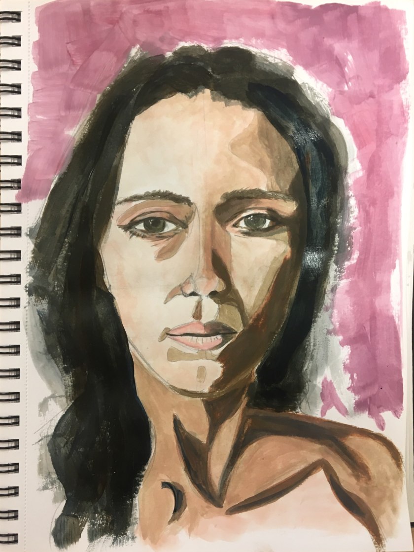
Aside from the too-dark patch on the cheek, I like the effect of this style of painting. This one was based on a tetrad of Yellow Ochre, Blue-Green, Blue-Purple and Red-Orange. What I have learned from this and my research is to consider what colour to make dominant. At the moment it is equally balanced but the red-orange seems to overpower the picture.
I enjoy the second one too, it has an art deco sharpness to it, unintentional but eventually the marks were being over-worked I think and it became this way.
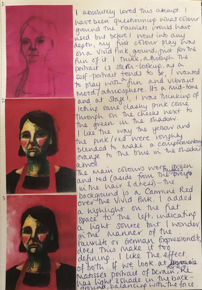
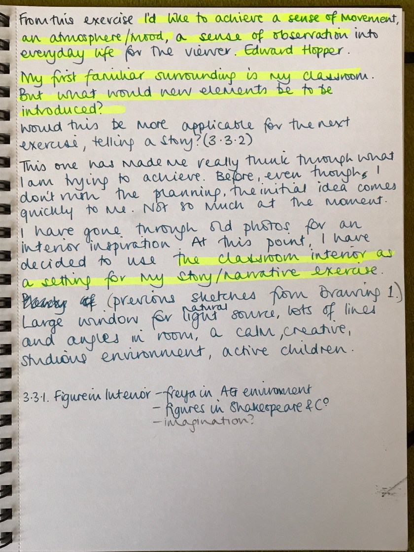
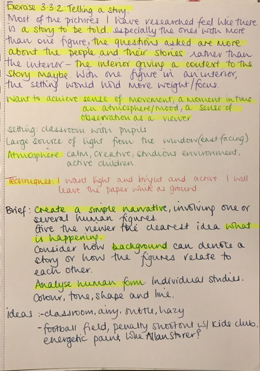
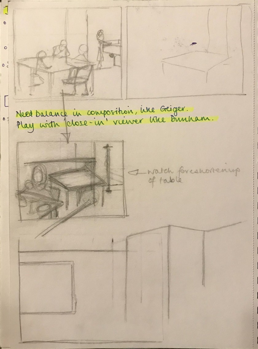
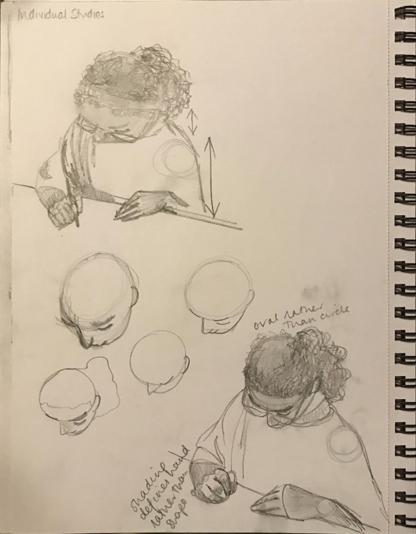
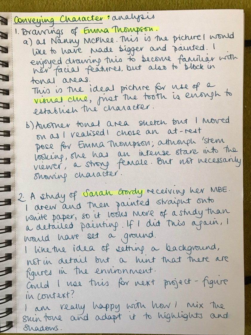
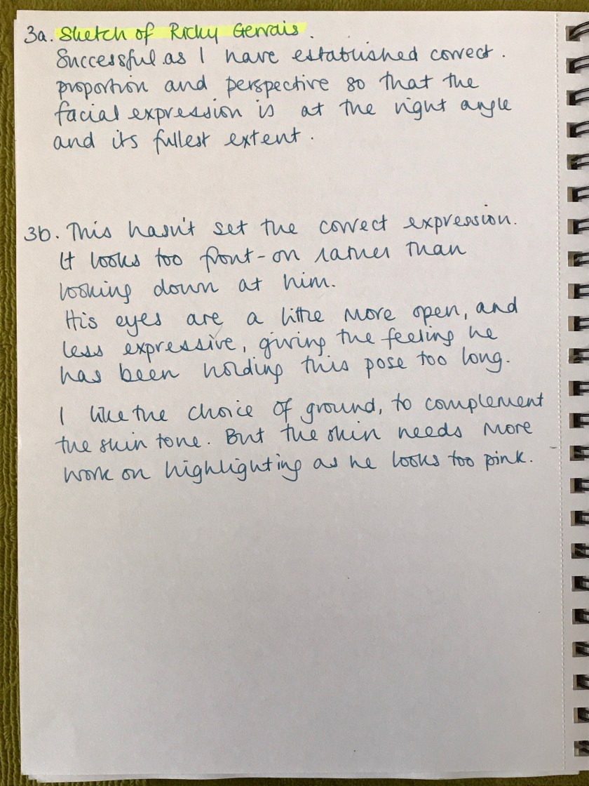
What I like and will take forward in my assignment:

The picture on the left originally felt it had too much dark tone, contrasting too much with the (wrong) high-key orange in the face. I think this one has more interest, all over, with the mixed coloured background as well. This is the same painting, my final study. I seem to have returned to a similar palette to my previous attempt. Both seem to work to me, the colour are not in equal amounts.
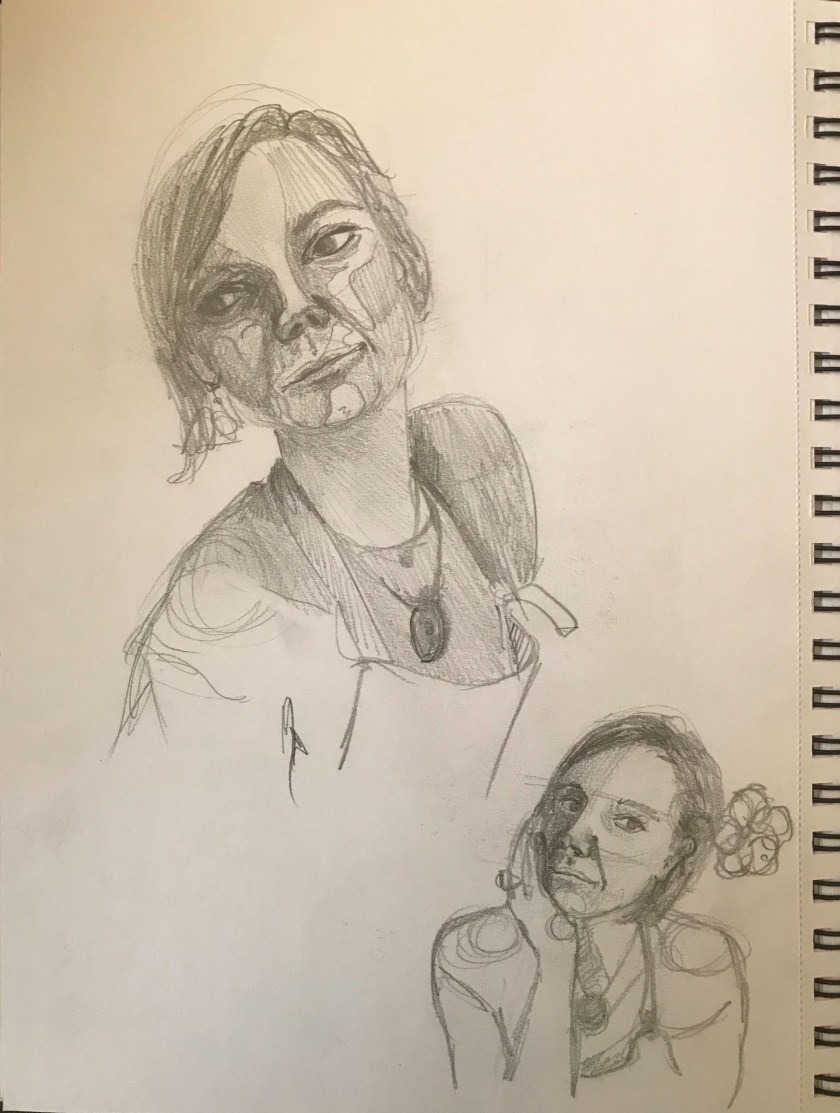
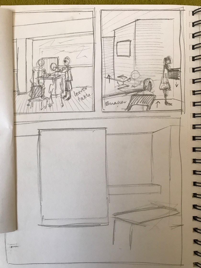
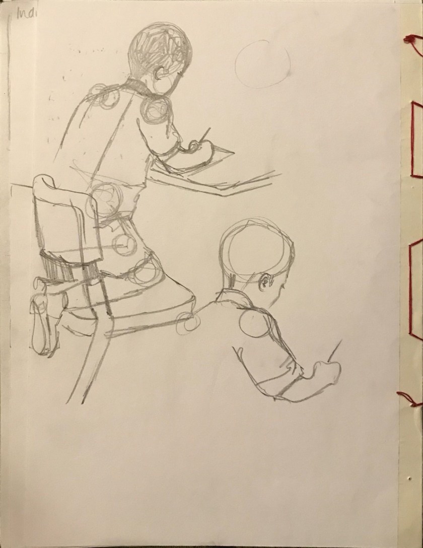
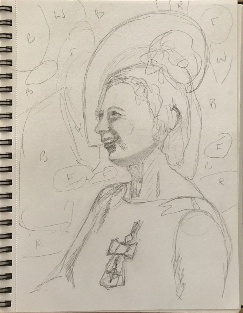
New pose
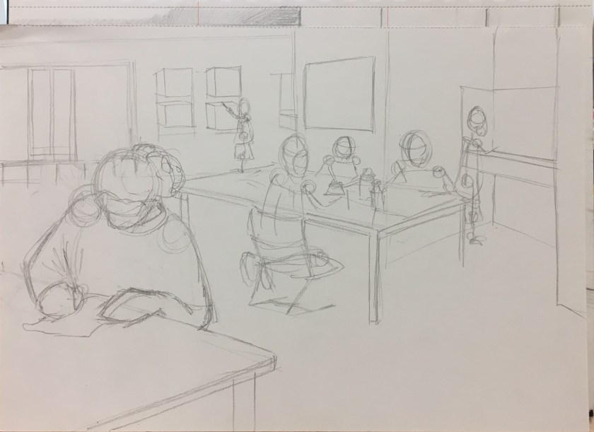
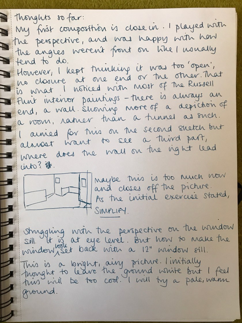
Composition
I tried both portrait and landscape composition as I wanted the background to be a feature, I wanted to see how I could use the orientation to best effect.
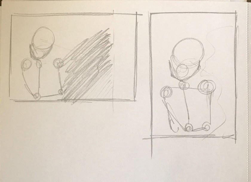
The painting is not the feature here! This was a quick study in placement.
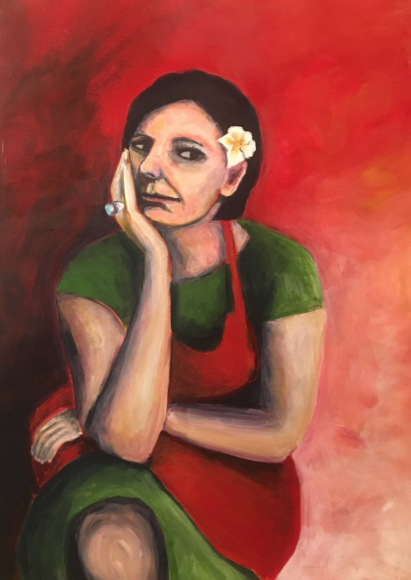
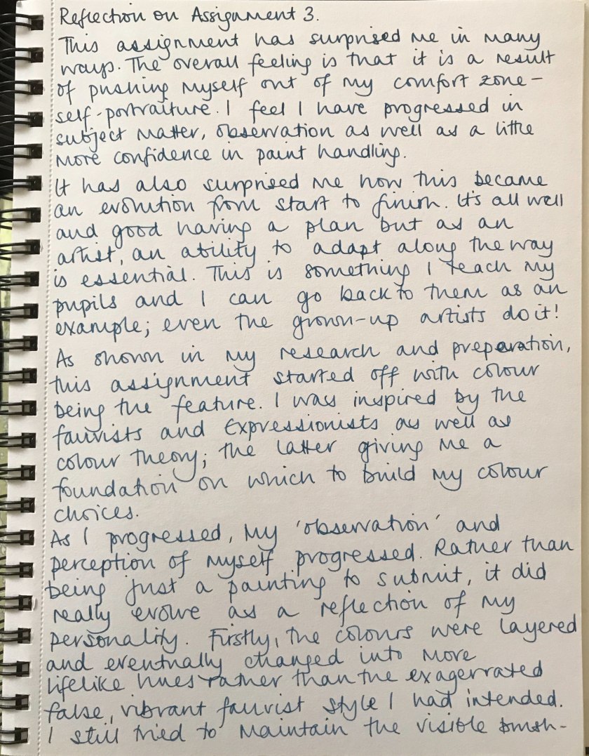
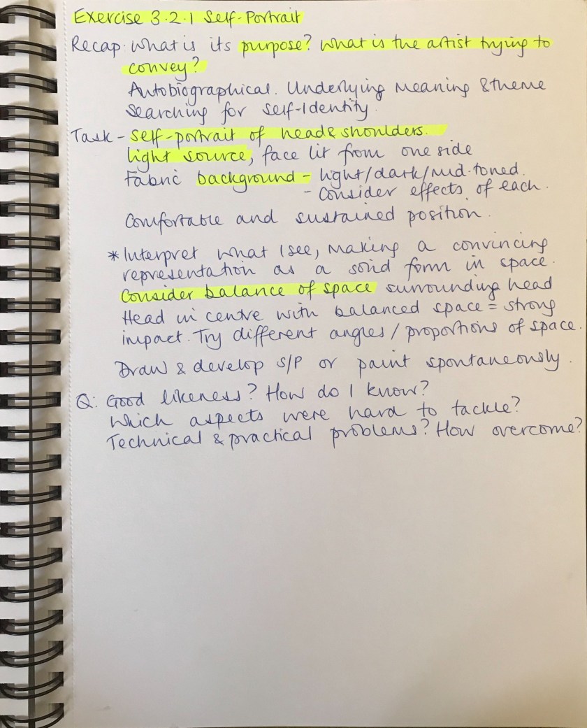
I have to say at this point that this has been the biggest leap in my courage, to create a self-portrait. I left this exercise to the end because I was nervous. I wanted to complete this further as an assignment for my own confidence and self-development.
Through looking at portrait composition I was reminded of the Fauvist movement. I introduce this exaggerated, vibrant, spontaneous concept to my classes and I see them apply their colour wheel theory to their work. I love how something inherently theoretical can be seen by children’s eyes as free and expressive; no other conditioning is needed.
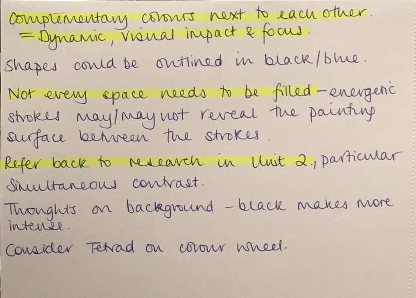
Link to Practise of Painting Unit 2 colour theory research.
With this in mind, I felt I needed to approach my style again in a new light and fresh eyes; the mind of a child. How liberating….
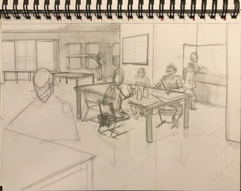
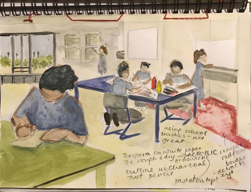
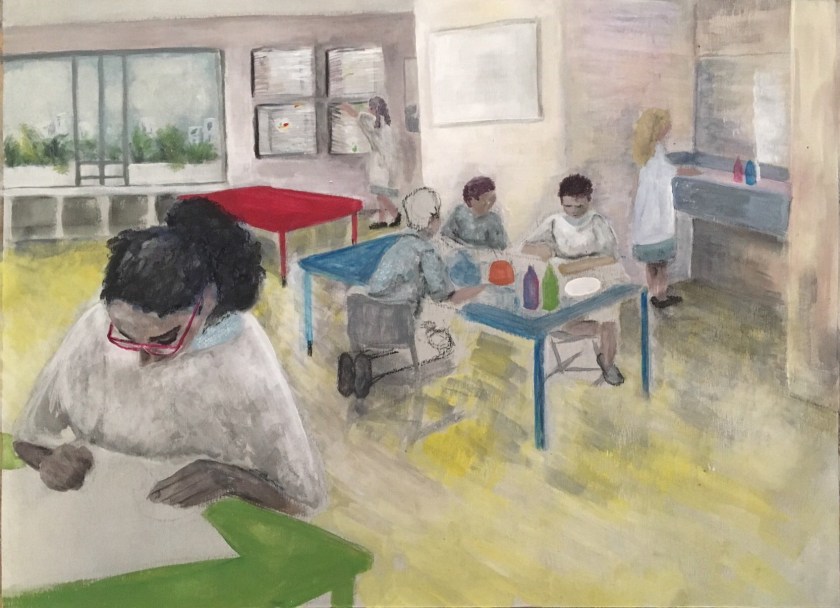
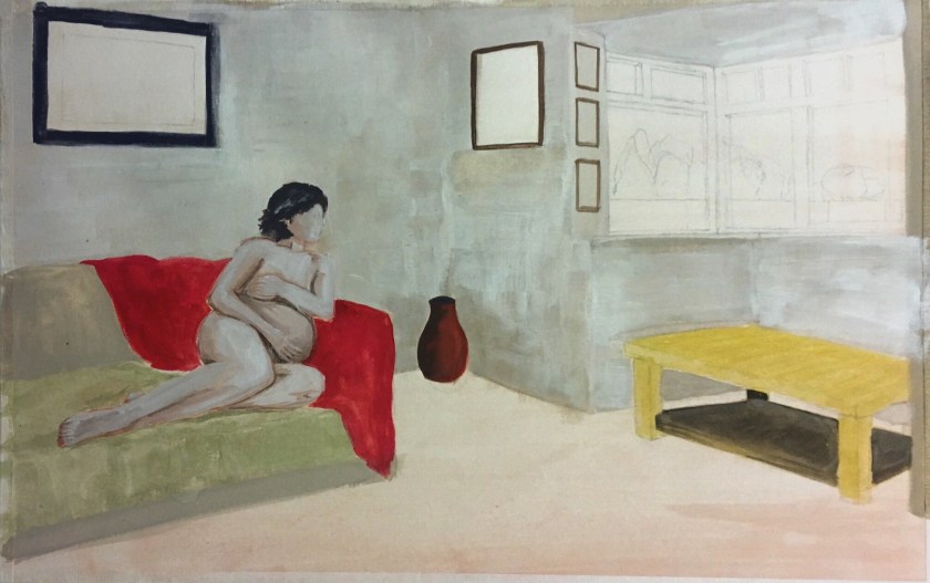
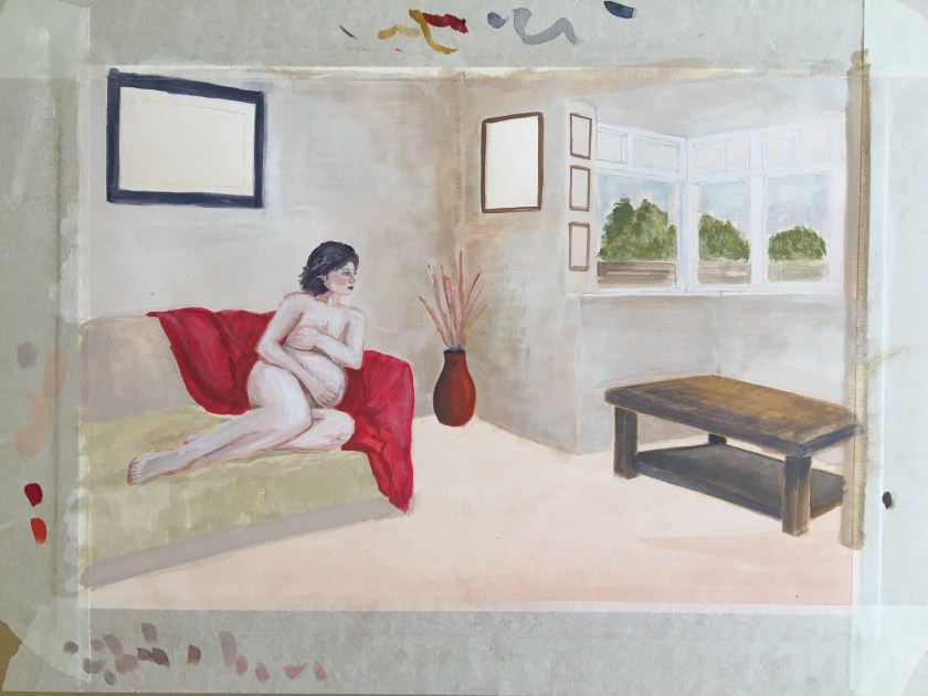
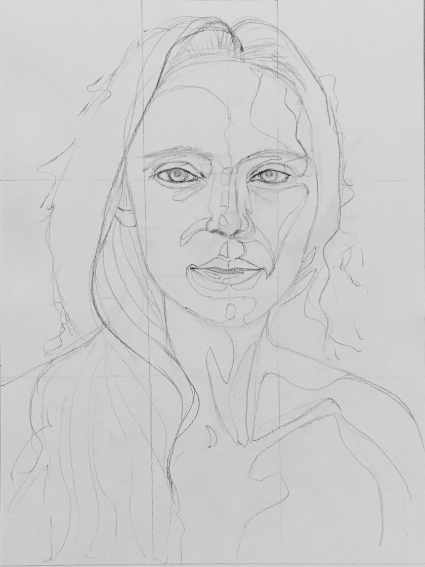
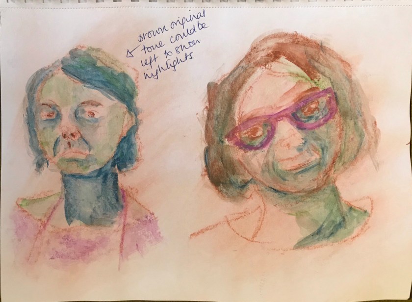
Between this tempera study above and the larger acrylic exercise below, the perspective had altered to become inaccurate. This will take some study and amending, but I will refer to the original study for positioning and line.
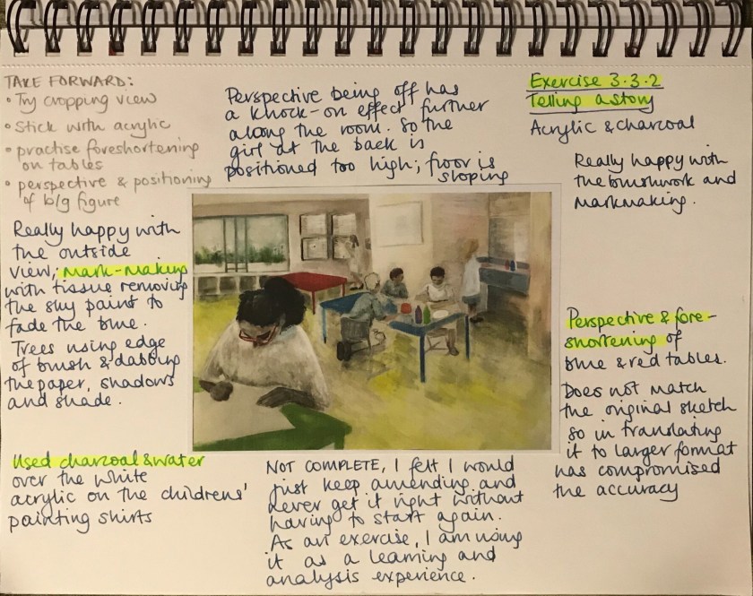

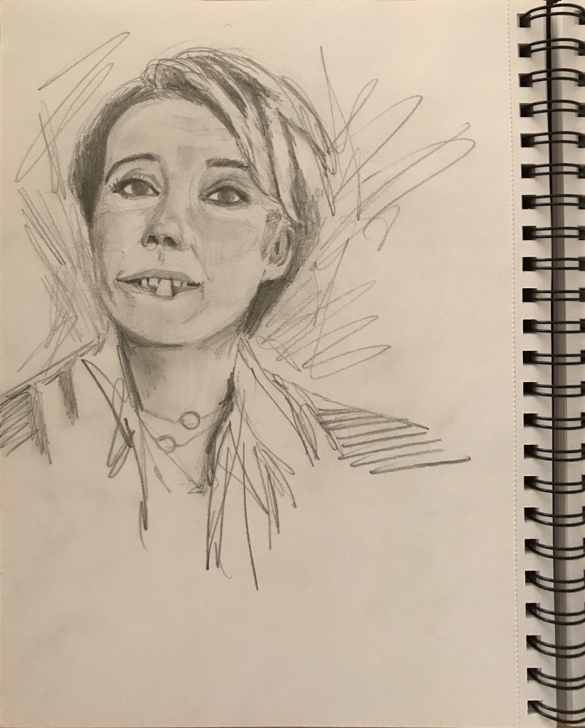
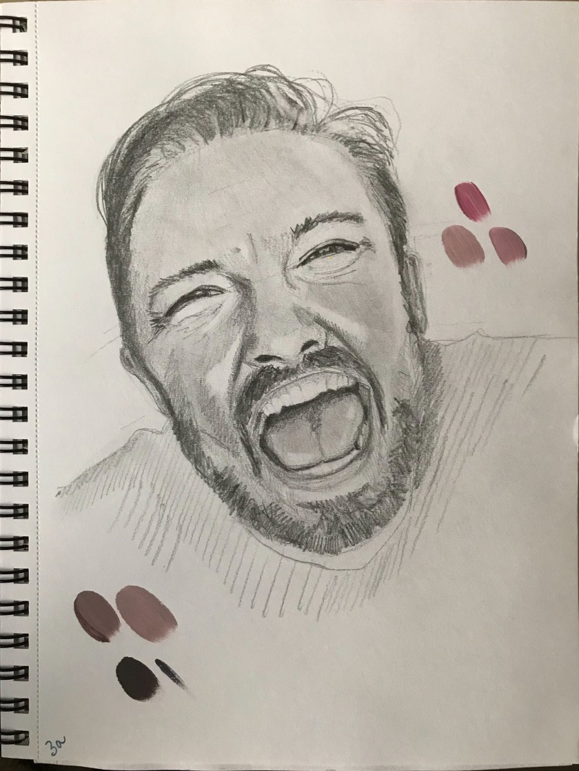
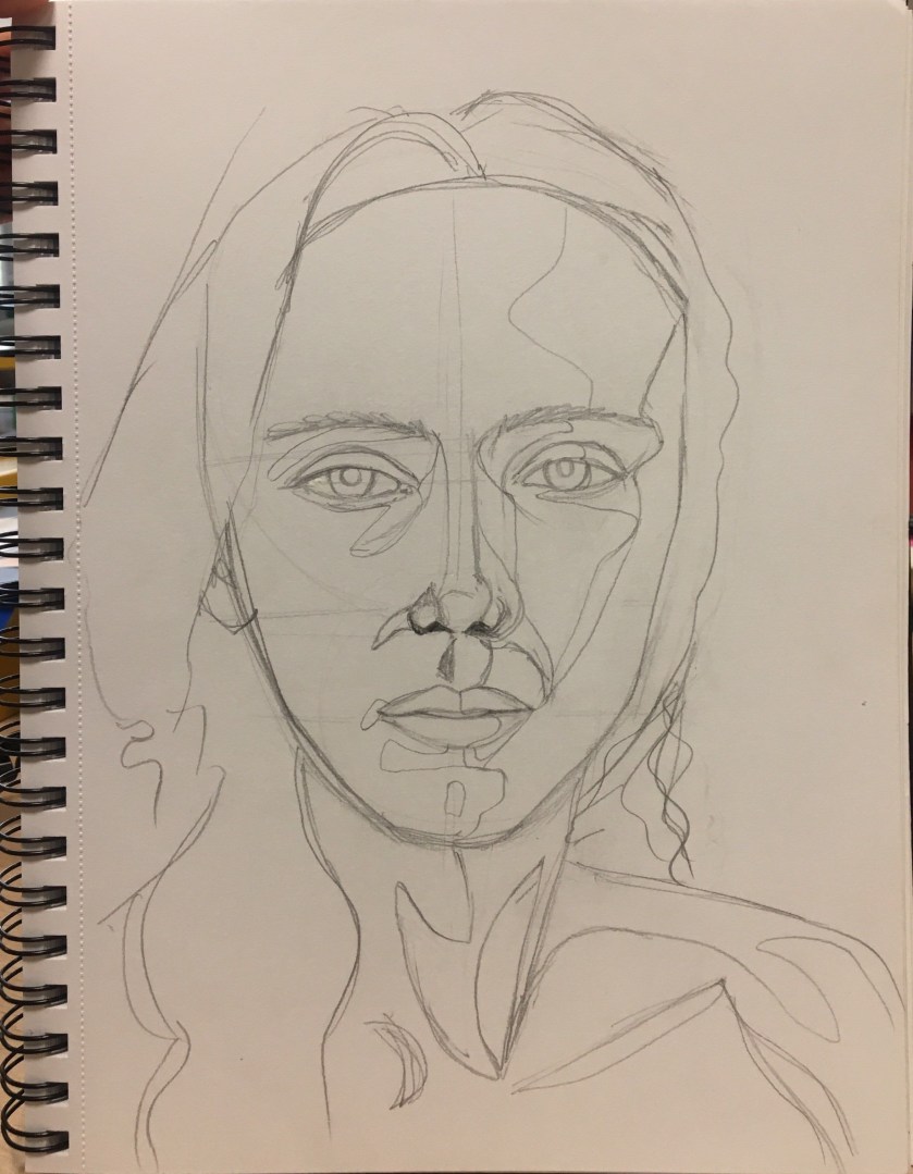
I thought I’d try out a study in my sketchbook expecting this to be the only attempt so that I could quickly move on (I have a tight schedule on this course). However, I knew I could do better and so figured it what I needed to improve and work on and then apply it to a larger attempt.
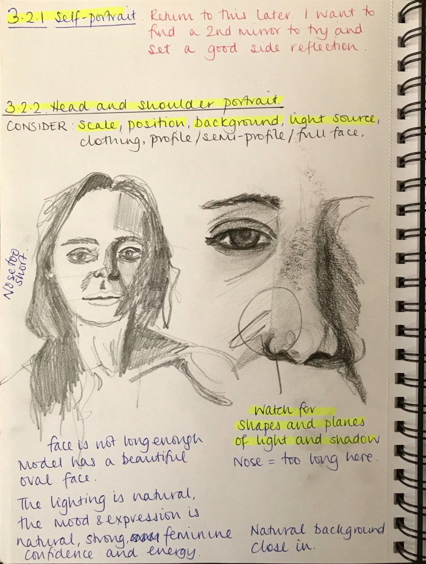
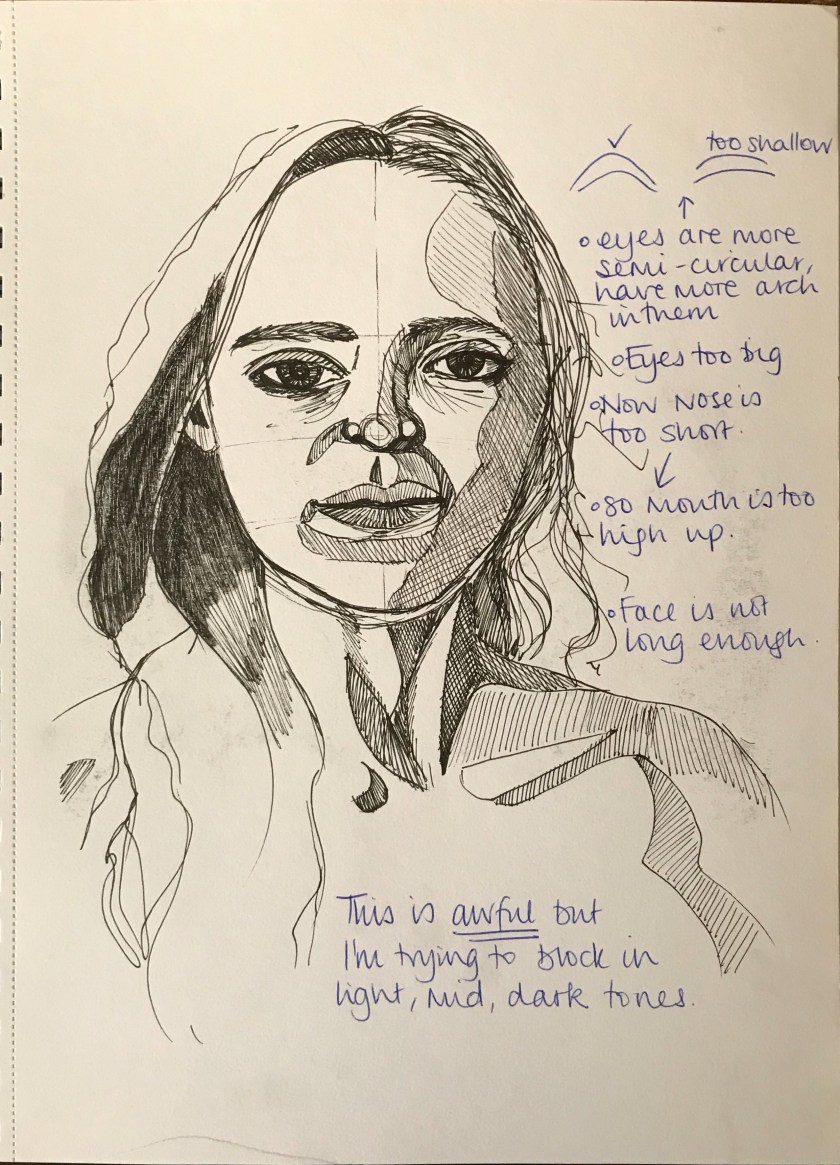
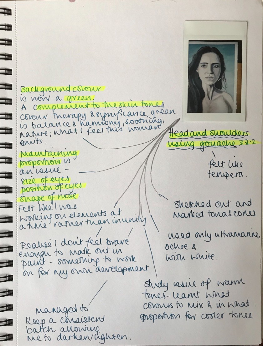
I need to work on proportion and sizing (eyes especially), making sure I vary the tones more and keeping the values consistent with an original skin tone.
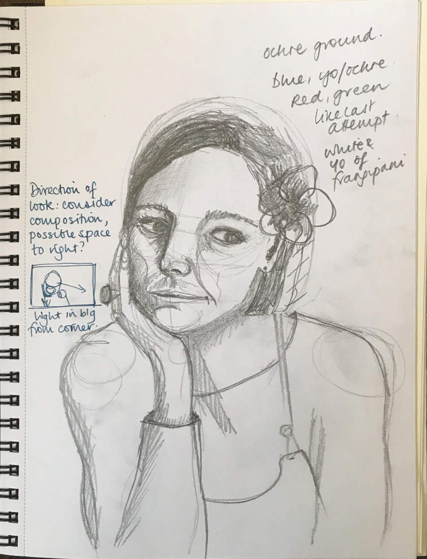
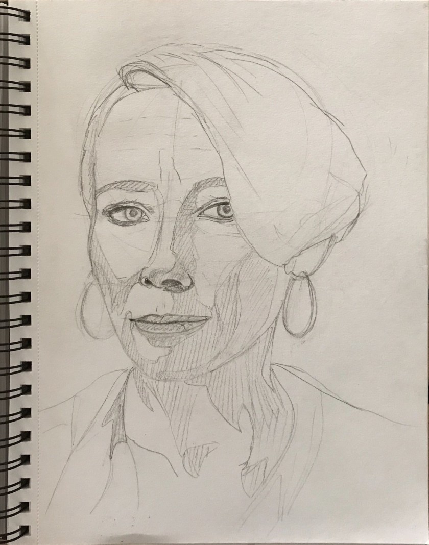
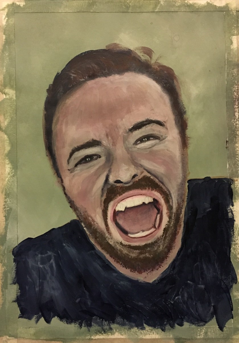
This marking out allowed me time to plan more areas for tonal variation. By this time I felt tuned into the subject and facial features. I noticed freckles and lines and additional shadows I hadn’t noticed before.
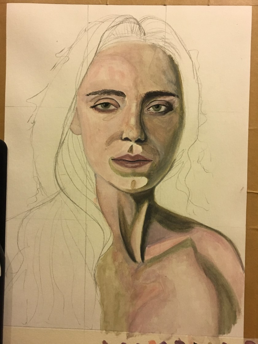
Between sketching out and filling in with paint, the eyes had changed shape. This was frustrating. However, I was really happy with the dark and mid tones at this stage. I found myself adding detail too soon as I was desperate to see it look real for me to be happy and continue. Next time I would block it all in and then build detail in.
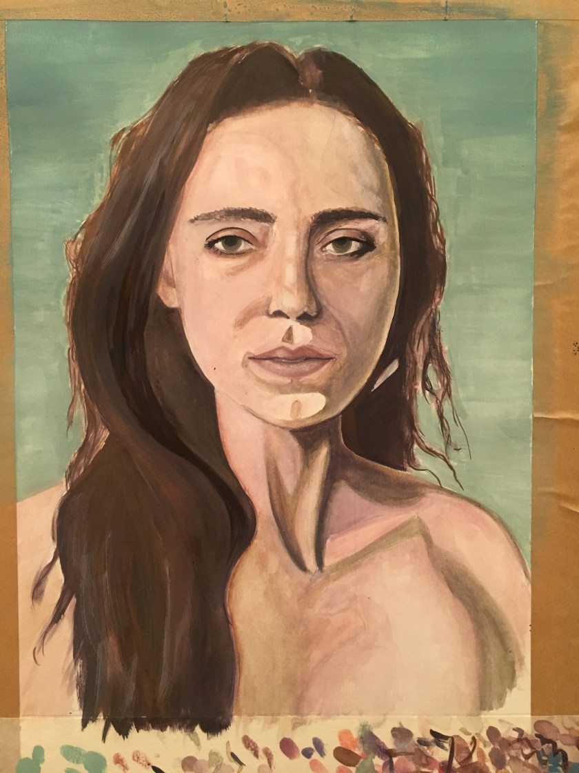
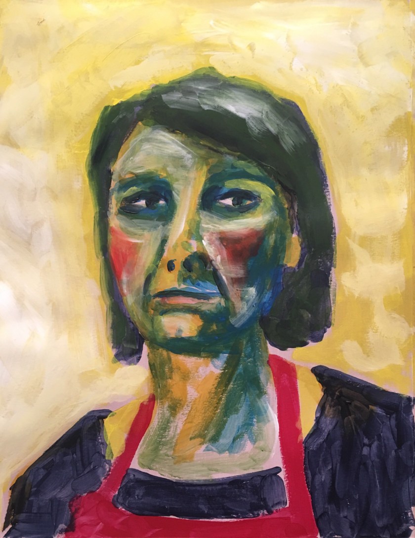
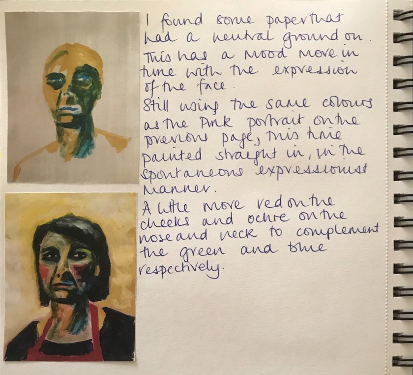
At this point I walked away and gave it chance, taking photographs so I could assess what I needed to amend – eye shape and detail, hair tones, definition and colours. I definitely need to work on hair. I chose a bluey green to complement the skin tone but also to represent the naturalness and peace of the woman.
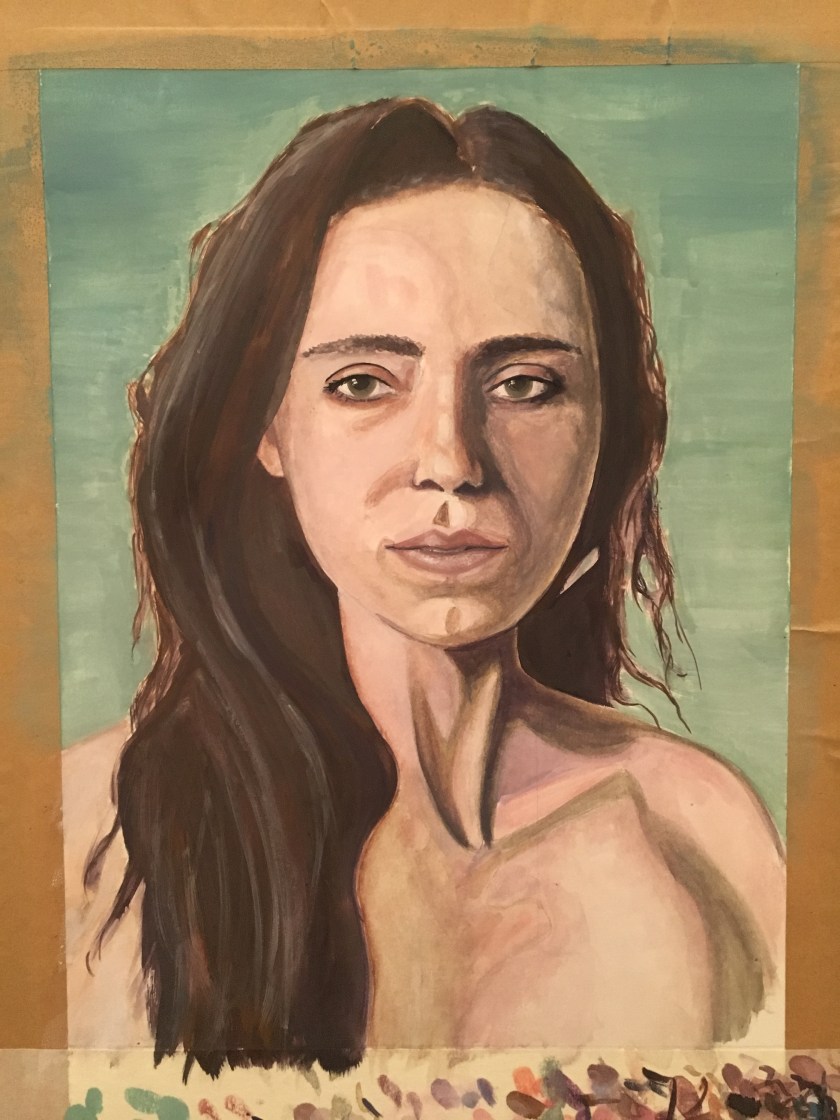
If I was to revisit this, I would work on the centre neck sinews. There is too much contrast and it is distracting. I would work to blend the defining lines a little more.
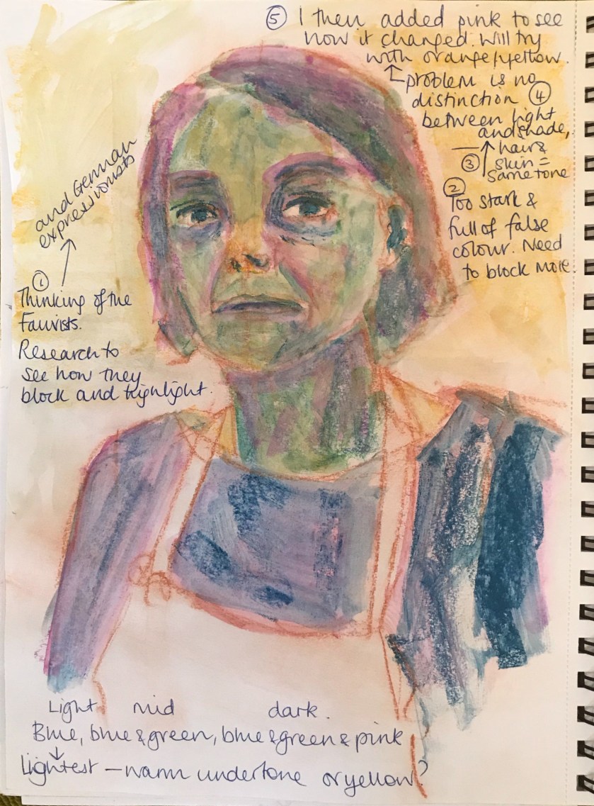
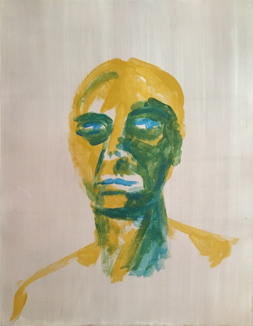
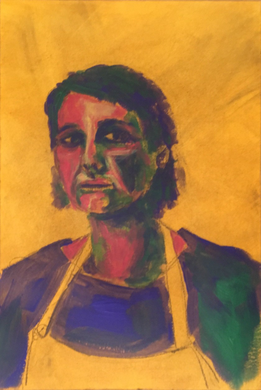
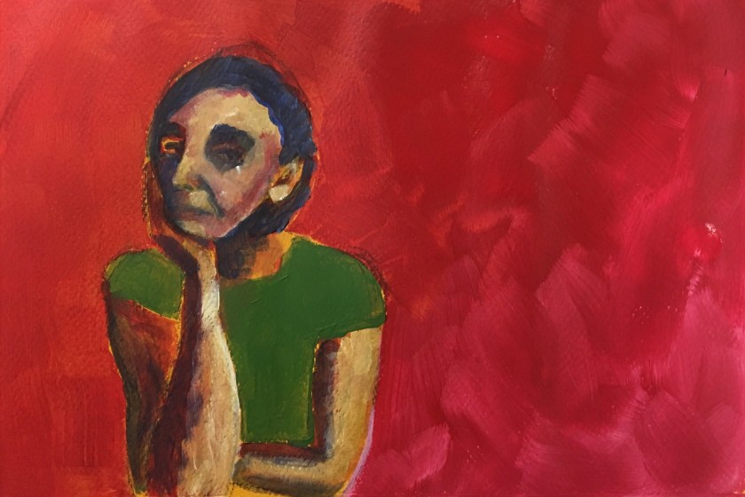
This first painted pastel study was purely experimental, and spontaneous. As I was working and choosing colour, I thought of the Fauvists and the German Expressionists. My link to research here.
In my next attempts for the exercise I will consider more what I am trying to convey, light source, different ways colours to highlight and shade according to my research and also composition and use of space.
This always happens but the one thing I was putting off actually became really enjoyable – even if it was the techniques and colour I was applying that made it so. Further practise will become preparation for my assignment 3