(My thoughts in green)
Overall Comments
Many thanks for sending me your third assignment. I have read through your blog which is well documented and thorough in its descriptions of your progress through the Chapter.
There is quite a difference between seeing the work on your blog and seeing it in real life and that has to do with scale , lighting , colour balance and recognising the material used. However as you have also sent the actual work it makes life easier.
This confirms my thoughts on Assignment 2, that online submission is not the ideal method. I will make a concerted effort to make sure I get the assignments posted.
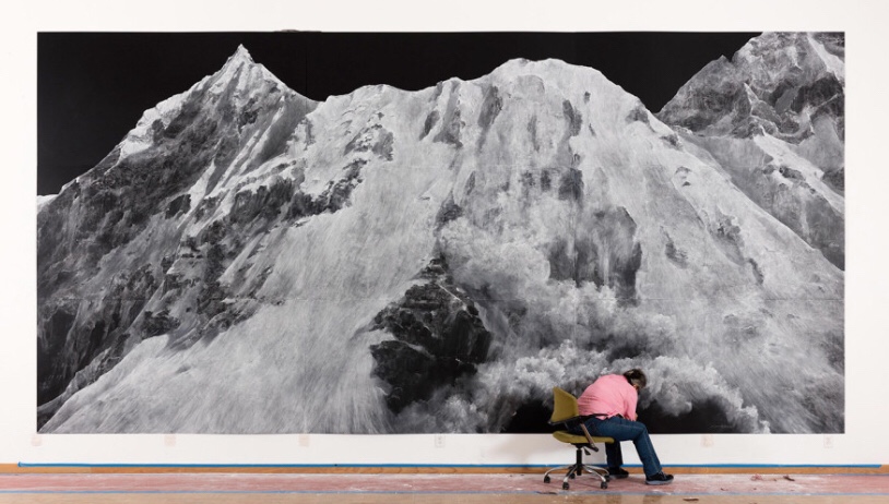
The drawing of a tree and its roots for example really stands out and the use of a blue biro to create the effects works really well. Similarly the cloud studies on black paper .You may have been inspired by Tacita Dean’s black and white drawings of mountains. They were on display in London recently but just in case you didn’t see them I’ve illustrated one here.
The name is familiar and I wonder if I came across her name and work subconsciously. I love this contrast and think I will want to use more contrasting media from here on.

Tacita Dean
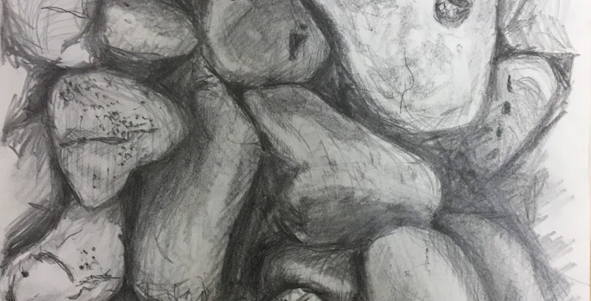
Where your pencil drawings are concerned they do not stand out as much as your ink drawings. The boldness of the hatching, and you can see that in your copy of the John Virtue drawing, is in contrast with the lightness of touch of your pencil drawing. This may have something to do with blending pencil marks with your finger, the effects of which look more like a smudge. I couldn’t quite out my finger on what was not ‘right’. Willow charcoal on the other hand gives a beautiful effect when spread with the finger. Using a range of pencils from HB to 6B is a possibility and gives you more of an opportunity for mark making and a variation of tone from light to dark. I oversimplified by using only one grade of pencil and varying the pressure. Your Cornish pencil landscape suffers from this lack of dynamic range. Agree. I am happy with the concept and composition but its execution has fallen short. Water-soluble pencils are also useful. I see you do use other pencils but next time you are in an art shop try out the different range and types of pencils from graphite to charcoal and coloured and see what you think will suit you . Graphite sticks are next on my list. I think I will use my coloured pencils more. I have a wonderful set but I still have the mindset that they are for children.
The other material you are using which you handle well is the pen and ink and watercolour that can be seen for example your sketch of Freshwater West where the whole range of tones from dark to light are used and where the tonal range of the colours is also exploited to good effect.
Great! This is one of my favourite media and would like to work and develop this a bit more. Maybe work on my simplification.
Feedback on assignment
Demonstration of technical and Visual Skills, Quality of Outcome, Demonstration of Creativity
For your final assignment landscape,the first attempt is the better picture. It has not only a better composition but also colour and tone and has more pictorial interest. The sketches used as preliminary designs are informative and there are quite a number of them with some a delight in themselves. The compositional decision of having the two sets of palm trees on either side works well. The glass barrier is a good compositional device as is the use of the wavy lines that emphasis the perspective. David Hockney for example had to invent ways of depicting modern materials such as glass, sprinklers and swimming pools and he did it by using a graphic shorthand of his own devising in his Los Angeles pictures. Further research on this needed. Further work on this picture might be worth doing on the sand to give it more substance and possibly the colour and tone of the sky which could be darker at the top getting lighter to the horizon . Ah-hah…Of course. This also helps with the Arial perspective. Otherwise the browns and ochre’s and violets used and the shadows cast are quite evocative.
Sketchbooks
Demonstration of technical and Visual Skills, Demonstration of Creativity
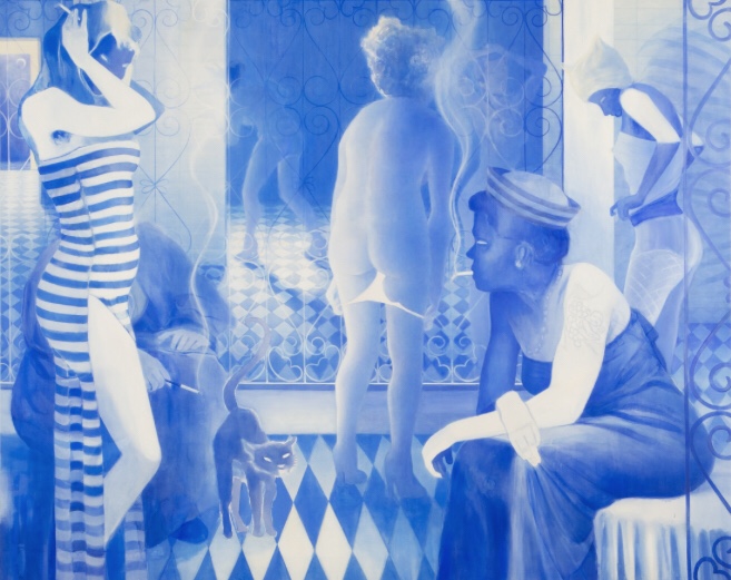
Your sketchbook is a delight in the combined use of written and visual information. I like very much the drawing of lobster pots , the Cornish sea and rocks and especially ‘Callen at Wave crest” an intense use of blue biro and dramatic composition. The colour blue reminds me of an artist called Lisa Brice who was recently on at the Tate Britain who has used the colour blue among other things to demonstrate the use of the product ‘Ricketts Blue powder’ that was associated with skin lightener in the Caribbean. More information can be found here Wowsers! Almost a negative photographic feel.
https://www.tate.org.uk/tate-etc/issue-43-summer-2018/lisa-brice-art-now-interview-aicha-mehrez
 Lisa Brice
Research
Context, reflective thinking, critical thinking, analysis
Your research is good but It is worth thinking about the Ron Lawson picture you have illustrated beside the Hopper picture. The former has a graphic quality that is designed to ring certain bells through its flat and attractive colour range. It is knowingly commercial in its appeal and through these devices attracts attention at first sight. There is nothing wrong with creating a commercial product of course but the Edward Hopper is in a different league altogether and it would not make a good fridge magnet although I do have another one on my fridge. There is a deeper psychological level to a Hopper painting that marks him out as one of the great painters of the 20th century . He is not using easy colours or attractive brushmarks and design to make his statement and that is an important difference. Being able to recognise this difference will become more important as you progress. I completely agree with this, again, in hindsight. I analysed ‘Nighthawks’ in my Creative Arts module and yes, he was in a league of his own. I feel a little guilty to have ‘commercialised’ Hopper in this comparison. However, the scientist in me comes to the fore and questions WHY he is in a league of his own. I feel Lawson’s techniques and colour contrast are beautiful and yet Hopper is classed as such a vital painter with comparatively dull colours. This is the point I feel my tutor is making. He is not using EASY colours or attractive techniques in his statement. Need to remind myself about Hopper’s statements. Relevant to the time in which he worked.
As I am unable to take a History of Art module now, this research needs to come in my own time.
Although of course we distain monetary values in art, (unless we are on the receiving end) check out this article about the most expensive Hopper sold at auction.
https://www.bbc.co.uk/news/entertainment-arts-46205604
Learning Logs or Blogs/Critical essays
Context, reflective thinking, critical thinking, analysis
If you are unable to see exhibitions where you are, the Internet can supply you with all the information you need for your leaning log.
Suggested reading/viewing
Context
At present in London there is an exhibition of Egon Schiele and Gustav Klimt drawings, The BBC has put out a good film on Schiele which you can probably get on I Player.
Its called Igon Schiele: Dangerous Desires
I had downloaded this before this assessment came through! It was intriguing and inspirational. Putting the distressed or pornographic feel of some of his work aside, I have always enjoyed the flow through his drawings, and wanted to emulate his relaxed line.
https://www.bbc.co.uk/iplayer/episode/b0brzkrh/egon-schiele-dangerous-desires
Pointers for the next assignment
● Reflect on this feedback in your learning log.
Well done, I look forward to your next assignment.

