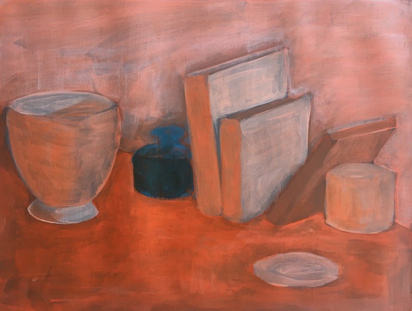
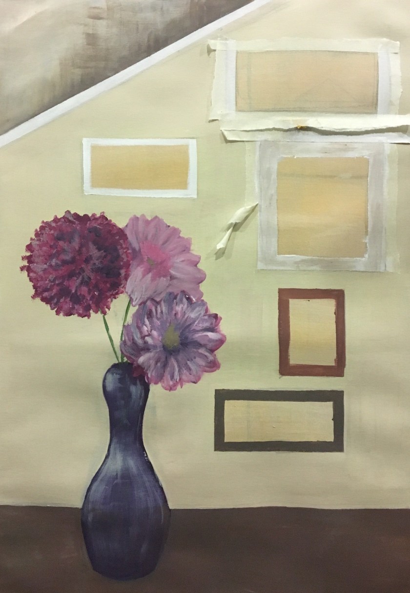
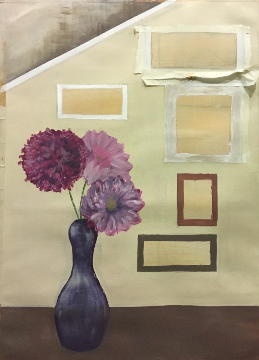
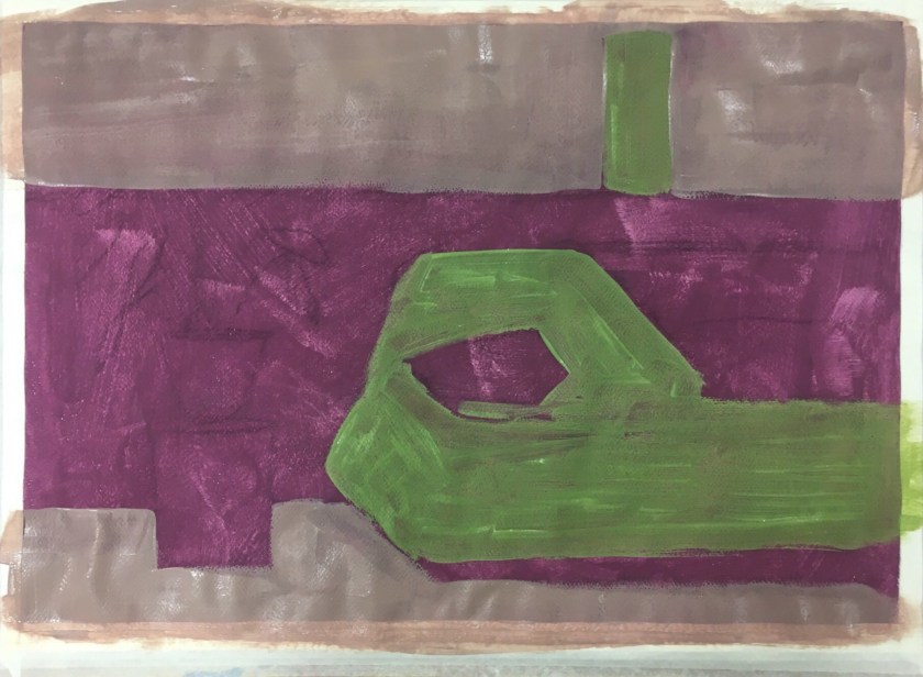
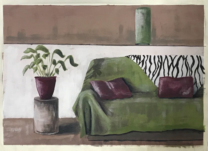
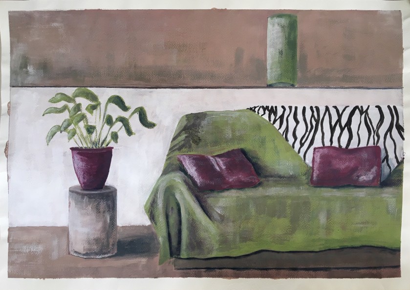
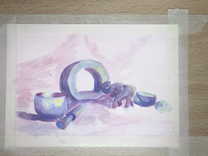
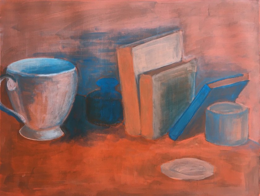
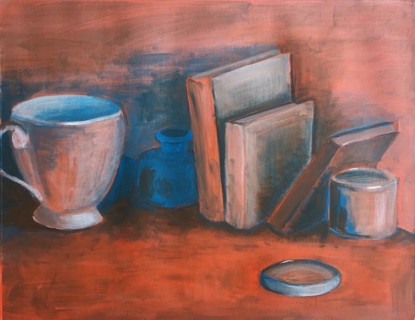
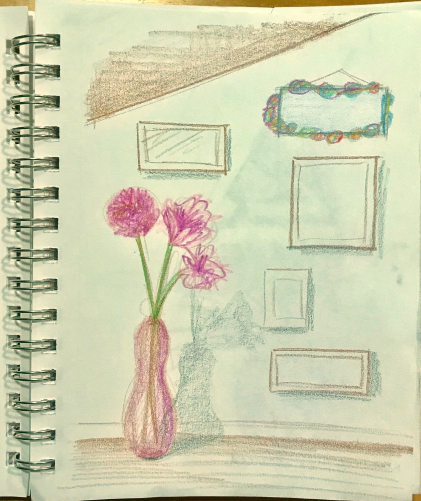
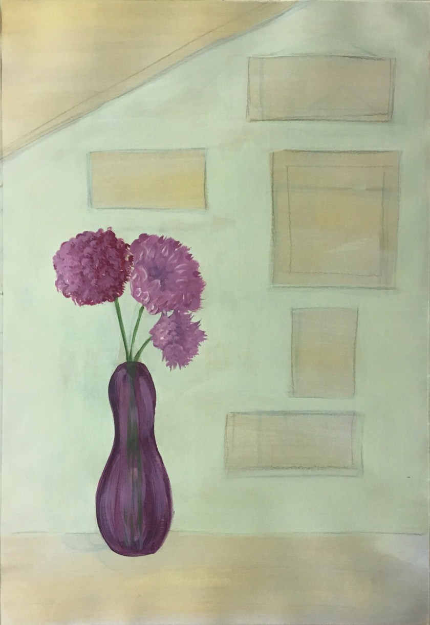
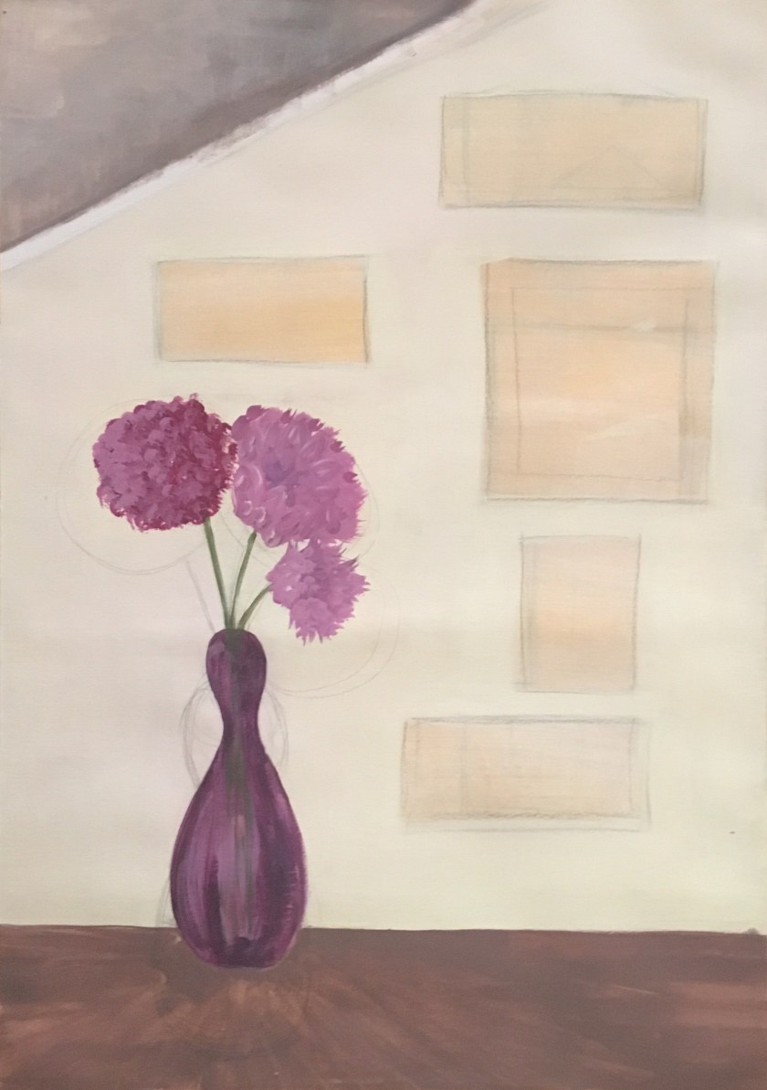
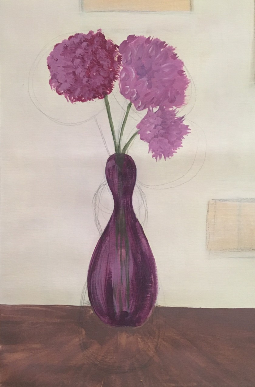
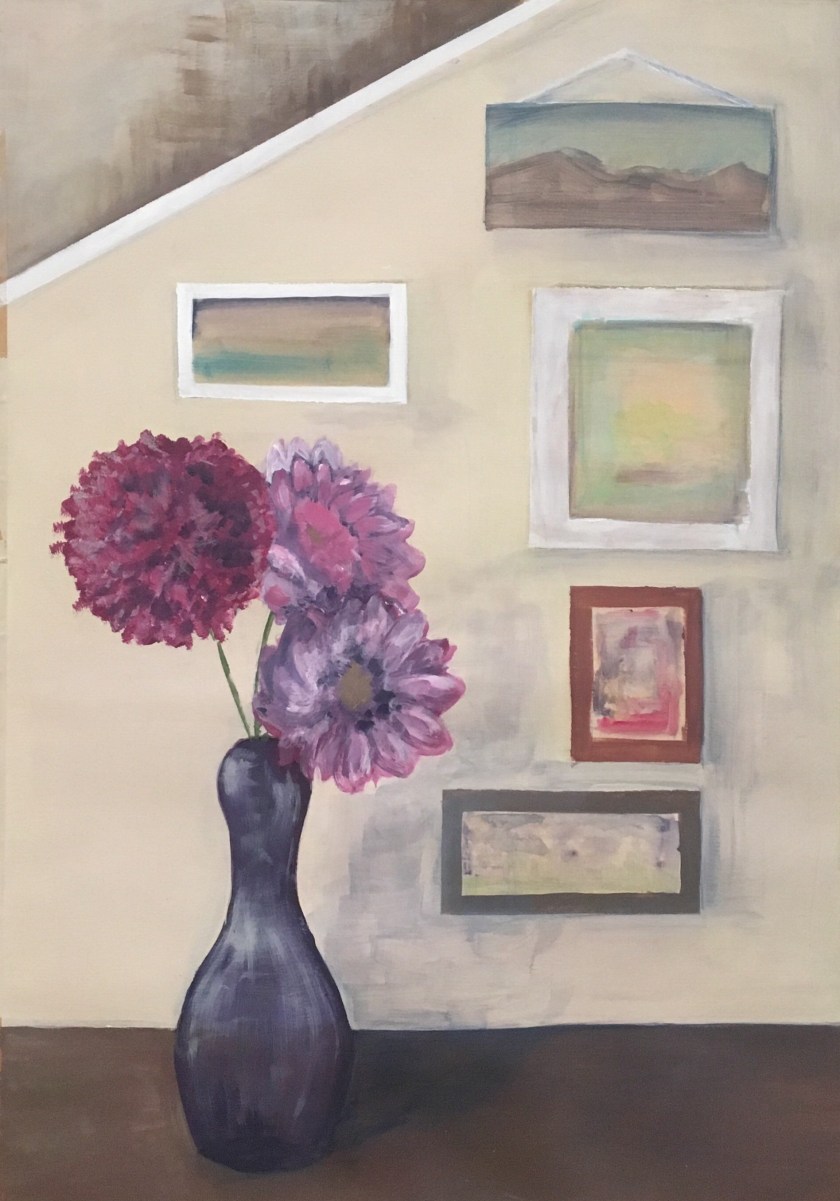
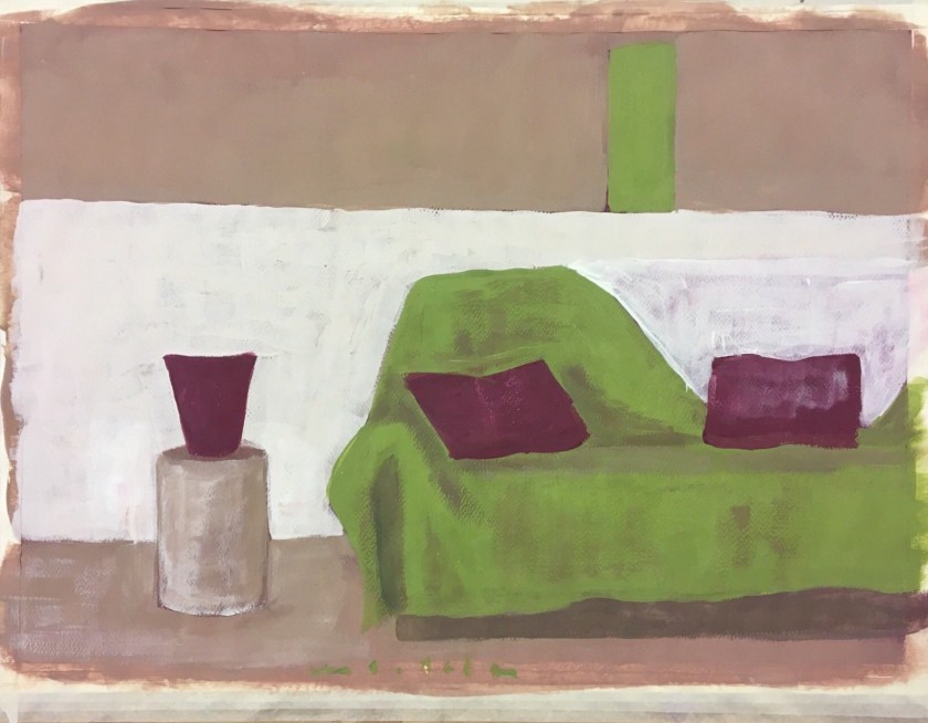
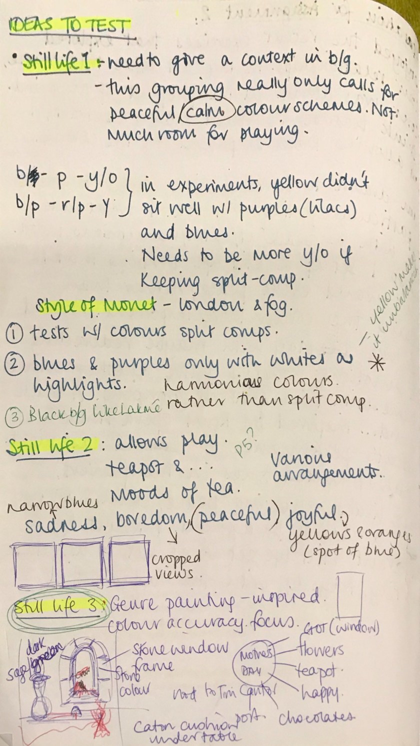
Assignment 2 – preparation

Idea 1 development

Pickin' the Pedicles by Carol McIntyre Oil ~ 30 x 24
Pickin’ the Pedicles. Carol McIntyre
...
Waterloo Bridge. Effect of Fog. Claude Monet (1903)
Image result for delibes lakme in muscat
Delibe’s Lakmé in the Royal Opera House Muscat
A quick study in muted tones


Idea 3 development

Image result for https://www.royal-painting.com window still ife
Still Life in Front of the Window. Fernando Botero
Image result for still life in front of a window
Still life of various fruit on a stone counter, in front of an open window looking out onto a tree filled landscape. After Sebastian Wegmayr
Image result for still life painting open window right hand side leon
Prudence Heward

2019-04-23 21-46 page 6

2019-04-23 21-46 page 7

img_0950

img_0954

img_0959-1

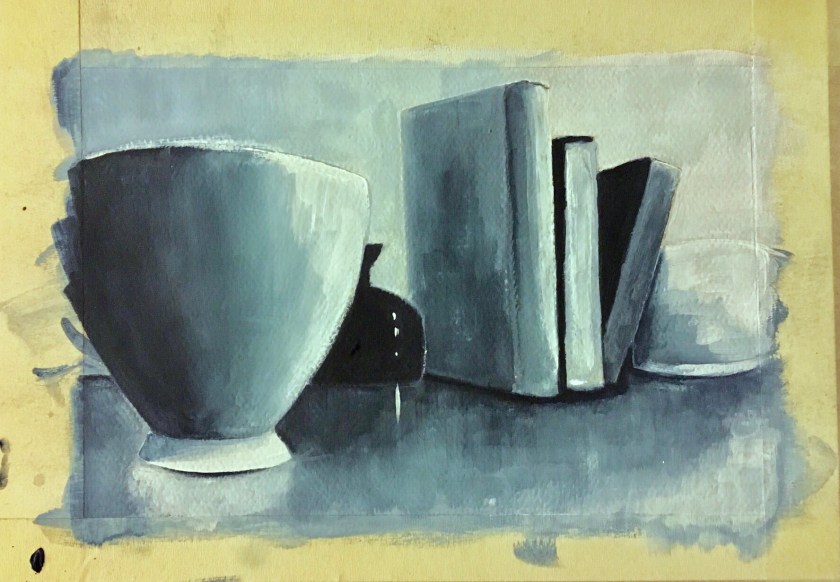
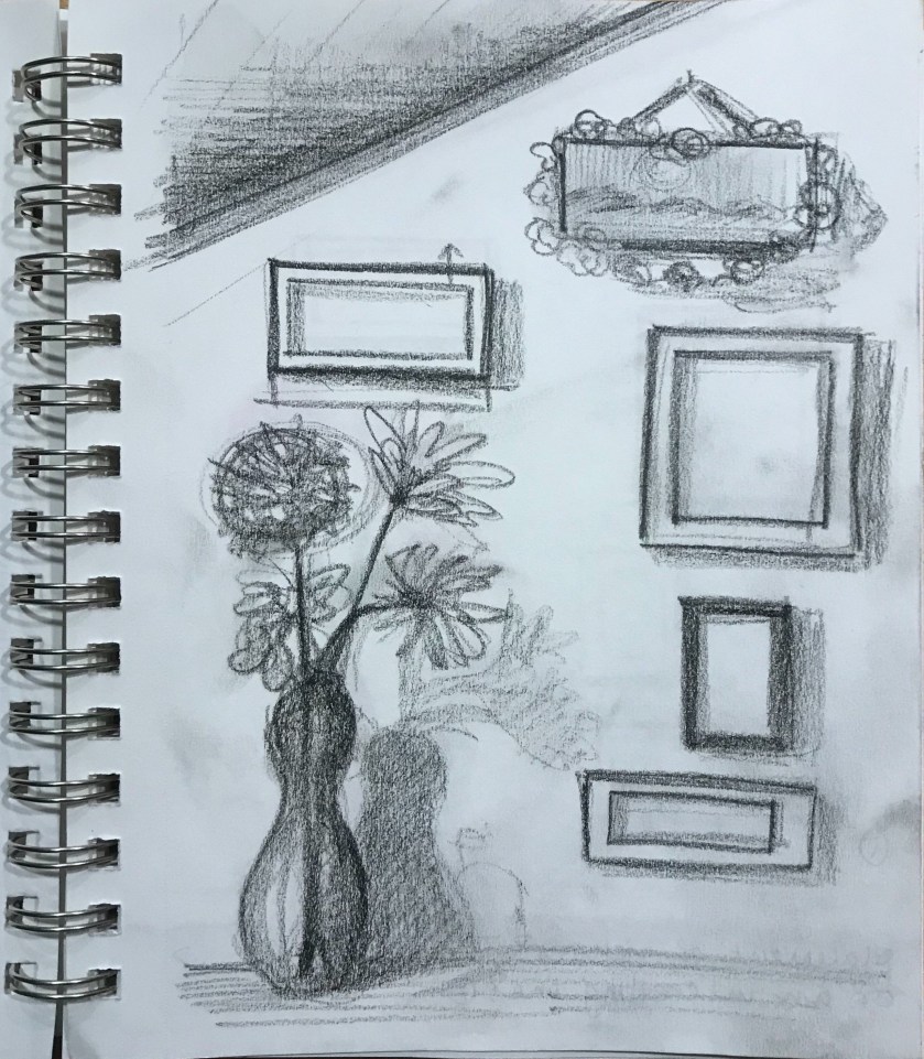
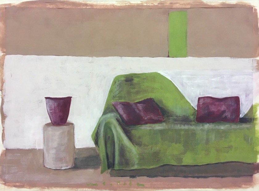
So at this stage I am happy with the composition, in that the eye should flow around from the window frame inwards and out to the mountains. I am however, struggling with the perspective of the window stones. This picture has evolved from a combination of  imagination and reality and, although much of it will be referenced, some parts have had to develop from processing the view in my mind.

img_2988

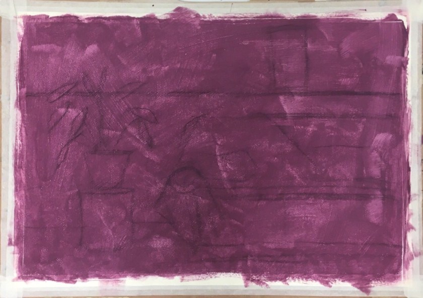
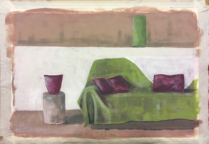
I sometimes experiment digitally to establish composition and colour plans. It seems to be a more time-efficient tool for planning.

img_2989

img_0962


PoP 2.3.5 – Still life with colour to evoke mood

https://www.bourneendauctionrooms.co.uk/catalogue/lots/89FBD8D97A92BED8B2DFF647744A4C84C3CF33BCAACAD3A0BF12CC6DFA19E8FA/DF552CF371F2E3A723B4EBDB4BF38E80/antiques-collectors-sale-incorporating-wines-spirits-lot-184/?d&action=4

I’ve always liked John Brunsdon’s Pembroke II for the way he used a narrow range of tones, evoking, to me, an eerie atmosphere. When I show this to the children in my class, they mostly say they feel scared or nervous; it has a sense of foreboding. Some children feel nervous but hopeful when they think the house is a respite after being lost in the mountains. I decided to try to replicate a sinister, cold feel, just to be contrary as I always want to focus on the energy I feel when I’m painting, peace, calm…so I decided to play a bit. Same still life grouping but viewed from a different angle to generate a dominance of the objects.

I took on board the ‘language’ that Chevreul and Seurat, where sadness or other negative emotions could be interpreted through dark and cold colours with lines pointing down. With the latter, there are no obvious lines to point down but I found I was brushing in a downward direction, maybe subconsciously taking on this language.

(I need to be aware of white balance affecting tone when taking photographs of my work. The first photograph is truest to colour).

PoP 2.3.4 – Still life with complementary colours

2019-03-26 15-19 page 6

2019-03-26 15-19 page 7

2019-03-26 15-19 page 8
These were my initial colours to play with but I anticipated difficulty in creating a consistent starting colour every time.
2019-03-26 15-19
I decided to work with Brilliant Blue and Vermillion out of the tube for consistency
2019-03-26 15-19 page 6
I initially found this concept hard to imagine so I tried it out in coloured pencils. This did help me especially where to combine the hues if to create shadow, where to lift tones for lighter values. It didn’t really help me think where to use which hue and its appropriate tone. At this stage RO was for lighter tones and BG was for darker tones in the objects.
2019-03-26 15-19 page 5
Black and white helped me establish the levels.
2019-03-26 15-19 page 4
Perspective lines
2019-03-26 15-19 page 3
Building up and lowering the values. I was starting to see how this works, especially in the darker shadowy areas.
2019-03-26 15-19 page 2
The blue became functional only in the creating of shadows where it was combined with vermillion.
2019-03-26 15-19 page 1
The dark glass bottle was tricky but I feel it needed the blue to dominant as an object rather than combine to make a shadow tone.

If I continued working on this exercise:

  • The surface was too vibrant and needed work to reduce its chroma. It is too high-key against the rest of the picture.
  • Create shadows around the jar lid
  • Experiment with creating the dark blue bottle in shadow. How would I combine colours to do this?
  • Keep the fluidity of my work pace. I was loose and relaxed and this allowed brushstrokes to remain and add atmosphere.

PoP P2.2.2 – Still Life with Flowers

Acrylic on mixed media paper

It was at this point that I felt the composition was flat in regards to depth. The vase was against the wall. It’s placement was nothing more than lack of creativity. It occurred to me to try and created the depth that could exist in a different placement of the vase and also to create more interest in the pictures composition.

I worked on pencilling in the new composition with the vase being moved forward. I’m glad I did this as I would have thought the flowers would change perspective and position but they merely changed size with little significant change with their placement ‘on’ the wall.

I realised I was spending too much time on this considering this was an exercise only. It’s something I may develop in the assignment.

Assignment 1 and Reflection

This assignment was developed here and I’ve decided to work on a complementary ground colour of violet.

I will say at this stage that I have a love-hate relationship with paper stretching….

Blocking in the midtones and highlights. Not sure of my process at the moment, I don’t feel I have a ‘checklist’ and seem to be blocking in by feel rather than a theoretical process as such.

Ugh. So happy with this and then I see that appalling horizontal line at the last minute. Why?? Looking back, this was present early on. Something to watch.

Corrected, but worried I will overwork it so will leave it at this point.

Design a site like this with WordPress.com
Get started