Assignment 3 – second attempt

676d68f2-8586-4ea3-994b-4271c000acf0-776-0000002beb830da7_file-12018-10-22 15-23 page 5

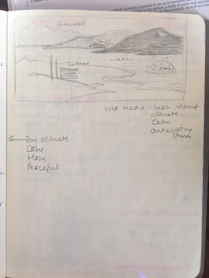
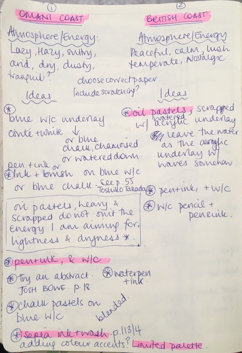
Words I would associate with this landscape would include peace, tranquil, lush, temperate; a calm energy. Originally I wanted to follow the lush and temperate feel by using thick, ‘full’ medium of oil pastels, texture could be scrapped into the oil pastel with a wash over the top.

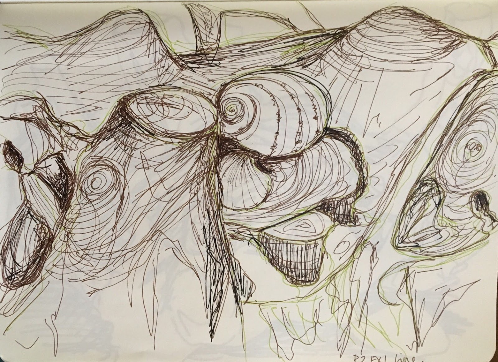
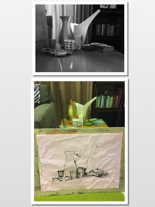
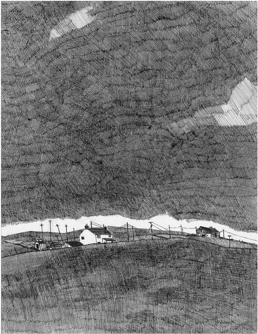
I had three ideas forming – oil pastels, textured, and wash; watercolour pencils and pen and ink; pen and ink and watercolour. I considered the oil pastels as they offered an unpredictability and a full thickness to match the lush feel of a temperate landscape. However, in the end I chose not to go this route after I lost myself in John Virtue’s tonal pencil drawings from the 1970s.

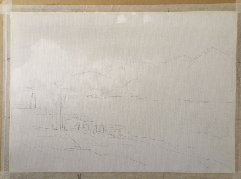
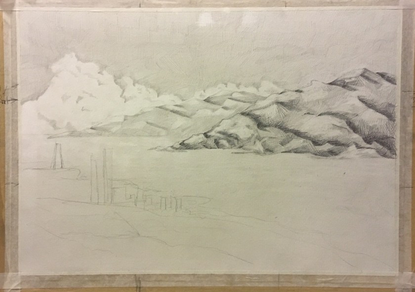
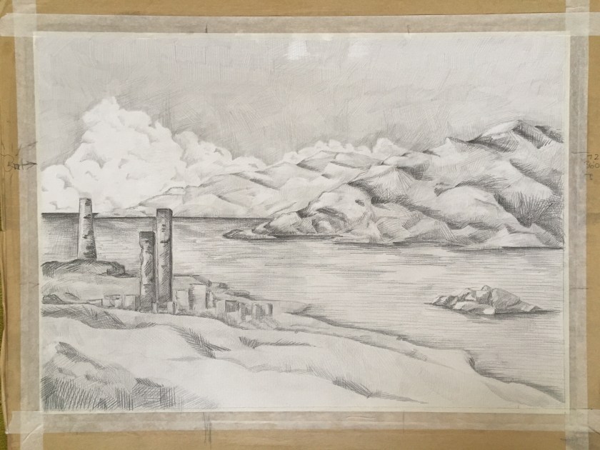
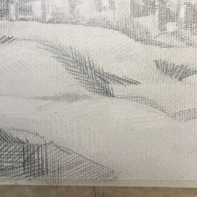
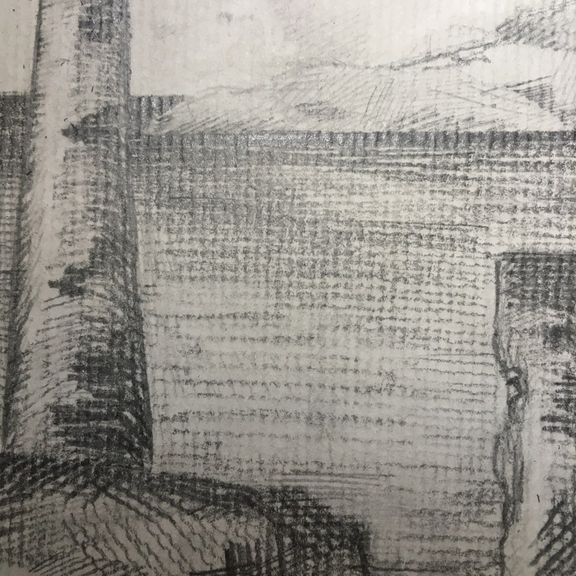
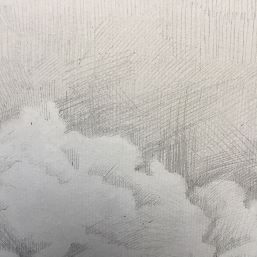
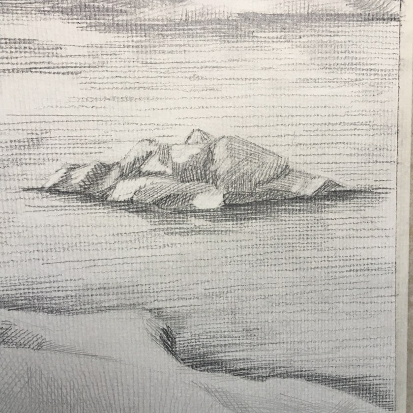
I know that one of the points in the assignment outline was to create preliminary drawings for this assignment. I worked on basic composition but wanted to get this piece out in its simplicity, with John Virtue in mind the whole time. Hence I knew I would work with pencil only. I might have added ink if there were any distinct, man-made lines, like the telegraph poles in Green Haworth from South. I did not want to risk overworking this piece and I am a lot happier this time round. Not satisfied entirely, I’d like to continue practicing building and layering the Virtue-style marks to create depth as well as tone but for now, I need to step away and move on.

My inspiration:

https://www.christies.com/lotfinder/Lot/john-virtue-b-1947-green-haworth-5484636-details.aspx

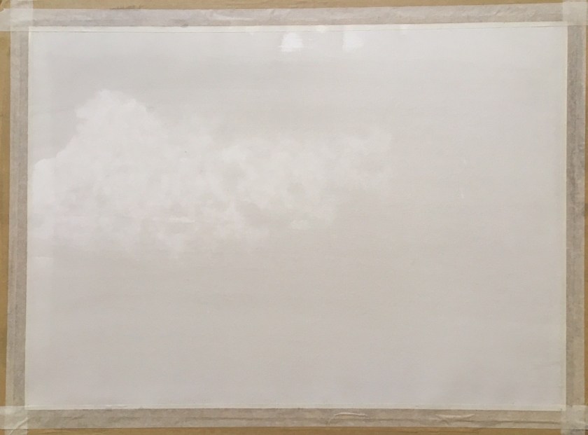
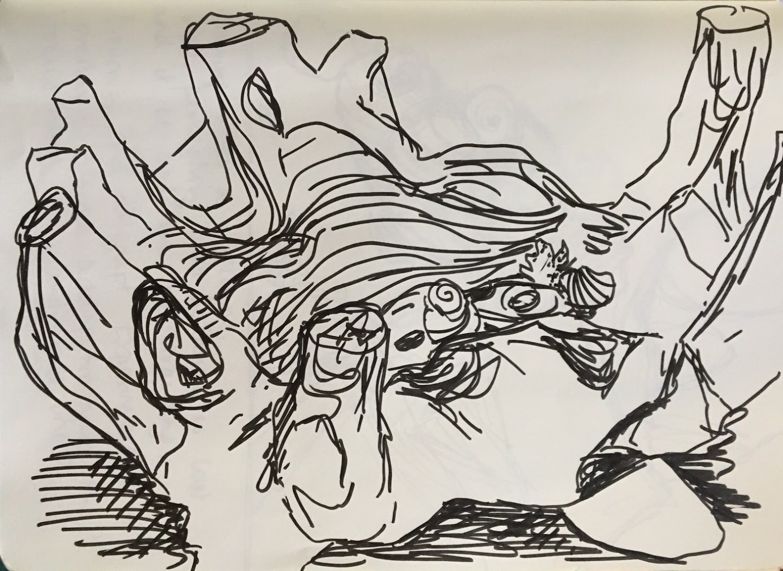
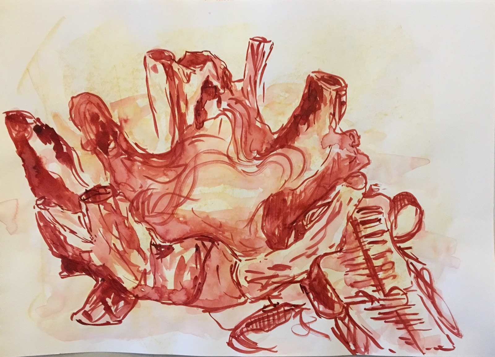
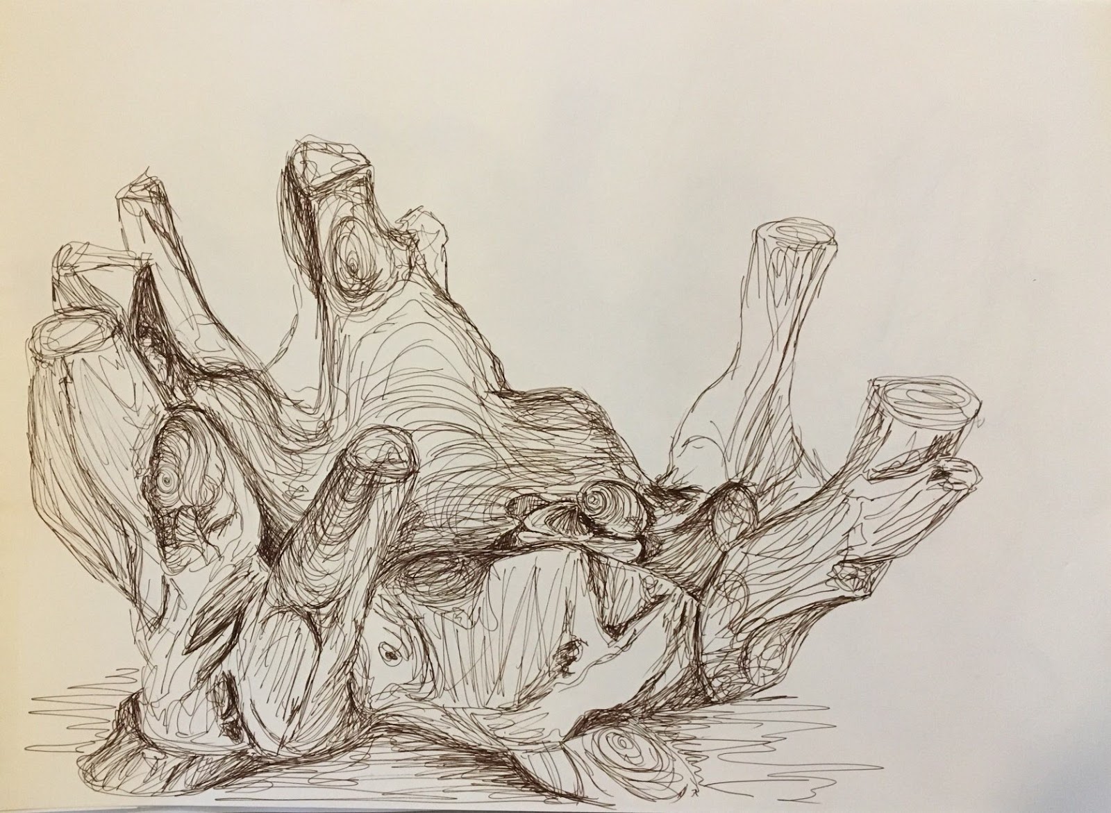
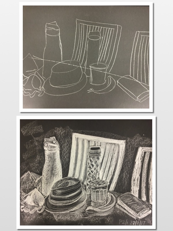
Below are photos from the process, plus the earlier composition ideas I had. I started with a black ink wash, with the cloud area tissued away. Ink does not seem to react to this as well as black watercolour may have done as I was looking for more of the delicate cloud edges to appear from the tissue. Nice enough though.

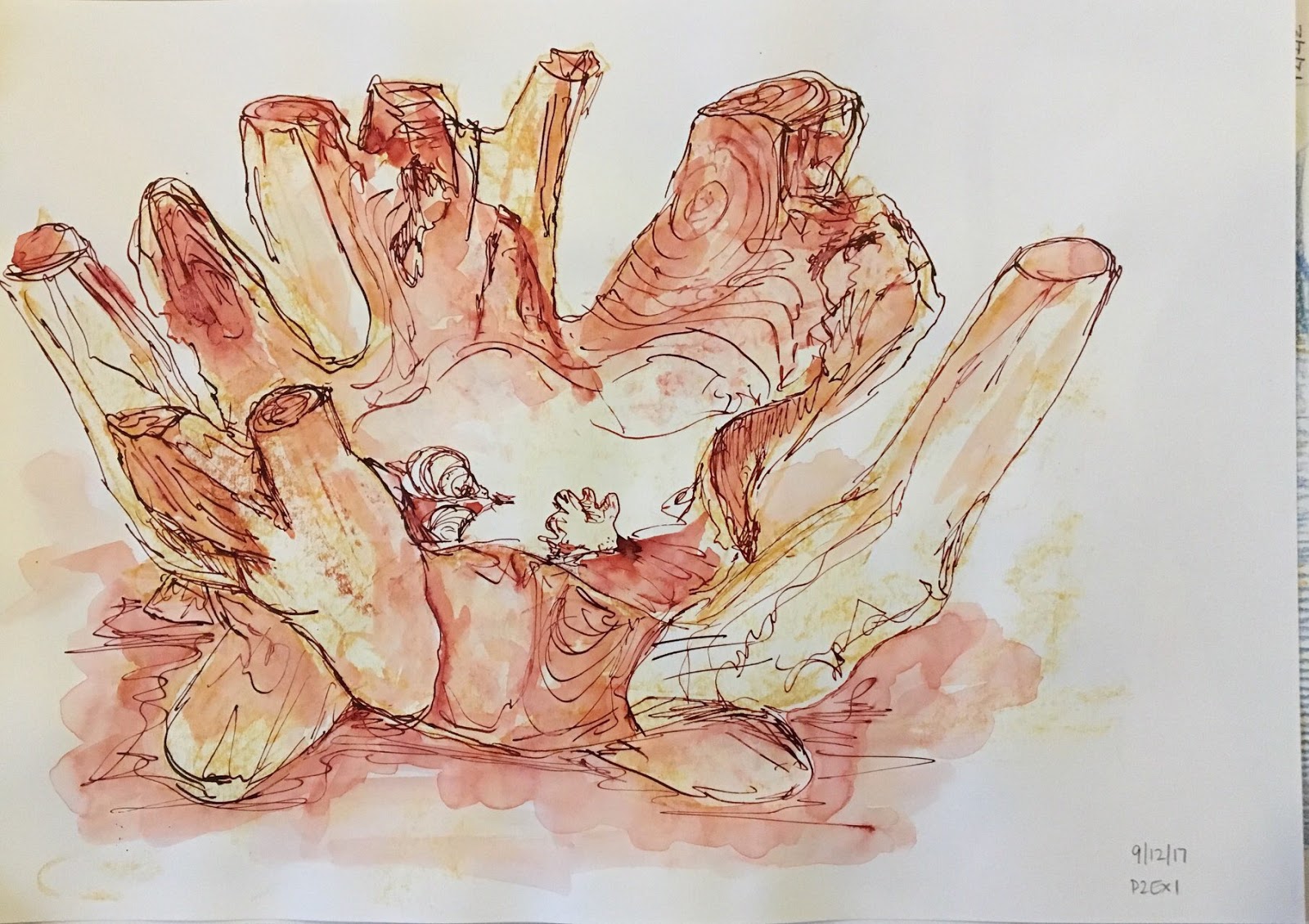
I’d like try this again with pen, ink and wash.

Completed Assignment 2 & Reflection

  • This assignment is designed to pull together the fine observation and practice that you’ve done on this part of the course. 
  • You’re free to choose your own source material and media, provided that you take account of the factors listed below. You can either work on a still life, or interior scene – or a combination of these. 
In the work you produce now you must demonstrate a growing understanding of:
  • the use of colour in drawing
  • the most appropriate medium for the subject
  • composition and context
  • mark-making and contrasts of line and tone
  • accurate and expressive depiction of form, experimentation with idea, material and method.
  • Is this a creative composition? 
  • Is my subject interesting? 
  • Am I using the most appropriate medium, colour, method, etc.?
In my previous posts here and here I have shown my sketching and preparation for this assignment. I enjoy perspective and I liked the idea of combining a little still life of sorts with an interior scene. I am always on the lookout for interesting light shapes and tonal contrasts; I see how they could evoke a mood maybe in a photo and I would love to portray that in a drawing. 

Reflection

  • the use of colour in drawing
  • composition and context
After preparing mostly in black and white, I chose to complete my final assignment piece in warm sepia tones to create a welcoming warmth to the room. If I worked with too many colours it would suggest a more balanced, natural light across the room. It was the late evening, with the house in darkness apart from one landing light, shining down the stairs to the left of the picture.  ‘Leave a light on for me’ seemed an appropriate title as I noticed the shot when I came into my home late at night and everyone was in bed.

I think the shot struck me instantly as it was balanced in its composition without me having to tweak too much. It was in thirds from left to right – the bright light, bar area and stairs to the left, the darkness of the kitchen door to the centre and rear and the shadows of the dining table to the right.


  • the most appropriate medium for the subject
  • mark-making and contrasts of line and tone
An inviting, warm atmosphere required similar materials to recreate such a feeling. I started in black pen for all the sketches I did and, as much as I love pen line, it was too ‘matter of fact’. I had ink wash in mind from early on; I liked the way it ‘worked’ with oil pastel in its resist effect and it worked well to create that artificial lightness without risking it being muted by the ink wash. Maybe pencil to add definition and detail as the last stage. I thought chalks would be ideal for the soft, peaceful, ethereal effect but are not defined enough. I knew that mixed media approach would be ideal to show definition as well as effect. I finally settled on mixed black and Indian Red inks in various dilution helped to make a warm sepia picture, with subtle pencil detail. The pencil worked as an additional layer to show detail and contrast; it helped me to define the pattern in the sheer georgette curtain to the far right. A layer of pencil also gave a ‘veil’ to suggest tangible shadow.
  • accurate and expressive depiction of form, experimentation with idea, material and 
    method.

I was working to get a perfectly accurate picture as is my usual wont, but whilst I was completing this, an ongoing discussion was being had on the Drawing 1 forums regarding assignments, expectations and ability on the OCA drawing course.

There is some frustration that people come to a drawing course with little formal training and the OCA accepts them on a degree course/module. This might suggest that the OCA wants people who are willing to experiment, investigate and think outside the box rather than provide accurate depictions of still life. But then feedback given on the experimental and progressive assignments might be critical in the lack of technical skills. And it becomes a catch-22 situation; is this a technical course or an application of knowledge?

With that in mind, I seem to want to approach my work with a freer, more flowing sense, trying to think outside of the box, which is a contrast to how I have always worked in many aspects of my life. I am becoming more relaxed and I want to apply this to my art. A more expressive, investigative approach appeals to me. 
I have really enjoyed this assignment in that, as the title suggests, it is an intimate look at my space, my home. I am entirely happy with my assignment, I really like it. Technically, I could do better; some straight lines are a little off and I am bothered with this. It was a little hard with a brush and the fluidity of ink.

Staying on a technical level and process, I stepped back and realised I had created a workflow without realising it. I initially thought, and maybe hoped that I worked more spontaneously.  I focussed on what I wanted to achieve – an atmosphere and feeling of the place at that moment in time. This led me to practice with materials and find which suited the aim. 

PART 1 P2: Exercise 1 – Groups of Objects

Already we see that lines and marks can be more than just that on a piece of paper. Expression and mood can be conveyed through the medium used, pressure, speed, intensity etc. An intention can now be given to a drawing as it takes on the mood of the flowing media. Even basic shapes and forms can take on an expression if the application is considered.

A flat piece of paper with a two-dimensional surface is the ‘picture plane’. When a line is drawn on the paper, it is still 2D. But building up these lines can give the illusion of three-dimension. They also help to show the objects in relation to each other. 

A method in the process of learning to draw is to recognise the basic shapes are flat and 2D. A build-up of lines can make these flat shapes appear 3D.

These are my attempts drawing a group of objects. I really enjoy this activity, especially after I relaxed and tried to stop making my drawings realistic.

The first work is stick and ink. 

I like looking for the shapes in the negative space, the space that the objects ‘leave behind’:

The second attempt was using compressed white chalk on black sugar paper. I need to work on my placement I think but I enjoy looking at how the shapes link to each other, if we imagined them as 3D and see-through. Although I focussed physically more on this in the first attempt, but still visualised it in the second.

Design a site like this with WordPress.com
Get started