
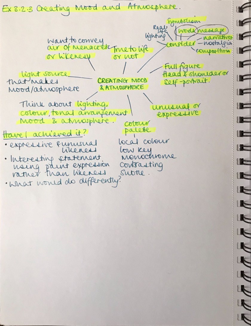
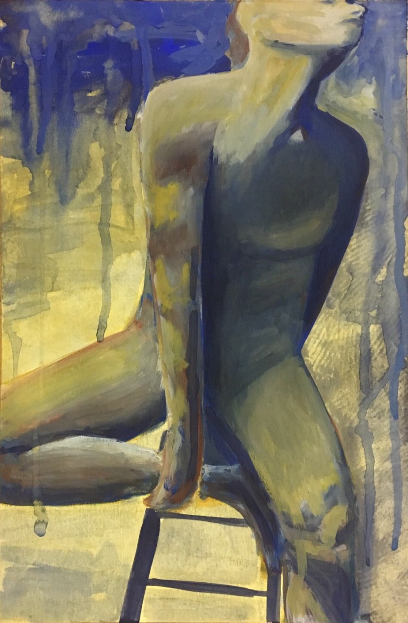
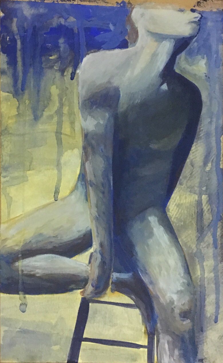
For this exercise you can choose to paint a full figure portrait, a head and shoulders portrait or a self-portrait. Your finished portrait should be unusual or expressive in some way. It can be true to life or not, depending on the effects you wish to achieve.
Decide what you’re trying to achieve at the outset and make some notes in your learning log.
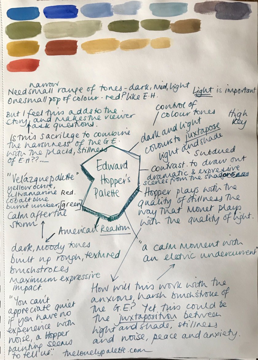
Next, decide on your light source as this will determine both the effect of solidity that you’re able to capture and convey mood and atmosphere.
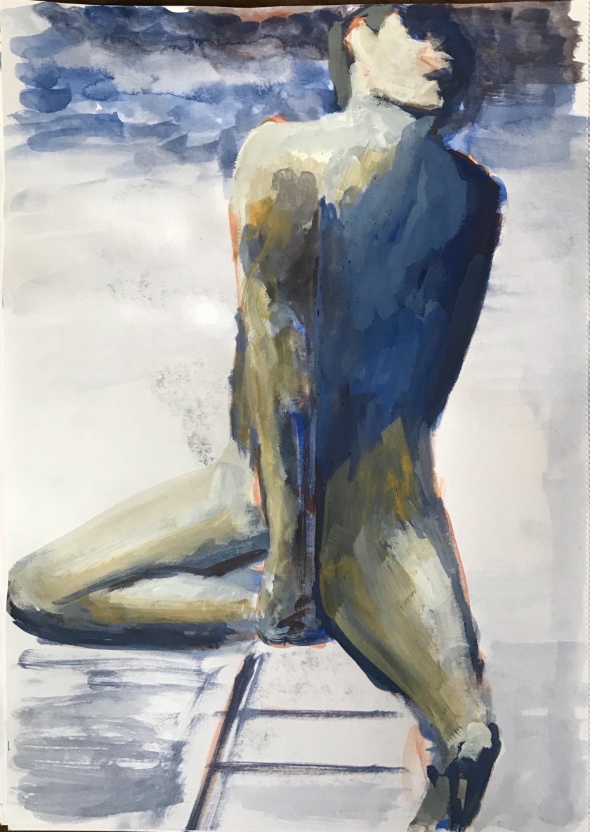
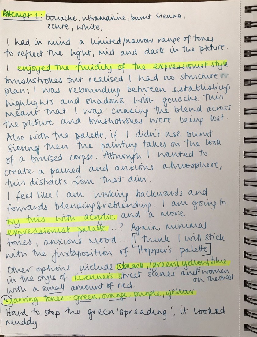

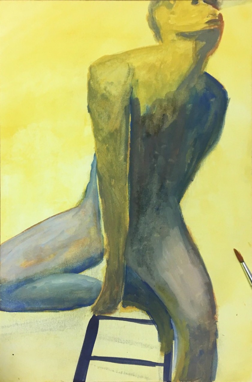
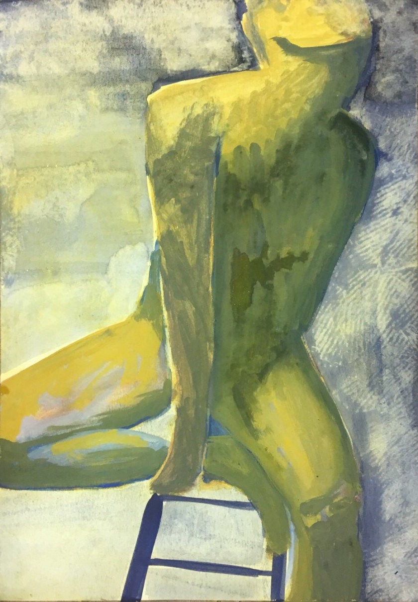
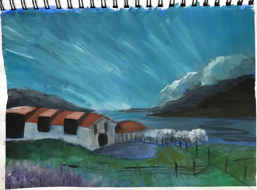
Attempt 2: Acrylic in sketchbook
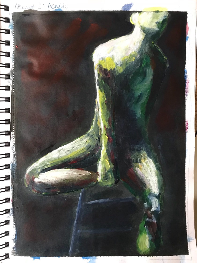
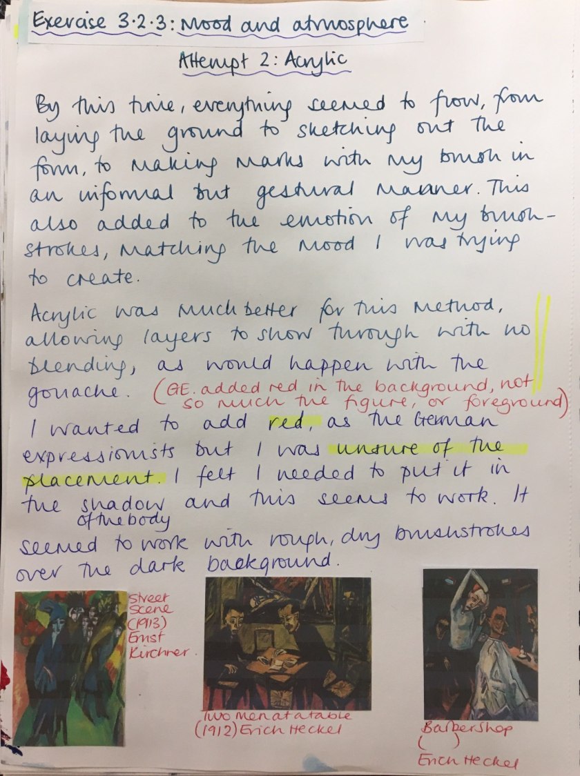
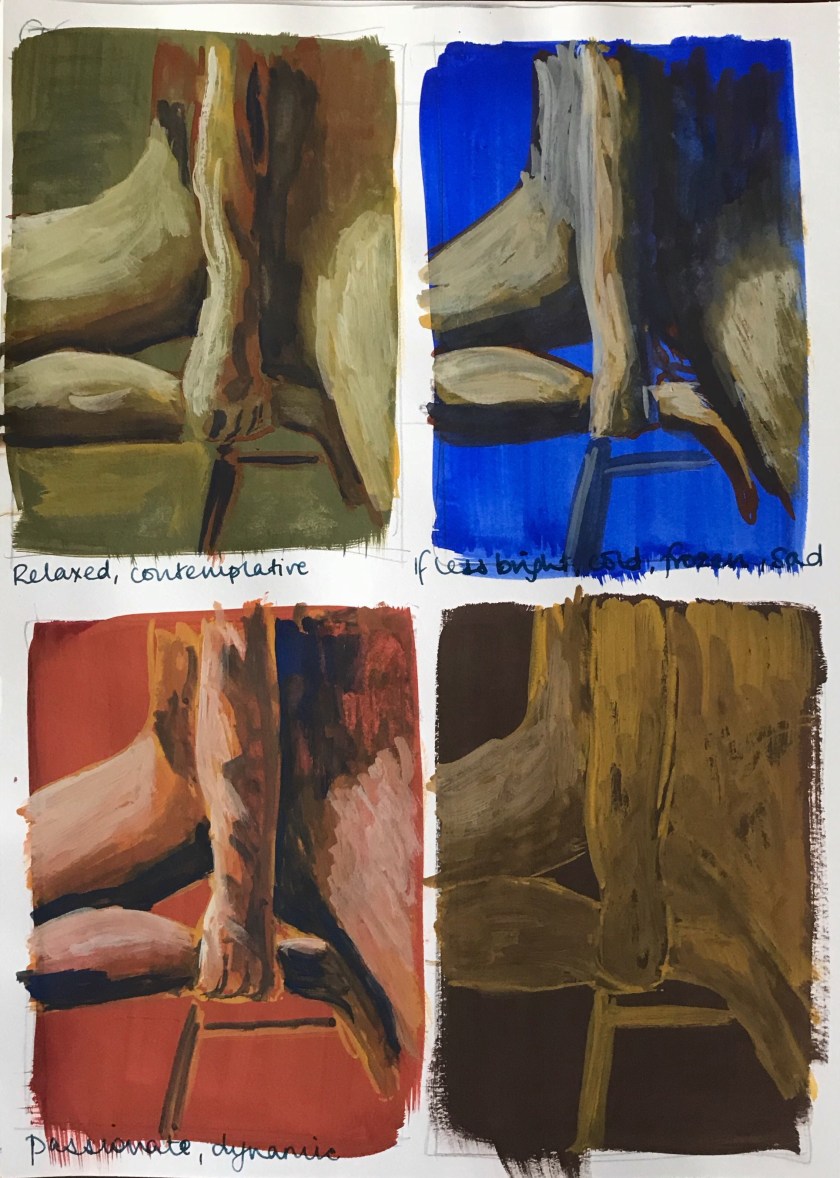
I really enjoyed the freedom of the mark making in the German Expressionist style. I understood how they sought to reflect inner feelings and emotional state through their colour choice and brushstrokes.
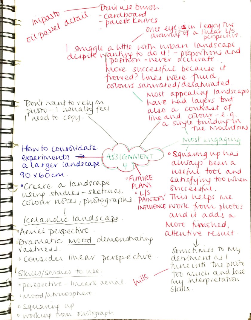
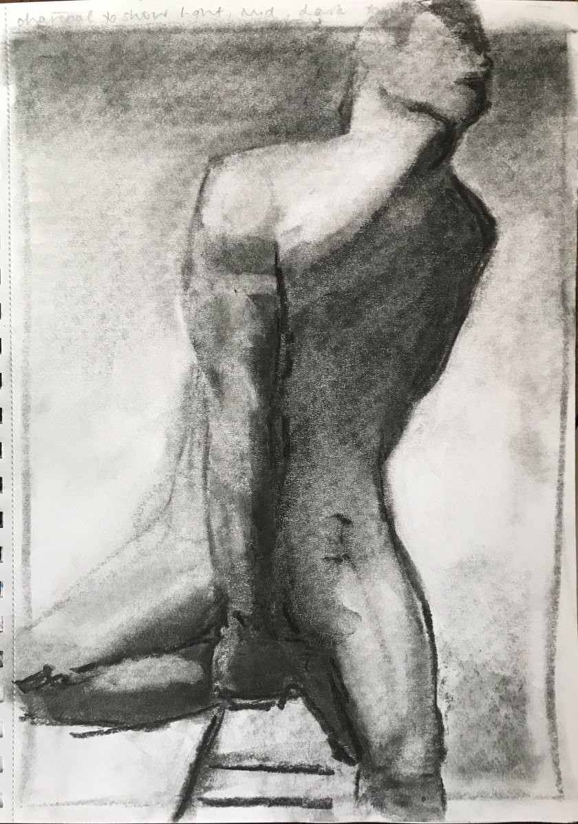
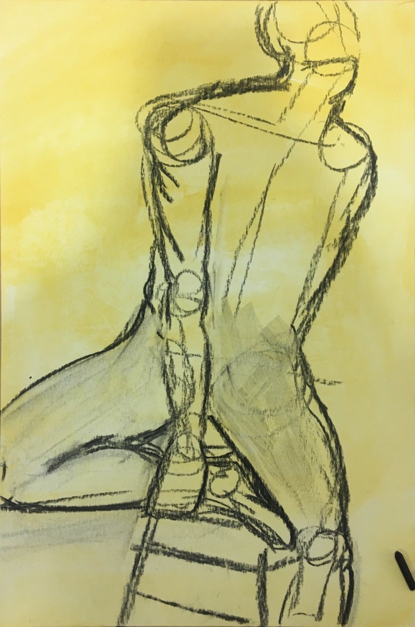
I want to know how to get that muscle definition I found using charcoal, without placing perfect brushstrokes.
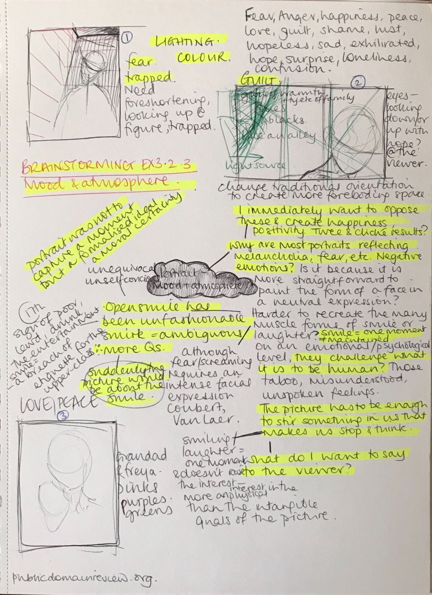
Idea 1 development


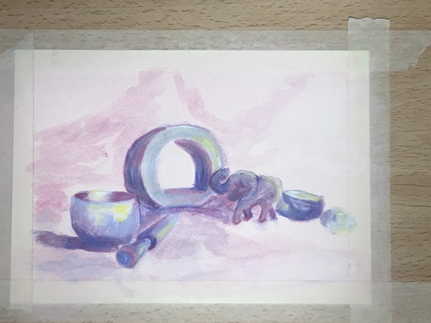
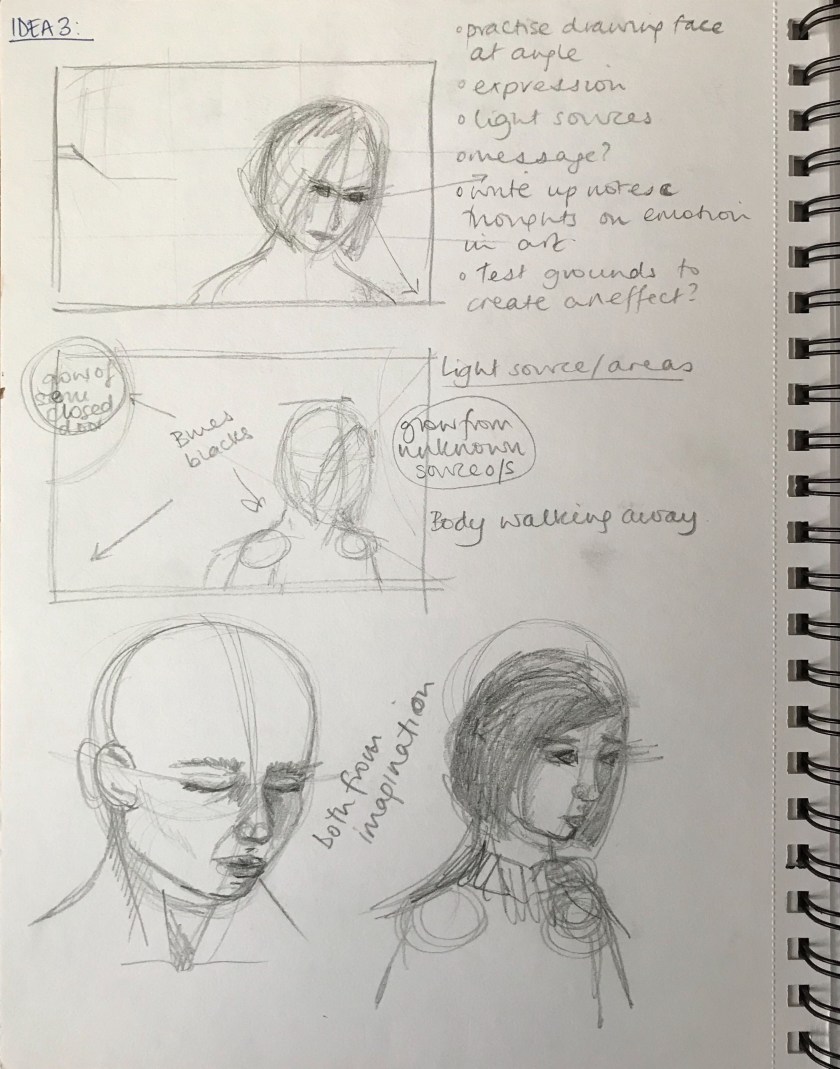
Idea 3 development


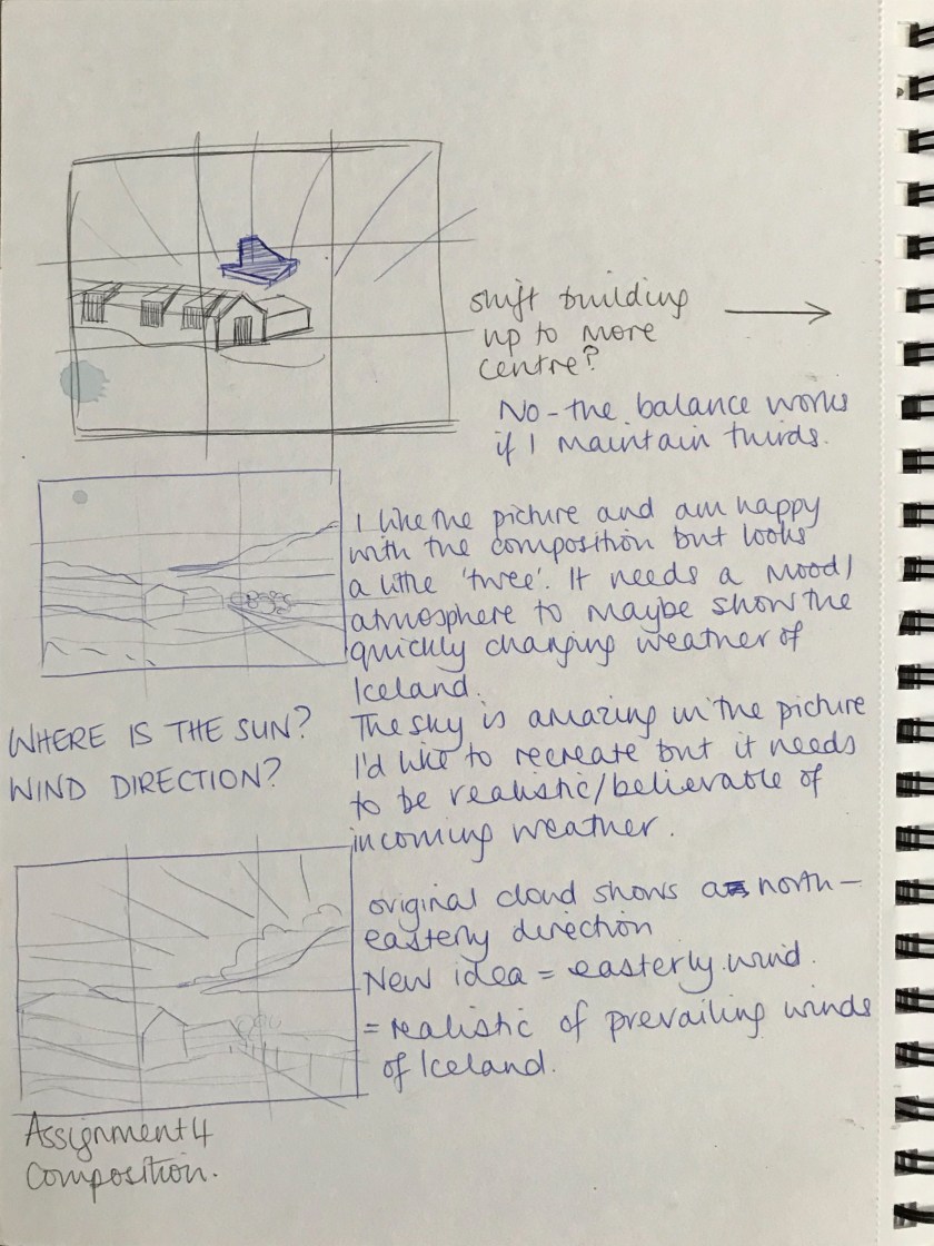
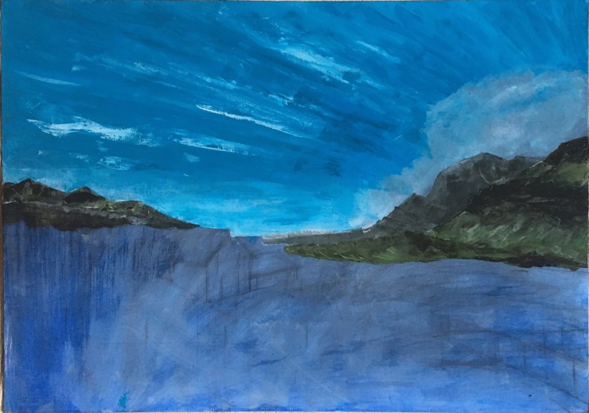
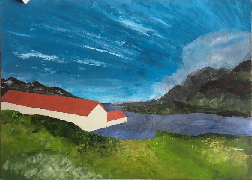
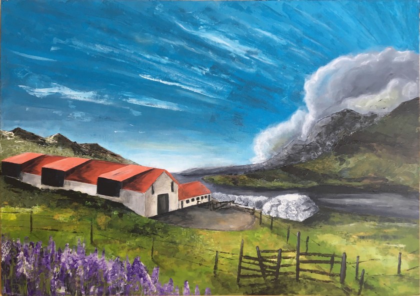
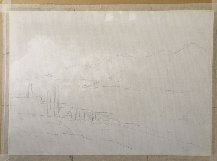
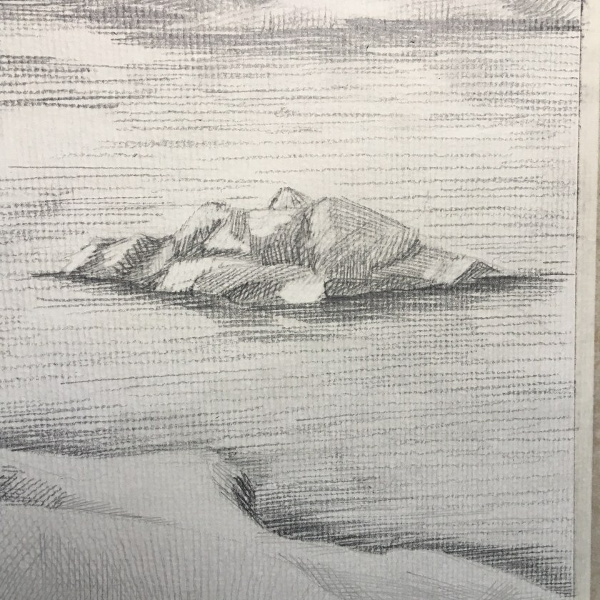
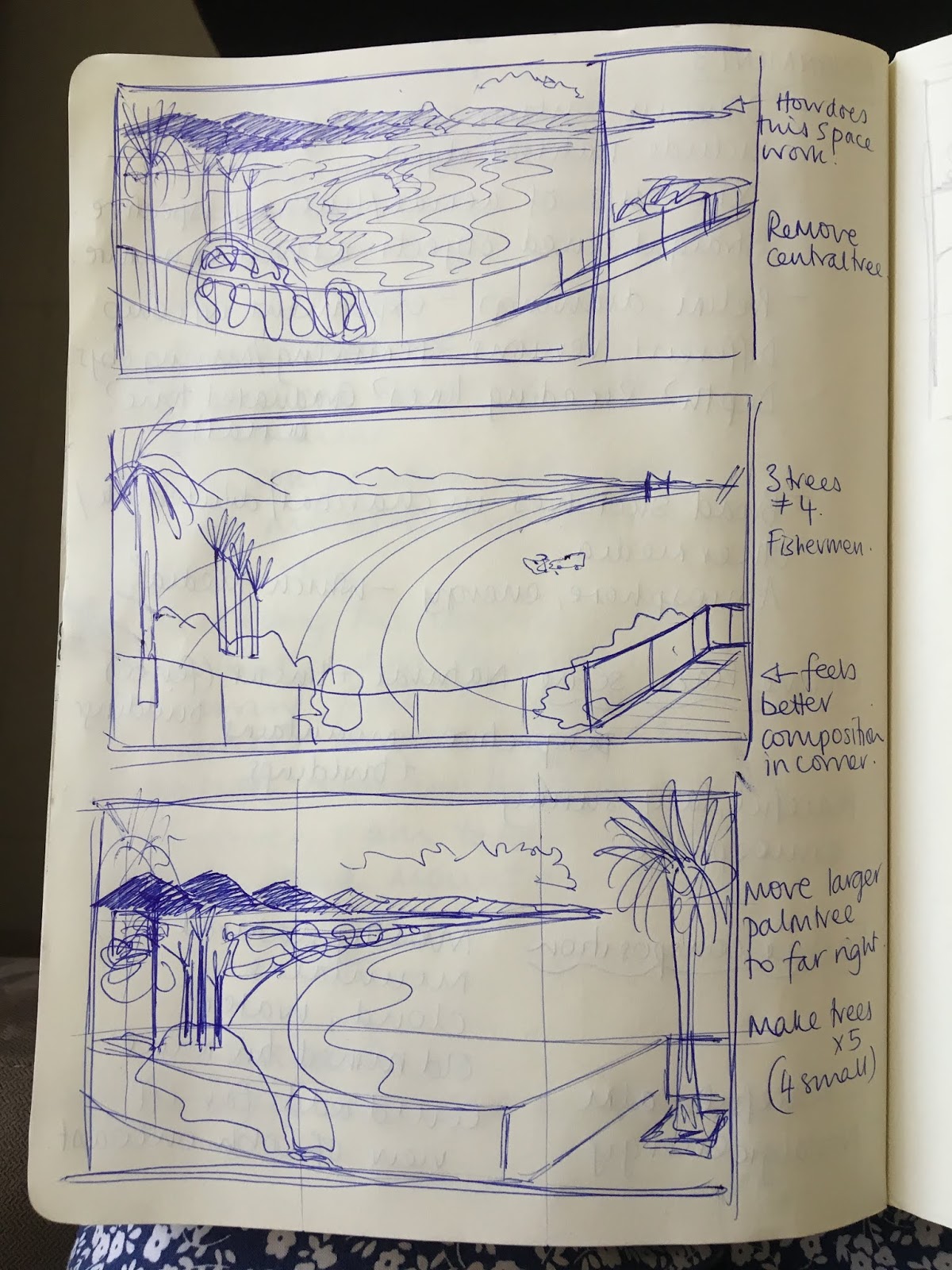
So at this stage I am happy with the composition, in that the eye should flow around from the window frame inwards and out to the mountains. I am however, struggling with the perspective of the window stones. This picture has evolved from a combination of imagination and reality and, although much of it will be referenced, some parts have had to develop from processing the view in my mind.

I sometimes experiment digitally to establish composition and colour plans. It seems to be a more time-efficient tool for planning.


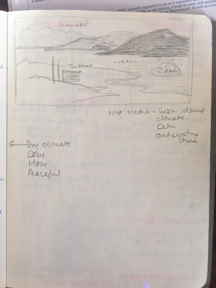
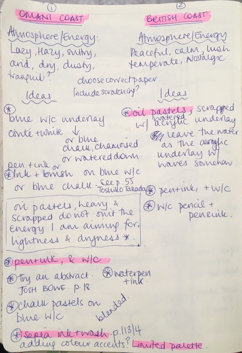
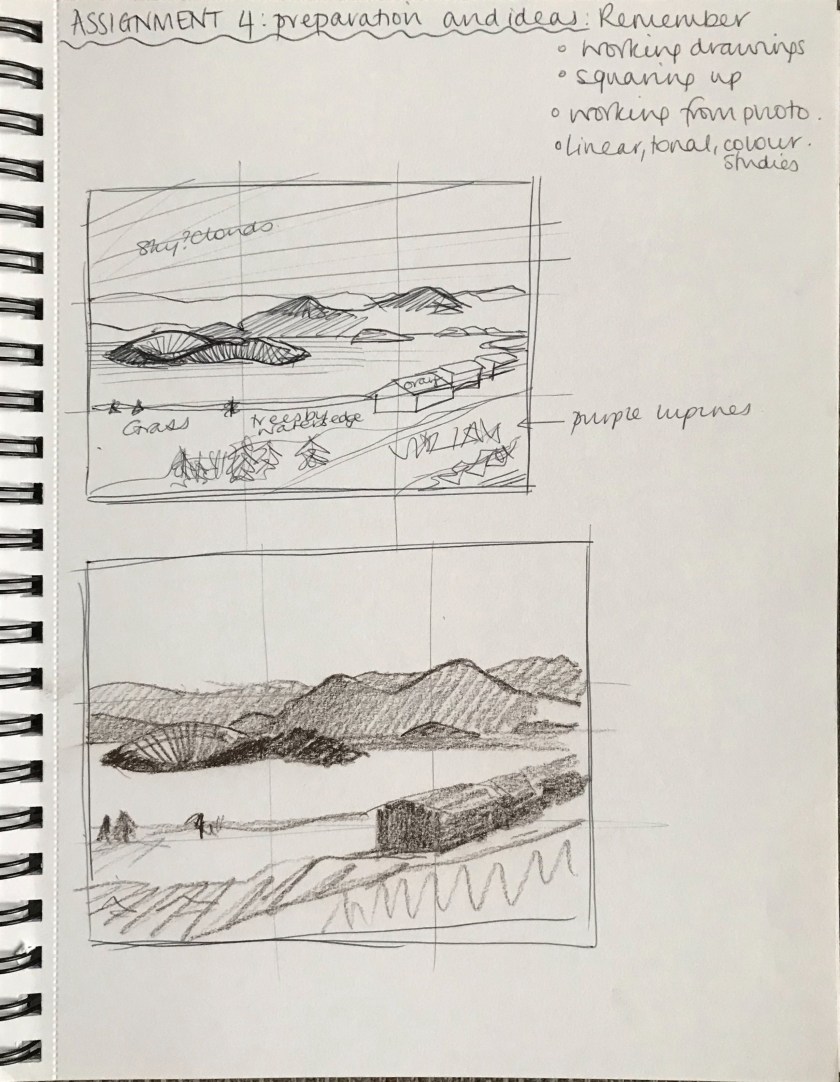
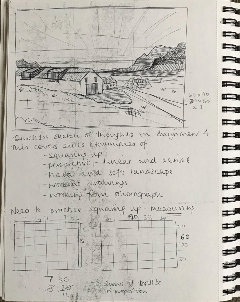
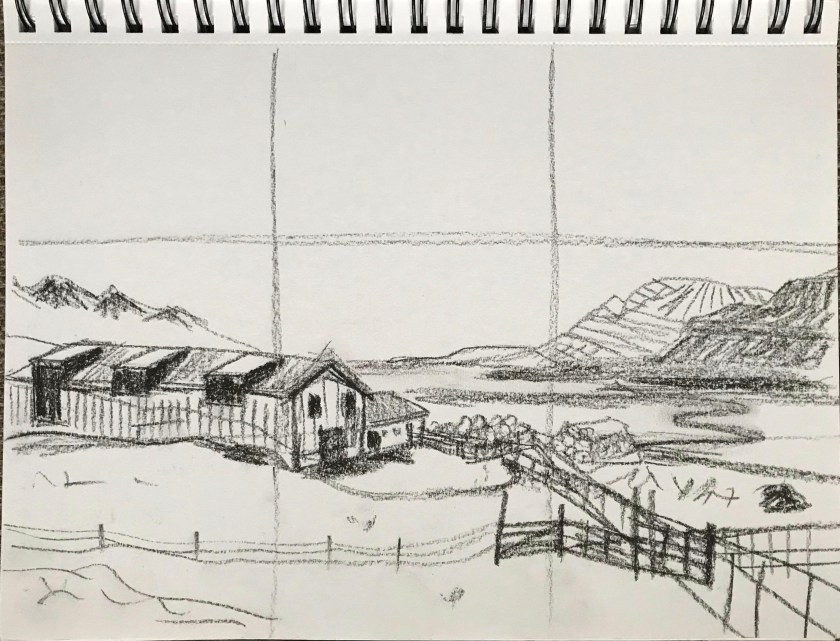
Words I would associate with this landscape would include peace, tranquil, lush, temperate; a calm energy. Originally I wanted to follow the lush and temperate feel by using thick, ‘full’ medium of oil pastels, texture could be scrapped into the oil pastel with a wash over the top.
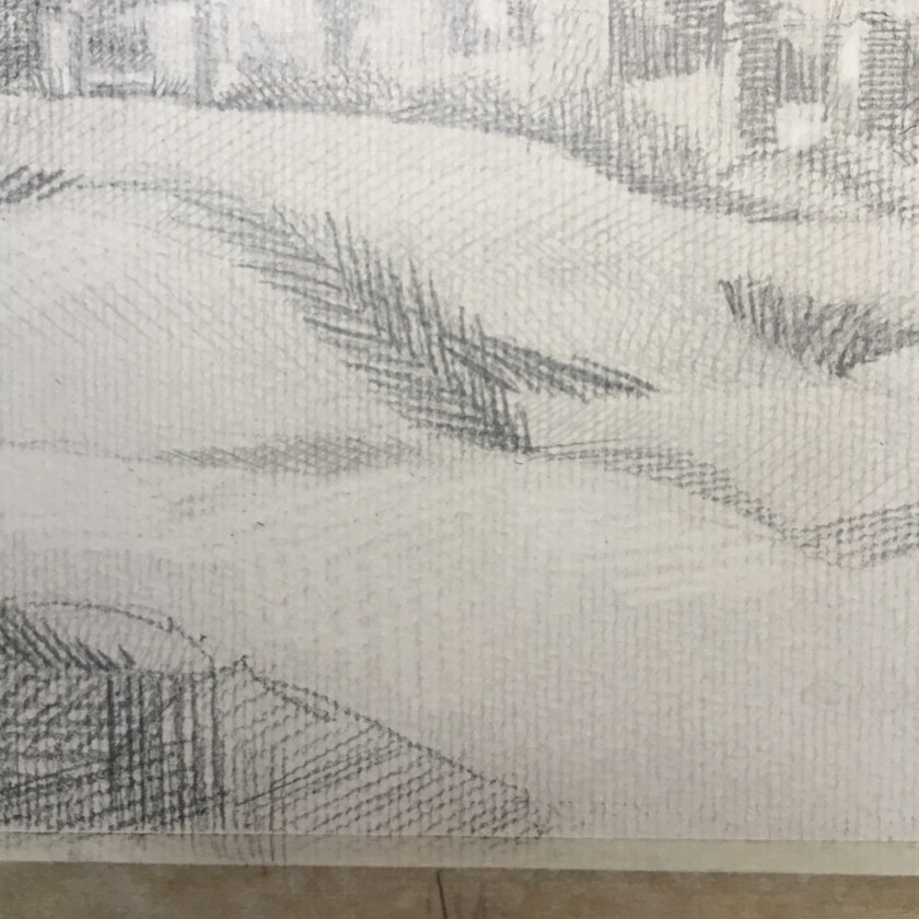
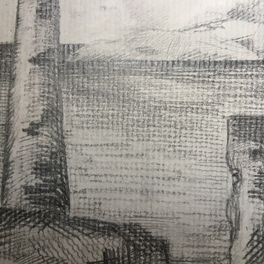
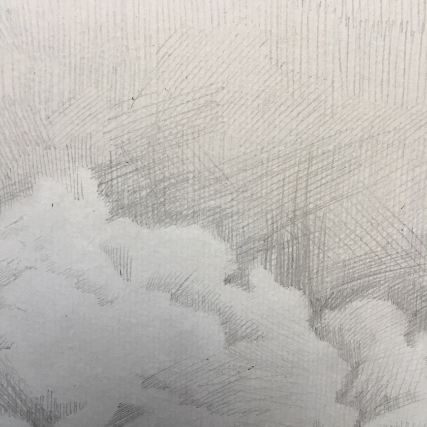
I had three ideas forming – oil pastels, textured, and wash; watercolour pencils and pen and ink; pen and ink and watercolour. I considered the oil pastels as they offered an unpredictability and a full thickness to match the lush feel of a temperate landscape. However, in the end I chose not to go this route after I lost myself in John Virtue’s tonal pencil drawings from the 1970s.
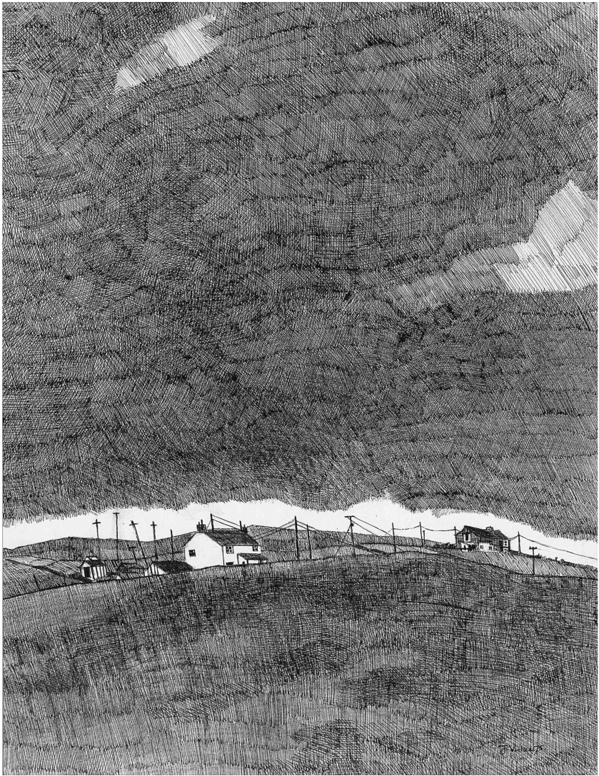
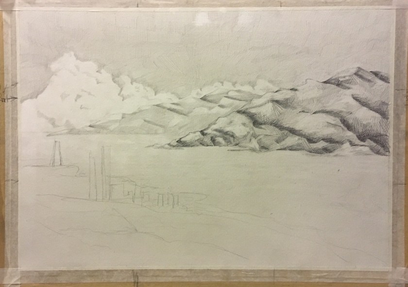
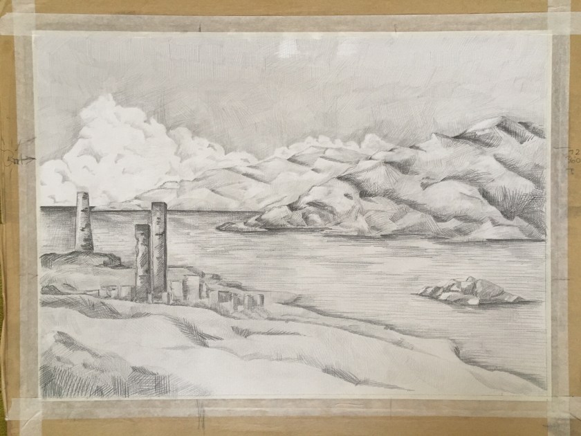
I know that one of the points in the assignment outline was to create preliminary drawings for this assignment. I worked on basic composition but wanted to get this piece out in its simplicity, with John Virtue in mind the whole time. Hence I knew I would work with pencil only. I might have added ink if there were any distinct, man-made lines, like the telegraph poles in Green Haworth from South. I did not want to risk overworking this piece and I am a lot happier this time round. Not satisfied entirely, I’d like to continue practicing building and layering the Virtue-style marks to create depth as well as tone but for now, I need to step away and move on.
My inspiration:
Below are photos from the process, plus the earlier composition ideas I had. I started with a black ink wash, with the cloud area tissued away. Ink does not seem to react to this as well as black watercolour may have done as I was looking for more of the delicate cloud edges to appear from the tissue. Nice enough though.
I’d like try this again with pen, ink and wash.


 |
| Original brainstorm for assignment |
 |
| Working on composition, thinking about relative sizes and balance |
 |
| Final layout and plan, thinking about materials to use and how to connect them |
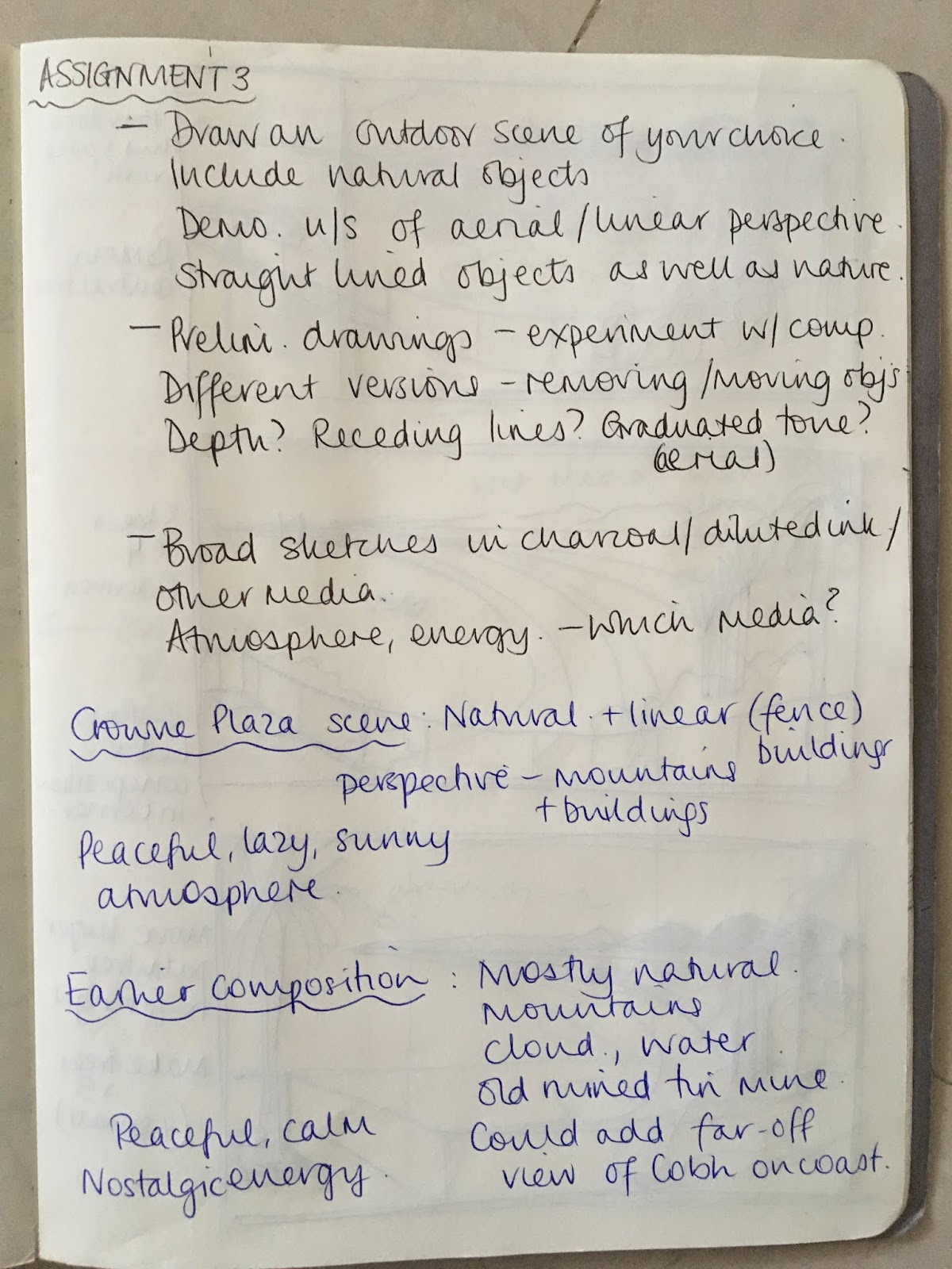
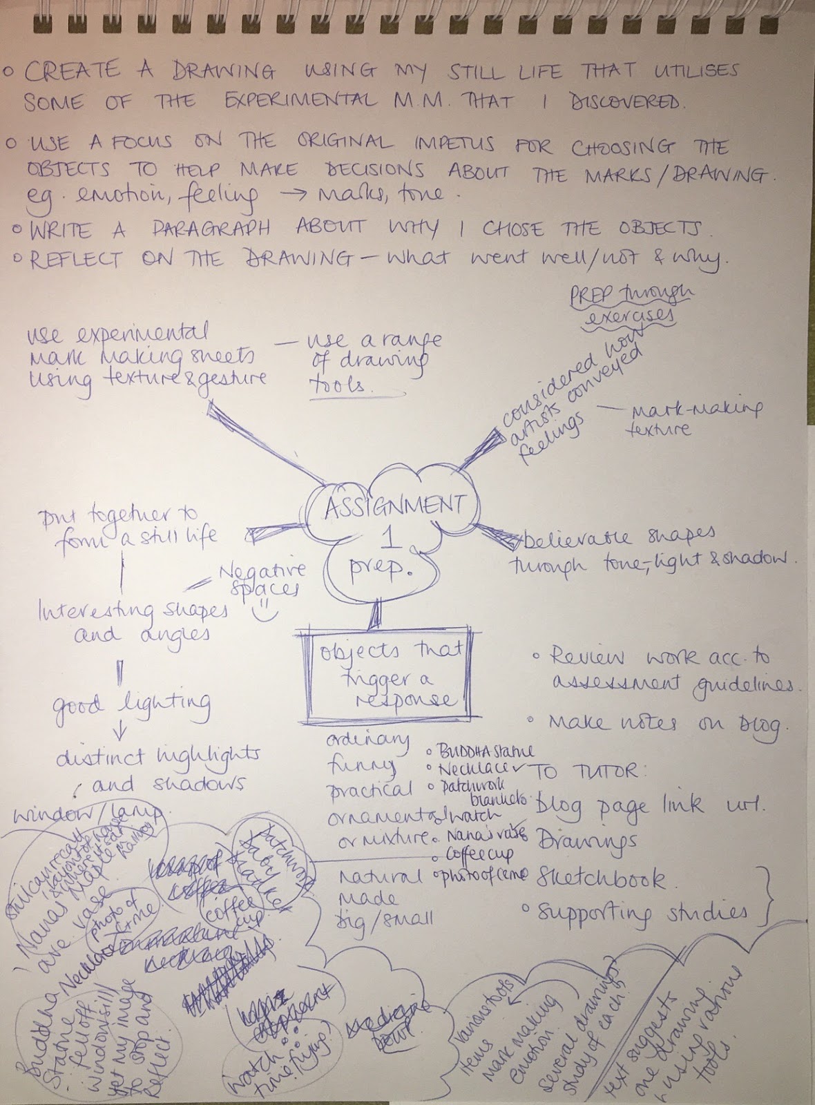
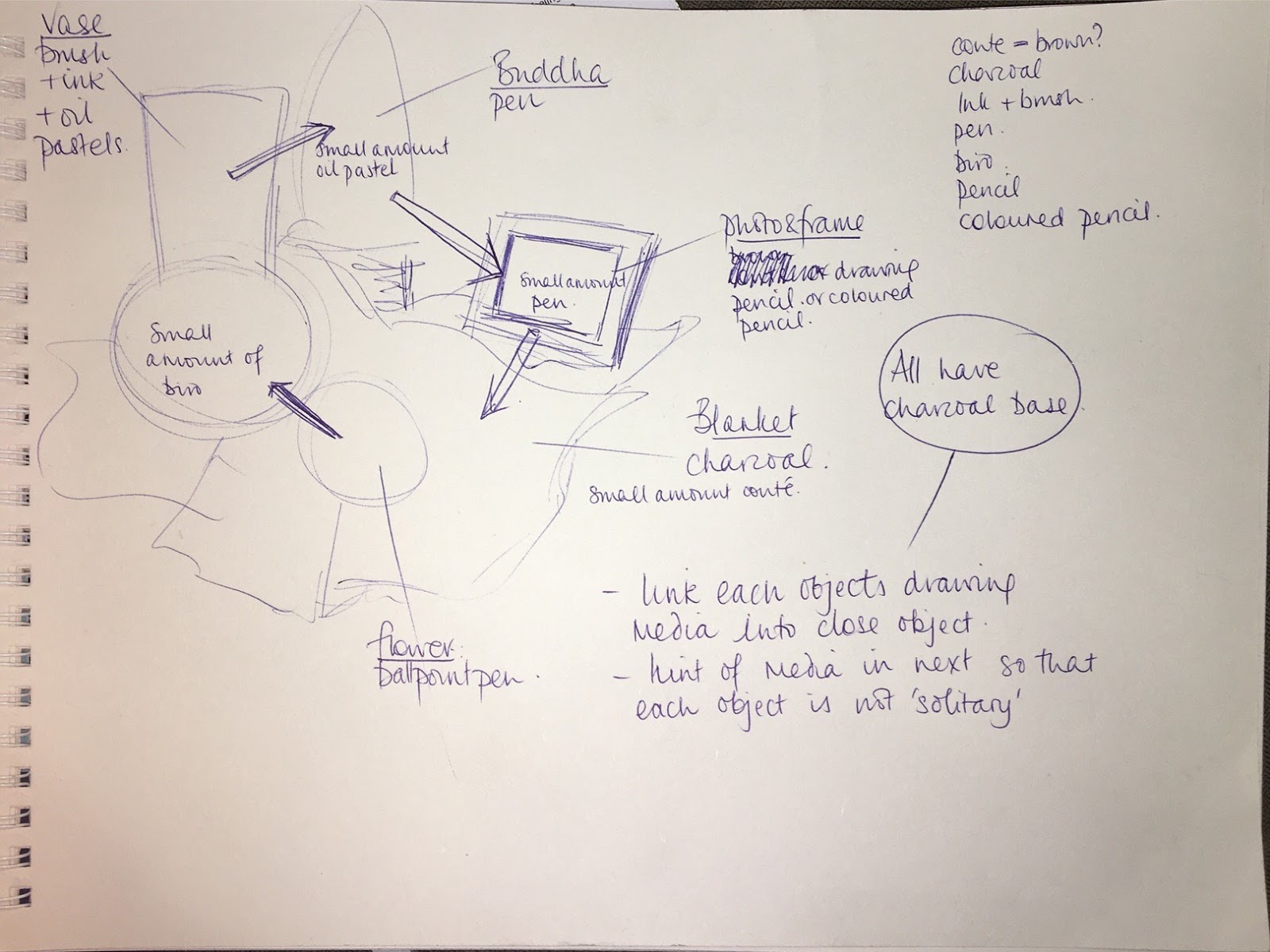
Through the various OCA Drawing 1 forums there was some discussion as to the intention and aims of the task. Using various media, create one drawing? Or, create drawings using various media? I originally felt that the first option would lead me to create a rather disjointed drawing, where each component is different to its neighbour. I thought my workflow and process would be stop-start and I would lose my momentum.
However, I thought I might work with this ‘obstacle’ in my assignment. So, yes, use a range of media but demonstrate connection between the objects, i.e. bring a hint of one medium in to another.
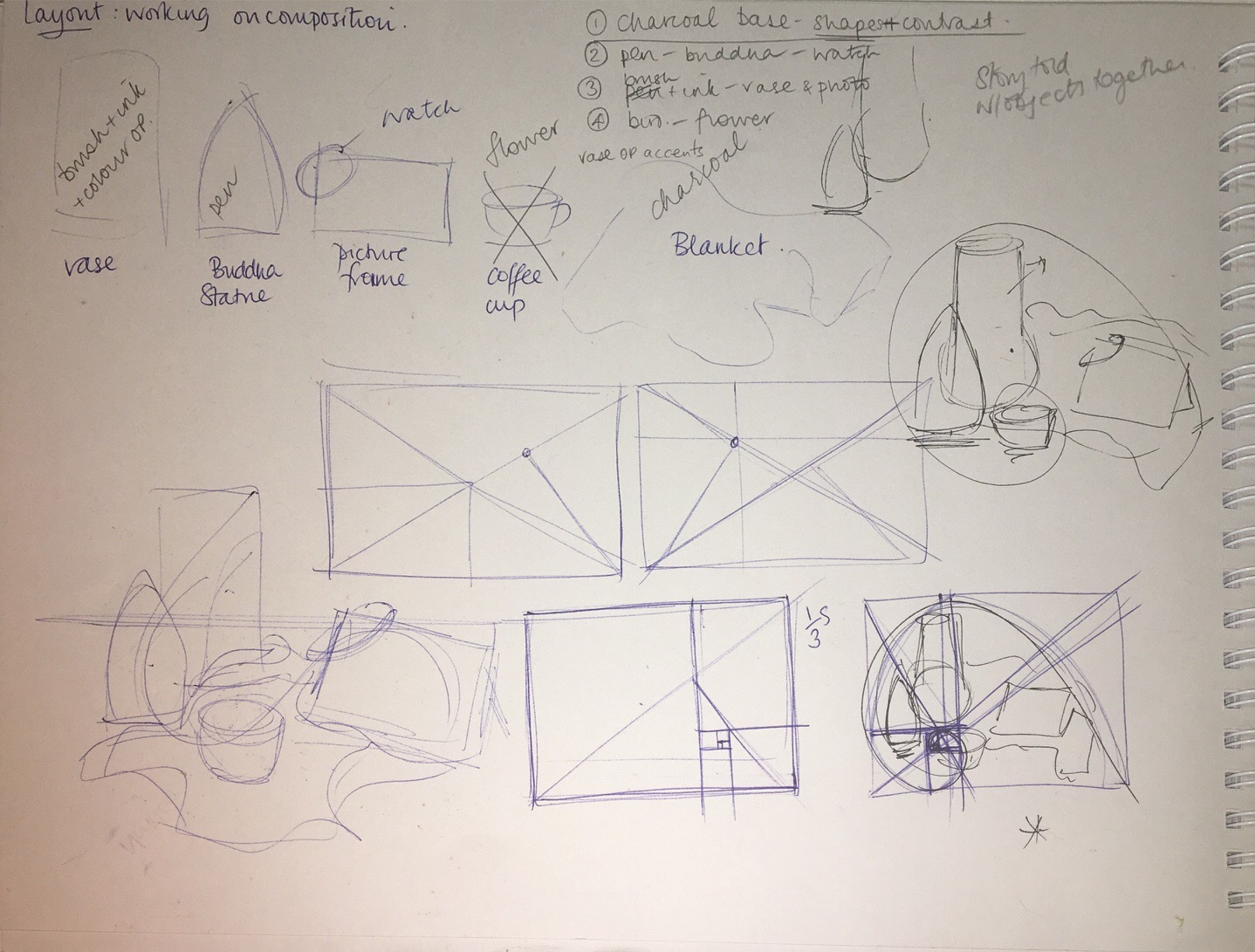
The media I have chosen for each object reflect the marks I want to make, I feel they matched the mood I would be trying to create in each part. For example, a drawing pen helps me make quick, hard lines for the Buddha statue (I have mixed feelings about this object which I will expand on in my final reflection!), brush and ink make soft, flowing, relaxed lines on the vase.


