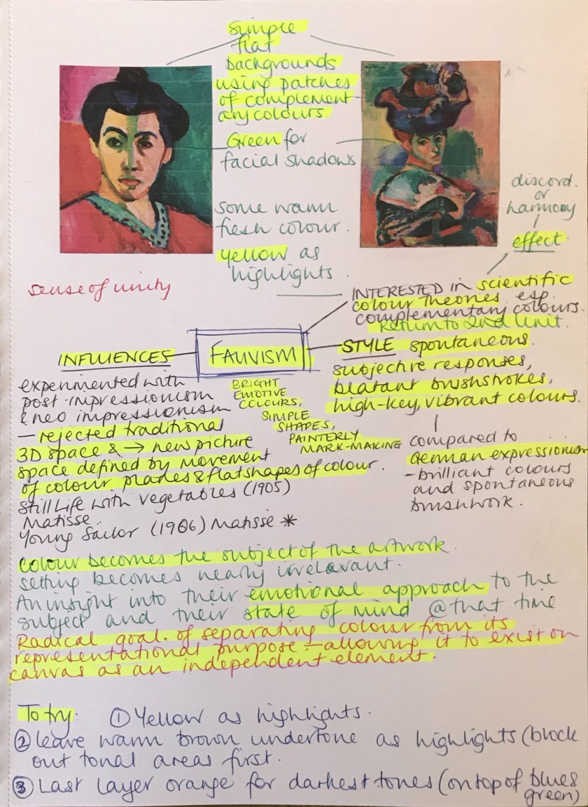
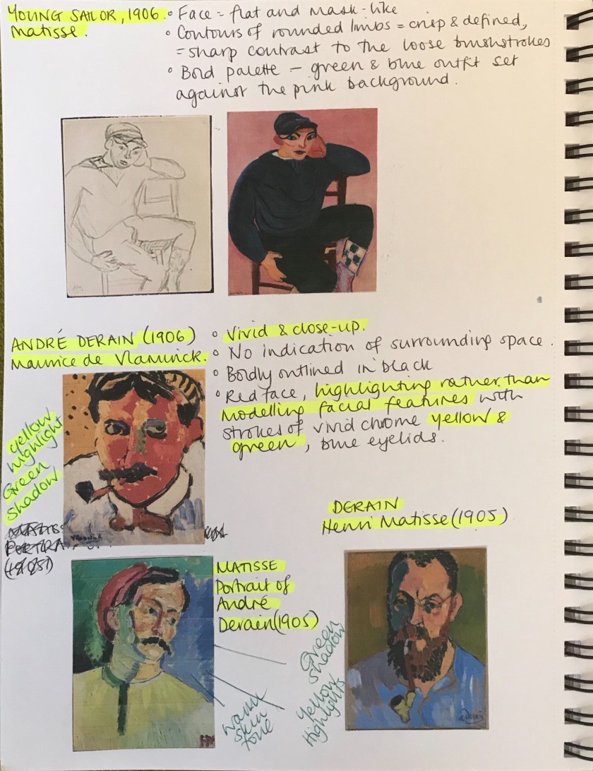
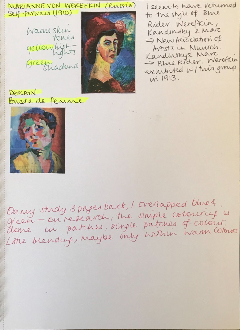
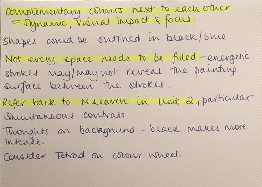
Through looking at portrait composition I was reminded of the Fauvist movement. I introduce this exaggerated, vibrant, spontaneous concept to my classes and I see them apply their colour wheel theory to their work. I love how something inherently theoretical can be seen by children’s eyes as free and expressive; no other conditioning is needed.
Link to Practise of Painting Unit 2 colour theory research.
With this in mind, I felt I needed to approach my style again in a new light and fresh eyes; the mind of a child. How liberating….
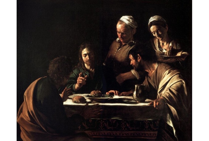
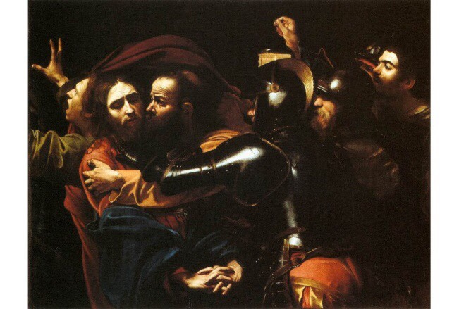
Supper at Emmaus (1606) by Caravaggio. Image via art history project.comThe Taking of Christ by Caravaggio (1602). Image via Wikipedia.org
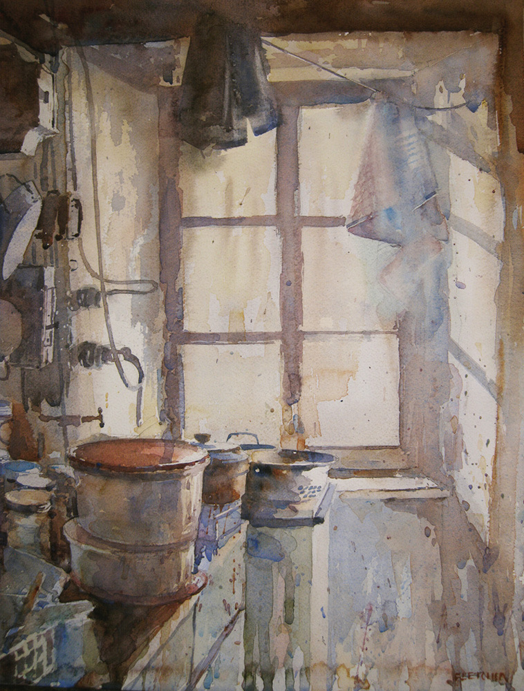
Chiaroscuro’s Place in the Contemporary World of Art and Artists
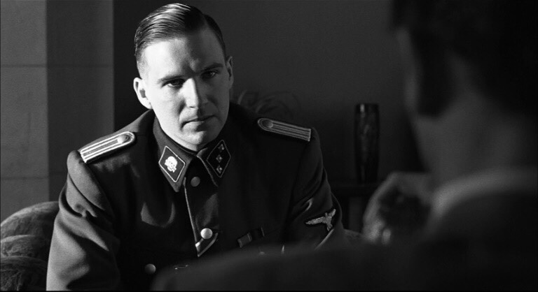
Today, the term chiaroscuro is frequently applied to a wide array of dramatic lighting effects and it is used as a technical word linked to many mediums and kinds of art[3]. It is related to literally any form of expression that possesses something dark and moody with strong slashes of shadow[4] that emphasize the dramatic effect. Interestingly, the traditional power of the chiaroscuro pictures and the tense action within their frames had a massive influence on cinematography as the genres such as Film Noir heavily based their visuals on it. Many filmmakers have stated that this technique shaped the final looks of their movies – for example, Martin Scorsese actually referenced Caravaggio as one of his biggest inspirations behind many of his films.
Ralph Fuentes in Schindler’s List (1993). Image via sleeplessthought.com
Jesse Lane
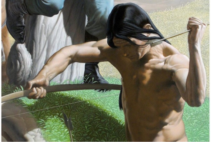
Staying true to Caravaggio’s original roots of realistic depictions, Jesse Lane is an American painter who combines the concepts of Hyperrealism and chiaroscuro. His paintings aim to channel the emotional impact and capture intimate moments wrapped into a single instant presented to the audience. Lane’s pieces are rather open-ended, as the artist himself explained on many occasions, and his goal is to make the viewers create the narrative on their own. When observed from a technical standpoint, it’s hard to find a more talented painter than Jesse Lane both in regards to Hyperrealism and chiaroscuro.
Echoes by Jesse Lane, 2016. Image via Jesselaneart.com
Nicola Verlato
With his specialty being found in the fusion of popular imagery and traditional painting techniques, it’s no wonder that Nicola Verlato‘s amazing painterly world enjoys such a high level of respect within the art community. This Italian artist is primarily known for his highly refined allegorical surrealism that features spectacular light effects, twisting nude figures and dense compositions, all underlined by a commanding application of chiaroscuro. Wonderful and bizarre, his compositions are a true delight to analyze.
Nicola Verlato – The Settler, 2015 – Image via nicolaverlato.com
Chiaroscuro in Contemporary Photography
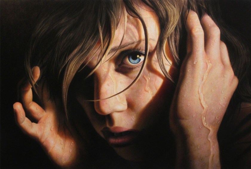
When used as a photography technique, the chiaroscuro style is often referred to as clair obscur or extreme low key. Just as the case is with movies, it’s rather interesting to investigate how this shading method traditionally associated with painting has evolved in order to become a viable option for modern artists. As far as the realm of photography is concerned, chiaroscuro kept its strong and bold contrasts between light and dark areas. Of course, the dramatical effects such photos are able to channel is often the reason why photographers opt to use this method of picture-making.[5] The chiaroscuro style of photography is often well-suited for portraits[6], still life compositions and boudoir. The pioneering attempts to translate this technique into the vocabulary of camera images can be traced to the early developments of black and white imagery – for instance, Alfred Stieglitz was one of the oldest practitioners to successfully use a form of chiaroscuro in his work.
Stepan Mazurov – Your Move – Image via thephotoargus.com
Tim Cantor
Charade by Tim Cantor. Image via Timcantor.comTemptation of Difference by Tim Cantor. Image via KOjewel.com
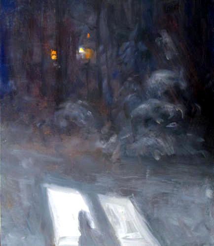
The landscape is a readily available subject for artists. It is fascinating how we experience one particular landscape at one particular time in our own particular way.
I am interested in the effect of time on the interpretation of a landscape. Artists often return to the same scene each season or even a few hours later. Even minutes can see a change in light, tone or subject.
I originally left the research point until later on as I was behind in my work for Assignment 2. Now I am preparing for the assignment I have revisited this section for further inspiration.
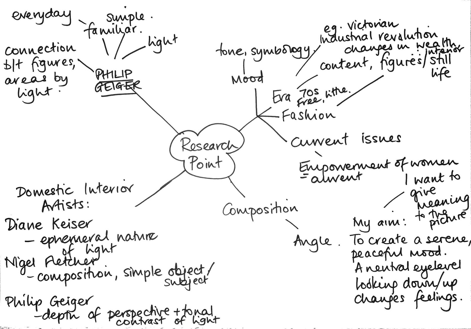
My thoughts and research so far (I am still adding to this brainstorm):
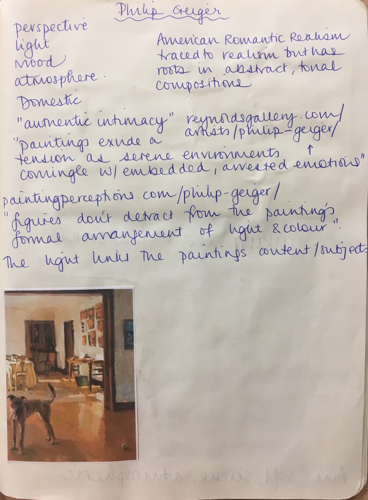
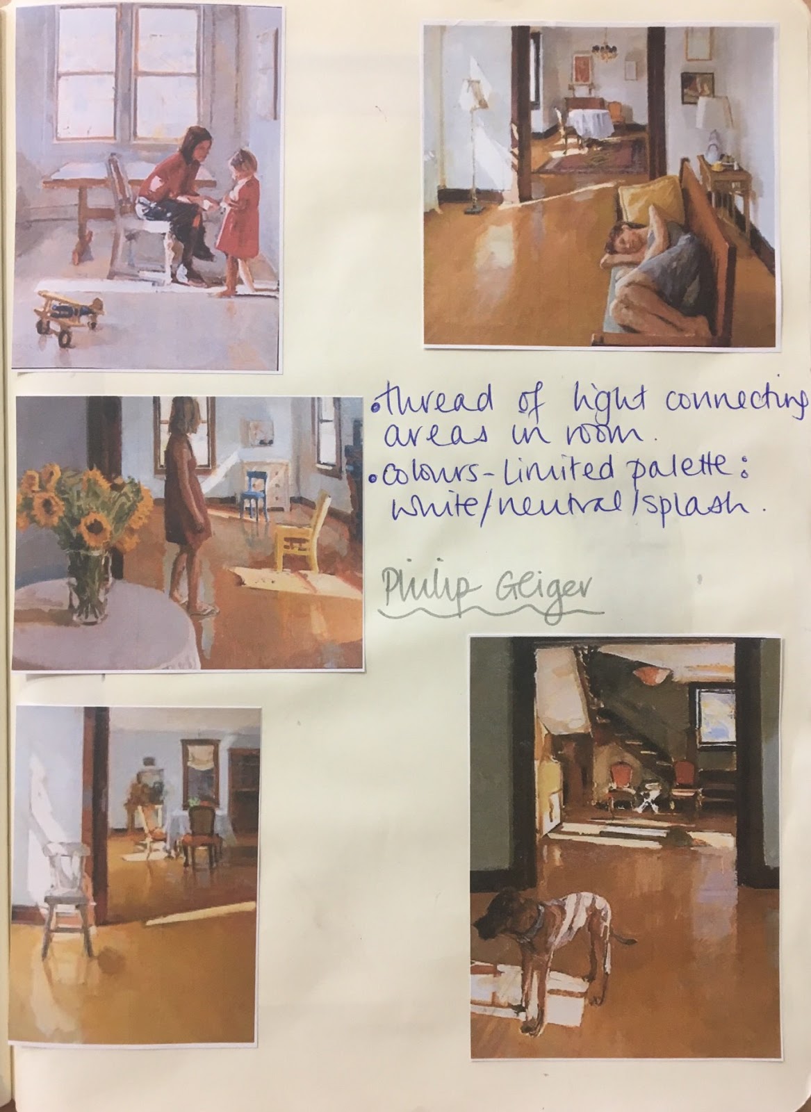
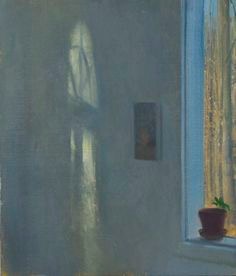
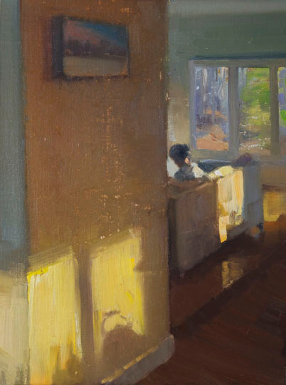
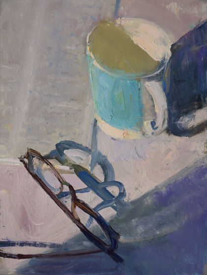
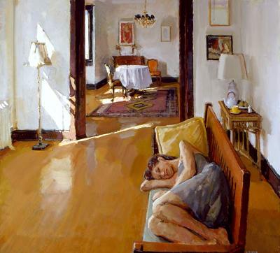
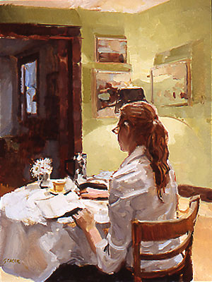
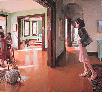
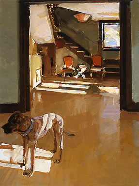
Philip Geiger is my chosen artist. An instant love of his content and work.
The overriding theme is simplicity. It feels familiar in its snapshot of life. Light is a theme in all of his pictures, with a stream of light connecting the people or areas of the rooms. He is an American Romantic Realist whose work can be traced to realism. He has roots in abstract, tonal compositions.
I enjoy how Geiger does not necessarily focus on the detail of the subject and the environment. He is offering a moment in time glimpsed through the placing of light and tone.
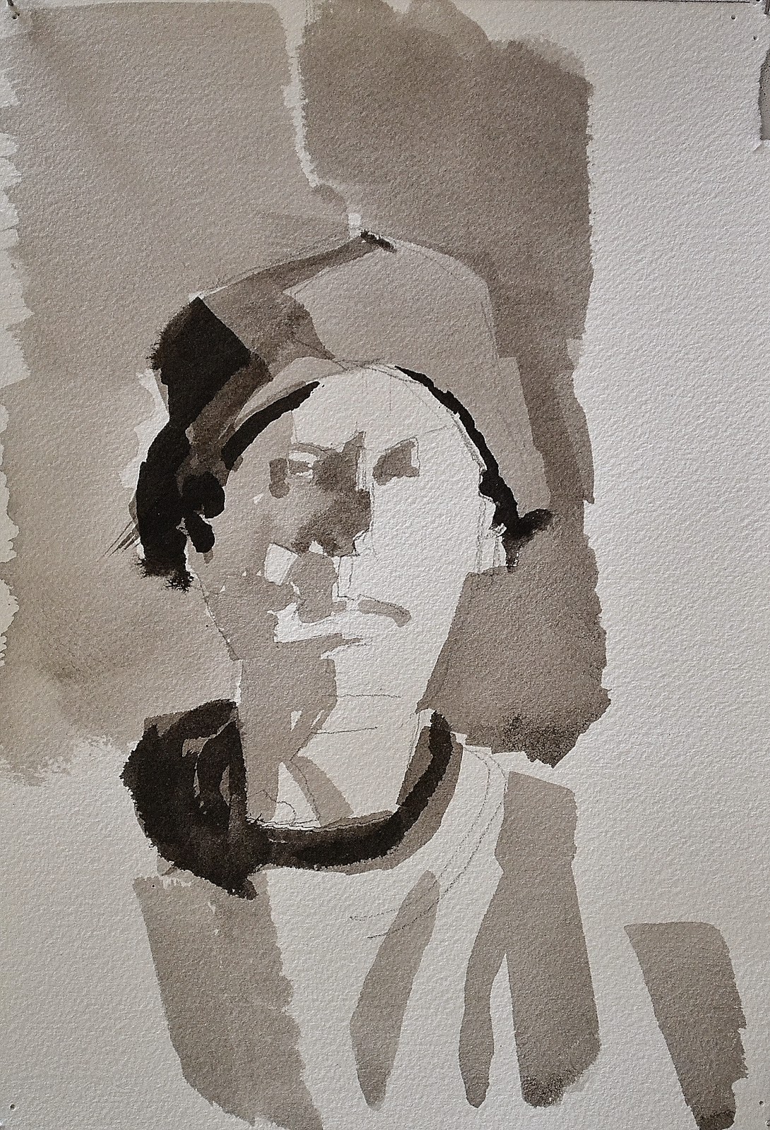
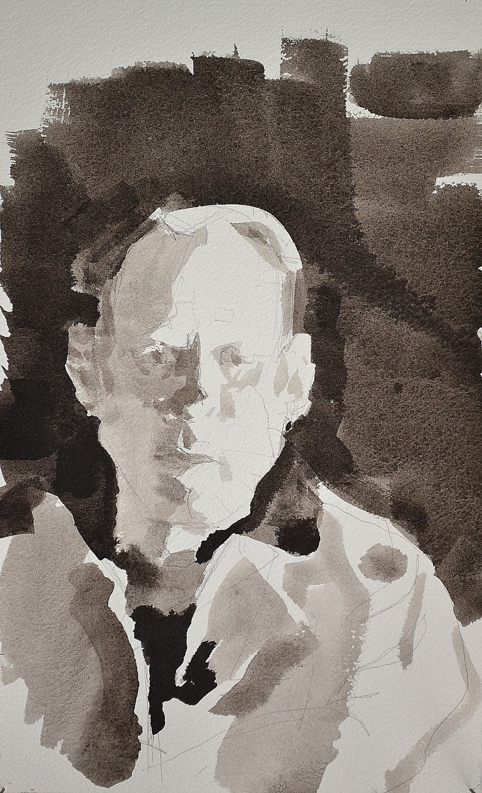
I felt inspired at this point in combining his blocked tonal ink studies with his interior domestic everyday.