Assignment 2 and reflection

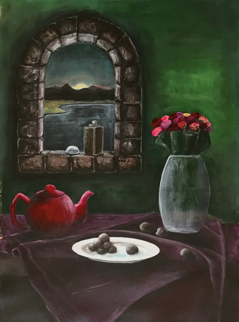
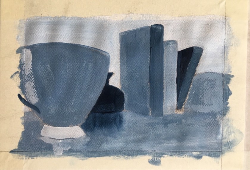
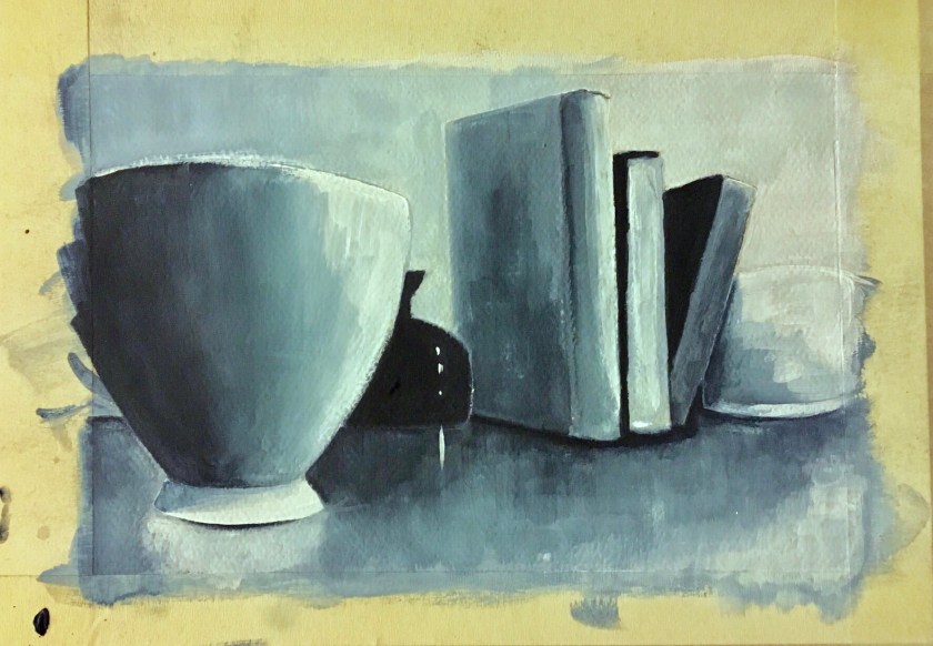
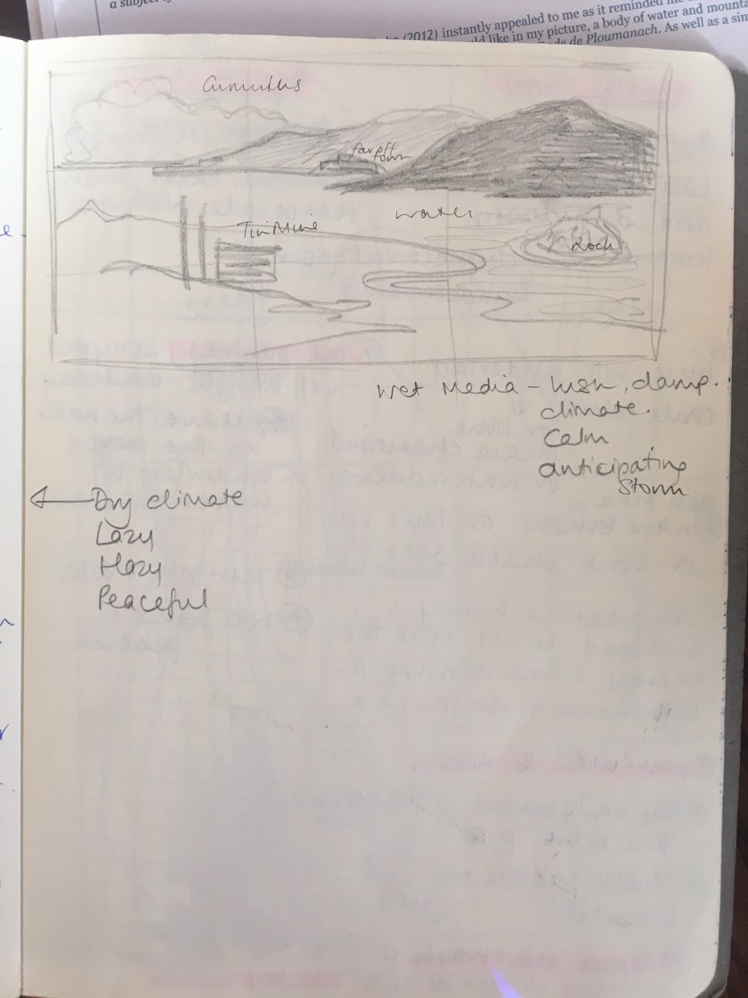
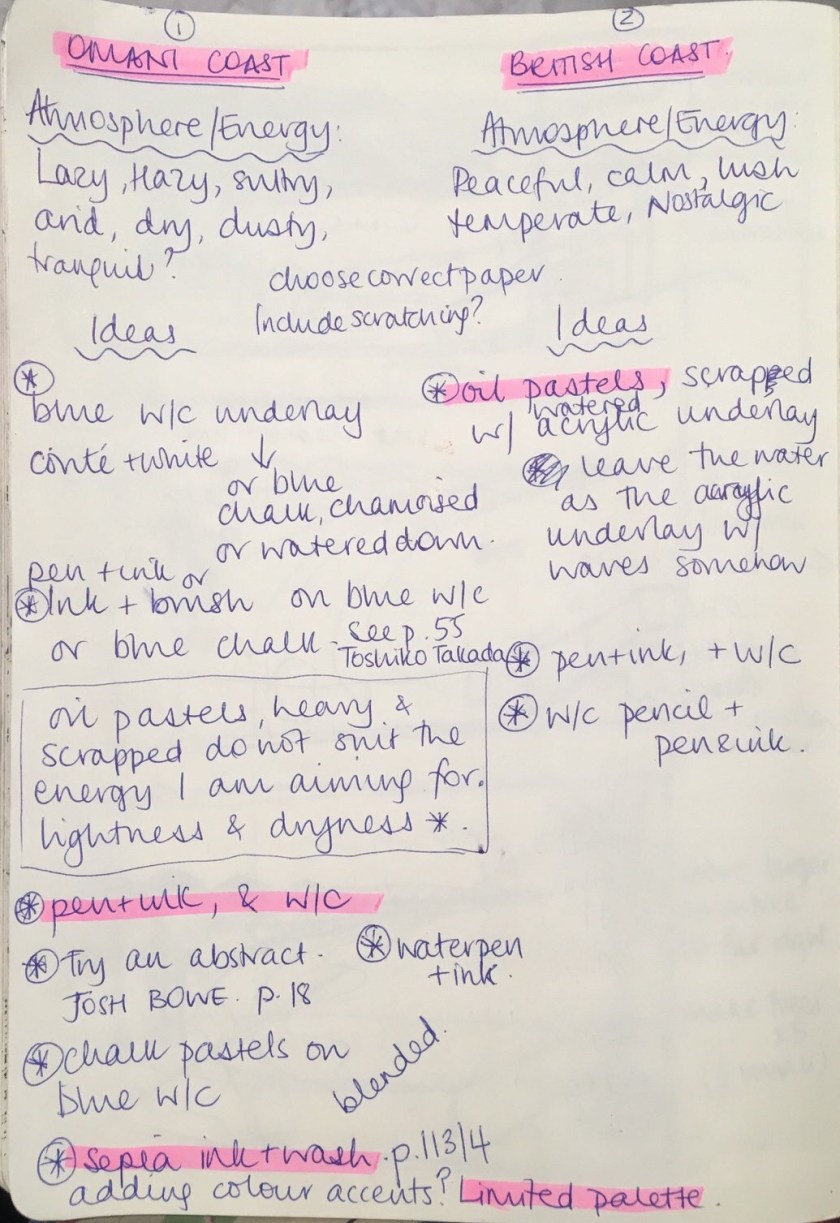
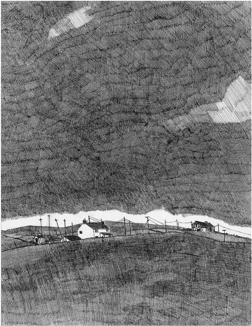
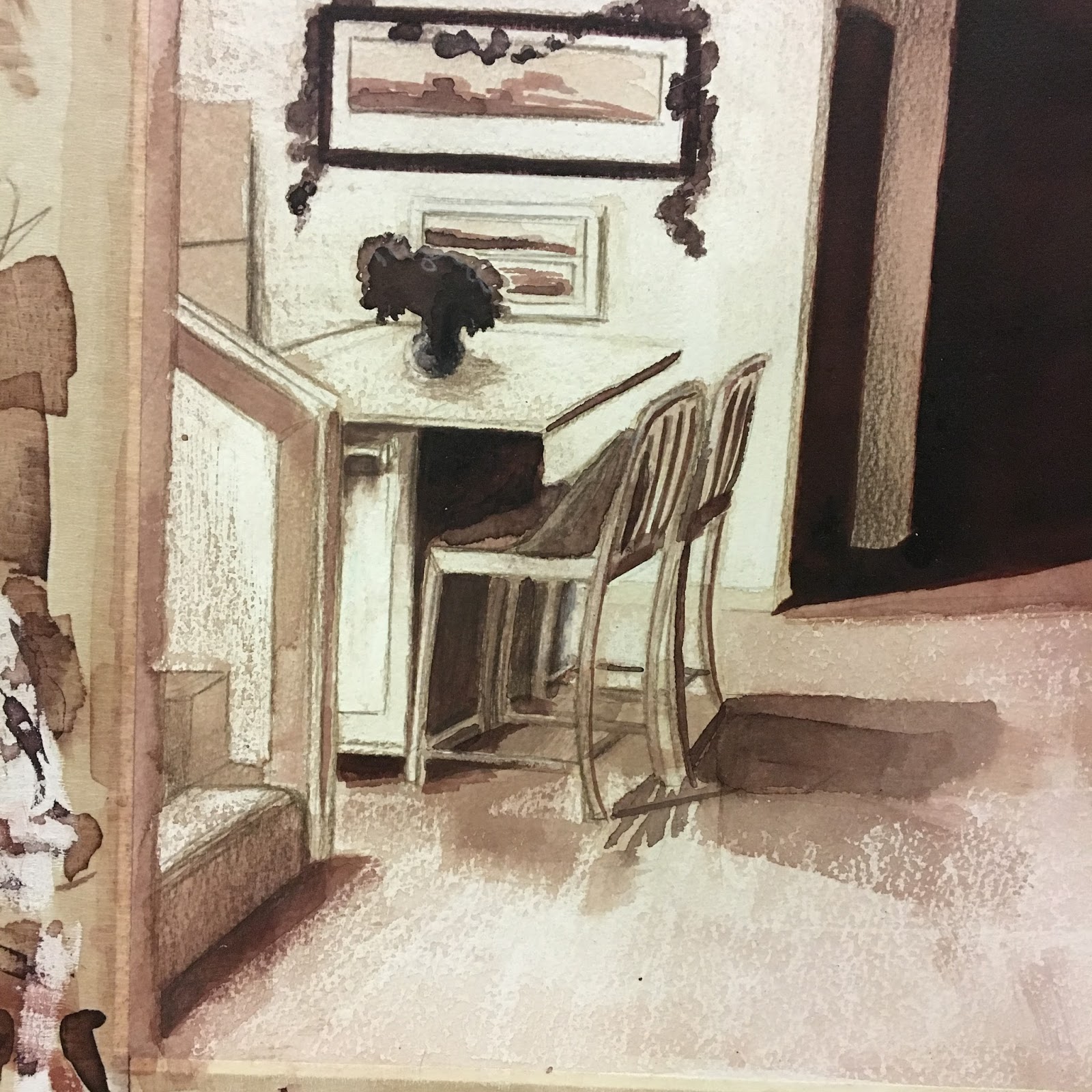
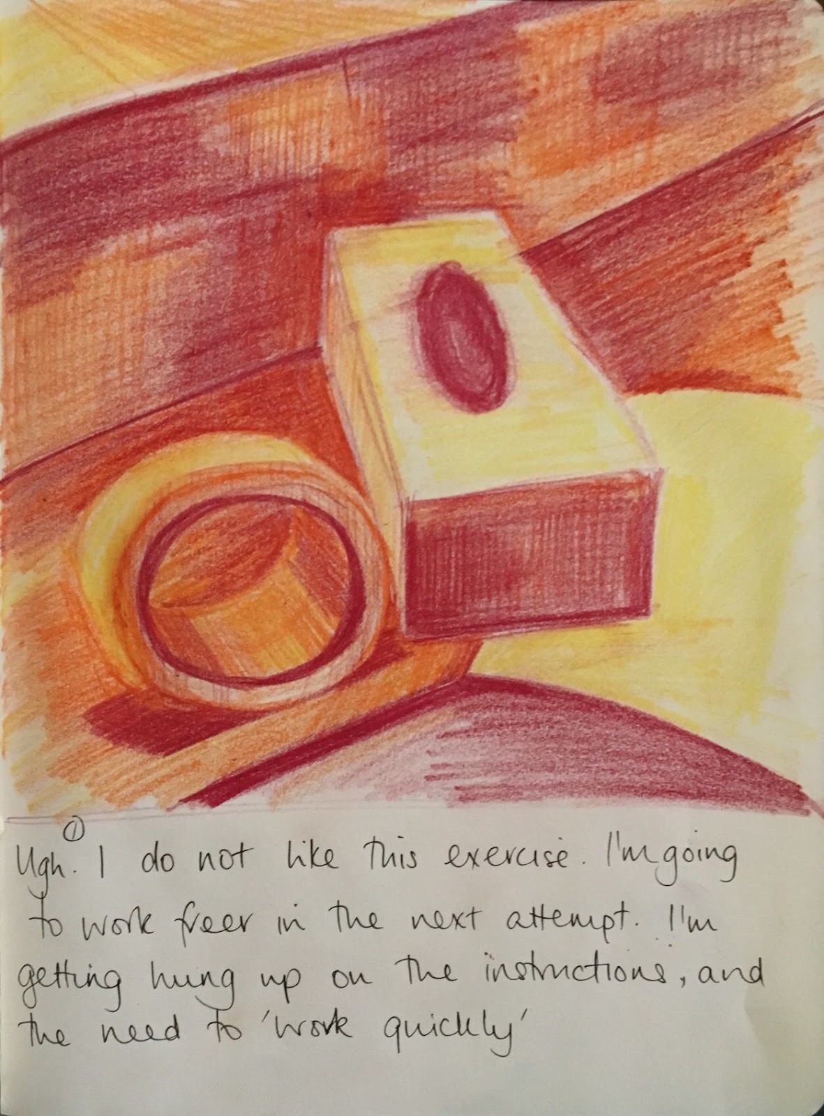
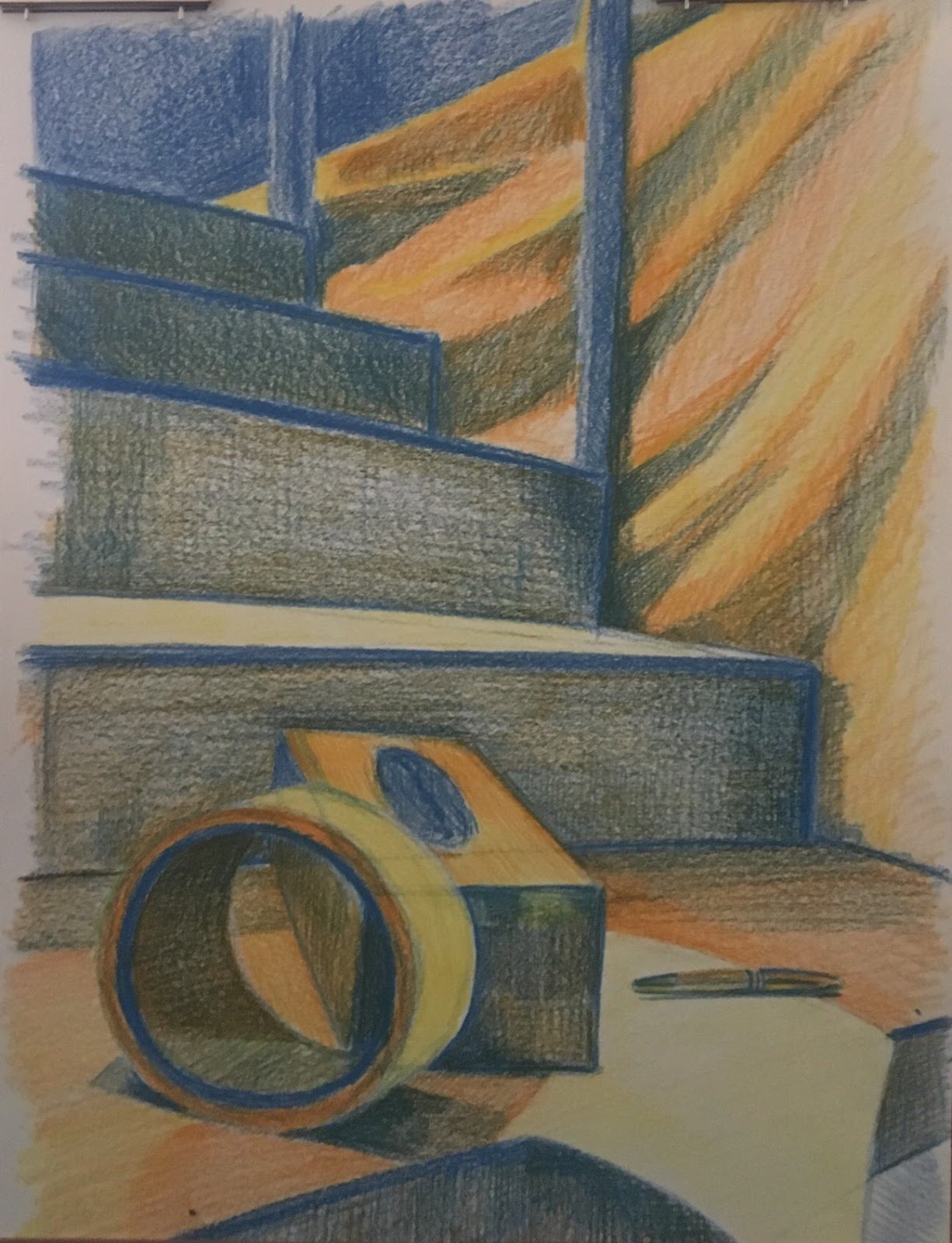
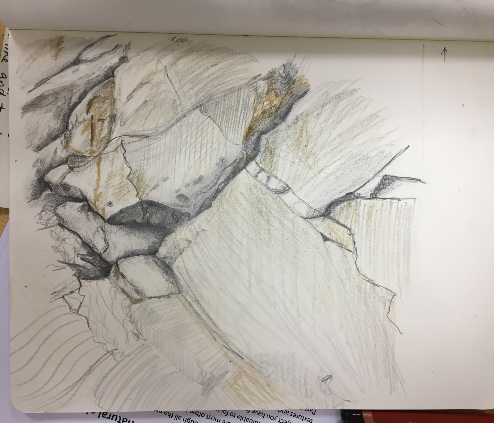
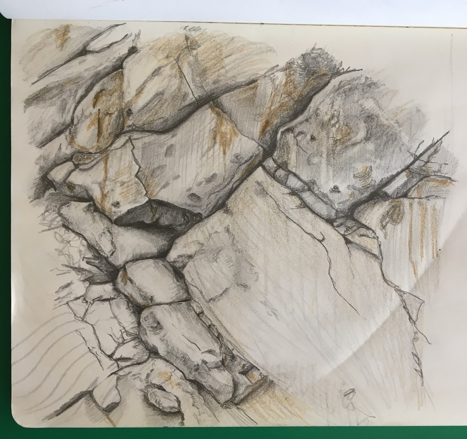
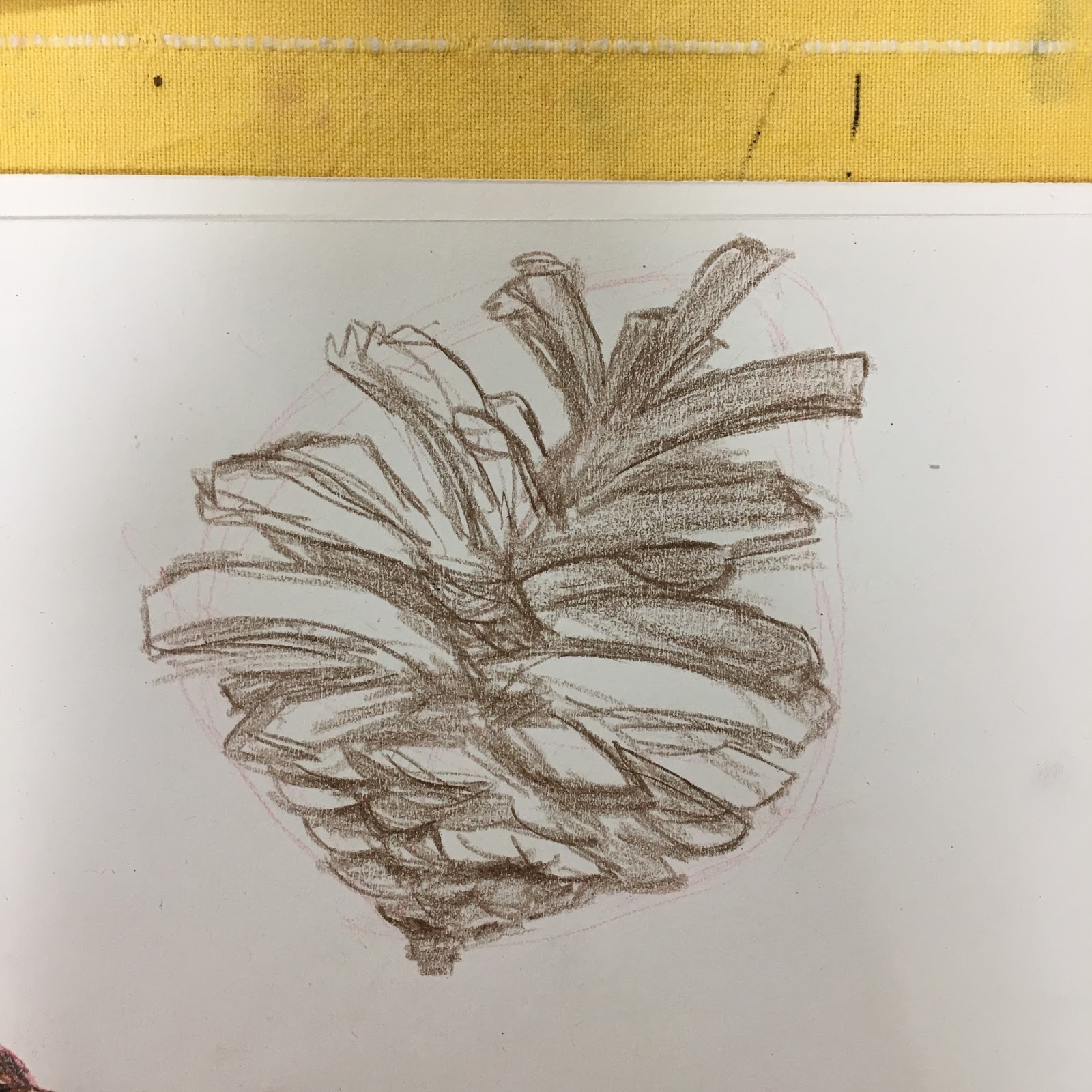
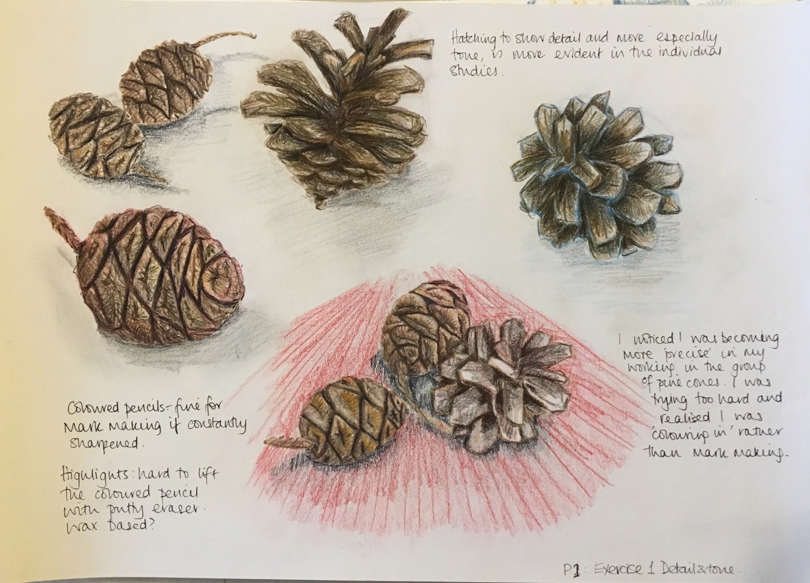
This still life was inspired by the incredible skills and arrangements of the Dutch Golden Age painters. I have been in awe of their richness and detail and am already a little concerned that the perfectionist in me will struggle with making this picture become realistic without looking cartoony.

img_0979
Blocking in the tones
img_1007-1
Adding detail and lifting tone

img_10182019-04-22 15-52img_1019

I initially enjoyed working on the fabric but ended up spending all my time on it. I had to move away from it. I was struggling with the making the tones looked realistic and accurate. I realise that I have probably made work for myself in making the painting up by referencing and observing only parts at a time.

2019-04-22 22-36

img_1231

As I have progressed through this piece, I think what I would do differently. A more cropped version is a possibility.

img_1028                       img_1220

2019-04-23 14-37

IMG-1253
Completed Assignment 2 – idea 3

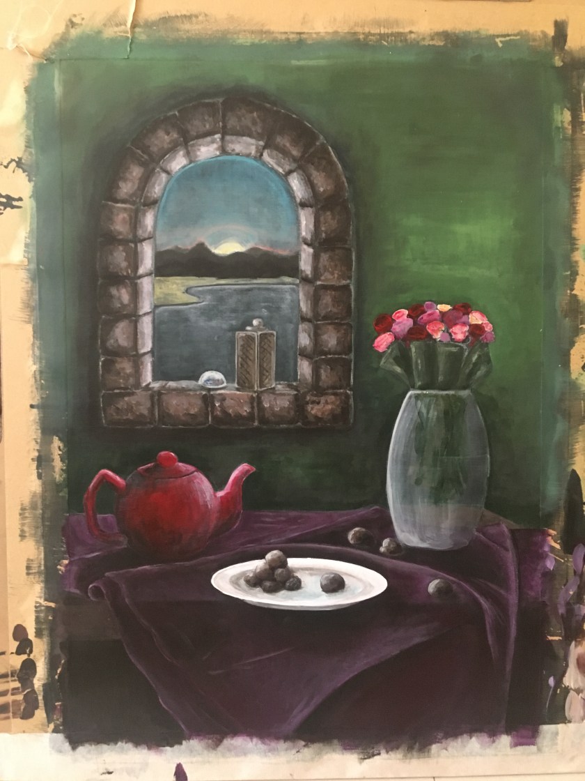
In the feedback given to Assignment 1 I made noisy brushstrokes on the stool holding the flower pot. I remember thinking I liked the effect as it was  a rough wooden trunk. Looking at it, it seems that it was a noisy effect across the whole picture. I thought this was a more relaxed, fluid approach that some artists have, with brushstrokes being visible. Maybe it was the texture of the paper making the noise. I think I have avoided that in Assignment 2 with smooth working and texture across the most part.

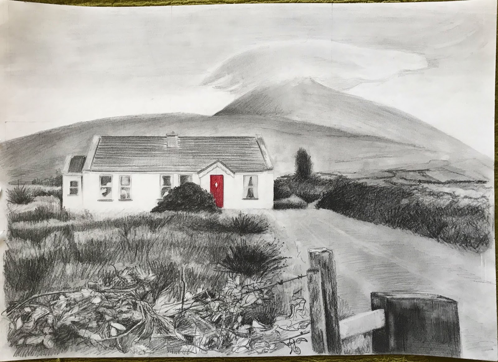
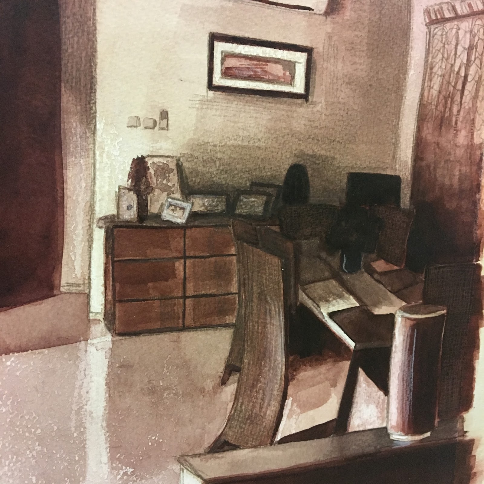
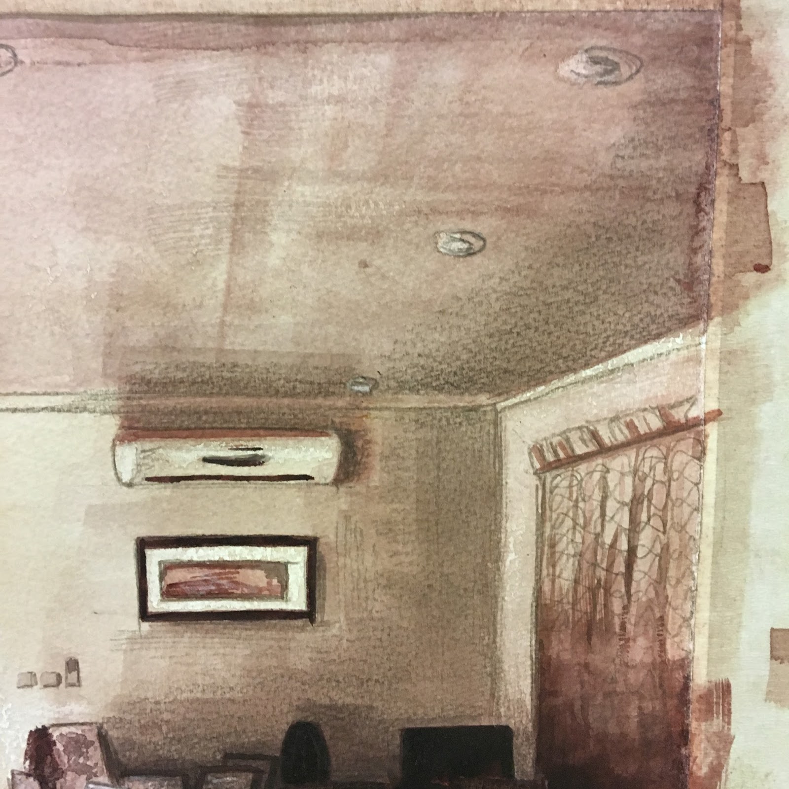
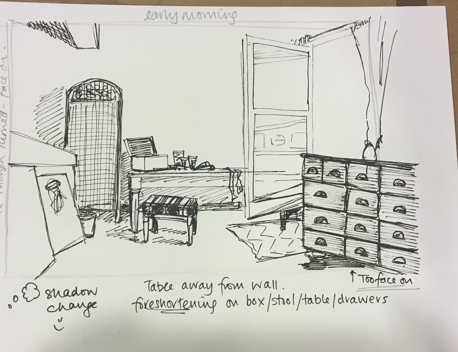
Looking back over the process of this painting, I see I have lost myself in each element and although I think I have flowed from one to the other in my composition, it feels disjointed to me. I could work on several aspects differently if I were to try this again. For a start, I would relax more. This took some time as I was constantly observing my still life elements in parts. Looking at the photograph of my painting I see that I need to add more shading on the flowers, leaves and the lantern and mountain shadow on the beach. I need to work on the glass vase as well. The perspective on the window stones is glaring at me. I think I could have made the window aperture bigger. With an infinite amount of time I could work on this continuously to amend and perfect. I will spend one more session amending and will call it a day.

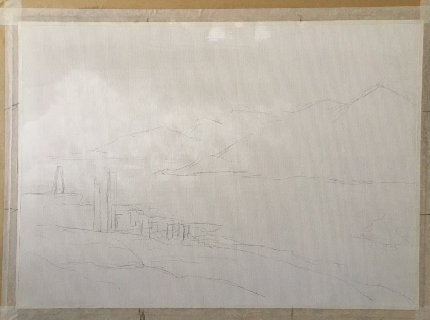
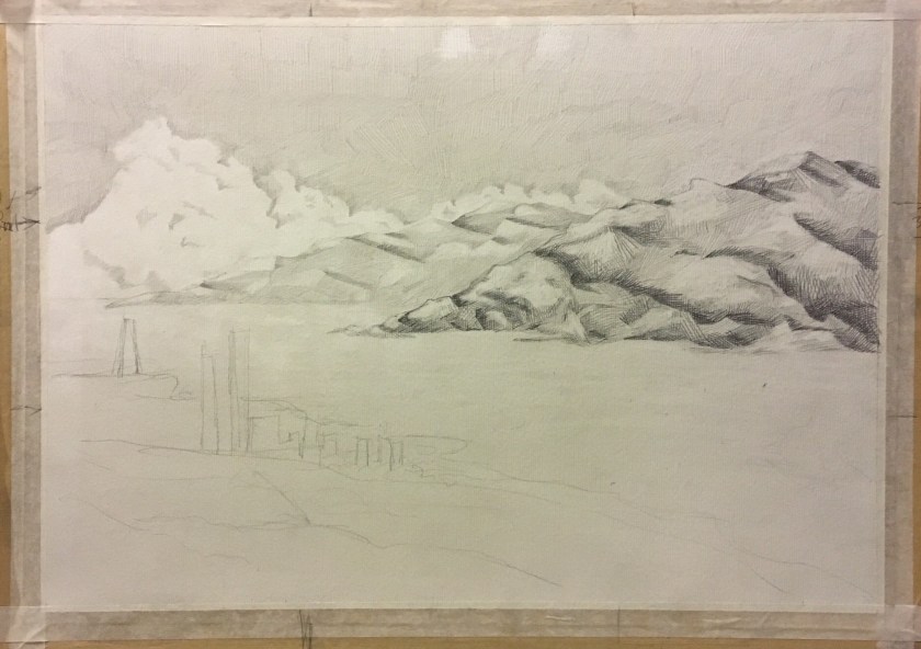
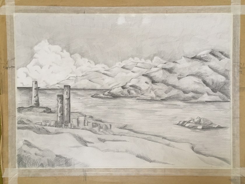
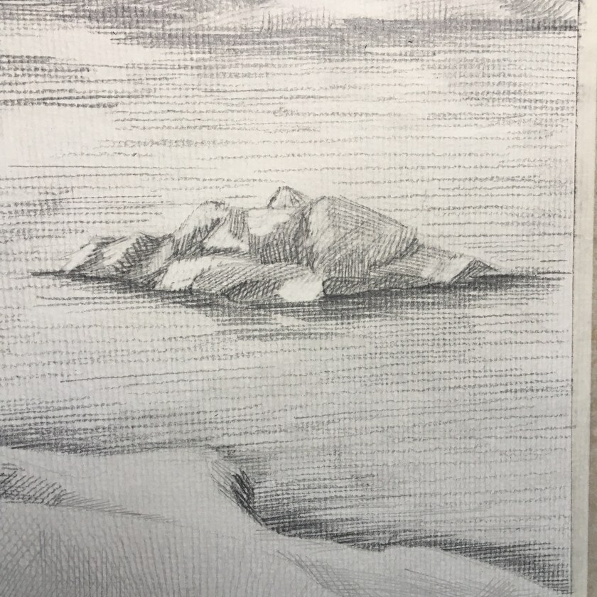
I added a dark translucent wash over the blue sky as well as the beach.

2019-04-23 21-53
Completed Assignment 2 – idea 3

PoP 2.3.5 – Still life with colour to evoke mood

https://www.bourneendauctionrooms.co.uk/catalogue/lots/89FBD8D97A92BED8B2DFF647744A4C84C3CF33BCAACAD3A0BF12CC6DFA19E8FA/DF552CF371F2E3A723B4EBDB4BF38E80/antiques-collectors-sale-incorporating-wines-spirits-lot-184/?d&action=4

I’ve always liked John Brunsdon’s Pembroke II for the way he used a narrow range of tones, evoking, to me, an eerie atmosphere. When I show this to the children in my class, they mostly say they feel scared or nervous; it has a sense of foreboding. Some children feel nervous but hopeful when they think the house is a respite after being lost in the mountains. I decided to try to replicate a sinister, cold feel, just to be contrary as I always want to focus on the energy I feel when I’m painting, peace, calm…so I decided to play a bit. Same still life grouping but viewed from a different angle to generate a dominance of the objects.

I took on board the ‘language’ that Chevreul and Seurat, where sadness or other negative emotions could be interpreted through dark and cold colours with lines pointing down. With the latter, there are no obvious lines to point down but I found I was brushing in a downward direction, maybe subconsciously taking on this language.

(I need to be aware of white balance affecting tone when taking photographs of my work. The first photograph is truest to colour).

PoP Research – Chiaroscuro

Supper at Emmaus (1606) by Caravaggio. Image via art history project.com
The Taking of Christ by Caravaggio (1602). Image via Wikipedia.org

Chiaroscuro’s Place in the Contemporary World of Art and Artists

Today, the term chiaroscuro is frequently applied to a wide array of dramatic lighting effects and it is used as a technical word linked to many mediums and kinds of art[3]It is related to literally any form of expression that possesses something dark and moody with strong slashes of shadow[4] that emphasize the dramatic effect. Interestingly, the traditional power of the chiaroscuro pictures and the tense action within their frames had a massive influence on cinematography as the genres such as Film Noir heavily based their visuals on it. Many filmmakers have stated that this technique shaped the final looks of their movies – for example, Martin Scorsese actually referenced Caravaggio as one of his biggest inspirations behind many of his films.

Ralph Fuentes in Schindler’s List (1993). Image via sleeplessthought.com

Jesse Lane

Staying true to Caravaggio’s original roots of realistic depictions, Jesse Lane is an American painter who combines the concepts of Hyperrealism and chiaroscuro. His paintings aim to channel the emotional impact and capture intimate moments wrapped into a single instant presented to the audience. Lane’s pieces are rather open-ended, as the artist himself explained on many occasions, and his goal is to make the viewers create the narrative on their own. When observed from a technical standpoint, it’s hard to find a more talented painter than Jesse Lane both in regards to Hyperrealism and chiaroscuro.

Echoes by Jesse Lane, 2016. Image via Jesselaneart.com

Nicola Verlato

With his specialty being found in the fusion of popular imagery and traditional painting techniques, it’s no wonder that Nicola Verlato‘s amazing painterly world enjoys such a high level of respect within the art community. This Italian artist is primarily known for his highly refined allegorical surrealism that features spectacular light effects, twisting nude figures and dense compositions, all underlined by a commanding application of chiaroscuro. Wonderful and bizarre, his compositions are a true delight to analyze.

Nicola Verlato – The Settler, 2015 – Image via nicolaverlato.com

Chiaroscuro in Contemporary Photography

When used as a photography technique, the chiaroscuro style is often referred to as clair obscur or extreme low keyJust as the case is with movies, it’s rather interesting to investigate how this shading method traditionally associated with painting has evolved in order to become a viable option for modern artists. As far as the realm of photography is concerned, chiaroscuro kept its strong and bold contrasts between light and dark areas. Of course, the dramatical effects such photos are able to channel is often the reason why photographers opt to use this method of picture-making.[5] The chiaroscuro style of photography is often well-suited for portraits[6]still life compositions and boudoir. The pioneering attempts to translate this technique into the vocabulary of camera images can be traced to the early developments of black and white imagery – for instance, Alfred Stieglitz was one of the oldest practitioners to successfully use a form of chiaroscuro in his work.

Stepan Mazurov – Your Move – Image via thephotoargus.com

Tim Cantor

Charade by Tim Cantor. Image via Timcantor.com
Temptation of Difference by Tim Cantor. Image via KOjewel.com

Assignment 3 – second attempt

676d68f2-8586-4ea3-994b-4271c000acf0-776-0000002beb830da7_file-12018-10-22 15-23 page 5

Words I would associate with this landscape would include peace, tranquil, lush, temperate; a calm energy. Originally I wanted to follow the lush and temperate feel by using thick, ‘full’ medium of oil pastels, texture could be scrapped into the oil pastel with a wash over the top.

I had three ideas forming – oil pastels, textured, and wash; watercolour pencils and pen and ink; pen and ink and watercolour. I considered the oil pastels as they offered an unpredictability and a full thickness to match the lush feel of a temperate landscape. However, in the end I chose not to go this route after I lost myself in John Virtue’s tonal pencil drawings from the 1970s.

I know that one of the points in the assignment outline was to create preliminary drawings for this assignment. I worked on basic composition but wanted to get this piece out in its simplicity, with John Virtue in mind the whole time. Hence I knew I would work with pencil only. I might have added ink if there were any distinct, man-made lines, like the telegraph poles in Green Haworth from South. I did not want to risk overworking this piece and I am a lot happier this time round. Not satisfied entirely, I’d like to continue practicing building and layering the Virtue-style marks to create depth as well as tone but for now, I need to step away and move on.

My inspiration:

https://www.christies.com/lotfinder/Lot/john-virtue-b-1947-green-haworth-5484636-details.aspx

Below are photos from the process, plus the earlier composition ideas I had. I started with a black ink wash, with the cloud area tissued away. Ink does not seem to react to this as well as black watercolour may have done as I was looking for more of the delicate cloud edges to appear from the tissue. Nice enough though.

I’d like try this again with pen, ink and wash.

P3 P3: Ex 2 Foreground, middle ground and background

It has taken me to select photos and sketches to work on this exercise, for me to let go of my previous composition for now. It was a more made-up impromptu landscape, which hasn’t allowed for in-depth study yet.

Whilst studying this section, I did watch the BBC’s This Green and Pleasant Land: The Story of Landscape  Painting. It was certainly offered some much needed motivation and inspiration.

I am not entirely happy with the lenticular cloud, but I decided to stop working it. I’m also not so happy with the shape of the tree on the right. New version:


Reflection


PART 3 P2: Ex 1 Cloud formations and tone

Having been a meteorologist in a previous working life, I was looking forward to this exercise. I have always loved watching clouds form and seeing the shadows they cast on each other as well as on the ground. However, this is an exercise I feel I need to come back to as I have been too formal in the drawing of the cloud formation and my drawings seem flat. More practice and observation here, possibly on a close-up scale rather than within a landscape.


The following three sketches are further developing cloud study, but more of a detailed look at a particular cloud formation.


White ink on black paper

Chalk pastel on blue paper 

Eraser on black pastel in art book (no tooth)


Completed Assignment 2 & Reflection

  • This assignment is designed to pull together the fine observation and practice that you’ve done on this part of the course. 
  • You’re free to choose your own source material and media, provided that you take account of the factors listed below. You can either work on a still life, or interior scene – or a combination of these. 
In the work you produce now you must demonstrate a growing understanding of:
  • the use of colour in drawing
  • the most appropriate medium for the subject
  • composition and context
  • mark-making and contrasts of line and tone
  • accurate and expressive depiction of form, experimentation with idea, material and method.
  • Is this a creative composition? 
  • Is my subject interesting? 
  • Am I using the most appropriate medium, colour, method, etc.?
In my previous posts here and here I have shown my sketching and preparation for this assignment. I enjoy perspective and I liked the idea of combining a little still life of sorts with an interior scene. I am always on the lookout for interesting light shapes and tonal contrasts; I see how they could evoke a mood maybe in a photo and I would love to portray that in a drawing. 

Reflection

  • the use of colour in drawing
  • composition and context
After preparing mostly in black and white, I chose to complete my final assignment piece in warm sepia tones to create a welcoming warmth to the room. If I worked with too many colours it would suggest a more balanced, natural light across the room. It was the late evening, with the house in darkness apart from one landing light, shining down the stairs to the left of the picture.  ‘Leave a light on for me’ seemed an appropriate title as I noticed the shot when I came into my home late at night and everyone was in bed.

I think the shot struck me instantly as it was balanced in its composition without me having to tweak too much. It was in thirds from left to right – the bright light, bar area and stairs to the left, the darkness of the kitchen door to the centre and rear and the shadows of the dining table to the right.


  • the most appropriate medium for the subject
  • mark-making and contrasts of line and tone
An inviting, warm atmosphere required similar materials to recreate such a feeling. I started in black pen for all the sketches I did and, as much as I love pen line, it was too ‘matter of fact’. I had ink wash in mind from early on; I liked the way it ‘worked’ with oil pastel in its resist effect and it worked well to create that artificial lightness without risking it being muted by the ink wash. Maybe pencil to add definition and detail as the last stage. I thought chalks would be ideal for the soft, peaceful, ethereal effect but are not defined enough. I knew that mixed media approach would be ideal to show definition as well as effect. I finally settled on mixed black and Indian Red inks in various dilution helped to make a warm sepia picture, with subtle pencil detail. The pencil worked as an additional layer to show detail and contrast; it helped me to define the pattern in the sheer georgette curtain to the far right. A layer of pencil also gave a ‘veil’ to suggest tangible shadow.
  • accurate and expressive depiction of form, experimentation with idea, material and 
    method.

I was working to get a perfectly accurate picture as is my usual wont, but whilst I was completing this, an ongoing discussion was being had on the Drawing 1 forums regarding assignments, expectations and ability on the OCA drawing course.

There is some frustration that people come to a drawing course with little formal training and the OCA accepts them on a degree course/module. This might suggest that the OCA wants people who are willing to experiment, investigate and think outside the box rather than provide accurate depictions of still life. But then feedback given on the experimental and progressive assignments might be critical in the lack of technical skills. And it becomes a catch-22 situation; is this a technical course or an application of knowledge?

With that in mind, I seem to want to approach my work with a freer, more flowing sense, trying to think outside of the box, which is a contrast to how I have always worked in many aspects of my life. I am becoming more relaxed and I want to apply this to my art. A more expressive, investigative approach appeals to me. 
I have really enjoyed this assignment in that, as the title suggests, it is an intimate look at my space, my home. I am entirely happy with my assignment, I really like it. Technically, I could do better; some straight lines are a little off and I am bothered with this. It was a little hard with a brush and the fluidity of ink.

Staying on a technical level and process, I stepped back and realised I had created a workflow without realising it. I initially thought, and maybe hoped that I worked more spontaneously.  I focussed on what I wanted to achieve – an atmosphere and feeling of the place at that moment in time. This led me to practice with materials and find which suited the aim. 

PART 2 P3 Ex 2: Composition – an interior

I have had no shortage of places to draw in the house. I had in mind I would draw my art ‘room’ at the top of the house as it is my bolt hole and a place to relax that nobody else visits. I found some beautiful light play and reflection at different times of the day and I was excited that this could make a good composition and assignment.  

However, sometimes things can be overworked and I may have been forcing this line of investigation too far as I was losing the sanctuary and peaceful feeling of the room. Plus it was getting too hot to continue working up there.

I then found another area of the house at a certain time of day that invokes all sorts of feelings that I wanted to capture in a drawing – or at least see if I could. 

I was locking up the house at bedtime and switching off the lights when I came across this view:


It is very peaceful, but almost eerie. Not a soul except me awake. The landing light being left on to guide me upstairs. Shadows and reflections being cast on the tile floor. What is where the light is? What does it lead to? 

This could be a great inspiration to combine Philip Geiger’s simplistic domestic scene with more focus on tone and atmosphere.

PART 2 P1 Ex 1: Detail and Tone

The fact that this part of the project is of natural objects has inspired me. Despite not really being naturally drawn to realistic drawing, I have enjoyed this as I can see improvements in my observation skills over time. And I just love looking at pattern and formations in nature.

In the past, I would build up the picture but it would be very flat at the end. I now realise that I was not being brave enough and creating additional layers. I feel that my drawing has been transformed through this layers of tone.

Design a site like this with WordPress.com
Get started